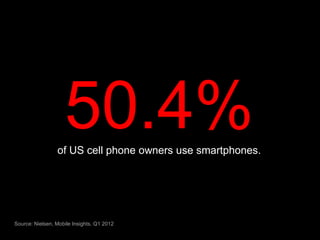
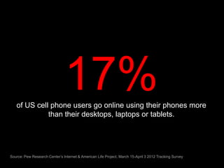
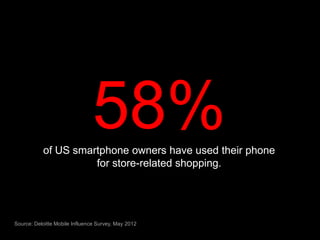
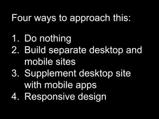
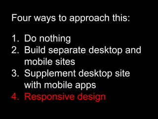
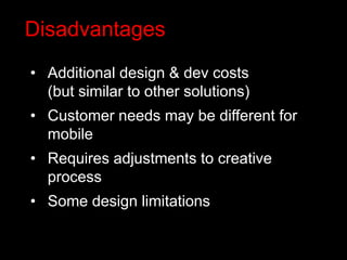
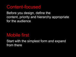
What is
Responsive
Design?
The mobile
browser has
   arrived
50.4%
                 of US cell phone owners use smartphones.


Source: Nielsen, Mobile Insights, Q1 2012
17%
   of US cell phone users go online using their phones more
             than their desktops, laptops or tablets.


Source: Pew Research Center’s Internet & American Life Project, March 15-April 3 2012 Tracking Survey
58%
           of US smartphone owners have used their phone
                     for store-related shopping.


Source: Deloitte Mobile Influence Survey, May 2012
$158B
        of estimated 2012 in-store sales will be influenced by
                        in-store mobile use.


Source: Deloitte Mobile Influence Survey, May 2012
Devices are
 evolving
2010
2012
Mobile user needs
 are different from
desktop user needs
Mobile designs
are different from
desktop designs
One size
doesn’t fit all.
Four ways to approach this:

1. Do nothing
2. Build separate desktop and
   mobile sites
3. Supplement desktop site
   with mobile apps
4. Responsive design
Four ways to approach this:

1. Do nothing
2. Build separate desktop and
   mobile sites
3. Supplement desktop site
   with mobile apps
4. Responsive design
What is
Responsive
Design?
Philosophy
Deliver a single, flexible design
that adapts to display properly on
whatever device is used to view
your site.
Advantages
• Eliminates maintenance redundancies
• Better for social & linking strategies
• Search engines like it
• Seamless experience
• Future-ready
• Full site is accessible from mobile
Disadvantages
• Additional design & dev costs
  (but similar to other solutions)
• Customer needs may be different for
  mobile
• Requires adjustments to creative
  process
• Some design limitations
In-between
Content-focused
Before you design, define the
content, priority and hierarchy appropriate
for the audience
Content-focused
Before you design, define the
content, priority and hierarchy appropriate
for the audience


Mobile first
Start with the simplest form and expand
from there
Collaborative
Requires close communication and
collaboration between Design, UI and
Development
Customer
Customer
+ Content
Customer
  Content
+ Context
Customer
  Content
+ Context
 Optimized
experience
Thank You.

Responsive Design

Editor's Notes

  • #2 “Responsive Design” is a term that has been getting a lot of buzz lately, both internally and from our clients.We thought it might be a good idea to put a presentation together to describe what it is and what it means for us.
  • #3 First, a little background.We’ve been saying for years that “mobile is coming.” It is finally here.We are on the edge of a fundamental shift in customer contact.It is no longer a question of IF you have a mobile presence. Rather, it is a question of HOW WELL you do it.Let me give you some numbers that put this into perspective.
  • #7 According to a new study by Deloitte, in-store smartphone use currently influences 5.1 percent of annual retail store sales, translating into $158 billion. This is expected to nearly quadruple by 2016.
  • #8 Not only do we have this tremendous shift in consumer behavior, we also have an explosion in devices and their capabilities.
  • #9 Just a few years ago, it was standard practice to design a single version of a site that worked on a typical 1024 x 768 desktop screen. If we were feeling especially generous, we would make sure it was also usable on an 800 x 600 browser.
  • #10 Today there are over 25 screen resolutions.This doesn’t take into non-traditional Web devices like TVs and internet-ready appliances. Nor does it address future devices
  • #11 Behavior patterns are distinctly different on mobile devices, and our experiences should be tailored accordingly.Swipe vs. clickSmaller screen sizeShorter, more focused sessions
  • #12 If the device sizes and user needs are different between mobile and desktop, we should be modifying the design to account for this.
  • #13 Behavior patterns are distinctly different on mobile devices, and our experiences should be tailored accordingly..Behavioral studies have shown that people surf and explore on a desktop PC (longer sessions, multiple sites). They look for discrete information on an phone (shorter sessions, more focused)
  • #14 There are valid reasons to take any of these four approaches, but our default approach should be #4: Responsive Design
  • #15 There are valid reasons to take any of these four approaches, but our default approach should be #4: Responsive Design
  • #16 So, back to our initial question…
  • #17 Responsive design has been around for a couple of years.Coined by Ethan Marcotte in 2010.Built on technology that we use today, but I’m not going to go into detail about that this morning.
  • #22 benefits
  • #23 benefits
  • #24 Responsive design is as much about the in-between as it is the end points.The designer, developer and client need to understand what happens to the content as it flexes between the two.This requires a new approach and some new tools
  • #25 Content-focusedBefore doing any design, define content priority and hierarchyGives designer an objective set of communication guidelines and developers a clear outline for developmentMobile firstStart with the simplest form and expand from there.Much easier to expand design than it is to shrink it.
  • #26 Content-focusedBefore doing any design, define content priority and hierarchyGives designer an objective set of communication guidelines and developers a clear outline for developmentMobile firstStart with the simplest form and expand from there.Much easier to expand design than it is to shrink it.
  • #27 CollaborativeDesigners can’t always predict what is going to happen as their layouts flex to different widthsThey need to be able to effectively work with their project teammates to handle issues as they come up.