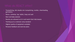
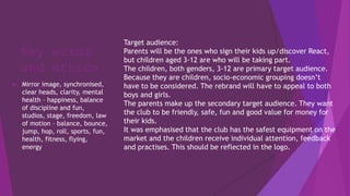
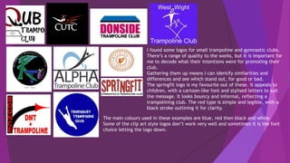
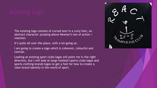
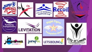
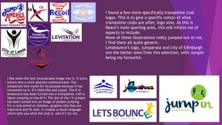
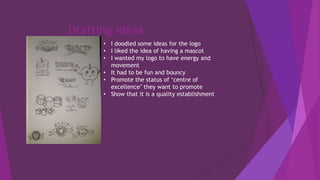
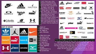
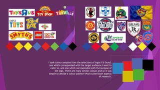
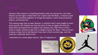
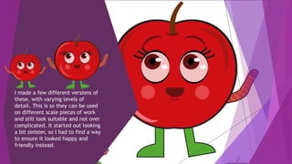
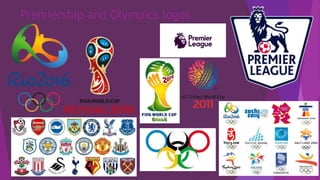
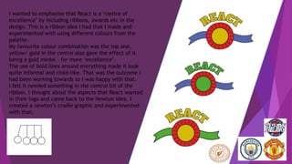
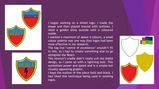
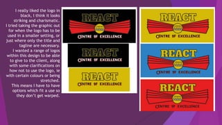
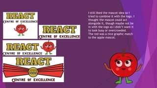
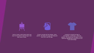
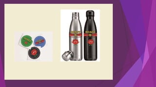
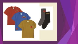
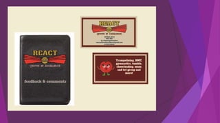
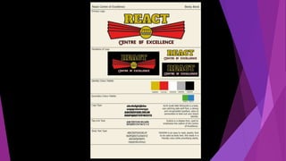
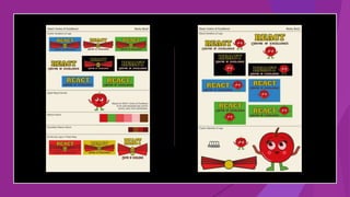
React Centre of Excellence
For fun, for fitness, for high flyers
What do REACT offer?
 Trampolining, dmt double min trampolining, tumble, cheerleading,
gymnastics
 Dance, contemp, tap, ballet, hoop and sash
 Mum and baby sessions
 Parents are allowed to sit in and watch their kids lessons
 Training up to a national comp standard
 Highest quality of equipment available
 Personal feedback and exercise plans
Key words
and ethics
 Mirror image, synchronised,
clear heads, clarity, mental
health – happiness, balance
of discipline and fun,
studios, stage, freedom, law
of motion – balance, bounce,
jump, hop, roll, sports, fun,
health, fitness, flying,
energy
Target audience:
Parents will be the ones who sign their kids up/discover React,
but children aged 3-12 are who will be taking part.
The children, both genders, 3-12 are primary target audience.
Because they are children, socio-economic grouping doesn’t
have to be considered. The rebrand will have to appeal to both
boys and girls.
The parents make up the secondary target audience. They want
the club to be friendly, safe, fun and good value for money for
their kids.
It was emphasised that the club has the safest equipment on the
market and the children receive individual attention, feedback
and practises. This should be reflected in the logo.
I found some logos for small trampoline and gymnastic clubs.
There’s a range of quality to the works, but it is important for
me to decode what their intentions were for promoting their
club.
Gathering them up means I can identify similarities and
differences and see which stand out, for good or bad.
The springfit logo is my favourite out of these. It appeals to
children, with a cartoon-like font and stylised letters to suit
the message. It looks bouncy and informal, reflecting a
trampolining club. The red type is simple and legible, with a
black stroke outlining it for clarity.
The main colours used in these examples are blue, red then black and white.
Some of the clip art style logos don’t work very well and sometimes it is the font
choice letting the logo down.
1
2 3
4 5 6
1 is unreadable, they’ve tried to combine text with inner shadow, a dolphin and a graphic of a jumping
person, all while having the text overlap and at different sizes. The colour scheme is unclear as there are
too many colours and shades. I don’t think this has any redeemable features to it
2 looks like it was trying to imitate a graph and make it relate to a bounce movement. The colour scheme
is black, red and white which is a bit intense to be aimed at a young audience, this highlights the
effectiveness of D, where a thin black stroke is used on the text to highlight, not overpower it. 2 also has
stretched text and slightly mismatched vector shapes. These are things as a graphic designer I know to
avoid.
3 uses a font better suited for body text rather than heading. The clip art style doesn’t appeal to me, but
it shows a creative response to wanting an image of somebody trampolining. It’s not quite catchy enough
to be a logo.
4 has a range of fonts, which is hard to pull off without it looking messy. I cant tell if it’s supposed to read
QUB of OUB, not quite legible enough. The art choice on this one is okay in my opinion, but the mismatch
of fonts is too distracting. Not a good balance of text to imagery.
5 is the least offensive one, the typeface is nice and bold, in a solid pink. It works well with the blue of
the picture. The picture itself is of sport mats I think, which isn’t very energetic. Visually it is a nice logo,
but it doesn’t fit the target audience of children who want to do trampolining.
6 has a nice composition of image to text, the image is clear, the text is informal and so suits its purpose.
I put it with the logos I wasn’t keen on because it looked plain, but connotating it I’ve changed my mind.
Although it’s a little plain, it’s a decent logo for a sports club aimed at kids.
These are the selection of logos I liked on first glance. I will pick them apart and find out
which specifics appeal to me, make for a good logo and suit the target demographic.
A is sleek, it has a tight colour scheme and the ribbon graphic is a visual match of the C. the
font is formal and quite serious, the composition of that below the slightly wider visual looks
appealing and well balanced. I think this gymnastic club may be for older children/teenagers
or might be quite prestigious. The black background is quite mature and stands out from the
white and blue of these other logos.
B has a colour scheme recognisable from gyms and leisure centres, sea blue, muted darker
blue and white. This familiarity might be why it appeals to me. The type is stylishly mirrored
by enlarging the A at either end. It has a similar composition to A, which is something I will
consider when developing my own ideas.
C is an interesting Aztec type logo. The type on the circular path is not particularly sleek, but
the overall design is visually appealing. It looks fun and would work well on merchandise like t-
shirts or water bottles. Orange looks good as a singular colour on white.
D is my favourite, it looks bouncy and cheerful, with dashed lines mimicking movement. The
letters are not perfectly in line, which is an element I like. It suits the target audience very
well and the colours mean it is readable and stands out. It doesn’t have a separate graphic like
the other logos here, there’s no need as the text is illustrative.
A B
C D
Target audience
 REACT accepts members from 4 year olds to young adults. A few of the
members then go on to become staff. The members often win awards,
regionally and nationally in competitions (where the logo will be
displayed). REACT is inclusive and can facilitate those with disabilities.
They also have mum and tot events. They currently have 140 kids – this
will increase with the new move and rebrand.
 REACT prides itself on prioritising individuals, and restricting the number
of kids on one trampoline so they can get the most out of the lessons.
 The quality of the equipment is higher than other local clubs.
 The target audience for most local trampolining clubs are 4-18, all
genders, mid socio economic groups (C1/C2)
 TA for sports brands and sporting events are usually 10-50, male, lower
to middle socio economic classes (C3,C2,C1)
Existing logo
 The existing logo consists of curved text in a curly font, an
abstract character jumping above Newton’s law of action /
reaction.
 It’s quite all over the place, with a lot going on.
 I am going to create a logo which is coherent, colourful and
concise.
 Looking at existing sport clubs logos will point me in the right
direction, but I will look at large football/sports clubs logos and
sports clothing brands logos to get a feel for how to create a
clear brand identity in the world of sport.
i found a few more specifically trampoline club
logos. This is to give a specific notion of what
trampoline clubs are after, logo wise. As this is
React’s main sporting area, this will inform me of
aspects to include.
None of these illustrations really jumped out at me,
I find them all quite generic.
Letsbounce’s logo, jumparooz and city of Edinburgh
are the better ones from this selection, with JumpIn
being my favourite.
I like when the text incorporates image into it, it turns
letters into a more abstract communicator. The
jumparooz font works for its purpose because it has
movement to it. It’s child-like and casual. The E in
letsbounce has been turned into a trampoline, with a
figure jumping on top of it. The dot of the i in jumpin
has been turned into an image of people jumping.
For a club aimed at children, graphics like that are
important and fit well. It creates a visual language
which tells you what the club is, who it’s for etc.
 business cards
 T-shirts
 Instagram grid layout
 Waterbottles
 Certificates (most improved etc)
 Stickers
 Feedback book for the sessions
 Branded socks
 Posters / flyers
 Rule sheet for parents (wait here etc)
 Front of building
 Vinyl sticker
 On the website – profiles for each member of staff as described by the kids
 ‘Remember’ sheet for kids – clean socks, jewellery, hair, manners
 Why choose us? Bit for the website
 ‘Recently expanded and rebranded’
 You and your child - focus
 Unique selling points of React– parents are allowed in, encouraged to watch in our brand new viewing area, personal contact with parents,
feedback forms, personalised routine/pics/advice, safety – better than halo only centre in Herefordshire with professional sprung floor –
necessary for your child’s safety, fun, adult parties
React want their logo to be on their merchandise. I thought
up some ideas for what I could mock up my logo pitch onto.
I imagined I was going to a trampolining club, what would I
take with me? What would I see and use while I was there?
What sort of place would it be? If I was a parent with a
child attending, what would they be likely to try to sell to
me?
Speaking to the client, I learnt about the unique selling
points of React, how the parents are, who the staff are
(past members of the club) etc. these are important to
remember to create a rebrand which suits everybody’s
needs. Children are the primary target audience, then
parents, but the staff must also be considered. They will be
represented by the branding of React.
Drafting ideas
• I doodled some ideas for the logo
• I liked the idea of having a mascot
• I wanted my logo to have energy and
movement
• It had to be fun and bouncy
• Promote the status of ‘centre of
excellence’ they want to promote
• Show that it is a quality establishment
Sans serif, black type, either
tightened or loosened spacing,
complimenting graphics, closely
linked to the name, the lettering
or the slogans, quite literal
graphics (puma, UA, NB, O)
The Oakley logo is incredibly
simple, which I like – by using an
O, they’ve simplified the brand in
a recognisable way. It’s been
stretched slightly. Puma use a
perfect cross between realistic and
stylised puma. Under Armour’s
designer noticed the potential with
U and A, and created the logo with
this in mind. I like the simplicity of
this.
Examples of
graphics standing
alone, logos on
colours, rebrands
etc
The Nike tick is one
of the most iconic
brand symbols of all
time. It links to
their ‘just do it’
slogan, has energy
and flow, signifies
speed and
accomplishment in a
single curved line.
These sporting logos are a good compilation of graphic designers aiming
for simplicity and energy for their icons. As sport is all about speed, the
link is direct and coherent. When no graphic has been used, such as
Prince, Everlast, Converse and Casio, the type has been created in such a
way that it conveys the message they want to send. Everlast is one of the
few brands to use a serif typeface, it works because of the warped
design, the serif feet almost at as an underline/overline. It remains
readable by being bold and purposefully stretched.
 Sports fashion brands logos tend
to be bold, black, sans serif and
forward facing.
 Sans serif type is timeless and
easy to read, it can be bold and
sleek, with quick simple lines
symbolising speed and sleekness
 the motifs tend to have a lot of
motion to them, either racing
stripes, simple lines or vector
shapes
 These logos don’t have much
colour on them as default, but
the context they’re used in
determines that
reinforce the myth of family values and family unit
with the myth of health at the forefront of society
Attention grabbing
Bold, fun and bright
Uses the lettering as a means for graphics
Mascot?
Simple but smart
Say a lot in a little
I looked into foreign countries sports clubs for kids, places like
America and China take their sports clubs a lot more seriously than
people in the UK – one example of this is how big a part college
football teams play in culture and society in the USA.
With this in mind, I thought they would perhaps put more effort
into logos which look professional and more reminiscent of
professional league sports logos.
I wanted to analyse if they can find a middle ground, having an
amateur team but a professional looking logo.
I collected some that I really liked. Some of my favourite aspects
are the silk flag effect on 3, how professional 1 looks, the bold
stylish text on 5, the mascot usage and text on 6, the colours on 7
keeping a close colour palette and the shape and detail of 12.
The badge logo style really stood out on these images, it can be
easily applied onto merchandise, looks remiscent of professional
English football team logos and can look really sleek.
I decided to create some badge emblems and see where adding
previous research ideas into this new format would take me. These
all look as if they’re targeted at older kids or teenagers, even 6
with a logo of a cartoon swallow is quite professional. 5 looks
stylish enough to be a clothing brand logo, which is really gorgeous
but recreating something like that wouldn’t fit the brief.
13, 7, 1 & 2 are most suited to a young audience.
They have simple colour schemes, big bold letters mostly and are
self contained within their own shapes.
1 2 3
4 5 6
7 8 9
10 11 12 13
With children as the primary audience for the logo, I needed some
research which linked to them in other directions than just sport
clubs. I looked at how shops market themselves towards children.
Same as the sports club, the children are primary target audience
and their parents are the secondary TA.
Looking at these, instantly my focus
was on colour and big chunky words.
Red and yellow are the most used
colours here, with blue coming in
third. Orange accents complement the
red and yellow combination, and black
outlines text to increase clarity.
They all have a fun gimmick with their
logos, stylised colourful houses, a big
happy sun-lit town, a rocket matching
the text colour shape and thickness, a
star and lettering made to look like
castle wall-tops.
I took colour samples from the selections of logos I’d found,
one which corresponded with the target audience I want to
cater to, and one which corresponded with the purpose of
the logo. There are many similar colours and so it was
simple to decide a colour palette which suited both aspects
of research.
mascot
 Having a little mascot is something football clubs are famous for, and some
feature on the logos I researched. For a small club like React, a mascot could
help tie the branding together on things like posters, event announcements,
letters, certificates etc.
 The existing logo links to Isaac Newton, a scientist who’s work taught us more
about gravity. All children are told the story of how an apple fell onto his
head which prompted him to explore the reasons why. With this in mind, I
think an apple could be made into a suitable mascot for React. They are keen
to keep a close link to the Newton’s law that is their current logo, and this
could be a different kind of link.
 I sketched out a small apple mascot, then I’ll digitalise it
I made a few different versions of
these, with varying levels of
detail. This is so they can be used
on different scale pieces of work
and still look suitable and not over
complicated. It started out looking
a bit sinister, so I had to find a way
to ensure it looked happy and
friendly instead.
 I began this logo with a super simple logo
– bold font, tagline and a box around it.
 I had edited the type so it was balanced,
with the outer letters the same size.
 With a 5 letter word this works well, it
makes for a symmetrical word and keeps
it looking catchy and snappy.
 I asked Scott for advice on composition as
I wanted the apple mascot to be alongside
the logo.
 He suggested making the character react
to some element of the logo.
 I made a bounce effect on the box of the
text.
Premiership and Olympics logos
 I started working on this idea, a banner for the tagline and a bouncy REACT
title. I used different colour letters to create a bouncing effect on the word
REACT. I worked on it, changing the curvature and sizing for a short while
before disregarding the idea. It looked a little too type-heavy, the
composition wasn’t working out and I was more interested in exploring
crest/shield ideas instead. However, it gave me a chance to try out the colour
palette and see that in action, it looked quite good.
 While the text is bold, I would emphasise the black in certain areas more I
think to change the weight and give it a different feel. The yellow tagline on
red looks nice, it reminds me of Toy Story and a lot of the toy shop logos I was
looking at.
 I think the font choice was good and I may take that element away from this.
The design I had made had reminded me of Toy Story logo. This gave me another revenue of research to look into – films and specific toys, franchises. I found
this collection of toy/movie franchises that have been popular over the past 10 or so years and are still popular today.
Toys have to look enticing and exciting.
The LOL surprise logo is an example of those characteristics combining with modern graphic trends – the neo3D shadow with spotty bold text.
SlimeBaff fits its purpose by being slimy as a logo, while maintaining readability.
Nerf is similar to the sports logos, nerf make toy guns with squishy bullets – speed and power are what they will want to promote with their logo. Much like
sports logos, Nerf has achieved this using a simplistic but effective vector shape, with changing width to give it the effect of shooting through space.
Paw Patrol is a show about puppy police, the shield they used shows authority and pride.
Soft’n slo squishies are as squishy as they sound, fun, playful and nicely rounded. The colourscheme shows they are for girls primarily, with pink, purple and
yellow being used.
I wanted to emphasise that React is a ‘centre of
excellence’ by including ribbons, awards etc in the
design. This is a ribbon idea I had that I made and
experimented with using different colours from the
palette.
My favourite colour combination was the top one,
yellow/ gold in the centre also gave the effect of it
being a gold medal – for more ‘excellence’.
The use of bold lines around everything made it look
quite informal and child-like. That was the outcome I
had been working towards so I was happy with that.
I felt it needed something in the central bit of the
ribbon. I thought about the aspects that React wanted
in their logo and came back to the Newton idea. I
created a newton’s cradle graphic and experimented
with that.
I began working on a shield logo. I made the
shape and then played around with outlines. I
liked a golden shiny outside with a coloured
inside.
I wanted a maximum of about 4 colours, a small
colour palette was one way that logos had been
most effective in my research.
The tag line ‘centre of excellence’ wouldn’t fit
in this, so I had to create something else to go
alongside the React.
The newton’s cradle didn’t really suit the shield
design, so I came up with a lightning bolt. This
symbolises power and speed and is a simple but
visually appealing graphic.
I kept the outline of the piece bold and black. I
had liked this technique being used in existing
logos.
I quite liked these designs. The type is sporty and cool and matched the gold used on
the shields. I think they would be better suited to football teams though – they look
quite masculine and not quite as fun as the other logos I've created. I think it would
look good on merchandise and would show them to be a trampoline club to be taken
seriously at competitions, but it didn’t reflect the enthusiasm, bubbliness and fun
atmosphere React has.
I digitalised another one of my drawn ideas. I drew it out originally
intending it to look like a ribbon, but when I drew it on Illustrator I found it
also looked a bit like book pages. I emphasised the central circle and that
made it look more like an awards ribbon. This also gave me a shape to play
around with for the text, I tried arching the text as a visual match.
I chose a bold text with a built in drop shadow, for emphasis. I hadn’t
decided on a colour scheme yet so I kept it black and white while I created
and changed the composition of the piece.
I wanted the tagline to be included in the logo because it gives the company
an air of high standard. This was something they wanted to encourage.
I changed the tagline placement from the draft sketch, it gave the logo a
better flow and a nicer balance.
The rounded text with bold lettering worked as a more fun looking logo.
The middle one looked too cartoon-y to fit with the tag-line font.
The lower image has a tagline font which has a handwritten element to it
while not looking too childish.
I need to experiment with colours and see how this affects my outcomes.
 I didn’t know what to put in the centre so I started
with some quick vector shapes.
 I had chosen which font I liked best for the tagline
and a composition which I think looked good.
 As I was colouring the images, I realised the font I had
chosen didn’t allow colour in the white.
 I had to choose another font, this time slightly more
neutral and legible.
 I chose the gold colour from my palette as the centre,
and liked the red ribbon more than the blue.
 I matched the tagline text to the red and found that
worked nicely. When I had the tagline in blue, it
didn’t show up very much.
 I repurposed the newton’s cradle and used it in
this design.
 I changed the font to alfa slab, which is quite
heavy and then tried different colours before
landing on the gold/yellow.
 I kept the centre of excellence tagline in a quirky
font with red highlights
 I used a grey for the inside of the Newton’s
cradle.
 I think this is a logo which React would be proud
to wear at competitions, but I still have to play
around with other colours for a variety of usable
logos
 I’m overall happy with this one, it combines the
Newton element with bold, striking type, a
colourful graphic which links to the high standards
of the club and gold which links to their
competitive spirit.
 I had taken inspiration from my research to inform
me of choices for the font, layout, the use of a
motif inside the circle and a small colour scheme.
I really liked the logo in
black, I think it looks
striking and charismatic.
I tried taking the graphic out
for when the logo has to be
used in a smaller setting, or
just where only the title and
tagline are necessary.
I wanted a range of logos
within this design to be able
to give to the client, along
with some clarifications on
how not to use the logo, ie
with certain colours or being
stretched.
This means I have to have
options which fit a use so
they don’t get warped.
I still liked the mascot idea so I
tried to combine it with the logo. I
thought the mascot could act
alongside it, though maybe not be
in with the logo as I didn’t want it
to look busy or overcrowded.
The red was a nice graphic match
to the apple mascot.
This logo combines elements which I have discovered through my research work well. The small colour palette makes for distinctive
branding, the graphics are understandable, the font is easy to read and coherent. It works when it’s small and when it’s large. The thick
black outlines give it a friendly and bold air. I’ve addressed the target audience by choosing bright happy colours, simple graphics and
large bubbly text. I could perhaps stylise the text a bit more, by making it softer and giving it a bit more character. Different revenues of
inspiration have been really crucial in my development of the logos, especially the final design. This gave me an opportunity to see how
other companies and designers view the target audience and the products of cultivating their own research.
These are all of the variations of the logo. The white
background is the main logo. Some others are the
secondary ones, and some are just extras.
When looking through Speller Metcalfe’s logos to add
to my banner design, I remember they had about 15
or so variables depending on their desired purpose.
I wanted to offer the client multiple options within
the same theme.
I had to create a pitch board which was
easy for the client to look through, then
take away to keep.
It had to include the final design, colour
palette, info about the type and sizing and
how not to use the logo.
I wanted to include the logo on
merchandise, certificates, cards and
posters. This would show the logo in action,
hopefully highlighting its qualities as an all-
round solid design.
React trampolining Becky Bond

React trampolining Becky Bond

  • 1.
    React Centre ofExcellence For fun, for fitness, for high flyers
  • 2.
    What do REACToffer?  Trampolining, dmt double min trampolining, tumble, cheerleading, gymnastics  Dance, contemp, tap, ballet, hoop and sash  Mum and baby sessions  Parents are allowed to sit in and watch their kids lessons  Training up to a national comp standard  Highest quality of equipment available  Personal feedback and exercise plans
  • 3.
    Key words and ethics Mirror image, synchronised, clear heads, clarity, mental health – happiness, balance of discipline and fun, studios, stage, freedom, law of motion – balance, bounce, jump, hop, roll, sports, fun, health, fitness, flying, energy Target audience: Parents will be the ones who sign their kids up/discover React, but children aged 3-12 are who will be taking part. The children, both genders, 3-12 are primary target audience. Because they are children, socio-economic grouping doesn’t have to be considered. The rebrand will have to appeal to both boys and girls. The parents make up the secondary target audience. They want the club to be friendly, safe, fun and good value for money for their kids. It was emphasised that the club has the safest equipment on the market and the children receive individual attention, feedback and practises. This should be reflected in the logo.
  • 4.
    I found somelogos for small trampoline and gymnastic clubs. There’s a range of quality to the works, but it is important for me to decode what their intentions were for promoting their club. Gathering them up means I can identify similarities and differences and see which stand out, for good or bad. The springfit logo is my favourite out of these. It appeals to children, with a cartoon-like font and stylised letters to suit the message. It looks bouncy and informal, reflecting a trampolining club. The red type is simple and legible, with a black stroke outlining it for clarity. The main colours used in these examples are blue, red then black and white. Some of the clip art style logos don’t work very well and sometimes it is the font choice letting the logo down.
  • 5.
    1 2 3 4 56 1 is unreadable, they’ve tried to combine text with inner shadow, a dolphin and a graphic of a jumping person, all while having the text overlap and at different sizes. The colour scheme is unclear as there are too many colours and shades. I don’t think this has any redeemable features to it 2 looks like it was trying to imitate a graph and make it relate to a bounce movement. The colour scheme is black, red and white which is a bit intense to be aimed at a young audience, this highlights the effectiveness of D, where a thin black stroke is used on the text to highlight, not overpower it. 2 also has stretched text and slightly mismatched vector shapes. These are things as a graphic designer I know to avoid. 3 uses a font better suited for body text rather than heading. The clip art style doesn’t appeal to me, but it shows a creative response to wanting an image of somebody trampolining. It’s not quite catchy enough to be a logo. 4 has a range of fonts, which is hard to pull off without it looking messy. I cant tell if it’s supposed to read QUB of OUB, not quite legible enough. The art choice on this one is okay in my opinion, but the mismatch of fonts is too distracting. Not a good balance of text to imagery. 5 is the least offensive one, the typeface is nice and bold, in a solid pink. It works well with the blue of the picture. The picture itself is of sport mats I think, which isn’t very energetic. Visually it is a nice logo, but it doesn’t fit the target audience of children who want to do trampolining. 6 has a nice composition of image to text, the image is clear, the text is informal and so suits its purpose. I put it with the logos I wasn’t keen on because it looked plain, but connotating it I’ve changed my mind. Although it’s a little plain, it’s a decent logo for a sports club aimed at kids. These are the selection of logos I liked on first glance. I will pick them apart and find out which specifics appeal to me, make for a good logo and suit the target demographic. A is sleek, it has a tight colour scheme and the ribbon graphic is a visual match of the C. the font is formal and quite serious, the composition of that below the slightly wider visual looks appealing and well balanced. I think this gymnastic club may be for older children/teenagers or might be quite prestigious. The black background is quite mature and stands out from the white and blue of these other logos. B has a colour scheme recognisable from gyms and leisure centres, sea blue, muted darker blue and white. This familiarity might be why it appeals to me. The type is stylishly mirrored by enlarging the A at either end. It has a similar composition to A, which is something I will consider when developing my own ideas. C is an interesting Aztec type logo. The type on the circular path is not particularly sleek, but the overall design is visually appealing. It looks fun and would work well on merchandise like t- shirts or water bottles. Orange looks good as a singular colour on white. D is my favourite, it looks bouncy and cheerful, with dashed lines mimicking movement. The letters are not perfectly in line, which is an element I like. It suits the target audience very well and the colours mean it is readable and stands out. It doesn’t have a separate graphic like the other logos here, there’s no need as the text is illustrative. A B C D
  • 6.
    Target audience  REACTaccepts members from 4 year olds to young adults. A few of the members then go on to become staff. The members often win awards, regionally and nationally in competitions (where the logo will be displayed). REACT is inclusive and can facilitate those with disabilities. They also have mum and tot events. They currently have 140 kids – this will increase with the new move and rebrand.  REACT prides itself on prioritising individuals, and restricting the number of kids on one trampoline so they can get the most out of the lessons.  The quality of the equipment is higher than other local clubs.  The target audience for most local trampolining clubs are 4-18, all genders, mid socio economic groups (C1/C2)  TA for sports brands and sporting events are usually 10-50, male, lower to middle socio economic classes (C3,C2,C1)
  • 7.
    Existing logo  Theexisting logo consists of curved text in a curly font, an abstract character jumping above Newton’s law of action / reaction.  It’s quite all over the place, with a lot going on.  I am going to create a logo which is coherent, colourful and concise.  Looking at existing sport clubs logos will point me in the right direction, but I will look at large football/sports clubs logos and sports clothing brands logos to get a feel for how to create a clear brand identity in the world of sport.
  • 9.
    i found afew more specifically trampoline club logos. This is to give a specific notion of what trampoline clubs are after, logo wise. As this is React’s main sporting area, this will inform me of aspects to include. None of these illustrations really jumped out at me, I find them all quite generic. Letsbounce’s logo, jumparooz and city of Edinburgh are the better ones from this selection, with JumpIn being my favourite. I like when the text incorporates image into it, it turns letters into a more abstract communicator. The jumparooz font works for its purpose because it has movement to it. It’s child-like and casual. The E in letsbounce has been turned into a trampoline, with a figure jumping on top of it. The dot of the i in jumpin has been turned into an image of people jumping. For a club aimed at children, graphics like that are important and fit well. It creates a visual language which tells you what the club is, who it’s for etc.
  • 10.
     business cards T-shirts  Instagram grid layout  Waterbottles  Certificates (most improved etc)  Stickers  Feedback book for the sessions  Branded socks  Posters / flyers  Rule sheet for parents (wait here etc)  Front of building  Vinyl sticker  On the website – profiles for each member of staff as described by the kids  ‘Remember’ sheet for kids – clean socks, jewellery, hair, manners  Why choose us? Bit for the website  ‘Recently expanded and rebranded’  You and your child - focus  Unique selling points of React– parents are allowed in, encouraged to watch in our brand new viewing area, personal contact with parents, feedback forms, personalised routine/pics/advice, safety – better than halo only centre in Herefordshire with professional sprung floor – necessary for your child’s safety, fun, adult parties React want their logo to be on their merchandise. I thought up some ideas for what I could mock up my logo pitch onto. I imagined I was going to a trampolining club, what would I take with me? What would I see and use while I was there? What sort of place would it be? If I was a parent with a child attending, what would they be likely to try to sell to me? Speaking to the client, I learnt about the unique selling points of React, how the parents are, who the staff are (past members of the club) etc. these are important to remember to create a rebrand which suits everybody’s needs. Children are the primary target audience, then parents, but the staff must also be considered. They will be represented by the branding of React.
  • 11.
    Drafting ideas • Idoodled some ideas for the logo • I liked the idea of having a mascot • I wanted my logo to have energy and movement • It had to be fun and bouncy • Promote the status of ‘centre of excellence’ they want to promote • Show that it is a quality establishment
  • 12.
    Sans serif, blacktype, either tightened or loosened spacing, complimenting graphics, closely linked to the name, the lettering or the slogans, quite literal graphics (puma, UA, NB, O) The Oakley logo is incredibly simple, which I like – by using an O, they’ve simplified the brand in a recognisable way. It’s been stretched slightly. Puma use a perfect cross between realistic and stylised puma. Under Armour’s designer noticed the potential with U and A, and created the logo with this in mind. I like the simplicity of this. Examples of graphics standing alone, logos on colours, rebrands etc The Nike tick is one of the most iconic brand symbols of all time. It links to their ‘just do it’ slogan, has energy and flow, signifies speed and accomplishment in a single curved line. These sporting logos are a good compilation of graphic designers aiming for simplicity and energy for their icons. As sport is all about speed, the link is direct and coherent. When no graphic has been used, such as Prince, Everlast, Converse and Casio, the type has been created in such a way that it conveys the message they want to send. Everlast is one of the few brands to use a serif typeface, it works because of the warped design, the serif feet almost at as an underline/overline. It remains readable by being bold and purposefully stretched.
  • 13.
     Sports fashionbrands logos tend to be bold, black, sans serif and forward facing.  Sans serif type is timeless and easy to read, it can be bold and sleek, with quick simple lines symbolising speed and sleekness  the motifs tend to have a lot of motion to them, either racing stripes, simple lines or vector shapes  These logos don’t have much colour on them as default, but the context they’re used in determines that
  • 14.
    reinforce the mythof family values and family unit with the myth of health at the forefront of society Attention grabbing Bold, fun and bright Uses the lettering as a means for graphics Mascot? Simple but smart Say a lot in a little
  • 16.
    I looked intoforeign countries sports clubs for kids, places like America and China take their sports clubs a lot more seriously than people in the UK – one example of this is how big a part college football teams play in culture and society in the USA. With this in mind, I thought they would perhaps put more effort into logos which look professional and more reminiscent of professional league sports logos. I wanted to analyse if they can find a middle ground, having an amateur team but a professional looking logo. I collected some that I really liked. Some of my favourite aspects are the silk flag effect on 3, how professional 1 looks, the bold stylish text on 5, the mascot usage and text on 6, the colours on 7 keeping a close colour palette and the shape and detail of 12. The badge logo style really stood out on these images, it can be easily applied onto merchandise, looks remiscent of professional English football team logos and can look really sleek. I decided to create some badge emblems and see where adding previous research ideas into this new format would take me. These all look as if they’re targeted at older kids or teenagers, even 6 with a logo of a cartoon swallow is quite professional. 5 looks stylish enough to be a clothing brand logo, which is really gorgeous but recreating something like that wouldn’t fit the brief. 13, 7, 1 & 2 are most suited to a young audience. They have simple colour schemes, big bold letters mostly and are self contained within their own shapes. 1 2 3 4 5 6 7 8 9 10 11 12 13
  • 17.
    With children asthe primary audience for the logo, I needed some research which linked to them in other directions than just sport clubs. I looked at how shops market themselves towards children. Same as the sports club, the children are primary target audience and their parents are the secondary TA. Looking at these, instantly my focus was on colour and big chunky words. Red and yellow are the most used colours here, with blue coming in third. Orange accents complement the red and yellow combination, and black outlines text to increase clarity. They all have a fun gimmick with their logos, stylised colourful houses, a big happy sun-lit town, a rocket matching the text colour shape and thickness, a star and lettering made to look like castle wall-tops.
  • 18.
    I took coloursamples from the selections of logos I’d found, one which corresponded with the target audience I want to cater to, and one which corresponded with the purpose of the logo. There are many similar colours and so it was simple to decide a colour palette which suited both aspects of research.
  • 19.
    mascot  Having alittle mascot is something football clubs are famous for, and some feature on the logos I researched. For a small club like React, a mascot could help tie the branding together on things like posters, event announcements, letters, certificates etc.  The existing logo links to Isaac Newton, a scientist who’s work taught us more about gravity. All children are told the story of how an apple fell onto his head which prompted him to explore the reasons why. With this in mind, I think an apple could be made into a suitable mascot for React. They are keen to keep a close link to the Newton’s law that is their current logo, and this could be a different kind of link.  I sketched out a small apple mascot, then I’ll digitalise it
  • 20.
    I made afew different versions of these, with varying levels of detail. This is so they can be used on different scale pieces of work and still look suitable and not over complicated. It started out looking a bit sinister, so I had to find a way to ensure it looked happy and friendly instead.
  • 21.
     I beganthis logo with a super simple logo – bold font, tagline and a box around it.  I had edited the type so it was balanced, with the outer letters the same size.  With a 5 letter word this works well, it makes for a symmetrical word and keeps it looking catchy and snappy.  I asked Scott for advice on composition as I wanted the apple mascot to be alongside the logo.  He suggested making the character react to some element of the logo.  I made a bounce effect on the box of the text.
  • 22.
  • 23.
     I startedworking on this idea, a banner for the tagline and a bouncy REACT title. I used different colour letters to create a bouncing effect on the word REACT. I worked on it, changing the curvature and sizing for a short while before disregarding the idea. It looked a little too type-heavy, the composition wasn’t working out and I was more interested in exploring crest/shield ideas instead. However, it gave me a chance to try out the colour palette and see that in action, it looked quite good.  While the text is bold, I would emphasise the black in certain areas more I think to change the weight and give it a different feel. The yellow tagline on red looks nice, it reminds me of Toy Story and a lot of the toy shop logos I was looking at.  I think the font choice was good and I may take that element away from this.
  • 25.
    The design Ihad made had reminded me of Toy Story logo. This gave me another revenue of research to look into – films and specific toys, franchises. I found this collection of toy/movie franchises that have been popular over the past 10 or so years and are still popular today. Toys have to look enticing and exciting. The LOL surprise logo is an example of those characteristics combining with modern graphic trends – the neo3D shadow with spotty bold text. SlimeBaff fits its purpose by being slimy as a logo, while maintaining readability. Nerf is similar to the sports logos, nerf make toy guns with squishy bullets – speed and power are what they will want to promote with their logo. Much like sports logos, Nerf has achieved this using a simplistic but effective vector shape, with changing width to give it the effect of shooting through space. Paw Patrol is a show about puppy police, the shield they used shows authority and pride. Soft’n slo squishies are as squishy as they sound, fun, playful and nicely rounded. The colourscheme shows they are for girls primarily, with pink, purple and yellow being used.
  • 26.
    I wanted toemphasise that React is a ‘centre of excellence’ by including ribbons, awards etc in the design. This is a ribbon idea I had that I made and experimented with using different colours from the palette. My favourite colour combination was the top one, yellow/ gold in the centre also gave the effect of it being a gold medal – for more ‘excellence’. The use of bold lines around everything made it look quite informal and child-like. That was the outcome I had been working towards so I was happy with that. I felt it needed something in the central bit of the ribbon. I thought about the aspects that React wanted in their logo and came back to the Newton idea. I created a newton’s cradle graphic and experimented with that.
  • 28.
    I began workingon a shield logo. I made the shape and then played around with outlines. I liked a golden shiny outside with a coloured inside. I wanted a maximum of about 4 colours, a small colour palette was one way that logos had been most effective in my research. The tag line ‘centre of excellence’ wouldn’t fit in this, so I had to create something else to go alongside the React. The newton’s cradle didn’t really suit the shield design, so I came up with a lightning bolt. This symbolises power and speed and is a simple but visually appealing graphic. I kept the outline of the piece bold and black. I had liked this technique being used in existing logos.
  • 30.
    I quite likedthese designs. The type is sporty and cool and matched the gold used on the shields. I think they would be better suited to football teams though – they look quite masculine and not quite as fun as the other logos I've created. I think it would look good on merchandise and would show them to be a trampoline club to be taken seriously at competitions, but it didn’t reflect the enthusiasm, bubbliness and fun atmosphere React has.
  • 31.
    I digitalised anotherone of my drawn ideas. I drew it out originally intending it to look like a ribbon, but when I drew it on Illustrator I found it also looked a bit like book pages. I emphasised the central circle and that made it look more like an awards ribbon. This also gave me a shape to play around with for the text, I tried arching the text as a visual match. I chose a bold text with a built in drop shadow, for emphasis. I hadn’t decided on a colour scheme yet so I kept it black and white while I created and changed the composition of the piece. I wanted the tagline to be included in the logo because it gives the company an air of high standard. This was something they wanted to encourage. I changed the tagline placement from the draft sketch, it gave the logo a better flow and a nicer balance. The rounded text with bold lettering worked as a more fun looking logo. The middle one looked too cartoon-y to fit with the tag-line font. The lower image has a tagline font which has a handwritten element to it while not looking too childish. I need to experiment with colours and see how this affects my outcomes.
  • 32.
     I didn’tknow what to put in the centre so I started with some quick vector shapes.  I had chosen which font I liked best for the tagline and a composition which I think looked good.  As I was colouring the images, I realised the font I had chosen didn’t allow colour in the white.  I had to choose another font, this time slightly more neutral and legible.  I chose the gold colour from my palette as the centre, and liked the red ribbon more than the blue.  I matched the tagline text to the red and found that worked nicely. When I had the tagline in blue, it didn’t show up very much.
  • 33.
     I repurposedthe newton’s cradle and used it in this design.  I changed the font to alfa slab, which is quite heavy and then tried different colours before landing on the gold/yellow.  I kept the centre of excellence tagline in a quirky font with red highlights  I used a grey for the inside of the Newton’s cradle.  I think this is a logo which React would be proud to wear at competitions, but I still have to play around with other colours for a variety of usable logos  I’m overall happy with this one, it combines the Newton element with bold, striking type, a colourful graphic which links to the high standards of the club and gold which links to their competitive spirit.  I had taken inspiration from my research to inform me of choices for the font, layout, the use of a motif inside the circle and a small colour scheme.
  • 34.
    I really likedthe logo in black, I think it looks striking and charismatic. I tried taking the graphic out for when the logo has to be used in a smaller setting, or just where only the title and tagline are necessary. I wanted a range of logos within this design to be able to give to the client, along with some clarifications on how not to use the logo, ie with certain colours or being stretched. This means I have to have options which fit a use so they don’t get warped.
  • 35.
    I still likedthe mascot idea so I tried to combine it with the logo. I thought the mascot could act alongside it, though maybe not be in with the logo as I didn’t want it to look busy or overcrowded. The red was a nice graphic match to the apple mascot.
  • 36.
    This logo combineselements which I have discovered through my research work well. The small colour palette makes for distinctive branding, the graphics are understandable, the font is easy to read and coherent. It works when it’s small and when it’s large. The thick black outlines give it a friendly and bold air. I’ve addressed the target audience by choosing bright happy colours, simple graphics and large bubbly text. I could perhaps stylise the text a bit more, by making it softer and giving it a bit more character. Different revenues of inspiration have been really crucial in my development of the logos, especially the final design. This gave me an opportunity to see how other companies and designers view the target audience and the products of cultivating their own research.
  • 37.
    These are allof the variations of the logo. The white background is the main logo. Some others are the secondary ones, and some are just extras. When looking through Speller Metcalfe’s logos to add to my banner design, I remember they had about 15 or so variables depending on their desired purpose. I wanted to offer the client multiple options within the same theme.
  • 38.
    I had tocreate a pitch board which was easy for the client to look through, then take away to keep. It had to include the final design, colour palette, info about the type and sizing and how not to use the logo. I wanted to include the logo on merchandise, certificates, cards and posters. This would show the logo in action, hopefully highlighting its qualities as an all- round solid design.