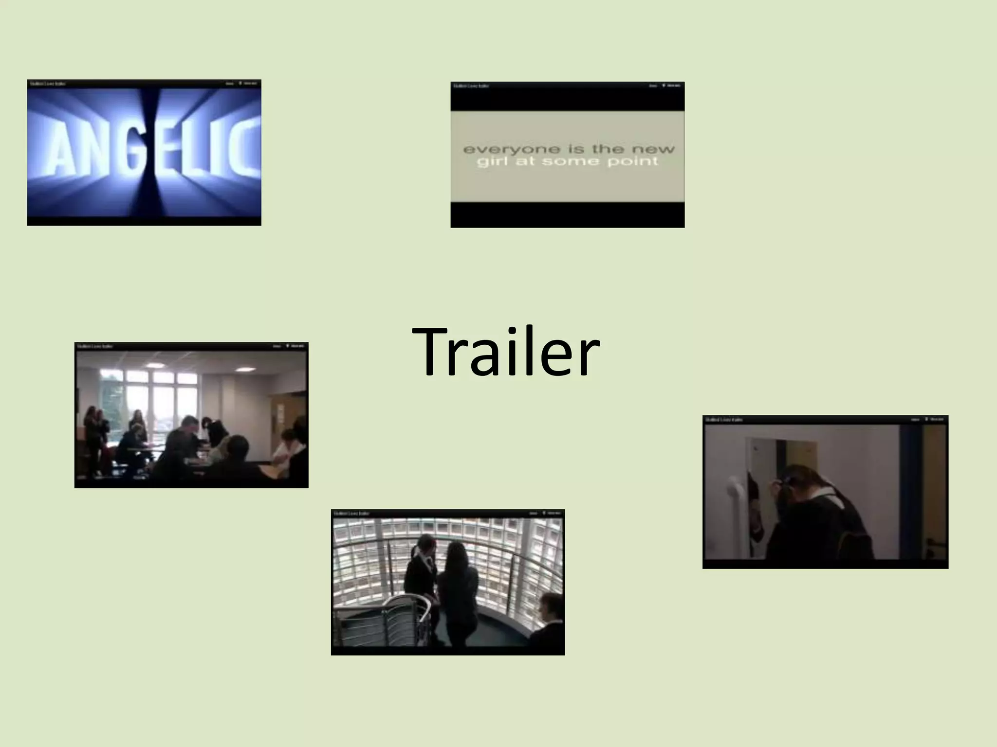
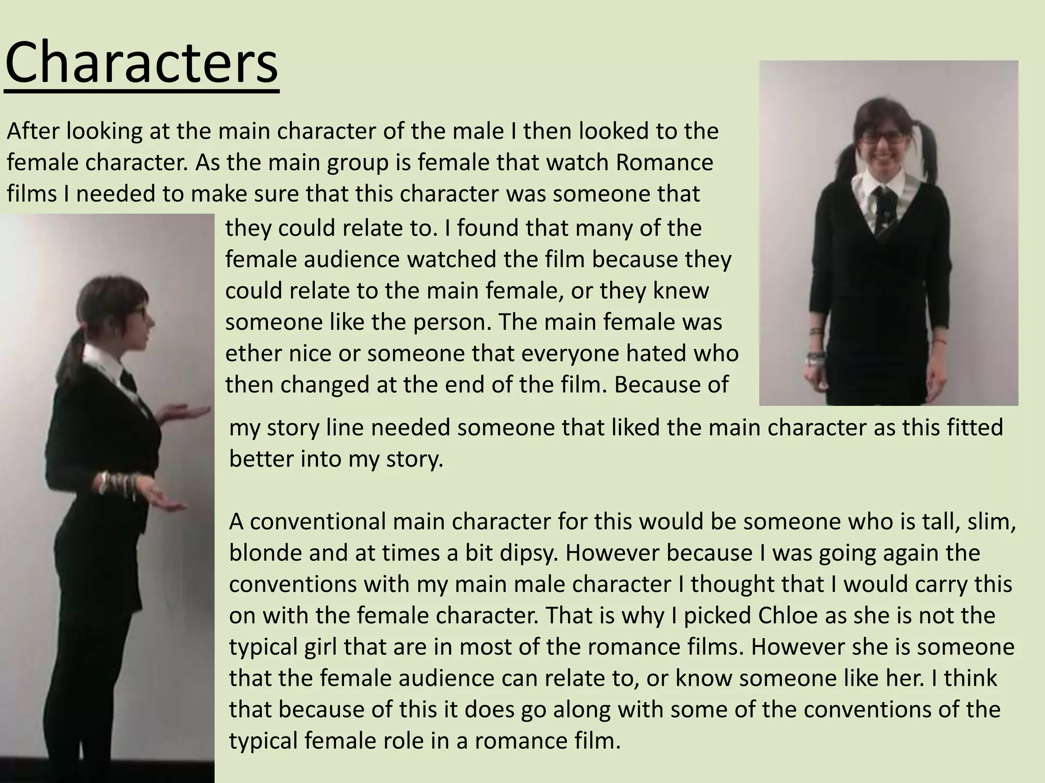
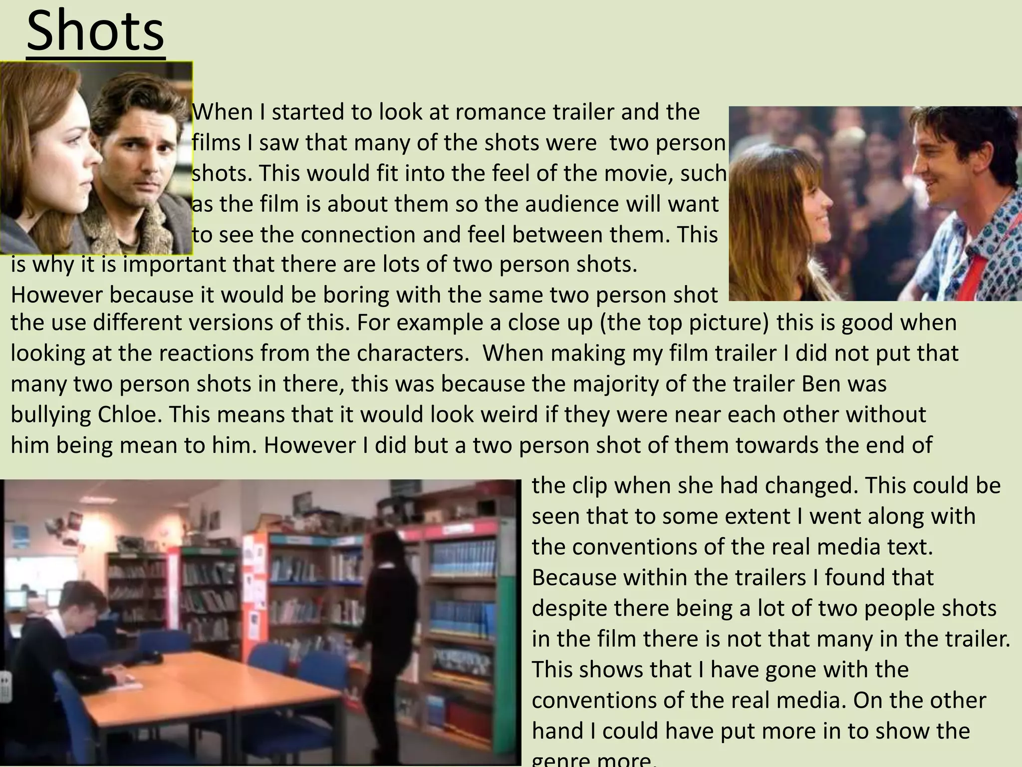
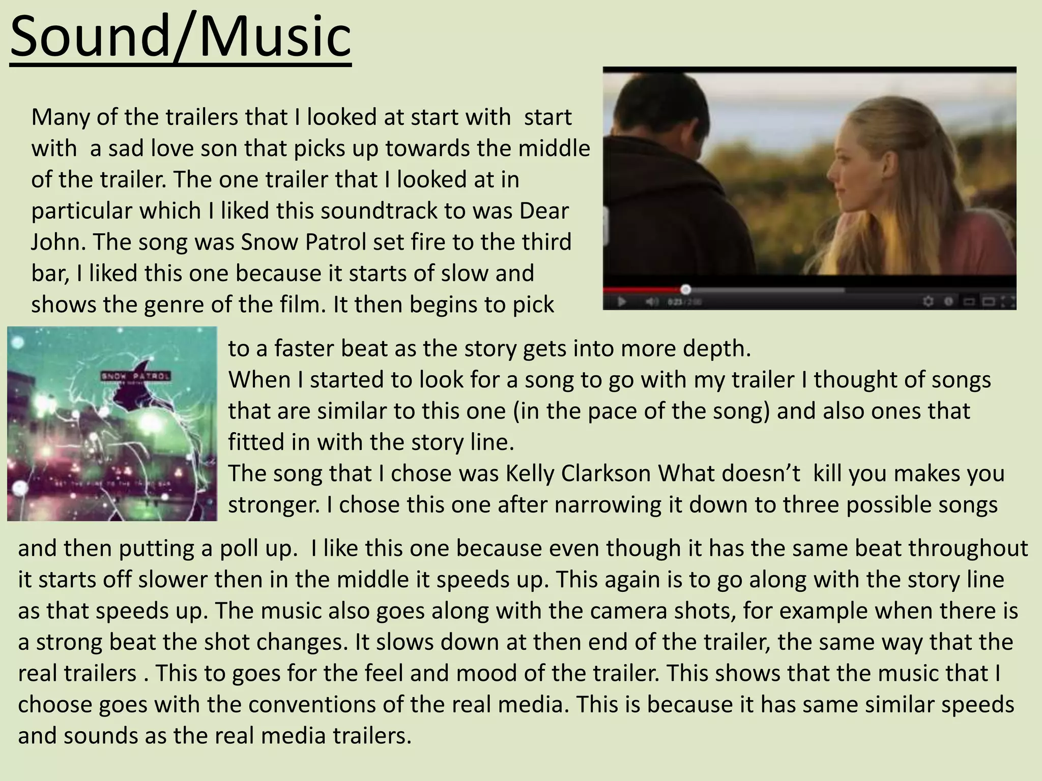
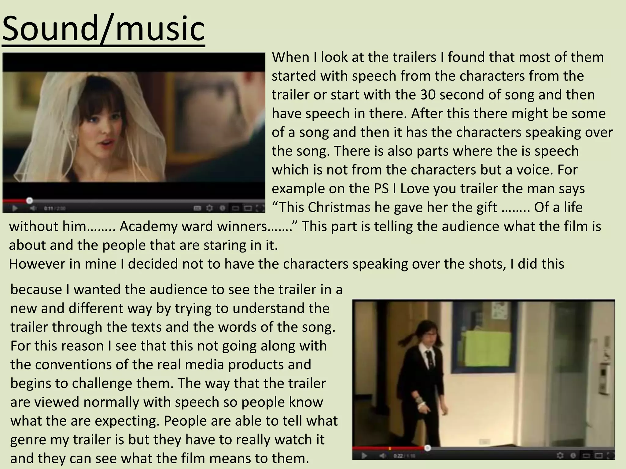
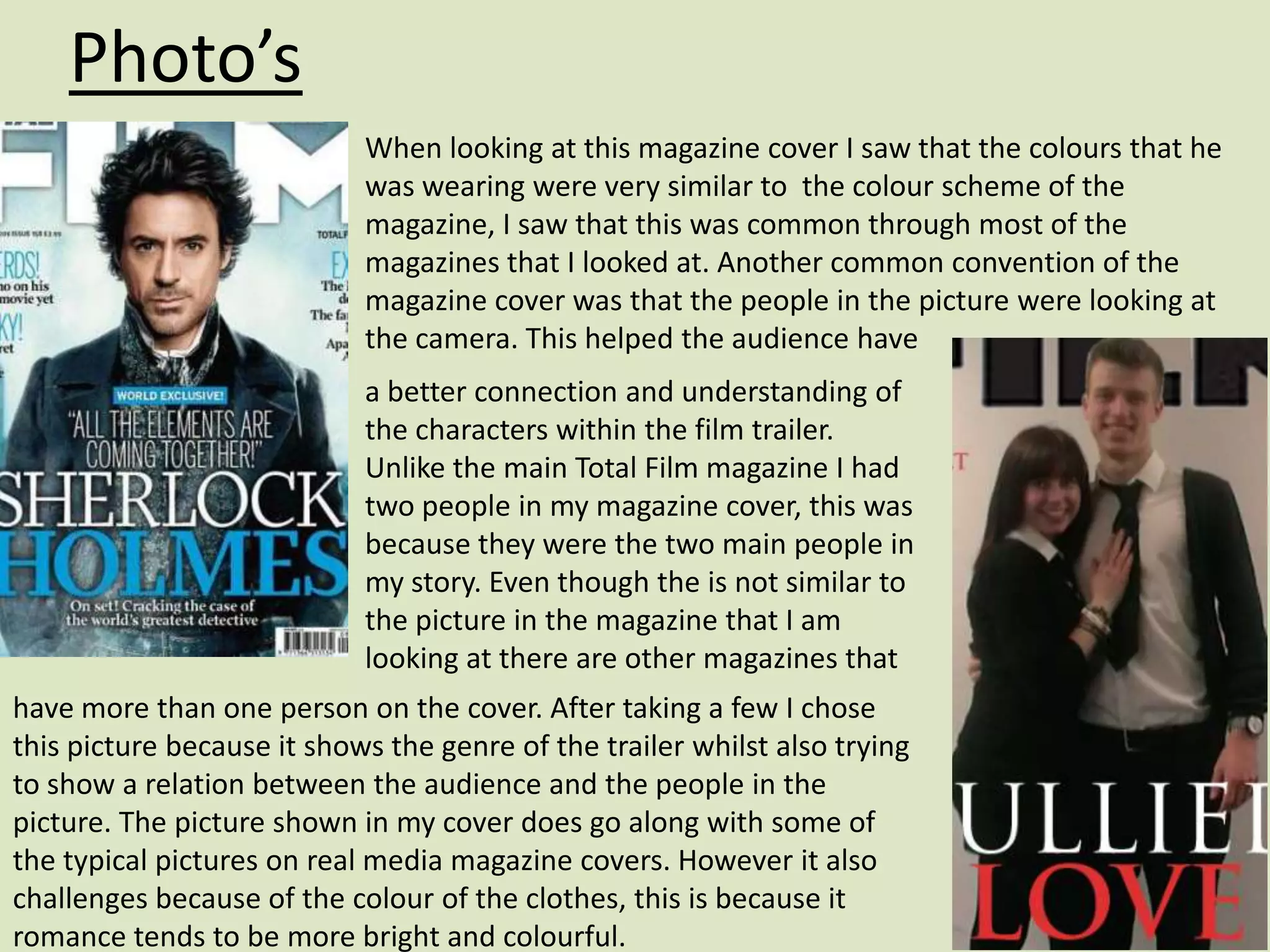
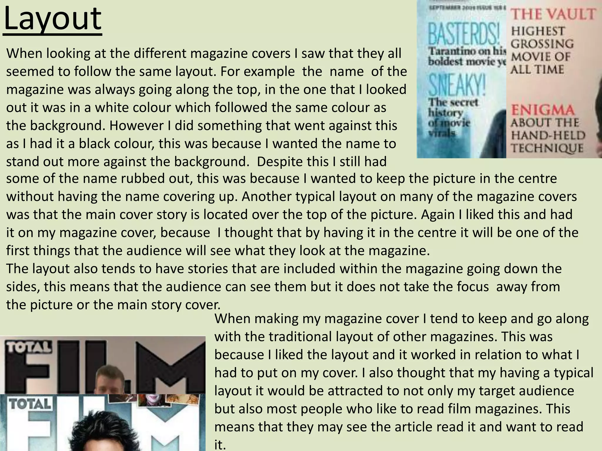
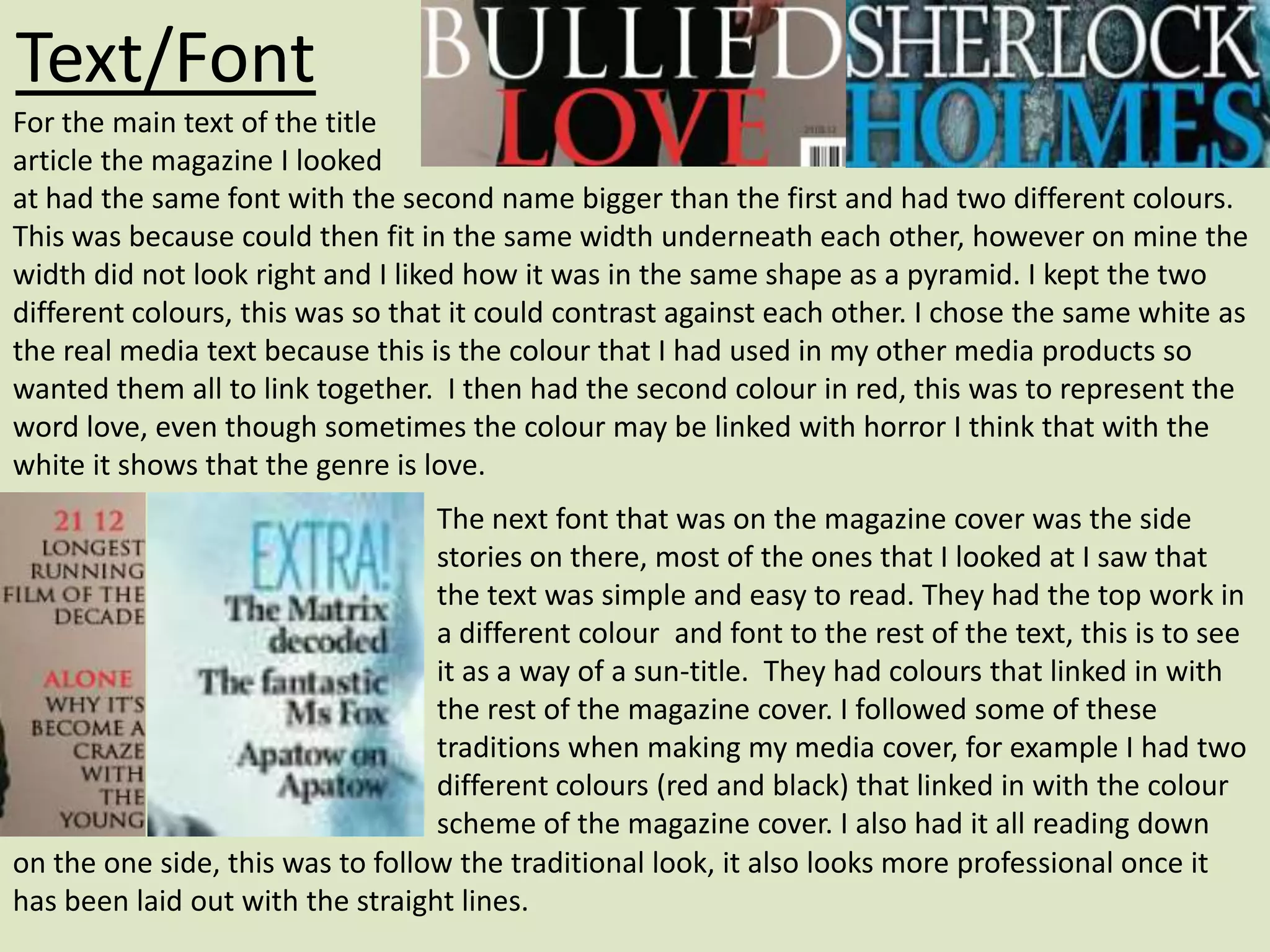
3. Research behind the genre
Before I started to make my trailer I began to look into the different genres that
there was. Some of the ones that I found and were interested in were:
Horror, Comedy, Romance and Thriller. I liked these mainly because it was
something that I was interested in. I then started to look at trailers from these
genres, I fond that ones from thriller and horror would be hard to recreate. One
of the main reasons was because of the lighting, in these genres there is normally
dark which with the camera that I was using it would be hard to still see the
characters in there. I also thought it would be hard to think of a story line that
people would find scary. I found that some horror films were intended to be scary
but many found them funny. This is something that I didnât want to happen, I
wanted the audience to know the genre that they were watching. I then started
to look into Romance. I liked this genre because there was many different story
lines to be thought of and because it is a genre that I watch I could see aspects of
it and make sure that there are those in the trailer.
Once I had decided on the genre that I was going to make I then looked into
some of the films that fell into the genre. In particular I looked at PS I love
you, The Vow, Time travellers Wife. When watching their trailers I looked for
things that were similar in them such as the music, camera angles, colour and
texts that they used and what were in common. I also looked at the audience that
watched them, for example gender, age etc. This was I had to keep my audience in
mind at all time when I was making the trailer, I did not want to aim for one age
group and then make something that would not appeal to them.
4. Characters
When I was looking at Romance films they tended to have two main
characters, being a boy and a girl. The boy always seemed to be
someone that would attract the have all the girls on the film but also
attract the female audience (who are the main group). The main boy also
seemed to be confident and âsureâ of himself, but always was softer
inside. This tends to be the typical convention of the romance. When I
started to look for someone to act as the main character I chose Ben
because I wanted to challenge the conventions a bit and I think that Ben
does this. He is not the âtypicalâ boy that would play the main role
as he has a different look at style, however this style is the style and
look that many of my audience (16-25) has or likes. I also think that by
not having the typical dark, muscly tall brown haired man also could
attract more Men into watching my film. This is because it will give
something that they can relate to and see that other men can get the
girl to!
I think that by not having the typical conventional male character
could work as a positive because it will be something different to what
they see and not what they expect to see in this genre. On the other
this could put some off as they might want to see the typical romantic
film.
5. Characters
After looking at the main character of the male I then looked to the
female character. As the main group is female that watch Romance
films I needed to make sure that this character was someone that
they could relate to. I found that many of the
female audience watched the film because they
could relate to the main female, or they knew
someone like the person. The main female was
ether nice or someone that everyone hated who
then changed at the end of the film. Because of
my story line needed someone that liked the main character as this fitted
better into my story.
A conventional main character for this would be someone who is tall, slim,
blonde and at times a bit dipsy. However because I was going again the
conventions with my main male character I thought that I would carry this
on with the female character. That is why I picked Chloe as she is not the
typical girl that are in most of the romance films. However she is someone
that the female audience can relate to, or know someone like her. I think
that because of this it does go along with some of the conventions of the
typical female role in a romance film.
6. Shots
When I started to look at romance trailer and the
films I saw that many of the shots were two person
shots. This would fit into the feel of the movie, such
as the film is about them so the audience will want
to see the connection and feel between them. This
is why it is important that there are lots of two person shots.
However because it would be boring with the same two person shot
the use different versions of this. For example a close up (the top picture) this is good when
looking at the reactions from the characters. When making my film trailer I did not put that
many two person shots in there, this was because the majority of the trailer Ben was
bullying Chloe. This means that it would look weird if they were near each other without
him being mean to him. However I did but a two person shot of them towards the end of
the clip when she had changed. This could be
seen that to some extent I went along with
the conventions of the real media text.
Because within the trailers I found that
despite there being a lot of two people shots
in the film there is not that many in the trailer.
This shows that I have gone with the
conventions of the real media. On the other
hand I could have put more in to show the
7. Sound/Music
Many of the trailers that I looked at start with start
with a sad love son that picks up towards the middle
of the trailer. The one trailer that I looked at in
particular which I liked this soundtrack to was Dear
John. The song was Snow Patrol set fire to the third
bar, I liked this one because it starts of slow and
shows the genre of the film. It then begins to pick
to a faster beat as the story gets into more depth.
When I started to look for a song to go with my trailer I thought of songs
that are similar to this one (in the pace of the song) and also ones that
fitted in with the story line.
The song that I chose was Kelly Clarkson What doesnât kill you makes you
stronger. I chose this one after narrowing it down to three possible songs
and then putting a poll up. I like this one because even though it has the same beat throughout
it starts off slower then in the middle it speeds up. This again is to go along with the story line
as that speeds up. The music also goes along with the camera shots, for example when there is
a strong beat the shot changes. It slows down at then end of the trailer, the same way that the
real trailers . This to goes for the feel and mood of the trailer. This shows that the music that I
choose goes with the conventions of the real media. This is because it has same similar speeds
and sounds as the real media trailers.
8. Sound/music
When I look at the trailers I found that most of them
started with speech from the characters from the
trailer or start with the 30 second of song and then
have speech in there. After this there might be some
of a song and then it has the characters speaking over
the song. There is also parts where the is speech
which is not from the characters but a voice. For
example on the PS I Love you trailer the man says
âThis Christmas he gave her the gift âŚâŚ.. Of a life
without himâŚâŚ.. Academy ward winnersâŚâŚ.â This part is telling the audience what the film is
about and the people that are staring in it.
However in mine I decided not to have the characters speaking over the shots, I did this
because I wanted the audience to see the trailer in a
new and different way by trying to understand the
trailer through the texts and the words of the song.
For this reason I see that this not going along with
the conventions of the real media products and
begins to challenge them. The way that the trailer
are viewed normally with speech so people know
what the are expecting. People are able to tell what
genre my trailer is but they have to really watch it
and they can see what the film means to them.
9. Font and text
Because I knew that I was not going to have any voices my
trailer I knew that I would have to use text to help show what
the story is about. I looked at a few trailers that has text on
them and saw a few key points. On them I saw that there was
a few words on each slide, this was to keep it simple into the feel of the genre. They also had
simple font this is because they feel of romance would not go
with this genre. For example with horror the font seems to be
sharp edges and bold, if I had then the audience would be
confused into what the genre. The trailers also had soft,
normally white, colours. This is to help with the relaxed
atmosphere that romantic films try to give out. Because of this I
choose to follow the style of the font that was on The Vow. This was because it went with the
look and feel of my trailer. Because of this it goes along with the conventions that are shown in
the real products. However in many of the trailers that I have seen they did not have text going
going throughout telling the story. This type of text tends to
be seen with the type of genre such as horror, because of this
it challenges the conventions from the real media products.
This is because of the way in which I have used the texts and
have placed them into my trailer despite the colour and font
following a past real media trailer.
10. Editing and transitions
When I was looking at romance film trailers I saw that
many of them had a fading from one shot to another.
This was done so that it was soft and slow to go into
the feel of the film, I also saw that as the film got into
more depth and the story line became more the fading
become faster. There was also a range of fades used, for example some shots went into black
whilst others went into the next scene. This was done but doing it fast and having them, in a
way, over lapping. Also the shots at the start of the trailer were long compared to the ones at
the end of the trailer, this was again done to go into the mood of the trailer and the pace of
the song. When I started to edit my trailer I wanted to go along with these conventions that
are seen in real media because I saw that these transitions, along with the sound, helped to
show the audience why type of genre it was.
This means that it would help not only help show
the genre of the film but also the transitions fit
well into the shots and the music. When editing
the clips I faded the clips slowly into black and
then to the next scene. I also did a similar style
of fade with the writing, which again follows the
conventions of the real media
12. Research
Similar to my film trailer
before I started to make
my magazine cover I
looked into different
magazine covers. I began
to look at a range of different ways to get an understanding of the best layout, different style of
what font works best and where it looks best. I also looked at the pictures and how the person
was positioned so that they stood out. When looking I found that there was one big picture
normally in the centre of the picture. I also saw that the two big text tended to be the name of
the magazine and the title of the story. Another thing that I noticed was that there was a similar
colour scheme going throughout, this carried from the colour of the
background to the colour of the font and the magazine name.
I also saw that there are aspects in one magazine that there are in many
of them. One of the magazine covers that I have saw that I liked was
the âTotal Filmâ cover to the left, because of this I based some parts of
my magazine cover and always kept looking at it when I was making my
cover.
13. Photoâs
When looking at this magazine cover I saw that the colours that he
was wearing were very similar to the colour scheme of the
magazine, I saw that this was common through most of the
magazines that I looked at. Another common convention of the
magazine cover was that the people in the picture were looking at
the camera. This helped the audience have
a better connection and understanding of
the characters within the film trailer.
Unlike the main Total Film magazine I had
two people in my magazine cover, this was
because they were the two main people in
my story. Even though the is not similar to
the picture in the magazine that I am
looking at there are other magazines that
have more than one person on the cover. After taking a few I chose
this picture because it shows the genre of the trailer whilst also trying
to show a relation between the audience and the people in the
picture. The picture shown in my cover does go along with some of
the typical pictures on real media magazine covers. However it also
challenges because of the colour of the clothes, this is because it
romance tends to be more bright and colourful.
14. Layout
When looking at the different magazine covers I saw that they all
seemed to follow the same layout. For example the name of the
magazine was always going along the top, in the one that I looked
out it was in a white colour which followed the same colour as
the background. However I did something that went against this
as I had it a black colour, this was because I wanted the name to
stand out more against the background. Despite this I still had
some of the name rubbed out, this was because I wanted to keep the picture in the centre
without having the name covering up. Another typical layout on many of the magazine covers
was that the main cover story is located over the top of the picture. Again I liked this and had
it on my magazine cover, because I thought that by having it in the centre it will be one of the
first things that the audience will see what they look at the magazine.
The layout also tends to have stories that are included within the magazine going down the
sides, this means that the audience can see them but it does not take the focus away from
the picture or the main story cover.
When making my magazine cover I tend to keep and go along
with the traditional layout of other magazines. This was
because I liked the layout and it worked in relation to what I
had to put on my cover. I also thought that my having a typical
layout it would be attracted to not only my target audience
but also most people who like to read film magazines. This
means that they may see the article read it and want to read
it.
15. Text/Font
For the main text of the title
article the magazine I looked
at had the same font with the second name bigger than the first and had two different colours.
This was because could then fit in the same width underneath each other, however on mine the
width did not look right and I liked how it was in the same shape as a pyramid. I kept the two
different colours, this was so that it could contrast against each other. I chose the same white as
the real media text because this is the colour that I had used in my other media products so
wanted them all to link together. I then had the second colour in red, this was to represent the
word love, even though sometimes the colour may be linked with horror I think that with the
white it shows that the genre is love.
The next font that was on the magazine cover was the side
stories on there, most of the ones that I looked at I saw that
the text was simple and easy to read. They had the top work in
a different colour and font to the rest of the text, this is to see
it as a way of a sun-title. They had colours that linked in with
the rest of the magazine cover. I followed some of these
traditions when making my media cover, for example I had two
different colours (red and black) that linked in with the colour
scheme of the magazine cover. I also had it all reading down
on the one side, this was to follow the traditional look, it also looks more professional once it
has been laid out with the straight lines.
17. Research
I started to look at
different posters to
try and see what they
all had in common
and what was
different in some of them. The main ones that I looked at I made sure that they fitted into with
the genre that my trailer was, this is was because it would be something that lots of people
would see. Because of this if I had a poster that looked like a horror it would attract that
audience and they would expect to see a horror when they see the film.
When looking at them I saw a number of different things for example I saw that majority of
them had two people in them, this help to show the audience that it was a romance. Also the
two people in the picture are very close and show a close bond between the two people. I also
saw that the title was the biggest writing and in a different colour, this then made it stand out
better against the paler background that they tend to have.
The poster I liked the most was the Juno one. This was
because I liked that the picture was not the typical romance
film poster.
18. When making my film poster I tried to keep to the
Layout most of the way that it was laid out, however
changed something's around so that it looked
different and a bit different. I liked the Juno poster
because it is not like the traditional romance
poster because the couple are not stood together.
Due to the story line I did not want them to be
stood together because it would give away if the
couple got together in the end. This goes away
from the traditional from of real media but works
for the film type I am doing. I also put the names of
the actors above their head because I wanted it to
look different and saw that this was not on many of
the posters that I have looked at.
I tried to keep the layout and content of the poster
simple, this was because I wanted the main picture
to stand out the most. I thought that if I had other
things going on, such as colourful background or
people between the two main characters. This in a
way goes against some of the traditional poster for
romance films, the majority of the time I found that
the simple layout is linked to the horror genre.
However because of the picture, colour and text I
think that it is still seen to be a romance genre.
19. I liked the way that the boy was stood
because it showed to the audience a bit Picture
about his character without him having to do anything. I found that
most of the posters of the romance had at least one person looking
at the camera. wanted this to be done with the male character, with
a mixture of the Juno male pose, because of the eye contact I think
that it draws the audience in whilst still showing some of the
personality character. Majority of the time it is the female who looks
in the camera, however I went against this traditional look which I
wanted as the story line may not be the traditional which fits in with
the forms of media.
The girl picture is also similar to the
Juno poster, which goes with the forms
of some of the real media text. I also think that the expression on
the girl is not typical of a traditional media poster. When
researching into posters I found that many of the girls were looking
at the camera whilst the boy was behind them or next to them
with a sad expression. However in mine I made the female do this
expression, this shows that roles were reversed. This is not the
traditional look of the poster, but it works within mine because my
trailer, to a degree, does not have the traditional looks and aspects
of romance films.
20. Text/Font
When looking at different posters I saw that
there was not one particular font or style that
was used, they used ones that fir into the feel
of the movie. For example, P.S. I love you is a
soft swirly writing compared to Juno which is
bold and sharp this is because P.S. I love you is
more about love and soft whilst Juno has a hint
of humour in there. With my film is has a mixture of the bullying with the love, this means that
it wouldnât look right if bullied and love were in the some font of writing. The font that I have
used is the one I used on the trailer, this was because I wanted all the media products to link in
together so by having the same font it does this. I think that by having the writing in two
different fonts it works well for my trailer however it is not something traditionally seen on
posters.
The colours that I have picked also do not go with some
of the real media posters, however again it works in
relation to my poster. I think the colour of the word
bullied fits into the feeling of the word whilst love is
seen as softer so the colour would have to be softer.