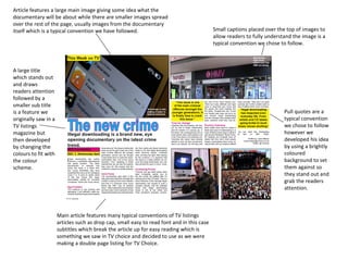
This document summarizes how a media product uses conventions from real TV listings. It features a large main image and smaller images spread throughout the page showing scenes from the documentary, using captions to describe the images. It also uses a large headline in a different color than the rest of the text to draw attention, followed by a smaller subtitle. Pull quotes are used with a brightly colored background to make them stand out. The main article features conventions like drop caps, small readable fonts, and subtitles to break up the text for easy reading, mimicking conventions from TV Choice magazine.


![In what way does your media product use[1]](https://cdn.slidesharecdn.com/ss_thumbnails/inwhatwaydoesyourmediaproductuse1-130224155705-phpapp02-thumbnail.jpg?width=640&height=640&fit=bounds)

