Qlik View Ase 2009
•Download as PPSX, PDF•
0 likes•411 views

The document discusses topics related to business intelligence (BI) and data analysis software QlikView. It provides an overview of the agenda which includes introductions to BI basics, AQL technology compared to OLAP, QlikView deployment examples, the implementation process, and advanced visual design techniques. The document also includes sections on dimensional data models, QlikView features for dynamic data analysis, and best practices for visualization design.

More Related Content
Similar to Qlik View Ase 2009
Similar to Qlik View Ase 2009 (20)
Qlik View Ase 2009
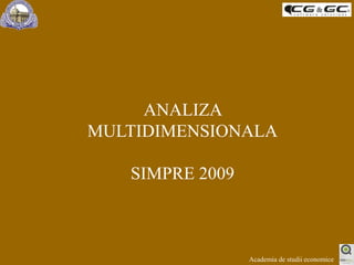
- 1. ANALIZA MULTIDIMENSIONALA SIMPRE 2009 Academia de studii economice
- 2. AGENDA Admin stuff BI - BASICS AQL Technology (vs OLAP) QlikView – deployment examples Implementation process Advanced Visual Design Academia de studii economice
- 3. Admin stuff Alex Barbulescu Asistant lecturer Phd.c. 3 intalniri - de la ora 18.00, sala 2001 17 – noi - Intro ppt - Instalare locala QV - demo QV – utilizare - hands on - examples 19 – noi – QlikTech Romania, QQinfo, Cotiso Hanganu - hands on - examples 20 – noi – hands on Academia de studii economice
- 4. BI - BASICS Dimensiuni Ierarhii Măsuri Hipercuburi Intersecţii de date Măsurile ca dimensiuni Academia de studii economice
- 5. AQL Technology (vs OLAP) Academia de studii economice
- 6. AQL Technology (vs OLAP) Ce este AQL ? AQL - Advanced Query Logic este o tehnologie revoluţionară, care accesează informaţiile structurate din surse variate într-un mod dinamicşi interactiv, propagând selecţiile de analiză prin întreaga bază de date relaţională înglobată. Academia de studii economice
- 7. Click ! AQL Technology (vs OLAP) AQL Interfaţa utilizator Fiecare click este o interogare. Extrem de rapid, şi foarte flexibil. Selecţia se propagăprin baza de date relaţională. Academia de studii economice
- 8. AQL Technology (vs OLAP) Ce oferă AQL ? Simplificarea procesului de conectare şi administrare a structurilor de înmagazinare ale soluţiilor de business intelligence (NO DATA WAREHOUSE REQUIRED !) Viteză remarcabilă de implementare Viteză incredibilă de returnare a rapoartelor (secunde!) Portabilitate (“Off-LAP”) Uşurinţă în utilizare (analize la un “Qlik” distanţă) Academia de studii economice
- 9. AQL Technology (vs OLAP) Cui foloseşte AQL ? Tuturor celor care vor răspunsuri instantanee la întrebările lor. Tuturor celor care nu vor să devină experţi IT pentru a afla informaţii relevante de la un sistem informatic Tuturor celor pentru care timpul e critic Tuturor celor care vor să verifice rapid corectitudinea informaţiilor pe care le deţin Tuturor celor care vor să ofere plusvaloare informaţională şi transparenţă clienţilor sau partenerilor săi Academia de studii economice
- 10. AQL Technology (vs OLAP) Cine ofera? QlikTech este o coporaţie suedeză care a dezvoltat această tehnologie. Produsul care înglobează această tehnologie se numeşte QlikView In Romania prin parteneri. Academia de studii economice
- 11. Data Warehouse AQL Technology (vs OLAP) OLAP Relaţional Interfaţă utilizator Interogările SQL sunt generate grafic. Flexibil, dar neprietenos şi lent. Academia de studii economice
- 12. Hyper Cube Data Warehouse AQL Technology (vs OLAP) OLAP Multidimensional Interfaţă utilizator Fiecare click este o interogare. Rapid, dar inflexibil. Număr limitat de dimensiuni. Construirea cubului. Multe date. Lent. Totul trebuie predefinit. 12 Academia de studii economice
- 13. Fiecare click este o interogare. Rapid, dar inflexibil. Număr limitatde dimensiuni. Hyper Cube Căutare “Drill-through”la nevoie. Încet şi neprietenos. Data Warehouse AQL Technology (vs OLAP) OLAP Hibrid Interfaţă utilizator Academia de studii economice
- 14. Data Warehouse Fişier QlikView AQL Technology (vs OLAP) AQL Interfaţă utilizator Baza de date relaţională este în fişier Data Warehouse nu mai este neapărat necesar Academia de studii economice
- 15. Fişier QlikView AQL Technology (vs OLAP) AQL Interfaţă utilizator Încarcă ... şi apoi poţi lucra off-line Sursa de date primare Academia de studii economice
- 16. AQL Technology (vs OLAP) Fişiere QlikView (Scade de10x – 100x – 300 x) Surse de date primare Data Warehouse (Creşte dex3 – x10– x100) Academia de studii economice
- 17. Qlik View – deployment examples Academia de studii economice
- 18. Qlik View – deployment examples Academia de studii economice
- 19. Qlik View – deployment examples Academia de studii economice
- 20. Qlik View – deployment examples Academia de studii economice
- 21. Qlik View – deployment examples Academia de studii economice
- 22. Implementation process Academia de studii economice
- 23. Implementation process Put in place infrastructure Identify most valuable/reasonable places to start Identifiy existing data structures Identify & develop new data structures required Develop scripting Develop analyzing Develop reporting Develop macros Continuous learn (iterative process !) Academia de studii economice
- 24. Advanced Visual Design Academia de studii economice
- 25. Advanced Visual Design What is bad design? What is good design? What is user-friendly? Overview Chart type choices Academia de studii economice
- 26. Advanced Visual Design What is bad design in QlikView? Cluttered Too many colors in one Dark colors Inconsistent object placement Wrong choice in object type Objects placed on top of each other Objects placed off the screen … etc Academia de studii economice
- 27. Advanced Visual Design Cluttered Academia de studii economice
- 28. Advanced Visual Design Too many colors Academia de studii economice
- 29. Advanced Visual Design Inconsistency Academia de studii economice
- 30. Advanced Visual Design Wrong Object Types Top Performers Line chart Bar chart Academia de studii economice
- 31. Advanced Visual Design Objects overlap Academia de studii economice
- 32. Advanced Visual Design What is good design? Academia de studii economice
- 33. Advanced Visual Design What is good design in QlikView? Uncluttered Crisp Aligned Light color choices Consistency with object placement in a sheet … etc Academia de studii economice
- 34. Advanced Visual Design Uncluttered Academia de studii economice
- 35. Advanced Visual Design Light colors Academia de studii economice
- 36. Advanced Visual Design Consistency Time Dimensions Body Charts Regular Selection Related Minimized Icons Academia de studii economice
- 37. Advanced Visual Design What is user friendly design? Academia de studii economice
- 38. Advanced Visual Design What is user friendly in QlikView? Easy to find what you are looking for Repeated objects (clear buttons) at the same position in every sheet Clean layout in charts Hierarchy dimensions placed in order Color choices for color-blind … etc Academia de studii economice
- 39. Advanced Visual Design Easy to find Create sheets to categorize the data/report Always place Current Selection Box to keep track on what information you are looking at Name charts wisely Place proper selection objects in each sheet KPI Sheet Transaction Sheet Academia de studii economice
- 40. Advanced Visual Design Consistent positioning Academia de studii economice
- 41. Advanced Visual Design Hierarchy Dimensions 1 1 2 4 3 3 4 2 5 5 Academia de studii economice
- 42. Advanced Visual Design Color blindness Academia de studii economice
- 43. Advanced Visual Design Overview Uncluttered Crisp Light color choices Consistency in object placement Easy to find what you are looking for Repeated objects (clear buttons) at the same position in every sheet Clean layout in charts Hierarchy dimensions placed in order Color choices for color-blind … etc Cluttered Too many colors in one Dark colors Inconsistent object placement Wrong choice in object type Objects placed on top of each other Objects placed off the screen … etc Academia de studii economice
- 44. Advanced Visual Design Choices for chart types Academia de studii economice
- 45. Bar Chart Line Chart Combo Chart Radar Chart Gauge Chart Scatter Chart Grid Chart Pie Chart Block Chart Straight Table Pivot Table Advanced Visual Design Choices for chart types Graphic Chart Types Table Chart Types The question is… When to use what? Academia de studii economice
- 47. Actual vs. Budget money to money, quantity to quantity
- 48. Amount over time time to time
- 49. Top N categorized values (sales reps, customers etc)
- 50. Avoid for $ and QtyAcademia de studii economice
- 53. Performance Trends Amount movements over time
- 54. 2 dimension Comparisons Annual Comparisons over monthsAcademia de studii economice
- 57. Two axis Left-axis and right axis for measurements
- 58. Two or more axis Split axis horizontallyAcademia de studii economice
- 60. One or Two measurements Sales and Profit
- 61. Avoid a dimension with many valuesAcademia de studii economice
- 63. Percentages Margin, Quota Achieved, YTD vs. Last Year YTD
- 64. Avoid actual amountsAcademia de studii economice
- 66. 3D measurement chart Amounts, quantity and # of customers
- 67. Map chart Sales on geographical mapAcademia de studii economice
- 70. Amounts over regional and product over timeAcademia de studii economice
- 72. What contributes how to the whole Regional Sales
- 73. Yes / No analysisAcademia de studii economice
- 75. What contributes how to the whole and within each segments
- 76. Sales contribution per state per regionAcademia de studii economice
- 78. KPI Overview Cycle group dimension with Sales, Qty, Margin
- 79. Sort in any columns (No grouping)Academia de studii economice
- 81. Grouping of dimensions Product sales by item
- 82. Dimension across the table Annual sales by months
- 84. No repetition of the same values (grouped)
- 85. No end-user sort by double-clickAcademia de studii economice
- 86. Advanced Visual Design Which graphical chart would you choose? when you have dollar amount and quantity… when you have actual amount and budget amount… when you display top performers… when you display the ratio (%) of dollar amounts by top performers… when you display the trend line over time… Straight table or Pivot table? when you have a dimension and multiple expressions… when you have multiple dimensions… Combo chart Bar chart Bar chart Pie chart Line chart Straight table Pivot table Academia de studii economice