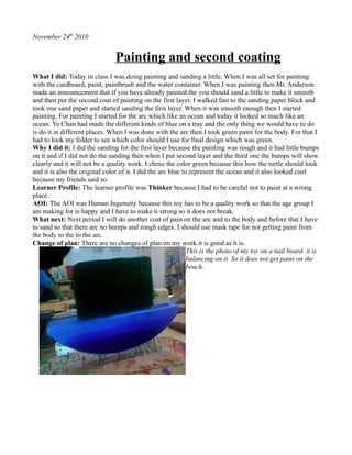
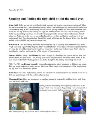
The document describes the process of painting and finishing a toy turtle over several class periods. In the first period, the learner sanded and applied the first coat of paint to the toy. They then added a second coat after more sanding. Subsequent periods involved adding additional coats of paint while using masking tape to prevent different colors from mixing. The final periods focused on sanding, finding the right drill bit and eyes, and gluing the eyes onto the toy to complete the project.
The document summarizes Zakriya Chughtai's location studies assignment. It describes the process of examining a location through drawings from different angles. It then details creating sketches of the location in Google SketchUp and using those to influence drawings and a 3D model. The document outlines the development of larger drawings incorporating different materials and techniques. It discusses creating dry point prints inspired by artist Lesser Ury and using those to develop ideas for the 3D model. The model takes the form of a small pavilion for Zakriya's college, incorporating tile designs and a wood structure.
The student completed a project focusing on representing their chosen location of an alleyway behind their college. They began with detailed line drawings and studies using different media to practice perspective. They created 3D models using Google SketchUp and a physical model to capture details. For their final piece, the student combined 2D and 3D elements by painting the space and having physical building and fence elements extending from the painting. The student evaluated that their time management weakened towards the end but their technical skills in perspective and modeling improved. Overall they felt the project captured their location well and developed their creative process.
8085 Problems in Curriculum and InstructionAshDTay
This presentation organizes and explains works of art made in three studio classes (Drawing with Colored Pencils, Acrylic Painting, and Green Art/Recycled Art) over the course of the 2015 Spring semester. Each piece is then translated into a brief art lesson appropriate for teaching to grades K-12.
- The document outlines a 12-day drawing course, with each day focused on different drawing exercises and techniques.
- Exercises included exploring line, tone, perspective, textures, human forms, and compositions through activities like contour drawings, blind contours, still lifes, and figure drawings.
- Key lessons and takeaways included understanding pressure and consistency in line quality, exploring tones within a medium, proportion studies, and improving observational skills.
- The participant found exercises like drawing with non-dominant hands, upside down portraits, and black card drawings particularly interesting and helpful for developing skills. Areas of weakness identified were drawing human forms and applying appropriate lines.
This document contains summaries and reflections from a student on their art project. It discusses the techniques and processes they learned, such as relief printing and the importance of safety procedures. The student evaluated their time management, research skills, drawing development, and use of visual language. They reflected on how to improve incorporating different elements into one composition and making their sketchbook and blog more visually interesting.
Eve has been working on creating a children's book over several months. She met with her illustrator Caylee to discuss the pictures needed for the book. Eve has been formatting the pictures and writing the text of the book. She met with her project facilitator who edited the book and found several grammatical errors. Eve will have others help edit the book before finalizing it to be printed. She is working to complete the book over the next few days and make it look as professional as possible.
Eve has been working on creating a children's book over several months as her senior project. She met with her illustrator Caylee to discuss the pictures needed for the book and set a deadline of March 1st. Eve struggled with formatting the pictures correctly but found a solution. She completed several pages of the book and met with her project facilitator who edited the book and found several grammatical errors. Eve will have others help edit the book before final production.
This document summarizes an art activity where children used straws to blow paint onto paper to create "bubble art". The activity went well, with children engaging and choosing their own colors. A few issues came up like paper ripping or difficulty drawing paint, which the teacher adapted to by providing new materials. Children's understanding of cause and effect and curiosity during the activity was also observed and documented. Ideas to expand the activity in the future are provided, such as using different paper textures, adding soap to make bubbles, or changing the paint consistency.
The document summarizes the process of making three sculptures - a statue, a korok, and a tray with an apple. For the statue, foil and clay were used to shape the base and details were added to the face. For the korok, clay was used to shape the rounded body and details were painted. The tray was made with clay, painted beige and grey for depth, and sealed. The sculptures were created using materials like foil, clay, acrylic paint, and glazing medium to achieve the desired textures and details.
The document summarizes a student's process of creating several art projects over multiple lessons. It describes their research into different art mediums like clay pots, paintings, buildings and costumes. For each lesson, it outlines what the student worked on and their strength, such as being independent, organized, and able to complete goals. The projects culminated in a final large clay pot that the student was able to finish decorating based on their research.
The team worked together to build an archery target out of cans for the Canstruction project. They had to plan their design, calculate materials needed, and collaborate over two days to complete the build. The group enjoyed the process of working as a team, though stacking the cans in the proper design was challenging. In the end, they were pleased with their completed archery target and felt the project improved their teamwork skills.
The document describes sanding and painting various craft materials. Rough sandpaper was used to sand balls and dowels, while smooth sandpaper was used to sand dowels that had already been painted. The balls were going to be painted and given pig faces, but the plan was changed. Dowels were painted pink. The process of changing plans multiple times made it a busy day. Going forward, the plan is to paint balls different colors and then assemble the toy.
The document describes two experiments the author conducted using Photoshop. In the first experiment, the author created a composite image mixing a photograph of a wall with a hand-drawn scene from Dexter's Laboratory. In the second experiment, the author created an animated graphic or GIF featuring a trippy, spiraling design and effects. For the final product, the author plans to incorporate elements from both experiments, including using their own photographs and drawings as well as animation techniques.
2015 2 adx presentation summary place in questionmomokopowis
The document summarizes the student's process for their Place in Question assignment. They chose to depict the allotment area on their college campus. To research the location, they took photos and sketches from different angles. They also created a model of the greenhouse to study perspective. The student analyzed artworks by various artists like Julia Potts and used these styles to create studies of their location. Their final piece was a watercolor and pen sketch on A3 board inspired by Leonid Afremov's painting technique. Through experimenting with materials and perspectives, they created prototypes and developed their ideas before finishing the painting, which depicted textures like grass and buildings using different brush techniques.
This document evaluates the specifications of a cosmetic organizer project against the actual final product. The function, size, aesthetics, materials, and other specifications are compared. Changes that occurred during the creation process are discussed, such as adding a drawer, increasing the size, and using plywood instead of the planned materials. Areas for potential improvement are also identified, such as making the drawer fit more tightly and sanding surfaces smoother. The impacts of the product on individuals, users, society, and the environment are assessed.
This document is a production log from a student named Patryk Kleczkowski enrolled in a BTEC Level 3 Extended Diploma in Creative Media Production course. Over the course of 4 weeks, the student worked on developing a character for a science fiction video game. In the first week, the student researched the sci-fi genre and wrote a synopsis. In subsequent weeks, the student created a character profile, background artwork in Photoshop using traced images, and finally traced the artwork in Illustrator while considering color schemes.
My magazine will resemble the design of Billboard magazine as I feel its style attracts its target audience effectively without appearing immature, focusing on music content for a similar demographic in a clean, straightforward format.
Potential locations for a photoshoot include natural settings like fields or forests to portray more ethereal artists, urban settings like alleys with graffiti for indie artists to suggest creativity, and inside clubs with characteristic decor like graffitied walls or a gold glitter wall to represent different musical genres.
The document outlines a photoshoot plan with three different options. Having multiple photoshoot plans allows the photographer to choose which pose they like best in case one plan does not work out or is not as well liked. The photographer created three photoshoot plans to select from to ensure they get a pose they are satisfied with.
The photographer used their school's media room to take photos of Deejay for a digipack, as the same location was used successfully for magazine photos last year. The media room provided good lighting, backgrounds, and lenses to produce great photos. A white background was chosen to allow flexibility in editing, such as changing it to blue. Artificial lighting was beneficial since natural light is unreliable in winter. The accessible on-campus studio was deemed perfect since retakes could easily be done with consistent lighting and background.
The document discusses planning for a photo shoot and magazine cover design. It analyzes color schemes from example magazines to inform color choices. Location, poses, clothing, and props are selected to emulate professional magazines and portray an attractive, glamorous style. The results of the photo shoot achieve the desired look and positions, feeling related to research and producing higher quality, professional images.
I have used several online tools to create and share my work online, including Blogger to post written work, SlideShare to upload presentations, and Issuu to convert documents into online magazine/book formats. These tools allow me to both create and organize my own work as well as follow and engage with the work of others. Key features include uploading files, adding descriptive metadata, and sharing or embedding content on other websites and blogs.
The document outlines plans for a photoshoot, including different shots that will be taken of the subjects. Shots include medium close-ups, sitting shots, full body shots, and close-ups. The subjects will be placed in natural wooded environments, studios, and against brick walls. Different angles, costumes, props like instruments, and backgrounds are suggested to showcase the subjects' appearances and talents in a variety of settings.
The document outlines plans for six photoshoots of models portraying hip hop artists. For each photo, details are provided on the model's pose, clothing, any props, and location. The poses, outfits, and props are designed to portray stereotypical images of male and female hip hop artists. Locations like a studio with colored lights or a brick wall aim to match scenes from hip hop music videos and magazines. An evaluation states the photoshoots will feature poses, costumes, props, and locations typical of hip hop culture in order to appeal to the intended audience.
GCSE Media Studies Coursework - Magazine research and planningNeill Ford
This document analyzes the cover designs of various magazines to understand how they appeal to their target audiences. It discusses magazines across different genres, including fashion, music, and football. Key techniques identified that magazines use to be appealing include using bright colors, celebrity images similar in age to readers, minimal text, and catchy taglines. Font styles, cover layouts, and photo positioning are also examined for how they draw in audiences.
The document summarizes a student's evaluation of their Move It Project, which involved designing and building a rocking toy turtle. Some key points:
1) The student is happy with how their design and colors turned out, though would change the colors and movement for next time.
2) Testing with kindergarteners showed the eyes were an engaging feature, but the dark colors may not appeal to all children.
3) For their next toy, the student aims to incorporate more movement like rolling, as well as brighter colors.
The student painted and repainted their toy over multiple class periods, working to improve the pigment so it would not split or look rough. They sanded off old pigment, painted the rocker with gradual color changes, glued eyes onto the toy, and finally painted claws and a smiling mouth. Throughout the process, the student thought critically about which tools to use and how to plan and problem solve their work.
The document describes the process of preparing and beginning to paint a toy dragon. It details using a garnet paper to remove pencil lines, planning to attach the head with PVA glue, and starting to paint the toy green and blue. The author is pleased to see the toy taking shape but worried the head may break off. Next steps are to finish painting and complete the toy.
1) The student created three artworks and one additional piece based on the theme of "cloud" using different materials and printmaking techniques.
2) For one artwork, the student traced a cloud and person onto lino and carved the designs to create a print. They received feedback on layout from their teacher.
3) The student reflected on successes and areas for improvement, such as supporting a weak area in their 3D artwork, and said they enjoyed experimenting with different artistic approaches.
- The document discusses a moving toy project made by Ji Min Kim for a design technology class. The toy is a penguin that moves when pulled.
- Ji Min is happy with how the project turned out overall and thinks the materials used worked well. The main materials were pine wood, paint, screws and plastic eyes.
- Kindergarten students enjoyed playing with the toy, particularly two girls who played with it for an entire class period.
This document provides details about a student's first attempt at sketching a kitchen peeler as part of an assignment. The student discusses selecting the kitchen peeler as the subject, gathering the necessary supplies like pencils and paper. They explain struggling at first to apply shadowing techniques but practicing and getting feedback until successfully completing a sketch with shadows and 3D effects over two days. The student found the project gave them a chance to learn new skills and enjoyed the satisfaction of their finished sketch.
This document is a process essay describing the steps taken to sketch a kitchen peeler. It begins by choosing a kitchen peeler as the object to sketch. The essay then details observing the peeler from different angles and preparing sketching tools. The process of sketching the peeler is described, including challenges with shading and perspective. Feedback was received from family and friends, and multiple attempts were made before completing a sketch that captured shadowing and three-dimensional effects. The two-hour sketching process provided a new learning experience.
The document provides a detailed production reflection from an artist named Abi Long. They began by establishing a color scheme and sketching rough designs for two supernatural creatures - a deer-like creature and a rabbit-like creature. Abi then worked on animations, room designs, puzzles, a song, character close-ups, and a main room to complete assets for a horror game. They reflected on strengths and areas for improvement in their pixel art and character designs. Due to time constraints, some additional planned rooms and assets had to be cut from the final project.
The document provides details on a photography student's selection of final images and review for an assignment on photography and photographic practice. It includes 10 images taken of band members in various poses and locations. For each image, the student explains their theme, goals, and strengths and improvements. The student aimed to capture poses and styles typical of indie rock band magazine covers. They worked to direct the viewer's gaze and used lighting, angles, and post-processing techniques like adding selective color. Overall, the student demonstrated an understanding of compositional techniques and sought to convey different emotions and perspectives through their shots.
This student evaluated their toy design project. They made a rocking bear toy out of pine and MDF that was meant to be for children ages 2-3. While the student was happy with some aspects of their design like the materials used and safety, they noted several areas that could be improved such as smoothing surfaces, adjusting proportions, and making the toy more novel by adding moving parts. The student concluded they mostly met their design brief of making a moving toy, though it was larger than originally planned. Overall, the student provided a self-critical evaluation to improve upon their toy design for future projects.
The document summarizes the speaker's activities sanding, painting, and getting ideas for crafting a pig figure. It states that the speaker finished sanding dowels and the face and back of a pig figure. They then started painting the pig's face and back pink but may need to add another coat. The speaker discusses needing to be careful not to paint the edges when attaching the pieces and getting an idea to use felt instead of paint for features like the nose.
The document summarizes the speaker's activities sanding, painting, and crafting parts of a wooden pig figure over the course of one day. They sanded dowels and the pig's face and back. They then started painting the pig's face and back pink using red and white paint, but may paint it again if it is still light in color. They also got an idea to make the pig's nose and possibly tail from felt instead of painting it.
The document summarizes the process and reflections of a graphic design student on several relief tile projects experimenting with styles like Van Gogh's Starry Night and cubism. For each project, the student describes the original image, techniques used to distort and add texture, challenges faced, and lessons learned. Overall the projects helped the student learn new tools and develop strategies for abstracting real-world images in different styles.
The student worked on creating a toy by drawing, measuring, cutting, sanding and filing different shapes of wood, which included the shape of the sea and a tree, using various tools like coping saws, sanders and files, and documenting the process through photos and reflections on the steps, challenges, and emotions experienced each day of working on the toy.
This document contains summaries of artworks and techniques explored by a student over the course of an art project. It discusses primary and secondary sources, development processes using different mediums, techniques like relief printing and its health and safety practices, and an evaluation of their time management, research, skill development, and areas for future improvement. Key lessons included learning about visual language, analyzing and developing ideas, and presenting work in a visually engaging way.
Jee Yeon Park continued painting their light support and base for a project. They initially chose brown paint for the light support but it did not match as intended, so only brown was used. Painting was difficult with poor brushes. Mixing green, yellow, and white created the desired color for the base, but only part was painted due to time and paint amount. The gantt chart was changed as painting was nearly complete instead of sanding. Care was taken painting the light support near delicate petals. Knowledge of color mixing was applied. Community and service were involved through color choices helping others.
The document describes a student sanding and painting a key tag in woodshop class. They sanded the tag to remove its dark color, then started painting it despite their teacher advising against it. They planned to add a blue cross but disliked the marker color. They also drilled a hole but it did not go all the way through. They were not sure if they would lacquer the tag due to yellowing issues with lacquer on a previous project.
Paulina completed the tasks for her BTec Level 3 Extended Diploma in Creative Media Production Games Design unit on digital graphics for computer games. Over the 5 week period, she finished tutorials, created a logo and mind map, and estimated working 60 hours to complete the tasks. She struggled to find time some weeks to work due to family commitments but completed all tasks by the deadline, including creating vector artwork characters and backgrounds using tools like pen tool and brush strokes in Illustrator. She received feedback from her teacher and published her work online for additional feedback to complete all requirements.
The document summarizes the design and creation process of a toy by the author. It describes the initial design of the toy including its colors and moving parts. It then discusses changes the author would make, such as shortening the tail and string, based on safety and usability concerns observed. The author also reflects on the materials used, time it took to create, and the appropriate age group for the toy.
Architectural and constructions management experience since 2003 including 18 years located in UAE.
Coordinate and oversee all technical activities relating to architectural and construction projects,
including directing the design team, reviewing drafts and computer models, and approving design
changes.
Organize and typically develop, and review building plans, ensuring that a project meets all safety and
environmental standards.
Prepare feasibility studies, construction contracts, and tender documents with specifications and
tender analyses.
Consulting with clients, work on formulating equipment and labor cost estimates, ensuring a project
meets environmental, safety, structural, zoning, and aesthetic standards.
Monitoring the progress of a project to assess whether or not it is in compliance with building plans
and project deadlines.
Attention to detail, exceptional time management, and strong problem-solving and communication
skills are required for this role.
Explore the essential graphic design tools and software that can elevate your creative projects. Discover industry favorites and innovative solutions for stunning design results.
International Upcycling Research Network advisory board meeting 4Kyungeun Sung
Slides used for the International Upcycling Research Network advisory board 4 (last one). The project is based at De Montfort University in Leicester, UK, and funded by the Arts and Humanities Research Council.
Discovering the Best Indian Architects A Spotlight on Design Forum Internatio...Designforuminternational
India’s architectural landscape is a vibrant tapestry that weaves together the country's rich cultural heritage and its modern aspirations. From majestic historical structures to cutting-edge contemporary designs, the work of Indian architects is celebrated worldwide. Among the many firms shaping this dynamic field, Design Forum International stands out as a leader in innovative and sustainable architecture. This blog explores some of the best Indian architects, highlighting their contributions and showcasing the most famous architects in India.
1. November 24th 2010
Painting and second coating
What I did: Today in class I was doing painting and sanding a little. When I was all set for painting
with the cardboard, paint, paintbrush and the water container. When I was painting then Mr. Anderson
made an announcement that if you have already painted the you should sand a little to make it smooth
and then put the second coat of painting on the first layer. I walked fast to the sanding paper block and
took one sand paper and started sanding the first layer. When it was smooth enough then I started
painting. For painting I started for the arc which like an ocean and today it looked so much like an
ocean. Ye Chan had made the different kinds of blue on a tray and the only thing we would have to do
is do it in different places. When I was done with the arc then I took green paint for the body. For that I
had to look my folder to see which color should I use for final design which was green.
Why I did it: I did the sanding for the first layer because the painting was rough and it had little bumps
on it and if I did not do the sanding then when I put second layer and the third one the bumps will show
clearly and it will not be a quality work. I chose the color green because this how the turtle should look
and it is also the original color of it. I did the arc blue to represent the ocean and it also looked cool
because my friends said so.
Learner Profile: The learner profile was Thinker because I had to be careful not to paint at a wrong
place.
AOI: The AOI was Human Ingenuity because this toy has to be a quality work so that the age group I
am making for is happy and I have to make ti strong so it does not break.
What next: Next period I will do another coat of pain on the arc and to the body and before that I have
to sand so that there are no bumps and rough edges. I should use mask tape for not getting paint from
the body to the to the arc.
Change of plan: There are no changes of plan on my work it is good as it is.
This is the photo of my toy on a nail board. it is
balancing on it. So it does not get paint on the
bench.
2. 25th november 2010 Thursday
SECOND AND THIRD LAYER OF
PAINTING THE TOY
What I did: Today we only had one period, so we could not get very much done. I started with the
third layer of the painting of the arc which is dark blue and light blue. To not get the blue paint on the
turtles body I used masking tape which prevented the blue paint to get on the turtles green body which I
already painted.
Why I did it: I did the sanding for the second layer because the painting was rough and it had little
bumps on it and if I did not do the sanding then when I put third layer and the third one the bumps will
show clearly and it will not be a quality work. I chose the color green because this how the turtle
should look and it is also the original color of it. I did the arc blue to represent the ocean and it also
looked cool because my friends said so. I used the masking tape to prevent the paint getting on other
paint on my toy
Learner Profile: The learner profile was thinker because I was thinking what I would use for
preventing the blue paint on the green paint which was the body and the blue paint was the arc. I also
thought of the paint color and which paint I should not use.
AOI: The AOI was Human Ingenuity because I was designing and completing a material which helps
people to pass the time and have fun with. I have to be careful of the kind of paint I use if it is
poisonous and if it OK for little kids.
What next: Next period I will do painting of the body with the green color and use the masking tape
for preventing the paint getting on other paint.
Changes of plan: There are no changes of plan because it looks perfect with the paint and it is getting
together and when it is done it will look awesome and cool.
This is the photo of my toy with second layer of the
painting. It is on the nail Board. The arc
represents the ocean while the green is the body of
the turtle.
3. 29th november 2010
Painting the arcs and the turtles body
What I did: Today we had two periods and we pretty much had a lot of good time to do our work.
Today I was doing painting most of the time. Today was the day I should use masking tape very
carefully and not destroy because it was the third layer of my toys arc and it second layer of my toys
body. I had to work so much on the arc because I wanted it to look just like the ocean and if I
sometimes put the wrong tape I would then need do to again and again. I was being careful at every
time I did a stroke on the arc but one time i suddenly put some light blue where it should it dark blue
and then I got so nervous that I quickly put dark blue on top of ti and started painting again. Mr.
Anderson called us to a bench to show us a new type of glue which only used for plastic to wood or
plastic to plastic. He used it for Nirajs toy because he was gluing the toys eye on the turtle which was
made by wood.
Why I did it: I did the painting because it is part of our project and it makes it look good. The color
blue was the color which represented the ocean. It was also hard because I needed two brush. One for
light blue and the other one for dark blue because if I used one brush then it would be me taking a visit
to the sink very much. I also used dark green which represents the true color of the turtle. We also
learned about the glue because it was very important to know about different kinds of glue which is
used for different uses.
Learner Profile: The learner profile was Thinker because I thought of a way to not get paint on any
other parts of the body in which was not meant to be the same color. To prevent that I used the masking
tape and had to be careful.
AOI: The AOI was Environment because I am using wood to make the toy and to help me make ti for
other people which will entertain them. I was also Approaches to learning because I had to learn from
my mistake like when I paint in the wrong part and how to use the masking tape. The masking tape
could be helpful to me because it may help me in the future for painting because of the the painting I
am doing in my toy is very good.
What next: The next period I will do painting and the third layer of the body which will be green. I
will also use light green for the head because it will look cute and would make it real.
Changes of plan: There are no changes of plan in my toy because it is looking good and fine and is
correct.
This is the picture of my toy and as you can
see there is masking tape and it has paint on
it which is protecting the blue arc from
getting green paint.
4. December 1 2010
Painting the arcs and the turtles body again.
What I did: Today we had two periods and today was the day for my third layer of the body and I
worked on it very much to make it good and I worked on the head for the first time. To start I sanded
the the toy because there were bumps on it which were caused by to much paint and when I sanded
then I saw that there was too much paint on it and ti was coming off when it was smooth I saw that
there were less bumps and not too much paint. The masking tape was helping me a lot and I think is a
very helpful tool when you are painting. Then I took some light green for the turtles head and I also
used masking tape for the painting of the head. I went to Nirajs toy because he said he was having a
upgrade on his toy because his toy was moving when it spins and then when I saw the underneath of it
it was a plastic thing which prevented it to spin.
Why I did it: I did the sanding because of the bumps which were caused by the to much paint. When I
was sanding I could also see that there was some paint coming off when I was sanding. The sanding is
also a good thing because if you are going to sell it the buyer would first observe it and ten buy if he
think its good he will buy it and if its not then he would not. The buying
Learner profile: The learner profile was thinker because I was thinking what I would use for
preventing the green paint on the blue paint which was the arc and the green paint was the body. I also
thought of the paint color and which paint I should not use. I was also good at figuring out how to use
the masking tape.
AOI:The AOI was Environment because I am using wood to make the toy and to help me make ििता
for other people which will entertain them. I was also Approaches to learning because I had to learn
from my mistake like when I paint in the wrong part and how to use the masking tape. The masking
tape could be helpful to me because it may help me in the future for painting because of the the
painting I am doing in my toy is very good.
What next: next period I will do the second layer of painting the head and then do some marking to
the body and the arc while the head is drying. I will also use the masking tape
Changes of plan: Nope, no changes of plan in my project. It looks good as it is and it is very good and
its a quality work.
This is the picture of my toy when I
remove the masking tape.
This is the picture of my toy
with his head painted.
5. December 2nd 2010
Sanding and finding the right drill bit for the small eyes
What I did: Today we had one period and it took some period for checking the process journal. When
we got in the work shop I started sanding my toy. When I was sanding the toy smelled really bad which
I do not know why. When I was sanding the surface was getting smooth and there were no bumps on it.
When me and my friends were sanding our toys Mr. Anderson came and saw Ashwin sanding he told
that if we are sanding we should never sand with a rough sander always with a medium one. Then I
asked Mr. Anderson for the eyes he showed different types of them and I chose small one to fit my
turtles small face. Then I went to find the drill bit which will be perfect for the eye. When I got the drill
and the perfect drill bit but it was time to pack up.
Why I did it: I did the sanding because it would keep my toy as a quality work and there wold be no
rough and sharp edges left by the paint. There would be bumps because you put to much paint and then
it would dry it would create a bump which you would have had to sand it after wards. That's why you
should paint very less and be careful of the amount of paint you use.
Learner Profile: Today I was Thinker because I thought if I should put the eyes or not and what size
and what tool and glue would I use. If they eyes would make toy better and make it look better. If the
eyes would make the toy funny, good or bad. I also thought if the sanding would help me or not.
AOI: The AOI was Human Ingenuity because I am designing a tool for people in different age group.
This toy would make them happy and not feel bored. There might be consequences of the people using
my toy have a cut, bruise or a splinter.
What next: Next class we have two periods and I think I will be done in those two periods. I will use a
drill and glue the eyes with the contact adhesive glue.
Changes of Plan: There are no changes in my plant because it looks and it will look better with those
eyes and it will look cute.
In this picture I am sanding the rough surface because of the
bumps which were caused by the painting. I am sanding with a
sand paper and to make it flat I am using a sanding block.
This is the picture of my toy when it was all painted and dried.-----
6. 6th december 2010
Finishing my project
What I did: Today we had two periods and today I only had to do the eyes and I will be completed
with my project. To start with I started with finding the eyes and the drill bit. When I found the drill bit
I got the drill. The problem with me was that I did not know how to put a drill bit in a drill. I asked Mr.
Anderson to help me with it but he said that I should use a machine drill to drill the eyes. I was wearing
safety goggles to protect my eyes from dust. When I was done I used contact adhesive glue to glue the
eyes to the toys head.
Why I did it: I did the eyes because the looked funny and the would look cute on my toy. I also used
the machine drill because it is fast and you already have the control to keep it straight and you just need
to mind the power. I also used the safety glasses to keep my eyes safe from the wood dust that might fly
towards my eyes. I used contact adhesive glue as it is basically used for gluing plastics to plastic or
plastic to wood.
Learner Profile: The learner profile was Thinker because I was thinking if I should put the eyes or
not. If I do put it then how would it look. Would it look goo or bad? I also thought of the type of glue I
should I use.
AOI: The AOI was Human Ingenuity because I was done creating my project and I also checked the
safety parts of it and if they are not safe what could the consequences be.
This is my toy with its eyes and a carved mouth which
done by a marker.
This is a contact adhesive glue which is used to
glue plastic to plastic or plastic to wood.