The document contains various charts and tables of data including:
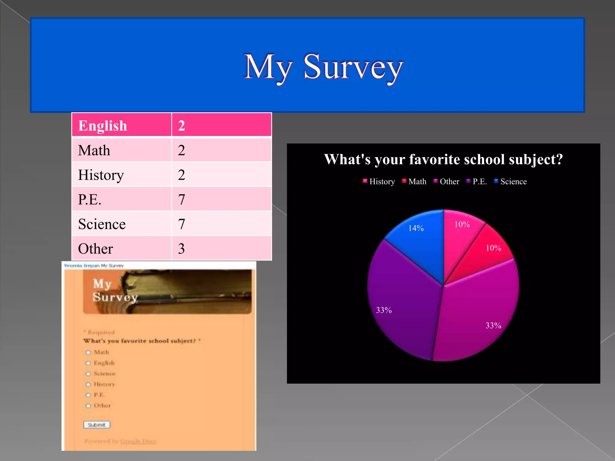
- A pie chart showing students' favorite subjects with History and Science as the most popular at 14% each.
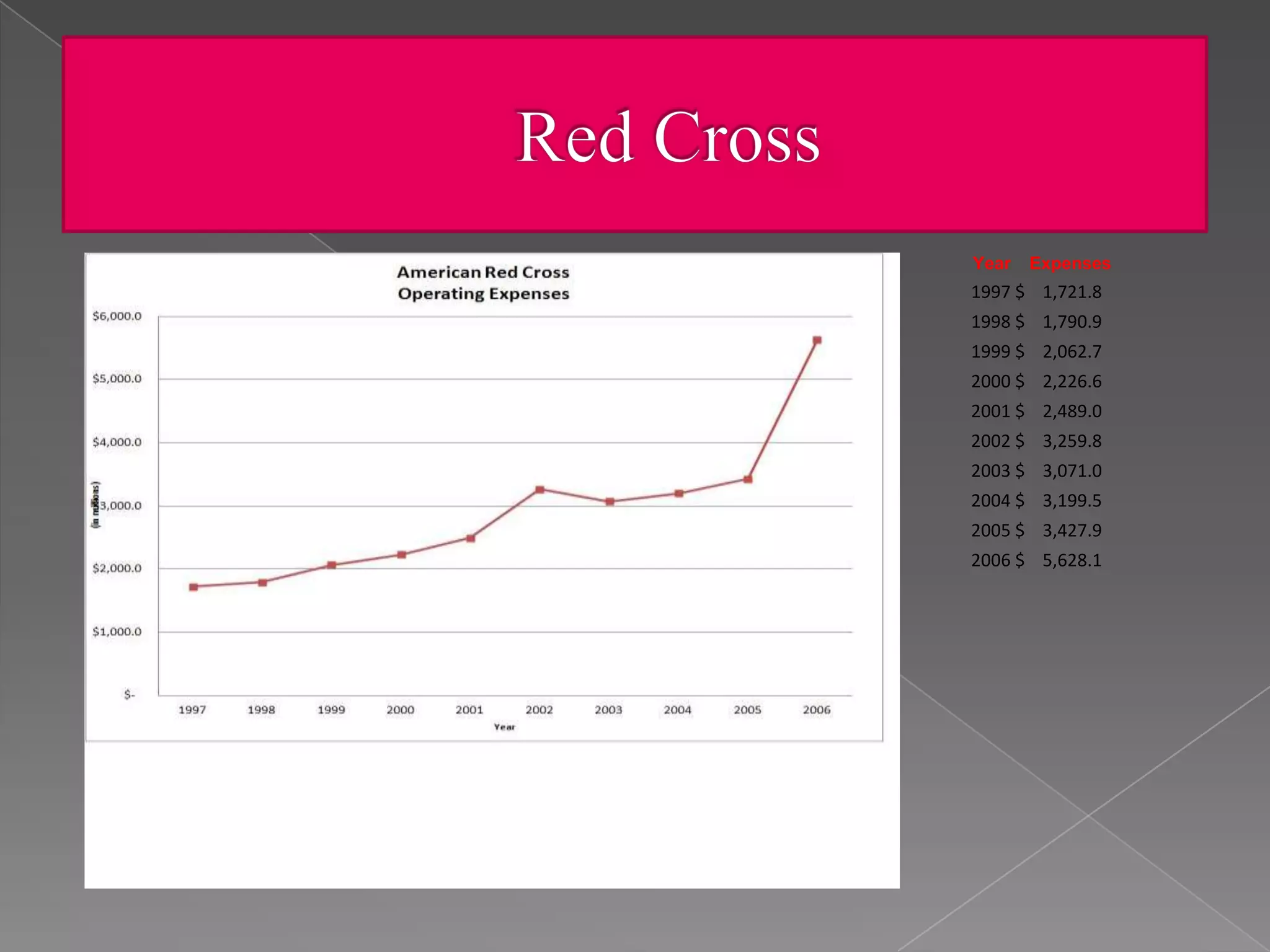
- A line graph showing the expenses of a company or organization increasing every year from 1997 to 2006.
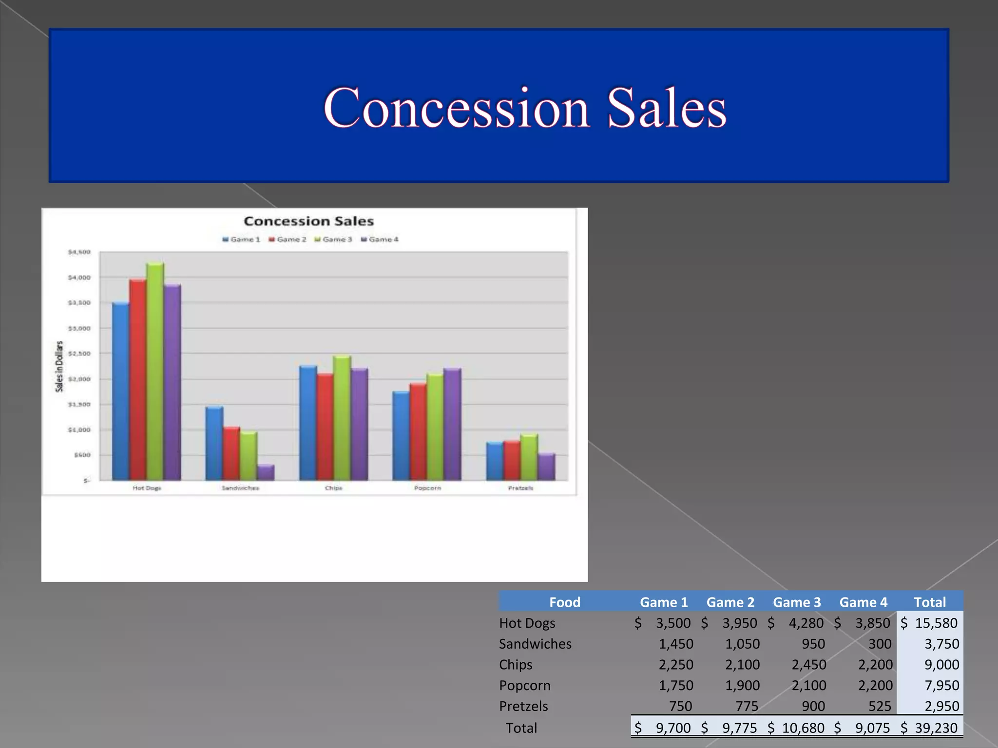
- A table showing the amount of food and drinks purchased for different games or events totaling over $39,000.
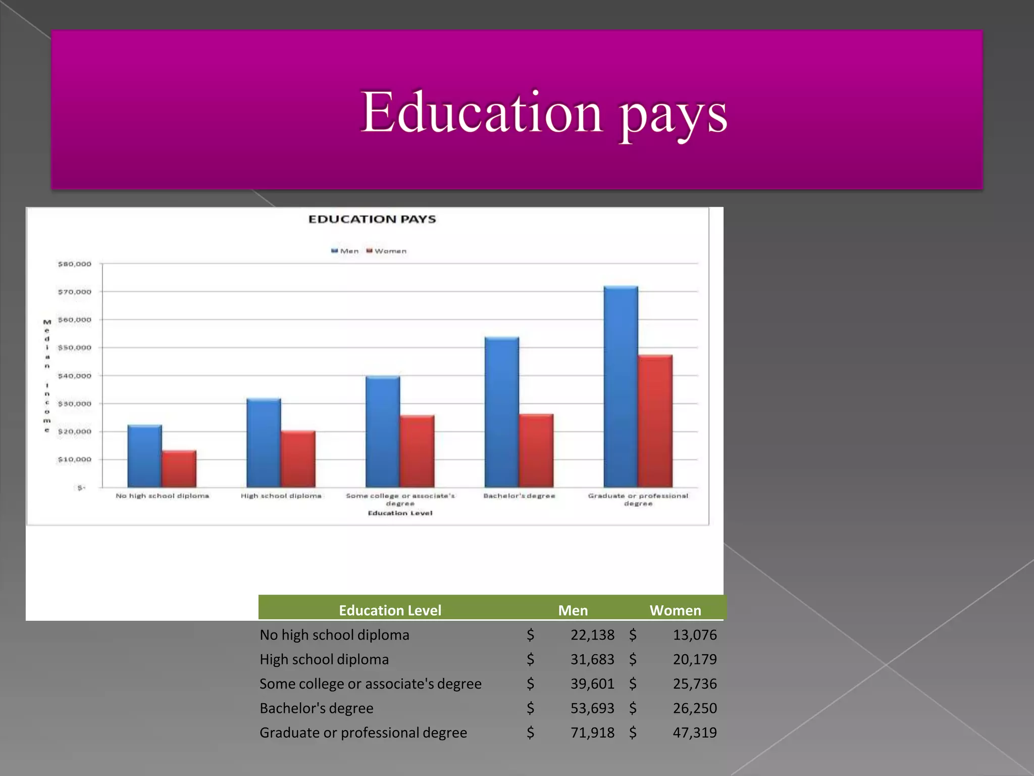
- A table comparing the median earnings of men and women based on their education level.
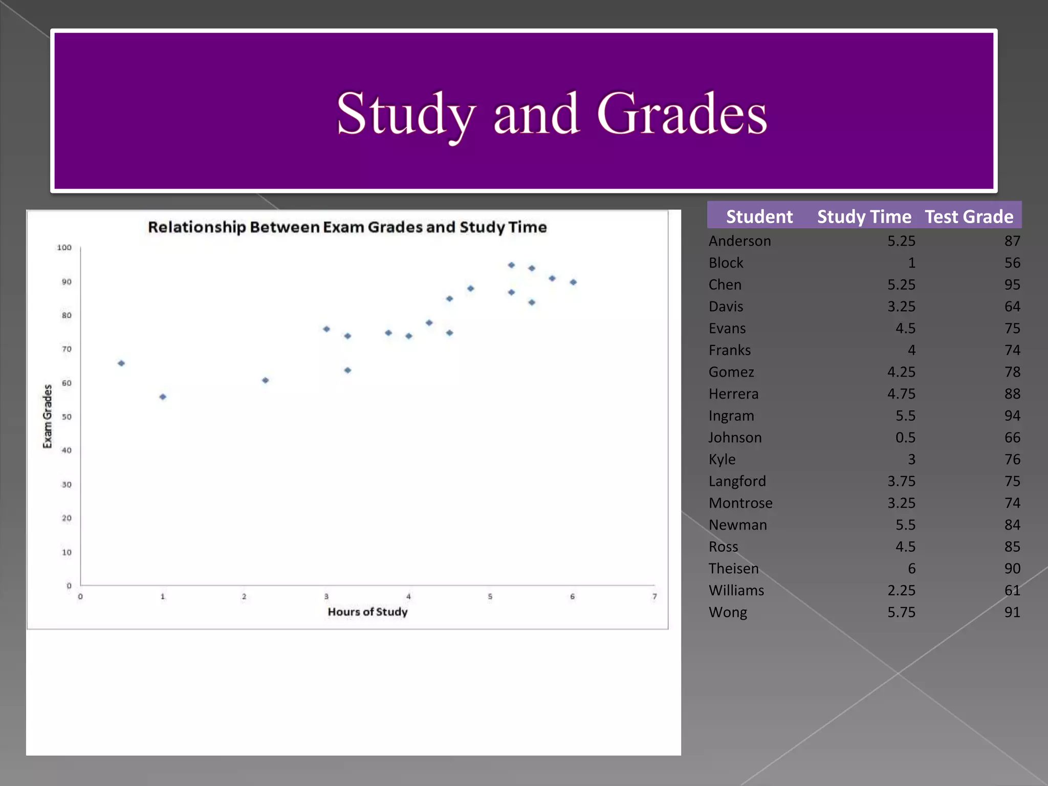
- A scatter plot showing a correlation between students' study time and their test grades.
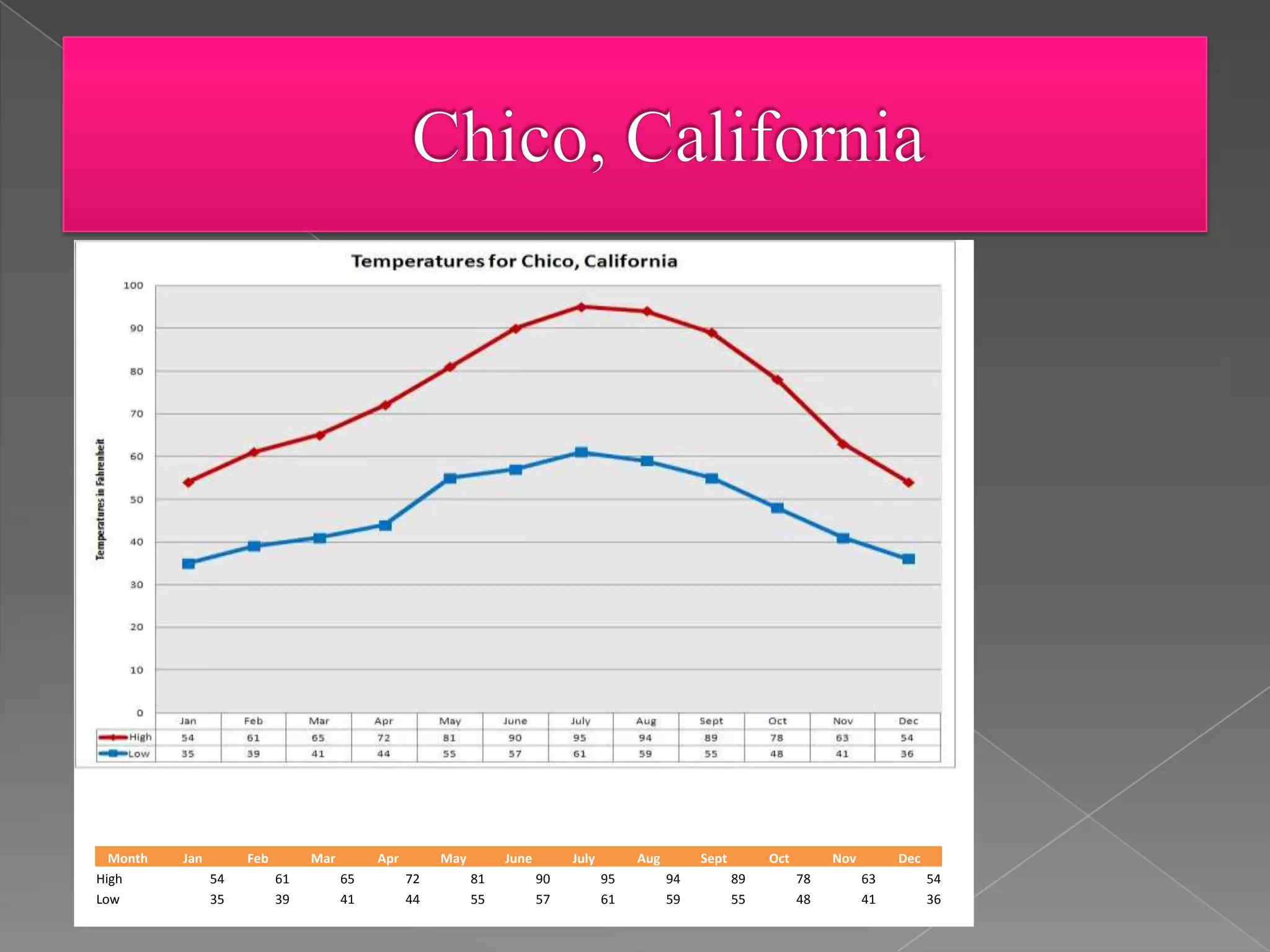
- A line graph showing monthly high and low temperatures over a year.