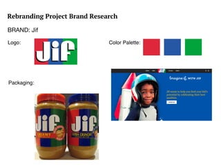
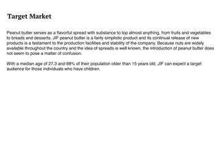
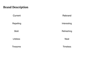
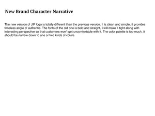
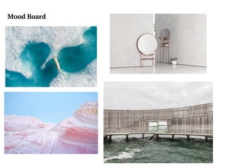
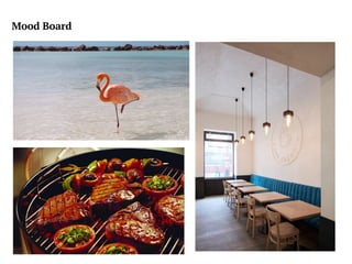
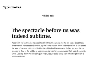
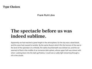
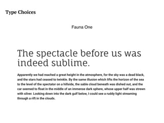
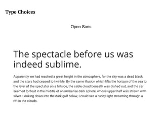
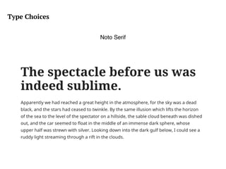
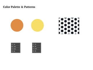
Rebranding Project Brand Research
BRAND: Jif
Logo:
Packaging:
Color Palette:
Target Market
Peanut butter serves as a flavorful spread with substance to top almost anything, from fruits and vegetables
to breads and desserts. JIF peanut butter is a fairly simplistic product and its continual release of new
products is a testament to the production facilities and stability of the company. Because nuts are widely
available throughout the country and the idea of spreads is well known, the introduction of peanut butter does
not seem to pose a matter of confusion.
With a median age of 27.3 and 68% of their population older than 15 years old, JIF can expect a target
audience for those individuals who have children.
POV
First, the color palette of JIF is terrible. It seems hard to make it fit to any package of the product. Also the fonts
of the logo is bold and unlovely, the best way is to narrow down the size and make it slim. The message behind
the logo is unclear, if I am the customer, I wouldn’t the meaning of the logo trying to represent.
Brand Character
I need to change the color palette, make it simple and clean. The JIF typeface needs to be advanced as well, it
is bold and un-fashioned. I need to make it convincing so when customers look at the logo, they will see it not
only as peanut butter logo, instead of healthy and interesting brand.
Brand Description
Current Rebrand
Repelling Interesting
Bold
Lifeless
Refreshing
Neat
TimelessTiresome
New Brand Character Narrative
The new version of JIF logo is totally different than the previous version. It is clean and simple, it provides
timeless angle of authentic. The fonts of the old one is bold and straight, I will make it tight along with
interesting perspective so that customers won’t get uncomfortable with it. The color palette is too much, it
should be narrow down to one or two kinds of colors.
Mood Board
Mood Board
Type Choices
Noticia Text
Type Choices
Frank Ruhl Libre
Type Choices
Fauna One
Type Choices
Open Sans
Type Choices
Noto Serif
Color Palette & Patterns

Presentation

  • 1.
    Rebranding Project BrandResearch BRAND: Jif Logo: Packaging: Color Palette:
  • 2.
    Target Market Peanut butterserves as a flavorful spread with substance to top almost anything, from fruits and vegetables to breads and desserts. JIF peanut butter is a fairly simplistic product and its continual release of new products is a testament to the production facilities and stability of the company. Because nuts are widely available throughout the country and the idea of spreads is well known, the introduction of peanut butter does not seem to pose a matter of confusion. With a median age of 27.3 and 68% of their population older than 15 years old, JIF can expect a target audience for those individuals who have children.
  • 3.
    POV First, the colorpalette of JIF is terrible. It seems hard to make it fit to any package of the product. Also the fonts of the logo is bold and unlovely, the best way is to narrow down the size and make it slim. The message behind the logo is unclear, if I am the customer, I wouldn’t the meaning of the logo trying to represent.
  • 4.
    Brand Character I needto change the color palette, make it simple and clean. The JIF typeface needs to be advanced as well, it is bold and un-fashioned. I need to make it convincing so when customers look at the logo, they will see it not only as peanut butter logo, instead of healthy and interesting brand.
  • 5.
    Brand Description Current Rebrand RepellingInteresting Bold Lifeless Refreshing Neat TimelessTiresome
  • 6.
    New Brand CharacterNarrative The new version of JIF logo is totally different than the previous version. It is clean and simple, it provides timeless angle of authentic. The fonts of the old one is bold and straight, I will make it tight along with interesting perspective so that customers won’t get uncomfortable with it. The color palette is too much, it should be narrow down to one or two kinds of colors.
  • 7.
  • 8.
  • 9.
  • 10.
  • 11.
  • 12.
  • 13.
  • 14.