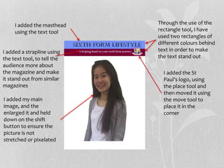
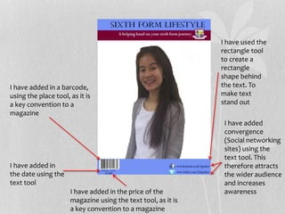
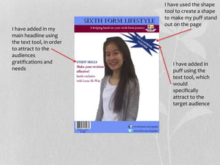
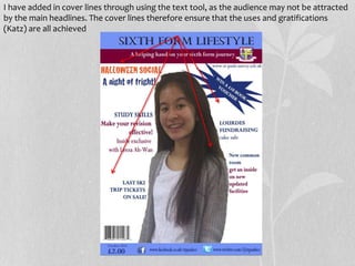
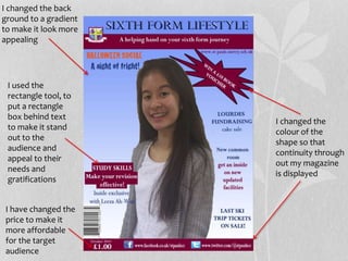
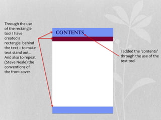
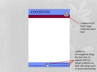
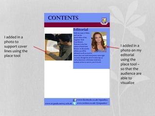
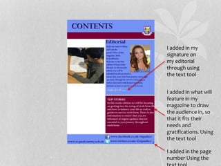
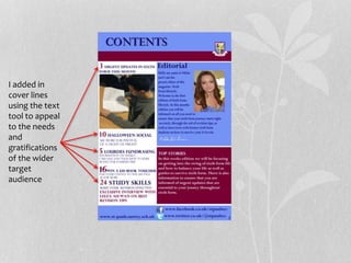
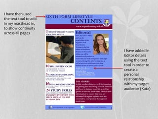
PRELIMINARY TASK
PROGRESSION–
EVIDENCE
FRONT COVER
Through the use of the
rectangle tool, I have
used two rectangles of
different colours behind
text in order to make
the text stand out
I added the masthead
using the text tool
I added a strapline using
the text tool, to tell the
audience more about
the magazine and make
it stand out from similar
magazines
I added the St
Paul’s logo, using
the place tool and
then moved it using
the move tool to
place it in the
corner
I added my main
image, and the
enlarged it and held
down on the shift
button to ensure the
picture is not
stretched or pixelated
I have used the
rectangle tool
to create a
rectangle
shape behind
the text. To
make text
stand out
I have added in a barcode,
using the place tool, as it is
a key convention to a
magazine
I have added in
the date using the
text tool
I have added in the price of the
magazine using the text tool, as it is
a key convention to a magazine
I have added
convergence
(Social networking
sites) using the
text tool. This
therefore attracts
the wider audience
and increases
awareness
I have added in
puff using the
text tool, which
would
specifically
attract to the
target audience
I have added in my
main headline using
the text tool, in order
to attract to the
audiences
gratifications and
needs
I have used the shape
tool to create a shape
to make my puff stand
out on the page
I have added in cover lines through using the text tool, as the audience may not be attracted
by the main headlines. The cover lines therefore ensure that the uses and gratifications
(Katz) are all achieved
I used the
rectangle tool, to
put a rectangle
box behind text
to make it stand
out to the
audience and
appeal to their
needs and
gratifications
I changed the back
ground to a gradient
to make it look more
appealing
I changed the
colour of the
shape so that
continuity through
out my magazine
is displayed
I have changed the
price to make it
more affordable
for the target
audience
PRELIMINARY TASK
PROGRESSION–
EVIDENCE
CONTENTS
PAGE
Through the use
of the rectangle
tool I have
created a
rectangle behind
the text – to make
text stand out,.
And also to repeat
(Steve Neale) the
conventions of
the front cover
I added the ‘contents’
through the use of the
text tool
I added the St
Paul's logo
using the place
tool
I added in
convergence using
the text too, to
appeal with my
target audience as
they will using much
of social networking
I added the St
Paul's logo
using the place
tool
I added in
convergence using
the text too, to
appeal with my
target audience as
they will using much
of social networking
I added in a
photo on my
editorial
using the
place tool –
so that the
audience are
able to
visualize
I added in a
photo to
support cover
lines using the
place tool
I added in my
signature on
my editorial
through using
the text tool
I added in what will
feature in my
magazine to draw
the audience in, so
that it fits their
needs and
gratifications. Using
the text tool
I added in the page
number Using the
I added in
cover lines
using the text
tool to appeal
to the needs
and
gratifications
of the wider
target
audience
I have added in
Editor details
using the text
tool in order to
create a
personal
relationship
with my target
audience (Katz)
I have then used
the text tool to add
in my masthead in,
to show continuity
across all pages

Preliminary task progression

  • 1.
  • 2.
    Through the useof the rectangle tool, I have used two rectangles of different colours behind text in order to make the text stand out I added the masthead using the text tool I added a strapline using the text tool, to tell the audience more about the magazine and make it stand out from similar magazines I added the St Paul’s logo, using the place tool and then moved it using the move tool to place it in the corner I added my main image, and the enlarged it and held down on the shift button to ensure the picture is not stretched or pixelated
  • 3.
    I have usedthe rectangle tool to create a rectangle shape behind the text. To make text stand out I have added in a barcode, using the place tool, as it is a key convention to a magazine I have added in the date using the text tool I have added in the price of the magazine using the text tool, as it is a key convention to a magazine I have added convergence (Social networking sites) using the text tool. This therefore attracts the wider audience and increases awareness
  • 4.
    I have addedin puff using the text tool, which would specifically attract to the target audience I have added in my main headline using the text tool, in order to attract to the audiences gratifications and needs I have used the shape tool to create a shape to make my puff stand out on the page
  • 5.
    I have addedin cover lines through using the text tool, as the audience may not be attracted by the main headlines. The cover lines therefore ensure that the uses and gratifications (Katz) are all achieved
  • 6.
    I used the rectangletool, to put a rectangle box behind text to make it stand out to the audience and appeal to their needs and gratifications I changed the back ground to a gradient to make it look more appealing I changed the colour of the shape so that continuity through out my magazine is displayed I have changed the price to make it more affordable for the target audience
  • 7.
  • 8.
    Through the use ofthe rectangle tool I have created a rectangle behind the text – to make text stand out,. And also to repeat (Steve Neale) the conventions of the front cover I added the ‘contents’ through the use of the text tool
  • 9.
    I added theSt Paul's logo using the place tool I added in convergence using the text too, to appeal with my target audience as they will using much of social networking
  • 10.
    I added theSt Paul's logo using the place tool I added in convergence using the text too, to appeal with my target audience as they will using much of social networking
  • 11.
    I added ina photo on my editorial using the place tool – so that the audience are able to visualize I added in a photo to support cover lines using the place tool
  • 12.
    I added inmy signature on my editorial through using the text tool I added in what will feature in my magazine to draw the audience in, so that it fits their needs and gratifications. Using the text tool I added in the page number Using the
  • 13.
    I added in coverlines using the text tool to appeal to the needs and gratifications of the wider target audience
  • 14.
    I have addedin Editor details using the text tool in order to create a personal relationship with my target audience (Katz) I have then used the text tool to add in my masthead in, to show continuity across all pages