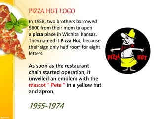
1. Pizza Hut is an American restaurant chain founded in 1958 in Wichita, Kansas by brothers Dan and Frank Carney.
2. The company is known for its Italian-American cuisine like pizza and pasta and has over 16,000 locations worldwide.
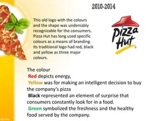
3. Pizza Hut has updated its logo several times over the years, with the most recent change in 2014 featuring a single pink color and a circular pizza-like design meant to represent a spinning pizza crust.