Download to read offline
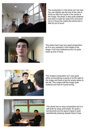
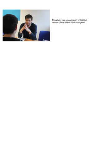

The document discusses and critiques the composition of several photos. It notes that one photo somewhat follows the rule of thirds but the subject is far away, making the photo feel disconnected. Another photo is centered and not cluttered since it is close-up but lacks interesting composition. A third photo has an unbalanced composition with everything on the right side, leaving half the image empty. The last photo discussed has an okay but simple composition despite using depth of field well.


