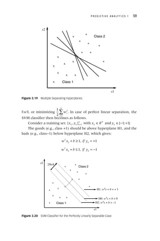
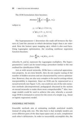
The document discusses the significance of analytics in a big data environment, highlighting various applications for senior-level managers. It covers key topics such as data collection, predictive analytics, and the analytics process model, aimed at equipping professionals with the necessary skills to leverage analytics for strategic advantages. Additionally, it emphasizes practical applications through real-life case studies across multiple industries.


![P R E D I C T I V E A N A L Y T I C S ◂ 37
at time t (see Chapter 5), and
t d the discounting factor (typically the
d
weighted average cost of capital [WACC]). Defining all these param-
eters is by no means a trivial exercise and should be done in close
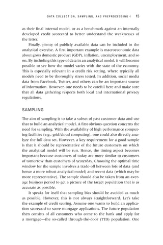
collaboration with the business expert. Table 3.1 gives an example of
calculating CLV.
Loss given default (LGD) is an important credit risk parameter in a
Basel II/Basel III setting.4
It represents the percentage of the exposure
likely to be lost upon default. Again, when defining it, one needs to
decide on the time horizon (typically two to three years), what costs
to include (both direct and indirect), and what discount factor to adopt
(typically the contract rate).
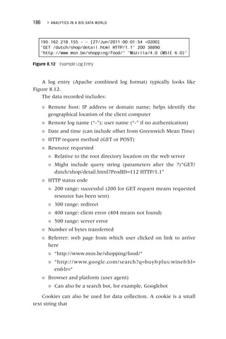
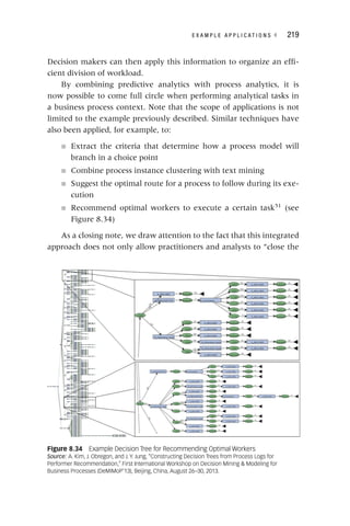
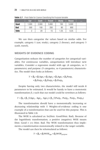
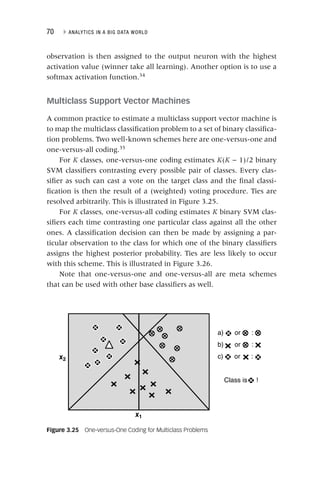
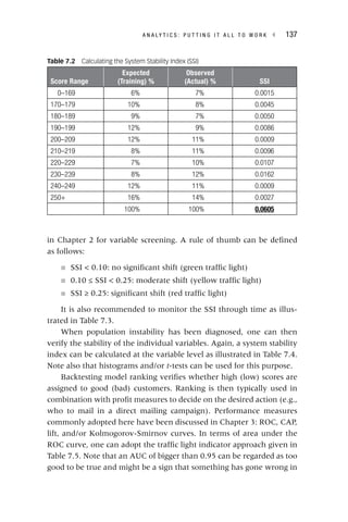
Before starting the analytical step, it is really important to check
the robustness and stability of the target definition. In credit scoring,
one commonly adopts roll rate analysis for this purpose as illustrated
in Figure 3.1. The purpose here is to visualize how customers move
from one delinquency state to another during a specific time frame. It
Table 3.1 Example CLV Calculation
Month t
Revenue in
Month t (Rt)
Cost in Month
t (Ct)
Survival
Probability in
Month t (st)
(Rt − Ct) *
st / (1 + d )t
1 150 5 0.94 135.22
2 100 10 0.92 82.80
3 120 5 0.88 101.20
4 100 0 0.84 84.00
5 130 10 0.82 98.40
6 140 5 0.74 99.90
7 80 15 0.7 45.50
8 100 10 0.68 61.20
9 120 10 0.66 72.60
10 90 20 0.6 42.00
11 100 0 0.55 55.00
12 130 10 0.5 60.00
CLV 937.82
Yearly WACC 10%
Monthly WACC 1%](https://image.slidesharecdn.com/phntchtrongbigdata-221113140612-5c05eeb9/85/Phan-tich-trong-Big-Data-pdf-57-320.jpg)
![38 ▸ ANALYTICS IN A BIG DATA WORLD
can be easily seen from the plot that once the customer has reached
90 or more days of payment arrears, he or she is unlikely to recover.
LINEAR REGRESSION
Linear regression is a baseline modeling technique to model a continu-
ous target variable. For example, in a CLV modeling context, a linear
regression model can be defined to model CLV in terms of the RFM
(recency, frequency, monetary value) predictors as follows:
= β + β + β + β
CLV R F M
0 1 2 3
The β parameters are then typically estimated using ordinary least
squares (OLS) to minimize the sum of squared errors. As part of the
estimation, one then also obtains standard errors, p‐values indicating
variable importance (remember important variables get low p‐values),
and confidence intervals. A key advantage of linear regression is that it
is simple and usually works very well.
Note that more sophisticated variants have been suggested in the
literature (e.g., ridge regression, lasso regression, time series mod-
els [ARIMA, VAR, GARCH], multivariate adaptive regression splines
[MARS]).
Figure 3.1 Roll Rate Analysis
Source: N. Siddiqi, Credit Risk Scorecards: Developing and Implementing Intelligent Credit Scoring
(Hoboken, NJ: John Wiley & Sons, 2005).
100%
80%
60%
40%
20%
0%
Worst—Next 12 Months
Curr/x day
30 day
60 day
90+
Worst—Previous
12
Months Roll Rate
Curr/x day 30 day 60 day 90+](https://image.slidesharecdn.com/phntchtrongbigdata-221113140612-5c05eeb9/85/Phan-tich-trong-Big-Data-pdf-58-320.jpg)


![90 ▸ ANALYTICS IN A BIG DATA WORLD
Again, the data analyst has to specify a minimum confidence (min-
conf) in order for an association rule to be considered interesting.
When considering Table 4.2, the association rule baby food and
diapers ⇒ beer has confidence 3/5 or 60 percent.
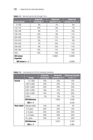
Association Rule Mining
Mining association rules from data is essentially a two‐step process as
follows:
1. Identification of all item sets having support above minsup (i.e.,
“frequent” item sets)
2. Discovery of all derived association rules having confidence
above minconf
As said before, both minsup and minconf need to be specified
beforehand by the data analyst. The first step is typically performed
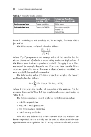
using the Apriori algorithm.1
The basic notion of apriori states that every
i
subset of a frequent item set is frequent as well or, conversely, every
superset of an infrequent item set is infrequent. This implies that can-
didate item sets with k items can be found by pairwise joining frequent
k
item sets with k − 1 items and deleting those sets that have infrequent
k
subsets. Thanks to this property, the number of candidate subsets to
be evaluated can be decreased, which will substantially improve the
performance of the algorithm because fewer databases passes will be
required. The Apriori algorithm is illustrated in Figure 4.1.
Once the frequent item sets have been found, the association rules
can be generated in a straightforward way, as follows:
■ For each frequent item set k, generate all nonempty subsets of k
■ For every nonempty subset s of k, output the rule s ⇒ k −
k s if the
confidence minconf
Note that the confidence can be easily computed using the support
values that were obtained during the frequent item set mining.
For the frequent item set {baby food, diapers, beer}, the following
association rules can be derived:
diapers, beer ⇒ baby food [conf = 75%]
f
baby food, beer ⇒ diapers [conf = 75%]
f](https://image.slidesharecdn.com/phntchtrongbigdata-221113140612-5c05eeb9/85/Phan-tich-trong-Big-Data-pdf-110-320.jpg)
![D E S C R I P T I V E A N A L Y T I C S ◂ 91
baby food, diapers ⇒ beer [conf = 60%]
f
beer ⇒ baby food and diapers [conf = 50%]
f
baby food ⇒ diapers and beer [conf = 43%]
f
diapers ⇒ baby food and beer [conf = 43%]
f
If the minconf is set to 70 percent, only the first two association
rules will be kept for further analysis.
The Lift Measure
Table 4.3 provides an example from a supermarket transactions data-
base to illustrate the lift measure.
Let’s now consider the association rule tea ⇒ coffee. The support
of this rule is 100/1,000, or 10 percent. The confidence of the rule is
Table 4.3 The Lift Measure
Tea Not Tea Total
Coffee 150 750 900
Not coffee 50 50 100
Total 200 800 1,000
Figure 4.1 The Apriori Algorithm
Items
TID
1, 3, 4
100
2, 3, 5
200
1, 2, 3, 5
300
2, 5
400
Support
Itemsets
2/4
{1, 3}
2/4
{2, 3}
3/4
{2, 5}
2/4
{3, 5}
L2
Support
Itemsets
1/4
{1, 2}
2/4
{1, 3}
1/4
{1, 5}
2/4
{2, 3}
3/4
{2, 5}
2/4
{3, 5}
C2
Support
Itemsets
2/4
{2, 3, 5}
C3
Result = {{1},{2},{3},{5},{1,3},{2,3},{2,5},{3,5},{2,3,5}}
Support
Itemsets
2/4
{2, 3, 5}
L3
Minsup = 50%
Database
Support
Itemsets
2/4
{1}
3/4
{2}
3/4
{3}
3/4
{5}
L1
{1,3} and {2,3} give
{1,2,3}, but because {1,2}
is not frequent, you do not
have to consider it!](https://image.slidesharecdn.com/phntchtrongbigdata-221113140612-5c05eeb9/85/Phan-tich-trong-Big-Data-pdf-111-320.jpg)


![D E S C R I P T I V E A N A L Y T I C S ◂ 95
A sequential version can then be obtained as follows:
Session 1: A, B, C
Session 2: B, C
Session 3: A, C, D
Session 4: A, B, D
Session 5: D, C, A
One can now calculate the support in two different ways. Con-
sider, for example, the sequence rule A ⇒ C. A first approach would
be to calculate the support whereby the consequent can appear in any
subsequent stage of the sequence. In this case, the support becomes
2/5 (40%). Another approach would be to only consider sessions in
which the consequent appears right after the antecedent. In this case,
the support becomes 1/5 (20%). A similar reasoning can now be fol-
lowed for the confidence, which can then be 2/4 (50%) or 1/4 (25%),
respectively.
Remember that the confidence of a rule A1 ⇒ A2 is defined as the
probability P(A2 |A1) = support(A1 ∪ A2)/support(A1). For a rule with
multiple items, A1 ⇒ A2 ⇒ … An–1 ⇒ An, the confidence is defined as
P(An |A1, A2, …, An–1), or support(A1 ∪ A2 ∪ … ∪ An–1 ∪ An)/support
(A1 ∪ A2 ∪ … ∪ An–1).
SEGMENTATION
The aim of segmentation is to split up a set of customer observa-
tions into segments such that the homogeneity within a segment is
maximized (cohesive) and the heterogeneity between segments is
maximized (separated). Popular applications include:
■ Understanding a customer population (e.g., targeted marketing
or advertising [mass customization])
■ Efficiently allocating marketing resources
■ Differentiating between brands in a portfolio
■ Identifying the most profitable customers
■ Identifying shopping patterns
■ Identifying the need for new products](https://image.slidesharecdn.com/phntchtrongbigdata-221113140612-5c05eeb9/85/Phan-tich-trong-Big-Data-pdf-115-320.jpg)


![100 ▸ ANALYTICS IN A BIG DATA WORLD
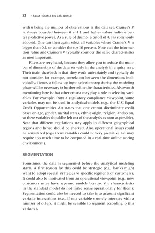
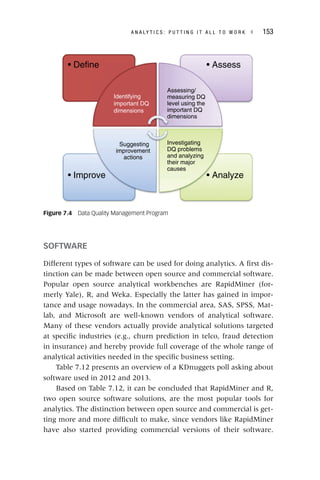
Self‐Organizing Maps
A self‐organizing map (SOM) is an unsupervised learning algorithm
that allows you to visualize and cluster high‐dimensional data on a
low‐dimensional grid of neurons.3
An SOM is a feedforward neural
network with two layers. The neurons from the output layer are usu-
ally ordered in a two‐dimensional rectangular or hexagonal grid (see
Figure 4.10). For the former, every neuron has at most eight neigh-
bors, whereas for the latter every neuron has at most six neighbors.
Each input is connected to all neurons in the output layer with
weights w = [
w w1, …, wN
w ], with
N
N N the number of variables. All weights
N
are randomly initialized. When a training vector x is presented, the
x
weight vector wc of each neuron
c c is compared with
c x, using, for
example, the Euclidean distance metric (beware to standardize the
data first):
d x w x w
c i ci
i
N
( , ) ( )2
1
∑
= −
=
x in Euclidean sense is called
x
the best matching unit (BMU). The weight vector of the BMU
and its neighbors in the grid are then adapted using the following
learning rule:
w t w t h t x t w t
i i ci i
( 1) ( 1) ( ) ( ) ( )
[ ]
+ = + + −
whereby t represents the time index during training and
t hci(
i t) defines
t
the neighborhood of the BMU c, specifying the region of influence. The
Figure 4.10 Rectangular versus Hexagonal SOM Grid
Rectangular SOM Grid Hexagonal SOM Grid](https://image.slidesharecdn.com/phntchtrongbigdata-221113140612-5c05eeb9/85/Phan-tich-trong-Big-Data-pdf-120-320.jpg)


![112 ▸ ANALYTICS IN A BIG DATA WORLD
Note that the logarithmic transform is used here to make sure that
the hazard rate is always positive.
The Weibull distribution is another popular choice for a parametric
survival analysis model. It is defined as follows:
= κρ ρ − ρ
κ− κ
f t t t
( ) ( ) exp[ ( ) ]
1
The survival function then becomes:
= − ρ κ
S t t
( ) exp[ ( ) ]
and the hazard rate
= = κρ ρ κ−
h t
f t
S t
t
( )
( )
( )
( ) 1
Note that in this case the hazard rate does depend on time and can
be either increasing or decreasing (depending upon κ and ρ).
When including covariates, the model becomes:
( ) = μ + α + β + β + β
log ( , ) log( ) 1 1 2 2
h t x t x x x
i i i N iN
Other popular choices for the event time distribution are the
gamma, log‐logistic, and log‐normal distribution.3
Parametric survival analysis models are typically estimated using
maximum likelihood procedures. In case of no censored observations,
the likelihood function becomes:
∏
=
=
L f t
i
n
i
( )
1
When censoring is present, the likelihood function becomes:
L f t S t
i
n
i i
i i
∏ ( )
=
=
δ −δ
( )
1
1
i
δ equals 0 if observation i is censored, and 1 if the observa-
i
tion dies at time ti.
i It is important to note here that the censored obser-
vations do enter the likelihood function and, as such, have an impact
on the estimates. For example, for the exponential distribution, the
likelihood function becomes:
L e e
t
i
n
t
i i i i
∏
= λ −λ δ
=
−λ −δ
[ ] [ ]
1
1](https://image.slidesharecdn.com/phntchtrongbigdata-221113140612-5c05eeb9/85/Phan-tich-trong-Big-Data-pdf-132-320.jpg)


![182 ▸ ANALYTICS IN A BIG DATA WORLD
different knowledge sources are used to obtain features, and these are
then given to the recommendation algorithm. A fifth type is feature
augmentation: A first recommender computes the features while the
next recommender computes the remainder of the recommendation.
For example, Melville, Mooney, and Nagarajan27
use a content‐based
model to generate ratings for items that are unrated and then col-
laborative filtering uses these to make the recommendation. Cascade
is the sixth type of hybrid technique. In this case, each recommender
is assigned a certain priority and if high priority recommenders pro-
duce a different score, the lower priority recommenders are decisive.
Finally, a meta‐level hybrid recommender system consists of a first
recommender that gives a model as output that is used as input by
the next recommender. For example, Pazzani28
discusses a restaurant
recommender that first uses a content‐based technique to build user
profiles. Afterward, collaborative filtering is used to compare each
user and identify neighbors. Burke29
states that a meta‐level hybrid is
different from a feature augmentation hybrid because the meta‐level
hybrid does not use any original profile data; the original knowledge
source is replaced in its entirety.
Evaluation of Recommender Systems
Two categories of evaluation metrics are generally considered:30
the
goodness or badness of the output presented by a recommender
system and its time and space requirements. Recommender systems
generating predictions (numerical values corresponding to users’ rat-
ings for items) should be evaluated separately from recommender
systems that propose a list of N items that a user is expected to find
N
interesting (top‐N recommendation). The first category of evaluation
N
metrics that we consider is the goodness or badness of the output pre-
sented by a recommender system. Concerning recommender systems
that make predictions, prediction accuracy can be measured using
statistical accuracy metrics (of which mean absolute deviation [MAD]
is the most popular one) and using decision support accuracy met-
rics (of which area under the receiver operating characteristic curve
is the most popular one). Coverage denotes for which percentage of
the items the recommender system can make a prediction. Coverage](https://image.slidesharecdn.com/phntchtrongbigdata-221113140612-5c05eeb9/85/Phan-tich-trong-Big-Data-pdf-202-320.jpg)