Download as PDF, PPTX


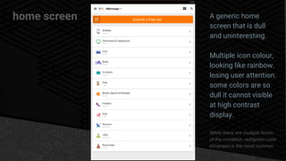
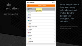
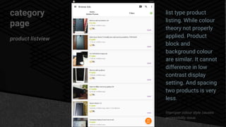


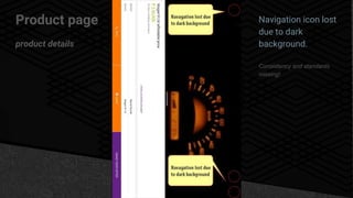
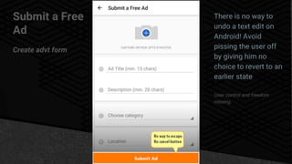


The OLX mobile app home screen is dull and uninteresting with multiple dull icon colors that lose user attention. The main navigation menu needs reorganization and consolidation to follow gestalt principles and reduce cognitive load. Product listings on category pages have improper color combinations that reduce visibility and accessibility. The app lacks visibility of system status, recognition over recall, and user control. Overall, the user experience needs improvement through use of negative space, increased tap areas, and resolving usability and accessibility issues.


