The document provides steps to create an OBIEE11g dashboard for brand analysis. It describes creating various dashboard prompts, filters, and analyses and integrating them into a single dashboard. Specifically, it outlines creating prompts for year, company, weeks between, and product hierarchy. It then provides details on building two initial analyses - a product line analysis pivot table and a trending analysis bar graph. The goal is to create a fully functioning sample brand analysis dashboard to help learners explore OBIEE11g features.
The document provides steps to create an OBIEE11g dashboard with various objects like analysis, charts, maps, and prompts. It begins by creating a dashboard prompt for revenue between a specified range using a slider. It then creates an analysis to show order, revenue, unit price by customer and establishment with filters. Subsequent steps will cover creating a chart and map visualization and integrating them into a single dashboard.
Sample sales reengineering in obiee 11g part iiAmit Sharma
This document provides instructions for rebuilding the sample sales repository (RPD), reports, and dashboard that come with OBIEE 10g in OBIEE 11g. It discusses rebuilding the data model, building the physical, business model and mapping, and presentation layers. Specific steps covered include importing metadata from sources, creating logical and physical tables, dimensions and hierarchies, measures, mappings between logical and physical layers, and validating the repository. The goal is to cover all major OBIEE features using a best practice approach to repository building.
This presentation is not mine, the due rights are stated inside the ppt. I'm just uploading this to slideshare, so I can share it in a blackboard course site for my grade in a course at my institution.
The document provides steps to create an OBIEE11g dashboard for brand analysis. It describes creating various dashboard prompts, filters, and analyses and integrating them into a single dashboard. Specifically, it outlines creating prompts for year, company, weeks between, and product hierarchy. It then provides details on building two initial analyses - a product line analysis pivot table and trending analysis bar graph. The goal is to create a fully functioning sample brand analysis dashboard to help learn OBIEE11g features.
This document provides instructions for an exercise on using IBM Rational Team Concert for source control. The exercise teaches how to create a repository workspace, make code changes, check in changes, resolve conflicts when merging code, and create baselines to mark milestones. The goal is to master source control tasks like using workspaces, managing change sets, and manipulating streams and baselines.
This document provides instructions for an exercise on managing work items in IBM Rational Team Concert. The purpose is to become familiar with creating, querying, triaging, and working on work items. Specific tasks covered include creating a defect work item, creating simple and more complex queries to find work items by properties and conditions, and joining a project team to accept work items.
- Chúng tôi hướng đến mục tiêu trở thành Công ty cung cấp dịch vụ Giá trị Gia tăng tốt nhất, nhanh nhất, uy tín nhất.
- Mong muốn Khách hàng và Đối tác của Viễn Thông Di Động đạt lợi nhuận cao nhất từ hoạt động đầu tư Mobile Marketing và sử dụng dịch vụ Giá trị Gia tăng
BISP is committed to provide BEST learning material to the beginners and advance learners. In
the same series, we have prepared a complete end-to-end OBIEE Dashboard design document. The
document briefs you practical approach to create Dashboard, Analysis, Filters, Maps, KPI, scorecard
Gauge and Prompts. The document assists OBIEE11g learners to explore the various features. The
document simplifies OBIEE11g. In the first part of tutorial it is shown creation of Brand Analysis
Dashboard. The subsequent release of the case study will cover many new advanced features of
Dashboard building. Join our professional training program to learn from the experts.
Mastering dashboard and reporting guideAmit Sharma
The document describes steps to create an OBIEE11g dashboard with prompts, filters, analyses, charts, functions, and a master-detail table. It includes creating a dashboard prompt with options for number of buckets, metric, and product line of business. Next, it adds charts including a pie chart of office organization units and bar charts of metric distribution by customers and orders. The dashboard is then built to include these prompts and charts.
Obiee11g building logical dimension hierarchyAmit Sharma
This document provides step-by-step instructions for building a logical dimension hierarchy in OBIEE 11g. It covers creating the logical dimension object, adding levels and keys, setting the preferred drill path, creating presentation hierarchies, testing the hierarchy, and creating level-based and shared measures. Building the hierarchy involves defining the parent-child relationships between attributes, adding logical levels and keys, and mapping the hierarchy to presentation layers where it can be used in analysis.
This document provides guidance on creating a strategy tree, KPIs, and dashboard in OBIEE11g. It discusses creating objectives and assigning KPIs to objectives to measure performance. Steps are provided to create a scorecard with objectives like improving financial results and increasing sales. The document then covers creating a strategy tree and building a dashboard to display the strategy tree. Guidance is given on creating KPIs in OBIEE11g related to metrics like average revenue per employee and billed vs target quantities.
Sample sales reengineering in obiee 11g part iiiAmit Sharma
This document provides instructions on how to rebuild the sample sales repository (RPD), reports, and dashboard that are included with OBIEE 11g. It discusses reengineering the data model, building the physical, business model and mapping, and presentation layers. The presentation layer section specifically focuses on creating presentation catalogs and tables, mapping presentation columns to logical columns, checking global consistency, and publishing the repository.
To watch the recorded on-demand web seminar go to http://alturl.com/2mjzg
In this session, discover the new dashboard capabilities of IBM Cognos Business Intelligence V10.1.1. Learn how IBM Cognos Business Insight revolutionizes information delivery for all business users and enables you to build rich, personalized, and interactive dashboards for sound business decisions and better bottom-line results.
Learn more: www.CognosEducation.com
This document provides instructions for creating a single and multi-axis rating system using Drupal 6 with the Fivestar, Voting API and CCK modules. It describes creating "Product" and "Review" content types, adding rating fields to the "Review" type, and displaying average ratings on "Product" nodes. It also covers setting up a Views display to list products with their average rating values sorted by axis.
This document provides instructions for creating a single and multi-axis rating/review system using Drupal 6 and the Fivestar, Voting API and CCK modules. It describes how to create "Product" and "Review" content types to allow users to review products and rate them on one or multiple criteria. It also provides code to display average ratings on product nodes and instructions to build a Views display of products and their average ratings.
IBM Cognos 10 Framework Manager Metadata Modeling: Tips and TricksSenturus
This document summarizes a webinar presentation about IBM Cognos 10 Framework Manager metadata modeling techniques. The presentation included demonstrations of implementing dynamic row-level security, understanding determinants, dimensionally modeling relational data, and creating regular and measure dimensions. It also discussed Cognos training options available through IBM and Senturus, an IBM partner.
Here are the key steps to create a mapping in Informatica PowerCenter:
1. Open the Mapping Designer and create a new mapping
2. Drag and drop the source and target tables from the Repository Navigator into the mapping area
3. Create an Expression Transformation and name it appropriately
4. Connect the source table ports to the Expression Transformation ports
5. Right click the Expression Transformation and select 'Edit' to open the Expression Editor
6. In the Expression Editor, add a dummy output port for the field to be calculated/transformed
7. Write the expression in the Expression Editor to calculate/transform the field value based on the business logic
8. Connect the Expression Transformation output port
This document provides an agenda and overview for an OBIEE training course. The agenda covers topics like OBIEE architecture, login screens, important file locations, the OBIEE home page, column types, exercises for creating analyses and filters, pivot tables, grouping, calculated members, graphs and visualizations, maps, and creating prompts and dashboard prompts. The overview describes key features of OBIEE like its comprehensive analytics and reporting capabilities, web-based tools, multiple server architecture, support for connecting to different data sources, and integration with Oracle Fusion Middleware.
This document provides instructions for setting up and using taxonomy and personalization features in the Lift 2.0 platform. It discusses mapping taxonomy terms to Lift categories, creating user segments based on criteria like page content or user properties, and adding personalized content to a Drupal site using the Lift wizard. The goal is to engage users by delivering tailored content according to their segment membership as defined by the criteria.
The document provides steps to perform an incremental update of a target table (TRG_BANK_CD) using a source table (SRC_BANK_CD) in Informatica PowerCenter. This involves importing the source and target tables, creating a mapping with Lookup and Update Strategy transformations, building a reusable session, creating a workflow assigning the session, executing the workflow, and reviewing the target data and logs. The goal is to update, insert, and delete records in the target table based on the source data in an incremental and data-driven manner.
Power bi slide share pdf it is a very importantSatyabratarath5
It is first pdf I am Satyabrata rath my 1st pdf in power bi it is most wonderful pdf .A basic knowledge in power bi
Power bi most wonderful pdf.power bi is business purposes tool
This document provides a three-part summary of building financial reports and dashboards using Oracle Business Intelligence Enterprise Edition (OBIEE) with Essbase as the data source:
1. It outlines the steps to prepare the repository planning document (RPD) by importing the Essbase cube and associated dimensions, hierarchies, and measures into the physical layer of the RPD.
2. It describes how to build the business model and mapping layer by dragging the physical cube into these layers to automatically generate the associated dimensions and relationships.
3. It discusses setting up the presentation layer by dragging objects from the business model layer into catalogs for ad-hoc analysis and testing.
Customer Automation Masterclass - Workshop 1: Data Enrichment using ClearbitJanBogaert8
In this first masterclass workshop, you'll learn how to write a custom-coded workflow action aimed at enriching your HubSpot CRM data with company information sourced from Clearbit. This is ideal for sales teams who want to adopt an account-based selling approach or for marketing teams interested in account-based marketing.
This document summarizes a presentation given in September 2013 by Archana Joshi, a senior manager at Cognizant, and Zaheer Abbas Contractor, head of AgileNext at Wipro Technologies. The presentation covered Agile basics such as the primary goal of Agile development being working software, critical items to start a Scrum project, and the correct sequence of events in the Scrum framework. It also discussed concepts like what a product backlog item, sprint burn-down charts, and the product owner's role. The document provided examples and explanations to build understanding of foundational Agile and Scrum terminology and practices.
In this webinar, we will take a look on deploying Power BI Report in Dynamics 365 FOE using Entity Store and its entire configuration. We will take a look on how to create Analytics elements and discuss how to refresh it in Operations for using as DirectQuery. This will include configurations of Power BI report in D365 FOE workspaces.
Oracle enteprise pbcs drivers and assumptionsAmit Sharma
This document discusses driver-based planning and budgeting solutions using Oracle Enterprise Planning and Budgeting. It allows adjusting numbers based on internal or external factors through defining key drivers that impact areas like revenue, expenses, balance sheets, and cash flows. Drivers can be standard or custom defined and then used to calculate and adjust planned numbers across various areas. The document provides examples of common drivers for revenue, expenses, balance sheet accounts, and cash flows that can significantly impact the planning and budgeting process.
BISP is committed to provide BEST learning material to the beginners and advance learners. In
the same series, we have prepared a complete end-to-end OBIEE Dashboard design document. The
document briefs you practical approach to create Dashboard, Analysis, Filters, Maps, KPI, scorecard
Gauge and Prompts. The document assists OBIEE11g learners to explore the various features. The
document simplifies OBIEE11g. In the first part of tutorial it is shown creation of Brand Analysis
Dashboard. The subsequent release of the case study will cover many new advanced features of
Dashboard building. Join our professional training program to learn from the experts.
Mastering dashboard and reporting guideAmit Sharma
The document describes steps to create an OBIEE11g dashboard with prompts, filters, analyses, charts, functions, and a master-detail table. It includes creating a dashboard prompt with options for number of buckets, metric, and product line of business. Next, it adds charts including a pie chart of office organization units and bar charts of metric distribution by customers and orders. The dashboard is then built to include these prompts and charts.
Obiee11g building logical dimension hierarchyAmit Sharma
This document provides step-by-step instructions for building a logical dimension hierarchy in OBIEE 11g. It covers creating the logical dimension object, adding levels and keys, setting the preferred drill path, creating presentation hierarchies, testing the hierarchy, and creating level-based and shared measures. Building the hierarchy involves defining the parent-child relationships between attributes, adding logical levels and keys, and mapping the hierarchy to presentation layers where it can be used in analysis.
This document provides guidance on creating a strategy tree, KPIs, and dashboard in OBIEE11g. It discusses creating objectives and assigning KPIs to objectives to measure performance. Steps are provided to create a scorecard with objectives like improving financial results and increasing sales. The document then covers creating a strategy tree and building a dashboard to display the strategy tree. Guidance is given on creating KPIs in OBIEE11g related to metrics like average revenue per employee and billed vs target quantities.
Sample sales reengineering in obiee 11g part iiiAmit Sharma
This document provides instructions on how to rebuild the sample sales repository (RPD), reports, and dashboard that are included with OBIEE 11g. It discusses reengineering the data model, building the physical, business model and mapping, and presentation layers. The presentation layer section specifically focuses on creating presentation catalogs and tables, mapping presentation columns to logical columns, checking global consistency, and publishing the repository.
To watch the recorded on-demand web seminar go to http://alturl.com/2mjzg
In this session, discover the new dashboard capabilities of IBM Cognos Business Intelligence V10.1.1. Learn how IBM Cognos Business Insight revolutionizes information delivery for all business users and enables you to build rich, personalized, and interactive dashboards for sound business decisions and better bottom-line results.
Learn more: www.CognosEducation.com
This document provides instructions for creating a single and multi-axis rating system using Drupal 6 with the Fivestar, Voting API and CCK modules. It describes creating "Product" and "Review" content types, adding rating fields to the "Review" type, and displaying average ratings on "Product" nodes. It also covers setting up a Views display to list products with their average rating values sorted by axis.
This document provides instructions for creating a single and multi-axis rating/review system using Drupal 6 and the Fivestar, Voting API and CCK modules. It describes how to create "Product" and "Review" content types to allow users to review products and rate them on one or multiple criteria. It also provides code to display average ratings on product nodes and instructions to build a Views display of products and their average ratings.
IBM Cognos 10 Framework Manager Metadata Modeling: Tips and TricksSenturus
This document summarizes a webinar presentation about IBM Cognos 10 Framework Manager metadata modeling techniques. The presentation included demonstrations of implementing dynamic row-level security, understanding determinants, dimensionally modeling relational data, and creating regular and measure dimensions. It also discussed Cognos training options available through IBM and Senturus, an IBM partner.
Here are the key steps to create a mapping in Informatica PowerCenter:
1. Open the Mapping Designer and create a new mapping
2. Drag and drop the source and target tables from the Repository Navigator into the mapping area
3. Create an Expression Transformation and name it appropriately
4. Connect the source table ports to the Expression Transformation ports
5. Right click the Expression Transformation and select 'Edit' to open the Expression Editor
6. In the Expression Editor, add a dummy output port for the field to be calculated/transformed
7. Write the expression in the Expression Editor to calculate/transform the field value based on the business logic
8. Connect the Expression Transformation output port
This document provides an agenda and overview for an OBIEE training course. The agenda covers topics like OBIEE architecture, login screens, important file locations, the OBIEE home page, column types, exercises for creating analyses and filters, pivot tables, grouping, calculated members, graphs and visualizations, maps, and creating prompts and dashboard prompts. The overview describes key features of OBIEE like its comprehensive analytics and reporting capabilities, web-based tools, multiple server architecture, support for connecting to different data sources, and integration with Oracle Fusion Middleware.
This document provides instructions for setting up and using taxonomy and personalization features in the Lift 2.0 platform. It discusses mapping taxonomy terms to Lift categories, creating user segments based on criteria like page content or user properties, and adding personalized content to a Drupal site using the Lift wizard. The goal is to engage users by delivering tailored content according to their segment membership as defined by the criteria.
The document provides steps to perform an incremental update of a target table (TRG_BANK_CD) using a source table (SRC_BANK_CD) in Informatica PowerCenter. This involves importing the source and target tables, creating a mapping with Lookup and Update Strategy transformations, building a reusable session, creating a workflow assigning the session, executing the workflow, and reviewing the target data and logs. The goal is to update, insert, and delete records in the target table based on the source data in an incremental and data-driven manner.
Power bi slide share pdf it is a very importantSatyabratarath5
It is first pdf I am Satyabrata rath my 1st pdf in power bi it is most wonderful pdf .A basic knowledge in power bi
Power bi most wonderful pdf.power bi is business purposes tool
This document provides a three-part summary of building financial reports and dashboards using Oracle Business Intelligence Enterprise Edition (OBIEE) with Essbase as the data source:
1. It outlines the steps to prepare the repository planning document (RPD) by importing the Essbase cube and associated dimensions, hierarchies, and measures into the physical layer of the RPD.
2. It describes how to build the business model and mapping layer by dragging the physical cube into these layers to automatically generate the associated dimensions and relationships.
3. It discusses setting up the presentation layer by dragging objects from the business model layer into catalogs for ad-hoc analysis and testing.
This document provides a three-part summary of building financial reports and dashboards using Oracle Business Intelligence Enterprise Edition (OBIEE) with Essbase as the data source:
1. It outlines the steps to prepare the repository planning document (RPD) by importing the Essbase cube and associated dimensions, hierarchies, and measures into the physical layer of the RPD.
2. It describes how to build the business model and mapping layer by dragging the physical cube into these layers to automatically generate the associated dimensions and relationships.
3. It discusses setting up the presentation layer by dragging objects from the business model layer into catalogs for ad-hoc analysis and testing.
This document provides a three-part summary of building financial reports and dashboards using Oracle Business Intelligence Enterprise Edition (OBIEE) with Essbase as the data source:
1. It outlines the steps to prepare the repository planning document (RPD) by importing the Essbase cube and associated dimensions, hierarchies, and measures into the physical layer of the RPD.
2. It describes how to build the business model and mapping layer by dragging the physical cube into these layers to automatically generate the associated dimensions and relationships.
3. It discusses setting up the presentation layer by dragging objects from the business model layer into catalogs for ad-hoc analysis and testing.
Customer Automation Masterclass - Workshop 1: Data Enrichment using ClearbitJanBogaert8
In this first masterclass workshop, you'll learn how to write a custom-coded workflow action aimed at enriching your HubSpot CRM data with company information sourced from Clearbit. This is ideal for sales teams who want to adopt an account-based selling approach or for marketing teams interested in account-based marketing.
This document summarizes a presentation given in September 2013 by Archana Joshi, a senior manager at Cognizant, and Zaheer Abbas Contractor, head of AgileNext at Wipro Technologies. The presentation covered Agile basics such as the primary goal of Agile development being working software, critical items to start a Scrum project, and the correct sequence of events in the Scrum framework. It also discussed concepts like what a product backlog item, sprint burn-down charts, and the product owner's role. The document provided examples and explanations to build understanding of foundational Agile and Scrum terminology and practices.
In this webinar, we will take a look on deploying Power BI Report in Dynamics 365 FOE using Entity Store and its entire configuration. We will take a look on how to create Analytics elements and discuss how to refresh it in Operations for using as DirectQuery. This will include configurations of Power BI report in D365 FOE workspaces.
Similar to Obiee11g building-brand-analysis-dashboard (20)
Oracle enteprise pbcs drivers and assumptionsAmit Sharma
This document discusses driver-based planning and budgeting solutions using Oracle Enterprise Planning and Budgeting. It allows adjusting numbers based on internal or external factors through defining key drivers that impact areas like revenue, expenses, balance sheets, and cash flows. Drivers can be standard or custom defined and then used to calculate and adjust planned numbers across various areas. The document provides examples of common drivers for revenue, expenses, balance sheet accounts, and cash flows that can significantly impact the planning and budgeting process.
Oracle Strategic Workforce Planning Cloud is a tool to help companies align workforce strategy with business goals. It assesses skills across categories like behavioral, managerial, and technical. It identifies gaps between current and future skill needs through supply and demand analysis. Recommendations include establishing reliable data processes and using intelligent software to link HR transactions to workforce planning and strategic goals.
This document provides an overview of Oracle's Financial Data Quality Management, Enterprise Edition (FDMEE). It describes FDMEE's introduction, architecture, key differences from the previous Financial Data Management product, and value-added features. The document also walks through the FDMEE graphical user interface and components for navigation, setup, integration, data loading, and batch processing.
This document provides examples of using import and mapping scripts in Oracle Hyperion Financial Data Quality Management. There are four examples that demonstrate different ways to apply import and mapping scripts, including using string expressions to extract data from import files, conditional expressions to convert credit and debit columns into a single amount column, and using the "IGNORE" expression to skip rows with negative amounts in a mapping script. The examples are intended to illustrate the flexibility of using Jython scripts to customize data import and mapping tasks.
Oracle PBCS creating standard applicationAmit Sharma
This document provides steps for creating a standard application in Oracle Enterprise Performance Management Cloud. It discusses selecting the application type as standard, which builds advanced applications. It also covers setting up currencies, custom dimensions and metadata, and the calendar. The complete creation process involves 7 steps: 1) Creating the application 2) Loading metadata 3) Modifying metadata 4) Configuring components 5) Assigning security 6) Loading data 7) Creating and deploying business rules.
The document provides information about creating consolidation and elimination rules in HFM Calc Manager. It describes the default consolidation calculation process and functions like PCon and Con that are used to calculate the proportion and elimination members. It explains that custom rules can override the default process. A standard consolidation template is presented that can be used as a starting point, which uses PCon to get the consolidation percentage and Con to calculate proportions and eliminations.
This document discusses calculating return on assets (ROA) using a dynamic procedure in HFM Calc Manager. It defines ROA as net profit divided by average total assets. It then shows a dynamic sub routine that calculates periodic, quarter-to-date, half-year-to-date, and year-to-date ROA by dividing net income by assets over different time periods. An example calculation is provided to demonstrate how it works.
There are two modes for adding new members in the Oracle Hyperion Planning Smartview grid: Dimension Editor Mode and Submit without Refresh Mode. Dimension Editor Mode requires a refresh after each addition but is generally faster, and marks new members with an asterisk. Submit without Refresh Mode does not require a refresh but is slower, and does not mark new members. By default, the mode is Dimension Editor, but it can be changed to Submit without Refresh by setting a property to "True".
This document provides an overview of weekly distribution in Oracle Hyperion Planning 11.1.2.4 presented by Amit Sharma of BISP Solutions. It includes instructions for forecasting salaries, miscellaneous expenses, and total expenses by setting calculation options, fixing a forecast cell, and using formulas to calculate salaries based on headcount and average salaries and miscellaneous expenses as a percentage of salaries. It concludes by asking if there are any questions.
Hyperion planning scheduling data importAmit Sharma
This document discusses putting Oracle Hyperion Planning in maintenance mode via the command line, forecasting salaries and expenses in a salary forecast data form, and fixing a forecast for salaries, miscellaneous expenses, and total expenses based on headcount, average salaries, and an employee benefits percentage. It ends by asking if there are any questions.
Oracle Hyperion Planning 11.1.2.4 includes a new simplified interface designed for tablets with faster client-side scripting, rich planning dashboards combining forms, charts, links and commentary. The presentation discusses new features in Oracle Hyperion Planning 11.1.2.4, focusing on the simplified interface optimized for tablets and including rich dashboards combining different planning elements.
The document provides an overview and hands-on guide for using Oracle Application Express (APEX). It describes the key components of APEX including the Application Builder, SQL Workshop, and Administration. The SQL Workshop component allows users to browse, create, and manage database objects using the Object Browser, run SQL commands, work with SQL scripts, and use the Query Builder. Step-by-step instructions are provided on creating a workspace and logging in, using the Object Browser to create tables and insert data, and running SQL queries using the SQL Commands component.
The document provides instructions for creating different types of applications in Oracle Application Express (APEX) using the Application Builder component. It describes how to create database applications, spreadsheet applications, and websheet applications step-by-step. It also explains how to install pre-built packaged applications available in APEX. The goal is to provide beginners with guidance on building their first APEX applications through the different subcomponents of the Application Builder.
This document provides an overview of security and data access in Salesforce CRM, including how to restrict logins by hours, IP addresses, and profiles; set object, record, and field-level security; manage access with roles and permission sets; and handle exceptions. It discusses viewing and customizing field-level security for standard and custom objects.
The document provides a summary of Salesforce formulas and validation rules that are commonly asked about during interviews. It includes 17 questions related to formulas and validation rules, each with a description of the requirement and the solution in the form of Salesforce code. The document is intended to help both beginners and advanced learners prepare for Salesforce interviews by providing real-world examples of formulas and validation rules.
The document provides information about various data management tools in Salesforce including analytic snapshots, the data import wizard, export data, and mass transfer and delete records. It describes how to use these tools to import, export, and manage data in 3 steps or less for each tool. The analytic snapshots tool allows users to save report results as custom object records while the import wizard provides a unified interface to import standard and custom objects from a CSV file by mapping fields. Users can also export data on-demand or on a scheduled basis and mass transfer or delete multiple records at once.
For the full video of this presentation, please visit: https://www.edge-ai-vision.com/2024/06/building-and-scaling-ai-applications-with-the-nx-ai-manager-a-presentation-from-network-optix/
Robin van Emden, Senior Director of Data Science at Network Optix, presents the “Building and Scaling AI Applications with the Nx AI Manager,” tutorial at the May 2024 Embedded Vision Summit.
In this presentation, van Emden covers the basics of scaling edge AI solutions using the Nx tool kit. He emphasizes the process of developing AI models and deploying them globally. He also showcases the conversion of AI models and the creation of effective edge AI pipelines, with a focus on pre-processing, model conversion, selecting the appropriate inference engine for the target hardware and post-processing.
van Emden shows how Nx can simplify the developer’s life and facilitate a rapid transition from concept to production-ready applications.He provides valuable insights into developing scalable and efficient edge AI solutions, with a strong focus on practical implementation.
How to Get CNIC Information System with Paksim Ga.pptxdanishmna97
Pakdata Cf is a groundbreaking system designed to streamline and facilitate access to CNIC information. This innovative platform leverages advanced technology to provide users with efficient and secure access to their CNIC details.
Main news related to the CCS TSI 2023 (2023/1695)Jakub Marek
An English 🇬🇧 translation of a presentation to the speech I gave about the main changes brought by CCS TSI 2023 at the biggest Czech conference on Communications and signalling systems on Railways, which was held in Clarion Hotel Olomouc from 7th to 9th November 2023 (konferenceszt.cz). Attended by around 500 participants and 200 on-line followers.
The original Czech 🇨🇿 version of the presentation can be found here: https://www.slideshare.net/slideshow/hlavni-novinky-souvisejici-s-ccs-tsi-2023-2023-1695/269688092 .
The videorecording (in Czech) from the presentation is available here: https://youtu.be/WzjJWm4IyPk?si=SImb06tuXGb30BEH .
Digital Marketing Trends in 2024 | Guide for Staying AheadWask
https://www.wask.co/ebooks/digital-marketing-trends-in-2024
Feeling lost in the digital marketing whirlwind of 2024? Technology is changing, consumer habits are evolving, and staying ahead of the curve feels like a never-ending pursuit. This e-book is your compass. Dive into actionable insights to handle the complexities of modern marketing. From hyper-personalization to the power of user-generated content, learn how to build long-term relationships with your audience and unlock the secrets to success in the ever-shifting digital landscape.
Unlock the Future of Search with MongoDB Atlas_ Vector Search Unleashed.pdfMalak Abu Hammad
Discover how MongoDB Atlas and vector search technology can revolutionize your application's search capabilities. This comprehensive presentation covers:
* What is Vector Search?
* Importance and benefits of vector search
* Practical use cases across various industries
* Step-by-step implementation guide
* Live demos with code snippets
* Enhancing LLM capabilities with vector search
* Best practices and optimization strategies
Perfect for developers, AI enthusiasts, and tech leaders. Learn how to leverage MongoDB Atlas to deliver highly relevant, context-aware search results, transforming your data retrieval process. Stay ahead in tech innovation and maximize the potential of your applications.
#MongoDB #VectorSearch #AI #SemanticSearch #TechInnovation #DataScience #LLM #MachineLearning #SearchTechnology
Cosa hanno in comune un mattoncino Lego e la backdoor XZ?Speck&Tech
ABSTRACT: A prima vista, un mattoncino Lego e la backdoor XZ potrebbero avere in comune il fatto di essere entrambi blocchi di costruzione, o dipendenze di progetti creativi e software. La realtà è che un mattoncino Lego e il caso della backdoor XZ hanno molto di più di tutto ciò in comune.
Partecipate alla presentazione per immergervi in una storia di interoperabilità, standard e formati aperti, per poi discutere del ruolo importante che i contributori hanno in una comunità open source sostenibile.
BIO: Sostenitrice del software libero e dei formati standard e aperti. È stata un membro attivo dei progetti Fedora e openSUSE e ha co-fondato l'Associazione LibreItalia dove è stata coinvolta in diversi eventi, migrazioni e formazione relativi a LibreOffice. In precedenza ha lavorato a migrazioni e corsi di formazione su LibreOffice per diverse amministrazioni pubbliche e privati. Da gennaio 2020 lavora in SUSE come Software Release Engineer per Uyuni e SUSE Manager e quando non segue la sua passione per i computer e per Geeko coltiva la sua curiosità per l'astronomia (da cui deriva il suo nickname deneb_alpha).
Best 20 SEO Techniques To Improve Website Visibility In SERPPixlogix Infotech
Boost your website's visibility with proven SEO techniques! Our latest blog dives into essential strategies to enhance your online presence, increase traffic, and rank higher on search engines. From keyword optimization to quality content creation, learn how to make your site stand out in the crowded digital landscape. Discover actionable tips and expert insights to elevate your SEO game.
Skybuffer SAM4U tool for SAP license adoptionTatiana Kojar
Manage and optimize your license adoption and consumption with SAM4U, an SAP free customer software asset management tool.
SAM4U, an SAP complimentary software asset management tool for customers, delivers a detailed and well-structured overview of license inventory and usage with a user-friendly interface. We offer a hosted, cost-effective, and performance-optimized SAM4U setup in the Skybuffer Cloud environment. You retain ownership of the system and data, while we manage the ABAP 7.58 infrastructure, ensuring fixed Total Cost of Ownership (TCO) and exceptional services through the SAP Fiori interface.
Driving Business Innovation: Latest Generative AI Advancements & Success StorySafe Software
Are you ready to revolutionize how you handle data? Join us for a webinar where we’ll bring you up to speed with the latest advancements in Generative AI technology and discover how leveraging FME with tools from giants like Google Gemini, Amazon, and Microsoft OpenAI can supercharge your workflow efficiency.
During the hour, we’ll take you through:
Guest Speaker Segment with Hannah Barrington: Dive into the world of dynamic real estate marketing with Hannah, the Marketing Manager at Workspace Group. Hear firsthand how their team generates engaging descriptions for thousands of office units by integrating diverse data sources—from PDF floorplans to web pages—using FME transformers, like OpenAIVisionConnector and AnthropicVisionConnector. This use case will show you how GenAI can streamline content creation for marketing across the board.
Ollama Use Case: Learn how Scenario Specialist Dmitri Bagh has utilized Ollama within FME to input data, create custom models, and enhance security protocols. This segment will include demos to illustrate the full capabilities of FME in AI-driven processes.
Custom AI Models: Discover how to leverage FME to build personalized AI models using your data. Whether it’s populating a model with local data for added security or integrating public AI tools, find out how FME facilitates a versatile and secure approach to AI.
We’ll wrap up with a live Q&A session where you can engage with our experts on your specific use cases, and learn more about optimizing your data workflows with AI.
This webinar is ideal for professionals seeking to harness the power of AI within their data management systems while ensuring high levels of customization and security. Whether you're a novice or an expert, gain actionable insights and strategies to elevate your data processes. Join us to see how FME and AI can revolutionize how you work with data!
Ivanti’s Patch Tuesday breakdown goes beyond patching your applications and brings you the intelligence and guidance needed to prioritize where to focus your attention first. Catch early analysis on our Ivanti blog, then join industry expert Chris Goettl for the Patch Tuesday Webinar Event. There we’ll do a deep dive into each of the bulletins and give guidance on the risks associated with the newly-identified vulnerabilities.
Taking AI to the Next Level in Manufacturing.pdfssuserfac0301
Read Taking AI to the Next Level in Manufacturing to gain insights on AI adoption in the manufacturing industry, such as:
1. How quickly AI is being implemented in manufacturing.
2. Which barriers stand in the way of AI adoption.
3. How data quality and governance form the backbone of AI.
4. Organizational processes and structures that may inhibit effective AI adoption.
6. Ideas and approaches to help build your organization's AI strategy.
Project Management Semester Long Project - Acuityjpupo2018
Acuity is an innovative learning app designed to transform the way you engage with knowledge. Powered by AI technology, Acuity takes complex topics and distills them into concise, interactive summaries that are easy to read & understand. Whether you're exploring the depths of quantum mechanics or seeking insight into historical events, Acuity provides the key information you need without the burden of lengthy texts.
Ocean lotus Threat actors project by John Sitima 2024 (1).pptxSitimaJohn
Ocean Lotus cyber threat actors represent a sophisticated, persistent, and politically motivated group that poses a significant risk to organizations and individuals in the Southeast Asian region. Their continuous evolution and adaptability underscore the need for robust cybersecurity measures and international cooperation to identify and mitigate the threats posed by such advanced persistent threat groups.
Your One-Stop Shop for Python Success: Top 10 US Python Development Providersakankshawande
Simplify your search for a reliable Python development partner! This list presents the top 10 trusted US providers offering comprehensive Python development services, ensuring your project's success from conception to completion.
TrustArc Webinar - 2024 Global Privacy SurveyTrustArc
How does your privacy program stack up against your peers? What challenges are privacy teams tackling and prioritizing in 2024?
In the fifth annual Global Privacy Benchmarks Survey, we asked over 1,800 global privacy professionals and business executives to share their perspectives on the current state of privacy inside and outside of their organizations. This year’s report focused on emerging areas of importance for privacy and compliance professionals, including considerations and implications of Artificial Intelligence (AI) technologies, building brand trust, and different approaches for achieving higher privacy competence scores.
See how organizational priorities and strategic approaches to data security and privacy are evolving around the globe.
This webinar will review:
- The top 10 privacy insights from the fifth annual Global Privacy Benchmarks Survey
- The top challenges for privacy leaders, practitioners, and organizations in 2024
- Key themes to consider in developing and maintaining your privacy program
How to Interpret Trends in the Kalyan Rajdhani Mix Chart.pdfChart Kalyan
A Mix Chart displays historical data of numbers in a graphical or tabular form. The Kalyan Rajdhani Mix Chart specifically shows the results of a sequence of numbers over different periods.
20240609 QFM020 Irresponsible AI Reading List May 2024
Obiee11g building-brand-analysis-dashboard
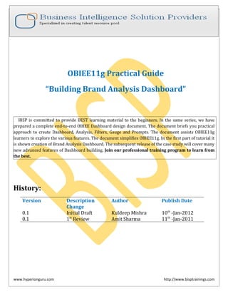
1. OBIEE11g Practical Guide
“Building Brand Analysis Dashboard”
BISP is committed to provide BEST learning material to the beginners. In the same series, we have
prepared a complete end-to-end OBIEE Dashboard design document. The document briefs you practical
approach to create Dashboard, Analysis, Filters, Gauge and Prompts. The document assists OBIEE11g
learners to explore the various features. The document simplifies OBIEE11g. In the first part of tutorial it
is shown creation of Brand Analysis Dashboard. The subsequent release of the case study will cover many
new advanced features of Dashboard building. Join our professional training program to learn from
the best.
History:
Version Description Author Publish Date
Change
0.1 Initial Draft Kuldeep Mishra 10th -Jan-2012
0.1 1st Review Amit Sharma 11th -Jan-2011
www.hyperionguru.com http://www.bisptrainings.com
2. Purpose
This tutorial covers steps to create OBIEE11g Dashboard, Dashboard Prompts, Filters, Analysis, Charts and
Pivots. Finally it shows how to integrate them into a single unit.
Time to Complete
Approximately 120 min.
Overview
OBIEE11g provides rich functionalities to create Dashboard and Users requests in multiple formats i.e chart ,
tabular, pivots, filters etc.
• Dashboard: Single user interface to show the complete company stats in common windows.
• Analysis — Business Users makes adhoc queries to satisfy various business questions by simply drag
and drop the objects.
• Filters/Dashboard Prompts— Enable users to filter the records. It could be based on user inputs.
• Pivot: Cross Tabular layout of the information.
• Chart: Graphical view of the business data.
• Gauge: An alternate way to display info where we need to project data Actual Vs Target.
Software and Hardware Requirements
The following is a list of software requirements:
• Oracle Database 11g
• OBIEE11g 11.1.1.5
www.hyperionguru.com http://www.bisptrainings.com
3. Table of Contents.
i) Year Dashboard Prompt 5
ii) Company Dashboard Prompt 11
iii) For Weeks Between Dashboard Prompt 12
iv) Product Hierarchy Dashboard Prompt 14
v) Product Line Analysis 22
vi) Trending Analysis 31
vii) Revenue by Months 43
viii) Daily Revenue Timeline 47
ix) Top Customers Booking 57
x) Performance index to Company Avg 66
xi) Creating Dashboard 80
www.hyperionguru.com http://www.bisptrainings.com
4. xii)
Creating Brand Analysis Dashboard
Requirement #1: As a part of our learning, we are going to create the below Dashboard. The
dashboard is divided into multiple objects (Analysis, Prompts, Chart and Pivots etc). We are
going to create below object in the specified order. This makes very easy for the learner to
create the dashboard.
1 8
2
5
3
9
4
6
10
7
www.hyperionguru.com http://www.bisptrainings.com
5. Requirements to create Brand Analysis Dashboard
Year Dashboard Prompt
Step 1):- Create a new dashboard prompt Year.
To create dashboard prompt login into Analytics and go to right pane ClickNew and
select dashboard prompt and select a Subject Area.
After selecting subject area Creating Dashboard Prompt window will display. The other
options are preview, add , open prompt for catalog , insert page break ,edit ,delete options.
Now, Click the button to add a new prompt ,There are three choices available.
Column Prompt:- Obtain list of values from a Subject Area column.
Variable Prompt:- Provide a custom list of values to populate a variable.
Image Prompt:- Allow the user to select values using an HTML
www.hyperionguru.com http://www.bisptrainings.com
6. Step 3):- Click the button and select Column Prompt then choose the Subject Area
column.
Step 4):- Now chosen the column New Prompt window will display. Below are the properties.
Label - Year (Label to display to user)
Operator - “is equal to/is in ” (Select from the drop down list)
www.hyperionguru.com http://www.bisptrainings.com
7. User Input - Check Boxes (Choose from the various types of prompt available )
Step 5):- In the Options dropdown, below are the properties can be set.
In Choice List Values, select
All Columns Values, alternatively you could select few members.
User can also select
i) Limit the values displayed based on the other prompt selections already chosen.
www.hyperionguru.com http://www.bisptrainings.com
8. ii) Enable /Disable multiple value selection.
iii) Enable user to type value or Force the user to select a value.
iv) Require user input.
In default selection , here we specify a default value and also we can specify a Value,
Variable , SQL Expression or Logical SQL.
vii) Assign the selection to a Session or presentation Variable.
In Check Boxes Values within the Options, select the Specific Column Values from the
drop down list and click on to select values.
After Click on , Select Values window will display..
www.hyperionguru.com http://www.bisptrainings.com
9. Select values which we want and click on move button. We see the selected values on
the right pane.
Click Ok..
Step 6):- Click on Require user input.
Step 7):- In Default Selection within the options Select Specific Values option from
the drop down list. Click on and select values from the select values windows.
Step 8):- Select Check Boxes Width Dynamic
Step 9):- Set a variable as None from the drop down list.
www.hyperionguru.com http://www.bisptrainings.com
10. Click Ok.
Step 10):- After Click on Ok. Year prompt which we created, is displayed in Prompt label
within Definition and Prompt result is display on Display pane
Company Dashboard Prompt
www.hyperionguru.com http://www.bisptrainings.com
11. Step 11) :- Similarly add other prompts which is used in dashboard reports.
Click the button to add a new prompt and select Column Prompt .
then choose the Subject Area column.
Select column from subject area and Click Ok.
After Click on Ok. New Prompt window will display and set it is all properties.
www.hyperionguru.com http://www.bisptrainings.com
12. For Weeks Between Dashboard Prompt
Step 11):-Similarly add another dashboard prompt.
Click the button to add a new prompt and select Column Prompt .
Then choose the Subject Area column.
Select column from subject area and Click Ok.
After Clicking on Ok. New Prompt window will display and set all properties.
www.hyperionguru.com http://www.bisptrainings.com
13. In this Prompt we set the Operator “is between” and User Input Slider (To show the
limits in slider) .
In Slider Values within Options we select Specific Limits from the drop down list .
Specify Lower Limit and Upper Limit. Check Require User Input and also Check Compress
Values.
Select Specific Values from the Default Selection drop down list. Select default low value
and default high value from drop down list.
SelectVertical radio button of Slider orientation to see the slider as vertical.
Select Slider SizeSmall and Set a VariableNone from drop down list.
Click Ok
Product Hierarchy Dashboard Prompt
Step 12):-Similarly add another dashboard prompt.
www.hyperionguru.com http://www.bisptrainings.com
14. Click the button to add a new prompt and select Column Prompt .
Select column from subject area and Click Ok. New Prompt window will display and set all
properties.
Here we set the properties .User InputChoice List from the dropdown list.
www.hyperionguru.com http://www.bisptrainings.com
15. Select All Column Values from Choice List Values ropdown list within the Options.
Check Enable user to select multiple values.
Select Default Selection None from dropdown list.
Select Choice List WidthDynamic.
Step 13):-The prompts will, by default , be listed vertically. If you wish them to appear
side- by- side then check the New Column option.
If you wish them to appear side- by- side then check the New Column option.
www.hyperionguru.com http://www.bisptrainings.com
16. Step 14):-Save and Preview. When we click on preview we get the result as below.
Click on Save .
www.hyperionguru.com http://www.bisptrainings.com
17. Click Ok.
Step 15):-Now, To create a Filter
i) Click on NewAnalysis then chose subject area from Select Subject Area pane.
ii) Select tables column from left side Subject Area pane within Criteria.
www.hyperionguru.com http://www.bisptrainings.com
18. iii) ClickFilter and SelectMore Column options ,.
iv)After selected “More Columns” option , Select Columns window will display.
Click Ok.
www.hyperionguru.com http://www.bisptrainings.com
19. v) After click ok New Filter window will display, Here we select Operator is
prompted from dropdown list.
Click Ok.
vi) After click ok we see the filter in criteria tab.
vii) Similarly we make other filters.
www.hyperionguru.com http://www.bisptrainings.com
20. viii) Now, go to result tab.
ix) In result ClickFilter in View pane.
www.hyperionguru.com http://www.bisptrainings.com
21. x) Drag the Filter from View pane to Title.
www.hyperionguru.com http://www.bisptrainings.com
22. xi) ClickSave, to save the report. We save the report in Sample Reports Folders the
within the Shared Folders.
Step 17):- Now, we create the first report of Brand Analysis dashboard called as
Product Line Analysis.
i)Click on NewAnalysis then chose subject area from Select Subject Area.
ii)Select tables column from left side Subject Area pane within Criteria.
iii) Make a filter on Year column of Time table.
www.hyperionguru.com http://www.bisptrainings.com
23. After ClickFilter , New Filter window will display. Select Operator is prompted.
ClickOk.
iv)ClickCreate a filter for the current Subject Area and SelectMore Columns option.
www.hyperionguru.com http://www.bisptrainings.com
24. v)After selected more columns option Select Columns window will display.
Click Ok.
vi)New Filter window will display, Here we select Operator is prompted from
dropdown list.
www.hyperionguru.com http://www.bisptrainings.com
25. Click Ok.
v) Select the Column Properties of Year column.
vi) Set the properties as we desire.
www.hyperionguru.com http://www.bisptrainings.com
26. vii) Go to interaction tab of column properties. Primary InteractionSend Master Detail Event
from dropdown list. Specify channelMD1.
Click Ok.
www.hyperionguru.com http://www.bisptrainings.com
27. viii)Now select the result tab to see the result of report.
Select Pivot Table option from the New View property.
ix)The result in pivot table is display below.
x)Click Edit View option on the pivot table then Edit View window will display.
Here we have Layout and Selection Steps sections. In Layout we have Rows, Columns,
Measures and Exclude option. Set the properties then ClickDone.
www.hyperionguru.com http://www.bisptrainings.com
28. xi)Here we set the properties like we ExcludeMeasure Labels from Columns within
Layout ,MeasuresBase Facts(Revenue) , ColumnsTime(T05 per name year) ,
RowsProducts(Products Hierarchy).Select as after.
www.hyperionguru.com http://www.bisptrainings.com
29. xii) To hide column heading Click Row properties. Uncheck Display Heading option
and click ok.
After uncheck display heading option we get the result as.
xiii)ClickEdit View of title.
After click on edit view the title edit view window will display.
www.hyperionguru.com http://www.bisptrainings.com
30. Here in title we show the report title ,we can attach a logo in logo box also give the
subtitle in subtitle box and we can display date , time , date and time from Started time
from dropdown list and Click done.
xvi)ClickSave , to save the report.
www.hyperionguru.com http://www.bisptrainings.com
31. We save the report in Sample Reports Folders the within the Shared Folders.
Step 15):- Now, we create the second report of Brand Analysis dashboard called as
Trending Analysis.
i)Similarly, as the first report , for creating a new report click on NewAnalysis and
Select Subject Area from subject area pane.
ii)Select tables column from left side Subject Area pane within Criteria.
www.hyperionguru.com http://www.bisptrainings.com
32. iii) Make a filter on Year column of Time table.
iv) After ClickFilter , New Filter window will display. Select Operator is prompted.
ClickOk.
v)We make another filter. ClickFilter and select More options.
www.hyperionguru.com http://www.bisptrainings.com
33. vi)Select the column from the Select Column window.
Click Ok.
vii)After Click Ok. Select Operatoris prompted.
www.hyperionguru.com http://www.bisptrainings.com
34. Click Ok.
viii) Filters are shown in
viii) Similarly, Create all the necessary filters
www.hyperionguru.com http://www.bisptrainings.com
35. ix) Go to the result tab and select the result tab.
xiii) Go to New ViewGraphDefault(Vertical)
xi) Graph is shown in
www.hyperionguru.com http://www.bisptrainings.com
36. xii)ClickEdit View of graph. Then the edit view window will display.
Set all the properties as we desire.
www.hyperionguru.com http://www.bisptrainings.com
37. In Layout within Edit View. We Exclude C0 Customer Number Column SectionT05 Per
Name Year , MeasuresRevenue, Bars(Group by(Horizontal Axis))T32 Cal Month , Vary
Color By(Vertical Axis0P4 Brands ,Measure Labels(Check the Show in Legend).
To show the graph in slider Check the check box of Display as Slider.
Set all properties and Click Done.
xiii)After click done we get the graph as shown below..
www.hyperionguru.com http://www.bisptrainings.com
38. xiv) Now ClickEdit Graph Properties.
a) After click on edit graph properties Graph properties window will appear. In this
window we find General, Style, Scale, Titles and Labels. In general tab here we set the
properties like Canvas Width, Canvas Height , Legend Location, Zoom and Scroll, Listen
to Master-Detail Events , Event Channels ,CheckAnimated graph on display.
b) Now, go to style tab and set it’s properties. In style tab select StyleRectangle from
dropdown list. Set the properties of Graph data, Plot Area , Legend, Canvas colors and
Borders.
www.hyperionguru.com http://www.bisptrainings.com
39. Click Style and Conditional Formatting .
To add Custom Formatted Positions Click and select color from dropdown list and
Click Ok.
c) Now, ClickScale tab, Set properties of Scale Limits , Scale Type and Tick Marks .
Click Ok.
d) ClickTitles and Labels tab, Set the properties of Graph Title, Axis titles and Labels.
www.hyperionguru.com http://www.bisptrainings.com
40. Click on Vertical Axis Labels then Vertical Axis Labels window will display.
Scale LabelDefault (Show), Label Orientation0 degree, Abbreviatethousands(k).
ClickFont Format, Set Size9
ClickOk.
www.hyperionguru.com http://www.bisptrainings.com
41. Click Ok.
xvi) After Set all properties we see the result.
In title ClickEdit View and set properties as we done previously.
xv)Now Click New View and select GraphPie.
www.hyperionguru.com http://www.bisptrainings.com
42. After select Pie the result is shown like
Revenue by Months
Click Edit View option of graph. Then the edit view window will display.
Set all the properties of edit view .In Layout Pane Pie Graph Measures(Slice Size)
Revenue, Pies and Slice(Pies)T05 Per Name Year , Pies and Slice(Slices)P4 Brand
www.hyperionguru.com http://www.bisptrainings.com
43. and Measure labels.(Check Slice In Legend), ExcludeT32 Cal Month and C0 Customer
Number.
After set all properties of edit view. Click-Edit Graph properties
After Click on Edit Graph Properties ,Graph properties window will display.
Set Canvas width420 and canvas height230 , Legend LocationDefault(Right) from
dropdown list, Uncheck Listen to Master Detail Event and Animated graph on Display.
www.hyperionguru.com http://www.bisptrainings.com
44. ClickOk.
Now , go to Style tab ,In Graph Data StyleDefault from dropdown list, Set all the
properties like Legend, Canvas Color and Borders.
Click Style and conditional Formatting. The Style and Conditional Formatting windows
will display. Click to add Custom Formatted Position, Select color from color
dropdown list. Check all the check boxes in explode wedge .
Click Ok.
Now go to Titles and Labels tab. Here we set the Graph Title and Labels.
www.hyperionguru.com http://www.bisptrainings.com
45. Click Data Labels, Data Label window display. In Display Option tab properties Show
Data labelsAlways from dropdown list, DisplayValue only , ValuePercentage of
total.
Select Font Format and set all it’s properties.
Click Ok.
www.hyperionguru.com http://www.bisptrainings.com
46. Click-Done.
Now save the report in Sample Reports Folder within the Shared Folders as Trending
Analysis as previous.
Daily Revenue Timeline.
Step 16):- Now, we create the third report of dashboard called as Daily Revenue
Timeline.
i)Similarly, as the first report , for creating a new report click on NewAnalysis and
Select Subject Area from subject area pane.
ii)Select tables column from left side Subject Area pane within Criteria.
iii) Click on edit formula in Calender Date column of Time table.
www.hyperionguru.com http://www.bisptrainings.com
47. Edit Column Formula window will display. Here we can change the Column Heading,
create formula ,create filter use column , use variables.
Click ok.
iv) Click on edit formula in 4-Paid Amount column of Base Facts.
Edit Column Formula window will display. Here we can change the Column Heading,
create formula ,create filter use column , use variables.
www.hyperionguru.com http://www.bisptrainings.com
49. vii) After selected graph , graph is display like below image.
ClickEdit View
After Click on Edit View the Edit View window will display.
www.hyperionguru.com http://www.bisptrainings.com
50. viii)Now , Click on Edit Graph properties.
a.)After Click on Edit Graph properties , Graph properties window will display.
In general tab set the properties like Canvas Width450 ,Canvas Height280 , Legend
LocationTop, Zoom and Scroll , Animated graph on displayCheck.
b.)Now go to Style tab, StyleCurved Line select from dropdown list , Set Plot Area ,
Legend ,Canvas Color and Brokers.
www.hyperionguru.com http://www.bisptrainings.com
51. ClickStyle and Conditional Formatting .To add Custom Formatted Positions Click
on , Set color from dropdown list, set type as default ,set width in pixel.Set all
properties then click ok.
c.)Now, go to Scale tab . In this property set Axis LimitD4efault(Dynamic), Tick
typeSpecify, Check Show Major Ticks4, Check Show Minor Ticks5.
www.hyperionguru.com http://www.bisptrainings.com
52. Click ok.
d.)Now , go to Titles and Labels , set Graph Titles , Axis Titles ,labels properties .
www.hyperionguru.com http://www.bisptrainings.com
53. ClickVertical Axis Labels, After Click on Vertical Axis Labels window display. Select
Scale LabelsDefault(Show) , Label Orientation0 degree, AbbreviateThousands(k).
After set the properties of Display option tab go to Font format tab and set Size10.
Click Ok.
www.hyperionguru.com http://www.bisptrainings.com
54. Click Ok.
ix)After set all the properties
Click Done to save all property.
x) Click Edit View on title , then title edit view window will display. Set title in
title box ,display time and date from started time from dropdown list.
Click Done.
xi) After click done, we see the result. Here we see the title of report.
www.hyperionguru.com http://www.bisptrainings.com
55. xii)Now save the report in Sample Reports Folder within the Shared Folders as Daily
Revenue Timeline.
Top Customers Booking
Step 17):- Now, we create the Fourth report of dashboard called as Top Customers
Booking.
i)Similarly, as the first report , for creating a new report click on NewAnalysis and
Select Subject Area from subject area pane.
ii)Select tables column from left side Subject Area pane within Criteria.
iii)Go to 8-Booked Amount column of Base Facts table and SelectEdit Formula change
the column name from 8-Booked Amount to Rank and also put the rank function on it
www.hyperionguru.com http://www.bisptrainings.com
56. Change the column heading from 8-Booked Amount to Rank.
Click on Function in Edit Column Formula.
After click on function Insert Function window will display. Here we see syntax ,example,
description.
www.hyperionguru.com http://www.bisptrainings.com
57. Click Ok.
After click ok
iv) Click on Rank column SelectSortSort Ascending .
www.hyperionguru.com http://www.bisptrainings.com
58. Now see column in which we make sort ascending operation.
v) Go to 8-Booked Amount column of Base Facts table and SelectEdit Formula to put
the rank function on it.
The Edit Formula window will display. Here click on function.
Insert Function window will display. SelectRound function.
www.hyperionguru.com http://www.bisptrainings.com
59. Click Ok.
After click ok we see the function and click Ok.
vi)Now we make filter as previous we done ClickFilter and SelectMore Options.
www.hyperionguru.com http://www.bisptrainings.com
60. vii) Select the column from the Select Column window.
Click Ok.
viii)After Click Ok. Select Operatoris prompted from drop down list.
www.hyperionguru.com http://www.bisptrainings.com
61. Click Ok.
ix)After click ok on New Filter we see the filter in filter pane within criteria.
x) Click on result tab and see the result.
www.hyperionguru.com http://www.bisptrainings.com
62. xi) Click on Edit View of title. The title window will display, set the properties of
title like Title, Started Time ,Logo, subtitle.
Click done to save properties.
xii)After save the properties of title. We see it in below image.
xiii)ClickNew View and SelectOther ViewTicker.
www.hyperionguru.com http://www.bisptrainings.com
63. xiv) After selected ticker .
xv) Click on Edit View property of Ticker. Check the check box of Contains
HTML Markup ,BehaviorScroll, DirectionUp, Width420 ,Height130, Row Format ,
Row Separator<br/>.
www.hyperionguru.com http://www.bisptrainings.com
64. Click Done to save the properties.
xvi) Now go to result and see the result.
Now save the report in Sample Reports Folder within the Shared Folders as Top
Customer Bookings .
Performance index to Company Avg.
Step 18):- Now, we create the third report of dashboard called as Performance index to
Company Avg.
i)Similarly, as the previous reports, for creating a new report click on NewAnalysis
and Select Subject Area from subject area pane.
www.hyperionguru.com http://www.bisptrainings.com
65. ii)Select tables column from left side Subject Area pane within Criteria tab.
iii)Now, Set filter in first column T05-Per Name Year.
After selected filter option Edit Filter window will display Select OperatorIs
prompted.
Click Ok.
iv)After Click on ok we go to criteria tab and see the filter.
www.hyperionguru.com http://www.bisptrainings.com
66. v)Now, We make another filter go to filter and select More Option.
vi)Select the column from the Select Column window .
Click Ok.
www.hyperionguru.com http://www.bisptrainings.com
67. vii)After click ok the New Filter window will display here select Operator is
prompted from drop down list.
Click Ok.
viii)After click ok we see the filter in filter pane within criteria tab.
ix) Similarly, we make other filters on report.
www.hyperionguru.com http://www.bisptrainings.com
68. x) Go to Base Facts table column 1-Revenue and SelectEdit Formula , change the
column name from 1-Revenue to Performance index to total and also put the cast
function on it .
The Edit Formula window will display. Here we change the column heading from 1-
Revenue to Performance index to total click on function.
www.hyperionguru.com http://www.bisptrainings.com
69. xi)After click on function , Insert Function window will display.
Here we see the Syntax of function.
www.hyperionguru.com http://www.bisptrainings.com
70. xii)After selected function
Click Ok.
xiii)Now, ClickResult.
xiv)ClickNew View and Select GaugeVertical Bar.
www.hyperionguru.com http://www.bisptrainings.com
71. xv)Vertical Gauge View display ClickEdit View
xvi)After Click on Edit View window will display. Here we see the properties like
Gauge Prompts ,Sections ,Gauge , Exclude within layout, Gauge set within settings.
www.hyperionguru.com http://www.bisptrainings.com
72. xvii)CheckDisplay as Slider, In SectionT05 Per Name Year(Time), RowsP4
Brand(Products) ,MeasuresPerformance index to total .
xviii)Now in settings property Select High values are desirable, Click to add new
threshold, Click and SelectCustom value to write in box.
www.hyperionguru.com http://www.bisptrainings.com
73. Write values on threshold ,Click and SelectSpecify Label in status.
Write values on Threshold and Status boxes.
Select the color by click on color box.
www.hyperionguru.com http://www.bisptrainings.com
74. Click Ok.
Select color from Color Selector according to report .
xix) In Edit View , ClickEdit graph property.
a)After click on edit graph property the graph property window will display. In general
tab Gauge per row3, Legend LocationDefault(Top),UncheckListen to Master Detail
Event.
www.hyperionguru.com http://www.bisptrainings.com
75. b)Click on Style tab and set properties Gauge sizeFit to canvas from dropdown list,
Width120px ,Height140px, CheckGradient.
c)Click on Scale tab Set properties Gauge LimitsDefault ,Tick typeDynamic.
www.hyperionguru.com http://www.bisptrainings.com
76. d)Click on Titles and Labels and set Gauge set title click and
TruncateAutomatic.
After click on footer Font Format window will display and TruncateAutomatic.
www.hyperionguru.com http://www.bisptrainings.com
77. Click Ok.
xx) Now go to result tab.
xxi) ClickNew View and SelectOther ViewStatic Text .
xxii)S tatic Text window will display. Here ChcekContain HTML Markup and write
Report Name which we want to show in static text and ClickBold.
www.hyperionguru.com http://www.bisptrainings.com
78. After set properties ClickDone.
xxiii) Now go to result tab .
xiv) Now save the report in Sample Reports Folder within the Shared Folders as
Performance index to Company Avg..
Creating Dashboard
Step 19): -Now we create a dashboard.
i)First create a New folder in Shared Folder named as Practice Dashboard.
www.hyperionguru.com http://www.bisptrainings.com
79. Click ok.
ii) Go to home page and SelectDashboard from Analysis and Interactive Reporting.
iii) New Dashboard window will display. Here write Name Sample Dashboard and give
its Location/Shared Folder/Practice Dashboard., ContentAdd content now.
Click Ok.
iv)now we go to the Sample Dashboard page1.Here we see Dashboard Objects like
Column, Section, Alert Section, Action Link, Action Link Menu, Link or Image, Embedded
Content, Text, Folder, and catalog we see only Shared Folder that’s why we save our all
reports within the Shared folder.
www.hyperionguru.com http://www.bisptrainings.com
80. v)Now first drag Column Object from left pane to right pane. Within Column Object
we drag Section Object from left pane to right pane and within Section Object we drag
our reports from Shared Folder which is in left pane to right pane. We see in below
image.
vi)Here we see in which order we put our report.
www.hyperionguru.com http://www.bisptrainings.com
81. vii) Here , We see the properties of dashboard. Here we see dashboard properties option
,when we click on dashboard properties option we see other properties in it like
Dashboard Properties, Pdf and Print Properties, Page report Links, Allow saving personal
customization, publish page to dashboard.
Other properties like we can add New Page ,Delete Page, Preview , Run and save.
viii) When we click on dashboard properties. The dashboard properties window will
display. Here we can set style from dropdown list.
www.hyperionguru.com http://www.bisptrainings.com
82. We can Edit Filters and variables, Edit Dashboard report Links,In dashboard page we
can rename ,delete ,page up and down. Hide Page and Show add to Briefing Book
options.
ix)Here we rename the page as Brand Analysis.
Click Ok.
x)Here we see the dashboard page name in page column.
www.hyperionguru.com http://www.bisptrainings.com
83. Click Ok.
xi)Now ClickSave and then ClickRun to see the result of dashboard.
www.hyperionguru.com http://www.bisptrainings.com