Download to read offline


![Media Queries Best Practices
• Don’t target devices, add breakpoints when the design breaks.
• When creating your breakpoints, consider moving away from pixels.
Use the em unit instead.
[ ref 1 - “…the only unit that performed consistently across all 4 browsers
is em…” ]
[ ref 2 - “…it’s best to be safe and use em breakpoints in your media queries…” ]
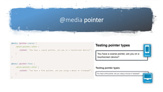
• Media Queries Level 4:
Detecting pointer type rather than screen size.](https://image.slidesharecdn.com/newcsswaystocontrollayout-201021140822/85/New-CSS-ways-to-control-layout-13-320.jpg)
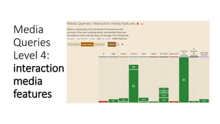


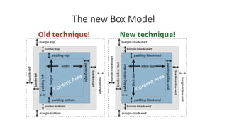
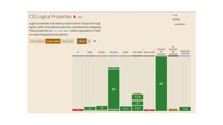
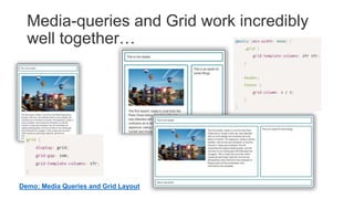
The document discusses new CSS techniques for controlling layout, including logical properties for right-to-left and left-to-right languages, and best practices for using media queries. Logical properties allow using direction-agnostic names like "inline-start" instead of "left" or "right". Media queries work well with CSS Grid for responsive design. It recommends using em units over pixels for breakpoints, and that media queries can detect interaction like pointer type instead of just screen size with new Level 4 features.


![Getting Started with Apache Spark: Big Data Made Simple [Free Meetup]](https://cdn.slidesharecdn.com/ss_thumbnails/apachesparkgettingstarted-260203175547-8361bcc3-thumbnail.jpg?width=640&height=640&fit=bounds)
