MongoDB & Big Data
Analytics
What is MongoDB?
 MongoDB was first developed in 2007 by a company
called 10gen, which later change its name to MongoDB.
It was officially released to the public in 2009.
 MongoDB is a NoSQL database that stores data in
flexible, JSON-like documents.
 The goal was to create a modern database that could
handle the growing needs of web application.
 Especially those that needed to store large amounts of
unstructured or semi-structured data.
Key Features of MongoDB
 Document-Oriented: Stores data as collections of
documents.
 Flexible Schema: No need to predefine the structure
of the data.
 High Performance: Fast read/write operations.
 Scalable: Easily grows with big data.
 Powerful Query Language: Allows filtering,
aggregation, and full-text search.
MongoDB in Big Data Analytics
 Used to manage and analyze large datasets in real
time.
 Works well with data from sensors, logs, social
media, etc.
 Integrates with data visualization tools like MongoDB
Charts.
 Supports aggregation pipelines to process and
summarize data.
Dataset Overview
Dataset Name: KE April 2025 Data of SITE industrial
feeders (KE Outages)
Description:
This dataset contains information about power outages
from different feeders of SITE area. It includes:
 Outage types (like Feeder Trip, Incoming Trip, Load
Management)
 Fault types (Shutdown, Fault, Operational, etc.)
 Dates and counts of outages
MongoDB Chart Visualization
What You See in the Dashboard:
 Total Outages: Shows total number of outage events.
 Outages Categories: Bar chart showing types of
outages.
 Fault Categories: Pie chart showing cause of outages.
 Outages Trend: Line graph showing outages over
time.
 Feeder Wise Outages: Feeder-wise bar chart of
outages.
Explanation of Charts
 Bar Chart: Most outages are due to “Feeder Trip.”
 Pie Chart: Most faults are due to general “Fault”
category.
 Trend Line: Shows a steady increase in outages over
days in April 2025.
 Feeder Chart: Identifies top feeders experiencing
frequent outages.
Benefits of Using MongoDB
 Handles high-volume, fast-changing data
 Easy integration with analytics tools
 Reduces development time with flexible schema
 Scalable and fault-tolerant
Summary
 MongoDB is a powerful, flexible tool for managing
big data.
 Using MongoDB Charts, we can quickly build
interactive visualizations.
 It's a great choice for real-time analytics in industries
like energy, healthcare, IoT, and more.
Thank You
 Any Questions?

MongoDB and Big data Analytics Simple.pptx

  • 1.
    MongoDB & BigData Analytics
  • 2.
    What is MongoDB? MongoDB was first developed in 2007 by a company called 10gen, which later change its name to MongoDB. It was officially released to the public in 2009.  MongoDB is a NoSQL database that stores data in flexible, JSON-like documents.  The goal was to create a modern database that could handle the growing needs of web application.  Especially those that needed to store large amounts of unstructured or semi-structured data.
  • 3.
    Key Features ofMongoDB  Document-Oriented: Stores data as collections of documents.  Flexible Schema: No need to predefine the structure of the data.  High Performance: Fast read/write operations.  Scalable: Easily grows with big data.  Powerful Query Language: Allows filtering, aggregation, and full-text search.
  • 4.
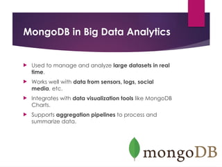
    MongoDB in BigData Analytics  Used to manage and analyze large datasets in real time.  Works well with data from sensors, logs, social media, etc.  Integrates with data visualization tools like MongoDB Charts.  Supports aggregation pipelines to process and summarize data.
  • 5.
    Dataset Overview Dataset Name:KE April 2025 Data of SITE industrial feeders (KE Outages) Description: This dataset contains information about power outages from different feeders of SITE area. It includes:  Outage types (like Feeder Trip, Incoming Trip, Load Management)  Fault types (Shutdown, Fault, Operational, etc.)  Dates and counts of outages
  • 6.
  • 7.
    MongoDB Chart Visualization WhatYou See in the Dashboard:  Total Outages: Shows total number of outage events.  Outages Categories: Bar chart showing types of outages.  Fault Categories: Pie chart showing cause of outages.  Outages Trend: Line graph showing outages over time.  Feeder Wise Outages: Feeder-wise bar chart of outages.
  • 8.
    Explanation of Charts Bar Chart: Most outages are due to “Feeder Trip.”  Pie Chart: Most faults are due to general “Fault” category.  Trend Line: Shows a steady increase in outages over days in April 2025.  Feeder Chart: Identifies top feeders experiencing frequent outages.
  • 9.
    Benefits of UsingMongoDB  Handles high-volume, fast-changing data  Easy integration with analytics tools  Reduces development time with flexible schema  Scalable and fault-tolerant
  • 10.
    Summary  MongoDB isa powerful, flexible tool for managing big data.  Using MongoDB Charts, we can quickly build interactive visualizations.  It's a great choice for real-time analytics in industries like energy, healthcare, IoT, and more.
  • 11.