This document discusses how to conduct usability studies on mobile devices. It provides tips for testing mobile websites and apps through usability research and eyetracking. Case studies are presented on testing the usability of a mobile website for C1000 and a TV Guide app for Ziggo on iPad. Key findings from the studies identified issues with clickable menus, button placement, and lack of titles. General tips provided include considering the user context, limiting clicks per page, and keeping mobile designs simple.
In November 2012 Raising Accessibility conducted a low vision usability study for a new iPhone app with users who experience low vision. Raising Accessibility’s purpose was to test assumptions about usage of Apple devices and identify essential futures that all developers should consider when designing apps.
This presentation outlines five takeaways from our low vision usability study. It details recommendations for mobile developers looking to create barrier free apps.
Mobile App Design and Development Best Practices for Senior Demographics and ...Sean Power
Updating the same presentation made at PodCampTO 2013, this slideshow discusses why your smartphone app needs to be accessible to meet the needs of older demographics and international markets. These markets drive smartphone market growth and will be the segments from which your app's newest users come.
Going Mobile First: a future-friendly approach to digital product designEzekiel Binion
A 2015 presentation delivered as part of Table XI's breakfast series. This talk shares how mobile platform usage has evolved since the 2009 release of "Mobile First" by Luke Wroblewski and shares some practical tips on how to decide if a native or web application is the right decision for your product.
Users are reaching for mobile devices numerous times every day specifically to use mobile apps. The power and
freedom of connected mobile computing continues to raise expectations but users have little patience for problematic
apps. Mobile device users heavily rely on peer reviews and star ratings to help them choose their apps. Once a
mobile app is installed, that app is judged for its speed, responsiveness and stability which define the user experience
and overall satisfaction. Yet this study finds that users are experiencing app issues regularly. Critically, this report
reveals that apps that exhibit issues are quickly abandoned after just a couple of occurrences.
For a company who creates mobile apps, while good performance can lead to satisfied user and app downloads,
poor performance will result in quick app abandonment. The findings indicate that the key to loyal customers from
mobile apps is directly related to the mobile app performance, stability and resource consumption. Metrics defining
the mobile app user experience must be measured from the customer’s perspective and ensure it meets or exceeds
expectations at all times. The consequence of failing to meet user expectations is not only app abandonment – it also
leads to a tarnished brand with lost revenue opportunities from both current and future users.
Mobile and Facebook apps developer's slides from a recent talk at the Online Marketing Show 2011. First couple of slides are promoting the agency and include examples of work. Thereafter are some revealing answers about what it takes to get an app built, including the average global cost of an app, lead time and useful tips on what to consider when commissioning an app for iPhone, Android, Facebook and other platforms.
Are Websites Optimized for Mobile Devices and Smart TVs ?Manos Perakakis
Full text: http://bit.do/optimizedwebtv
The purpose of this study is to evaluate the adaptation of some of the world’s most popular websites to the “post-pc era” of using multiple devices for accessing the web. Up till recently the PC used to be the only device used for accessing the WWW. This has changed dramatically over the past few years with the introduction of many powerful Internet-connected devices such as Smart Phones, Tablets and Smart TVs. Due to the many differences between these devices in terms of screen size,
hardware power, input methods etc. in most cases a PC-optimized website is not optimally viewed in these devices,
resulting in poor usability and User Experience. In this survey 49
of the world’s most visited websites, according to Alexa.com, are
being examined to see if they offer optimized versions for
Internet-connected mobile devices and Smart TVs. Results show
wide support for mobile devices in contrast to very limited
support for Smart TVs.
Mobile Application Design & DevelopmentRonnie Liew
The mobile landscape is incredibly fragmented with a huge pool of devices and operating systems. This presentation shares tips and guidelines on how to navigate this maze and help design/develop better mobile applications.
13 Things To Keep In Mind For Enhanced Mobile App UI/UX Design BugRaptors
85% of adults think that a mobile site should be better than the desktop version, while Marketing Charts found that 46.7% of consumers will tell others about a bad experience.
Even though most mobile app development companies, developers, and even mobile app testing services know the aforementioned points of UI significance, they often end up missing very minute details that can affect product performance in the market.
Development must be followed by testing ( mobile as well as usability); learn more about tools and technologies to implement to deliver seamless mobile application functionality here https://www.bugraptors.com/usability-testing-services.php
SMARCOS Abstract Paper submitted to ICCHP 2012Smarcos Eu
This study is part of the European project "Smarcos" (http://www.smarcos-project.eu/) that includes among its goals the development of services which are specifically designed and accessible for blind users.
In this paper we present the prototype application designed to make the main phone features available in a way which is accessible for a blind user. The prototype has been developed to firstly evaluate the interaction modalities based on gestures, audio and vibro-tactile feedback.
Key Lime Interactive's Principal Researcher/Director, Andrew Schall, and Facebook User Researcher, Jennifer Romano Bergstrom, take a deep dive into eye tracking the mobile user experience. View the slides from the webinar.
In our digital world, customer experiences are delivered primarily through the mobile. There are several compelling reasons why businesses should utilize this opportunity to build their brand.
There's Only One Screen: How to Plan for Users Not DevicesAnna Hrach
Responsive design has quickly become a catch-all response to solving brands’ mobile challenges and addressing users’ needs. But are we unknowingly setting ourselves up to repeat history with style-over-substance-websites? See how ethology’s content strategy directors, Anna Hrach and Sarah Krznarich, discuss how we can stop looking at users based on their device and instead adopt a holistic content strategy to create one consistent experience.
Communication Design for the Mobile ExperienceDavid Drucker
Presented to the Vancouver Chapter of the Society for Technical Communication at their May 2011 meeting. This is a discussion of issues, and strategies for creating usable, navigable, relevant content for mobile computing devices like smartphones. Included many examples and a case study.
A Perspective from the intersection Data Science, Mobility, and Mobile DevicesYael Garten
Invited talk at Stanford CSEE392I (Seminar on Trends in Computing and Communications) April 24, 2014.
Covered three topics: (1) Data science at LinkedIn. (2) Mobile data science — how is it different, challenges and opportunities. Examples of how data science impacts business and product decisions. (3) Mobile today, and LinkedIn's mobile story.
Increasing use of the mobile phone over a desktop is in the trend over the past few years. People have shifted their focus on building mobile apps as they help to engage more people. In today’s highly competitive environment, the company that focuses on engaging customers survives.
The work of building an app from scratch requires expertise and it is needed to ensure that the work is carried out by the help of a team of experts. You can make it yourself if you are good at it and the other way is to outsource it by giving the work to a mobile app developer or a company that does it.
Optimizing Mobile UX Design Webinar Presentation SlidesUserZoom
Optimizing Mobile UX Design: Webinar on Mobile User Experience Research Methods & Tools
Most businesses are investing in mobile apps and mobile commerce. Recently, more emphasis has been placed on the interactive experiences users have on mobile devices
To explain how to optimize the user experience on mobile interfaces, UserZoom will be joined by special guest User Centric in a complimentary webinar. The webinar will focus on how user experience research methods and tools can add extremely valuable insights into the design process and help brands optimize their mobile site or application’s performance. Attendees will hear presentations from the following experts:
Gavin Lew, Managing Director, User Centric
Gavin’s 20 years of experience in corporate and academic environments have given him a strong foundation in user-centered design and evaluation. In addition to managing User Centric, he holds particular expertise in mobile technology, among other interests. He is a frequent presenter at national conferences, adjunct faculty member at DePaul University and Northwestern University’s Feinberg School of Medicine, and the inventor of several patents.
Kim Oslob, UserZoom Director of Client Services
Kim has extensive experience with both qualitative and quantitative UX Research through her work at Claris (now Filemaker), Macromedia (now Adobe) and VistoCorp (now Good). She has managed projects with companies in the mobile space such as Vodafone, Nokia, Sprint, and Roger’s Wireless to improve the user experience of over 10 different mobile operating systems.
Google: How to Make Your Website Work Across DevicesMatt Brocklehurst
Understand the why and how of building websites that work across multiple devices e.g. mobile, tablet, desktop. This deck explains and compares Responsive Web Design, Dynamic Serving and Separate Sites including market stats, design tips and case studies
Mobile Convention Amsterdam - Sanoma Media - Roel Engel & Mark Wilmont
Mobile Convention Amsterdam - Netprofiler - Frans Appels
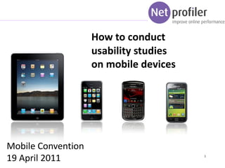
1. How to conduct
usability studies
on mobile devices
Mobile Convention
19 April 2011 1
2. Content
A. Usability research general
B. Usability research for mobile devices
C. Case 1: Mobile website C1000
D. Case 2: TV Guide app Ziggo
E. Tips
3. About Netprofiler and Frans Appels
• Frans Appels, director Netprofiler
• Founder of MobileMetrics.nl (together with aFrogLeap
and RapidSugar)
• Netprofiler: 15 consultants in The Netherlands
• Online marketing agency specialized in:
- Conversion and Usability
- Web analytics
- Search engine marketing:
• Partner off:
3
3
5. What is usability research
Testing the usability of a website or app.
Testing takes place with potential users of the website
Users are invited in an usability lab to interact with website
when conducting various tasks
Usability consultants and client are watching in another
room
6 or more users separetely
Main issues and problems of the site become clear
6. 2 ways of usability research
1. Usability research
– Kliks, facial expression and comments
2. Eyetracking usability research
– Eyemovements, facial expression and comments
Eyetracking usability research is a extended version in which the
eyemovements are registered. This gives more insights about
the structure of the pages and what is seen or not seen.
11. Internet gebruik mobile devices
• Een research done by MobileMetrics shows:
In October 2010 mobile devices generated
1,9% of the total traffic to normal websites
In March 2011 mobile devices generated
3,6% of the total traffic to normal websites
14. C. Usability research for mobile devices
1. Usability research
– Kliks, facial expression and comments
2. Eyetracking usability research
– Eyemovements, facial expression and comments
15. Usability research for mobiele site / app.
1. Show the screen of the mobile device on a big
normal monitor screen. The users looks on the
screen but navigates on his mobile devices.
2. It’s also possible to display the screen on a touch
screen monitor.
Not real world situation, other way of looking and
navigating
17. Usability research for a iPad
Eyetracking research for iPad?
Het screen of a ipad is much
bigger than the screen of a mobile
phone.
Therefore is is more usefull to
conduct a eyetracking research on
a iPad of tablet.
The users must be able to turn the
iPad during the test.
20. The research
On the homepage visitors first have to
select a location
The menus items “aanbiedingen” and
“acties” are already shown. But they
are not clickable because no location is
selected.
Advice is not to show these items as
visitors try to click on them.
21. The research
The button “plan route” as hard to see
for various visitors. The main focus is
om the map.
Advice: move to button “plan route’
closer to the map.
24. Research settings
TV Gids iPad app. Ziggo
6 tasks
8 users, experienced with iPad
25. The research
Their was no clear distiction
between the 2 parts at the
bottom of the site. Therefore
swyping went wrong for
various users.
Advice: make a clear line
between the 2 parts.
The upper part doesn’t have a
title or refercence. Users don’t
understand wat is selected
here.
Advice: make a title above the
the picture.
26. The research
During the research also bugs
in a application become clear.
The user has selected
tomorrow but the events of
today are shown. .
29. Tips & Tricks
What is the situation the users interact with the mobile site or app? At home, on
the move, in their office? This has a big influence on the information need.
What do you show when the users doesn’t have internet connection?
How do you use location and social context (who is around the user)
What is the speed of the internetconnection of the users?
30. Tips & Tricks
Use 1 call to action per page.
Clickable items at least 44 pixels away from other items
No flash.
Single column for mobile sites / apps.
From mail to correct landingpage in mobile website or normal website.
Contrast is very important because incoming light
No link to the normal website (or 1 that says: visit our normal website that isn’t
optimized for mobile visitors).
31. Tips and tricks
Visitors like to see where they are.
Visitor expect a reaction from the app. or website after an action.
Don’t hide items because there isn’t enough space.
Ask support of the future users in developing and testing. The earlier you know,
the easier it is to change.
Keep is simple (stupid)!