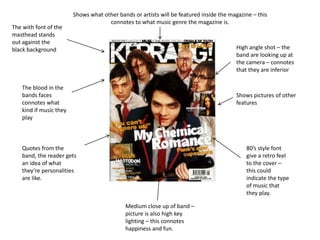
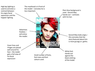
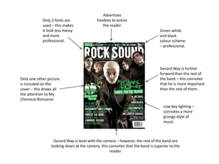
The blood in the
bands faces
connotes what
kind if music they
play
80’s style font
give a retro feel
to the cover –
this could
indicate the type
of music that
they play.
Shows what other bands or artists will be featured inside the magazine – this
connotes to what music genre the magazine is.
Quotes from the
band, the reader gets
an idea of what
they’re personalities
are like.
Shows pictures of other
features
High angle shot – the
band are looking up at
the camera – connotes
that they are inferior
The with font of the
masthead stands
out against the
black background
Medium close up of band –
picture is also high key
lighting – this connotes
happiness and fun.
The masthead is in front of
the model – connotes he is
less important.
White font
stands out
against the
black clothing
of the model
Advertises
freebies –
will entice
the reader.
Gerard Way looks angry –
this connotes that the
story featured about him
is more grungy or gothic.
Plain blue background is
used - Gerard Way
stands out – contrasts
with his hair.
Small number of fonts,
font sizes and font
colours used.
Cover lines and
images are placed
well around his
face – the reader
gets a full view of
his facial
expression
High key lighting is
used to connotes a
contrast between
his angry facial
expression and the
happier lighting.
Green white
and black
colour scheme
– professional.
Gerard Way is further
forward than the rest of
the band – this connotes
that he is more important
than the rest of them.
Only 2 fonts are
used – this makes
it look less messy
and more
professional.
Advertises
freebies to entice
the reader
Gerard Way is level with the camera – however, the rest of the band are
looking down at the camera, this connotes that the band is superior to the
reader.
Only one other picture
is included on the
cover – this draws all
the attention to My
Chemical Romance.
Low key lighting –
connotes a more
grungy style of
music

Media Powerpoint

  • 1.
    The blood inthe bands faces connotes what kind if music they play 80’s style font give a retro feel to the cover – this could indicate the type of music that they play. Shows what other bands or artists will be featured inside the magazine – this connotes to what music genre the magazine is. Quotes from the band, the reader gets an idea of what they’re personalities are like. Shows pictures of other features High angle shot – the band are looking up at the camera – connotes that they are inferior The with font of the masthead stands out against the black background Medium close up of band – picture is also high key lighting – this connotes happiness and fun.
  • 2.
    The masthead isin front of the model – connotes he is less important. White font stands out against the black clothing of the model Advertises freebies – will entice the reader. Gerard Way looks angry – this connotes that the story featured about him is more grungy or gothic. Plain blue background is used - Gerard Way stands out – contrasts with his hair. Small number of fonts, font sizes and font colours used. Cover lines and images are placed well around his face – the reader gets a full view of his facial expression High key lighting is used to connotes a contrast between his angry facial expression and the happier lighting.
  • 3.
    Green white and black colourscheme – professional. Gerard Way is further forward than the rest of the band – this connotes that he is more important than the rest of them. Only 2 fonts are used – this makes it look less messy and more professional. Advertises freebies to entice the reader Gerard Way is level with the camera – however, the rest of the band are looking down at the camera, this connotes that the band is superior to the reader. Only one other picture is included on the cover – this draws all the attention to My Chemical Romance. Low key lighting – connotes a more grungy style of music