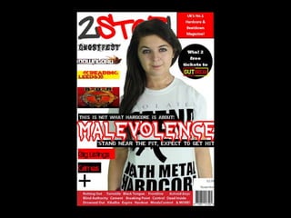
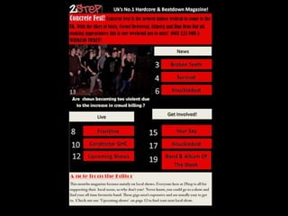
The document is a portfolio for a media studies course that includes the design and planning for a magazine focused on hardcore and beatdown music genres.
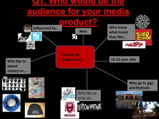
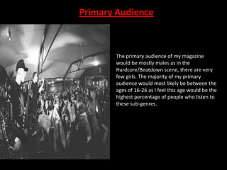
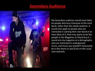
The summary analyzes the target audience as primarily males aged 16-26 interested in underground music scenes. Market research found a lack of magazines dedicated to these music subgenres. The portfolio also outlines plans for magazine content, identifying Bauer Media as a potential publisher due to their experience with music magazines.
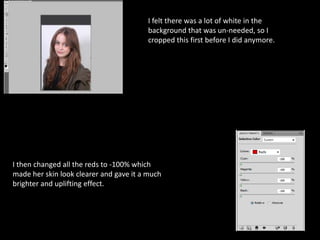
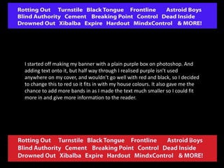
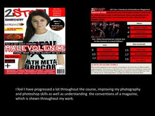
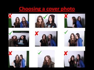
Technologies used included Photoshop for image editing, a digital SLR camera for photography, and publisher software. Lessons were learned about improving layouts and using house colors and styles to better represent the intended music audience.