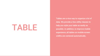
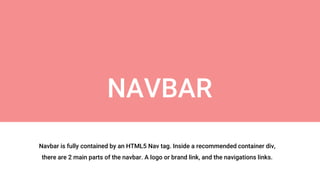
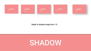
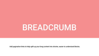
Based on Material Design
Prepared and Presented by : MRD
Materialize - CSS Framework
What we will Learn ?
โ— What and Why Materialize CSS
โ— Button, Waves & Pulse
โ— Floating Action Button
โ— Tabs
โ— Card
โ— Collections
โ— Icons
โ— Grid System
โ— Navbar
โ— Footer
โ— Carousel & Slider
โ— Parallax
โ— Dropdown
โ— Accordion
โ— Sidenav
โ— Modal
โ— Toast
โ— Tooltip
โ— Helper Classes
โ— Colors
โ— Table
โ— Media
โ— Shadow
โ— Breadcrumbs
โ— Badges
โ— Pagination
โ— Preloader
โ— Form
What and Why Materialize CSS
Material Design
Material Design is a visual language that
synthesizes the classic principles of good
design with the innovation of technology
and science.
MD is a design philosophy that inspired
by real materials and helps to create
smooth & interactive website.
Version : First version 0.100.2 Latest
version 1.0.0
Materialize
A modern responsive front-end
framework based on Material Design.
Version : First version 0.100.2 Latest
version 1.0.0
Button
Flat Button
Button without depth or elevation.
Mostly used inside other elements
which have depth
Raised Button
Button with some depth or elevation
or shadow. Looks good flat page.
Waves
Basic Class
.waves-effect
Color Class
.waves-light
.waves-red
.waves-yellow
.waves-orange
.waves-purple
.waves-green
.waves-teal
Waves is an external library that is included in
Materialize to create ink effect outlined in
Material Design and waves effect can be
applied to any element
Pulse
Basic Class
.pulse
Example
<a class="btn-floating pulse"><i class="material-icons">menu</i></a>
<a class="btn-floating btn-large pulse"><i class="material-icons">heart</i></a>
<a class="btn-floating btn-large cyan pulse"><i class="material-icons">edit</i></a>
Pulse is mainly used with floating buttons. It
draws attention to buttons with captivating
effect.
Floating Action Button (FAB)
If you want a fixed floating action button, you can add
multiple actions that will appear on hover or click.
It gives a feel like mobile application.
Button with depth and used for certain functionality. Mostly
used with Icon and rounded shape
TABS
The tabs structure consists of an
unordered list of tabs that have hashes
corresponding to tab ids. Then when you
click on each tab, only the container with
the corresponding tab id will become
visible.
Similar to Bootstrap but with some added
animation.
Cards are a convenient means of
displaying content composed of different
types of objects. Theyโ€™re also well-suited
for presenting similar objects whose size
or supported actions can vary
considerably, like photos with captions of
variable length.
CARDS
Collections allow you to group list objects together.
Similar to panel as in Bootstrap 3
COLLECTIONS
ICONS
All used in 4 sizes.
Tiny, Small, Medium, Large
Materialize have 932 material
icons courtesy of Google
<i class="material-icons">icon_name</i>
Default class
to use any
icon
Icon name
that you
want to use
GRID
1 2 3 4 5 6 7 8 9 10 11 12
Materialize has 12 columns.
No matter the size of the browser, each of these
columns will always have an equal width.
Classes to be used :
ROW : .row
COLUMN : .col
OFFSET : .offset-s1, .offset-m1, .offset-l1
PUSH : .push-s1
PULL : .pull-s1
s1 - s12
m1 - m12
l1 - l12
xl-1 - xl12
Breakpoints
Small (.s) : 0px - 600px
Medium (.m) : 601px - 992px
Large (.l) : 993px - 1200px
X-Large (.xl) : above 1200px
Tables are a nice way to organize a lot of
data. We provide a few utility classes to
help you style your table as easily as
possible. In addition, to improve mobile
experience, all tables on mobile-screen
widths are centered automatically.
TABLE
MEDIA Images can be styled in different
ways using Materialize
Navbar is fully contained by an HTML5 Nav tag. Inside a recommended container div,
there are 2 main parts of the navbar. A logo or brand link, and the navigations links.
NAVBAR
SHADOW
z-depth-
1
z-depth-
2
z-depth-
3
z-depth-
4
z-depth-
5
Depth or shadow range from 1-5.
Add pagination links to help split up your long content into shorter, easier to understand blocks.
BREADCRUMB
Add pagination links to help split up your long content into shorter, easier to understand blocks.
PAGINATION
If you have content that will take a long time to load, you should give the user feedback.
PRELOADER
FORM Images can be styled in different
ways using Materialize
Thank you !!!
For more details please
comment below...

Materialize CSS - A Material Design Framework

  • 1.
    Based on MaterialDesign Prepared and Presented by : MRD Materialize - CSS Framework
  • 2.
    What we willLearn ? โ— What and Why Materialize CSS โ— Button, Waves & Pulse โ— Floating Action Button โ— Tabs โ— Card โ— Collections โ— Icons โ— Grid System โ— Navbar โ— Footer โ— Carousel & Slider โ— Parallax โ— Dropdown โ— Accordion โ— Sidenav โ— Modal โ— Toast โ— Tooltip โ— Helper Classes โ— Colors โ— Table โ— Media โ— Shadow โ— Breadcrumbs โ— Badges โ— Pagination โ— Preloader โ— Form
  • 3.
    What and WhyMaterialize CSS Material Design Material Design is a visual language that synthesizes the classic principles of good design with the innovation of technology and science. MD is a design philosophy that inspired by real materials and helps to create smooth & interactive website. Version : First version 0.100.2 Latest version 1.0.0 Materialize A modern responsive front-end framework based on Material Design. Version : First version 0.100.2 Latest version 1.0.0
  • 4.
    Button Flat Button Button withoutdepth or elevation. Mostly used inside other elements which have depth Raised Button Button with some depth or elevation or shadow. Looks good flat page.
  • 5.
    Waves Basic Class .waves-effect Color Class .waves-light .waves-red .waves-yellow .waves-orange .waves-purple .waves-green .waves-teal Wavesis an external library that is included in Materialize to create ink effect outlined in Material Design and waves effect can be applied to any element
  • 6.
    Pulse Basic Class .pulse Example <a class="btn-floatingpulse"><i class="material-icons">menu</i></a> <a class="btn-floating btn-large pulse"><i class="material-icons">heart</i></a> <a class="btn-floating btn-large cyan pulse"><i class="material-icons">edit</i></a> Pulse is mainly used with floating buttons. It draws attention to buttons with captivating effect.
  • 7.
    Floating Action Button(FAB) If you want a fixed floating action button, you can add multiple actions that will appear on hover or click. It gives a feel like mobile application. Button with depth and used for certain functionality. Mostly used with Icon and rounded shape
  • 8.
    TABS The tabs structureconsists of an unordered list of tabs that have hashes corresponding to tab ids. Then when you click on each tab, only the container with the corresponding tab id will become visible. Similar to Bootstrap but with some added animation.
  • 9.
    Cards are aconvenient means of displaying content composed of different types of objects. Theyโ€™re also well-suited for presenting similar objects whose size or supported actions can vary considerably, like photos with captions of variable length. CARDS
  • 10.
    Collections allow youto group list objects together. Similar to panel as in Bootstrap 3 COLLECTIONS
  • 11.
    ICONS All used in4 sizes. Tiny, Small, Medium, Large Materialize have 932 material icons courtesy of Google <i class="material-icons">icon_name</i> Default class to use any icon Icon name that you want to use
  • 12.
    GRID 1 2 34 5 6 7 8 9 10 11 12 Materialize has 12 columns. No matter the size of the browser, each of these columns will always have an equal width. Classes to be used : ROW : .row COLUMN : .col OFFSET : .offset-s1, .offset-m1, .offset-l1 PUSH : .push-s1 PULL : .pull-s1 s1 - s12 m1 - m12 l1 - l12 xl-1 - xl12 Breakpoints Small (.s) : 0px - 600px Medium (.m) : 601px - 992px Large (.l) : 993px - 1200px X-Large (.xl) : above 1200px
  • 13.
    Tables are anice way to organize a lot of data. We provide a few utility classes to help you style your table as easily as possible. In addition, to improve mobile experience, all tables on mobile-screen widths are centered automatically. TABLE
  • 14.
    MEDIA Images canbe styled in different ways using Materialize
  • 15.
    Navbar is fullycontained by an HTML5 Nav tag. Inside a recommended container div, there are 2 main parts of the navbar. A logo or brand link, and the navigations links. NAVBAR
  • 16.
  • 17.
    Add pagination linksto help split up your long content into shorter, easier to understand blocks. BREADCRUMB
  • 18.
    Add pagination linksto help split up your long content into shorter, easier to understand blocks. PAGINATION
  • 19.
    If you havecontent that will take a long time to load, you should give the user feedback. PRELOADER
  • 20.
    FORM Images canbe styled in different ways using Materialize
  • 21.
    Thank you !!! Formore details please comment below...