Este documento presenta una biografía y experiencia del Dr. Antonio Salgado Leiner, un experto en computación social y educación. Brevemente describe sus estudios y trabajo en industrias de entretenimiento y medios. Actualmente es fundador de varias compañías enfocadas en educación, emprendimiento y redes sociales. El documento también ofrece consejos sobre el uso de herramientas tecnológicas como Google, YouTube y plataformas educativas para mejorar la enseñanza.
Usuários do Twitter que seguem as 100 maiores empresas do mundo são mais conectados e influentes, apontou o Estudo Global B-M "Twitter Influence”, pesquisa mundial da Burson-Marsteller que traçou o perfil dos seguidores de grandes corporações. O estudo é uma sequência da Twiplomacy, que analisou a influência e o alcance de líderes globais no Twitter.
O estudo foi produzido pela Burson-Marsteller, empresa global líder em relações públicas, em parceria com a StatSocial, plataforma de análise de mídias sociais, e estudou os mais de quatro milhões de seguidores das 100 maiores empresas do ranking da Fortune. Foi identificado que os seguidores de grandes empresas têm, em média, 735 conexões em seus canais de mídias sociais, contra 300 da média geral.
El documento habla sobre la publicidad corporativa y su importancia en el siglo 21. La publicidad corporativa ayuda a mejorar la imagen de una empresa y crear una actitud favorable hacia ella. Los objetivos de la publicidad corporativa incluyen establecer la imagen de la empresa, generar una actitud positiva hacia ella, y comunicar el punto de vista de la organización sobre temas sociales.
Stratégies d'influence, le décryptage de Pascal Gauchon.Bruno Racouchot
DOSSIER HORS SERIE N° 7 - Juin 2011 : Stratégies d'influence, le décryptage de Pascal Gauchon.
Normalien, agrégé d'histoire, spécialiste de géopolitique, directeur de la prestigieuse collection Major aux PUF (Presses Universitaires de France), Pascal Gauchon quitte cette année la direction de Prépasup, un institut privé spécialisé dans les classes préparatoires aux plus grandes écoles commerciales (ESSEC, HEC, ESCP Europe, EM Lyon, EDHEC, etc.) et aux instituts d'études politiques.
Avoir formé une partie de l'élite managériale française n'est pas anodin. Dans l'entretien qu'il a bien voulu nous accorder, Pascal Gauchon donne son sentiment sur les stratégies d'influence en matière de formation et d'éveil des jeunes générations.
Burson marsteller effective lobbying guide in EuropeDianova
This document summarizes the key findings of a survey on lobbying perceptions across Europe. The survey found:
1) Trade associations and public affairs agencies are most commonly seen as "lobbyists". Transparency is seen as very important when interacting with lobbyists.
2) Industry lobbyists are seen as generally more effective than NGO lobbyists, though this varies by sector. Trade associations are seen as the most effective overall.
3) The top poor practices identified for lobbyists are lack of transparency and aggressiveness. Around a quarter still see unethical inducements as an issue.
4) Meetings are the preferred way for officials to receive information, followed by site visits and written materials.
Content ads need to clearly communicate the benefits of clicking to the user. They should convey that the ad is relevant to the user, describe what will be found on the landing page, and include a clear call to action. The quality score for content ads is based primarily on click-through rate and relevancy of the ad, landing page, and placement. Testing various bids is recommended to determine the best bidding strategy.
Este documento presenta el cronograma del primer cuatrimestre de la Maestría en Gestión de la Comunicación para el año 2011-2012. Incluye las materias que se dictarán, los días y horarios de las clases para cada materia. Algunas materias son obligatorias y otras son optativas. El cronograma está sujeto a posibles cambios.
Vortrag von Dr. Hans Bellstedt, Inhaber der Hans Bellstedt Public Affairs GmbH (hbpa) im Rahmen des 33. Hambacher Disputs unter dem Titel "Parteienverdruss und Staatsgläubigkeit – Zwei Seiten einer Medaille?“. Die vorliegenden Ausführungen beschäftigten sich dabei vor allem mit der Frage wie das Leistungsversprechen des Staates mit der Zukunftsfähigkeit des Gemeinwesens in Einklang gebracht werden kann.
The document summarizes Charles Lindblom's argument that business has a "privileged position" that gives it structural influence over governments without significant lobbying. It discusses three structural mechanisms Lindblom asserts give business influence: 1) an "automatic punishing recoil" when business disapproval impacts the economy and voters, 2) legal rules that require governments to induce rather than command business, and 3) limited liability under corporate law. However, the document also notes that some scholars argue business influence is more contingent and negotiated based on public opinion and ideological commitments of politicians.
The document provides guidance on effective messaging and methods for advocacy delivery. It recommends that advocacy messages should be kept short and simple, focusing on stating the problem, providing evidence and examples, outlining benefits of action and impacts of inaction, and making a clear call to action. When delivering messages, advocates should ensure messages are repeated across various channels, are creative and memorable, and come from credible messengers. Common advocacy delivery methods include position papers, lobbying meetings, presentations, press releases and interviews. Proper preparation and practice are key to successful delivery.
Hardwiring Infuence-NYS Cable Common Causecommoncauseny
The document summarizes campaign contributions and lobbying expenditures by major cable companies in New York state. It finds that Cablevision, Time Warner Cable, and Verizon have spent millions on political donations and lobbying. This spending is argued to influence policy decisions around cable franchising and regulation that favor the industry over consumers.
Influência cultural nas interfaces gestuais: metodologia e resultadosEBAI
Este documento visa descrever o projeto “Cultural Influence on Gestural Interfaces”, em processo de desenvolvimento em dez diferentes países em todo o mundo, objetivando entender quais são os gestos e movimentos mais naturais para a realização de tarefas em um dispositivo móvel touchscreen.
O intiuto de apresentá-lo no 3º Encontro Brasileiro de Arquitetura de Informação é com-partilhar a metodologia utilizada para a realização dos testes com usuários, os tipos de gestos e movimentos executados, bem como os recursos para registro e análise dos mesmos.
Os resultados que serão apresentados durante o evento dizem respeito a um dos países no qual o projeto está sendo realizado. Nesta proposta de trabalho, no entanto, está sendo abordada apenas a apresentação da metodologia, uma vez que os resultados ainda estão em processo de aná-lise.
This document provides an introduction to lobbying and building youth movements for change. It discusses key concepts such as advocacy versus lobbying, different levels of decision makers, and how to choose issues to lobby on. The document then provides guidance on effective lobbying strategies, including how to contact decision makers through letters, emails, petitions, public events and meetings. It emphasizes being prepared, specific, and following up after meetings. Overall, the document aims to equip youth with basic lobbying skills and strategies to influence decision makers on issues they care about.
O documento analisa os seguidores das principais contas no Twitter de empresas de saúde, comparando suas características com a média de usuários do Twitter. Os seguidores das empresas de saúde tendem a ser mais velhos, com maioria entre 26-45 anos, ter menos mulheres e mais homens, e ter interesses em saúde, tecnologia e vida ao ar livre. Eles também têm uma rede social muito maior do que a média, com cerca de 5 vezes mais conexões.
Usuários do Twitter que seguem as 100 maiores empresas do mundo são mais conectados e influentes, apontou o Estudo Global B-M "Twitter Influence”, pesquisa mundial da Burson-Marsteller que traçou o perfil dos seguidores de grandes corporações. O estudo é uma sequência da Twiplomacy, que analisou a influência e o alcance de líderes globais no Twitter.
O estudo foi produzido pela Burson-Marsteller, empresa global líder em relações públicas, em parceria com a StatSocial, plataforma de análise de mídias sociais, e estudou os mais de quatro milhões de seguidores das 100 maiores empresas do ranking da Fortune. Foi identificado que os seguidores de grandes empresas têm, em média, 735 conexões em seus canais de mídias sociais, contra 300 da média geral.
Präsentation zur Jahres-Hauptversammlung von Kreativ Reisen Burgenland, in denen der Verein Kreativ Reisen Österreich über die erfolgten Vermarktungsziele und Erfolge der Kooperation berichtet.
Este documento describe los beneficios de la gestión de medios sociales para las empresas, incluyendo aumentar las ventas, mejorar la imagen de marca, interactuar con los clientes y sacar provecho de cada conversación. También discute cómo los Community Managers pueden ayudar a las empresas a comunicarse con los clientes y cómo las redes sociales pueden usarse para varios objetivos como la captación de clientes, relaciones públicas y fidelización.
Este documento trata sobre los grupos de presión y el lobby. Explica que los grupos de presión se presentan ante la sociedad defendiendo los intereses de grandes empresas pero también existen grupos que defienden causas filantrópicas. El documento analiza la regulación de los grupos de presión y el lobby en Estados Unidos y la Unión Europea, señalando las leyes y normativas que los regulan. Finalmente, concluye resaltando la importancia de una regulación que garantice la transparencia en las actividades de cabildeo y presión.
1) Jacques Attali é um economista, escritor e conselheiro francês que serviu como conselheiro especial do presidente François Mitterrand entre 1981-1991.
2) Ele fundou várias organizações, incluindo o Banco Europeu para Reconstrução e Desenvolvimento e PlanetFinance.
3) Attali é um estudioso da globalização e acredita que ela pode enfraquecer o poder dos estados e sua capacidade regulatória.
This document analyzes and summarizes the album cover, back cover, and contents of Adele's 21 album. It notes the strengths of the simple black, white, and green color scheme and font used throughout. It also points out some weaknesses, like the hand obscuring Adele's face on the front cover. Overall, it finds the consistent visual style across the different elements helps tie the album packaging together effectively.
This document analyzes and summarizes the album cover, back cover, and images from Kanye West's album "My Beautiful Dark Twisted Fantasy". It discusses the strengths and weaknesses of the abstract front cover image, the color scheme used, and the lack of an image on the back cover. It also examines the abstract and unreadable track list font, placement of the barcode, and promotional photos released to market the album before its release. In summary, it provides a thorough visual and stylistic breakdown of the album packaging and promotional materials.
This document analyzes and summarizes the album cover, back cover, and images from Kanye West's "My Beautiful Dark Twisted Fantasy" album. It discusses the strengths and weaknesses of the abstract front cover image, the color scheme used, and the lack of an image on the back cover. The document also examines the abstract and unreadable track list font, placement of the barcode, and random placement of text on the back cover. Finally, it mentions promotional images released before the album to help with marketing.
This document provides an analysis of Rihanna's LOUD album cover and packaging. It summarizes the key design elements, including the close-up image of Rihanna's face in bold red, blue, and white colors. The back cover features another image of Rihanna sitting in a chair with the same color scheme and font carrying over. Photos inside the album continue the bold color theme and were likely used to promote the album before its release.
The document provides an analysis of Rihanna's LOUD album cover and back cover design. It notes that the front cover features a close-up shot of Rihanna with bold red, blue, and white colors. The back cover shows Rihanna sitting on a chair with similar colors and font. The analysis provides strengths and weaknesses of the design elements, as well as suggestions for improvements, such as using black instead of blue. Photos inside the album helped promote it through magazines.
Sunaina Kumar is an 18-year-old female student studying drama, English, and music. She enjoys hip hop dance classes, festivals, shopping, and keeping up with fashion trends and music. She dislikes fakes and music everyone likes. She buys magazines to keep up with fashion, music, and wants a magazine combining both. She goes to concerts and likes artists like Kanye West, Nicki Minaj, and Rihanna. Keeping up with fashion is important to her identity.
The target audience for the magazine is 16-28 year olds, primarily females. It focuses on fashion, music, and culture. The profiled individual, Sunaina Kumar, loves keeping up with the latest trends in both fashion and music. She enjoys shopping at stores like Topshop and River Island, and following artists such as Kanye West, Nicki Minaj, and Rihanna.
The preliminary magazine cover design is unprofessional and does not attract buyers' attention effectively. There is too much cluttered writing on the cover that distracts from the image. The title is placed oddly and does not fit across the whole masthead area well.
The preliminary contents page has a good layout but poor color choices that do not coordinate well. The magazine page numbers are too close together and include non-feature pages, which does not look like a real magazine.
The final magazine designs are superior with simpler, neater layouts and more coordinated colors that make the designs look more professional and like real magazines that could be found in stores.
I used various tools and software to plan, design, and create my magazine work. This included using Blogger to organize my work online, Microsoft Word to make blog posts more creative, and Scribd to embed Word documents into my blog. I also used PowerPoint to annotate images and upload slides to SlideShare, Photoshop to develop my editing skills, and Animoto to create a video with pictures and music. Facebook, YouTube, and various websites provided inspiration and reference materials. This exposure to new tools expanded my digital skills and helped me produce higher quality magazine work.
The document discusses the design elements of a magazine cover and interior pages that appeal to audiences. Key points include:
1) The use of bold colors, graphics, and fonts on the cover catch readers' attention and attract them to buy the magazine. Quotes and eye-catching images similarly draw readers in.
2) Consistent branding through the use of the same colors inside connects the content to the cover's design. Clear labeling of sections helps readers find what interests them.
3) Interviews, photos, and fashion pieces relevant to the magazine's genre further appeal to audiences and attract them to read specific articles.
The document compares the cover art from The Artist magazine to a cover from VIBE magazine. Both covers feature close-up shots of a female model's face with an emphasis on the eyes and mouth. They utilize similar color palettes and poses, with the model using a hand gesture near the face and making direct eye contact with the viewer. While the outfits are different, both images reveal a significant amount of skin and are recognizably targeted towards a female audience.
This document appears to be about trying out different poses. It does not provide any additional context or details about the poses being tested. In just a single sentence, the document gives a high-level statement about testing out poses without explaining what types of poses, who is testing them, or for what purpose.
The document discusses the contents page of a magazine, praising certain design elements and critiquing others. It notes that the contents page is split into groups to make it easier to read and uses simple, unisex colors. However, it criticizes a yellow box that disrupts the color scheme and makes the page look "tacky." Overall, it appreciates the use of bold images and titles to draw the eye while keeping the text concise and readable.
This magazine pitch targets 15-22 year olds and proposes a grime/trash/hip-hop magazine with bright colors influenced by graffiti, fashion, and style to stand out from other publications through an edgy, aggressive, and loud aesthetic that grabs people's attention.
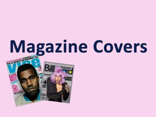
2. Masthead Title of magazine called Rap us. The magazine title is really big and across the top of the page as usual for Rap Us magazine. The Masthead is behind the image but as the magazine is well known, it doesn’t need to be as readable, although it looks good, I won’t be able to do this as it will be hard to read the masthead of my magazine. InfluencesThis magazine influence me to use little writing on my cover with black writing and two other simple colours which work well together and also I will try a mid shot/ long shot image when taking pictures for my cover. Cover LinesInteresting information about what’s in the magazine. Eye Catching ImagePicture of Kanye West a well known singer so will catch the eye of customers that listen to his type of music (people who read the magazine.)The image is side on and is a mid shot/ long shot which looks good because it you can see some of the stylish clothing which looks good and I will be thinking about using fashion in my magazine. Celebrity UsageMentioning of known celebrities makes customers want to buy it. LikesI really like the use of little amount ofwriting on the front as it looks more proffesional and neater. I also like the use of the pose as it is simple and also I like the effect of the heart as it stands out. Plugs And LuresLures which make the customer interested in buying the magazine. Tempt the customer. BarcodeThe barcode is on the front cover which is usual for Rap Us magazine and it’s at the bottom right which keeps it out of the way which I will put it on my magazine. Colour schemeI really like the colour scheme that have been used because the red/pink colour and the black go together really well and also the red in the heart goes with the writing which looks really good and I like this idea so therefore will think about putting my model in the colour used in the colour scheme on my magazine. The colours scheme is unisex so the colours scheme works well because the magazine is a unisex magazine aimed at both genders. Variety Of FontsThe different fonts of different colours, sizes and styles, make the bold points stand out which draws the buyers attention and the small writing is more detail. The fonts and colours make the magazine more visual. The fonts look really good together and the different fonts mean certain words stand out which works well, having too much of different fonts wouldn’t work well because it would look too messy.
3. LikesI really like the use of the colours, although it looks as if it is just aimed at girls which may promote false advertisement as it is aimed at boys as well as girls. I really like the unusual pose that is used because it uses a camera as a prop which is ironic as she is the one being photographed. I love the title as it’s really simple but I don’t like the writing which is between the B and E as I think it ruins the masthead. Masthead Title of magazine called Vibe. The title is behind the picture which makes the picture stand out more. I really like the colour of the masthead and is really big at the top of the page as Vibe magazines all have. Eye Catching ImagePicture of Janet Jackson a well known singer so will catch the eye of customers that listen to her type of music (people who read the magazine.)Standing in a seductive way, will catch the readers attention. InfluencesThis magazine influence me to have a unique pose on my cover that is individual. The magazine also influences me to pair up colours as they have done on this magazine which looks really effective and is very simple to do. It also inlfuences me to use a body shot where you can see most of the model as it looks really good as you can see her style. Celebrity UsageMentioning of known celebrities makes customers want to buy it. DetailsDate of magazine ’April 2008’ I like that it is really small as it would ruin the magazine if it was bigger. Colour schemeI really like the colour scheme that have been used because the blue is a really bright colour and the pink is a nice pastel like colour and they work well together as they are both different, one is pale and the other is bright. I think the use of having black and white involved as well works well as the black and white bits stand out. I also like how the blue and pink are paired up and the black and white pair up. I also like that the colour scheme is incorporated in her clothing as the white is involved. Variety Of FontsThe different fonts of different colours, sizes and styles, make the bold points stand out which draws the buyers attention and the small writing is more detail. The fonts and colours make the magazine more visual. Cover LinesInteresting information about what’s in the magazine. The use of having famous names makes people want to find out about the singer that is said in the lures. BarcodeThe barcode is on the front cover which is usual for Vibe magazine and it’s at the bottom left which keeps it out of the way which works well. Plugs And LuresLures which make the customer interested in buying the magazine. Tempt the customer.
4. Masthead Title of magazine is called Scratch which is a name which you can remember and I like that it is a sound, onomatopoeia which means it really stands out. The magazine title is really big and across the top of the magazine. The masthead is behind the image a little bit which makes the image look as if it stands out more. I really like that the writing has an outline to it. Colour schemeI really like the colour scheme that have been used because the yellow stands out from the white and the dark grey/green colour for the background and the yellow stands out from the background. The white contrasts with the dark background. The little bit of the red makes it stand out but it looks a little odd, but the red from the font is incorporated into the writing on the top which works well. The colour scheme is very boisterous. Eye Catching ImagePicture of Lil Jon a well known rapper so will catch the eye of customers that listen to his type of music (people who read the magazine.) The image is a mid shot/ long shot which looks good because it you can see some of the stylish clothing which looks good and I will be using fashion in my magazine. Celebrity UsageMentioning of known celebrities makes customers want to buy it. Plugs And LuresLures which make the customer interested in buying the magazine. Tempt the customer. Cover LinesInteresting information about what’s in the magazine. The use of having famous peoples names makes the reader want to read the magazine to find out about the singer. BarcodeThe barcode is on the front cover which is usual for Vibe magazine and it’s at the bottom left which keeps it out of the way which works well. DetailsDate of magazine ’March/April’ normally next to barcode. Variety Of FontsThe different fonts of different colours, sizes and styles, make the bold points stand out which draws the buyers attention and the small writing is more detail. The fonts and colours make the magazine more visual. The fonts work really well together as the bigger fonts make things stand out more which are the points that the reader will want to read more. InfluencesThis magazine influences me to use a simple amount of colours as this only uses 2/3 colours which makes it more professional and less messy. LikesI really like the use of the dark background as normally the backgrounds are quite pale. The colours used are quite boisterous colours and you can tell by the use of colours. I really like the comedy used ‘Sorry Kanye’ which makes the magazine individual.
5. Celebrity UsageMentioning of known celebrities makes customers want to buy it. Masthead Title of magazine called Complex. I really like the name of the magazine as it is very simple and it’s one syllable which means it’s easy to say. I like that is really bold and it is a different colour to the rest which makes it stand out more. Cover LinesInteresting information about what’s in the magazine. Variety Of FontsThe different fonts of different colours, sizes and styles, make the bold points stand out which draws the buyers attention and the small writing is more detail. The fonts and colours make the magazine more visual. The fonts work really well together as the bigger fonts make things stand out more which are the points that the reader will want to read more. The fonts and colours make the magazine more visual. The colours make you want to read the magazine. The different bubble writing works well as it looks like a comic. The different fonts looks very good aesthetically Plugs And LuresLures which make the customer interested in buying the magazine. Tempt the customer. Direct Address PronounsUse of direct words ‘Your’ to make the reader feel involved. interesting information about what’s in the magazine. Details Web address is used. Eye Catching ImagePicture of Keri Hilson a very stunning woman, standing in a seductive way. She is a well known singer so will catch the eye of people that listen to her type of music (people who read the magazine.) The long shot image looks good but it makes it look as if it isn’t a cover, more like a contents page image. LikesI really like the use of the fonts and colours because they are really bold and unique and stand out. I also like the pose pulled as it is a long shot so you can see the clothing and shoes. Colour schemeI really like the colour scheme of yellow, blue and black because the yellow and blue clash with each other which makes it stand out. The red involved with the magazine works well because the it is a bold colour. The use of having all the primary colours work well because they are all bold. Having the vibrant colours and the white background works well but if having a coloured background wouldn’t look as effective. I like that the yellow is incorporated in the clothing. InfluencesThis magazine influence me to use bold fonts that stand out and that are individual. I like the use of the white background and the colours being bold to stand out. BarcodeThe barcode is on the front cover which is usual for Rap Us magazine and it’s at the bottom right which keeps it out of the way which I will put it on my magazine.