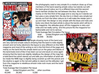
the photography used is very simple it’s a medium close up of two members of the band wearing simple colour but stands out with the back ground colour as it is a different blue and the second band member divides the red between the blue. the layout is mainly on the first third of the page and is very big so it stands out but uses a very simple font, the sky line is in black very simple but stands out from the other colours so it will make the reader pick it up and read. the design is very simple with the blues and reds and looks very block the lead article is about the bands witch will be in the magazine. the attitudes given off this magazine is retro and indie and not really caring  and this picture fits the magazine fun fashionable and not to serious  Total Average Net Circulation Per Issue  total  United Kingdom and RoI  other countries  40,948  36,942  4,006  the photography is a is of a high angle showing more of the band and are very dull and simple colours showing that the band is indie slightly emoish and not funky electronic the layout is very different on this NME magazine and most of the writing is not in the first third of the page and mainly on the band line the simple stand out on the greys and blacks of the band looks kind of like it has been cut out and stuck on once again showing that the band are slightly rebellious the design of the mag has a bold band line which stands out and tells you information of what will be inside the NME logo is slightly being covered up with the picture and the skyline is again is the red and yellow to stand out the attitudes I get from this magazine is rebellious emoish indie rock music and the band fit that slot.  Total Average Net Circulation Per Issue  total  United Kingdom and RoI  other countries  40,948  36,942  4,006
The photography used on this mag is a close up of ‘ La Roux’ and a metallic background fading out already from this picture you know what will be inside and what genre it is the brightness has been turned up so the audience wouldn’t think the artist is rock and metal  the layout of this mag is once again different from normal the  is not in the first third of the mag but in the last third of the mag ??? But the logo of the magazine is very dominant so you still know what magazine you are buying but it doesn't have much of a skyline it just tells you what type of issue it is by the design of the mag you can tell what genre it is electro funk the writing is very simple but the yellow stands out which indicates a style of retro which links in with the artists like of old and new music the attitudes I get from the magazine is very indie electro but not caring that much about the publics attitudes buy the slightly odd make up.  The photography used in this front cover is a bit different from the others it is not posed for its at a live concert medium close up which tells the readers what genre the band is and shows that they are a bit rebellious the layout of the mag is quite simple has big bold skylines and band lines telling you what is inside and a bold  which stands out because of the yellow and tells you who the band are the design of the mag is very simple and bold the main colour links in with the bands  name and stands out which makes you look at the skyline which it says ‘free’ so that will also attract the readers but the typography the very simple and bold the attitudes given tells the readers that it is a emoish band very rebellious and they don’t care how they are seen by others.
The photography used on this front cover is a close up of the artist and he looks serious and respectable which reflects onto his music and takes away the stereotype of black people music. The layout of this mag is very simple has a bold logo so the reader knows what he is reading the skyline stands out as it has different colour in it the first third is bigger and bolder than most writing so stand out and the pull quote uses two different colours in the same sentences which stands out. the design is very simple it has used colour to attract attention and the colour links in with the picture and it tells you what genre it is and is serious which fits in with the type of magazine. The attitudes for this magazine is a bit serious but still rap he touches upon real life things and isn't on about drugs sex and guns.  The photography used on this front cover is very advertising and it is a Christmas theme. But the picture is of a medium shot of snoop dogg posing trying to fit in his stereotype and pretending to smoke which links in with his music. The layout is used very well all the information which will grab the attention of the reader is on the first third of the page and the colours are very Christmas themed. The design is used well the artist id covering the magazines name but it is a well known mag so the readers will know what it is the colours really stand out as there is a white background linking in with snow. The attitudes given off are a mix there is the artist trying to look all hard and in the stereotype and then the Christmas theme looking all nice

Magazine Collage

  • 1.
  • 2.
    the photography usedis very simple it’s a medium close up of two members of the band wearing simple colour but stands out with the back ground colour as it is a different blue and the second band member divides the red between the blue. the layout is mainly on the first third of the page and is very big so it stands out but uses a very simple font, the sky line is in black very simple but stands out from the other colours so it will make the reader pick it up and read. the design is very simple with the blues and reds and looks very block the lead article is about the bands witch will be in the magazine. the attitudes given off this magazine is retro and indie and not really caring and this picture fits the magazine fun fashionable and not to serious Total Average Net Circulation Per Issue total United Kingdom and RoI other countries 40,948 36,942 4,006 the photography is a is of a high angle showing more of the band and are very dull and simple colours showing that the band is indie slightly emoish and not funky electronic the layout is very different on this NME magazine and most of the writing is not in the first third of the page and mainly on the band line the simple stand out on the greys and blacks of the band looks kind of like it has been cut out and stuck on once again showing that the band are slightly rebellious the design of the mag has a bold band line which stands out and tells you information of what will be inside the NME logo is slightly being covered up with the picture and the skyline is again is the red and yellow to stand out the attitudes I get from this magazine is rebellious emoish indie rock music and the band fit that slot. Total Average Net Circulation Per Issue total United Kingdom and RoI other countries 40,948 36,942 4,006
  • 3.
    The photography usedon this mag is a close up of ‘ La Roux’ and a metallic background fading out already from this picture you know what will be inside and what genre it is the brightness has been turned up so the audience wouldn’t think the artist is rock and metal the layout of this mag is once again different from normal the is not in the first third of the mag but in the last third of the mag ??? But the logo of the magazine is very dominant so you still know what magazine you are buying but it doesn't have much of a skyline it just tells you what type of issue it is by the design of the mag you can tell what genre it is electro funk the writing is very simple but the yellow stands out which indicates a style of retro which links in with the artists like of old and new music the attitudes I get from the magazine is very indie electro but not caring that much about the publics attitudes buy the slightly odd make up. The photography used in this front cover is a bit different from the others it is not posed for its at a live concert medium close up which tells the readers what genre the band is and shows that they are a bit rebellious the layout of the mag is quite simple has big bold skylines and band lines telling you what is inside and a bold which stands out because of the yellow and tells you who the band are the design of the mag is very simple and bold the main colour links in with the bands name and stands out which makes you look at the skyline which it says ‘free’ so that will also attract the readers but the typography the very simple and bold the attitudes given tells the readers that it is a emoish band very rebellious and they don’t care how they are seen by others.
  • 4.
    The photography usedon this front cover is a close up of the artist and he looks serious and respectable which reflects onto his music and takes away the stereotype of black people music. The layout of this mag is very simple has a bold logo so the reader knows what he is reading the skyline stands out as it has different colour in it the first third is bigger and bolder than most writing so stand out and the pull quote uses two different colours in the same sentences which stands out. the design is very simple it has used colour to attract attention and the colour links in with the picture and it tells you what genre it is and is serious which fits in with the type of magazine. The attitudes for this magazine is a bit serious but still rap he touches upon real life things and isn't on about drugs sex and guns. The photography used on this front cover is very advertising and it is a Christmas theme. But the picture is of a medium shot of snoop dogg posing trying to fit in his stereotype and pretending to smoke which links in with his music. The layout is used very well all the information which will grab the attention of the reader is on the first third of the page and the colours are very Christmas themed. The design is used well the artist id covering the magazines name but it is a well known mag so the readers will know what it is the colours really stand out as there is a white background linking in with snow. The attitudes given off are a mix there is the artist trying to look all hard and in the stereotype and then the Christmas theme looking all nice