SlideShare a Scribd company logo
1 of 98
Download to read offline
OS X 10.9 Mavericks: The Ars Technica Review | Ars Technica

23/10/13 14:12

OS X 10.9 Mavericks: The Ars Technica Review

Aurich Lawson / Thinkstock
After a dozen years and nine major releases, OS X has had a full life: the exuberance
of youth, gradually maturing into adulthood, and now, perhaps, entering its dotage.
When I am an old operating system I shall wear… leather?
The 2011 release of OS X 10.7 Lion seemed to mark the natural endpoint of the "big
cat" naming scheme. But Apple couldn't resist the lure of the "cat, modifier cat" naming
pattern, releasing OS X 10.8 Mountain Lion a year later. Perhaps it just wanted to give
its cat nine lives.
The 10th major release, OS X 10.9 Mavericks, is named after an awkwardly plural California surfing spot, finally ending the feline dynasty. But what part of the operating
system's existence is this? The afterlife?
When it comes to OS X, many people are suffering
from the end-of-history illusion: the belief that
while the Mac platform has consistently experienced significant enhancements in the past, it will
somehow not continue to grow and mature in the
future.
http://arstechnica.com/apple/2013/10/os-x-10-9/

Read it your way
Don't want to read an article this long on the
Web?
Ars Technica premier subscribers can
download a (free) Kindle, iBooks-compatible
EPUB, or PDF version of the complete review
from the links in the upper right of each article
page.
Pagina 1 di 98
OS X 10.9 Mavericks: The Ars Technica Review | Ars Technica

So let's readjust our perspective. Perhaps the first
seven big-cat releases were OS X's early childhood:
birth, potty training, learning to walk and talk, and
so on, culminating in some form of self-actualization.

23/10/13 14:12

Non-subscribers can buy the e-book from the
iBookstore or the Amazon Kindle store.

With Lion, the Mac entered an awkward adolescence, acquiring a newfound concern
about what the other kids were doing. Accordingly, OS X's last two releases included
several naked attempts to ape the look and feel of its more successful sibling, iOS.
But that was all before last year's ouster of Scott Forstall, senior vice president of iOS
Software. By all accounts, Forstall was one of the driving forces behind the iOS aesthetic that Lion and Mountain Lion so enthusiastically embraced. Jony Ive's iOS 7
strikes off in a bold new direction based on a philosophy that Apple is eager to generalize to the company as a whole—leaving OS X holding the stitched-leather bag.

An OS out to sea
Let's say we accept that this is not the end of history and that OS X will continue to
evolve. To what end? Aside from undoing the most egregious peer-pressure-motivated interface changes, what should this first non-cat release of OS X do differently from
its predecessors?
One option would be to continue to follow iOS's lead, switching gears from rich textures and simulations of analogous physical products and setting off in pursuit of the
new, spare iOS 7 aesthetic. I'll spoil it for you: Apple hasn't chosen this path—not yet,
anyway. Time and resource constraints alone could explain this choice. After all, Apple didn't even have the iPad version of iOS 7 ready in time for WWDC this year. An
interface overhaul in Mavericks was clearly out of the question.
Mavericks is also not an internals-only release like Snow Leopard, which famously
promised "no new features." There are new features in Mavericks, even new bundled
applications.
To some degree, the content of any OS release is determined by what did and didn't
make the deadline for the previous release. There are exceptions, like Fusion Drive,
which didn't quite make it into Mountain Lion but also couldn't wait for the next major OS release because it was a prerequisite for some new hardware products.
Nevertheless, Apple does try to give each new OS some sort of theme. Mavericks is
http://arstechnica.com/apple/2013/10/os-x-10-9/

Pagina 2 di 98
OS X 10.9 Mavericks: The Ars Technica Review | Ars Technica

23/10/13 14:12

the first California-themed release of OS X, named after "places that inspire us here in
California," according to Craig Federighi, who says this naming scheme is intended to
last for at least the next 10 years. The pressure is on for Mavericks to set a new direction for the Mac platform.
According to Apple, Mavericks has a dual focus. Its first and most important goal is to
extend battery life and improve responsiveness. Secondarily, Mavericks aims to add
functionality that will appeal to "power users" (Apple's words), a group that may be
feeling neglected after enduring two releases of OS X playing iOS dress-up.
Is that enough for Mavericks to live up to its major-release version number and to
kick off the next phase of OS X's life? Let's find out.

Table of Contents
Introduction
Purchase and installation
Branding
Interface
Safari
iCloud Keychain
Notification Center
The Finder
Tags
Implementation
Labels
Tags
iBooks
Maps
Multiple displays
Energy saving
App Nap
App Nap Policy
Energy best practices
App Nap API
Visibility
Timer tolerance
http://arstechnica.com/apple/2013/10/os-x-10-9/

Pagina 3 di 98
OS X 10.9 Mavericks: The Ars Technica Review | Ars Technica

23/10/13 14:12

User activities
Energy shaming
Background tasks
Centralized task scheduling
Compressed memory
Battery benchmarks
Energy summary
Responsive scrolling
iCloud Core Data
Sprite Kit
Grab Bag
System Preferences
General
Desktop & Screen Saver
Language & Region
Internet Accounts
Sharing
Parental Controls
App Store
Dictation
Accessibility
Integrated graphics improvements
Terminal cwd restoration
Special characters popover
System font
Recommendations
Changeover

Purchase and installation
Lion was the first download-mostly release of OS X, and Mountain Lion was the first
download-only release. Mavericks breaks no new ground in the realm of product distribution. As expected, it's available only through the Mac App Store.
With the transition away from physical media complete, Apple is free to focus on one
of the intended benefits of downloadable OS updates: adoption rate.
At WWDC, Tim Cook made a point of bragging about iOS's adoption rate. After less
http://arstechnica.com/apple/2013/10/os-x-10-9/

Pagina 4 di 98
OS X 10.9 Mavericks: The Ars Technica Review | Ars Technica

23/10/13 14:12

than 10 months on the market, 93 percent of iOS users
were using the latest version, iOS 6. (iOS 7 is well on its
way to matching that performance, with a 64 percent
adoption rate 34 days after its release.)
Earlier in the same presentation, Craig Federighi shared
some less impressive statistics about Mountain Lion
adoption: 35 percent after six months. Did it pass 90 percent four months later? If it did, I imagine Apple would have said so.
After eliminating the trip to the store (or the package delivery), the other major knob
Apple can turn to drive adoption of new OS X releases is the price. And turn it has,
dropping the price of the Mac operating system steadily over the past five years, hitting $19.99 with Mountain Lion. Mavericks follows the trend to its logical conclusion,
finally joining iOS at the magical price point of free. Mac users who are still stubbornly clinging to Snow Leopard are unlikely to be dislodged, but anyone running Lion or
Mountain Lion is sure to feel the gravitational pull of an OS upgrade that's just one
click and $0 away.
In a refreshing change of pace, Mavericks does not cut off support for any additional
Mac hardware. If your Mac can run Mountain Lion, it can run Mavericks. For completeness, here's the list of supported models:
iMac (Mid 2007 or newer)
MacBook (Late 2008 Aluminum, or Early 2009 or newer)
MacBook Pro (13-inch, Mid-2009 or later; 15-inch, Mid/Late 2007 or newer)
MacBook Air (Late 2008 or newer)
Mac mini (Early 2009 or newer)
Mac Pro (Early 2008 or newer)
Xserve (Early 2009)
Like its feline ancestors, a single copy of Mavericks can be installed on "each Applebranded computer […] that you own or control" plus two additional copies within virtual machines. There's still no DRM, no serial numbers, and no product activation. I
know I repeat this every year, but it's worth emphasizing. Despite having arguably
built a large portion of its current digital media empire on the back of its FairPlay
copy protection system, Apple still seems to view DRM as a net negative that should
be avoided, when possible.
http://arstechnica.com/apple/2013/10/os-x-10-9/

Pagina 5 di 98
OS X 10.9 Mavericks: The Ars Technica Review | Ars Technica

23/10/13 14:12

Branding
Time was when I'd review OS X branding trends by lining up images of cardboard
product boxes or optical discs. After the transition to download-only, Apple's marketing materials and website must fill the gap. Our first glimpse of Mavericks branding
was on a banner visible just before the WWDC 2013 keynote.

Mavericks banner at WWDC 2013.
Pierre Rothmaler
The thin "X" is an obvious echo of iOS 7's design—despite the fact that, as we would
soon find out in the keynote, Mavericks does not adopt the iOS 7 interface style.
Apple's website revealed what would become the more common logo for the OS.

http://arstechnica.com/apple/2013/10/os-x-10-9/

Pagina 6 di 98
OS X 10.9 Mavericks: The Ars Technica Review | Ars Technica

23/10/13 14:12

Enlarge / The Mavericks preview section of apple.com.
The "X" is thinner than in the past, but not quite iOS-7 thin. It's placed inside a circle
that initially reads like an optical disc—or does if you're a Mac user of a certain age,
anyway. But sometimes a circle is just a circle. Behind it, showing through the logo, is
the attractive new default desktop image showing a wave, presumably from the
eponymous surfing location.
I'm mentioning all of this not (just) because I'm interested in how Apple markets its
products, but because the branding of Mavericks reveals a tension that appears in
both the aesthetic and functional design of the OS itself. Mavericks is not iOS 7, but
it's also not Mountain Lion. Mavericks doesn't get an all-new interface, but it surely
can't carry on with many of its bundled applications looking like iOS 6
doppelgängers. In the next section, we'll see how Apple manages this tension.

Interface
At first glance, Mavericks looks like Mountain Lion. There are no major changes to the
appearance of standard controls like scroll bars and buttons; the Dock looks the same
(in its default position, anyway); most application icons have not changed.
But poke around a bit and you'll spot a few differences. Move the Dock to the side to
reveal its new smoked glass appearance. It's a nice match for the attractive gray metal
http://arstechnica.com/apple/2013/10/os-x-10-9/

Pagina 7 di 98
OS X 10.9 Mavericks: The Ars Technica Review | Ars Technica

23/10/13 14:12

look introduced in Mountain Lion, though the smoked glass Dock is
translucent instead of reflective like the metal Dock.
The gray linen texture that invaded OS X in a big way a few years ago
has now been expunged. The Notification Center sidebar and the login
screen are now a soothing slate gray.

Enlarge

The new linen-free login window.

No linen in Notification Center either.
http://arstechnica.com/apple/2013/10/os-x-10-9/

Pagina 8 di 98
OS X 10.9 Mavericks: The Ars Technica Review | Ars Technica

23/10/13 14:12

Linen also no longer covers secondary displays when full-screen mode is active; more
on that later.
With these changes, Mavericks can be seen as continuing to follow the lead of iOS 7,
which also notably parts ways with the linen texture. But Mavericks is unwilling—or
at least unable—to follow iOS 7 the rest of the way down the road. For now, Mavericks has settled for expelling as much visual and interactive baggage from iOS 6 as
possible.
Consider the state of the Address Book application in Lion. It was the spitting image
of its iOS 6 counterpart on the iPad: a beautifully drawn leather-bound book with a
red cloth bookmark. But the artwork was more misleading than helpful. The application looked like a book, but it didn't behave like one. Worse, important functionality
was sacrificed on the altar of those graphics. The third pane used to display contact
groups was removed entirely; an open book has two sides, not three, after all.
In Mountain Lion, the newly renamed Contacts application brought back the groups
pane, but it did so by cutting into the contact list's space on the left side of the "book"
graphic. Open books must have two equal sides, right?
Mavericks says enough is enough. The leather's gone, the fake pages are gone, the
three panes are independently resizable (more or less), even the title bar is bone-stock,
and it's… boring?

http://arstechnica.com/apple/2013/10/os-x-10-9/

Pagina 9 di 98
OS X 10.9 Mavericks: The Ars Technica Review | Ars Technica

23/10/13 14:12

The new look for the Contacts application: cucumbers with cottage cheese.
The story's the same for the Notes application. Once an iOS 6 lookalike sporting torn
bits of paper on a yellow legal pad, it's now stripped of all pretense. Also possibly removed: beauty, fun.

http://arstechnica.com/apple/2013/10/os-x-10-9/

Pagina 10 di 98
OS X 10.9 Mavericks: The Ars Technica Review | Ars Technica

23/10/13 14:12

The new Notes applications does not stand out in a crowd.
Calendar is straight up the middle, with just a touch of iOS 7's super-lightweight text
(e.g., the year) mingling somewhat awkwardly with the other typefaces.

In Mavericks, gray is the new Corinthian leather.
http://arstechnica.com/apple/2013/10/os-x-10-9/

Pagina 11 di 98
OS X 10.9 Mavericks: The Ars Technica Review | Ars Technica

23/10/13 14:12

In Mavericks, gray is the new Corinthian leather.
When Lion was released, here's what I wrote about its stitched-leather calendar application:
The immediate, visceral negative reaction to the rich Corinthian leather appearance had little to do with usability. What it came down to—what first
impressions like these always seem to come down to—is whether or not
you think it's ugly. People will take "really cool-looking but slightly harder
to use" over "usable but ugly" any day.
The freshly undecorated applications in Mavericks may test that assertion. Contacts
and Calendar look plain compared to their previous incarnations; to my eye, Notes
borders on ugly.
Don't get me wrong, in the case of applications like Contacts, I'm all for excising the
misleading graphics and returning the functionality that was removed in service of
them. But that kind of surgery appears to be the only significant change to these applications in Mavericks. Apple took the Mountain Lion versions, removed the graphical
frills, and updated the UI enough to work correctly without them.
I'm not sure there were any better options given the time constraints. Leaving these
applications unmodified would have made OS X look like even more of an old fogey
next to iOS 7 than it already does. An OS-wide overhaul (following the iOS lead or
not) would have easily pushed Mavericks out into next year, blowing Apple's annual
release schedule. And if an interface overhaul is in the cards for OS X in the next year
or two, a fresh rethinking of each application within the constraints of the current OS
X look might have been wasted effort (in addition to making Mavericks late).
And yet there are places where hints of iOS 7 peek through. The icon for the new
Maps application, for example, looks like an OS X-style application icon with iOS 7's
color palette and smooth gradients applied to it. The iBooks application icon takes this
look one step further. The new iCloud preference pane icon looks like a straight lift
from iOS 7.

http://arstechnica.com/apple/2013/10/os-x-10-9/

Pagina 12 di 98
OS X 10.9 Mavericks: The Ars Technica Review | Ars Technica

23/10/13 14:12

Maps, iBooks, and iCloud have icons that show more than a little of iOS 7's
influence.
You might expect the Calendar, Contacts, and Notes icons to have been revised in the
style of the new Maps icon to reflect their newly chastened interfaces. Nope, no time
for that either, I guess.

These applications have changed, but their icons still reflect their pre-Mavericks interfaces.
Many applications haven't been modified at all in Mavericks. Game Center retains its
tacky green felt and wood. Reminders still looks like textured black… something surrounding white note paper. Messages still sports glossy text bubbles.
The influence of both iOS 7's "frosted glass" header elements and the sadly misguided
translucent OS X menu bar can be felt in the new list-view headers in the Finder.

In what situation is it important to see the App Store application peeking
through the header?

http://arstechnica.com/apple/2013/10/os-x-10-9/

Pagina 13 di 98
OS X 10.9 Mavericks: The Ars Technica Review | Ars Technica

23/10/13 14:12

I can think of only one practical use for this effect: to indicate that there's more content
above the current scroll position when no scroll bar is visible to communicate this information. At all other times, this transparency only serves to slightly impair the readability of the column headers.
And then there's the crazy sparkle effect that appears around newly installed applications in Launchpad.

Apps, exciting and new…
The same effect is used when a new Dashboard widget is installed. I'm tempted to say
this is no more gaudy than the water-ripple effect used when a new instance of a widget is placed on the Dashboard, but in the context of the overall trend away from ostentatious ornamentation across Apple's product line… yeah, it does seem a little
worse.
In short, the look and feel of Mavericks is a mixed bag. The iOS-inspired interface divergences introduced in Lion and refined in Mountain Lion have been partially rolled
back in Mavericks, but there's still much more to be done. I look forward to the day
that the OS X interface will finally stop backtracking and start moving forward again.

Safari
The most important changes to Safari in Mavericks are internal. Two years ago, Lion
included a version of Safari based on the WebKit2 engine, which separated the task of
page rendering and JavaScript execution into an external process, mostly for security
reasons.
WebKit2 was a reaction to Chrome's multi-process architecture, which uses multiple
WebKit processes to handle page rendering. Google included the multi-process code
in the Chromium project, not in WebKit. Before creating WebKit2, Apple asked
Google if it was willing to contribute Chromium's multi-process code to the WebKit
project. Google declined, leaving Apple to create its own solution. Apple implementhttp://arstechnica.com/apple/2013/10/os-x-10-9/

Pagina 14 di 98
OS X 10.9 Mavericks: The Ars Technica Review | Ars Technica

23/10/13 14:12

ed its multi-process system in the WebKit engine itself, benefiting any application that
uses WebKit.
Unfortunately, the WebKit2 era of Safari has been marred by chronic instability.
When Safari's lone back-end Web rendering process gets wedged, users are greeted
with the all-too-familiar "webpages are not responding" dialog; forward progress requires reloading every open webpage in every tab in Safari. This problem has not
gone away in the years since Lion was released.
Contrast this to Google's Chrome browser, which has been rock-solid over the same
period. The cumulative effect of these years of Safari instability has made me start to
question whether Apple still has the chops to keep up in the fast-paced world of Web
rendering engines.
Safari version 7, included in Mavericks, is Apple's answer. It sports a new processper-tab architecture, finally following in Chrome's footsteps—though this change is
part of WebKit itself, not just the Safari application. It's too early to tell if this change
will restore Safari's stability, but I can report that I have not seen a single Safari crash
or "webpages are not responding" dialog in all my Mavericks testing. (I've seen many
in Safari 6 while writing this review in Mountain Lion.)
The new architecture also affords the ability to examine the behavior of individual
browser tabs using the Activity Monitor application.

At last, separate Safari Web Content processes for each tab.
It would be nice if this feature was built into Safari itself, like Chrome's Task Manager,
so each "Safari Web Content" process could be linked to a specific open tab.
Safari's first-run experience reveals most of its new user-visible features. The old Top
Sites, a concave pseudo-3D wall of website thumbnails, has been replaced by a plain,
http://arstechnica.com/apple/2013/10/os-x-10-9/

Pagina 15 di 98
OS X 10.9 Mavericks: The Ars Technica Review | Ars Technica

23/10/13 14:12

flat grid of thumbnails. The old Reading List sidebar has been replaced by a unified
sidebar containing Bookmarks, Reading List, and a new feature called Shared Links.

Safari's new sidebar and less flamboyant Top Sites layout.
Shared Links shows links from the social network accounts added through the Internet Accounts preference pane. For example, if a Twitter account is registered, Shared
Links will show only the tweets that contain links.
Reading List gets a mild facelift to fit in with the new sidebar styling. Two-finger
swiping past the bottom of the page when viewing an item from the Reading List
loads the next item in the list. It's as if all items form a single, long webpage.
The old bookmarks manager and history viewer are still available via separate items
in the Bookmarks and History menus, respectively. Editing bookmarks in the new
sidebar is frustrating (the interface is made for navigation, not modification), so don't
forget about the old interfaces.
After a brief absence, the "+" button has returned to its former home nestled in the left
side of the address bar. There is no separate incarnation of this button that can be
placed anywhere on the toolbar, nor is there an option to remove it from the address
bar. Holding down the mouse button (but not right-clicking) on the "+" button reveals
http://arstechnica.com/apple/2013/10/os-x-10-9/

Pagina 16 di 98
OS X 10.9 Mavericks: The Ars Technica Review | Ars Technica

23/10/13 14:12

a menu for adding the current webpage to all of Safari's various link storage locations.

The "add" button is here to stay in Safari 7, but at least it knows a few new
tricks.
While the additional functionality is welcome, I'm not sure the frequency with which
people add bookmarks, Top Sites, or Reading List items warrants such prominent,
permanent placement for this button.
Browser plug-ins can now be managed on a per-website basis, with five options: Ask,
Block, Allow, Always Allow, and Run in Unsafe Mode. The same options exist for the
default behavior when visiting a new website. The preferences window conveniently
splits the list of websites into those that are currently open in Safari and all the rest.

http://arstechnica.com/apple/2013/10/os-x-10-9/

Pagina 17 di 98
OS X 10.9 Mavericks: The Ars Technica Review | Ars Technica

23/10/13 14:12

Safari's new per-site, per-plug-in security settings.
Even when set to "Allow" a plug-in, Safari will block it if there are known security issues with the installed version of that plug-in. (Updated plug-in security information
is automatically distributed to all network-connected Macs using the same mechanism as the existing malware signature information.) The "Allow Always" setting
overrides this restriction, permitting plug-ins to load even if they have known vulnerabilities.
Most popular plug-ins run in a sandbox by default, including QuickTime, Flash Player, Silverlight, and Oracle's Java plug-in. The "Unsafe" plug-in setting instructs Safari
to run the plug-in outside the sandbox. This is intended as a last resort for plug-ins
that don't yet run correctly inside a sandbox. (This setting also allows plug-ins to load
despite the existence of known security problems with the installed version.)
The "Ask" setting is the default when visiting a new website. It presents a sheet with
options to trust, block, or disallow for now (but ask again later).
http://arstechnica.com/apple/2013/10/os-x-10-9/

Pagina 18 di 98
OS X 10.9 Mavericks: The Ars Technica Review | Ars Technica

23/10/13 14:12

When configured to "Ask" about plug-ins on the first visit to a website, Safari presents these options.
Blocked plug-ins are reported as such in the browser window. Clicking on the
blocked plug-in message will ask for confirmation before allowing it to load.

Click to load this plug-in…and all other instances of the same plug-in on
this website.
Clicking the "Trust" button doesn't just allow this particular instance of the plug-in to
load. It changes the setting for this plug-in for the entire website to "Allow." This is
unlike the once-popular ClickToFlash in which clicking on a particular instance of a
plug-in did not confer website-wide permission to load that plug-in in the future.
http://arstechnica.com/apple/2013/10/os-x-10-9/

Pagina 19 di 98
OS X 10.9 Mavericks: The Ars Technica Review | Ars Technica

23/10/13 14:12

Like last year's Gatekeeper feature, Safari's new plug-in security settings have sensible
defaults while also offering an easy way to opt out. Automatically disabling plug-ins
when vulnerabilities are discovered will likely annoy users a lot more than Gatekeeper does, but it's preferable to the alternative of leaving users exposed until they realize
there's a problem and upgrade on their own—a sequence of events that represents a
surprisingly high hurdle for most users. After all, most people don't read tech news
on a regular basis, scanning for the latest Flash or Java exploits.
There's also a new preference to "Stop plug-ins to save power," which is part of a feature Apple calls Safari Power Saver. Even if the preference for a website is set to "Allow," the Power Saver feature will stop plug-ins from running if they do not appear to
be the main content on the page.
Translating that from abstract to concrete, it means that you can enable Flash for a
website and Safari will still try to block auto-playing Flash ads that appear around the
content on that website. There's no visible indication that it's happening until you
mouse over one of the frozen ads.

Safari Power Saver in action: a Flash sidebar ad loads, but it's not allowed to
run until clicked.
Safari uses a fuzzy set of rules to distinguish plug-in "content" (e.g., the movie trailer
you came to the website to see) from extraneous items that should not be allowed to
auto-play (e.g., sidebar or banner ads). In practice, it works well. Credit the banal predictability of ad-heavy website layouts and ad banner sizes.
The default Web browser is an incredibly important part of any modern operating
http://arstechnica.com/apple/2013/10/os-x-10-9/

Pagina 20 di 98
OS X 10.9 Mavericks: The Ars Technica Review | Ars Technica

23/10/13 14:12

system. Though we geeks may routinely install alternate browsers, application download and installation on OS X is not yet as simple as it is on iOS. (It also doesn't help
that popular alternatives like Chrome and Firefox aren't available through the Mac
App Store.) Safari is "the Web" for most Mac users; it needs to be awesome.
Apple clearly realizes this, as it continues to pour resources into Safari in release after
release. Safari 7 is a standard-bearer for many of the flagship technologies in Mavericks, and its focus on stability, security, and energy-saving is a microcosm of the
whole OS. I came very close to switching to Chrome as my default Web browser during the reign of Safari 6. Safari 7 has pulled me firmly back into the Apple camp.

iCloud Keychain
Few lamented the end of MobileMe. Apple's much-maligned package of network services was in trouble from day one, and it never became the beloved, essential product
that Apple envisioned. When iCloud was introduced in 2011, it was welcomed as a
liberator.
The transition from MobileMe to iCloud was not without its pitfalls—and losses. The
end of support for Apple-hosted websites produced the biggest short-term turmoil,
but the writing had been on the wall for the iWeb application for years.
Passwords, on the other hand, are (sadly) not going away any time soon. MobileMe's
Keychain synchronization feature was one of the highlights of the service for me. To
replace it, iCloud offered exactly nothing. This was an ongoing pain, becoming worse
as the Keychain databases stranded on each isolated Mac slowly diverged from each
other.
In Mavericks, blessed relief is just one checkbox away.

The new iCloud Keychain isn't exactly the same as MobileMe's Keychain sync. Rather
than synchronizing the entire contents of the Mac's Keychain database, Mavericks
adds a new "iCloud" keychain alongside the local "login" and "System" keychains.

http://arstechnica.com/apple/2013/10/os-x-10-9/

Pagina 21 di 98
OS X 10.9 Mavericks: The Ars Technica Review | Ars Technica

23/10/13 14:12

iCloud gets its own separate keychain.
If the iCloud Keychain is subsequently disabled, the iCloud keychain highlighted in
the screenshot above is replaced with a "Local Items" keychain that has the same contents as the iCloud keychain. Any items added to the Local Items keychain will be
pushed out to other devices when iCloud Keychain is re-enabled.
Enabling iCloud Keychain requires traversing a gauntlet of security-related questions
rivaled in OS X only by the recently revised File Vault disk encryption feature. It
starts with a suggestion to enable a screen lock, if one is not already enabled, to prevent someone from walking up to your unattended Mac and having access to all your
cloud-synced passwords.
Heed Apple's advice (or click "Not Now"), then enter your Apple ID password to continue. Next, you'll be asked to create an "iCloud Security Code." The default dialog requests a four-digit numeric code, but the "Advanced…" button leads to more options.

iCloud Security Code setup: 4-digit numeric, or…

http://arstechnica.com/apple/2013/10/os-x-10-9/

Pagina 22 di 98
OS X 10.9 Mavericks: The Ars Technica Review | Ars Technica

23/10/13 14:12

iCloud Security Code "Advanced" options, including no security code at all.
You can forgo a security code entirely, ask to be prompted for a "complex" security
code (i.e., a password instead of a 4-digit code), or ask Mavericks to generate a random security code. Random codes look a lot like File Vault recovery keys (e.g., DCLKXZEX-XNEB-LGXJ-5UHB-89C3). The "complex" and "random" security code dialog
boxes also suggest that people write down their security codes and keep them "in a
safe place" because "Apple cannot recover a lost code."
Finally, if you didn't opt out of the security code entirely, you must enter a phone
number that can receive SMS messages.

At last, the final step: a phone number to receive verification codes from
Apple via SMS.

http://arstechnica.com/apple/2013/10/os-x-10-9/

Pagina 23 di 98
OS X 10.9 Mavericks: The Ars Technica Review | Ars Technica

23/10/13 14:12

There's also a first-run setup wizard that will take new users through the same steps
before logging in for the first time.
All of this additional security comes into play when you want to enable iCloud Keychain on a second device. At that point, you have two options. You can request approval from another device where iCloud Keychain has already been enabled for the
same Apple ID. This request appears in the form of a standard notification dialog.

Approval from a trusted device is one way to activate iCloud Keychain on
another Mac.
If you choose to configure an iCloud Security Code, you can enable iCloud Keychain
on a new device by entering all three of the following: your Apple ID password, your
security code, and a verification code that Apple will send to the configured phone
number via SMS.
Usability and security are often at odds with each other. iCloud Keychain bears this
out, presenting many more hurdles during the setup process than the MobileMe Keychain sync feature that it belatedly replaces.
Once configured, it mostly works as expected, helpfully offering to remember usernames and passwords in applications like Safari, syncing them to all configured devices, and then auto-completing those values when they're requested later.

http://arstechnica.com/apple/2013/10/os-x-10-9/

Pagina 24 di 98
OS X 10.9 Mavericks: The Ars Technica Review | Ars Technica

23/10/13 14:12

Safari's Keychain auto-fill, now powered by iCloud.
Safari's iCloud Keychain integration goes further, offering to auto-generate and then
remember passwords for the user.

Accepting the suggested password will also helpfully enter it in the password confirmation field as well. Interestingly, Apple's own Apple ID account creation website
ranks the strength of the auto-generated password as merely "moderate."

Apple is not impressed by its own password suggestions.
By default, auto-fill still refuses to activate on websites that explicitly ask to disable
the feature. Again, the tension between usability and security surfaces. Digging into
Safari 7's preferences reveals a setting that promises to "[a]llow AutoFill even for websites that request passwords not be saved." Jackpot! But there are caveats. First, enabling this override requires that the Mac be configured to lock the screen when idle.
Second, Safari still fails to auto-fill passwords on some websites, most notably Apple's
own icloud.com.
http://arstechnica.com/apple/2013/10/os-x-10-9/

Pagina 25 di 98
OS X 10.9 Mavericks: The Ars Technica Review | Ars Technica

23/10/13 14:12

For people with more complex needs, third-party password managers still fill an important role. Similarly, the people for whom "cross-platform" means more than just
"OS X and iOS" will continue to rely on the password management and sync features
built into Chrome and Firefox.
For everyone else, things are looking up. An Apple-made password manager that's
built into the default Web browser on OS X and works across multiple Macs and iOS
devices was long overdue. It's sure to be a hit among people who—rightly—expect
this functionality to work without any third-party software.

Notification Center
Notification Center has become such an integral part of my daily use of OS X that I
just spent a few moments searching my review of Lion for the word "notification" before realizing that Notification Center was actually introduced just a year ago in
Mountain Lion. I'd say the feature has handily earned its place in the upper-right corner of the screen, even if most of my interaction with it is through the preference pane
and the various alerts and banners that appear during the day.
Mavericks takes the obvious next step and adds the ability to reply to a notification
right from the alert itself. This only works for a handful of Apple-supported applications right now (e.g., instant messages using the Messages application, e-mail using
Apple's Mail application) but the supported services have broad coverage: Facebook,
Twitter, FaceTime, e-mail, instant message, calendar events, and reminders.
Simple, text-only replies can be sent directly from a notification alert using an inline
user interface.

Replying to an instant message from within the notification.
The reply button on e-mail notification alerts will launch the Mail application and prehttp://arstechnica.com/apple/2013/10/os-x-10-9/

Pagina 26 di 98
OS X 10.9 Mavericks: The Ars Technica Review | Ars Technica

23/10/13 14:12

pare a reply. Despite the potential sophistication of an e-mail message (attachments,
styled text, and so on), an inline e-mail reply interface would be a nice option. Maybe
next year.
Cross-protocol replies are a pleasant surprise. An invitation to a FaceTime video chat
offers an inline instant-message reply option with a configurable set of canned answers (or freeform text), plus an option to add a reminder to get back to the person
later. The reminder will include a link to initiate a FaceTime chat with the person.

FaceTime requests can be replied to with an instant message or by creating
a reminder to contact the person later.
Instant messages can also be initiated from that weird little area at the top of the Notification Center sidebar. It's getting pretty crowded up there. There's probably room
for one more service icon before things start getting silly.

Send an instant message, tweet, or share something on Facebook or
LinkedIn from the top of Notification Center.

http://arstechnica.com/apple/2013/10/os-x-10-9/

Pagina 27 di 98
OS X 10.9 Mavericks: The Ars Technica Review | Ars Technica

23/10/13 14:12

Sending an instant message from Notification Center.
Each type of notification now has an option (on by default) to display even when the
screen is locked. Notifications that may contain sensitive information, such as e-mails
or instant messages, have an additional option to show message previews only when
the screen is unlocked (the default), or always.

New privacy-related notification preferences.
These defaults are reasonable, but people who rely on screen savers for "casual" privacy in shared spaces may not want even the names of the people who are e-mailing
and instant-messaging them to appear on their unattended screens. As always, the
price of Notification Center satisfaction is eternal vigilance.
Though Safari in Mountain Lion linked Web notifications to OS X's native notification
system, I've encountered few websites that take advantage of this feature. It only
works when a website is open in a Safari window, so admittedly, its usefulness is limited.
Mavericks allows websites to use Apple's Push Notification service to post updates
even when Safari isn't running. This is a feature I really hope more websites adopt,
though its confinement to a single platform surely makes it less appealing.
Finally, the big on/off switch at the top of the Notification Center sidebar has been rehttp://arstechnica.com/apple/2013/10/os-x-10-9/

Pagina 28 di 98
OS X 10.9 Mavericks: The Ars Technica Review | Ars Technica

23/10/13 14:12

branded as Do Not Disturb and has been given a generous helping of preferences.

Notification Center's Do Not Disturb feature now has a full set of preferences.
The part of me that Apple's beautiful, terrible walled garden has not yet stamped out
of existence still yearns for a more open notification system that would allow thirdparty applications to enjoy the same interface integration as Apple's "blessed" applications for each service. (I use Adium for instant messaging, Twitterrific for Twitter, and
Gmail for e-mail.) But overall, the notification system in Mavericks is a comfortable
improvement over its initial incarnation in Mountain Lion.

The Finder
It's not fair to say that Apple has entirely neglected the OS X Finder. It's been extensively revised multiple times over the years. It was even "rewritten" in Cocoa when
Apple finally left Carbon behind for good a few years ago. Every major release of OS
X includes some changes to the Finder.
But even as Apple has regularly laid hands on the Finder codebase, the application
has continued to suffer from a kind of spiritual neglect. My own decade-long frustration with Apple's refusal to cleanly separate the "browser" features of the Finder from
the rest of its functionality may (still) seem academic and unimportant to most Mac
http://arstechnica.com/apple/2013/10/os-x-10-9/

Pagina 29 di 98
OS X 10.9 Mavericks: The Ars Technica Review | Ars Technica

23/10/13 14:12

users (though they are wrong). But more broadly speaking, it's clear that the OS X
Finder is far from the center of the Mac experience that it once was back in the days of
classic Mac OS. With the introduction of Launchpad in Lion, the Finder seems poised
to become even less relevant in the future.
Given all of this, perhaps we've been lulled into a false sense of complacency where
the Finder is concerned. Then along comes Mavericks and, suddenly, the Finder has
tabs.

Tabbed browsing in the Mavericks Finder. The wait is over.
Tabs! Can you believe it? This is such an obvious feature that entire third-party products have been developed to fill the gap. Why didn't the Finder get tabs sooner? Was
there some sort of philosophical objection to them? Did they conflict with the grand
vision of the OS X Finder? Does such a thing even exist?
So many questions. No matter, tabs are here now, so let's move on. They look and
work almost exactly like Safari tabs. They can be rearranged by dragging, torn out to
form new windows, and moved from one window to another. Holding down the
command key while double-clicking a folder opens it in a new tab. (There's a preference to turn this off, in which case command-double-clicking opens a folder in a new
window.) Files and folders can be dragged and dropped onto a tab in any window to
move or copy them. The proxy icon next to the folder name in the window title bar
can be dragged onto the "+" icon in the tab bar of another Finder window to add a
new tab with that location.
Since it's nearly impossible to add a major new feature to the Finder without further
complicating the interaction between "normal" and "browser" Finder windows
(browser windows are the ones with toolbars), please note that it's now impossible to
http://arstechnica.com/apple/2013/10/os-x-10-9/

Pagina 30 di 98
OS X 10.9 Mavericks: The Ars Technica Review | Ars Technica

23/10/13 14:12

hide the toolbar on a browser window that has two or more tabs. Non-browser Finder
windows don't have tabs, and apparently Apple couldn't decide what to do with the
tabs when "transforming" a browser window into a normal window.
Of course, that transformation is at the very heart of the Finder's schizophrenic/amnesiac persona, leading to similar questions about other aspects of window state such as
size, position, view style, and so on, which is why such window transformations
shouldn't be possible at all, under any circumstances. But I digress.
With the addition of tabs, the idea of a full-screen Finder window is a lot more attractive. Happily, the upper-right corner of each Finder browser window sports a fullscreen widget that does just what you'd expect.
Full-screen support and tabs would easily fulfill the low expectations for Finder
changes in a major OS X update, but Mavericks has one more thing…

Tags
At first glance, it appears that Finder Labels have been renamed "Tags" in Mavericks.
Sure enough, the menu items and preferences in the Finder use the word "Tags"
everywhere and "Labels" nowhere. The visual treatment of labels in the Finder's various views has also changed. Instead of highlighting the entire file or folder name (or
the entire row, in list view), a colored dot is displayed next to the name.

Finder Tags display: colored dots replace Mountain Lion's whole-row highlights.
Setting aside everything else that is to come regarding Tags, this change alone finally
resolves the visual confusion caused by the line-highlighting appearance of labels introduced in Panther 10 years ago.

http://arstechnica.com/apple/2013/10/os-x-10-9/

Pagina 31 di 98
OS X 10.9 Mavericks: The Ars Technica Review | Ars Technica

23/10/13 14:12

Stay in the Finder a bit longer and you'll undoubtedly discover that Tags are not quite
the same as labels. Attempt to change a file's Tag from blue to green, for example, and
the UI will gently explain what's about to happen.

Multiple Tags can be applied to a single file.
When an item has multiple Tags, the Finder will show multiple overlapping dots, up
to a maximum of three, showing the three most recently applied thereafter.

Multiple Tags as displayed in the Finder: the three most recent Tags are
shown as dots.
Careful observers will note that the text "Label:" that used to appear above the row of
colored dots in the Finder's context menu has been replaced with "Tags…" in Mavericks. As always on the Mac, that ellipsis denotes a menu item that leads to a further
prompt for input. Select it and a popover appears, featuring a list of colored dots
along with a text input field. (The same functionality can be triggered using the "Edit
Tags" Finder toolbar item or the "Tags…" menu item in the File menu.)
Go ahead and type. If the text matches an existing Tag name, hitting the return key
will add the Tag and return the insertion point to the text field, now including the
newly added Tag.

http://arstechnica.com/apple/2013/10/os-x-10-9/

Pagina 32 di 98
OS X 10.9 Mavericks: The Ars Technica Review | Ars Technica

23/10/13 14:12

The Finder Tags popover: add an existing Tag by clicking on it or typing its
name.
Type something that does not match an existing Tag and hit return to create a new
Tag. Enter the name of a Tag that's already added to the file and the Tag will be
moved to the end of the list of Tags.

The Finder Tags popover: create a new Tag or move an existing Tag.
The "Tags" section of the Finder's preferences window offers a way to assign colors to
http://arstechnica.com/apple/2013/10/os-x-10-9/

Pagina 33 di 98
OS X 10.9 Mavericks: The Ars Technica Review | Ars Technica

23/10/13 14:12

newly created Tags—though it's not immediately obvious how. (The answer: click the
circle to the left of the Tag name.) There are only seven colors to choose from, and
they can't be changed. More than one Tag can use the same color.
There's also a confusing drag-and-drop
area at the bottom of the window.
Though the text above it tries to explain
how it works, the lack of labels on the
colored dots at the bottom is confusing.
That horizontal line of colored dots represents the list of Tags shown in the
Finder's File menu and context menu.
Mouse over each dot to see the name of
the Tag that it represents. Do what the
text above the dots says and drag a Tag
from the top list onto the bottom row
and yet more text appears to explain
what will happen when you release the
mouse button and complete the drag
operation.
Frankly, this entire window is a userinterface disaster. And we haven't even The devious puzzle box that is the Finder's Tags preferences.
mentioned the checkbox to the right of
each label. Can you guess what those do? (No, there's no tooltip when you hover over
one.) I'll spoil the surprise. When that box is checked, it means the Tag appears in the
Finder sidebar; unchecked means it doesn't.
And still, more mysteries remain. Just try to guess what an indeterminate checkbox
(i.e., one with a horizontal line in it instead of a check mark) is meant to indicate. (No,
still no tooltip on hover!) Give up? I almost did. Here's what it means.
When a Tag that has never been added to any file before is added to a file for the first
time, that Tag automatically appears in the Finder sidebar (at the very top). But since
the user didn't explicitly ask for that to happen, the preferences window doesn't show
a check mark in the checkbox; it shows the indeterminate marker instead.

http://arstechnica.com/apple/2013/10/os-x-10-9/

Pagina 34 di 98
OS X 10.9 Mavericks: The Ars Technica Review | Ars Technica

23/10/13 14:12

You were just about to guess that, right? Thankfully, the fate of the OS—or even just
the Finder—doesn't hinge on this one preferences window. But good gravy, is it ever
a mess.
The rest of the Finder's integration of Tags is smoother. Selecting a Tag in the Finder
sidebar runs a Spotlight search for all files with that Tag. (As far as I can tell, there is
no way to select multiple Tags in the sidebar; use a full Spotlight search to find files
with any or all of a set of Tags.) Drag the Tags in the sidebar to reorder them.
When a Tag is selected in the Finder sidebar, dragging a file into that window will
add the selected Tag to the file (which will in turn make the file match the search criteria and appear in the window).
As usual, the same sidebar appears in open/save dialog boxes. The standard save dialog also includes a new field for entering or modifying Tags. This is convenient, but it
may also be confusing for some people. When the Tags field is empty, it looks exactly
like the file name field that's directly above it.

Add tags when saving a document—just make sure you enter them in the
correct field.
I've done a double-take several times when saving documents in Mavericks due to
this "clone" text field. It's all too easy for me to picture a less experienced user trying
to type a file name into the Tags field and not understanding the subsequent error
messages.
http://arstechnica.com/apple/2013/10/os-x-10-9/

Pagina 35 di 98
OS X 10.9 Mavericks: The Ars Technica Review | Ars Technica

23/10/13 14:12

Tags are also editable using the title bar pop-up menu introduced in Lion for document versioning.

Move over, versions. Tags now get pride of place in the title bar pop-up
menu.
The old "Move To…" command has been replaced with a pop-up menu containing
iCloud folders, favorites, devices, and recent destinations, with an "Other…" item at
the bottom. The document-versioning features that used to live in the title bar pop-up
menu remain accessible via the File menu's "Revert to…" submenu.

Tags implementation
File system metadata in OS X has had an extremely bumpy road. The folks from
NeXT wanted no part of the metadata inherited from classic Mac OS for both philosophical and technical reasons. Their proposed replacement: nothing.
That's all ancient history now. We may still be stuck with the practice of encoding file
type information in the file name like a bunch of animals, but in the end, file system
metadata did eventually come to OS X in a big way, as predicted.
The turning point came in Mac OS X 10.4, which added support for arbitrarily extensible file system metadata. No longer were we confined to just a file name, a few dates,
and some permissions and ownership information. Now we could attach any information to a file by adding arbitrary name/value pairs.
OS X itself was the first and biggest beneficiary of this feature, using it to implement
everything from low-level features like access control lists to flagship marketing features like Time Machine. In Mavericks, it's natural to assume that Tags leverage the
same mechanism. Sure enough, they do—though not quite in the way I expected. But
http://arstechnica.com/apple/2013/10/os-x-10-9/

Pagina 36 di 98
OS X 10.9 Mavericks: The Ars Technica Review | Ars Technica

23/10/13 14:12

before we get to that, let's consider how the legacy Label metadata is stored.
Labels
Labels were introduced way back in System 6 in 1988. Since Apple made both the
Finder and the file system, it reserved a place in the file system metadata for what it
called "Finder Info." This structure contained information useful to the Finder (usually
packed into bit fields—hey, it was 1988), including three bits for the Label color.
It would be nice if file system details from 1988 had little bearing on the Mac of today.
Alas, OS X continues to use a file system derived from the very same one in use when
Finder Labels were created. The Finder Info data structure is in the same old location
and format in the file system.
As a nod toward modernity, Finder Info is exposed in OS X through a "fake" extended
attribute named com.apple.FinderInfo. The code that reads and writes extended
attributes for files on HFS+ volumes checks to see if the attribute name is com.ap‐
ple.FinderInfo and then branches to another code path that reads the actual HFS+
Finder Info record from the file system. (The resource fork is exposed in a similar way
under the com.apple.ResourceFork attribute name.)
The upshot is that the xattr command can be used to show Finder Info for a file. In
this example, the "Red" Label has been applied to the file named Hello.
% xattr -p com.apple.FinderInfo Hello
00 00 00 00 00 00 00 00 00 0C 00 00 00 00 00 00
00 00 00 00 00 00 00 00 00 00 00 00 00 00 00 00
That 0C bit pattern represents the Red Label. Only three bits in the Finder Info are allotted for the Label color, which means there can be a maximum of seven Label colors
(001 through 111, reserving 000 for when there's no Label). Red is color number 6:
0x0C is 1100 in binary, but the last bit is not part of the Label's bitfield. We're left
with 110, which is 6 in base ten.
Tags
When a Tag that has a color assigned to it is applied to a file in Mavericks, Label information is written to the Finder Info field exactly as described above, making Tags at
http://arstechnica.com/apple/2013/10/os-x-10-9/

Pagina 37 di 98
OS X 10.9 Mavericks: The Ars Technica Review | Ars Technica

23/10/13 14:12

least partly backward-compatible with pre-Mavericks systems. As more colored Tags
are added to the file in Mavericks, the Label information changes to reflect the most
recently applied Tag. If a Tag does not have a color assigned to it, the Label information is not modified.
The actual Tag information is stored in its own separate extended attribute named
com.apple.metadata:_kMDItemUserTags. (As far as I know, this is a "normal"
extended attribute, not a proxy for legacy HFS+ metadata like com.apple.Finder‐
Info and com.apple.ResourceFork.) In this example, the "Green" and "Red" Tags
have been applied to the file Hello in that order.
% xattr -l Hello
com.apple.FinderInfo:
00000000 00 00 00 00 00 00 00 00 00
|................|
00000010 00 00 00 00 00 00 00 00 00
|................|
00000020
com.apple.metadata:_kMDItemUserTags:
00000000 62 70 6C 69 73 74 30 30 A2
|bplist00...WGree|
00000010 6E 0A 32 55 52 65 64 0A 36
|n.2URed.6.......|
00000020 00 00 01 01 00 00 00 00 00
|................|
00000030 00 00 00 00 00 00 00 00 00
|............|
0000003c

0C 00 00 00 00 00 00
00 00 00 00 00 00 00

01 02 57 47 72 65 65
08 0B 13 00 00 00 00
00 00 03 00 00 00 00
00 00 19

There's the expected 0C bit pattern in the Finder Info, since the "Red" was the last Tag
applied. The ASCII dump of the Tag metadata starts with the telltale bplist sequence of a binary property list. With a little help from a hex editor and a text editor
that understands binary property lists, the content of the Tag metadata is revealed:
<?xml version="1.0" encoding="UTF-8"?>
<!DOCTYPE plist PUBLIC "-//Apple//DTD PLIST 1.0//EN"
"http://www.apple.com/DTDs/PropertyList-1.0.dtd">
http://arstechnica.com/apple/2013/10/os-x-10-9/

Pagina 38 di 98
OS X 10.9 Mavericks: The Ars Technica Review | Ars Technica

23/10/13 14:12

<plist version="1.0">
<array>
<string>Green
2</string>
<string>Red
6</string>
</array>
</plist>
You can see the two Tag names, Green and Red, listed in the order they were added,
along with their decimal Label color values (2 for Green, 6 for Red).
The format of the Tag information within the property list is pretty strange. Your eyes
do not deceive you; that is indeed a Unix newline character (0x0A) separating the Tag
name from the decimal Label color value. Why the name and color are packed into a
single string value in the property list instead of being stored in separate <string>
and <integer> values is beyond me. (Is this what prolonged exposure to file name
extensions does to the mind?)
Tags that have no color assigned to them appear as lone strings, with no newline or
Label color value:
...
<array>
<string>Green
2</string>
<string>Red
6</string>
<string>Essential</string>
</array>
...
I was also initially surprised to find that information about Tags is stored in a single
extended attribute instead of using one extended attribute for each Tag, but it makes
some sense given how Spotlight searching and indexing works. The mdls command
shows the Tag information under the expected key:
% mdls -name kMDItemUserTags Hello
http://arstechnica.com/apple/2013/10/os-x-10-9/

Pagina 39 di 98
OS X 10.9 Mavericks: The Ars Technica Review | Ars Technica

23/10/13 14:12

kMDItemUserTags = (
Green,
Red,
Essential
)
Note that the Label color values for the Tags are not exposed in the Spotlight metadata; only the Tag names are stored. The legacy Label information remains unchanged
from Mountain Lion and earlier, with only the color value exposed to Spotlight:
% mdls -name kMDItemFSLabel Hello
kMDItemFSLabel = 6
These implementation details may seem esoteric and inconsequential, but some of
them do affect the user experience in significant ways. Sticking with the same seven
integer colors from the legacy Labels system affords Tags backward compatibility, but
it also explains why Tags have only seven possible colors and why those colors can't
be changed.
The use of plain strings as Tag values means that there's no central directory required
for Tags to show up correctly on shared files; any Mac can read and display the Tag
names. But the color associated with each Tag name may not match across systems. If
multiple users create a Tag named "Hot" but each chooses a different color for it, the
integer color value written to the Tag metadata for each file will be different. When
viewing files with the "Hot" Label, the user will see the color she chose for "Hot," not
the one stored in the Tag metadata for the file.
Storing the Tag name and color in each file's metadata also means that changing a
Tag's color requires updating the integer color value in every file that has that Tag. Of
course, this can only be done to files that the current user has permission to modify.
It's also potentially a time-consuming operation; Mavericks sometimes displays a dialog with a progress bar when changing Tag colors. Renaming a Tag requires the same
process, with the same caveats.
There are many edge cases in this system. The Tag metadata in a file doesn't always
correspond to the color displayed in the Finder and elsewhere. Changes to Tag names
and colors may not propagate to all files using that Tag. The order that Tags are
added to a file determines what Label color pre-Mavericks systems see.
http://arstechnica.com/apple/2013/10/os-x-10-9/

Pagina 40 di 98
OS X 10.9 Mavericks: The Ars Technica Review | Ars Technica

23/10/13 14:12

Hopefully these edge cases will be rare in normal usage. For certain operations, the
Tags data storage implementation could have benefitted from a little more normalization. For example, if Tag names and colors were stored in a single location that the
metadata stored with each file could reference, updating Tag names and colors could
be done in constant instead of linear time. Unfortunately, that would make the preservation and display of Tag metadata for shared files much more difficult—impossible
in some cases.
Apple has chosen an imperfect system that favors backward compatibility and simplicity of implementation over worst-case performance and storage efficiency. In the
end, I can't fault the company for it. But part of me still wants to see Apple tackle the
thorny underlying issues of taxonomy and implementation efficiency head on.

iBooks
It's a bit embarrassing that Apple's iBookstore has existed for three years without a
way to read the books purchased there on a Mac. It's probably true that most people
prefer to read e-books on an iOS device, but Amazon has had a Kindle reader for the
Mac available for years.
The Mac finally gets its due in Mavericks, which ships with Apple's first version of
iBooks for OS X. At any time in the past, say, two or three years, the next thing to appear in this review would surely be a screenshot of an exquisitely drawn application
window designed to look like a paper book. Today's Apple has other ideas.

http://arstechnica.com/apple/2013/10/os-x-10-9/

Pagina 41 di 98
OS X 10.9 Mavericks: The Ars Technica Review | Ars Technica

23/10/13 14:12

iBooks: no stacks of paper, no cloth bookmarks, no leather covers. Just the
words, thank you.
That wasn't so hard, was it? We don't need drawings of leather covers or lighting effects reproducing the shadows that fall on paper pages as they curve downward into
a spine. We just need the text, nicely displayed, and that's what iBooks provides.
The reading window has a small toolbar that fades in when the cursor hovers over the
top of the window, providing access to the table of contents, highlights and notes, appearance options, search, and bookmarks.
There are limited but reasonable appearance options: three color themes, seven fonts
in a dozen sizes, single- and double-page display modes, and full-screen support.
Blessedly, there's also an option to turn off full justification and a separate option to
disable automatic hyphenation.

http://arstechnica.com/apple/2013/10/os-x-10-9/

Pagina 42 di 98
OS X 10.9 Mavericks: The Ars Technica Review | Ars Technica

23/10/13 14:12

Enlarge / Even the iBooks toolbar is understated (albeit non-standard). The
appearance options are simple but adequate.

Text layout options to satisfy most tastes. The defaults are shown.
Unlike in Kindle Reader for the Mac, the iBookstore is accessible directly from within
the application. Unsurprisingly, it looks a lot like every other Apple media store; this
isn't a bad thing.

http://arstechnica.com/apple/2013/10/os-x-10-9/

Pagina 43 di 98
OS X 10.9 Mavericks: The Ars Technica Review | Ars Technica

23/10/13 14:12

The iBookstore should look familiar to anyone who frequents Apple's other
digital marketplaces.
iBooks can read DRM-free EPUB books in addition to books purchased from the
iBookstore. It can also import and organize PDFs, but reading one launches OS X's
Preview application.
This is definitely a version 1.0 product. The pre-release versions suffered from the expected crop of cosmetic and functional bugs. The network-resident store-that's-notreally-a-webpage is a bit clunky, often feeling strangely slower on the Mac than it
does in iOS. And as with the Mac App Store, there's no equivalent of browser tabs or
multiple windows to make browsing the store a bit more flexible.
Apple got the important part right: iBooks provides a pleasant, uncluttered way to
read iBookstore purchases on a Mac. It's about time.

Maps
Part of the reason that Apple abandoned Google maps in iOS 6 was that it was falling
behind the Web and Android incarnations of Google Maps. The divorce was messy to
say the least. Apple has been scrambling to overcome a terrible launch and restore
faith in its new mapping service.
http://arstechnica.com/apple/2013/10/os-x-10-9/

Pagina 44 di 98
OS X 10.9 Mavericks: The Ars Technica Review | Ars Technica

23/10/13 14:12

Should Mac users have felt slighted that only iOS devices had access to Apple maps
during this past year? Perhaps not, but it doesn't matter now because Mavericks lets
Mac users join the ranks of Apple maps users. The predictably named Maps application should be familiar to anyone who has used Apple maps in iOS 6, right down to
the graphics and icons.

Sharing directions or map locations ranges from seamless to awkward. Send directions to someone on a device running iOS 6 or later and the recipient will be sent right
into the iOS maps application. Map locations are e-mailed as a map image and a
vCard attachment with the address. E-mail directions and the lucky recipient will get
a PDF(!) showing the route and turn-by-turn directions.
These are all a far cry from the simplicity of a link to maps.google.com. Wouldn't it be
nice if there was a maps.apple.com website providing maps access to anyone with a
Web browser? In fact, there is such a site, and sharing a location or directions from the
OS X Maps application will include a link to it that looks something like this:
http://maps.apple.com/?q=40.911852,-73.254653&sspn=0.010284,0.023626&sll=40.911844,-73.254653

But don't expect to see a Google-Maps-like Web interface at maps.apple.com; it merely redirects to the "best" available location: the Apple Maps app in iOS, the Maps application in Mavericks, and (embarrassingly) the Google Maps website if you're runhttp://arstechnica.com/apple/2013/10/os-x-10-9/

Pagina 45 di 98
OS X 10.9 Mavericks: The Ars Technica Review | Ars Technica

23/10/13 14:12

ning a non-Apple OS or an older version of OS X.
It's a testament to Google's Web expertise that using Apple's native Maps application
doesn't feel appreciably more powerful or responsive than using Google Maps in a
modern Web browser. And Google Maps has features like Street View for which Apple still has no answer.
I'm glad OS X has reached feature parity with iOS in yet another area. The OS X Maps
application is perfectly adequate, even if it doesn't dazzle; we've seen these features
before in iOS 6, after all. But Apple really needs to step up its mapping game if it ever
wants to catch up to Google.

Multiple displays
Twenty-five years ago (yikes), the Macintosh was known for its excellent built-in support for multiple monitors. The Monitors control panel showed the relative sizes of
the attached displays as well as their positions, which could be adjusted by dragging.
During normal use, the mouse cursor would move smoothly from one display to another, crossing over at the edges where the monitors met.

http://arstechnica.com/apple/2013/10/os-x-10-9/

Pagina 46 di 98
OS X 10.9 Mavericks: The Ars Technica Review | Ars Technica

23/10/13 14:12

The System 6 Monitors control panel: built-in support for multiple displays
in 1988.
The primary display was selected by dragging the representation of the menu bar
from one tiny screen to another. The system could even handle monitors with different color depths. Dragging a window so it was half on a 256-color display and half on
a black-and-white display was a big nerd crowd-pleaser in the late 1980s, let me tell
you.
Fast-forward a few decades and the capabilities (and user interface) that the Macintosh pioneered are now taken for granted. But when it was the Mac's turn to play
catch-up two years ago with OS-level support for full-screen windows, the handling
of multiple displays came to the fore once again.
In Lion, triggering full-screen mode for a window caused all other attached displays
to be filled with the now-blessedly-banished linen texture. This behavior was especially infuriating when using a projector as a secondary display. Click the full-screen widget on the window being projected and the entire room gets treated to a giant swath
of gray linen. Smooth.
Mountain Lion offered a little relief, allowing windows to go full-screen on any display—but still covering all the other screens with linen.
Mavericks finally sets things straight. Each attached display is now treated as a separate domain for full-screen windows. Mission Control gestures and keyboard shortcuts will now switch between the desktop and full-screen windows on the display
that contains the cursor only, leaving all other displays untouched.
The price of this feature is the loss of the aforementioned nerd-impressing ability to
have windows that span multiple displays. In Mavericks, a window can span screens
while being dragged, but it will appear partially transparent on the destination screen
until the cursor touches the edge of the screen from which the window is being
dragged, at which point the opaqueness will switch sides. Releasing the window middrag leaves it visible only on the screen where it's opaque.
Mission Control now displays on all attached screens when activated, each screen
showing its own desktop and application windows. Windows (full-screen or otherwise) can be dragged between the separate Mission Control domains.
http://arstechnica.com/apple/2013/10/os-x-10-9/

Pagina 47 di 98
OS X 10.9 Mavericks: The Ars Technica Review | Ars Technica

23/10/13 14:12

A second Mission Control domain on a second monitor; note the "Desktop
2" item at the top.
These changes alone make Mavericks a must-have upgrade for some people—but
wait, there's more. For as long as Macs have supported multiple monitors, people
have asked for a way to quickly access the menu bar from a non-primary display. Several third-party applications have provided this ability over the years. Mavericks finally makes it official—and mandatory. The menu bar now appears on every attached
display.
This feature finally provides a legitimate function for the ill-considered translucent
menu bar added to OS X five years ago: put an opaque menu bar on the screen with
the current input focus and use a translucent menu bar on all the other displays.
Unfortunately, Apple is still convinced that there's some value in allowing the desktop background to impair the readability of the menu bar on the display with the currently active application. In Mavericks, other displays get an even more (and differently) translucent menu bar.

http://arstechnica.com/apple/2013/10/os-x-10-9/

Pagina 48 di 98
OS X 10.9 Mavericks: The Ars Technica Review | Ars Technica

23/10/13 14:12

The translucent menu bar on the primary display.

The other, differently translucent menu bar on a secondary display.
The option to disable the translucent menu remains (in the Desktop & Screen Saver
preference pane). Using it creates the experience I want: opaque on the display I'm using, translucent elsewhere.
Interestingly, since each full-screen window is tied to a display and has its own menu
bar (visible when the cursor hits the top of the screen), it's now possible to have two
different menu bars visible at once in OS X. Just use a non-full-screen window from
one application on one display, then press the mouse cursor against the top edge of
another display containing a full-screen window from a different application. Truly,
we are living in the future.
The Dock is also available on each display. When the Dock is positioned on the bottom of the screen, dragging the cursor to the bottom of a secondary display will cause
the Dock to appear there (and disappear from the primary display). This feature is a
little finicky in practice, often requiring an extra bit of downward mouse-dragging or
trackpad swiping to trigger it.
AirPlay-compatible displays (e.g., your television set with a 2nd or 3rd generation Apple TV attached) can now be used as full-fledged additional displays, instead of just
mirroring the primary display. (AirPlay displays can also mirror any other attached
display.) Like the existing AirPlay mirroring feature, this functionality is limited to
Macs from early- to mid-2011 or later.

http://arstechnica.com/apple/2013/10/os-x-10-9/

Pagina 49 di 98
OS X 10.9 Mavericks: The Ars Technica Review | Ars Technica

23/10/13 14:12

New AirPlay display options: extend, instead of just mirror.
Apple has made improved support for multiple displays one of the headline features
of the Mavericks marketing campaign. For people who never use more than one monitor, that may seem silly. But the cumulative annoyance of the pre-Mavericks behavior
for those of us who use multiple monitors on a regular basis should not be underestimated. Mavericks makes multiple monitors work the way we've all wanted them to
for years.
Well, perhaps not all of us. If you prefer the old behavior, uncheck the "Displays have
separate Spaces" checkbox in the Mission Control preference pane. Doing so will also
restore the ability to have windows that span more than one display. You know, for
old times' sake.

Energy saving
Nine years ago, Apple sold more laptops than desktops for the first time. These days,
Apple routinely sells three to four times more laptops than desktops. It seems strange,
then, that Apple waited so long to release a version of OS X heavily focused on extending battery life.
Back in the early 2000s, Apple's laptops compared favorably to contemporary Windows laptops in terms of battery life. Today, the bar has been raised—not by Winhttp://arstechnica.com/apple/2013/10/os-x-10-9/

Pagina 50 di 98
OS X 10.9 Mavericks: The Ars Technica Review | Ars Technica

23/10/13 14:12

dows laptops, but by iOS devices, which now outsell Macs 10-to-1. The battery life of
the iPad in particular has embarrassed Apple's heavier, more expensive Mac laptops
from the day it was introduced three years ago.
Apple has done a lot to reshape its Mac laptop hardware in the image of iOS devices.
Moving parts were eliminated (optical discs, spinning hard drives); removable, selfcontained parts were replaced with smaller, custom-fit equivalents (SSDs, batteries);
and the number of chips on the logic board has steadily decreased (discrete GPU and
north/south bridge chips replaced with integrated GPU and on-package PCH). All of
this has led to increased battery life, with Apple's latest Haswell-based MacBook Airs
finally achieving run times comparable to the much smaller, lighter iPad.
Time to declare victory, right? Well, not quite. Yes, Apple's latest laptops can reach
10+ hours of battery life… under the right circumstances. To understand the problem,
consider the top energy consumers in a laptop: LCD, RAM, SSD, CPU, GPU. (We sure
love our TLAs.) All of these components require some minimum amount of power to
run. The display can be switched completely off, but at that point it's not doing the
user much good. The RAM must be refreshed every few dozen milliseconds, lest it
lose all the data it contains. (Try not to think about it.)
The trouble isn't the minimum power required to keep things running, it's the difference between the minimum and the potential maximum power consumed by the most
demanding components of the system. When it comes to dynamic power range, nothing in a laptop beats the CPU/GPU combination (now both on the same die in
Haswell). The chart below, used by Apple at WWDC to explain its energy-saving
strategy in Mavericks, shows some power usage numbers for a typical modern laptop
CPU with an integrated GPU.

http://arstechnica.com/apple/2013/10/os-x-10-9/

Pagina 51 di 98
OS X 10.9 Mavericks: The Ars Technica Review | Ars Technica

23/10/13 14:12

(The "Turbo" label refers to Intel's Turbo Boost feature that allows the CPU to run
faster than its rated clock speed as long as power and thermal limits allow it.)
That's a 60x range between idle and turbo. And make no mistake, a sustained power
draw of 15 to 25 watts from the CPU alone will do terrible things to a new MacBook
Air's 54-watt-hour battery. (Do the math.) So much for a "12-hour" battery life.
No other component of the system has such a huge range between idle and maximum
power combined with such a high maximum power level. A dimmed screen does not
consume 60 times less power than a bright one; laptop RAM (soldered to the logic
board in Apple's modern MacBooks, Air and Pro) and SSDs will never use 25 watts
even when running full-tilt.
Given all of this, the most effective software strategy for saving energy becomes clear:
keep the CPU idle as much as possible.
This is not as ridiculous as it sounds. Even when you're actively using your Mac, the
CPU is probably spending most of its time waiting for input. Let's say you're an amazing typist and you're clacking away on the keyboard at 120 words per minute. That's
about one keystroke every tenth of a second. In the time between each of your keystrokes, even the slowest 2013 MacBook Air has enough time to perform hundreds of
millions of operations.
Of course, your typing is not the only thing happening on the system, nor is it the
most stressful to the CPU. Perhaps a video is playing in another window; if you're a
developer, Xcode may be compiling your code as you type in order to catch errors;
maybe some e-mail just arrived and was processed by the Mail application; Spotlight
will get a chance to index each newly created or modified file; Time Machine may be
running in the background.
Here's a simplified representation of a hypothetical CPU workload.

http://arstechnica.com/apple/2013/10/os-x-10-9/

Pagina 52 di 98
OS X 10.9 Mavericks: The Ars Technica Review | Ars Technica

23/10/13 14:12

That sure looks like a lot of idle time, right? But there's another wrinkle. Real CPUs
don't go from working to idle instantly. There's some transition time to account for. It
doesn't take long, and the delay is getting smaller all the time, but it remains nonzero.
In practice, a modern Intel CPU can reactivate a clock-gated region of the chip in 10-15
microseconds, and it may take hundreds of microseconds to restore the state of a core
that has been powered down entirely.
Look again at the scale on the x-axis of the chart above. It shows just 1 millisecond of
elapsed time. Even a ten-microsecond transition is going to show up on that graph.
Let's add power state transition information to the chart (again, in a heavily simplified
form).

http://arstechnica.com/apple/2013/10/os-x-10-9/

Pagina 53 di 98
OS X 10.9 Mavericks: The Ars Technica Review | Ars Technica

23/10/13 14:12

Suddenly, the amount of truly idle time has decreased dramatically. When the gap between units of work is small enough, the CPU doesn't get back to idle at all. All of that
gray area under the curves is waste, and there's a lot of it.
Now think back to the earlier examples of activities that might be using the CPU: processing keystrokes, playing video, compiling code, receiving e-mail, running backups,
indexing files. Only some of this work has a hard deadline.
Things like audio and video playback may only need a small amount of CPU time,
but they need it on a regular basis to prevent skipping or stuttering. Likewise, fast
typists want to see their keystrokes reflected on the screen as soon as possible. As for
everything else, there's definitely some wiggle room.
And remember, we're only considering a single millisecond of total time. With even
just a little bit of tolerance for rescheduling, we can rearrange the work into a more efficient form.

http://arstechnica.com/apple/2013/10/os-x-10-9/

Pagina 54 di 98
OS X 10.9 Mavericks: The Ars Technica Review | Ars Technica

23/10/13 14:12

Ah, that's more like it! By coalescing the work into a contiguous burst of high activity,
transitional waste has been cut to a bare minimum, and the amount of idle time has
been maximized. Even better, this strategy becomes more effective as CPU speed increases. All other things being equal, if the CPU can complete the same amount of
work in less time, it can get back to its power-sipping idle state sooner. (Picture the
red block in the chart above becoming narrower.) This is called the "race to sleep" phenomenon.
There's one final strategy to maximize CPU idle time. It's the obvious one: do less total
work. Background tasks like backups or Spotlight indexing can be slowed down, but
like the laundry, they do eventually need to be done. Processing user input is unavoidable. But there's a third kind of work that is pure waste.
Consider a progress bar in the Mail application, updated as it receives e-mail in the
background. If Mail is not the front-most application right now, that progress bar
probably doesn't need to update ten times per second. Maybe updating once a second
is enough. Or think of an animation running in a Web browser window that's entirely
obscured. That animation may not need to run at all.
A rule of thumb emerges: if it doesn't benefit the user, either immediately or in the future, do it less frequently; if possible, don't do it at all.

Energy-saving strategy summary
Let's recap. The CPU is one of the most power-hungry components in a Mac laptop,
but it also has the largest range between its idle and maximum power usage. Maxihttp://arstechnica.com/apple/2013/10/os-x-10-9/

Pagina 55 di 98
OS X 10.9 Mavericks: The Ars Technica Review | Ars Technica

23/10/13 14:12

mizing CPU idle time is therefore an effective way to extend battery life.
Because components of the CPU take some time to transition to and from an idle state,
doing work in contiguous chunks minimizes the number of these transitions and increases the total time that the CPU is idle.
Eliminating work that produces no immediate or lasting benefit to the user can reduce
the total amount of work to be done.
Now, finally, let's see how Mavericks implements this strategy.

App Nap
App Nap is Apple's umbrella term for a suite of energy-saving policies applied to applications in Mavericks. Like so many of the new technologies added to OS X over the
years, App Nap includes new APIs for developers to incorporate into their applications. Apple is leading the way by using these APIs extensively in the applications
and services that are part of Mavericks.
Unlike new technologies like sandboxing or Grand Central Dispatch, Apple is not
content to wait for third-party developers to update their applications to use these
new APIs. Applications running on Mavericks are eligible for App Nap by default.
The new Energy tab in the Activity Monitor application provides an overview of
processes' power usage over time, including a new App Nap column.

http://arstechnica.com/apple/2013/10/os-x-10-9/

Pagina 56 di 98
OS X 10.9 Mavericks: The Ars Technica Review | Ars Technica

23/10/13 14:12

When an application is napping, its CPU and I/O priority is lowered, causing the application to do less total work. But what about moving the work that is done into contiguous chunks, as described in the previous section?
Moving boxes on charts is easy; the past, present, and future are all laid out before
you. Scheduling the actual work performed by real, running applications is quite a bit
harder. Though the operating system can track the work done by each application, it
can't move new work backward in time to form contiguous chunks in the past. The
best it can do is delay new work in the hopes of combining it to form contiguous
chunks in the future.
Predicting future CPU usage is a tall order, but there's one kind of work that makes
the job easy: timers. Anything displayed on the screen that changes in response to the
passage of time (rather than just user input) likely has one or more timers behind it.
This includes obvious things like the clock in the menu bar, the blinking text insertion
point, or a throbbing default button in a dialog, but also less visible things like applications that periodically pull information from the network (e.g., a stock ticker, news
reader, or Twitter client). And don't forget every use of the now-ubiquitous Core Animation framework.

http://arstechnica.com/apple/2013/10/os-x-10-9/

Pagina 57 di 98
OS X 10.9 Mavericks: The Ars Technica Review | Ars Technica

23/10/13 14:12

Timers throughout Mavericks are coalesced in order to realize the energy savings described earlier. Even a single application is likely to have many timers running simultaneously. When all timers across the entire system are considered, there's ample opportunity to align events and maximize uninterrupted runs of idle time.
Consider the three timers below, shown running at their natural intervals.

Given a little leeway to reschedule events, those timers might be coalesced as shown
below.

When coalescing timers, Mavericks may delay events by around 100 milliseconds in
order to get them to align with other events. (Unlike the example images above,
timers will never be fired early in Mavericks; they may only be delayed.) This delay
should be imperceptible to the user. In fact, in past releases of OS X, timers routinely
experienced similar delays due to preemption from higher-priority processes or I/O
tasks, or even just some other work happening on the same event loop. In Mavericks,
the difference is that this delay is premeditated and purposeful instead of merely incidental.
Not all timers are created equal when it comes to conserving energy. High-frequency
timers are the biggest energy hogs, often firing many times a second, repeatedly waking the CPU from its idle state. When App Nap is activated for an application, the
maximum rate that any timer is allowed to fire is severely limited, requiring many
seconds between events.
http://arstechnica.com/apple/2013/10/os-x-10-9/

Pagina 58 di 98
OS X 10.9 Mavericks: The Ars Technica Review | Ars Technica

23/10/13 14:12

App Nap Policy
Right about now, you may be worried that Mavericks is going to make your Mac feel
slower by starving all your applications of resources. But remember that the goal of
App Nap—and Mavericks as a whole—is to extend battery life, yes, but also to improve responsiveness.
Rather than picturing App Nap as an energy miser, throttling all your processes to
conserve energy, think of it as a guardian, ensuring that whatever you're currently doing has access to as many system resources as possible. Success or failure comes down
to the question of which applications should nap and when.
The policy in Mavericks is conservative. First, only normal Cocoa applications are eligible for App Nap. As mentioned earlier, this is true regardless of whether an application has been updated for Mavericks. The Cocoa framework itself makes several private system calls to tell the operating system that the process associated with an application is eligible for App Nap.
A new checkbox in the Finder's Get Info window allows the user to disable App Nap
entirely on a per-application basis—but only for applications that are not linked
against the OS X 10.9 SDK. Developers who use the Mavericks SDK are expected to
exert more fine-grained control over how App Nap affects their applications by using
the new App Nap API.
Though Cocoa applications are signed up for App Nap by default and must opt out if
they don't want it, the existence of the aforementioned private system calls means that
any other kind of executable that is not a normal GUI Cocoa application is not eligible
for App Nap.
In fact, Cocoa applications that are not "foreground" applications (i.e., that do not
have an icon in the Dock—see the LSBackgroundOnly or LSUIElement Info.plist keys
for examples) are also not eligible for App Nap. (There are other energy-saving strategies for background applications; more on those later.)
For all applications that are eligible for App Nap, Mavericks applies a set of heuristics
to determine when it's safe and appropriate to put an application down for a nap. Several factors influence this decision: application window visibility and drawing activity, audio playback, user input event processing, and the use of the existing power ashttp://arstechnica.com/apple/2013/10/os-x-10-9/

Pagina 59 di 98
OS X 10.9 Mavericks: The Ars Technica Review | Ars Technica

23/10/13 14:12

sertion APIs.
One of Apple's demos in the App Nap session at WWDC featured a Cocoa implementation of the classic xeyes application. A pair of simply rendered eyeballs whose gaze
follows the cursor hardly seems like an energy hog, but it's exactly these kinds of innocuous applications that can end up using far more than their fair share of system
resources. Xeyes must track the mouse cursor constantly, even when it's not the frontmost application, and it must continually redraw its interface in response to these
mouse movements.
Sure enough, the new Energy Impact column in Activity Monitor—a composite, unitless estimate of an application's energy usage over time—shows that a pair of mousetracking eyeballs can be surprisingly taxing. But with the default App Nap heuristics,
dragging another window on top of the eyeballs, obscuring them completely, eventually causes the application to nap and its Energy Impact to drop to zero.
The exact weighting of the factors that influence App Nap will no doubt change as
Mavericks matures. A completely hidden application is an easy call, but in the general
case, it won't always be so simple for the OS to understand which activities are important to the user. When Mavericks is forced to guess, it tends to err on the side of leaving the application unmolested. But Apple would like it if the operating system didn't
have to guess, which is why it provides several new APIs that allow developers to
tune their applications for energy efficiency.
But before considering those, it's worth noting that there's a lot that developers can
and should do to make their applications better citizens even when they're not napping.

Energy best practices
One way to implement the xeyes demo application described earlier would be to periodically poll for the position of the mouse and then update the eyeball graphics to reflect the new cursor position. For smooth animation, this polling would have to be
done at least 20 to 30 times a second.
Unfortunately, polling is one of the least efficient ways to accomplish this task. Even
when the cursor isn't moving at all, the application is checking and rechecking the
mouse position many times a second—and possibly redrawing the eyeballs each time
if the developer isn't storing the previous state for comparison purposes.
http://arstechnica.com/apple/2013/10/os-x-10-9/

Pagina 60 di 98
OS X 10.9 Mavericks: The Ars Technica Review | Ars Technica

23/10/13 14:12

OS X offers a much more energy-efficient global event monitoring facility. (This is not
new in Mavericks.) The operating system is already tracking the cursor; there's no
need for individual applications to do so as well. The application merely needs to register its interest in the cursor position and the OS will notify it when the position
changes. No polling needed. This means that the xeyes application's CPU usage can
drop to nearly zero when the cursor isn't moving, even when its window is not obscured and the application is not napping.
This is the ideal: when an application isn't doing anything useful, its CPU usage
should be as close to zero as possible. To achieve this, Apple discourages all forms of
polling. Nearly every interesting event on the system can be delivered on demand to
interested applications: FSEvents for file system changes; GCD's dispatch sources for
file and network I/O, process creation and destruction, and signals; semaphores and
locks for process synchronization.
Once an application has excised all forms of polling, it's time to consider what else can
be done in Mavericks to become even more efficient.

App Nap API
As we've seen, the App Nap heuristics can do a reasonable job of detecting applications that aren't providing useful feedback to the user and then applying the App Nap
energy-limiting policies to them. But this process is not perfect, and, more importantly, an unmodified application will be unaware that it's happening.
Rather than waiting for App Nap to be applied by the system (which in practice can
take around ten seconds), applications can use the new App Nap APIs to take matters
into their own hands.
Visibility
The first set of APIs allows applications to detect when they're occluded and then take
action themselves. An application is considered occluded if it has no visible windows.
(The menu bar, technically a window, doesn't count unless it contains a status bar
icon created by the application.) If even a sliver of a window is showing, the application is considered visible. Windows that are minified to the Dock are not considered
visible.
http://arstechnica.com/apple/2013/10/os-x-10-9/

Pagina 61 di 98
OS X 10.9 Mavericks: The Ars Technica Review | Ars Technica

23/10/13 14:12

Application occlusion state is represented by a bit field (hey, they're not just for the
1980s!), with only one bit used right now to represent two states: completely visible
and completely hidden. It seems like Apple has plans to make this API more granular
in the future.
There's also an occlusion API for individual windows. The same rules apply: if any
part of a window is showing, it's considered visible. And as with the application occlusion API, window visibility is currently represented by a bit field with only one bit
used.
An application can use these visibility APIs to immediately discontinue expensive operations that can no longer benefit the user when some or all of its windows are hidden. Crucially, the application can also immediately resume those activities the instant
visibility is restored.
The energy savings provided by completely discontinuing work when possible are
even more dramatic than merely doing work more slowly due to the limitations automatically imposed by App Nap. This brings applications ever closer to the ideal of doing zero work and using no system resources when idle or ignored.
Timer tolerance
We've already seen how Mavericks will attempt to coalesce timer events to reduce the
number of transitions to and from the CPU's idle state, how App Nap can limit the
maximum rate at which timers are allowed to fire when an application is napping,
and how periodic polling using a timer is an inefficient way to detect changes elsewhere in the system.
But there are instances where strictly time-based operations are part of an application's core functionality (e.g., a reminder application, an RSS reader, or Twitter client).
In cases where the use of timers may be appropriate, Mavericks provides a way to express a time-shifting tolerance for each explicitly created timer beyond the standard
100-millisecond tolerance applied to all timers by default.
If an application has a timer that fires every 10 seconds, perhaps a tolerance of one
second or more is appropriate. The more timers on the system with large tolerance
values, the more flexibility Mavericks has when coalescing timer events. Developers
are strongly encouraged to apply larger tolerance values—10 percent of the timer inhttp://arstechnica.com/apple/2013/10/os-x-10-9/

Pagina 62 di 98
OS X 10.9 Mavericks: The Ars Technica Review | Ars Technica

23/10/13 14:12

terval is suggested—in cases where millisecond precision is unnecessary.
Timers can also be explicitly exempted from App Nap's rate limiting. Apple cautions
that such timers should be rare, perhaps used only when an application interacts with
a hardware device or network with specific latency demands. These "strict" timers still
accept a tolerance value in milliseconds, though, and a value of zero is strongly discouraged.
User activities
The new user activities API provides a way for applications to improve the system's
App Nap heuristics. With it, applications can tell the system the nature of the work
they're performing, including a descriptive string that may show up in system logs
and other diagnostic messages (e.g., in the output of the pmset -g assertions
command).
The most common type of activity is "user-initiated," meaning any task performed as
a result of direct user action (e.g., clicking a button, selecting a menu item). A variant
of this activity type explicitly requests that the Mac not be allowed to go to sleep for
the duration of the activity.
There's also a "background" activity type that's meant to be used for maintenance
tasks and other operations that are not time-sensitive. Background tasks have a lower
CPU and I/O priority to prevent them from contending with user-initiated tasks in
the same application.
Activity type options can be mixed with any activity type to modify its meaning: a "latency-sensitive" option for tasks that can't afford to be unduly delayed; options to disable display or system sleep; and options to disable Sudden Termination or Automatic Termination.
Many of these options are just nicer front-ends to the existing power assertions API,
but the user activities wrapper makes them much more convenient to use from a Cocoa application while also making it less likely that a developer will forget to release a
power assertion.
A single application can have multiple types of activities running at once, and App
Nap will take all of them into consideration when deciding when it's time for an aphttp://arstechnica.com/apple/2013/10/os-x-10-9/

Pagina 63 di 98
OS X 10.9 Mavericks: The Ars Technica Review | Ars Technica

23/10/13 14:12

plication to take a nap.

Energy shaming
Mavericks has one final energy-saving trick up its sleeve. Except in extreme cases, applications that burn CPU cycles needlessly usually do so without drawing attention to
themselves. When battery life suffers, everyone's ready to blame Flash animations
running in browser windows or graphics-intensive games, but the real culprit may be
the constant low-level waste generated by dozens of seemingly innocent applications:
Twitter clients, text editors, status items in the menu bar, even preference panes.
To help developers determine if their application is wasting energy, the new version
of Xcode includes an extensive set of tools for measuring and displaying energy usage
over time.

Xcode 5's energy impact tools.
But perhaps most importantly, the battery status menu in Mavericks now includes a
"hall of shame" section that lists applications that are currently using "significant energy" on the system.

http://arstechnica.com/apple/2013/10/os-x-10-9/

Pagina 64 di 98
OS X 10.9 Mavericks: The Ars Technica Review | Ars Technica

23/10/13 14:12

The battery status menu now calls out energy-hogging applications.
I can imagine Mac developers everywhere cringing at the thought of the e-mail
they're going to receive from users when their application shows up as an energy hog.
Some applications need "significant energy" to do the task they're designed to do.
Presumably, Apple will try to avoid reporting such activities as wasteful, but that
may be unavoidable. And it's pretty easy to get some of Apple's own applications to
appear in the menu, as shown in the screenshot above. Selecting an application from
the menu launches Activity Monitor, switches to the Energy tab, and highlights the
guilty application.
Despite the customer support noise that this feature will inevitably create, it may very
well be one of the most important energy-saving features in Mavericks. Apple has
been preaching the doctrine of efficient resource usage on OS X for years now. But
silent, parasitic energy loss due to a statistical haze of slightly inefficient idle applications is not a good motivator for developer action.
With Mavericks, Apple has forced the issue. Applications will be subject to App Nap
if developers do nothing; energy hogs will be reported in a place that's easily discoverable by the average Mac user. This combination of factors should finally result in
some real action for actively developed Mac applications. (The best developers have
already improved their applications' energy efficiency for Mavericks.) It might even
cause people to finally abandon applications that haven't been updated in years, once
their battery-sucking ways are revealed.

Background tasks
For many years now, daemon processes in OS X have been managed by launchd, Apple's all-singing, all-dancing background task manager. A surprising number of OS
http://arstechnica.com/apple/2013/10/os-x-10-9/

Pagina 65 di 98
Mac OS X Mavericks - John Siracusa's Ars Technica review

More Related Content

What's hot

mackintosh operating system
mackintosh operating systemmackintosh operating system
mackintosh operating systemDiderAlam1
 
Apple s os x server
Apple s os x serverApple s os x server
Apple s os x serverCarol Carter
 
The mac-osx-operating-system-presentazione
The mac-osx-operating-system-presentazioneThe mac-osx-operating-system-presentazione
The mac-osx-operating-system-presentazioneElda Rocchi
 
Beginning Mac Os X
Beginning Mac Os XBeginning Mac Os X
Beginning Mac Os XPerry Lund
 
Mac osx basics
Mac osx basicsMac osx basics
Mac osx basicsRicha Jain
 
MAX OS X operating system
MAX OS X operating systemMAX OS X operating system
MAX OS X operating systemAbir Rahman
 

What's hot (8)

mackintosh operating system
mackintosh operating systemmackintosh operating system
mackintosh operating system
 
Apple s os x server
Apple s os x serverApple s os x server
Apple s os x server
 
Introduction to Mac OSX
Introduction to Mac OSXIntroduction to Mac OSX
Introduction to Mac OSX
 
MacOS Presentation
MacOS PresentationMacOS Presentation
MacOS Presentation
 
The mac-osx-operating-system-presentazione
The mac-osx-operating-system-presentazioneThe mac-osx-operating-system-presentazione
The mac-osx-operating-system-presentazione
 
Beginning Mac Os X
Beginning Mac Os XBeginning Mac Os X
Beginning Mac Os X
 
Mac osx basics
Mac osx basicsMac osx basics
Mac osx basics
 
MAX OS X operating system
MAX OS X operating systemMAX OS X operating system
MAX OS X operating system
 

Similar to Mac OS X Mavericks - John Siracusa's Ars Technica review

Similar to Mac OS X Mavericks - John Siracusa's Ars Technica review (20)

Os
OsOs
Os
 
Mac OS(Operating System)
Mac OS(Operating System)Mac OS(Operating System)
Mac OS(Operating System)
 
Difference between Mac and Window
Difference between Mac and WindowDifference between Mac and Window
Difference between Mac and Window
 
mountain-lion-mac-os-x-10-8
mountain-lion-mac-os-x-10-8mountain-lion-mac-os-x-10-8
mountain-lion-mac-os-x-10-8
 
macOS app development for iOS devs: expand your horizons
macOS app development for iOS devs: expand your horizonsmacOS app development for iOS devs: expand your horizons
macOS app development for iOS devs: expand your horizons
 
Mac Os X Version 10
Mac Os X Version 10Mac Os X Version 10
Mac Os X Version 10
 
Apple mac os
Apple mac osApple mac os
Apple mac os
 
Apple WWDC15 Day 1- OS X
Apple WWDC15  Day 1- OS XApple WWDC15  Day 1- OS X
Apple WWDC15 Day 1- OS X
 
Operating System Mac OS X
Operating System Mac OS XOperating System Mac OS X
Operating System Mac OS X
 
Mac os
Mac osMac os
Mac os
 
Operating Systems: A History of MacOS
Operating Systems: A History of MacOSOperating Systems: A History of MacOS
Operating Systems: A History of MacOS
 
Comparison of OS
Comparison of OSComparison of OS
Comparison of OS
 
Operating Systems
Operating SystemsOperating Systems
Operating Systems
 
Windows vs mac os
Windows vs mac osWindows vs mac os
Windows vs mac os
 
Foundation Of IT
Foundation Of ITFoundation Of IT
Foundation Of IT
 
Mac Os X Version 10
Mac Os X Version 10Mac Os X Version 10
Mac Os X Version 10
 
Final presentation
Final presentationFinal presentation
Final presentation
 
catalog_09_web
catalog_09_webcatalog_09_web
catalog_09_web
 
catalog_09_web
catalog_09_webcatalog_09_web
catalog_09_web
 
Mac Os ( Pratik Negi)
Mac Os ( Pratik Negi)Mac Os ( Pratik Negi)
Mac Os ( Pratik Negi)
 

Recently uploaded

Connect Wave/ connectwave Pitch Deck Presentation
Connect Wave/ connectwave Pitch Deck PresentationConnect Wave/ connectwave Pitch Deck Presentation
Connect Wave/ connectwave Pitch Deck PresentationSlibray Presentation
 
Integration and Automation in Practice: CI/CD in Mule Integration and Automat...
Integration and Automation in Practice: CI/CD in Mule Integration and Automat...Integration and Automation in Practice: CI/CD in Mule Integration and Automat...
Integration and Automation in Practice: CI/CD in Mule Integration and Automat...Patryk Bandurski
 
Automating Business Process via MuleSoft Composer | Bangalore MuleSoft Meetup...
Automating Business Process via MuleSoft Composer | Bangalore MuleSoft Meetup...Automating Business Process via MuleSoft Composer | Bangalore MuleSoft Meetup...
Automating Business Process via MuleSoft Composer | Bangalore MuleSoft Meetup...shyamraj55
 
New from BookNet Canada for 2024: BNC BiblioShare - Tech Forum 2024
New from BookNet Canada for 2024: BNC BiblioShare - Tech Forum 2024New from BookNet Canada for 2024: BNC BiblioShare - Tech Forum 2024
New from BookNet Canada for 2024: BNC BiblioShare - Tech Forum 2024BookNet Canada
 
Human Factors of XR: Using Human Factors to Design XR Systems
Human Factors of XR: Using Human Factors to Design XR SystemsHuman Factors of XR: Using Human Factors to Design XR Systems
Human Factors of XR: Using Human Factors to Design XR SystemsMark Billinghurst
 
Making_way_through_DLL_hollowing_inspite_of_CFG_by_Debjeet Banerjee.pptx
Making_way_through_DLL_hollowing_inspite_of_CFG_by_Debjeet Banerjee.pptxMaking_way_through_DLL_hollowing_inspite_of_CFG_by_Debjeet Banerjee.pptx
Making_way_through_DLL_hollowing_inspite_of_CFG_by_Debjeet Banerjee.pptxnull - The Open Security Community
 
Enhancing Worker Digital Experience: A Hands-on Workshop for Partners
Enhancing Worker Digital Experience: A Hands-on Workshop for PartnersEnhancing Worker Digital Experience: A Hands-on Workshop for Partners
Enhancing Worker Digital Experience: A Hands-on Workshop for PartnersThousandEyes
 
Transcript: #StandardsGoals for 2024: What’s new for BISAC - Tech Forum 2024
Transcript: #StandardsGoals for 2024: What’s new for BISAC - Tech Forum 2024Transcript: #StandardsGoals for 2024: What’s new for BISAC - Tech Forum 2024
Transcript: #StandardsGoals for 2024: What’s new for BISAC - Tech Forum 2024BookNet Canada
 
"Federated learning: out of reach no matter how close",Oleksandr Lapshyn
"Federated learning: out of reach no matter how close",Oleksandr Lapshyn"Federated learning: out of reach no matter how close",Oleksandr Lapshyn
"Federated learning: out of reach no matter how close",Oleksandr LapshynFwdays
 
Install Stable Diffusion in windows machine
Install Stable Diffusion in windows machineInstall Stable Diffusion in windows machine
Install Stable Diffusion in windows machinePadma Pradeep
 
Bluetooth Controlled Car with Arduino.pdf
Bluetooth Controlled Car with Arduino.pdfBluetooth Controlled Car with Arduino.pdf
Bluetooth Controlled Car with Arduino.pdfngoud9212
 
Pigging Solutions Piggable Sweeping Elbows
Pigging Solutions Piggable Sweeping ElbowsPigging Solutions Piggable Sweeping Elbows
Pigging Solutions Piggable Sweeping ElbowsPigging Solutions
 
Kotlin Multiplatform & Compose Multiplatform - Starter kit for pragmatics
Kotlin Multiplatform & Compose Multiplatform - Starter kit for pragmaticsKotlin Multiplatform & Compose Multiplatform - Starter kit for pragmatics
Kotlin Multiplatform & Compose Multiplatform - Starter kit for pragmaticscarlostorres15106
 
Understanding the Laravel MVC Architecture
Understanding the Laravel MVC ArchitectureUnderstanding the Laravel MVC Architecture
Understanding the Laravel MVC ArchitecturePixlogix Infotech
 
Benefits Of Flutter Compared To Other Frameworks
Benefits Of Flutter Compared To Other FrameworksBenefits Of Flutter Compared To Other Frameworks
Benefits Of Flutter Compared To Other FrameworksSoftradix Technologies
 
CloudStudio User manual (basic edition):
CloudStudio User manual (basic edition):CloudStudio User manual (basic edition):
CloudStudio User manual (basic edition):comworks
 
costume and set research powerpoint presentation
costume and set research powerpoint presentationcostume and set research powerpoint presentation
costume and set research powerpoint presentationphoebematthew05
 
Kotlin Multiplatform & Compose Multiplatform - Starter kit for pragmatics
Kotlin Multiplatform & Compose Multiplatform - Starter kit for pragmaticsKotlin Multiplatform & Compose Multiplatform - Starter kit for pragmatics
Kotlin Multiplatform & Compose Multiplatform - Starter kit for pragmaticsAndrey Dotsenko
 

Recently uploaded (20)

Connect Wave/ connectwave Pitch Deck Presentation
Connect Wave/ connectwave Pitch Deck PresentationConnect Wave/ connectwave Pitch Deck Presentation
Connect Wave/ connectwave Pitch Deck Presentation
 
Integration and Automation in Practice: CI/CD in Mule Integration and Automat...
Integration and Automation in Practice: CI/CD in Mule Integration and Automat...Integration and Automation in Practice: CI/CD in Mule Integration and Automat...
Integration and Automation in Practice: CI/CD in Mule Integration and Automat...
 
Automating Business Process via MuleSoft Composer | Bangalore MuleSoft Meetup...
Automating Business Process via MuleSoft Composer | Bangalore MuleSoft Meetup...Automating Business Process via MuleSoft Composer | Bangalore MuleSoft Meetup...
Automating Business Process via MuleSoft Composer | Bangalore MuleSoft Meetup...
 
New from BookNet Canada for 2024: BNC BiblioShare - Tech Forum 2024
New from BookNet Canada for 2024: BNC BiblioShare - Tech Forum 2024New from BookNet Canada for 2024: BNC BiblioShare - Tech Forum 2024
New from BookNet Canada for 2024: BNC BiblioShare - Tech Forum 2024
 
Vulnerability_Management_GRC_by Sohang Sengupta.pptx
Vulnerability_Management_GRC_by Sohang Sengupta.pptxVulnerability_Management_GRC_by Sohang Sengupta.pptx
Vulnerability_Management_GRC_by Sohang Sengupta.pptx
 
E-Vehicle_Hacking_by_Parul Sharma_null_owasp.pptx
E-Vehicle_Hacking_by_Parul Sharma_null_owasp.pptxE-Vehicle_Hacking_by_Parul Sharma_null_owasp.pptx
E-Vehicle_Hacking_by_Parul Sharma_null_owasp.pptx
 
Human Factors of XR: Using Human Factors to Design XR Systems
Human Factors of XR: Using Human Factors to Design XR SystemsHuman Factors of XR: Using Human Factors to Design XR Systems
Human Factors of XR: Using Human Factors to Design XR Systems
 
Making_way_through_DLL_hollowing_inspite_of_CFG_by_Debjeet Banerjee.pptx
Making_way_through_DLL_hollowing_inspite_of_CFG_by_Debjeet Banerjee.pptxMaking_way_through_DLL_hollowing_inspite_of_CFG_by_Debjeet Banerjee.pptx
Making_way_through_DLL_hollowing_inspite_of_CFG_by_Debjeet Banerjee.pptx
 
Enhancing Worker Digital Experience: A Hands-on Workshop for Partners
Enhancing Worker Digital Experience: A Hands-on Workshop for PartnersEnhancing Worker Digital Experience: A Hands-on Workshop for Partners
Enhancing Worker Digital Experience: A Hands-on Workshop for Partners
 
Transcript: #StandardsGoals for 2024: What’s new for BISAC - Tech Forum 2024
Transcript: #StandardsGoals for 2024: What’s new for BISAC - Tech Forum 2024Transcript: #StandardsGoals for 2024: What’s new for BISAC - Tech Forum 2024
Transcript: #StandardsGoals for 2024: What’s new for BISAC - Tech Forum 2024
 
"Federated learning: out of reach no matter how close",Oleksandr Lapshyn
"Federated learning: out of reach no matter how close",Oleksandr Lapshyn"Federated learning: out of reach no matter how close",Oleksandr Lapshyn
"Federated learning: out of reach no matter how close",Oleksandr Lapshyn
 
Install Stable Diffusion in windows machine
Install Stable Diffusion in windows machineInstall Stable Diffusion in windows machine
Install Stable Diffusion in windows machine
 
Bluetooth Controlled Car with Arduino.pdf
Bluetooth Controlled Car with Arduino.pdfBluetooth Controlled Car with Arduino.pdf
Bluetooth Controlled Car with Arduino.pdf
 
Pigging Solutions Piggable Sweeping Elbows
Pigging Solutions Piggable Sweeping ElbowsPigging Solutions Piggable Sweeping Elbows
Pigging Solutions Piggable Sweeping Elbows
 
Kotlin Multiplatform & Compose Multiplatform - Starter kit for pragmatics
Kotlin Multiplatform & Compose Multiplatform - Starter kit for pragmaticsKotlin Multiplatform & Compose Multiplatform - Starter kit for pragmatics
Kotlin Multiplatform & Compose Multiplatform - Starter kit for pragmatics
 
Understanding the Laravel MVC Architecture
Understanding the Laravel MVC ArchitectureUnderstanding the Laravel MVC Architecture
Understanding the Laravel MVC Architecture
 
Benefits Of Flutter Compared To Other Frameworks
Benefits Of Flutter Compared To Other FrameworksBenefits Of Flutter Compared To Other Frameworks
Benefits Of Flutter Compared To Other Frameworks
 
CloudStudio User manual (basic edition):
CloudStudio User manual (basic edition):CloudStudio User manual (basic edition):
CloudStudio User manual (basic edition):
 
costume and set research powerpoint presentation
costume and set research powerpoint presentationcostume and set research powerpoint presentation
costume and set research powerpoint presentation
 
Kotlin Multiplatform & Compose Multiplatform - Starter kit for pragmatics
Kotlin Multiplatform & Compose Multiplatform - Starter kit for pragmaticsKotlin Multiplatform & Compose Multiplatform - Starter kit for pragmatics
Kotlin Multiplatform & Compose Multiplatform - Starter kit for pragmatics
 

Mac OS X Mavericks - John Siracusa's Ars Technica review

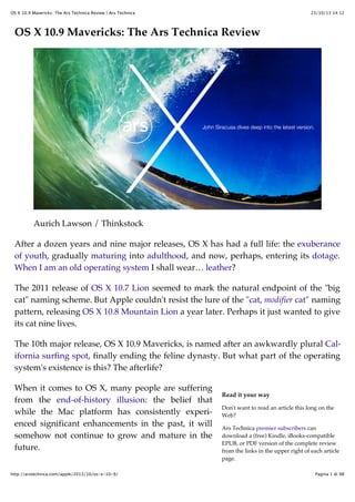
  • 1. OS X 10.9 Mavericks: The Ars Technica Review | Ars Technica 23/10/13 14:12 OS X 10.9 Mavericks: The Ars Technica Review Aurich Lawson / Thinkstock After a dozen years and nine major releases, OS X has had a full life: the exuberance of youth, gradually maturing into adulthood, and now, perhaps, entering its dotage. When I am an old operating system I shall wear… leather? The 2011 release of OS X 10.7 Lion seemed to mark the natural endpoint of the "big cat" naming scheme. But Apple couldn't resist the lure of the "cat, modifier cat" naming pattern, releasing OS X 10.8 Mountain Lion a year later. Perhaps it just wanted to give its cat nine lives. The 10th major release, OS X 10.9 Mavericks, is named after an awkwardly plural California surfing spot, finally ending the feline dynasty. But what part of the operating system's existence is this? The afterlife? When it comes to OS X, many people are suffering from the end-of-history illusion: the belief that while the Mac platform has consistently experienced significant enhancements in the past, it will somehow not continue to grow and mature in the future. http://arstechnica.com/apple/2013/10/os-x-10-9/ Read it your way Don't want to read an article this long on the Web? Ars Technica premier subscribers can download a (free) Kindle, iBooks-compatible EPUB, or PDF version of the complete review from the links in the upper right of each article page. Pagina 1 di 98
  • 2. OS X 10.9 Mavericks: The Ars Technica Review | Ars Technica So let's readjust our perspective. Perhaps the first seven big-cat releases were OS X's early childhood: birth, potty training, learning to walk and talk, and so on, culminating in some form of self-actualization. 23/10/13 14:12 Non-subscribers can buy the e-book from the iBookstore or the Amazon Kindle store. With Lion, the Mac entered an awkward adolescence, acquiring a newfound concern about what the other kids were doing. Accordingly, OS X's last two releases included several naked attempts to ape the look and feel of its more successful sibling, iOS. But that was all before last year's ouster of Scott Forstall, senior vice president of iOS Software. By all accounts, Forstall was one of the driving forces behind the iOS aesthetic that Lion and Mountain Lion so enthusiastically embraced. Jony Ive's iOS 7 strikes off in a bold new direction based on a philosophy that Apple is eager to generalize to the company as a whole—leaving OS X holding the stitched-leather bag. An OS out to sea Let's say we accept that this is not the end of history and that OS X will continue to evolve. To what end? Aside from undoing the most egregious peer-pressure-motivated interface changes, what should this first non-cat release of OS X do differently from its predecessors? One option would be to continue to follow iOS's lead, switching gears from rich textures and simulations of analogous physical products and setting off in pursuit of the new, spare iOS 7 aesthetic. I'll spoil it for you: Apple hasn't chosen this path—not yet, anyway. Time and resource constraints alone could explain this choice. After all, Apple didn't even have the iPad version of iOS 7 ready in time for WWDC this year. An interface overhaul in Mavericks was clearly out of the question. Mavericks is also not an internals-only release like Snow Leopard, which famously promised "no new features." There are new features in Mavericks, even new bundled applications. To some degree, the content of any OS release is determined by what did and didn't make the deadline for the previous release. There are exceptions, like Fusion Drive, which didn't quite make it into Mountain Lion but also couldn't wait for the next major OS release because it was a prerequisite for some new hardware products. Nevertheless, Apple does try to give each new OS some sort of theme. Mavericks is http://arstechnica.com/apple/2013/10/os-x-10-9/ Pagina 2 di 98
  • 3. OS X 10.9 Mavericks: The Ars Technica Review | Ars Technica 23/10/13 14:12 the first California-themed release of OS X, named after "places that inspire us here in California," according to Craig Federighi, who says this naming scheme is intended to last for at least the next 10 years. The pressure is on for Mavericks to set a new direction for the Mac platform. According to Apple, Mavericks has a dual focus. Its first and most important goal is to extend battery life and improve responsiveness. Secondarily, Mavericks aims to add functionality that will appeal to "power users" (Apple's words), a group that may be feeling neglected after enduring two releases of OS X playing iOS dress-up. Is that enough for Mavericks to live up to its major-release version number and to kick off the next phase of OS X's life? Let's find out. Table of Contents Introduction Purchase and installation Branding Interface Safari iCloud Keychain Notification Center The Finder Tags Implementation Labels Tags iBooks Maps Multiple displays Energy saving App Nap App Nap Policy Energy best practices App Nap API Visibility Timer tolerance http://arstechnica.com/apple/2013/10/os-x-10-9/ Pagina 3 di 98
  • 4. OS X 10.9 Mavericks: The Ars Technica Review | Ars Technica 23/10/13 14:12 User activities Energy shaming Background tasks Centralized task scheduling Compressed memory Battery benchmarks Energy summary Responsive scrolling iCloud Core Data Sprite Kit Grab Bag System Preferences General Desktop & Screen Saver Language & Region Internet Accounts Sharing Parental Controls App Store Dictation Accessibility Integrated graphics improvements Terminal cwd restoration Special characters popover System font Recommendations Changeover Purchase and installation Lion was the first download-mostly release of OS X, and Mountain Lion was the first download-only release. Mavericks breaks no new ground in the realm of product distribution. As expected, it's available only through the Mac App Store. With the transition away from physical media complete, Apple is free to focus on one of the intended benefits of downloadable OS updates: adoption rate. At WWDC, Tim Cook made a point of bragging about iOS's adoption rate. After less http://arstechnica.com/apple/2013/10/os-x-10-9/ Pagina 4 di 98
  • 5. OS X 10.9 Mavericks: The Ars Technica Review | Ars Technica 23/10/13 14:12 than 10 months on the market, 93 percent of iOS users were using the latest version, iOS 6. (iOS 7 is well on its way to matching that performance, with a 64 percent adoption rate 34 days after its release.) Earlier in the same presentation, Craig Federighi shared some less impressive statistics about Mountain Lion adoption: 35 percent after six months. Did it pass 90 percent four months later? If it did, I imagine Apple would have said so. After eliminating the trip to the store (or the package delivery), the other major knob Apple can turn to drive adoption of new OS X releases is the price. And turn it has, dropping the price of the Mac operating system steadily over the past five years, hitting $19.99 with Mountain Lion. Mavericks follows the trend to its logical conclusion, finally joining iOS at the magical price point of free. Mac users who are still stubbornly clinging to Snow Leopard are unlikely to be dislodged, but anyone running Lion or Mountain Lion is sure to feel the gravitational pull of an OS upgrade that's just one click and $0 away. In a refreshing change of pace, Mavericks does not cut off support for any additional Mac hardware. If your Mac can run Mountain Lion, it can run Mavericks. For completeness, here's the list of supported models: iMac (Mid 2007 or newer) MacBook (Late 2008 Aluminum, or Early 2009 or newer) MacBook Pro (13-inch, Mid-2009 or later; 15-inch, Mid/Late 2007 or newer) MacBook Air (Late 2008 or newer) Mac mini (Early 2009 or newer) Mac Pro (Early 2008 or newer) Xserve (Early 2009) Like its feline ancestors, a single copy of Mavericks can be installed on "each Applebranded computer […] that you own or control" plus two additional copies within virtual machines. There's still no DRM, no serial numbers, and no product activation. I know I repeat this every year, but it's worth emphasizing. Despite having arguably built a large portion of its current digital media empire on the back of its FairPlay copy protection system, Apple still seems to view DRM as a net negative that should be avoided, when possible. http://arstechnica.com/apple/2013/10/os-x-10-9/ Pagina 5 di 98
  • 6. OS X 10.9 Mavericks: The Ars Technica Review | Ars Technica 23/10/13 14:12 Branding Time was when I'd review OS X branding trends by lining up images of cardboard product boxes or optical discs. After the transition to download-only, Apple's marketing materials and website must fill the gap. Our first glimpse of Mavericks branding was on a banner visible just before the WWDC 2013 keynote. Mavericks banner at WWDC 2013. Pierre Rothmaler The thin "X" is an obvious echo of iOS 7's design—despite the fact that, as we would soon find out in the keynote, Mavericks does not adopt the iOS 7 interface style. Apple's website revealed what would become the more common logo for the OS. http://arstechnica.com/apple/2013/10/os-x-10-9/ Pagina 6 di 98
  • 7. OS X 10.9 Mavericks: The Ars Technica Review | Ars Technica 23/10/13 14:12 Enlarge / The Mavericks preview section of apple.com. The "X" is thinner than in the past, but not quite iOS-7 thin. It's placed inside a circle that initially reads like an optical disc—or does if you're a Mac user of a certain age, anyway. But sometimes a circle is just a circle. Behind it, showing through the logo, is the attractive new default desktop image showing a wave, presumably from the eponymous surfing location. I'm mentioning all of this not (just) because I'm interested in how Apple markets its products, but because the branding of Mavericks reveals a tension that appears in both the aesthetic and functional design of the OS itself. Mavericks is not iOS 7, but it's also not Mountain Lion. Mavericks doesn't get an all-new interface, but it surely can't carry on with many of its bundled applications looking like iOS 6 doppelgängers. In the next section, we'll see how Apple manages this tension. Interface At first glance, Mavericks looks like Mountain Lion. There are no major changes to the appearance of standard controls like scroll bars and buttons; the Dock looks the same (in its default position, anyway); most application icons have not changed. But poke around a bit and you'll spot a few differences. Move the Dock to the side to reveal its new smoked glass appearance. It's a nice match for the attractive gray metal http://arstechnica.com/apple/2013/10/os-x-10-9/ Pagina 7 di 98
  • 8. OS X 10.9 Mavericks: The Ars Technica Review | Ars Technica 23/10/13 14:12 look introduced in Mountain Lion, though the smoked glass Dock is translucent instead of reflective like the metal Dock. The gray linen texture that invaded OS X in a big way a few years ago has now been expunged. The Notification Center sidebar and the login screen are now a soothing slate gray. Enlarge The new linen-free login window. No linen in Notification Center either. http://arstechnica.com/apple/2013/10/os-x-10-9/ Pagina 8 di 98
  • 9. OS X 10.9 Mavericks: The Ars Technica Review | Ars Technica 23/10/13 14:12 Linen also no longer covers secondary displays when full-screen mode is active; more on that later. With these changes, Mavericks can be seen as continuing to follow the lead of iOS 7, which also notably parts ways with the linen texture. But Mavericks is unwilling—or at least unable—to follow iOS 7 the rest of the way down the road. For now, Mavericks has settled for expelling as much visual and interactive baggage from iOS 6 as possible. Consider the state of the Address Book application in Lion. It was the spitting image of its iOS 6 counterpart on the iPad: a beautifully drawn leather-bound book with a red cloth bookmark. But the artwork was more misleading than helpful. The application looked like a book, but it didn't behave like one. Worse, important functionality was sacrificed on the altar of those graphics. The third pane used to display contact groups was removed entirely; an open book has two sides, not three, after all. In Mountain Lion, the newly renamed Contacts application brought back the groups pane, but it did so by cutting into the contact list's space on the left side of the "book" graphic. Open books must have two equal sides, right? Mavericks says enough is enough. The leather's gone, the fake pages are gone, the three panes are independently resizable (more or less), even the title bar is bone-stock, and it's… boring? http://arstechnica.com/apple/2013/10/os-x-10-9/ Pagina 9 di 98
  • 10. OS X 10.9 Mavericks: The Ars Technica Review | Ars Technica 23/10/13 14:12 The new look for the Contacts application: cucumbers with cottage cheese. The story's the same for the Notes application. Once an iOS 6 lookalike sporting torn bits of paper on a yellow legal pad, it's now stripped of all pretense. Also possibly removed: beauty, fun. http://arstechnica.com/apple/2013/10/os-x-10-9/ Pagina 10 di 98
  • 11. OS X 10.9 Mavericks: The Ars Technica Review | Ars Technica 23/10/13 14:12 The new Notes applications does not stand out in a crowd. Calendar is straight up the middle, with just a touch of iOS 7's super-lightweight text (e.g., the year) mingling somewhat awkwardly with the other typefaces. In Mavericks, gray is the new Corinthian leather. http://arstechnica.com/apple/2013/10/os-x-10-9/ Pagina 11 di 98
  • 12. OS X 10.9 Mavericks: The Ars Technica Review | Ars Technica 23/10/13 14:12 In Mavericks, gray is the new Corinthian leather. When Lion was released, here's what I wrote about its stitched-leather calendar application: The immediate, visceral negative reaction to the rich Corinthian leather appearance had little to do with usability. What it came down to—what first impressions like these always seem to come down to—is whether or not you think it's ugly. People will take "really cool-looking but slightly harder to use" over "usable but ugly" any day. The freshly undecorated applications in Mavericks may test that assertion. Contacts and Calendar look plain compared to their previous incarnations; to my eye, Notes borders on ugly. Don't get me wrong, in the case of applications like Contacts, I'm all for excising the misleading graphics and returning the functionality that was removed in service of them. But that kind of surgery appears to be the only significant change to these applications in Mavericks. Apple took the Mountain Lion versions, removed the graphical frills, and updated the UI enough to work correctly without them. I'm not sure there were any better options given the time constraints. Leaving these applications unmodified would have made OS X look like even more of an old fogey next to iOS 7 than it already does. An OS-wide overhaul (following the iOS lead or not) would have easily pushed Mavericks out into next year, blowing Apple's annual release schedule. And if an interface overhaul is in the cards for OS X in the next year or two, a fresh rethinking of each application within the constraints of the current OS X look might have been wasted effort (in addition to making Mavericks late). And yet there are places where hints of iOS 7 peek through. The icon for the new Maps application, for example, looks like an OS X-style application icon with iOS 7's color palette and smooth gradients applied to it. The iBooks application icon takes this look one step further. The new iCloud preference pane icon looks like a straight lift from iOS 7. http://arstechnica.com/apple/2013/10/os-x-10-9/ Pagina 12 di 98
  • 13. OS X 10.9 Mavericks: The Ars Technica Review | Ars Technica 23/10/13 14:12 Maps, iBooks, and iCloud have icons that show more than a little of iOS 7's influence. You might expect the Calendar, Contacts, and Notes icons to have been revised in the style of the new Maps icon to reflect their newly chastened interfaces. Nope, no time for that either, I guess. These applications have changed, but their icons still reflect their pre-Mavericks interfaces. Many applications haven't been modified at all in Mavericks. Game Center retains its tacky green felt and wood. Reminders still looks like textured black… something surrounding white note paper. Messages still sports glossy text bubbles. The influence of both iOS 7's "frosted glass" header elements and the sadly misguided translucent OS X menu bar can be felt in the new list-view headers in the Finder. In what situation is it important to see the App Store application peeking through the header? http://arstechnica.com/apple/2013/10/os-x-10-9/ Pagina 13 di 98
  • 14. OS X 10.9 Mavericks: The Ars Technica Review | Ars Technica 23/10/13 14:12 I can think of only one practical use for this effect: to indicate that there's more content above the current scroll position when no scroll bar is visible to communicate this information. At all other times, this transparency only serves to slightly impair the readability of the column headers. And then there's the crazy sparkle effect that appears around newly installed applications in Launchpad. Apps, exciting and new… The same effect is used when a new Dashboard widget is installed. I'm tempted to say this is no more gaudy than the water-ripple effect used when a new instance of a widget is placed on the Dashboard, but in the context of the overall trend away from ostentatious ornamentation across Apple's product line… yeah, it does seem a little worse. In short, the look and feel of Mavericks is a mixed bag. The iOS-inspired interface divergences introduced in Lion and refined in Mountain Lion have been partially rolled back in Mavericks, but there's still much more to be done. I look forward to the day that the OS X interface will finally stop backtracking and start moving forward again. Safari The most important changes to Safari in Mavericks are internal. Two years ago, Lion included a version of Safari based on the WebKit2 engine, which separated the task of page rendering and JavaScript execution into an external process, mostly for security reasons. WebKit2 was a reaction to Chrome's multi-process architecture, which uses multiple WebKit processes to handle page rendering. Google included the multi-process code in the Chromium project, not in WebKit. Before creating WebKit2, Apple asked Google if it was willing to contribute Chromium's multi-process code to the WebKit project. Google declined, leaving Apple to create its own solution. Apple implementhttp://arstechnica.com/apple/2013/10/os-x-10-9/ Pagina 14 di 98
  • 15. OS X 10.9 Mavericks: The Ars Technica Review | Ars Technica 23/10/13 14:12 ed its multi-process system in the WebKit engine itself, benefiting any application that uses WebKit. Unfortunately, the WebKit2 era of Safari has been marred by chronic instability. When Safari's lone back-end Web rendering process gets wedged, users are greeted with the all-too-familiar "webpages are not responding" dialog; forward progress requires reloading every open webpage in every tab in Safari. This problem has not gone away in the years since Lion was released. Contrast this to Google's Chrome browser, which has been rock-solid over the same period. The cumulative effect of these years of Safari instability has made me start to question whether Apple still has the chops to keep up in the fast-paced world of Web rendering engines. Safari version 7, included in Mavericks, is Apple's answer. It sports a new processper-tab architecture, finally following in Chrome's footsteps—though this change is part of WebKit itself, not just the Safari application. It's too early to tell if this change will restore Safari's stability, but I can report that I have not seen a single Safari crash or "webpages are not responding" dialog in all my Mavericks testing. (I've seen many in Safari 6 while writing this review in Mountain Lion.) The new architecture also affords the ability to examine the behavior of individual browser tabs using the Activity Monitor application. At last, separate Safari Web Content processes for each tab. It would be nice if this feature was built into Safari itself, like Chrome's Task Manager, so each "Safari Web Content" process could be linked to a specific open tab. Safari's first-run experience reveals most of its new user-visible features. The old Top Sites, a concave pseudo-3D wall of website thumbnails, has been replaced by a plain, http://arstechnica.com/apple/2013/10/os-x-10-9/ Pagina 15 di 98
  • 16. OS X 10.9 Mavericks: The Ars Technica Review | Ars Technica 23/10/13 14:12 flat grid of thumbnails. The old Reading List sidebar has been replaced by a unified sidebar containing Bookmarks, Reading List, and a new feature called Shared Links. Safari's new sidebar and less flamboyant Top Sites layout. Shared Links shows links from the social network accounts added through the Internet Accounts preference pane. For example, if a Twitter account is registered, Shared Links will show only the tweets that contain links. Reading List gets a mild facelift to fit in with the new sidebar styling. Two-finger swiping past the bottom of the page when viewing an item from the Reading List loads the next item in the list. It's as if all items form a single, long webpage. The old bookmarks manager and history viewer are still available via separate items in the Bookmarks and History menus, respectively. Editing bookmarks in the new sidebar is frustrating (the interface is made for navigation, not modification), so don't forget about the old interfaces. After a brief absence, the "+" button has returned to its former home nestled in the left side of the address bar. There is no separate incarnation of this button that can be placed anywhere on the toolbar, nor is there an option to remove it from the address bar. Holding down the mouse button (but not right-clicking) on the "+" button reveals http://arstechnica.com/apple/2013/10/os-x-10-9/ Pagina 16 di 98
  • 17. OS X 10.9 Mavericks: The Ars Technica Review | Ars Technica 23/10/13 14:12 a menu for adding the current webpage to all of Safari's various link storage locations. The "add" button is here to stay in Safari 7, but at least it knows a few new tricks. While the additional functionality is welcome, I'm not sure the frequency with which people add bookmarks, Top Sites, or Reading List items warrants such prominent, permanent placement for this button. Browser plug-ins can now be managed on a per-website basis, with five options: Ask, Block, Allow, Always Allow, and Run in Unsafe Mode. The same options exist for the default behavior when visiting a new website. The preferences window conveniently splits the list of websites into those that are currently open in Safari and all the rest. http://arstechnica.com/apple/2013/10/os-x-10-9/ Pagina 17 di 98
  • 18. OS X 10.9 Mavericks: The Ars Technica Review | Ars Technica 23/10/13 14:12 Safari's new per-site, per-plug-in security settings. Even when set to "Allow" a plug-in, Safari will block it if there are known security issues with the installed version of that plug-in. (Updated plug-in security information is automatically distributed to all network-connected Macs using the same mechanism as the existing malware signature information.) The "Allow Always" setting overrides this restriction, permitting plug-ins to load even if they have known vulnerabilities. Most popular plug-ins run in a sandbox by default, including QuickTime, Flash Player, Silverlight, and Oracle's Java plug-in. The "Unsafe" plug-in setting instructs Safari to run the plug-in outside the sandbox. This is intended as a last resort for plug-ins that don't yet run correctly inside a sandbox. (This setting also allows plug-ins to load despite the existence of known security problems with the installed version.) The "Ask" setting is the default when visiting a new website. It presents a sheet with options to trust, block, or disallow for now (but ask again later). http://arstechnica.com/apple/2013/10/os-x-10-9/ Pagina 18 di 98
  • 19. OS X 10.9 Mavericks: The Ars Technica Review | Ars Technica 23/10/13 14:12 When configured to "Ask" about plug-ins on the first visit to a website, Safari presents these options. Blocked plug-ins are reported as such in the browser window. Clicking on the blocked plug-in message will ask for confirmation before allowing it to load. Click to load this plug-in…and all other instances of the same plug-in on this website. Clicking the "Trust" button doesn't just allow this particular instance of the plug-in to load. It changes the setting for this plug-in for the entire website to "Allow." This is unlike the once-popular ClickToFlash in which clicking on a particular instance of a plug-in did not confer website-wide permission to load that plug-in in the future. http://arstechnica.com/apple/2013/10/os-x-10-9/ Pagina 19 di 98
  • 20. OS X 10.9 Mavericks: The Ars Technica Review | Ars Technica 23/10/13 14:12 Like last year's Gatekeeper feature, Safari's new plug-in security settings have sensible defaults while also offering an easy way to opt out. Automatically disabling plug-ins when vulnerabilities are discovered will likely annoy users a lot more than Gatekeeper does, but it's preferable to the alternative of leaving users exposed until they realize there's a problem and upgrade on their own—a sequence of events that represents a surprisingly high hurdle for most users. After all, most people don't read tech news on a regular basis, scanning for the latest Flash or Java exploits. There's also a new preference to "Stop plug-ins to save power," which is part of a feature Apple calls Safari Power Saver. Even if the preference for a website is set to "Allow," the Power Saver feature will stop plug-ins from running if they do not appear to be the main content on the page. Translating that from abstract to concrete, it means that you can enable Flash for a website and Safari will still try to block auto-playing Flash ads that appear around the content on that website. There's no visible indication that it's happening until you mouse over one of the frozen ads. Safari Power Saver in action: a Flash sidebar ad loads, but it's not allowed to run until clicked. Safari uses a fuzzy set of rules to distinguish plug-in "content" (e.g., the movie trailer you came to the website to see) from extraneous items that should not be allowed to auto-play (e.g., sidebar or banner ads). In practice, it works well. Credit the banal predictability of ad-heavy website layouts and ad banner sizes. The default Web browser is an incredibly important part of any modern operating http://arstechnica.com/apple/2013/10/os-x-10-9/ Pagina 20 di 98
  • 21. OS X 10.9 Mavericks: The Ars Technica Review | Ars Technica 23/10/13 14:12 system. Though we geeks may routinely install alternate browsers, application download and installation on OS X is not yet as simple as it is on iOS. (It also doesn't help that popular alternatives like Chrome and Firefox aren't available through the Mac App Store.) Safari is "the Web" for most Mac users; it needs to be awesome. Apple clearly realizes this, as it continues to pour resources into Safari in release after release. Safari 7 is a standard-bearer for many of the flagship technologies in Mavericks, and its focus on stability, security, and energy-saving is a microcosm of the whole OS. I came very close to switching to Chrome as my default Web browser during the reign of Safari 6. Safari 7 has pulled me firmly back into the Apple camp. iCloud Keychain Few lamented the end of MobileMe. Apple's much-maligned package of network services was in trouble from day one, and it never became the beloved, essential product that Apple envisioned. When iCloud was introduced in 2011, it was welcomed as a liberator. The transition from MobileMe to iCloud was not without its pitfalls—and losses. The end of support for Apple-hosted websites produced the biggest short-term turmoil, but the writing had been on the wall for the iWeb application for years. Passwords, on the other hand, are (sadly) not going away any time soon. MobileMe's Keychain synchronization feature was one of the highlights of the service for me. To replace it, iCloud offered exactly nothing. This was an ongoing pain, becoming worse as the Keychain databases stranded on each isolated Mac slowly diverged from each other. In Mavericks, blessed relief is just one checkbox away. The new iCloud Keychain isn't exactly the same as MobileMe's Keychain sync. Rather than synchronizing the entire contents of the Mac's Keychain database, Mavericks adds a new "iCloud" keychain alongside the local "login" and "System" keychains. http://arstechnica.com/apple/2013/10/os-x-10-9/ Pagina 21 di 98
  • 22. OS X 10.9 Mavericks: The Ars Technica Review | Ars Technica 23/10/13 14:12 iCloud gets its own separate keychain. If the iCloud Keychain is subsequently disabled, the iCloud keychain highlighted in the screenshot above is replaced with a "Local Items" keychain that has the same contents as the iCloud keychain. Any items added to the Local Items keychain will be pushed out to other devices when iCloud Keychain is re-enabled. Enabling iCloud Keychain requires traversing a gauntlet of security-related questions rivaled in OS X only by the recently revised File Vault disk encryption feature. It starts with a suggestion to enable a screen lock, if one is not already enabled, to prevent someone from walking up to your unattended Mac and having access to all your cloud-synced passwords. Heed Apple's advice (or click "Not Now"), then enter your Apple ID password to continue. Next, you'll be asked to create an "iCloud Security Code." The default dialog requests a four-digit numeric code, but the "Advanced…" button leads to more options. iCloud Security Code setup: 4-digit numeric, or… http://arstechnica.com/apple/2013/10/os-x-10-9/ Pagina 22 di 98
  • 23. OS X 10.9 Mavericks: The Ars Technica Review | Ars Technica 23/10/13 14:12 iCloud Security Code "Advanced" options, including no security code at all. You can forgo a security code entirely, ask to be prompted for a "complex" security code (i.e., a password instead of a 4-digit code), or ask Mavericks to generate a random security code. Random codes look a lot like File Vault recovery keys (e.g., DCLKXZEX-XNEB-LGXJ-5UHB-89C3). The "complex" and "random" security code dialog boxes also suggest that people write down their security codes and keep them "in a safe place" because "Apple cannot recover a lost code." Finally, if you didn't opt out of the security code entirely, you must enter a phone number that can receive SMS messages. At last, the final step: a phone number to receive verification codes from Apple via SMS. http://arstechnica.com/apple/2013/10/os-x-10-9/ Pagina 23 di 98
  • 24. OS X 10.9 Mavericks: The Ars Technica Review | Ars Technica 23/10/13 14:12 There's also a first-run setup wizard that will take new users through the same steps before logging in for the first time. All of this additional security comes into play when you want to enable iCloud Keychain on a second device. At that point, you have two options. You can request approval from another device where iCloud Keychain has already been enabled for the same Apple ID. This request appears in the form of a standard notification dialog. Approval from a trusted device is one way to activate iCloud Keychain on another Mac. If you choose to configure an iCloud Security Code, you can enable iCloud Keychain on a new device by entering all three of the following: your Apple ID password, your security code, and a verification code that Apple will send to the configured phone number via SMS. Usability and security are often at odds with each other. iCloud Keychain bears this out, presenting many more hurdles during the setup process than the MobileMe Keychain sync feature that it belatedly replaces. Once configured, it mostly works as expected, helpfully offering to remember usernames and passwords in applications like Safari, syncing them to all configured devices, and then auto-completing those values when they're requested later. http://arstechnica.com/apple/2013/10/os-x-10-9/ Pagina 24 di 98
  • 25. OS X 10.9 Mavericks: The Ars Technica Review | Ars Technica 23/10/13 14:12 Safari's Keychain auto-fill, now powered by iCloud. Safari's iCloud Keychain integration goes further, offering to auto-generate and then remember passwords for the user. Accepting the suggested password will also helpfully enter it in the password confirmation field as well. Interestingly, Apple's own Apple ID account creation website ranks the strength of the auto-generated password as merely "moderate." Apple is not impressed by its own password suggestions. By default, auto-fill still refuses to activate on websites that explicitly ask to disable the feature. Again, the tension between usability and security surfaces. Digging into Safari 7's preferences reveals a setting that promises to "[a]llow AutoFill even for websites that request passwords not be saved." Jackpot! But there are caveats. First, enabling this override requires that the Mac be configured to lock the screen when idle. Second, Safari still fails to auto-fill passwords on some websites, most notably Apple's own icloud.com. http://arstechnica.com/apple/2013/10/os-x-10-9/ Pagina 25 di 98
  • 26. OS X 10.9 Mavericks: The Ars Technica Review | Ars Technica 23/10/13 14:12 For people with more complex needs, third-party password managers still fill an important role. Similarly, the people for whom "cross-platform" means more than just "OS X and iOS" will continue to rely on the password management and sync features built into Chrome and Firefox. For everyone else, things are looking up. An Apple-made password manager that's built into the default Web browser on OS X and works across multiple Macs and iOS devices was long overdue. It's sure to be a hit among people who—rightly—expect this functionality to work without any third-party software. Notification Center Notification Center has become such an integral part of my daily use of OS X that I just spent a few moments searching my review of Lion for the word "notification" before realizing that Notification Center was actually introduced just a year ago in Mountain Lion. I'd say the feature has handily earned its place in the upper-right corner of the screen, even if most of my interaction with it is through the preference pane and the various alerts and banners that appear during the day. Mavericks takes the obvious next step and adds the ability to reply to a notification right from the alert itself. This only works for a handful of Apple-supported applications right now (e.g., instant messages using the Messages application, e-mail using Apple's Mail application) but the supported services have broad coverage: Facebook, Twitter, FaceTime, e-mail, instant message, calendar events, and reminders. Simple, text-only replies can be sent directly from a notification alert using an inline user interface. Replying to an instant message from within the notification. The reply button on e-mail notification alerts will launch the Mail application and prehttp://arstechnica.com/apple/2013/10/os-x-10-9/ Pagina 26 di 98
  • 27. OS X 10.9 Mavericks: The Ars Technica Review | Ars Technica 23/10/13 14:12 pare a reply. Despite the potential sophistication of an e-mail message (attachments, styled text, and so on), an inline e-mail reply interface would be a nice option. Maybe next year. Cross-protocol replies are a pleasant surprise. An invitation to a FaceTime video chat offers an inline instant-message reply option with a configurable set of canned answers (or freeform text), plus an option to add a reminder to get back to the person later. The reminder will include a link to initiate a FaceTime chat with the person. FaceTime requests can be replied to with an instant message or by creating a reminder to contact the person later. Instant messages can also be initiated from that weird little area at the top of the Notification Center sidebar. It's getting pretty crowded up there. There's probably room for one more service icon before things start getting silly. Send an instant message, tweet, or share something on Facebook or LinkedIn from the top of Notification Center. http://arstechnica.com/apple/2013/10/os-x-10-9/ Pagina 27 di 98
  • 28. OS X 10.9 Mavericks: The Ars Technica Review | Ars Technica 23/10/13 14:12 Sending an instant message from Notification Center. Each type of notification now has an option (on by default) to display even when the screen is locked. Notifications that may contain sensitive information, such as e-mails or instant messages, have an additional option to show message previews only when the screen is unlocked (the default), or always. New privacy-related notification preferences. These defaults are reasonable, but people who rely on screen savers for "casual" privacy in shared spaces may not want even the names of the people who are e-mailing and instant-messaging them to appear on their unattended screens. As always, the price of Notification Center satisfaction is eternal vigilance. Though Safari in Mountain Lion linked Web notifications to OS X's native notification system, I've encountered few websites that take advantage of this feature. It only works when a website is open in a Safari window, so admittedly, its usefulness is limited. Mavericks allows websites to use Apple's Push Notification service to post updates even when Safari isn't running. This is a feature I really hope more websites adopt, though its confinement to a single platform surely makes it less appealing. Finally, the big on/off switch at the top of the Notification Center sidebar has been rehttp://arstechnica.com/apple/2013/10/os-x-10-9/ Pagina 28 di 98
  • 29. OS X 10.9 Mavericks: The Ars Technica Review | Ars Technica 23/10/13 14:12 branded as Do Not Disturb and has been given a generous helping of preferences. Notification Center's Do Not Disturb feature now has a full set of preferences. The part of me that Apple's beautiful, terrible walled garden has not yet stamped out of existence still yearns for a more open notification system that would allow thirdparty applications to enjoy the same interface integration as Apple's "blessed" applications for each service. (I use Adium for instant messaging, Twitterrific for Twitter, and Gmail for e-mail.) But overall, the notification system in Mavericks is a comfortable improvement over its initial incarnation in Mountain Lion. The Finder It's not fair to say that Apple has entirely neglected the OS X Finder. It's been extensively revised multiple times over the years. It was even "rewritten" in Cocoa when Apple finally left Carbon behind for good a few years ago. Every major release of OS X includes some changes to the Finder. But even as Apple has regularly laid hands on the Finder codebase, the application has continued to suffer from a kind of spiritual neglect. My own decade-long frustration with Apple's refusal to cleanly separate the "browser" features of the Finder from the rest of its functionality may (still) seem academic and unimportant to most Mac http://arstechnica.com/apple/2013/10/os-x-10-9/ Pagina 29 di 98
  • 30. OS X 10.9 Mavericks: The Ars Technica Review | Ars Technica 23/10/13 14:12 users (though they are wrong). But more broadly speaking, it's clear that the OS X Finder is far from the center of the Mac experience that it once was back in the days of classic Mac OS. With the introduction of Launchpad in Lion, the Finder seems poised to become even less relevant in the future. Given all of this, perhaps we've been lulled into a false sense of complacency where the Finder is concerned. Then along comes Mavericks and, suddenly, the Finder has tabs. Tabbed browsing in the Mavericks Finder. The wait is over. Tabs! Can you believe it? This is such an obvious feature that entire third-party products have been developed to fill the gap. Why didn't the Finder get tabs sooner? Was there some sort of philosophical objection to them? Did they conflict with the grand vision of the OS X Finder? Does such a thing even exist? So many questions. No matter, tabs are here now, so let's move on. They look and work almost exactly like Safari tabs. They can be rearranged by dragging, torn out to form new windows, and moved from one window to another. Holding down the command key while double-clicking a folder opens it in a new tab. (There's a preference to turn this off, in which case command-double-clicking opens a folder in a new window.) Files and folders can be dragged and dropped onto a tab in any window to move or copy them. The proxy icon next to the folder name in the window title bar can be dragged onto the "+" icon in the tab bar of another Finder window to add a new tab with that location. Since it's nearly impossible to add a major new feature to the Finder without further complicating the interaction between "normal" and "browser" Finder windows (browser windows are the ones with toolbars), please note that it's now impossible to http://arstechnica.com/apple/2013/10/os-x-10-9/ Pagina 30 di 98
  • 31. OS X 10.9 Mavericks: The Ars Technica Review | Ars Technica 23/10/13 14:12 hide the toolbar on a browser window that has two or more tabs. Non-browser Finder windows don't have tabs, and apparently Apple couldn't decide what to do with the tabs when "transforming" a browser window into a normal window. Of course, that transformation is at the very heart of the Finder's schizophrenic/amnesiac persona, leading to similar questions about other aspects of window state such as size, position, view style, and so on, which is why such window transformations shouldn't be possible at all, under any circumstances. But I digress. With the addition of tabs, the idea of a full-screen Finder window is a lot more attractive. Happily, the upper-right corner of each Finder browser window sports a fullscreen widget that does just what you'd expect. Full-screen support and tabs would easily fulfill the low expectations for Finder changes in a major OS X update, but Mavericks has one more thing… Tags At first glance, it appears that Finder Labels have been renamed "Tags" in Mavericks. Sure enough, the menu items and preferences in the Finder use the word "Tags" everywhere and "Labels" nowhere. The visual treatment of labels in the Finder's various views has also changed. Instead of highlighting the entire file or folder name (or the entire row, in list view), a colored dot is displayed next to the name. Finder Tags display: colored dots replace Mountain Lion's whole-row highlights. Setting aside everything else that is to come regarding Tags, this change alone finally resolves the visual confusion caused by the line-highlighting appearance of labels introduced in Panther 10 years ago. http://arstechnica.com/apple/2013/10/os-x-10-9/ Pagina 31 di 98
  • 32. OS X 10.9 Mavericks: The Ars Technica Review | Ars Technica 23/10/13 14:12 Stay in the Finder a bit longer and you'll undoubtedly discover that Tags are not quite the same as labels. Attempt to change a file's Tag from blue to green, for example, and the UI will gently explain what's about to happen. Multiple Tags can be applied to a single file. When an item has multiple Tags, the Finder will show multiple overlapping dots, up to a maximum of three, showing the three most recently applied thereafter. Multiple Tags as displayed in the Finder: the three most recent Tags are shown as dots. Careful observers will note that the text "Label:" that used to appear above the row of colored dots in the Finder's context menu has been replaced with "Tags…" in Mavericks. As always on the Mac, that ellipsis denotes a menu item that leads to a further prompt for input. Select it and a popover appears, featuring a list of colored dots along with a text input field. (The same functionality can be triggered using the "Edit Tags" Finder toolbar item or the "Tags…" menu item in the File menu.) Go ahead and type. If the text matches an existing Tag name, hitting the return key will add the Tag and return the insertion point to the text field, now including the newly added Tag. http://arstechnica.com/apple/2013/10/os-x-10-9/ Pagina 32 di 98
  • 33. OS X 10.9 Mavericks: The Ars Technica Review | Ars Technica 23/10/13 14:12 The Finder Tags popover: add an existing Tag by clicking on it or typing its name. Type something that does not match an existing Tag and hit return to create a new Tag. Enter the name of a Tag that's already added to the file and the Tag will be moved to the end of the list of Tags. The Finder Tags popover: create a new Tag or move an existing Tag. The "Tags" section of the Finder's preferences window offers a way to assign colors to http://arstechnica.com/apple/2013/10/os-x-10-9/ Pagina 33 di 98
  • 34. OS X 10.9 Mavericks: The Ars Technica Review | Ars Technica 23/10/13 14:12 newly created Tags—though it's not immediately obvious how. (The answer: click the circle to the left of the Tag name.) There are only seven colors to choose from, and they can't be changed. More than one Tag can use the same color. There's also a confusing drag-and-drop area at the bottom of the window. Though the text above it tries to explain how it works, the lack of labels on the colored dots at the bottom is confusing. That horizontal line of colored dots represents the list of Tags shown in the Finder's File menu and context menu. Mouse over each dot to see the name of the Tag that it represents. Do what the text above the dots says and drag a Tag from the top list onto the bottom row and yet more text appears to explain what will happen when you release the mouse button and complete the drag operation. Frankly, this entire window is a userinterface disaster. And we haven't even The devious puzzle box that is the Finder's Tags preferences. mentioned the checkbox to the right of each label. Can you guess what those do? (No, there's no tooltip when you hover over one.) I'll spoil the surprise. When that box is checked, it means the Tag appears in the Finder sidebar; unchecked means it doesn't. And still, more mysteries remain. Just try to guess what an indeterminate checkbox (i.e., one with a horizontal line in it instead of a check mark) is meant to indicate. (No, still no tooltip on hover!) Give up? I almost did. Here's what it means. When a Tag that has never been added to any file before is added to a file for the first time, that Tag automatically appears in the Finder sidebar (at the very top). But since the user didn't explicitly ask for that to happen, the preferences window doesn't show a check mark in the checkbox; it shows the indeterminate marker instead. http://arstechnica.com/apple/2013/10/os-x-10-9/ Pagina 34 di 98
  • 35. OS X 10.9 Mavericks: The Ars Technica Review | Ars Technica 23/10/13 14:12 You were just about to guess that, right? Thankfully, the fate of the OS—or even just the Finder—doesn't hinge on this one preferences window. But good gravy, is it ever a mess. The rest of the Finder's integration of Tags is smoother. Selecting a Tag in the Finder sidebar runs a Spotlight search for all files with that Tag. (As far as I can tell, there is no way to select multiple Tags in the sidebar; use a full Spotlight search to find files with any or all of a set of Tags.) Drag the Tags in the sidebar to reorder them. When a Tag is selected in the Finder sidebar, dragging a file into that window will add the selected Tag to the file (which will in turn make the file match the search criteria and appear in the window). As usual, the same sidebar appears in open/save dialog boxes. The standard save dialog also includes a new field for entering or modifying Tags. This is convenient, but it may also be confusing for some people. When the Tags field is empty, it looks exactly like the file name field that's directly above it. Add tags when saving a document—just make sure you enter them in the correct field. I've done a double-take several times when saving documents in Mavericks due to this "clone" text field. It's all too easy for me to picture a less experienced user trying to type a file name into the Tags field and not understanding the subsequent error messages. http://arstechnica.com/apple/2013/10/os-x-10-9/ Pagina 35 di 98
  • 36. OS X 10.9 Mavericks: The Ars Technica Review | Ars Technica 23/10/13 14:12 Tags are also editable using the title bar pop-up menu introduced in Lion for document versioning. Move over, versions. Tags now get pride of place in the title bar pop-up menu. The old "Move To…" command has been replaced with a pop-up menu containing iCloud folders, favorites, devices, and recent destinations, with an "Other…" item at the bottom. The document-versioning features that used to live in the title bar pop-up menu remain accessible via the File menu's "Revert to…" submenu. Tags implementation File system metadata in OS X has had an extremely bumpy road. The folks from NeXT wanted no part of the metadata inherited from classic Mac OS for both philosophical and technical reasons. Their proposed replacement: nothing. That's all ancient history now. We may still be stuck with the practice of encoding file type information in the file name like a bunch of animals, but in the end, file system metadata did eventually come to OS X in a big way, as predicted. The turning point came in Mac OS X 10.4, which added support for arbitrarily extensible file system metadata. No longer were we confined to just a file name, a few dates, and some permissions and ownership information. Now we could attach any information to a file by adding arbitrary name/value pairs. OS X itself was the first and biggest beneficiary of this feature, using it to implement everything from low-level features like access control lists to flagship marketing features like Time Machine. In Mavericks, it's natural to assume that Tags leverage the same mechanism. Sure enough, they do—though not quite in the way I expected. But http://arstechnica.com/apple/2013/10/os-x-10-9/ Pagina 36 di 98
  • 37. OS X 10.9 Mavericks: The Ars Technica Review | Ars Technica 23/10/13 14:12 before we get to that, let's consider how the legacy Label metadata is stored. Labels Labels were introduced way back in System 6 in 1988. Since Apple made both the Finder and the file system, it reserved a place in the file system metadata for what it called "Finder Info." This structure contained information useful to the Finder (usually packed into bit fields—hey, it was 1988), including three bits for the Label color. It would be nice if file system details from 1988 had little bearing on the Mac of today. Alas, OS X continues to use a file system derived from the very same one in use when Finder Labels were created. The Finder Info data structure is in the same old location and format in the file system. As a nod toward modernity, Finder Info is exposed in OS X through a "fake" extended attribute named com.apple.FinderInfo. The code that reads and writes extended attributes for files on HFS+ volumes checks to see if the attribute name is com.ap‐ ple.FinderInfo and then branches to another code path that reads the actual HFS+ Finder Info record from the file system. (The resource fork is exposed in a similar way under the com.apple.ResourceFork attribute name.) The upshot is that the xattr command can be used to show Finder Info for a file. In this example, the "Red" Label has been applied to the file named Hello. % xattr -p com.apple.FinderInfo Hello 00 00 00 00 00 00 00 00 00 0C 00 00 00 00 00 00 00 00 00 00 00 00 00 00 00 00 00 00 00 00 00 00 That 0C bit pattern represents the Red Label. Only three bits in the Finder Info are allotted for the Label color, which means there can be a maximum of seven Label colors (001 through 111, reserving 000 for when there's no Label). Red is color number 6: 0x0C is 1100 in binary, but the last bit is not part of the Label's bitfield. We're left with 110, which is 6 in base ten. Tags When a Tag that has a color assigned to it is applied to a file in Mavericks, Label information is written to the Finder Info field exactly as described above, making Tags at http://arstechnica.com/apple/2013/10/os-x-10-9/ Pagina 37 di 98
  • 38. OS X 10.9 Mavericks: The Ars Technica Review | Ars Technica 23/10/13 14:12 least partly backward-compatible with pre-Mavericks systems. As more colored Tags are added to the file in Mavericks, the Label information changes to reflect the most recently applied Tag. If a Tag does not have a color assigned to it, the Label information is not modified. The actual Tag information is stored in its own separate extended attribute named com.apple.metadata:_kMDItemUserTags. (As far as I know, this is a "normal" extended attribute, not a proxy for legacy HFS+ metadata like com.apple.Finder‐ Info and com.apple.ResourceFork.) In this example, the "Green" and "Red" Tags have been applied to the file Hello in that order. % xattr -l Hello com.apple.FinderInfo: 00000000 00 00 00 00 00 00 00 00 00 |................| 00000010 00 00 00 00 00 00 00 00 00 |................| 00000020 com.apple.metadata:_kMDItemUserTags: 00000000 62 70 6C 69 73 74 30 30 A2 |bplist00...WGree| 00000010 6E 0A 32 55 52 65 64 0A 36 |n.2URed.6.......| 00000020 00 00 01 01 00 00 00 00 00 |................| 00000030 00 00 00 00 00 00 00 00 00 |............| 0000003c 0C 00 00 00 00 00 00 00 00 00 00 00 00 00 01 02 57 47 72 65 65 08 0B 13 00 00 00 00 00 00 03 00 00 00 00 00 00 19 There's the expected 0C bit pattern in the Finder Info, since the "Red" was the last Tag applied. The ASCII dump of the Tag metadata starts with the telltale bplist sequence of a binary property list. With a little help from a hex editor and a text editor that understands binary property lists, the content of the Tag metadata is revealed: <?xml version="1.0" encoding="UTF-8"?> <!DOCTYPE plist PUBLIC "-//Apple//DTD PLIST 1.0//EN" "http://www.apple.com/DTDs/PropertyList-1.0.dtd"> http://arstechnica.com/apple/2013/10/os-x-10-9/ Pagina 38 di 98
  • 39. OS X 10.9 Mavericks: The Ars Technica Review | Ars Technica 23/10/13 14:12 <plist version="1.0"> <array> <string>Green 2</string> <string>Red 6</string> </array> </plist> You can see the two Tag names, Green and Red, listed in the order they were added, along with their decimal Label color values (2 for Green, 6 for Red). The format of the Tag information within the property list is pretty strange. Your eyes do not deceive you; that is indeed a Unix newline character (0x0A) separating the Tag name from the decimal Label color value. Why the name and color are packed into a single string value in the property list instead of being stored in separate <string> and <integer> values is beyond me. (Is this what prolonged exposure to file name extensions does to the mind?) Tags that have no color assigned to them appear as lone strings, with no newline or Label color value: ... <array> <string>Green 2</string> <string>Red 6</string> <string>Essential</string> </array> ... I was also initially surprised to find that information about Tags is stored in a single extended attribute instead of using one extended attribute for each Tag, but it makes some sense given how Spotlight searching and indexing works. The mdls command shows the Tag information under the expected key: % mdls -name kMDItemUserTags Hello http://arstechnica.com/apple/2013/10/os-x-10-9/ Pagina 39 di 98
  • 40. OS X 10.9 Mavericks: The Ars Technica Review | Ars Technica 23/10/13 14:12 kMDItemUserTags = ( Green, Red, Essential ) Note that the Label color values for the Tags are not exposed in the Spotlight metadata; only the Tag names are stored. The legacy Label information remains unchanged from Mountain Lion and earlier, with only the color value exposed to Spotlight: % mdls -name kMDItemFSLabel Hello kMDItemFSLabel = 6 These implementation details may seem esoteric and inconsequential, but some of them do affect the user experience in significant ways. Sticking with the same seven integer colors from the legacy Labels system affords Tags backward compatibility, but it also explains why Tags have only seven possible colors and why those colors can't be changed. The use of plain strings as Tag values means that there's no central directory required for Tags to show up correctly on shared files; any Mac can read and display the Tag names. But the color associated with each Tag name may not match across systems. If multiple users create a Tag named "Hot" but each chooses a different color for it, the integer color value written to the Tag metadata for each file will be different. When viewing files with the "Hot" Label, the user will see the color she chose for "Hot," not the one stored in the Tag metadata for the file. Storing the Tag name and color in each file's metadata also means that changing a Tag's color requires updating the integer color value in every file that has that Tag. Of course, this can only be done to files that the current user has permission to modify. It's also potentially a time-consuming operation; Mavericks sometimes displays a dialog with a progress bar when changing Tag colors. Renaming a Tag requires the same process, with the same caveats. There are many edge cases in this system. The Tag metadata in a file doesn't always correspond to the color displayed in the Finder and elsewhere. Changes to Tag names and colors may not propagate to all files using that Tag. The order that Tags are added to a file determines what Label color pre-Mavericks systems see. http://arstechnica.com/apple/2013/10/os-x-10-9/ Pagina 40 di 98
  • 41. OS X 10.9 Mavericks: The Ars Technica Review | Ars Technica 23/10/13 14:12 Hopefully these edge cases will be rare in normal usage. For certain operations, the Tags data storage implementation could have benefitted from a little more normalization. For example, if Tag names and colors were stored in a single location that the metadata stored with each file could reference, updating Tag names and colors could be done in constant instead of linear time. Unfortunately, that would make the preservation and display of Tag metadata for shared files much more difficult—impossible in some cases. Apple has chosen an imperfect system that favors backward compatibility and simplicity of implementation over worst-case performance and storage efficiency. In the end, I can't fault the company for it. But part of me still wants to see Apple tackle the thorny underlying issues of taxonomy and implementation efficiency head on. iBooks It's a bit embarrassing that Apple's iBookstore has existed for three years without a way to read the books purchased there on a Mac. It's probably true that most people prefer to read e-books on an iOS device, but Amazon has had a Kindle reader for the Mac available for years. The Mac finally gets its due in Mavericks, which ships with Apple's first version of iBooks for OS X. At any time in the past, say, two or three years, the next thing to appear in this review would surely be a screenshot of an exquisitely drawn application window designed to look like a paper book. Today's Apple has other ideas. http://arstechnica.com/apple/2013/10/os-x-10-9/ Pagina 41 di 98
  • 42. OS X 10.9 Mavericks: The Ars Technica Review | Ars Technica 23/10/13 14:12 iBooks: no stacks of paper, no cloth bookmarks, no leather covers. Just the words, thank you. That wasn't so hard, was it? We don't need drawings of leather covers or lighting effects reproducing the shadows that fall on paper pages as they curve downward into a spine. We just need the text, nicely displayed, and that's what iBooks provides. The reading window has a small toolbar that fades in when the cursor hovers over the top of the window, providing access to the table of contents, highlights and notes, appearance options, search, and bookmarks. There are limited but reasonable appearance options: three color themes, seven fonts in a dozen sizes, single- and double-page display modes, and full-screen support. Blessedly, there's also an option to turn off full justification and a separate option to disable automatic hyphenation. http://arstechnica.com/apple/2013/10/os-x-10-9/ Pagina 42 di 98
  • 43. OS X 10.9 Mavericks: The Ars Technica Review | Ars Technica 23/10/13 14:12 Enlarge / Even the iBooks toolbar is understated (albeit non-standard). The appearance options are simple but adequate. Text layout options to satisfy most tastes. The defaults are shown. Unlike in Kindle Reader for the Mac, the iBookstore is accessible directly from within the application. Unsurprisingly, it looks a lot like every other Apple media store; this isn't a bad thing. http://arstechnica.com/apple/2013/10/os-x-10-9/ Pagina 43 di 98
  • 44. OS X 10.9 Mavericks: The Ars Technica Review | Ars Technica 23/10/13 14:12 The iBookstore should look familiar to anyone who frequents Apple's other digital marketplaces. iBooks can read DRM-free EPUB books in addition to books purchased from the iBookstore. It can also import and organize PDFs, but reading one launches OS X's Preview application. This is definitely a version 1.0 product. The pre-release versions suffered from the expected crop of cosmetic and functional bugs. The network-resident store-that's-notreally-a-webpage is a bit clunky, often feeling strangely slower on the Mac than it does in iOS. And as with the Mac App Store, there's no equivalent of browser tabs or multiple windows to make browsing the store a bit more flexible. Apple got the important part right: iBooks provides a pleasant, uncluttered way to read iBookstore purchases on a Mac. It's about time. Maps Part of the reason that Apple abandoned Google maps in iOS 6 was that it was falling behind the Web and Android incarnations of Google Maps. The divorce was messy to say the least. Apple has been scrambling to overcome a terrible launch and restore faith in its new mapping service. http://arstechnica.com/apple/2013/10/os-x-10-9/ Pagina 44 di 98
  • 45. OS X 10.9 Mavericks: The Ars Technica Review | Ars Technica 23/10/13 14:12 Should Mac users have felt slighted that only iOS devices had access to Apple maps during this past year? Perhaps not, but it doesn't matter now because Mavericks lets Mac users join the ranks of Apple maps users. The predictably named Maps application should be familiar to anyone who has used Apple maps in iOS 6, right down to the graphics and icons. Sharing directions or map locations ranges from seamless to awkward. Send directions to someone on a device running iOS 6 or later and the recipient will be sent right into the iOS maps application. Map locations are e-mailed as a map image and a vCard attachment with the address. E-mail directions and the lucky recipient will get a PDF(!) showing the route and turn-by-turn directions. These are all a far cry from the simplicity of a link to maps.google.com. Wouldn't it be nice if there was a maps.apple.com website providing maps access to anyone with a Web browser? In fact, there is such a site, and sharing a location or directions from the OS X Maps application will include a link to it that looks something like this: http://maps.apple.com/?q=40.911852,-73.254653&sspn=0.010284,0.023626&sll=40.911844,-73.254653 But don't expect to see a Google-Maps-like Web interface at maps.apple.com; it merely redirects to the "best" available location: the Apple Maps app in iOS, the Maps application in Mavericks, and (embarrassingly) the Google Maps website if you're runhttp://arstechnica.com/apple/2013/10/os-x-10-9/ Pagina 45 di 98
  • 46. OS X 10.9 Mavericks: The Ars Technica Review | Ars Technica 23/10/13 14:12 ning a non-Apple OS or an older version of OS X. It's a testament to Google's Web expertise that using Apple's native Maps application doesn't feel appreciably more powerful or responsive than using Google Maps in a modern Web browser. And Google Maps has features like Street View for which Apple still has no answer. I'm glad OS X has reached feature parity with iOS in yet another area. The OS X Maps application is perfectly adequate, even if it doesn't dazzle; we've seen these features before in iOS 6, after all. But Apple really needs to step up its mapping game if it ever wants to catch up to Google. Multiple displays Twenty-five years ago (yikes), the Macintosh was known for its excellent built-in support for multiple monitors. The Monitors control panel showed the relative sizes of the attached displays as well as their positions, which could be adjusted by dragging. During normal use, the mouse cursor would move smoothly from one display to another, crossing over at the edges where the monitors met. http://arstechnica.com/apple/2013/10/os-x-10-9/ Pagina 46 di 98
  • 47. OS X 10.9 Mavericks: The Ars Technica Review | Ars Technica 23/10/13 14:12 The System 6 Monitors control panel: built-in support for multiple displays in 1988. The primary display was selected by dragging the representation of the menu bar from one tiny screen to another. The system could even handle monitors with different color depths. Dragging a window so it was half on a 256-color display and half on a black-and-white display was a big nerd crowd-pleaser in the late 1980s, let me tell you. Fast-forward a few decades and the capabilities (and user interface) that the Macintosh pioneered are now taken for granted. But when it was the Mac's turn to play catch-up two years ago with OS-level support for full-screen windows, the handling of multiple displays came to the fore once again. In Lion, triggering full-screen mode for a window caused all other attached displays to be filled with the now-blessedly-banished linen texture. This behavior was especially infuriating when using a projector as a secondary display. Click the full-screen widget on the window being projected and the entire room gets treated to a giant swath of gray linen. Smooth. Mountain Lion offered a little relief, allowing windows to go full-screen on any display—but still covering all the other screens with linen. Mavericks finally sets things straight. Each attached display is now treated as a separate domain for full-screen windows. Mission Control gestures and keyboard shortcuts will now switch between the desktop and full-screen windows on the display that contains the cursor only, leaving all other displays untouched. The price of this feature is the loss of the aforementioned nerd-impressing ability to have windows that span multiple displays. In Mavericks, a window can span screens while being dragged, but it will appear partially transparent on the destination screen until the cursor touches the edge of the screen from which the window is being dragged, at which point the opaqueness will switch sides. Releasing the window middrag leaves it visible only on the screen where it's opaque. Mission Control now displays on all attached screens when activated, each screen showing its own desktop and application windows. Windows (full-screen or otherwise) can be dragged between the separate Mission Control domains. http://arstechnica.com/apple/2013/10/os-x-10-9/ Pagina 47 di 98
  • 48. OS X 10.9 Mavericks: The Ars Technica Review | Ars Technica 23/10/13 14:12 A second Mission Control domain on a second monitor; note the "Desktop 2" item at the top. These changes alone make Mavericks a must-have upgrade for some people—but wait, there's more. For as long as Macs have supported multiple monitors, people have asked for a way to quickly access the menu bar from a non-primary display. Several third-party applications have provided this ability over the years. Mavericks finally makes it official—and mandatory. The menu bar now appears on every attached display. This feature finally provides a legitimate function for the ill-considered translucent menu bar added to OS X five years ago: put an opaque menu bar on the screen with the current input focus and use a translucent menu bar on all the other displays. Unfortunately, Apple is still convinced that there's some value in allowing the desktop background to impair the readability of the menu bar on the display with the currently active application. In Mavericks, other displays get an even more (and differently) translucent menu bar. http://arstechnica.com/apple/2013/10/os-x-10-9/ Pagina 48 di 98
  • 49. OS X 10.9 Mavericks: The Ars Technica Review | Ars Technica 23/10/13 14:12 The translucent menu bar on the primary display. The other, differently translucent menu bar on a secondary display. The option to disable the translucent menu remains (in the Desktop & Screen Saver preference pane). Using it creates the experience I want: opaque on the display I'm using, translucent elsewhere. Interestingly, since each full-screen window is tied to a display and has its own menu bar (visible when the cursor hits the top of the screen), it's now possible to have two different menu bars visible at once in OS X. Just use a non-full-screen window from one application on one display, then press the mouse cursor against the top edge of another display containing a full-screen window from a different application. Truly, we are living in the future. The Dock is also available on each display. When the Dock is positioned on the bottom of the screen, dragging the cursor to the bottom of a secondary display will cause the Dock to appear there (and disappear from the primary display). This feature is a little finicky in practice, often requiring an extra bit of downward mouse-dragging or trackpad swiping to trigger it. AirPlay-compatible displays (e.g., your television set with a 2nd or 3rd generation Apple TV attached) can now be used as full-fledged additional displays, instead of just mirroring the primary display. (AirPlay displays can also mirror any other attached display.) Like the existing AirPlay mirroring feature, this functionality is limited to Macs from early- to mid-2011 or later. http://arstechnica.com/apple/2013/10/os-x-10-9/ Pagina 49 di 98
  • 50. OS X 10.9 Mavericks: The Ars Technica Review | Ars Technica 23/10/13 14:12 New AirPlay display options: extend, instead of just mirror. Apple has made improved support for multiple displays one of the headline features of the Mavericks marketing campaign. For people who never use more than one monitor, that may seem silly. But the cumulative annoyance of the pre-Mavericks behavior for those of us who use multiple monitors on a regular basis should not be underestimated. Mavericks makes multiple monitors work the way we've all wanted them to for years. Well, perhaps not all of us. If you prefer the old behavior, uncheck the "Displays have separate Spaces" checkbox in the Mission Control preference pane. Doing so will also restore the ability to have windows that span more than one display. You know, for old times' sake. Energy saving Nine years ago, Apple sold more laptops than desktops for the first time. These days, Apple routinely sells three to four times more laptops than desktops. It seems strange, then, that Apple waited so long to release a version of OS X heavily focused on extending battery life. Back in the early 2000s, Apple's laptops compared favorably to contemporary Windows laptops in terms of battery life. Today, the bar has been raised—not by Winhttp://arstechnica.com/apple/2013/10/os-x-10-9/ Pagina 50 di 98
  • 51. OS X 10.9 Mavericks: The Ars Technica Review | Ars Technica 23/10/13 14:12 dows laptops, but by iOS devices, which now outsell Macs 10-to-1. The battery life of the iPad in particular has embarrassed Apple's heavier, more expensive Mac laptops from the day it was introduced three years ago. Apple has done a lot to reshape its Mac laptop hardware in the image of iOS devices. Moving parts were eliminated (optical discs, spinning hard drives); removable, selfcontained parts were replaced with smaller, custom-fit equivalents (SSDs, batteries); and the number of chips on the logic board has steadily decreased (discrete GPU and north/south bridge chips replaced with integrated GPU and on-package PCH). All of this has led to increased battery life, with Apple's latest Haswell-based MacBook Airs finally achieving run times comparable to the much smaller, lighter iPad. Time to declare victory, right? Well, not quite. Yes, Apple's latest laptops can reach 10+ hours of battery life… under the right circumstances. To understand the problem, consider the top energy consumers in a laptop: LCD, RAM, SSD, CPU, GPU. (We sure love our TLAs.) All of these components require some minimum amount of power to run. The display can be switched completely off, but at that point it's not doing the user much good. The RAM must be refreshed every few dozen milliseconds, lest it lose all the data it contains. (Try not to think about it.) The trouble isn't the minimum power required to keep things running, it's the difference between the minimum and the potential maximum power consumed by the most demanding components of the system. When it comes to dynamic power range, nothing in a laptop beats the CPU/GPU combination (now both on the same die in Haswell). The chart below, used by Apple at WWDC to explain its energy-saving strategy in Mavericks, shows some power usage numbers for a typical modern laptop CPU with an integrated GPU. http://arstechnica.com/apple/2013/10/os-x-10-9/ Pagina 51 di 98
  • 52. OS X 10.9 Mavericks: The Ars Technica Review | Ars Technica 23/10/13 14:12 (The "Turbo" label refers to Intel's Turbo Boost feature that allows the CPU to run faster than its rated clock speed as long as power and thermal limits allow it.) That's a 60x range between idle and turbo. And make no mistake, a sustained power draw of 15 to 25 watts from the CPU alone will do terrible things to a new MacBook Air's 54-watt-hour battery. (Do the math.) So much for a "12-hour" battery life. No other component of the system has such a huge range between idle and maximum power combined with such a high maximum power level. A dimmed screen does not consume 60 times less power than a bright one; laptop RAM (soldered to the logic board in Apple's modern MacBooks, Air and Pro) and SSDs will never use 25 watts even when running full-tilt. Given all of this, the most effective software strategy for saving energy becomes clear: keep the CPU idle as much as possible. This is not as ridiculous as it sounds. Even when you're actively using your Mac, the CPU is probably spending most of its time waiting for input. Let's say you're an amazing typist and you're clacking away on the keyboard at 120 words per minute. That's about one keystroke every tenth of a second. In the time between each of your keystrokes, even the slowest 2013 MacBook Air has enough time to perform hundreds of millions of operations. Of course, your typing is not the only thing happening on the system, nor is it the most stressful to the CPU. Perhaps a video is playing in another window; if you're a developer, Xcode may be compiling your code as you type in order to catch errors; maybe some e-mail just arrived and was processed by the Mail application; Spotlight will get a chance to index each newly created or modified file; Time Machine may be running in the background. Here's a simplified representation of a hypothetical CPU workload. http://arstechnica.com/apple/2013/10/os-x-10-9/ Pagina 52 di 98
  • 53. OS X 10.9 Mavericks: The Ars Technica Review | Ars Technica 23/10/13 14:12 That sure looks like a lot of idle time, right? But there's another wrinkle. Real CPUs don't go from working to idle instantly. There's some transition time to account for. It doesn't take long, and the delay is getting smaller all the time, but it remains nonzero. In practice, a modern Intel CPU can reactivate a clock-gated region of the chip in 10-15 microseconds, and it may take hundreds of microseconds to restore the state of a core that has been powered down entirely. Look again at the scale on the x-axis of the chart above. It shows just 1 millisecond of elapsed time. Even a ten-microsecond transition is going to show up on that graph. Let's add power state transition information to the chart (again, in a heavily simplified form). http://arstechnica.com/apple/2013/10/os-x-10-9/ Pagina 53 di 98
  • 54. OS X 10.9 Mavericks: The Ars Technica Review | Ars Technica 23/10/13 14:12 Suddenly, the amount of truly idle time has decreased dramatically. When the gap between units of work is small enough, the CPU doesn't get back to idle at all. All of that gray area under the curves is waste, and there's a lot of it. Now think back to the earlier examples of activities that might be using the CPU: processing keystrokes, playing video, compiling code, receiving e-mail, running backups, indexing files. Only some of this work has a hard deadline. Things like audio and video playback may only need a small amount of CPU time, but they need it on a regular basis to prevent skipping or stuttering. Likewise, fast typists want to see their keystrokes reflected on the screen as soon as possible. As for everything else, there's definitely some wiggle room. And remember, we're only considering a single millisecond of total time. With even just a little bit of tolerance for rescheduling, we can rearrange the work into a more efficient form. http://arstechnica.com/apple/2013/10/os-x-10-9/ Pagina 54 di 98
  • 55. OS X 10.9 Mavericks: The Ars Technica Review | Ars Technica 23/10/13 14:12 Ah, that's more like it! By coalescing the work into a contiguous burst of high activity, transitional waste has been cut to a bare minimum, and the amount of idle time has been maximized. Even better, this strategy becomes more effective as CPU speed increases. All other things being equal, if the CPU can complete the same amount of work in less time, it can get back to its power-sipping idle state sooner. (Picture the red block in the chart above becoming narrower.) This is called the "race to sleep" phenomenon. There's one final strategy to maximize CPU idle time. It's the obvious one: do less total work. Background tasks like backups or Spotlight indexing can be slowed down, but like the laundry, they do eventually need to be done. Processing user input is unavoidable. But there's a third kind of work that is pure waste. Consider a progress bar in the Mail application, updated as it receives e-mail in the background. If Mail is not the front-most application right now, that progress bar probably doesn't need to update ten times per second. Maybe updating once a second is enough. Or think of an animation running in a Web browser window that's entirely obscured. That animation may not need to run at all. A rule of thumb emerges: if it doesn't benefit the user, either immediately or in the future, do it less frequently; if possible, don't do it at all. Energy-saving strategy summary Let's recap. The CPU is one of the most power-hungry components in a Mac laptop, but it also has the largest range between its idle and maximum power usage. Maxihttp://arstechnica.com/apple/2013/10/os-x-10-9/ Pagina 55 di 98
  • 56. OS X 10.9 Mavericks: The Ars Technica Review | Ars Technica 23/10/13 14:12 mizing CPU idle time is therefore an effective way to extend battery life. Because components of the CPU take some time to transition to and from an idle state, doing work in contiguous chunks minimizes the number of these transitions and increases the total time that the CPU is idle. Eliminating work that produces no immediate or lasting benefit to the user can reduce the total amount of work to be done. Now, finally, let's see how Mavericks implements this strategy. App Nap App Nap is Apple's umbrella term for a suite of energy-saving policies applied to applications in Mavericks. Like so many of the new technologies added to OS X over the years, App Nap includes new APIs for developers to incorporate into their applications. Apple is leading the way by using these APIs extensively in the applications and services that are part of Mavericks. Unlike new technologies like sandboxing or Grand Central Dispatch, Apple is not content to wait for third-party developers to update their applications to use these new APIs. Applications running on Mavericks are eligible for App Nap by default. The new Energy tab in the Activity Monitor application provides an overview of processes' power usage over time, including a new App Nap column. http://arstechnica.com/apple/2013/10/os-x-10-9/ Pagina 56 di 98
  • 57. OS X 10.9 Mavericks: The Ars Technica Review | Ars Technica 23/10/13 14:12 When an application is napping, its CPU and I/O priority is lowered, causing the application to do less total work. But what about moving the work that is done into contiguous chunks, as described in the previous section? Moving boxes on charts is easy; the past, present, and future are all laid out before you. Scheduling the actual work performed by real, running applications is quite a bit harder. Though the operating system can track the work done by each application, it can't move new work backward in time to form contiguous chunks in the past. The best it can do is delay new work in the hopes of combining it to form contiguous chunks in the future. Predicting future CPU usage is a tall order, but there's one kind of work that makes the job easy: timers. Anything displayed on the screen that changes in response to the passage of time (rather than just user input) likely has one or more timers behind it. This includes obvious things like the clock in the menu bar, the blinking text insertion point, or a throbbing default button in a dialog, but also less visible things like applications that periodically pull information from the network (e.g., a stock ticker, news reader, or Twitter client). And don't forget every use of the now-ubiquitous Core Animation framework. http://arstechnica.com/apple/2013/10/os-x-10-9/ Pagina 57 di 98
  • 58. OS X 10.9 Mavericks: The Ars Technica Review | Ars Technica 23/10/13 14:12 Timers throughout Mavericks are coalesced in order to realize the energy savings described earlier. Even a single application is likely to have many timers running simultaneously. When all timers across the entire system are considered, there's ample opportunity to align events and maximize uninterrupted runs of idle time. Consider the three timers below, shown running at their natural intervals. Given a little leeway to reschedule events, those timers might be coalesced as shown below. When coalescing timers, Mavericks may delay events by around 100 milliseconds in order to get them to align with other events. (Unlike the example images above, timers will never be fired early in Mavericks; they may only be delayed.) This delay should be imperceptible to the user. In fact, in past releases of OS X, timers routinely experienced similar delays due to preemption from higher-priority processes or I/O tasks, or even just some other work happening on the same event loop. In Mavericks, the difference is that this delay is premeditated and purposeful instead of merely incidental. Not all timers are created equal when it comes to conserving energy. High-frequency timers are the biggest energy hogs, often firing many times a second, repeatedly waking the CPU from its idle state. When App Nap is activated for an application, the maximum rate that any timer is allowed to fire is severely limited, requiring many seconds between events. http://arstechnica.com/apple/2013/10/os-x-10-9/ Pagina 58 di 98
  • 59. OS X 10.9 Mavericks: The Ars Technica Review | Ars Technica 23/10/13 14:12 App Nap Policy Right about now, you may be worried that Mavericks is going to make your Mac feel slower by starving all your applications of resources. But remember that the goal of App Nap—and Mavericks as a whole—is to extend battery life, yes, but also to improve responsiveness. Rather than picturing App Nap as an energy miser, throttling all your processes to conserve energy, think of it as a guardian, ensuring that whatever you're currently doing has access to as many system resources as possible. Success or failure comes down to the question of which applications should nap and when. The policy in Mavericks is conservative. First, only normal Cocoa applications are eligible for App Nap. As mentioned earlier, this is true regardless of whether an application has been updated for Mavericks. The Cocoa framework itself makes several private system calls to tell the operating system that the process associated with an application is eligible for App Nap. A new checkbox in the Finder's Get Info window allows the user to disable App Nap entirely on a per-application basis—but only for applications that are not linked against the OS X 10.9 SDK. Developers who use the Mavericks SDK are expected to exert more fine-grained control over how App Nap affects their applications by using the new App Nap API. Though Cocoa applications are signed up for App Nap by default and must opt out if they don't want it, the existence of the aforementioned private system calls means that any other kind of executable that is not a normal GUI Cocoa application is not eligible for App Nap. In fact, Cocoa applications that are not "foreground" applications (i.e., that do not have an icon in the Dock—see the LSBackgroundOnly or LSUIElement Info.plist keys for examples) are also not eligible for App Nap. (There are other energy-saving strategies for background applications; more on those later.) For all applications that are eligible for App Nap, Mavericks applies a set of heuristics to determine when it's safe and appropriate to put an application down for a nap. Several factors influence this decision: application window visibility and drawing activity, audio playback, user input event processing, and the use of the existing power ashttp://arstechnica.com/apple/2013/10/os-x-10-9/ Pagina 59 di 98
  • 60. OS X 10.9 Mavericks: The Ars Technica Review | Ars Technica 23/10/13 14:12 sertion APIs. One of Apple's demos in the App Nap session at WWDC featured a Cocoa implementation of the classic xeyes application. A pair of simply rendered eyeballs whose gaze follows the cursor hardly seems like an energy hog, but it's exactly these kinds of innocuous applications that can end up using far more than their fair share of system resources. Xeyes must track the mouse cursor constantly, even when it's not the frontmost application, and it must continually redraw its interface in response to these mouse movements. Sure enough, the new Energy Impact column in Activity Monitor—a composite, unitless estimate of an application's energy usage over time—shows that a pair of mousetracking eyeballs can be surprisingly taxing. But with the default App Nap heuristics, dragging another window on top of the eyeballs, obscuring them completely, eventually causes the application to nap and its Energy Impact to drop to zero. The exact weighting of the factors that influence App Nap will no doubt change as Mavericks matures. A completely hidden application is an easy call, but in the general case, it won't always be so simple for the OS to understand which activities are important to the user. When Mavericks is forced to guess, it tends to err on the side of leaving the application unmolested. But Apple would like it if the operating system didn't have to guess, which is why it provides several new APIs that allow developers to tune their applications for energy efficiency. But before considering those, it's worth noting that there's a lot that developers can and should do to make their applications better citizens even when they're not napping. Energy best practices One way to implement the xeyes demo application described earlier would be to periodically poll for the position of the mouse and then update the eyeball graphics to reflect the new cursor position. For smooth animation, this polling would have to be done at least 20 to 30 times a second. Unfortunately, polling is one of the least efficient ways to accomplish this task. Even when the cursor isn't moving at all, the application is checking and rechecking the mouse position many times a second—and possibly redrawing the eyeballs each time if the developer isn't storing the previous state for comparison purposes. http://arstechnica.com/apple/2013/10/os-x-10-9/ Pagina 60 di 98
  • 61. OS X 10.9 Mavericks: The Ars Technica Review | Ars Technica 23/10/13 14:12 OS X offers a much more energy-efficient global event monitoring facility. (This is not new in Mavericks.) The operating system is already tracking the cursor; there's no need for individual applications to do so as well. The application merely needs to register its interest in the cursor position and the OS will notify it when the position changes. No polling needed. This means that the xeyes application's CPU usage can drop to nearly zero when the cursor isn't moving, even when its window is not obscured and the application is not napping. This is the ideal: when an application isn't doing anything useful, its CPU usage should be as close to zero as possible. To achieve this, Apple discourages all forms of polling. Nearly every interesting event on the system can be delivered on demand to interested applications: FSEvents for file system changes; GCD's dispatch sources for file and network I/O, process creation and destruction, and signals; semaphores and locks for process synchronization. Once an application has excised all forms of polling, it's time to consider what else can be done in Mavericks to become even more efficient. App Nap API As we've seen, the App Nap heuristics can do a reasonable job of detecting applications that aren't providing useful feedback to the user and then applying the App Nap energy-limiting policies to them. But this process is not perfect, and, more importantly, an unmodified application will be unaware that it's happening. Rather than waiting for App Nap to be applied by the system (which in practice can take around ten seconds), applications can use the new App Nap APIs to take matters into their own hands. Visibility The first set of APIs allows applications to detect when they're occluded and then take action themselves. An application is considered occluded if it has no visible windows. (The menu bar, technically a window, doesn't count unless it contains a status bar icon created by the application.) If even a sliver of a window is showing, the application is considered visible. Windows that are minified to the Dock are not considered visible. http://arstechnica.com/apple/2013/10/os-x-10-9/ Pagina 61 di 98
  • 62. OS X 10.9 Mavericks: The Ars Technica Review | Ars Technica 23/10/13 14:12 Application occlusion state is represented by a bit field (hey, they're not just for the 1980s!), with only one bit used right now to represent two states: completely visible and completely hidden. It seems like Apple has plans to make this API more granular in the future. There's also an occlusion API for individual windows. The same rules apply: if any part of a window is showing, it's considered visible. And as with the application occlusion API, window visibility is currently represented by a bit field with only one bit used. An application can use these visibility APIs to immediately discontinue expensive operations that can no longer benefit the user when some or all of its windows are hidden. Crucially, the application can also immediately resume those activities the instant visibility is restored. The energy savings provided by completely discontinuing work when possible are even more dramatic than merely doing work more slowly due to the limitations automatically imposed by App Nap. This brings applications ever closer to the ideal of doing zero work and using no system resources when idle or ignored. Timer tolerance We've already seen how Mavericks will attempt to coalesce timer events to reduce the number of transitions to and from the CPU's idle state, how App Nap can limit the maximum rate at which timers are allowed to fire when an application is napping, and how periodic polling using a timer is an inefficient way to detect changes elsewhere in the system. But there are instances where strictly time-based operations are part of an application's core functionality (e.g., a reminder application, an RSS reader, or Twitter client). In cases where the use of timers may be appropriate, Mavericks provides a way to express a time-shifting tolerance for each explicitly created timer beyond the standard 100-millisecond tolerance applied to all timers by default. If an application has a timer that fires every 10 seconds, perhaps a tolerance of one second or more is appropriate. The more timers on the system with large tolerance values, the more flexibility Mavericks has when coalescing timer events. Developers are strongly encouraged to apply larger tolerance values—10 percent of the timer inhttp://arstechnica.com/apple/2013/10/os-x-10-9/ Pagina 62 di 98
  • 63. OS X 10.9 Mavericks: The Ars Technica Review | Ars Technica 23/10/13 14:12 terval is suggested—in cases where millisecond precision is unnecessary. Timers can also be explicitly exempted from App Nap's rate limiting. Apple cautions that such timers should be rare, perhaps used only when an application interacts with a hardware device or network with specific latency demands. These "strict" timers still accept a tolerance value in milliseconds, though, and a value of zero is strongly discouraged. User activities The new user activities API provides a way for applications to improve the system's App Nap heuristics. With it, applications can tell the system the nature of the work they're performing, including a descriptive string that may show up in system logs and other diagnostic messages (e.g., in the output of the pmset -g assertions command). The most common type of activity is "user-initiated," meaning any task performed as a result of direct user action (e.g., clicking a button, selecting a menu item). A variant of this activity type explicitly requests that the Mac not be allowed to go to sleep for the duration of the activity. There's also a "background" activity type that's meant to be used for maintenance tasks and other operations that are not time-sensitive. Background tasks have a lower CPU and I/O priority to prevent them from contending with user-initiated tasks in the same application. Activity type options can be mixed with any activity type to modify its meaning: a "latency-sensitive" option for tasks that can't afford to be unduly delayed; options to disable display or system sleep; and options to disable Sudden Termination or Automatic Termination. Many of these options are just nicer front-ends to the existing power assertions API, but the user activities wrapper makes them much more convenient to use from a Cocoa application while also making it less likely that a developer will forget to release a power assertion. A single application can have multiple types of activities running at once, and App Nap will take all of them into consideration when deciding when it's time for an aphttp://arstechnica.com/apple/2013/10/os-x-10-9/ Pagina 63 di 98
  • 64. OS X 10.9 Mavericks: The Ars Technica Review | Ars Technica 23/10/13 14:12 plication to take a nap. Energy shaming Mavericks has one final energy-saving trick up its sleeve. Except in extreme cases, applications that burn CPU cycles needlessly usually do so without drawing attention to themselves. When battery life suffers, everyone's ready to blame Flash animations running in browser windows or graphics-intensive games, but the real culprit may be the constant low-level waste generated by dozens of seemingly innocent applications: Twitter clients, text editors, status items in the menu bar, even preference panes. To help developers determine if their application is wasting energy, the new version of Xcode includes an extensive set of tools for measuring and displaying energy usage over time. Xcode 5's energy impact tools. But perhaps most importantly, the battery status menu in Mavericks now includes a "hall of shame" section that lists applications that are currently using "significant energy" on the system. http://arstechnica.com/apple/2013/10/os-x-10-9/ Pagina 64 di 98
  • 65. OS X 10.9 Mavericks: The Ars Technica Review | Ars Technica 23/10/13 14:12 The battery status menu now calls out energy-hogging applications. I can imagine Mac developers everywhere cringing at the thought of the e-mail they're going to receive from users when their application shows up as an energy hog. Some applications need "significant energy" to do the task they're designed to do. Presumably, Apple will try to avoid reporting such activities as wasteful, but that may be unavoidable. And it's pretty easy to get some of Apple's own applications to appear in the menu, as shown in the screenshot above. Selecting an application from the menu launches Activity Monitor, switches to the Energy tab, and highlights the guilty application. Despite the customer support noise that this feature will inevitably create, it may very well be one of the most important energy-saving features in Mavericks. Apple has been preaching the doctrine of efficient resource usage on OS X for years now. But silent, parasitic energy loss due to a statistical haze of slightly inefficient idle applications is not a good motivator for developer action. With Mavericks, Apple has forced the issue. Applications will be subject to App Nap if developers do nothing; energy hogs will be reported in a place that's easily discoverable by the average Mac user. This combination of factors should finally result in some real action for actively developed Mac applications. (The best developers have already improved their applications' energy efficiency for Mavericks.) It might even cause people to finally abandon applications that haven't been updated in years, once their battery-sucking ways are revealed. Background tasks For many years now, daemon processes in OS X have been managed by launchd, Apple's all-singing, all-dancing background task manager. A surprising number of OS http://arstechnica.com/apple/2013/10/os-x-10-9/ Pagina 65 di 98