Download to read offline

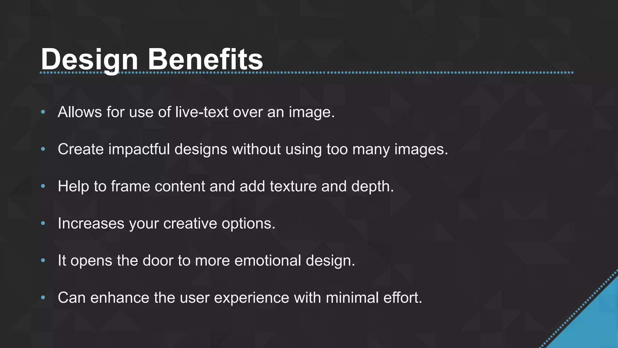


The document discusses the considerations for using background images in design, highlighting benefits such as allowing live-text use, enhancing emotional impact, and improving user experience. It emphasizes the creative opportunities provided by thoughtful image integration and aims to inspire impactful design choices. The author includes a thank you note and Twitter handles for further engagement.


