Download to read offline

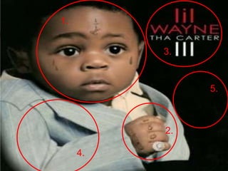
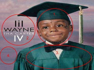
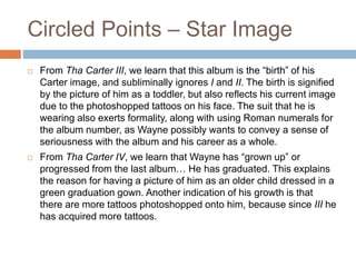
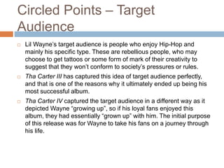
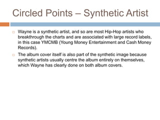

Lil Wayne's album covers for Tha Carter III and Tha Carter IV both feature younger photos of himself that are edited to include his tattoos in order to reflect his "gangster" image. Tha Carter III depicts him as a toddler in a suit, suggesting formality, while Tha Carter IV shows an older photo where he wears a graduation gown, implying growth. Both covers are meant to portray Wayne's star image and target rebellious hip-hop fans by depicting his journey through life. Wayne is considered a synthetic artist who centers the albums entirely around himself and his image.


