This document provides branding guidelines for Leeds College of Art's new visual identity. The summary includes:
1) The identity evolves the college's previous logo which featured a mosaic, retaining the mosaic's significance while making the logo more flexible and adaptable.
2) The new logo features a hand-drawn typeface within a shape derived from the original mosaic. Color, typography, and mosaic pattern usage guidelines are provided.
3) Examples are given of how the identity system can be applied creatively while maintaining consistency, such as using the mosaic pattern in different ways or colors not from the standard palette. Adherence to the guidelines helps ensure a cohesive brand is presented.
This is The Littlefield Company brand guideline. The purpose of this guide is an attempt to formalize our ever-developing brand. As the company grows and evolves, this book will evolve with it.
Simplifying Massive Changes with a Live Style GuideMark Meeker
What would appear on the surface to be a simple change like updating the look of a button or changing the color of a link can turn out to be a huge effort. When everyone understands what can be reused and what needs to be newly created, the team can focus discussion on how to attain the best designs.
Top 10 logo design trends 2017 (updated)The Crowder
We strongly believe that a well-crafted logo is about building something that can impress, captivate and engage an audience. A great logo is one that customers will immediately recognize and connect with as well as clearly convey the message of the business.
With that said here are some of the design trends we see taking over for 2017
10 Pitfalls To Avoid When Designing A LogoDesignMantic
Logo Design is an art. It involves understanding the target audience (business) and translating business vision into an effective corporate identity. However, the path to logo design is littered with traps invisible. The designer should avoid some common pitfalls that might limit the longevity and legibility of a design.
RKCO Group provides the complete manpower services, manpower consultants and payroll outsourcing services in Delhi, Noida, Gurgaon, Ghaziabad, Faridabad and India, under the manpower services RKCO Group provides the security guards, housekeeping, facility management, temporary labor, catering and garden maintenance and office support services.
“Collaborative and productive: Moving Utah forward together.” As a Chamber, we challenge the preconceptions and possibilities of business. We search for smarter ways to do things; we
bring new partners together in a productive and innovative way to discover ideas to help Utah grow economically. We use our
knowledge and experience to continually improve and consistently deliver results for our community and stakeholders. And we
do everything responsibly and considerately to help support our members and the businesses we work with.
yellow slice is a design agency based in mumbai offers branding, UI & UX design. Deliver website design rich in user experience smart user interface design. India's top web design agency and with quality web designer and graphic designer
There are so many brands which became in the top list of customers minds.It is not less importance for their logos also.These unique, professional logos make them to stand out in industry and bring the values reminding their corporate identity.
Precision. Innovation. Professionalism.
These words are essential for Breavis core philosophy and its path to company’s success increasing over years. The company has always stayed true to its core values.
Whether you’re an engraver or diamond cognoscente, a good style and taste will set yourorganization apart from competitors. In addition, a good brand will communicate thesequalities to your spectators – commencing with your jewelry logo.
In my branding and brand identity portfolio, I present a collection of projects that exemplify my expertise in crafting distinctive brand identities. Each project reflects a deep understanding of the client's vision, target audience, and market positioning.
From logo designs that serve as the cornerstone of brand recognition to comprehensive brand guidelines that ensure consistency across all touchpoints, my portfolio showcases a holistic approach to branding. I have created visual identities for a diverse range of clients, spanning industries such as technology, hospitality, fashion, and beyond.
My portfolio demonstrates a commitment to creativity, innovation, and strategic thinking. Whether it's developing a new brand from scratch or refreshing an existing identity, I strive to capture the essence of the brand and communicate its unique story through design.
In addition to traditional branding elements, my portfolio includes collateral such as business cards, letterheads, packaging, and digital assets. I leverage a mix of typography, color theory, imagery, and graphic elements to create cohesive brand experiences that resonate with audiences and leave a lasting impression.
Furthermore, I showcase my ability to adapt to various mediums and platforms, including print, web, and mobile. I have also collaborated with clients on brand strategy, helping to define their brand voice, values, and positioning in the market.
Overall, my branding and brand identity portfolio exemplifies my passion for design, my dedication to client satisfaction, and my ability to create meaningful brand experiences that resonate with audiences and drive business success.
A company's name and logo are THE most important identifiers that it has. Learn how to design a logo that will stand the test of time and how to work with a designer. Slides taken from a class taught by Aaron Belyea, founder of Alphabet Arm Design
Transforming Brand Perception and Boosting Profitabilityaaryangarg12
In today's digital era, the dynamics of brand perception, consumer behavior, and profitability have been profoundly reshaped by the synergy of branding, social media, and website design. This research paper investigates the transformative power of these elements in influencing how individuals perceive brands and products and how this transformation can be harnessed to drive sales and profitability for businesses.
Through an exploration of brand psychology and consumer behavior, this study sheds light on the intricate ways in which effective branding strategies, strategic social media engagement, and user-centric website design contribute to altering consumers' perceptions. We delve into the principles that underlie successful brand transformations, examining how visual identity, messaging, and storytelling can captivate and resonate with target audiences.
Methodologically, this research employs a comprehensive approach, combining qualitative and quantitative analyses. Real-world case studies illustrate the impact of branding, social media campaigns, and website redesigns on consumer perception, sales figures, and profitability. We assess the various metrics, including brand awareness, customer engagement, conversion rates, and revenue growth, to measure the effectiveness of these strategies.
The results underscore the pivotal role of cohesive branding, social media influence, and website usability in shaping positive brand perceptions, influencing consumer decisions, and ultimately bolstering sales and profitability. This paper provides actionable insights and strategic recommendations for businesses seeking to leverage branding, social media, and website design as potent tools to enhance their market position and financial success.
Dive into the innovative world of smart garages with our insightful presentation, "Exploring the Future of Smart Garages." This comprehensive guide covers the latest advancements in garage technology, including automated systems, smart security features, energy efficiency solutions, and seamless integration with smart home ecosystems. Learn how these technologies are transforming traditional garages into high-tech, efficient spaces that enhance convenience, safety, and sustainability.
Ideal for homeowners, tech enthusiasts, and industry professionals, this presentation provides valuable insights into the trends, benefits, and future developments in smart garage technology. Stay ahead of the curve with our expert analysis and practical tips on implementing smart garage solutions.
You could be a professional graphic designer and still make mistakes. There is always the possibility of human error. On the other hand if you’re not a designer, the chances of making some common graphic design mistakes are even higher. Because you don’t know what you don’t know. That’s where this blog comes in. To make your job easier and help you create better designs, we have put together a list of common graphic design mistakes that you need to avoid.
Can AI do good? at 'offtheCanvas' India HCI preludeAlan Dix
Invited talk at 'offtheCanvas' IndiaHCI prelude, 29th June 2024.
https://www.alandix.com/academic/talks/offtheCanvas-IndiaHCI2024/
The world is being changed fundamentally by AI and we are constantly faced with newspaper headlines about its harmful effects. However, there is also the potential to both ameliorate theses harms and use the new abilities of AI to transform society for the good. Can you make the difference?
Between Filth and Fortune- Urban Cattle Foraging Realities by Devi S Nair, An...Mansi Shah
This study examines cattle rearing in urban and rural settings, focusing on milk production and consumption. By exploring a case in Ahmedabad, it highlights the challenges and processes in dairy farming across different environments, emphasising the need for sustainable practices and the essential role of milk in daily consumption.
Hello everyone! I am thrilled to present my latest portfolio on LinkedIn, marking the culmination of my architectural journey thus far. Over the span of five years, I've been fortunate to acquire a wealth of knowledge under the guidance of esteemed professors and industry mentors. From rigorous academic pursuits to practical engagements, each experience has contributed to my growth and refinement as an architecture student. This portfolio not only showcases my projects but also underscores my attention to detail and to innovative architecture as a profession.
Book Formatting: Quality Control Checks for DesignersConfidence Ago
This presentation was made to help designers who work in publishing houses or format books for printing ensure quality.
Quality control is vital to every industry. This is why every department in a company need create a method they use in ensuring quality. This, perhaps, will not only improve the quality of products and bring errors to the barest minimum, but take it to a near perfect finish.
It is beyond a moot point that a good book will somewhat be judged by its cover, but the content of the book remains king. No matter how beautiful the cover, if the quality of writing or presentation is off, that will be a reason for readers not to come back to the book or recommend it.
So, this presentation points designers to some important things that may be missed by an editor that they could eventually discover and call the attention of the editor.
7 Alternatives to Bullet Points in PowerPointAlvis Oh
So you tried all the ways to beautify your bullet points on your pitch deck but it just got way uglier. These points are supposed to be memorable and leave a lasting impression on your audience. With these tips, you'll no longer have to spend so much time thinking how you should present your pointers.
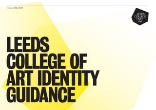
1. Version 002 / 2015
LEEDS
COLLEGE OF
ART IDENTITY
GUIDANCE
2. Identity Guidelines 2Leeds College of Art
01 Evolving the Identity
02 Our Logo
03 Colours
04 Mosaic – Ideas
05 Typography
06 Bringing it all together
CONTENTS
4. Identity Guidelines 4Leeds College of Art
01
EVOLVING THE IDENTITY
INTRODUCTION
This new identity for the Leeds College of Art was developed
with three key principles in mind:
– To stay true to the heritage of our institution
– To create a flexible system that supports the values
of our organisation
– To introduce an adaptable identity that works in all
applications.
The mosaic has been the basis of our identity for many years.
Its symbolism for us and our students is significant, but it presents
several challenges that until now we have not fully addressed.
This evolution takes on those challenges, retaining the mosaic
at its heart and developing its appearance and application
so that it can underpin and represent the modern ethos, impact
and ambition of Leeds College of Art. As well as respecting our
tradition and heritage, it embraces our dynamic, modern offer
and the way we want to reach out to current and potential
students with something lively, colourful, promising.
Please read and refer to this guidance as you produce or
commission any design work. Consider these the ‘guiding
principles’ of the design, rather than a set of unbreakable rules.
If you have queries about how best to maintain its integrity and
consistent use, contact…
5. Identity Guidelines 5Leeds College of Art
Please read and refer to this guidance as you
produce or commission any design work.
Consider these the ‘guiding principles’ of
the design, rather than a set of unbreakable
rules. If you have queries about how best
to maintain its integrity and consistent
use, contact Lucy Tee, Marketing Officer
(Branding, design and print) 0113 202 8131
lucy.tee@leeds-art.ac.uk
01
EVOLVING THE IDENTITY
INTRODUCTION
6. Identity Guidelines 6Leeds College of Art
Our previous identity used an image of the mosaic
wherever possible, which was limited because of the
‘legibility’ of the image at small sizes. We were also
restricted to using the logo in four colour print, as it
doesn’t work as a mono image. Neither could it be used
reversed out of a darker colour, or at small sizes where
detail was completely lost. These limitations meant that
the mosaic was often omitted which left the logo a lot
of work to do. Our very open, loose approach to design
meant that we often missed the opportunity to clearly
brand our own material. Although a distinctive feature
of the building, and a tradition of our identity, the original
mosaic logo was not helping us to stand out in our
crowded marketplace.
01
EVOLVING THE IDENTITY
INTRODUCTION
7. Identity Guidelines 7Leeds College of Art
We will continue to work with the mosaic logo on
corporate materials, where it does function and can
be used in full colour at an appropriate size. So we will
use it on our existing letterheads, compliment slips
and business cards and we will integrate the mosaic
with the new visual identity on building signage and
decoration. This will show the origin of the identity and
the relationship between ‘old’ and ‘new’.
Letterhead
Compliments Slip
01
EVOLVING THE IDENTITY
INTRODUCTION
9. Identity Guidelines 9Leeds College of Art
02 — OUR NEW LOGO
ORIGINAL TYPOGRAPHY
Since the mosaic image rarely appeared, our logo has
had an awful lot of work to do, often appearing the only
consistent element on our print, which used dramatically
different design approaches and content. However, the
logo was drawn from the original mosaic and so was,
as logos go, unrefined and posed its own problems in
usage.
10. Identity Guidelines 10Leeds College of Art
02 — OUR NEW LOGO
NEW TYPOGRAPHY
Our new identity redraws this original type, using a hand
drawn font to retain a carefully crafted, established feel.
However, the lines are clean and solid, making the type
more consistent, definitive and contemporary.
The new logo incorporates the year the college opened.
This underpins our claim to tradition and heritage, and
brings weight and kudos to the college’s offer.
11. Identity Guidelines 11Leeds College of Art
02 — OUR NEW LOGO
THE LOGO
Our new identity uses this new, hand drawn logo on a shape taken
directly from the mosaic. The background shape brings definition to
the logo, making it more visible, eye-catching and ensuring that it has
clear space around it. The bold shape, which holds the Leeds College of
Art name, ensures its leading role in designs.
14. Identity Guidelines 14Leeds College of Art
The logo can be applied in any colour from
the palette and the typography should always be
black or white out.
02 — OUR NEW LOGO
THE LOGO
15. Identity Guidelines 15Leeds College of Art
02 — OUR NEW LOGO
LOGO EXCLUSION ZONES
Always make sure the logo has sufficient clear space
around it. As a general rule use the height of the type
within the tile. The minimum size for logo variants is
15mm in black and white.
15mm
Minimum size
x x
16. Identity Guidelines 16Leeds College of Art
02 — OUR NEW LOGO
WHAT NOT TO DO
Never place the type in a mosaic shape of your own
creation.
Insufficient contrast between the logo
and background colour
The LCA type should never be placed
within an alternative shape
Never reverse logo without sufficient
contrast between the background and logo
Never change the typeface or
setting of the type within the logo
LEEDS
COLLEGE
OF ART
5
2
6
3
7
4
Do not change the angle the logo sits at - the type
should remain horizontal.
18. Identity Guidelines 18Leeds College of Art
03 — COLOURS
Our colour palette is flexible and you can add to it, if it
works for the application you are creating. These are
here as a guide but you may find that your application
requires you to deviate from this set. That’s fine.
The following slides demonstrate how you can still
maintain the identity whilst using different colours. P 7499 C0 / M2 / Y15 / K0
R239 / G231 / B197
P 317 C18 / M0 / Y8 / K0
R206 / G235 / B234
P 3135 C100 / M0 / Y16 / K0
R0 / G138 / B171
P 5855 C0 / M0 / Y31 / K18
R208 / G202 / B145
P 176 C0 / M25 / Y18 / K0
R251 / G201 / B191
P 213 C0 / M95 / Y27 / K0
R238 / G44 / B111
P 254 C50 / M100 / Y0 / K0
R159 / G38 / B181
P Yellow C0 / M0 / Y100 / K0
R255 / G239 / B0
P 7545 C23 / M2 / Y0 / K63
R83 / G98 / B110
P 202 C0 / M100 / Y61 / K43
R152 / G0 / B46
Black C0 / M0 / Y0 / K100
R0 / G0 / B0
P 7419 C0 / M60 / Y45 / K18
R169 / G74 / B88
P 5205 C50 / M58 / Y50 / K0
R138 / G105 / B122
P 1505 C0 / M42 / Y77 / K0
R255 / G111 / B0
P 3385 C45 / M0 / Y33 / K0
R79 / G216 / B177
19. Identity Guidelines 19Leeds College of Art
03 — COLOURS
IN USE EXAMPLE 01
– Pantone 317
– From the colour palette
Chosen because it references a colour in the artwork.
20. 03 — COLOURS
IN USE EXAMPLE 02
– Metallic Red
– Not from the colour palette
Chosen for the prospectus cover to give the title copy
more lift.
Identity Guidelines 20Leeds College of Art
The best place to begin
Leeds College of Art prospectus
21. 03 — COLOURS
IN USE EXAMPLE 03
– 100% Yellow / 100% Cyan (creating Green)
– Not all from the colour palette
Chosen because visibility was important for this piece.
Also the print process was digital so 100% process
colours gave a good flat colour result.
Identity Guidelines 21Leeds College of Art
LIFE
AFTER
COLLEGE
Events, advice, career coaching
and workshops for anyone asking
the question:
WHAT
NEXT
22. 22
THE MOSAIC – IDEAS
4
Identity Guidelines 22Leeds College of Art
23. Identity Guidelines 23Leeds College of Art
04 — THE MOSAIC – IDEAS
WHERE IT COMES FROM
As a theme running through a lot of the corporate level,
or public-facing applications, there is a mosaic pattern.
This pattern is derived from the original mosaic on
our building and is a subtle nod to the history of Leeds
College of Art.The way we use this mosaic is varied
and largely dependent on what the project is and the
accompanying visual assets around it.
The following slides give you some examples of how
application of the mosaic can vary. This being an
‘ideas’ section though, please feel free to add your own
alternatives.
Note – The mosaic pattern is often used for corporate,
or ‘public-facing’ marketing and communications, but is
not mandatory for all applications.
31. Identity Guidelines 31Leeds College of Art
Aa
Aa Aa
Aa
05 — TYPOGRAPHY
Much like the colour rules, typography rules are here
as a suggestion. We are currently using 4 fonts for
the campaign cycle in 2015 but we may add to that list.
Again, this is dependent on what your needs are and
what you’re creating.
The following slides indicate the fonts that are
currently in circulation.
A2 Grot – for text
Cheltenham – for large quotes
Bureau Grot – for headlines
Elementa - for captions
32. Identity Guidelines 32Leeds College of Art
Bodycopy
A2 Grot10 Regular
abcdefghijklmnopqrstuvwxyz
ABCDEFGHIJKLMN
OPQRSTUVWXYZ
1234567890£$%&
05 — TYPOGRAPHY
BODY COPY
We’re quite open-minded about typography usage
but the one rule you should stick to* is that body copy
is set in A2 Grot. If it works well you can also set
headlines in A2 Grot too (see page 40).
Header and display fonts may change but this should
be the constant.
* If for any reason A2 Grot isn’t available to you
then speak to the marketing team about using
an alternative. You should also look through the
remainder of this document as we go on to look at
other alternative typefaces.
Bodycopy
A2 Grot10 Bold
abcdefghijklmnopqrstuvwxyz
ABCDEFGHIJKLMN
OPQRSTUVWXYZ
1234567890£$%&
33. Identity Guidelines 33Leeds College of Art
Headlines
Bureau Grot Condensed Book
abcdefghijklmnopqr
stuvwxyz
ABCDEFGHIJKLMN
OPQRSTUVWXYZ
Headlines
BUREAU GROT
CONDENSED BOLD
ABCDEFGHIJKLMN
OPQRSTUVWXYZ
05 — TYPOGRAPHY
DISPLAY TYPEFACE 01
The display typeface used in the most recent
prospectus and in this guidance document is Bureau
Grot. Selected for its similarity to A2 Grot, this font
is ideal for strong header styles where we need our
voice to be heard!
Available at:
https://www.myfonts.com/fonts/fontbureau/
bureau-grot/
34. Identity Guidelines 34Leeds College of Art
05 — TYPOGRAPHY
DISPLAY TYPEFACE 02
Chosen for its similarity to the type in the logo,
Adobe Garamond titling can be used when a more
authoritative tone of voice is required.
Available from:
https://store1.adobe.com/cfusion/store/html/
index.cfm?&event=displayFont&code=GARA10005
020
Headlines
ADOBE GARAMOND
TITLING CAPITALS
ABCDEFGHIJKLMN
OPQRSTUVWXYZ
1234567890£$%&
35. Quotes
Cheltenham ITC light
abcdefghijklmnopqrstuvwxyz
ABCDEFGHIJKLMN
OPQRSTUVWXYZ
1234567890£$%&
05 — TYPOGRAPHY
QUOTES
For a change in tone of voice the typeface for
extended quotes is Cheltenham. You can use this
for times when we’re quoting our famous alumni,
recognised public figures or staff.
Available from:
http://www.azfonts.net/load_font/itc_cheltenham--
lte50652.html
Identity Guidelines 35Leeds College of Art
Quotes
Cheltenham ITC light italic
abcdefghijklmnopqrstuvwxyz
ABCDEFGHIJKLMN
OPQRSTUVWXYZ
1234567890£$%&
36. 05 — TYPOGRAPHY
CAPTIONS
For captions you can use Elementa.
Available from:
https://www.myfonts.com/fonts/fontfont/elementa-
pro/
Identity Guidelines 36Leeds College of Art
Captions
Elementa Regular
abcdefghijklmnopqrstuvwxyz
ABCDEFGHIJKLMN
OPQRSTUVWXYZ
1234567890£$%&
Captions
Elementa Bold
abcdefghijklmnopqrstuvwxyz
ABCDEFGHIJKLMN
OPQRSTUVWXYZ
1234567890£$%&
37. Identity Guidelines 37Leeds College of Art
A combination of Trebuchet and Georgia can be
used for internal communications as a substitute
to A2 Grot and Garamond.
These fonts are available on all systems and are
free to use so do not require a font licence.
Headlines or Bodycopy
Trebuchet
abcdefghijklmnopqrstuvwxyz
ABCDEFGHIJKLMN
OPQRSTUVWXYZ
1234567890£$%&
Headlines or Body Copy
Georgia
abcdefghijklmnopqrstuvwxyz
ABCDEFGHIJKLMN
OPQRSTUVWXYZ
1234567890£$%&
05 — TYPOGRAPHY
INTERNAL USAGE
39. The following slides show applications that have
been created in the last year. We’ve highlighted
where the application has stuck to and deviated
from the guidance to best achieve the design
requirements, so you can see how this document
works to set out ‘guiding principles’ rather than a
hard and fast set of rules to work to.
From the guidance
• A2 Grot is used as the small text
• The logo is on the cover
• Mosaic used as gradient fade on inner pages
Specific for this application
• Headline typeface is called ‘Bluu’ and is chosen almost
as the ‘masthead’ for the book. Its angular cuts reflect
the shape of the mosaic
• The design aesthetic was intended to feel like an art
book / magazine so a deviation from the guidance
was required
• Metallic red chosen to lift the cover typography from
the image
06 — BRINGING IT ALL TOGETHER
PROSPECTUS MINI GUIDE
Identity Guidelines 39Leeds College of Art Identity Guidelines 39Leeds College of Art
The best place to begin
Leeds College of Art prospectus
Prospectus
Leeds College of Art
40. From the guidance
• A2 Grot is used as the small text and headlines
• The logo is on the cover
• Yellow used from the palette
• Mosaic used in keyline
06 — BRINGING IT ALL TOGETHER
EXHIBITIONS BROCHURE
Identity Guidelines 40Leeds College of Art Identity Guidelines 40Leeds College of Art
Exhibitions
2014 —
2015
Leeds College of Art
41. 06 — BRINGING IT ALL TOGETHER
CREATIVE DEVELOPMENT AWAY-DAYS
Identity Guidelines 41Leeds College of Art Identity Guidelines 41Leeds College of Art
From the guidance
• A2 Grot is used as the small text
• Bureau is used as headline font
• Cheltenham is used for quotes
• The logo is on the cover
• Mosaic used as pattern
What kind of event could you arrange?
Choose from our standard range of activities or ask us to
put together a bespoke development day, tailored to your
objectives. If you want to do more than one day, or if you
just want to allow additional time for socialising, we can
arrange private fine dining in the evening as well as
4* accommodation.
What about lunch and refreshments?
Our own in-house caterers will suggest a range of tasty
and nutritious options, enabling you to share an enjoyable
lunch as you top up your energies before embarking on
your afternoon session. Menus can be provided, and we
can cater for all special requirements.
What does it cost?
Each event is priced according to the number of people
attending and the number of workshops you need. We’ll
be happy to talk you through a range of options, providing
guidance on pricing as we go. Once you’ve decided on the
ideal event for you, we’ll submit a formal quote.
It costs nothing to enquire further!
Please call 0113 202 8000 or contact:
Louise Miller louise.miller@leeds-art.ac.uk
Sharon Heleine sharon.heleine@leeds-art.ac.uk
41
Leeds College of Art
Creative
development
away-daysfor
organisations
From—
Making
Sales
To —
Making
Art If you can
laugh
together,
you can
work
together.
Robert Orben
“
”
Creative Development Away Days
41
42. 06 — BRINGING IT ALL TOGETHER
POWERPOINT PRESENTATION
Identity Guidelines 42Leeds College of Art Identity Guidelines 42Leeds College of Art
From the guidance
• Internal comms piece rather than public-facing
so Georgia is the font
• Logo at the front
• Colour from the palette
• Small scattered mosaic pattern used
43. For any further queries contact:
Andrew Craske
Head of Marketing Communication
Leeds College of Art
0114 202 8144
andrew.craske@leeds-art.ac.uk
—
Lucy Tee
Marketing Officer
(Branding, design and print)
Leeds College of Art
0113 202 8131
lucy.tee@leeds-art.ac.uk