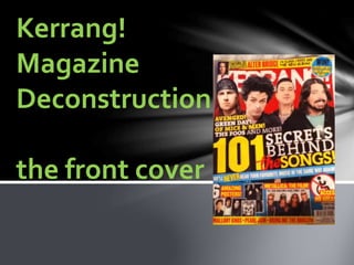
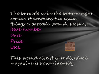
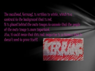
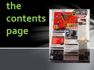
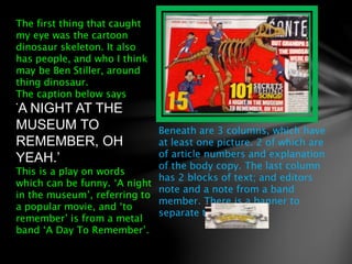
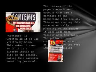
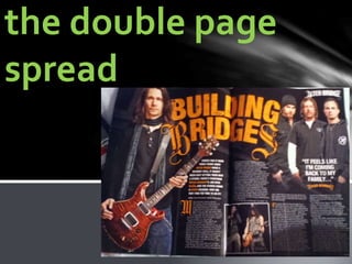
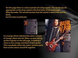
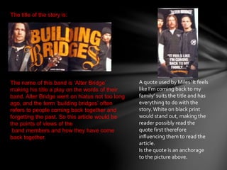
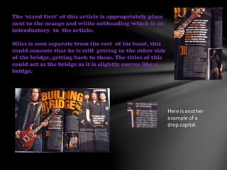
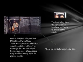
This document provides a detailed deconstruction of the front cover of Kerrang! magazine. It analyzes various design elements including the barcode, masthead, buzzwords, images, and color scheme. The contents page is also examined, noting the cartoon dinosaur skeleton and play on words in the caption. Finally, the document analyzes a double page article spread, highlighting features like the drop capital letter, title, quote, photo positioning and captions.