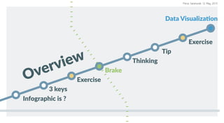
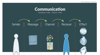
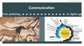
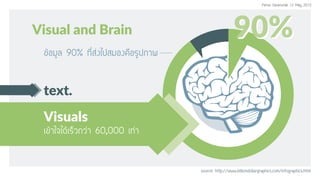
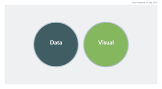
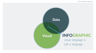
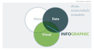
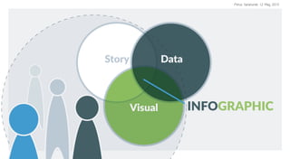
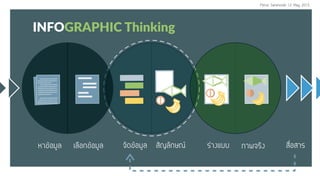
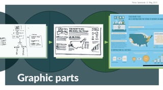
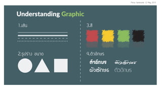
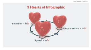
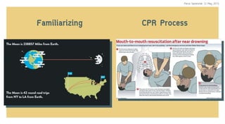
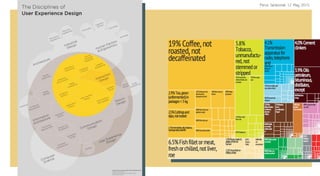
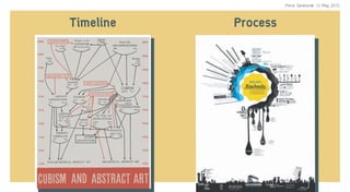
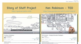
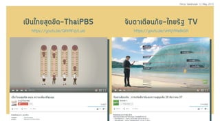
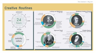
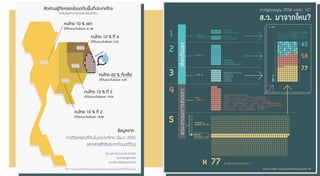
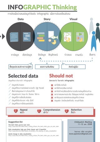
12 may 2015
This workshop tends to give the overview understanding of infographic to researchers and teachers. Also it shows the thinking process how to create infographic.
Thanks ChildWatch Ramajitti
Accenture had a long-standing performance management model that was built when the company was primarily a consulting organization in a less global and digital environment. Over time, changes in technology, Accenture’s business services and the company’s workforce led to reimagining performance management for the company.Accenture Human Resources designed Performance Achievement, a new performance management approach in collaboration with Accenture’s global IT organization; Fjord, part of Accenture Interactive; and early adopter groups. Human Resources and Fjord focused on applying human-centered, experience design to the concepts, while global IT partnered with Human Resources to develop the functional and technical requirements.
Global IT together with Human Resources solution architects assessed the marketplace for packaged solutions but were unable to find any that would meet this project’s unique requirements. This outcome led the team to turning to build a solution. Development had to be done quickly to meet a tight timeline. To support this objective, a core global IT team started with three main tenets:
Stay on the leading edge architecturally and use on-demand cloud computing platforms to allow for fast development and experimentation.
Move toward use of microservices architecture.
Be cloud-first.
Data Storytelling: The only way to unlock true insight from your dataBright North
Data visualisation is failing. Many businesses are relying on tools like Excel and PowerPoint to deliver an engaging data story without first establishing the plot. Bright North's latest whitepaper explains why Data Storytelling is the only way to unlock true insight from your data and lists five steps you can take to give your data story a happy ending.
An introduction to infographic design written for global health and development professionals, including ideas for storyboarding, design tools, and tips and tricks to create fun, meaningful infographics. Lots of links to free web-based tools and great resources.
Data is only useful when your audience can understand it. One of the best ways to decipher a jumble of figures and statistics is to turn it into a visual representation. Learn how to become a data visualization pro.
Storytelling with Data - Approach | SkillsAmit Kapoor
The ever increasing computational capacity has enabled us to acquire, process and analyze larger data-sets and information. However, the human memory and attention required to use this data is more limited and has remained relatively constant. Data visualization can enable us to compress data and encode it visually in ways that allows us to aid perceptual and cognitive understanding.
However, data visualisation alone is not enough and often we need to try to tell stories through data. Storytelling with data can enable us to move from analysis to synthesis, from numbers to visuals, and from an argument to a story. Operating at this intersection of data, visual and story can help persuade not only through logos (logic) but also through pathos (empathy) and ethos (credibility). In trying to tell compelling data stories, we can empower our selves to engage, communicate and persuade a large and diverse audience.
In this talk, I discuss ‘why’ stories work and what we can learn about the art of storytelling from other mediums like oral storytelling, written stories, pictures, comics and movies. I will summarise basic principles that can help us in our crafting journey, as we take the data through the layers of abstraction. The focus would be on unpacking the seven dimensions of creating an engaging data story - Abstraction (data patterns), Representation (visual encoding), Framing & Transition (perspective, focus), Messaging (verbal, text annotation), Flow (arrangement) and Interactivity.
Further, creating data stories is a cross disciplinary activity that requires us to operate at the intersection of a visual designer, data scientist and storyteller. It is both a science and an art. So how does one realistically learn these multitude of skills needed to get good at it. I will also discuss ideas about the possible path that practitioners could adopt to learn this craft through sustained practice.
## About the Speaker
Amit Kapoor is interested in learning and teaching the craft of telling visual stories with data. He uses storytelling and data visualization as tools for improving communication, persuasion and leadership. He conducts workshops and trainings for corporates, non-profits, colleges, and individuals at narrativeVIZ Consulting. He also teaches storytelling with data as invited guest faculty in academia, both in management context at IIM Bangalore and IIM Ahmedabad and in design context at NID, Bangalore.
His background is in strategy consulting in using data-driven stories to drive change across organizations and businesses. He has 15 years of management consulting experience, first with AT Kearney in India, then with Booz & Company in Europe and more recently with startups in Bangalore. He did his B.Tech in Mechanical Engineering from IIT, Delhi and PGDM (MBA) from IIM, Ahmedabad. You can find more about him at amitkaps.com and tweet him at @amitkaps
Risk Management KPI Dashboard Showing Risk Heat Map And Control Rate By PeriodSlideTeam
Presenting this set of slides with name - Risk Management KPI Dashboard Showing Risk Heat Map And Control Rate By Period. This is a five stage process. The stages in this process are Risk Management, Risk Assessment, Project Risk. https://bit.ly/2Vxo2tb
Data Visualization 101: How to Design Charts and GraphsVisage
Learn to design effective charts and graphs.
Your data is only as good as your ability to understand and communicate it. The right visualization is essential to incite a desired action, whether from customers or colleagues. But most marketers aren’t mathematicians or adept at data visualization. Fortunately, you don’t need a PhD in statistics to crack the data visualization code.
“You can download this product from SlideTeam.net”
Presenting this set of slides with name - Business Intelligence Maturity Model. This is a five stage process. The stages in this process are Maturity Model, Cmm, Continuous Improvement. https://bit.ly/3vN6pmJ
Slides for the webredacteuren meeting op june 28th 2011: http://www.webredacteuren.com/2011/06/kennissessie-3-doelgroepen-en-personas/
From time to time I am organizing an open workshop. Somewhere between Amsterdam and Düsseldorf:
Deutsch / German
www.creative-companion.com/Data-Storytelling-with-personas/persona-workshop-deutsch.html
Nederlands/Dutch
www.creative-companion.com/Data-Storytelling-with-personas/persona-workshop-nederlands.html
Understanding your audience and considering them in your design is essential for building great visualizations. This deck will walk you through the critical steps for identifying and understanding your audience, and developing a complex visualization storyboard to share your message.
Presentation slides: Interactive Storytelling
Edward Segel helped Bloomberg develop a datavis strategy. He also wrote a really great paper: Narrative Visualization
Developing Dashboards with User-Centered DesignAmanda Makulec
Design sprint session hosted at the TechLady Hackathon, focused on the basic principles and techniques for starting a design process with who will use the data, rather than the tables and tools.
Storytelling with Data - See | Show | Tell | EngageAmit Kapoor
Stories have been recognized for their power of communication & persuasion for centuries and we need to operate at that intersection of data, visual and stories to fully harness the power of data.
I take your through a short tour of the science and the art of visualization and storytelling. Then give you an introduction through examples and exemplar on the four different layers in a data-story: See - Show - Tell - Engage.
Used in the session on Business Analytics and Intelligence at IIM Bangalore in July 2014.
We are bombarded with 174 newspapers worth of information each day and in order to get your message to cut through the noise, you need to be simple to understand, provide value, and if possible, evoke an emotional response. By combining hard data with beautiful visuals, you have a fighting chance to stand out. As my good friend Joe Chernov likes to say: "The secret to breaking through a noisy landscape isn't more noise. It is sounding different."
What's more, there is a high likelihood that you will have a lot of fun in the process. Heck, I would even argue you will feel actual JOY. Why? By returning to the basics of storytelling, you are tapping into the origins of how you learned to communicate as a child -- from using colors and shapes, to employing mixed media. Just because you are a grown up doesn't mean you shouldn't still draw about these early stage arts.
Project Status Report Presentation VisualsSlideTeam
Presenting this set of slides with name - Project Status Report Presentation Visuals. This is a three stage process. The stages in this process are Project Path, Title, Owner, Due. https://bit.ly/3k8PMxS
Data visualization & Story Telling with DataDr Nisha Arora
Storytelling with data using the appropriate visualization is a skill that is well sought-after for data-driven decision making and it spans many industries and roles (technical/non-technical).
In this presentation, we will briefly discuss the importance of understanding the context, selecting the right visuals, key points for effectively using those for storytelling, design dos, and don’ts, etc.
What is HR analytics & how advanced methods such as analytic & machine learning can evolve the role of HR and make them leader of the change in the organization
Business KPI Dashboard Showing Net Promoter ScoreSlideTeam
"You can download this product from SlideTeam.net"
Presenting this set of slides with name - Business Kpi Dashboard Showing Net Promoter Score. This is a two stage process. The stages in this process are Business Dashboard, Business Kpi, Business Performance. https://bit.ly/3CxwO9Y
"You can download this product from SlideTeam.net"
Presenting this set of slides with name 30 60 90 Sales Plan Gantt Chart. The topics discussed in these slides are 30 60 90 Plan, Integration Plan. This is a completely editable PowerPoint presentation and is available for immediate download. Download now and impress your audience. https://bit.ly/3mTd77Z
How To Build An Infographic Using Microsoft PowerpointPaul Wilson
For years I've used Powerpoint to build graphic and data rich infographics. It's easy and quick to use and at the same time looks professional. This SlideShare takes you by the hand each step of the way until you have something you're proud of!
How to Create Infographic Masterclass by VenngageVenngage
How to create infographics in 5 easy steps. ICCORE method for visualizing your data. Design principles and hack to make your infographic beautiful. Short cuts and real examples.
The infographic is in danger. Learn what you can do to save it from (insert villain here).
Originally presented at JESS3's UX Week 2012 Infographic Workshop.
JESS3 specializes in the art of data visualization, adding context and meaning to the exponentially growing world of data around us.
Presentation on infographic marketing given 10/17/11 at Brigham Young University, including design, publication, and promotion. Promotion tactics include blog outreach, social media and bookmarking, and SEO. Includes examples of best and worst practices.
Have you ever found yourself in a never ending spiral of edits from a client? Did you or your client assume that making an infographic would be "quick" and "easy"? If you've answered yes to any of these questions, you may want to review this deck and reflect.
Originally presented at JESS3's UX Week 2012 Infographic Workshop.
JESS3 specializes in the art of data visualization, adding context and meaning to the exponentially growing world of data around us.
How Agile Marketing Kept Me From Sleeping Under My DeskAndrea Fryrear
Thanks to Agile marketing I published over 200 articles in one year, all without ever sleeping under my desk. Here are the tools and practices that can help you deliver at scale without sacrificing your life outside the office.
How to Create a Narrative for Your InfographicJESS3
Just like your term paper in college, an infographic needs to have a structure: from a clear thesis, to credible evidence to a concise (and even actionable) conclusion.
Originally presented at JESS3's UX Week 2012 Infographic Workshop.
JESS3 specializes in the art of data visualization, adding context and meaning to the exponentially growing world of data around us.
Material de apoio aos alunos do curso de Office do Projeto Função. Apostila de Word desenvolvida por Cibele Kanegae.
O Projeto Função é realizado na Comunidade da Vila Prudente. Nasceu da motivação de levar cultura e educação social/profissional para dentro da comunidade.
Referências:site da Microsoft Office
CUSTOM RESEARCH REPORT DATA, ANALYTICS, AND AI: HOW TRUST DELIVERS VALUE
Deriving more value from analytics and emerging technologies like artificial intelligence starts with trust, simply because data collected for analytics must be trusted.....
Porur times Neighbourhood newspaper, Sports civil & Business News,local Newspaper, porur rental,about porurnews, Porur Times, porurtimes contact no, porur local newspaper, porur times paper
Speed matters, So why is your site so slow?Andy Davies
Slides from my talk at ReDevelop 2015
Covers business case for web performance, along with the fundamentals of how latency and the critical rendering path affect page load performance
القرءان الكريم برواية قالون عن نافع من موقع الشبكة الإسلاميةسمير بسيوني
القرءان الكريم برواية قالون عن نافع
وقالون له أربعة أوجه من الخلاف الواجب وهي:
1-قصر المنفصل مع سكون ميم الجمع
2- قصر المنفصل مع صلة ميم الجمع
3- توسط المنفصل مع سكون ميم الجمع
4- توسط المنفصل مع صلة ميم الجمع
والحم لله رب العالمين ، أسأل الله أن ينفع به...آمين
Laghu Udyog Bharati is one of India’s largest MSE Industry Networks in India, with branches in every state and members in every district of India, working towards the welfare of MSEs in India. We have grass-root level insights into the challenges faced by the MSEs as well as changing industry trends & practices on the ground.
القرءان الكريم برواية الدوري عن الكسائي من موقع الشبكة الإسلاميةسمير بسيوني
حفص الدوري
هو أبو عمر حفص بن عمر بن عبد العزيز بن صهبان بن عدس بن صهبان ويقال صهيب الدوري نسبة إلى دور موضع ببغداد بالعراق ومحله بالجانب الشرقي ولد بها فهو الدور الأزدي البغدادي النحوي الضرير نزيل سامرا أمام القراءة في عصره وشيخ القراءة بالناس في زمانه ثقة ثبت كبير ضابط أول من جمع القراءات قال رحل الدوري في طلب القراءات وقرأ بسائر الحروف السبعة
وتعلم الشواذ وسمع من ذلك شيئا كثيرا قرأ على إسماعيل بن جعفر عن نافع وقرأ أيضا عليه وعلى أخيه يعقوب بن جعفر عن ابن حجاز عن أبي جعفر وسليم عن حمزة ومحمد بن سعدان عن حمزة وعلي الكسائي لنفسه ولأبي بكر عن عاصم وحمزة بن القاسم عن أصحابه ويحيى بن المبارك اليزيدي وشجاع بن أبي نصر البلخي وقول الهزلي أنه قرأ على أبي بكر نفسه وهم بل على الكسائي عنه وقرأ عليه وروى القراءة عنه أحمد بن حرب شيخ المطوعي وأحمد بن فرح بالحاء المهملة أبو جعفر المفسر المشهور وأحمد بن محمد بن حماد بن ماهان فيما ذكره أبو علي الرهاوي وأحمد بن يزيد الحلواني وأحمد بن مسعود السراج وإسحاق بن إبراهيم العسكري وإسماعيل بن أحمد وإسماعيل ابن يونس بن ياسين وبكر بن أحمد السراويلي وجعفر بن عبد الله بن الصباح وجعفر ابن أسد وجعفر بن محمد بن عبد الله الفارض وجعفر بن محمد الرافعي وجعفر ابن محمد بن الهيثم والحسن بن علي بن بشار بن العلاف والحسن بن الحسين الصواف والحسن بن عبد الوهاب والحسن الحداد والخضر بن الهيثم السطوسي وسعيد بن عبد الرحيم أبو عثمان الضرير وصالح بن يعقوب وعباس بن محمد وعبد الرحمن بن عبدوس وعبد الله بن أحمد الفسطاطي وعبد الله بن أحمد البلخي وعبد الله بن أحمد بن حبيب النحوي وعبد الله ابن بكار وعثمان بن خرزاذ وعلي بن سليم الدوري وعلي بن محمد بن فارس بن عبديل وعلي بن الحسين الفارس وعمر ابن أحمد بن نصر الكاغذي وعمر بن محمد بن برزة الأصبهاني وعمر بن محمد الكاغذي والقاسم بن زكريا المطرز والقاسم بن عبد الوارث والقاسم بن محمد بن سنان فيما ذكر
Wizards of Learning is a board game design studio which focus on education with fun.
We design board game for organize and coperate which has story or infomation to communicate in playable way.
เห็นภาพตลาดบอร์ดเกมไทย มีความแตกต่างหลากหลายของพฤติกรรมการเล่นบอร์ดเกมอย่างไรบ้าง
วิเคราะห์ข้อมูลจากการทำสำรวจบอร์ดเกมประจำปี 2020 มีผู้ตอบแบบสอบถาม 1092 คน จัดทำโดย Wizards of Learning และ Lunar Gravity
-----
Overview of Thai board game market analysis. There are 6 different clusters which have different motive and different behavior in board game.
Overview about board game movement in Thailand for 2017-2019 in a perspective of Thai board game designer.
for people who want to understand boardgame market in Thailand in 2019
21 Feb 2016
Teaching is to provide effective learning experiences for students.
Before make a class, Teacher should have these skills:
- Understand Learners.
- Design for Learning.
cite: Julie Dirksen. (2011) DESIGN FOR HOW PEOPLE LEARN.
Branding
A - Sensing brand and branding in everyday life deeper.
K - Branding has many purposes, it is not only for sell. Branding is in everywhere. Tools
P - Being your brand, and communicating yours
What is Market Research ?
A - Everyday-like, we always research on internet behaviors
K - Market Research in What? Why? When? Where? Who? How?
P - Mapping Persona
Basic of Social Network for Business 20-10-2015Perus Saranurak
Social Network
A - Social Network shift the market in to the next level
K - Case studies, Inbound Marketing, What? Why? When? Where? Who? How?
P - Planing
Infographic Thinking Workshop - Data communicatorPerus Saranurak
28 July 2015
This workshop tends to give the overview understanding of infographic to researchers and teachers. Also it shows the thinking process how to simplify massive data and create infographic.
Game of Knowing: couriosity-lead learning method -> Metalearning by Perus Sar...Perus Saranurak
Metalearning - Bring personal creativity and motivation to curiosity-led learning systems (ecology of wisdom)
"Today's fact becomes tomorrow's misinformation" stated Alvin Toffler, futurologist, in 1970. Now changes are accelerating due to the development of technology and connectivity. New learning methods are being developed and learners should not be passive because the knowledge cannot be relied upon for long.
This project introduces the idea of "Game of Knowing" the platform to support active learners to improve their interest through self-learning and collaborating. the concept of Metal
You should read this if you ... :
- you want to know the role of designers, not in the terms of economic. (sociology, philosophy or changes) --- see page 6 (19 in SlideShare)
- you want to improve your capability, learn about self-learning or DIY your futures --- start from page 12 (25 in SlideShare)
- you are cognitive designer who is interested in motivation --- see page 36 (49 in SlideShare)
- you are interested in self-learning tools --- see page 46 (59 in SlideShare) and Appendix 1 page 65 (78 in SlideShare)
- you are 'Metalearner' --- free the read through this book and contact me I am also looking for chatting with you too.
Even I have already submitted this MA dissertation, but I think it's still not proper complete. I would like to develop it further. please feel free to give me any comments .
I investigate the lifelong and self-determined learning (heutagogy) and creative exploration through the unknown. My purpose is to I try to hack a learning process by creating a tool for helping learners can develop "their own knowledge" and "shift their view of learning framework" (from teacher-centered to learner-centered). This project's called the 'Game of Knowing'.
by: Perus Saranurak, 6 June 2014, MA Design Futures and Metadesign at Goldsmiths, University of London, London, UK. Postgraduate Dissertation work.
My Methods & Processes: The Report how I developed my thinking and working th...Perus Saranurak
I wrote this essay to communicate with myself in the future to remind the experiences and how I developed my thinking process while studying MA Design Futures at Goldsmiths, University of London.
This essay will introduce and review my process and methods that would relate to studying in “MA Design Futures” and “Metadesign”.
(1st-draft) Money to the Tiny Big Journey: Tracking money for revealing the c...Perus Saranurak
Perus Saranurak, 15 Mar 2014, MA Design Futures and Metadesign at Goldsmiths, University of London, London, UK. Postgraduate project work 'Technonature'.
We create technology and we are shaped by technology. This essay considers "money" as a technology, and studies about the perception of money and its influences.
Also this essay approaches the perception of money as the object of relationship between people in community.
“how can designers inspire the members of the community to raise their awareness in the living area?”
Shifting the role of "designers" to "facilitators", From object to workshop, and let's the members in community can develop their living together, under the concept of Prosumer (an active consumer)
This essay tries to extend this concept from an individual scale to a collaborative scale – designing the momentum to activate community. The writer tends to explore the practical and tangible solutions for creating the guideline of future sociability. Moreover, it would be good if the community member could involve in developing their area.
Transform the role of "designers" to "facilitators"
by: Perus Saranurak, 16 Jan 2014,Volume 2 -Futures of Sociability, MA Design Futures and Metadesign at Goldsmiths, University of London, London, UK. Postgraduate project work 'Future of Sociability'.
Hacking Happiness - sustainability from inside outPerus Saranurak
"Even someone knows what behaviours are harmful for the world, but they keep doing, Why?"
This essay re-define happiness and needs into the terms of sustainability by introducing an alternative guided life. This guided life focuses on accessing straight to happiness and try to shift the paradigm of consumerism to be 'Prosumer'. This concept I call it "Hacking Happiness".
"Happiness", a simple word, which everyone possibly understand and experience, generally means the state of positive feeling. But in these days, as we live in capitalism, happiness seems to be more and more expensive and difficult to reach them because it lay on many elements becoming more complex.
Hacking Happiness - will create a shortcut to happiness in sustainable way
by: Perus Saranurak, 22 Nov 2013, Volume 1 -Futures of Sustainability, MA Design Futures and Metadesign at Goldsmiths, University of London, London, UK. Postgraduate project work 'Future of Sustainability'.
Chatty Kathy - UNC Bootcamp Final Project Presentation - Final Version - 5.23...John Andrews
SlideShare Description for "Chatty Kathy - UNC Bootcamp Final Project Presentation"
Title: Chatty Kathy: Enhancing Physical Activity Among Older Adults
Description:
Discover how Chatty Kathy, an innovative project developed at the UNC Bootcamp, aims to tackle the challenge of low physical activity among older adults. Our AI-driven solution uses peer interaction to boost and sustain exercise levels, significantly improving health outcomes. This presentation covers our problem statement, the rationale behind Chatty Kathy, synthetic data and persona creation, model performance metrics, a visual demonstration of the project, and potential future developments. Join us for an insightful Q&A session to explore the potential of this groundbreaking project.
Project Team: Jay Requarth, Jana Avery, John Andrews, Dr. Dick Davis II, Nee Buntoum, Nam Yeongjin & Mat Nicholas
Adjusting primitives for graph : SHORT REPORT / NOTESSubhajit Sahu
Graph algorithms, like PageRank Compressed Sparse Row (CSR) is an adjacency-list based graph representation that is
Multiply with different modes (map)
1. Performance of sequential execution based vs OpenMP based vector multiply.
2. Comparing various launch configs for CUDA based vector multiply.
Sum with different storage types (reduce)
1. Performance of vector element sum using float vs bfloat16 as the storage type.
Sum with different modes (reduce)
1. Performance of sequential execution based vs OpenMP based vector element sum.
2. Performance of memcpy vs in-place based CUDA based vector element sum.
3. Comparing various launch configs for CUDA based vector element sum (memcpy).
4. Comparing various launch configs for CUDA based vector element sum (in-place).
Sum with in-place strategies of CUDA mode (reduce)
1. Comparing various launch configs for CUDA based vector element sum (in-place).
06-04-2024 - NYC Tech Week - Discussion on Vector Databases, Unstructured Data and AI
Discussion on Vector Databases, Unstructured Data and AI
https://www.meetup.com/unstructured-data-meetup-new-york/
This meetup is for people working in unstructured data. Speakers will come present about related topics such as vector databases, LLMs, and managing data at scale. The intended audience of this group includes roles like machine learning engineers, data scientists, data engineers, software engineers, and PMs.This meetup was formerly Milvus Meetup, and is sponsored by Zilliz maintainers of Milvus.
Opendatabay - Open Data Marketplace.pptxOpendatabay
Opendatabay.com unlocks the power of data for everyone. Open Data Marketplace fosters a collaborative hub for data enthusiasts to explore, share, and contribute to a vast collection of datasets.
First ever open hub for data enthusiasts to collaborate and innovate. A platform to explore, share, and contribute to a vast collection of datasets. Through robust quality control and innovative technologies like blockchain verification, opendatabay ensures the authenticity and reliability of datasets, empowering users to make data-driven decisions with confidence. Leverage cutting-edge AI technologies to enhance the data exploration, analysis, and discovery experience.
From intelligent search and recommendations to automated data productisation and quotation, Opendatabay AI-driven features streamline the data workflow. Finding the data you need shouldn't be a complex. Opendatabay simplifies the data acquisition process with an intuitive interface and robust search tools. Effortlessly explore, discover, and access the data you need, allowing you to focus on extracting valuable insights. Opendatabay breaks new ground with a dedicated, AI-generated, synthetic datasets.
Leverage these privacy-preserving datasets for training and testing AI models without compromising sensitive information. Opendatabay prioritizes transparency by providing detailed metadata, provenance information, and usage guidelines for each dataset, ensuring users have a comprehensive understanding of the data they're working with. By leveraging a powerful combination of distributed ledger technology and rigorous third-party audits Opendatabay ensures the authenticity and reliability of every dataset. Security is at the core of Opendatabay. Marketplace implements stringent security measures, including encryption, access controls, and regular vulnerability assessments, to safeguard your data and protect your privacy.
Explore our comprehensive data analysis project presentation on predicting product ad campaign performance. Learn how data-driven insights can optimize your marketing strategies and enhance campaign effectiveness. Perfect for professionals and students looking to understand the power of data analysis in advertising. for more details visit: https://bostoninstituteofanalytics.org/data-science-and-artificial-intelligence/
Predicting Product Ad Campaign Performance: A Data Analysis Project Presentation
Infographic Thinking Workshop
1. data 1
data 2
data 3
data 4
data 5
data 6
data 7
INFOGRAPHIC
90%â´Â ¾ÕÃѪ ÉÃÒ¹ØÃÑ¡É May 2015
¡ÒäԴà¾×è͹Óàʹ͢ŒÍÁÙÅÇÔ¨ÑÂàªÔ§ infographic à¾×èÍ¡ÒâѺà¤Å×è͹Êѧ¤Á
Perus Saranurak 12 May 2015
2. Overview
Infographic is ?
3 keys
Thinking
Tip
Exercise
Data Visualization
Brake
Exercise
Perus Saranurak 12 May 2015
11. What did you understand ?What did you understand ?What did you understand ?
What did you feel ?What did you feel ?What did you feel ?
Perus Saranurak 12 May 2015
31. Information from‘The Power of Visual Communication’
http://www.billiondollargraphics.com/infographics.html
C
R
A
3 Hearts of Infographic
Appeal - ʹã¨
Comprehension - ࢌÒã¨
Retention - ¢Öé¹ã¨
Perus Saranurak 12 May 2015
34. TDRI- stratigy and economy
howdesign.com-from earth to the moon https://www.youtube.com/watch?v=U3qDBbLEmDY
Familiarizing Data
Ref#6 Ref#7
Perus Saranurak 12 May 2015
35. CPR Process
Ref#8 Ref#9
ÃÙŒÊÙŒ flood
https://www.youtube.com/watch?v=bivD0TscGnA
Emergency Data
Perus Saranurak 12 May 2015
38. Story of Stuff Project
https://youtu.be/cpkRvc-sOKk
Ken Robinson - TED
https://www.youtube.com/watch?v=zDZFcDGpL4U
Awaring the Story of Change
Ref#14 Ref#15
Perus Saranurak 12 May 2015