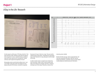
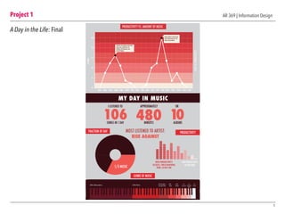
The Process
ART 369: Information Design
Shelby Albrecht
promotion of justice”
MAJORS PER DEPARTMENT:
KEY
STUDENT ETHNICITIES:
ORGS
HOUSING
CAMPUS
APPLY
MORE LOS ANGELES WEATHERMORE LMU FACTS
WHERE LMU FRESHMAN COME FROM
CALIFORNIA
WASHINGTON
OREGON
ARIZONA
NEVADA
COLORADO
TEXAS
STATES BY POPULATION
KEY
Student to
faculty ratio:
11:1
Average
undergrad class
size:
21
ACADEMICS ADMINISTRATION STUDENT ORGS
MOST POPULAR MAJORS
FILM & TELEVISION
Currently ranked
8th in the world
552
25
19FULL TIME
FACULTY
FULLBRIGHT
SCHOLARS
2NOBEL PRIZE
WINNERS
DEPARTMENT
CHAIRS
GREEK LIFE: 27% of student body
MORE INFO
promotion of justice”
MAJORS PER DEPARTMENT: STUDENT ETHNICITIES:
73 75 71 72 68
MORE WEATHERMORE LMU FACTS
WHERE LMU STUDENTS ARE FROM
CALIFORNIA
WASHINGTON
OREGON
ARIZONA
NEVADA
COLORADO
TEXAS
STATES BY POPULATION
KEYKEY
LIBERAL ARTS: 24 MAJORS
SCIENCE & ENGINEERING:13 MAJORS
BUSINESS ADMINISTRATION: 6 MAJORS
COMMUNICATION & FINE ARTS: 6 MAJORS
FILM & TELEVISION:5 MAJORS
EDUCATION:1 MAJORS
73%
48%
22%
Student to
faculty ratio:
11:1
Average
undergrad class
size:
21
ACADEMICS ADMINISTRATION STUDENT ORGS
MOST POPULAR MAJORS
FILM & TELEVISION
Currently ranked
8th in the world
552
25
19FULL TIME
FACULTY
FULLBRIGHT
SCHOLARS
2NOBEL PRIZE
WINNERS
DEPARTMENT
CHAIRS
GREEK LIFE: 27% of student body
MORE INFO
ORGS
HOUSING
CAMPUS
APPLY
PERCENTAGE OF
UNDERGRADUATE
STUDENT BODY
1 2 3 2 3
4 5 6 7 8
9 10 11 12 13 14
Creating an Account
Posting Content
Uploading & Editting Content
1. Open Instagram
2-3. Login into your account
2-3. Create and account with your email
or Facebook information
4-5. From the home feed, press the camera button in
the middle on the bottom toolbar panel
6. Choose a photo from your albums, or take a photo
7. Pic a filter, or click on your toolbar to edit your
photo
8. Click through the tools and edit your photo to your
desired quality. When ready, click the “next” button.
9. Here you can add a photo description as well as
other features
10. For a photo location (or a seperate caption in my
example), swipe the “on” switch and then press “add
location”
11-12. Choose/type your location and then press next
13. Now you are back to your photo caption menu.
Press the blue button on the bottom
14. You’re finished!
or
or
PRODUCTIVITY VS. AMOUNT OF MUSIC
GENRE OF MUSIC
FRACTION OF DAY PRODUCT
MY DAY IN MUSIC
12
16
8
4
0
20
8AM 9AM 10AM 11AM 12PM 1PM 2PM 3PM 4PM 5PM 6PM 7PM 8PM 9PM7AM 12A11PM10PM
#SONGS
1/3 MUSIC
38% Alternative 24% Rock
9% Singer/
Songwriter
8%
Pop
6%
Punk
6%
Country
5%
Hip Ho
R&B
HIGH PRODUCTIVITY:
EXCERSIZE, FINISH HOMEWORK,
WORK, LIESURE TIME
LOW PROD
DO NO
480
APPROXIMATELY
MINUTES
10ALBUMS
OR
106
I LISTENED TO
SONGS IN 1 DAY
Productive time getting ready before
classes start: worked out, ate
breakfast, did homework, and
personal hygiene
Before bedtime: finished class
work and personal care. Ate
dinner and socialized.
AR 369 | Information DesignTable of Contents
Project 4
	 LA Metro
	 • Research
	 • Sketches & Versions
	 • Final Design
	 • Final Design in Context
2
3 10
14
6
4 11
15
13
1718
12
16
7
5
8
9
Project 1
	 A Day in the Life
	 • Research
	 • Design Process & Versions
	 • Final Design
Project 2
	 APP Decision Tree
	 • Sketches & Versions
	 • Versions
	 • Final Design
	 • Final Design in Context
Project 3
	 LMU Dashboard
	 • Research
	 • Sketches & Grids
	 • Wireframes & Annotations
	 • Final Design in Context
AR 369 | Information DesignProject 1
A Day in the Life: Research
For the research, and first part, of “The Day in the Life,” I first
had to decide on what I wanted to share with the audience.
Since my passion is music, I wanted to show my audience
how much music means to me in my daily life. So what,
and how, could I express the importance of music?
My everyday routine cannot function without music. I just
can’t handle a quite space, there must always be music
playing. Because of this reliance, I wanted to incorporate
the amount of music I listen to in a day. This was truly the
challening part of the project— remembering to mark down
every song I listened to in a day, what genre, and the length
of the song.
In order to make it easier on myself, not to mention less
time consuming, I made a chart in Excel to quickly mark
when I was infront of my computer. Each hour, I would try
and keep count of the songs I listened to, mainly on the
streaming service, Spotify.
By the end of the long day, I had an organized chart, and
some very interesting information. Now that I had my
research and statistics, I could then move on to how I would
visually display my newfound personal information.
3
Time # Alternative Rock Country Pop Hip Hop/
R&B
Punk Soundtrack singer/songwriter Other
7 AM 0
8 AM 6 3 2 1
9 AM 10 7 1 2
10 AM 13 2 9 2
11 AM 9 7 1 1
12 PM 3 2 1
1 PM 2 2
2 PM 0
3 PM 0
4 PM 1 1
5 PM 8 1 1 1 1 4
6 PM 10 3 1 1 2 1 2
7 PM 22 10 4 2 2 2 1
8 PM 11 3 1 1 1 2 1 1 2
9 PM 3 1 2
10 PM 6 4 1
11 PM 2 2
12 PM 0
1 AM 0
2 AM 0
TOTAL 106 40 25 6 8 5 5 10 6
38% 24% 6% 8% 5% 5% 9% 6%
0
6
12
18
24
30
7 AM 8 AM 9 AM 10 AM 11 AM 12 PM 1 PM 2 PM 3 PM 4 PM 5 PM 6 PM 7 PM 8 PM 9 PM 10 PM 11 PM 12 PM 1 AM 2 AM
#
Project 1
4
AR 369 | Information Design
A Day in the Life: Design Process & Versions
The design process was the most time consuming part of
the project, since I had to constantly throw away ideas and
come up with new ways to uniquely display my musical
statistics. Since the project is focused on numbers and other
stats, I decided that an infographic approach would best fit
the criteria.
A dot graph was chosen to display the number of songs
played throughout the day, since it perfectly shows a
period of time and is easily recognizable at a glance.
Next, I thought that bar and pie graphs would best show
the genres of music I listened to.After that, the other
information fell into place.
The color scheme went through other dramatic changes as
well, until I finally picked a color that fit the mood. I went
from blues and greens, and finally reds.
In order to find the best graphs, I began by sketching and
coloring the spaces in my sketchbook before moving to
the digital versions, in order to see what my poster would
look like first. I also made many different layouts and
played with the organization of the information, from most
important, to not as important. Overall, I think I found the
perfect balance between my visual heirarchy and aesthetic
choices.
MUSIC IN MY DAY: PRODUCTIVITY LEVELS
NUMBER OF SONGS IN A DAY
PRODUCTIVITY VS. AMOUNT OF MUSIC
SCHEDULE
12
16
8
4
0
20
8AM 9AM 10AM 11AM 12PM 1PM 2PM 3PM 4PM 5PM 6PM 7PM 8PM 9PM7AM 12AM11PM10PM
#SONGS
TIME OF DAY
HIGH PRODUCTIVITY:
EXCERSIZE, FINISH HOMEWORK,
WORK, LIESURE TIME
LOW PRODUCTIVITY:
DO NOTHING
12
16
8
4
0
20
8AM 9AM 10AM 11AM 12PM 1PM 2PM 3PM 4PM 5PM 6PM 7PM 8PM 9PM7AM 12AM11PM10PM
#SONGS
CLASS CLASS
HOMEWORKLUNCH
DINNER
WAKE UP
BREAKFAST
WORK OUT
PERSONAL
HYGIENE
BEDTIME
106
IN ONE DAY
I LISTENED TO
SONGS
Project 1
5
AR 369 | Information Design
A Day in the Life: Final
PRODUCTIVITY VS. AMOUNT OF MUSIC
GENRE OF MUSIC
FRACTION OF DAY PRODUCTIVITY
MY DAY IN MUSIC
12
16
8
4
0
20
8AM 9AM 10AM 11AM 12PM 1PM 2PM 3PM 4PM 5PM 6PM 7PM 8PM 9PM7AM 12AM11PM10PM
#SONGS
LEVELOFPRODUCTIVITY
1/3 MUSIC
38% Alternative 24% Rock
9% Singer/
Songwriter
8%
Pop
6%
Punk
6%
Country
5%
Hip Hop
R&B
5%
Other
HIGH PRODUCTIVITY:
EXCERSIZE, FINISH HOMEWORK,
WORK, LIESURE TIME
LOW PRODUCTIVITY:
DO NOTHING
MOST LISTENED TO ARTIST:
RISE AGAINST
480
APPROXIMATELY
MINUTES
10ALBUMS
OR
106
I LISTENED TO
SONGS IN 1 DAY
Productive time getting ready before
classes start: worked out, ate
breakfast, did homework, and
personal hygiene
Before bedtime: finished class
work and personal care. Ate
dinner and socialized.
Project 2
6
AR 369 | Information Design
APP Decision Tree: Sketches and Versions
The beginning part of the Decision Flow project did not seem like a
challenging thing at first, but I quickly changed my mind after the first
intial sketches. The goal of this project was to create a flow chart and
accompaning photo chart to show how to post a photo to Instagram.
Simple, right? No.There were so many factors to the flowchart that
I did not know were a thing. It was an eye-opening experience at
how app designers and programers have to work through in order to
create the simplist and accessible menues and process, just to post
one photo.
Before starting with the actual Instagram flowchart, I practiced with a
simpler process— making a PB&J sandwhich. After I got the hang of
picking and choosing how my flowchart would work, I moved on to
the actual project’s flowchart.
Once I made multiple flowcharts, I then moved on to making the
visual representation of the process. Here, I took screenshots of
uploading my own photo to Instagram, and tried to coordinate my
Instagram process with the flowchart I made.The next couple of pages
show my process with both sketches and versions.
HOW TO MAKE A
BOMB (toasted) PB&J
Do you have your
Ingredients?
Do you have a
toaster?
Do you have
a knife?
No
Yes
Buy your ingredients
No PB&J
Use a Skillet
Go grab a knife
Wheat Bread
Grape/Strawberry Jam
Honey
Smooth Peanut Butter
No
Yes
Toast bread to a nice golden
brown color
On one slice of bread, evenly
spread your PB
On the other slice, evenly spread
your preferred jam
Combine both pieces of bread
together.
Now cut diagonally from corner
to corner with your knife.
Next, drizzle honey over the slice
of bread with the peanut butter.
Can decide how much/little
honey you want.
No
Yes
Have you completed
all these steps?
No
Yes
ENJOY!
Project 2
7
AR 369 | Information Design
APP Decision Tree: Sketches and Versions
Project 2
8
APP Decision Tree: Final Decision Tree
AR 369 | Information Design
Open your Instagram app
Do you have
an account?
Want to post a
photo or video?
Want to add
a filter?
Need to edit
your pic?
How to create an account:
Log into your account
From your livefeed, press the
camera button on the bottom toolbar
Register with Facebook
Register with an email
No
OR
Yes
photo
video
Choose a photo from your library,
or take a photo with the blue button
Choose a video from your library,
or take a video with the video
button on the right
Note: video can only be 15 seconds
Choose a filter
Use the tools in
the toolbar
When done, click the
“Next” button
Now you can add
a caption
No
Yes
No
Yes
Want to add
a location?
No
Yes
Want to share
on other social
media accounts?
No
Yes
Choose or type in
a location
Choose which
platforms to share on
Horray!
You posted an Instagram photo!
When done, click the blue “Share”
banner on the bottom of the screen
1. Amaro
2. Hudson
3. Mayfair
4. Rise
5. Sierra
6. Valencia
7. Willow
8. Brannan
9. Sutro
10. Earlybird
11. Toaster
12. Hefe
13. XPro II
14. Lo-Fi
15. Inkwell
16. Walden
17. Nashville
18. 1977
19. Kevin
1. Contrast
2. Brightness
3. Adjust
4. Saturation
5. Highlights
6. Shadows
7. Warmth
8. Sharpen
9. Tilt Shift
10. Vignette
1. Facebook
2. Twitter
3. Tumblr
4. Flickr
5. Foursquare
Creating an Account
Uploading Content
Posting Content
The final flow chart came out nicely,
since it is very organized and clear to
follow. I made sure to include all of
the steps to determine how to post
a photo on Instagram. I decided to
make the chart color-coded, so that
the viewer could use the chart hand-
in-hand with the Photo Flow Chart on
the next page.
The Photo Chart on the next page was
the trickier part to show, since I had to
make sure I included every screen. It
is also color-coded to match the flow
chart here, and is divided into three
categories for easy to read navigation.
The final versions are meant to be
read on a computer screen, most
likely in a PDF file, so viewers
have easy access to the content. In
addition, they can zoom in on the
flow chart, since it looks small on text
here.
Project 2
9
APP Decision Tree: Final Project pt. 2
1 2 3 2 3
4 5 6 7 8
9 10 11 12 13 14
Creating an Account
Posting Content
Uploading & Editting Content
1. Open Instagram
2-3. Login into your account
2-3. Create and account with your email
or Facebook information
4-5. From the home feed, press the camera button in
the middle on the bottom toolbar panel
6. Choose a photo from your albums, or take a photo
7. Pic a filter, or click on your toolbar to edit your
photo
8. Click through the tools and edit your photo to your
desired quality. When ready, click the “next” button.
9. Here you can add a photo description as well as
other features
10. For a photo location (or a seperate caption in my
example), swipe the “on” switch and then press “add
location”
11-12. Choose/type your location and then press next
13. Now you are back to your photo caption menu.
Press the blue button on the bottom
14. You’re finished!
or
or
Project 3
10
AR 369 | Information Design
LMU Dashboard: Research
For the first part of my project,
the class was divided in sections
and given a topic to research. I
was placed into the LMU athletic
research department. Although
I was not remotely interested in
althletics on campus, I did find
some very interesting information.
	
Quick fact: More money goes into
men’s athletic teams over women,
although women’s teams make
more revenue.
Even though I did not include any
athletic information in my final
design, this research led my closer
to my goal.
LMU Athletics: Financial Information
I. REVENUE
§ LMU’s basketball revenue is significantly smaller, totaling about $3
million. The women’s team makes about half that amount. But when
the other sports are included, women’s sports bring in nearly $7.9
million, while men’s sports only bring in just over $7.2 million.
§ Compare: Fordham University in New York
o Like LMU, Fordham has around 7 thousand undergrads. However, Fordham’s
men’s teams actually do make more money than their women’s teams, raking
in $13 million next to the women’s nine. They too have a gap between head
coach salaries, but their men’s coaches only make about 50 percent more than
the women’s. Men’s assistants only make $10 thousand more than women’s
team assistants at Fordham. (LA Loyolan)
II. Student Financial Aid
§ Women’s team earn around $5 million in scholarships
§ Men’s athletic teams receive less: $3 million
§ Private school financial aid: averages about $35,000 per student athlete
(NCAA.org)
III. Recreational Costs
§ Burns Rec Center: Cost $15 million to build
o Undergraduate (12-units): Free access
o Part Time Undergrads: $200 annual fee ($100 semester)
o Family membership: $400 academic year
o Graduates: $130
§ Gersten Pavilion (1982): $4.2 million to build
o Hosted the 1984 Olympic weightlifting competition
§ The $3.85 million Annex project was completed in April of 2011 and is
just the latest piece in move to improve the facilities the past 10 years.
§ Page Stadium:
o The stadium, built at the site of LMU's old baseball field, was
completed at a cost of more than $250,000, with the Incentive
Aid Foundation of Los Angeles providing the majority of the
funding
§ Tennis court
o The 6th
court was a gift built with $50,000
Project 3
11
AR 369 | Information Design
LMU Dashboard: Sketches and Grids
I began the next step of my
design process by quickly
sketching a variety of grids and
layouts in my sketchbook, as
well as within a piece of paper
the size of an iPad screen.
After creating multiple free-
handed sketches, I then took
my favorite grid systems and
layouts and placed them onto
a digital design document.
With my layouts in Illustrator, I
then had more opportunites to
move objects around and play
with ideas.
Many decision-making rounds
later, I finally had the perfect
layout to move on to the next
round: the wireframes.
Project 3.1 | Dashboard Layouts
2048 px
1536px
Project 3
12
AR 369 | Information Design
LMU Dashboard: Wireframe and Annotations
The wirefram portion of the project was probably one of the
most difficult aspects of the design process. Mainly because it
was here where I had to decide what information went where,
and how I would visually represent that information.
Because my target audience was for potential undergraduate
students and their parents, I wanted to create a simple yet
bold dashboard.The dashboard would consist of “quick facts”
about LMU, and would center around Academic Departments,
Student Life, and Organizations on campus.
In order to concisely and aestetically display my information,
I decided that maps, charts, and large bold text would be the
best option. In addition, I chose very bright and contrasted
colors, based off of LMU’s crimson and blue color scheme.The
dashboard is also interactive, so each box and image should
be tactile or act as links. In the above image, I included
annotations to my wireframe, as well as my color palette, as a
preview for my finalized version of the Dashboard, coming up
on the next page.
105 x 107 px
HEADER
1. HEADER (45 x 446 px)
1.1 LMU Logo
1.2 Ttile
2. NAVIGATION (596 x 40 px)
2.1 Menu ICONS
3. LMU MISSION STATEMENT (104 x 107 px)
“The encouragement of learning, the
education of the whole person, the service of
faith and the promotion of justice”
4. QUICK FACTS (104 x 107 px)
-Enrollment
- Tuition/Scholarships
-Out of State vs. In State %
5. LMU AWARDS (104 x 107px)
-Fulbright
-3rd in “Best Universities with Master’s
Programs in the West”
-School of Film and Television ranks 8th
nationally
-LMU places 34th in the West and 183rd
nationally
6. PIE CHART (151 x 107px)
Student body populations
-Greek Life
-Service Orgs
-Athletics
-Other
7. STUDENT ETHNICITIES PIE CHART (151 x 107)
8. US MAP OF STUDENTS (351 x 160 px)
9. ACADEMICS (105 x 125 px)
9.1 Department Sizes/Ranking
-Bar Graph/Pie Chart showing the
student body size in each school
department
9.2 Scholarships
10. ADMINISTRATION (105 x 125 px)
10.1 Distinguishments
-List of Awards and Research grants
-Graduated from LMU
10.2 Student to Professor Ratio & # of Full
time Staff
-11-1 & 552 Professors
10.3 Head of Departments
-Can swipe through the photos, and
click on their photo to read a quick and
interesting bio
11. STUDENT LIFE (105 x 125 px): LINKS
11.1 Greek Life
11.2 Service Orgs
11.3 Athletics
11.4 Other
1
2 3 4 5
6 7
8
9
9.1 10.1
11.1 11.2
11.3 11.4
10.2
10.3
9.2
10 11
1.1
2.2
1.2
ANNOTATIONS
Project 3
13
AR 369 | Information Design
Interatcive displayUntouched display
LMU Dashboard: Final Design in Context
LOYOLA MARYMOUNT UNIVERSITY
LMU MISSION STATEMENT:
The encouragement of
learning, the education of
the whole person, the
service of faith and the
promotion of justice”
MAJORS PER DEPARTMENT:
KEY
STUDENT ETHNICITIES:
There are 6,064 Undergrads
HOME
ACADEMICS
ADMIN
SCHOOLS
ORGS
HOUSING
CAMPUS
APPLY
LOS ANGELES, CA
72°FSUN MON TUES WED THUR
73 75 71 72 68
MORE LOS ANGELES WEATHERMORE LMU FACTS
QUICK FACTS WEATHER
57% FEMALE
43% MALE
WHERE LMU FRESHMAN COME FROM
CALIFORNIA
WASHINGTON
OREGON
ARIZONA
NEVADA
COLORADO
TEXAS
STATES BY POPULATION
KEY
APPLY NOW
Student to
faculty ratio:
11:1
Average
undergrad class
size:
21
ACADEMICS ADMINISTRATION STUDENT ORGS
MOST POPULAR MAJORS
FILM & TELEVISION
Currently ranked
8th in the world
552
25
19FULL TIME
FACULTY
FULLBRIGHT
SCHOLARS
2NOBEL PRIZE
WINNERS
DEPARTMENT
CHAIRS
GREEK LIFE: 27% of student body
MORE INFO
LOYOLA MARYMOUNT UNIVERSITY
LMU MISSION STATEMENT:
The encouragement of
learning, the education of
the whole person, the
service of faith and the
promotion of justice”
MAJORS PER DEPARTMENT: STUDENT ETHNICITIES:
There are 6,064 Undergrads LOS ANGELES, CA
72°FSUN MON TUES WED THUR
73 75 71 72 68
MORE WEATHERMORE LMU FACTS
QUICK FACTS WEATHER
57% FEMALE
43% MALE
WHERE LMU STUDENTS ARE FROM
CALIFORNIA
WASHINGTON
OREGON
ARIZONA
NEVADA
COLORADO
TEXAS
STATES BY POPULATION
KEYKEY
LIBERAL ARTS: 24 MAJORS
SCIENCE & ENGINEERING:13 MAJORS
BUSINESS ADMINISTRATION: 6 MAJORS
COMMUNICATION & FINE ARTS: 6 MAJORS
FILM & TELEVISION:5 MAJORS
EDUCATION:1 MAJORS
73%
48%
22%
Student to
faculty ratio:
11:1
Average
undergrad class
size:
21
ACADEMICS ADMINISTRATION STUDENT ORGS
MOST POPULAR MAJORS
FILM & TELEVISION
Currently ranked
8th in the world
552
25
19FULL TIME
FACULTY
FULLBRIGHT
SCHOLARS
2NOBEL PRIZE
WINNERS
DEPARTMENT
CHAIRS
GREEK LIFE: 27% of student body
MORE INFO
APPLY NOW
HOME
ACADEMICS
ADMIN
SCHOOLS
ORGS
HOUSING
CAMPUS
APPLY
PERCENTAGE OF
UNDERGRADUATE
STUDENT BODY
Project 4
14
AR 369 | Information Design
LA Metro: Research
For the start of my LA Metro project, I first had to research
the Metro system: how it functioned, financial staistics, who
rides it, what makes up the Metro, and much more important
information.
After hours of research, I became interested in the train stops,
and how expansive the Metro was throughout the greater LA
area. I combined this interest in “inter-connectedness” and
combined it with my love for culture— one of the reasons I
moved to a city like LA.
Now I had the task of choosing with neighborhoods had
the most cultural attractions, and whether or not the Metro
connected these neighborhoods. Ultimately, I decided to
focus on four main locations: Down Town LA (Union Station),
Chinatown, Old Town Pasadena, and Culver City.
In addition, I had to narrow down my cultural attractions. For
this aspect I chose the simplist, yet still interesting things, that
tourists could go to by using the Metro. Thus, my four main
groups were as followed: Museums, markets, entertainment,
and festivals or events.
Project 4
15
AR 369 | Information Design
LA Metro: Sketches and Versions
For the start of my LA Metro project, I first had to research
the Metro system: how it functioned, financial staistics, who
rides it, what makes up the Metro, and much more important
information.
After hours of research, I became interested in the train stops,
and how expansive the Metro was throughout the greater LA
area. I combined this interest in “inter-connectedness” and
combined it with my love for culture— one of the reasons I
moved to a city like LA.
Now I had the task of choosing with neighborhoods had
the most cultural attractions, and whether or not the Metro
connected these neighborhoods. Ultimately, I decided to
focus on four main locations: Down Town LA (Union Station),
Chinatown, Old Town Pasadena, and Culver City.
In addition, I had to narrow down my cultural attractions. For
this aspect I chose the simplist, yet still interesting things, that
tourists could go to by using the Metro. Thus, my four main
groups were as followed: Museums, markets, entertainment,
and festivals or events.
Project 4
16
AR 369 | Information Design
LA Metro: Final Design Pt. 1
UNION STATION
CHINA TOWN
PASADENA
CULVER CITY
MUSEUMS MARKETS ENTERTAINMENT EVENTS
QUICK FACTS ABOUT
THE METRO
THE GOLD & BLUE
LINES ARE THE
NEWEST ADDITIONS
1.2 MILLIONpeople ride the
GOLD line a month
2.2 MILLIONpeople ride the
BLUE line a month
OF TOTAL METRO TRACK
87MILES
Outside Design
MUSEUMS MUSEUMS MUSEUMS MUSEUMS
MARKETS
MARKETS
ENTERTAINMENT
ENTERTAINMENT
ENTERTAINMENT
CULTURAL EVENTS
CULTURAL EVENTS
CULTURAL EVENTS
CULTURAL EVENTS
Located in the heart of Down Town LA, Union Station is the
perfect place to start your LA Metro journey. Union Station is
within short travel distance of some of LA’s greatest cultural
offerings. It is also the central hub of the Metro, so hop on a
train and go anywhere!
Chinatown has been a cultural hotspot in Los Angeles since
1890. Located near downtown, Chinantown has plenty of
interesting things to do: historical and art museums, great
restaraunts, and festivals certain times of the year.
Also considered the “real downtown” of LA, Old Pasadena
is in the business district of Pasadena, a lively and diverse
city located just ten miles from downtown Los Angeles. This
eclectic area features entertainment and activities for kids and
adults alike: museums, galleries, and music events, and the
Rose Bowl.
Culver City, “the heart of screenland,” was one of the first
centers of LA’s film industry. Now home to Sony Studios,
Culver has more culture to offer. It is also one of the most
up-and-coming neighborhoods, with plenty of galleries and
restaraunts to enjoy.
Museum of Contemporary Art
1.5 miles | 250 South Grand Avenue
Japanese American National Museum
0.1 miles | 100 North Central Avenue
Chinese American Museum
0.2 miles | 425 North Los Angeles Street
KGB Studio
1.2 miles | 1640 North Spring Street
The Geffen Contemporary
0.01 miles | 152 North Central Avenue
The Studio for Southern Californian History
0.7 miles | 818 North Hill Street
Chinatown Arts District
0.9 miles | 969 Chung King Road
Norton Simon Museum and Botanical Garden
10 miles | 411 West Colorado Boulevard
Pasadena Museum of Southern Californian Art
11.2 miles | 490 East Union Street
Los Angeles County Arboretum and Botanic Garden
19.3 miles | 301 North Baldwin Avenue
Pacific Asia Museum
11.1 miles | 46 North Los Robles Avenue
The Wende Museum
4.5 miles | 5741 Buckingham Parkway
Mayme A. Clayton Library & Museum
1.6 miles | 4130 Overland Avenue
The Museum of Jurassic Technology
0.7 miles | 9341 Venice Boulevard
Eco Station
1.5 miles | 10101 Jefferson Boulevard
Grand Central Market
1.1 miles | Broadway Street
Olevera Street
0.2 miles | walking distance
Culver City Farmer’s Market
0.5 miles | Main Street
Beckman Auditorium
12 miles | 1200 East California Boulevard
Rose Bowl Stadium
11.1 miles | 1001 Rose Bowl Drive
Pasadena Playhouse
11.2 miles | 39 South El Molino Avenue
Kirk Douglas Theatre
1.0 mile | 9820 West Washington Boulevard
Sony Pictures Studio
1.7 miles | 3970 Overland Avenue
Los Angeles Theatre
Purple to Red Line | 615 South Broadway Street
Amahnson Theatre
0.8 miles | 135 North Grand Avenue
Walt Disney Concert Hall
1.2 miles | 111 South Grand Avenue
Chinese New Year Festival
February 19, 2015
Lantern Festival:
March 7, 2015
Chinatown Summer Nights
For specific dates, visit chinatownla.com
Rose Bowl
January 1, 2015
Pasadena International Film Festival
February 11-16, 2015
City of Art and Science Festival
Fall 2015
Visit culvercity.org for a calendar of monthly
cultural events and exhibitions
Dia de los Muertos
Oct-November 5, 2015 | Olevera Street
LA Art Walk: Second Tuesday (monthly)
Get off:
Chinatown Station | Gold Line
Get off:
Del Mar Station | Gold Line Get off:
Culver City Station | Blue Line
DT:
Union
Station
Project 4 AR 369 | Information Design
LA Metro: Final Design Pt.2
Inside Design
Project 4
18
AR 369 | Information Design
LA Metro: Final Design in Context
In context, it is easier to get a sense
of the final direction I went with my
brochure. I chose bold colors that also
matched the color of the Metro lines that
one would take to get to those locations.
For example, one would like the gold
line from Union Station to get to both
Chinatown and Pasadena. All the colors
are repeated throughout the brochure,
and on the map, so the user can easily
identify the location.
In addition, I incorporated simple
iconography for the four cultural points
I chose earlier, also for easy recognition.
I wanted the brochure to be simple
enough that it could be glanced at
quickly, and the user could use it to
explore the city. Each cultural location
also has an address and estimated
distance from the Metro station, so the
user could decide if they wanted to walk
or grab a taxi. A fun infographic about
the LA Metro was also included for a
reading break and quick info sheet.
The brochure acts as an easy-to-use
guide for exploring the city in a new
an interesting way. My final decisions
rested on the idea that someone who
was staying downtown could use this
brochure to go from Union Station to
the other cultural locations. Overall, I
learned more about Los Angeles and
how the city runs, than I would have
without this project.

Info Design Process Book

  • 1.
    The Process ART 369:Information Design Shelby Albrecht promotion of justice” MAJORS PER DEPARTMENT: KEY STUDENT ETHNICITIES: ORGS HOUSING CAMPUS APPLY MORE LOS ANGELES WEATHERMORE LMU FACTS WHERE LMU FRESHMAN COME FROM CALIFORNIA WASHINGTON OREGON ARIZONA NEVADA COLORADO TEXAS STATES BY POPULATION KEY Student to faculty ratio: 11:1 Average undergrad class size: 21 ACADEMICS ADMINISTRATION STUDENT ORGS MOST POPULAR MAJORS FILM & TELEVISION Currently ranked 8th in the world 552 25 19FULL TIME FACULTY FULLBRIGHT SCHOLARS 2NOBEL PRIZE WINNERS DEPARTMENT CHAIRS GREEK LIFE: 27% of student body MORE INFO promotion of justice” MAJORS PER DEPARTMENT: STUDENT ETHNICITIES: 73 75 71 72 68 MORE WEATHERMORE LMU FACTS WHERE LMU STUDENTS ARE FROM CALIFORNIA WASHINGTON OREGON ARIZONA NEVADA COLORADO TEXAS STATES BY POPULATION KEYKEY LIBERAL ARTS: 24 MAJORS SCIENCE & ENGINEERING:13 MAJORS BUSINESS ADMINISTRATION: 6 MAJORS COMMUNICATION & FINE ARTS: 6 MAJORS FILM & TELEVISION:5 MAJORS EDUCATION:1 MAJORS 73% 48% 22% Student to faculty ratio: 11:1 Average undergrad class size: 21 ACADEMICS ADMINISTRATION STUDENT ORGS MOST POPULAR MAJORS FILM & TELEVISION Currently ranked 8th in the world 552 25 19FULL TIME FACULTY FULLBRIGHT SCHOLARS 2NOBEL PRIZE WINNERS DEPARTMENT CHAIRS GREEK LIFE: 27% of student body MORE INFO ORGS HOUSING CAMPUS APPLY PERCENTAGE OF UNDERGRADUATE STUDENT BODY 1 2 3 2 3 4 5 6 7 8 9 10 11 12 13 14 Creating an Account Posting Content Uploading & Editting Content 1. Open Instagram 2-3. Login into your account 2-3. Create and account with your email or Facebook information 4-5. From the home feed, press the camera button in the middle on the bottom toolbar panel 6. Choose a photo from your albums, or take a photo 7. Pic a filter, or click on your toolbar to edit your photo 8. Click through the tools and edit your photo to your desired quality. When ready, click the “next” button. 9. Here you can add a photo description as well as other features 10. For a photo location (or a seperate caption in my example), swipe the “on” switch and then press “add location” 11-12. Choose/type your location and then press next 13. Now you are back to your photo caption menu. Press the blue button on the bottom 14. You’re finished! or or PRODUCTIVITY VS. AMOUNT OF MUSIC GENRE OF MUSIC FRACTION OF DAY PRODUCT MY DAY IN MUSIC 12 16 8 4 0 20 8AM 9AM 10AM 11AM 12PM 1PM 2PM 3PM 4PM 5PM 6PM 7PM 8PM 9PM7AM 12A11PM10PM #SONGS 1/3 MUSIC 38% Alternative 24% Rock 9% Singer/ Songwriter 8% Pop 6% Punk 6% Country 5% Hip Ho R&B HIGH PRODUCTIVITY: EXCERSIZE, FINISH HOMEWORK, WORK, LIESURE TIME LOW PROD DO NO 480 APPROXIMATELY MINUTES 10ALBUMS OR 106 I LISTENED TO SONGS IN 1 DAY Productive time getting ready before classes start: worked out, ate breakfast, did homework, and personal hygiene Before bedtime: finished class work and personal care. Ate dinner and socialized.
  • 2.
    AR 369 |Information DesignTable of Contents Project 4 LA Metro • Research • Sketches & Versions • Final Design • Final Design in Context 2 3 10 14 6 4 11 15 13 1718 12 16 7 5 8 9 Project 1 A Day in the Life • Research • Design Process & Versions • Final Design Project 2 APP Decision Tree • Sketches & Versions • Versions • Final Design • Final Design in Context Project 3 LMU Dashboard • Research • Sketches & Grids • Wireframes & Annotations • Final Design in Context
  • 3.
    AR 369 |Information DesignProject 1 A Day in the Life: Research For the research, and first part, of “The Day in the Life,” I first had to decide on what I wanted to share with the audience. Since my passion is music, I wanted to show my audience how much music means to me in my daily life. So what, and how, could I express the importance of music? My everyday routine cannot function without music. I just can’t handle a quite space, there must always be music playing. Because of this reliance, I wanted to incorporate the amount of music I listen to in a day. This was truly the challening part of the project— remembering to mark down every song I listened to in a day, what genre, and the length of the song. In order to make it easier on myself, not to mention less time consuming, I made a chart in Excel to quickly mark when I was infront of my computer. Each hour, I would try and keep count of the songs I listened to, mainly on the streaming service, Spotify. By the end of the long day, I had an organized chart, and some very interesting information. Now that I had my research and statistics, I could then move on to how I would visually display my newfound personal information. 3 Time # Alternative Rock Country Pop Hip Hop/ R&B Punk Soundtrack singer/songwriter Other 7 AM 0 8 AM 6 3 2 1 9 AM 10 7 1 2 10 AM 13 2 9 2 11 AM 9 7 1 1 12 PM 3 2 1 1 PM 2 2 2 PM 0 3 PM 0 4 PM 1 1 5 PM 8 1 1 1 1 4 6 PM 10 3 1 1 2 1 2 7 PM 22 10 4 2 2 2 1 8 PM 11 3 1 1 1 2 1 1 2 9 PM 3 1 2 10 PM 6 4 1 11 PM 2 2 12 PM 0 1 AM 0 2 AM 0 TOTAL 106 40 25 6 8 5 5 10 6 38% 24% 6% 8% 5% 5% 9% 6% 0 6 12 18 24 30 7 AM 8 AM 9 AM 10 AM 11 AM 12 PM 1 PM 2 PM 3 PM 4 PM 5 PM 6 PM 7 PM 8 PM 9 PM 10 PM 11 PM 12 PM 1 AM 2 AM #
  • 4.
    Project 1 4 AR 369| Information Design A Day in the Life: Design Process & Versions The design process was the most time consuming part of the project, since I had to constantly throw away ideas and come up with new ways to uniquely display my musical statistics. Since the project is focused on numbers and other stats, I decided that an infographic approach would best fit the criteria. A dot graph was chosen to display the number of songs played throughout the day, since it perfectly shows a period of time and is easily recognizable at a glance. Next, I thought that bar and pie graphs would best show the genres of music I listened to.After that, the other information fell into place. The color scheme went through other dramatic changes as well, until I finally picked a color that fit the mood. I went from blues and greens, and finally reds. In order to find the best graphs, I began by sketching and coloring the spaces in my sketchbook before moving to the digital versions, in order to see what my poster would look like first. I also made many different layouts and played with the organization of the information, from most important, to not as important. Overall, I think I found the perfect balance between my visual heirarchy and aesthetic choices. MUSIC IN MY DAY: PRODUCTIVITY LEVELS NUMBER OF SONGS IN A DAY PRODUCTIVITY VS. AMOUNT OF MUSIC SCHEDULE 12 16 8 4 0 20 8AM 9AM 10AM 11AM 12PM 1PM 2PM 3PM 4PM 5PM 6PM 7PM 8PM 9PM7AM 12AM11PM10PM #SONGS TIME OF DAY HIGH PRODUCTIVITY: EXCERSIZE, FINISH HOMEWORK, WORK, LIESURE TIME LOW PRODUCTIVITY: DO NOTHING 12 16 8 4 0 20 8AM 9AM 10AM 11AM 12PM 1PM 2PM 3PM 4PM 5PM 6PM 7PM 8PM 9PM7AM 12AM11PM10PM #SONGS CLASS CLASS HOMEWORKLUNCH DINNER WAKE UP BREAKFAST WORK OUT PERSONAL HYGIENE BEDTIME 106 IN ONE DAY I LISTENED TO SONGS
  • 5.
    Project 1 5 AR 369| Information Design A Day in the Life: Final PRODUCTIVITY VS. AMOUNT OF MUSIC GENRE OF MUSIC FRACTION OF DAY PRODUCTIVITY MY DAY IN MUSIC 12 16 8 4 0 20 8AM 9AM 10AM 11AM 12PM 1PM 2PM 3PM 4PM 5PM 6PM 7PM 8PM 9PM7AM 12AM11PM10PM #SONGS LEVELOFPRODUCTIVITY 1/3 MUSIC 38% Alternative 24% Rock 9% Singer/ Songwriter 8% Pop 6% Punk 6% Country 5% Hip Hop R&B 5% Other HIGH PRODUCTIVITY: EXCERSIZE, FINISH HOMEWORK, WORK, LIESURE TIME LOW PRODUCTIVITY: DO NOTHING MOST LISTENED TO ARTIST: RISE AGAINST 480 APPROXIMATELY MINUTES 10ALBUMS OR 106 I LISTENED TO SONGS IN 1 DAY Productive time getting ready before classes start: worked out, ate breakfast, did homework, and personal hygiene Before bedtime: finished class work and personal care. Ate dinner and socialized.
  • 6.
    Project 2 6 AR 369| Information Design APP Decision Tree: Sketches and Versions The beginning part of the Decision Flow project did not seem like a challenging thing at first, but I quickly changed my mind after the first intial sketches. The goal of this project was to create a flow chart and accompaning photo chart to show how to post a photo to Instagram. Simple, right? No.There were so many factors to the flowchart that I did not know were a thing. It was an eye-opening experience at how app designers and programers have to work through in order to create the simplist and accessible menues and process, just to post one photo. Before starting with the actual Instagram flowchart, I practiced with a simpler process— making a PB&J sandwhich. After I got the hang of picking and choosing how my flowchart would work, I moved on to the actual project’s flowchart. Once I made multiple flowcharts, I then moved on to making the visual representation of the process. Here, I took screenshots of uploading my own photo to Instagram, and tried to coordinate my Instagram process with the flowchart I made.The next couple of pages show my process with both sketches and versions. HOW TO MAKE A BOMB (toasted) PB&J Do you have your Ingredients? Do you have a toaster? Do you have a knife? No Yes Buy your ingredients No PB&J Use a Skillet Go grab a knife Wheat Bread Grape/Strawberry Jam Honey Smooth Peanut Butter No Yes Toast bread to a nice golden brown color On one slice of bread, evenly spread your PB On the other slice, evenly spread your preferred jam Combine both pieces of bread together. Now cut diagonally from corner to corner with your knife. Next, drizzle honey over the slice of bread with the peanut butter. Can decide how much/little honey you want. No Yes Have you completed all these steps? No Yes ENJOY!
  • 7.
    Project 2 7 AR 369| Information Design APP Decision Tree: Sketches and Versions
  • 8.
    Project 2 8 APP DecisionTree: Final Decision Tree AR 369 | Information Design Open your Instagram app Do you have an account? Want to post a photo or video? Want to add a filter? Need to edit your pic? How to create an account: Log into your account From your livefeed, press the camera button on the bottom toolbar Register with Facebook Register with an email No OR Yes photo video Choose a photo from your library, or take a photo with the blue button Choose a video from your library, or take a video with the video button on the right Note: video can only be 15 seconds Choose a filter Use the tools in the toolbar When done, click the “Next” button Now you can add a caption No Yes No Yes Want to add a location? No Yes Want to share on other social media accounts? No Yes Choose or type in a location Choose which platforms to share on Horray! You posted an Instagram photo! When done, click the blue “Share” banner on the bottom of the screen 1. Amaro 2. Hudson 3. Mayfair 4. Rise 5. Sierra 6. Valencia 7. Willow 8. Brannan 9. Sutro 10. Earlybird 11. Toaster 12. Hefe 13. XPro II 14. Lo-Fi 15. Inkwell 16. Walden 17. Nashville 18. 1977 19. Kevin 1. Contrast 2. Brightness 3. Adjust 4. Saturation 5. Highlights 6. Shadows 7. Warmth 8. Sharpen 9. Tilt Shift 10. Vignette 1. Facebook 2. Twitter 3. Tumblr 4. Flickr 5. Foursquare Creating an Account Uploading Content Posting Content The final flow chart came out nicely, since it is very organized and clear to follow. I made sure to include all of the steps to determine how to post a photo on Instagram. I decided to make the chart color-coded, so that the viewer could use the chart hand- in-hand with the Photo Flow Chart on the next page. The Photo Chart on the next page was the trickier part to show, since I had to make sure I included every screen. It is also color-coded to match the flow chart here, and is divided into three categories for easy to read navigation. The final versions are meant to be read on a computer screen, most likely in a PDF file, so viewers have easy access to the content. In addition, they can zoom in on the flow chart, since it looks small on text here.
  • 9.
    Project 2 9 APP DecisionTree: Final Project pt. 2 1 2 3 2 3 4 5 6 7 8 9 10 11 12 13 14 Creating an Account Posting Content Uploading & Editting Content 1. Open Instagram 2-3. Login into your account 2-3. Create and account with your email or Facebook information 4-5. From the home feed, press the camera button in the middle on the bottom toolbar panel 6. Choose a photo from your albums, or take a photo 7. Pic a filter, or click on your toolbar to edit your photo 8. Click through the tools and edit your photo to your desired quality. When ready, click the “next” button. 9. Here you can add a photo description as well as other features 10. For a photo location (or a seperate caption in my example), swipe the “on” switch and then press “add location” 11-12. Choose/type your location and then press next 13. Now you are back to your photo caption menu. Press the blue button on the bottom 14. You’re finished! or or
  • 10.
    Project 3 10 AR 369| Information Design LMU Dashboard: Research For the first part of my project, the class was divided in sections and given a topic to research. I was placed into the LMU athletic research department. Although I was not remotely interested in althletics on campus, I did find some very interesting information. Quick fact: More money goes into men’s athletic teams over women, although women’s teams make more revenue. Even though I did not include any athletic information in my final design, this research led my closer to my goal. LMU Athletics: Financial Information I. REVENUE § LMU’s basketball revenue is significantly smaller, totaling about $3 million. The women’s team makes about half that amount. But when the other sports are included, women’s sports bring in nearly $7.9 million, while men’s sports only bring in just over $7.2 million. § Compare: Fordham University in New York o Like LMU, Fordham has around 7 thousand undergrads. However, Fordham’s men’s teams actually do make more money than their women’s teams, raking in $13 million next to the women’s nine. They too have a gap between head coach salaries, but their men’s coaches only make about 50 percent more than the women’s. Men’s assistants only make $10 thousand more than women’s team assistants at Fordham. (LA Loyolan) II. Student Financial Aid § Women’s team earn around $5 million in scholarships § Men’s athletic teams receive less: $3 million § Private school financial aid: averages about $35,000 per student athlete (NCAA.org) III. Recreational Costs § Burns Rec Center: Cost $15 million to build o Undergraduate (12-units): Free access o Part Time Undergrads: $200 annual fee ($100 semester) o Family membership: $400 academic year o Graduates: $130 § Gersten Pavilion (1982): $4.2 million to build o Hosted the 1984 Olympic weightlifting competition § The $3.85 million Annex project was completed in April of 2011 and is just the latest piece in move to improve the facilities the past 10 years. § Page Stadium: o The stadium, built at the site of LMU's old baseball field, was completed at a cost of more than $250,000, with the Incentive Aid Foundation of Los Angeles providing the majority of the funding § Tennis court o The 6th court was a gift built with $50,000
  • 11.
    Project 3 11 AR 369| Information Design LMU Dashboard: Sketches and Grids I began the next step of my design process by quickly sketching a variety of grids and layouts in my sketchbook, as well as within a piece of paper the size of an iPad screen. After creating multiple free- handed sketches, I then took my favorite grid systems and layouts and placed them onto a digital design document. With my layouts in Illustrator, I then had more opportunites to move objects around and play with ideas. Many decision-making rounds later, I finally had the perfect layout to move on to the next round: the wireframes. Project 3.1 | Dashboard Layouts 2048 px 1536px
  • 12.
    Project 3 12 AR 369| Information Design LMU Dashboard: Wireframe and Annotations The wirefram portion of the project was probably one of the most difficult aspects of the design process. Mainly because it was here where I had to decide what information went where, and how I would visually represent that information. Because my target audience was for potential undergraduate students and their parents, I wanted to create a simple yet bold dashboard.The dashboard would consist of “quick facts” about LMU, and would center around Academic Departments, Student Life, and Organizations on campus. In order to concisely and aestetically display my information, I decided that maps, charts, and large bold text would be the best option. In addition, I chose very bright and contrasted colors, based off of LMU’s crimson and blue color scheme.The dashboard is also interactive, so each box and image should be tactile or act as links. In the above image, I included annotations to my wireframe, as well as my color palette, as a preview for my finalized version of the Dashboard, coming up on the next page. 105 x 107 px HEADER 1. HEADER (45 x 446 px) 1.1 LMU Logo 1.2 Ttile 2. NAVIGATION (596 x 40 px) 2.1 Menu ICONS 3. LMU MISSION STATEMENT (104 x 107 px) “The encouragement of learning, the education of the whole person, the service of faith and the promotion of justice” 4. QUICK FACTS (104 x 107 px) -Enrollment - Tuition/Scholarships -Out of State vs. In State % 5. LMU AWARDS (104 x 107px) -Fulbright -3rd in “Best Universities with Master’s Programs in the West” -School of Film and Television ranks 8th nationally -LMU places 34th in the West and 183rd nationally 6. PIE CHART (151 x 107px) Student body populations -Greek Life -Service Orgs -Athletics -Other 7. STUDENT ETHNICITIES PIE CHART (151 x 107) 8. US MAP OF STUDENTS (351 x 160 px) 9. ACADEMICS (105 x 125 px) 9.1 Department Sizes/Ranking -Bar Graph/Pie Chart showing the student body size in each school department 9.2 Scholarships 10. ADMINISTRATION (105 x 125 px) 10.1 Distinguishments -List of Awards and Research grants -Graduated from LMU 10.2 Student to Professor Ratio & # of Full time Staff -11-1 & 552 Professors 10.3 Head of Departments -Can swipe through the photos, and click on their photo to read a quick and interesting bio 11. STUDENT LIFE (105 x 125 px): LINKS 11.1 Greek Life 11.2 Service Orgs 11.3 Athletics 11.4 Other 1 2 3 4 5 6 7 8 9 9.1 10.1 11.1 11.2 11.3 11.4 10.2 10.3 9.2 10 11 1.1 2.2 1.2 ANNOTATIONS
  • 13.
    Project 3 13 AR 369| Information Design Interatcive displayUntouched display LMU Dashboard: Final Design in Context LOYOLA MARYMOUNT UNIVERSITY LMU MISSION STATEMENT: The encouragement of learning, the education of the whole person, the service of faith and the promotion of justice” MAJORS PER DEPARTMENT: KEY STUDENT ETHNICITIES: There are 6,064 Undergrads HOME ACADEMICS ADMIN SCHOOLS ORGS HOUSING CAMPUS APPLY LOS ANGELES, CA 72°FSUN MON TUES WED THUR 73 75 71 72 68 MORE LOS ANGELES WEATHERMORE LMU FACTS QUICK FACTS WEATHER 57% FEMALE 43% MALE WHERE LMU FRESHMAN COME FROM CALIFORNIA WASHINGTON OREGON ARIZONA NEVADA COLORADO TEXAS STATES BY POPULATION KEY APPLY NOW Student to faculty ratio: 11:1 Average undergrad class size: 21 ACADEMICS ADMINISTRATION STUDENT ORGS MOST POPULAR MAJORS FILM & TELEVISION Currently ranked 8th in the world 552 25 19FULL TIME FACULTY FULLBRIGHT SCHOLARS 2NOBEL PRIZE WINNERS DEPARTMENT CHAIRS GREEK LIFE: 27% of student body MORE INFO LOYOLA MARYMOUNT UNIVERSITY LMU MISSION STATEMENT: The encouragement of learning, the education of the whole person, the service of faith and the promotion of justice” MAJORS PER DEPARTMENT: STUDENT ETHNICITIES: There are 6,064 Undergrads LOS ANGELES, CA 72°FSUN MON TUES WED THUR 73 75 71 72 68 MORE WEATHERMORE LMU FACTS QUICK FACTS WEATHER 57% FEMALE 43% MALE WHERE LMU STUDENTS ARE FROM CALIFORNIA WASHINGTON OREGON ARIZONA NEVADA COLORADO TEXAS STATES BY POPULATION KEYKEY LIBERAL ARTS: 24 MAJORS SCIENCE & ENGINEERING:13 MAJORS BUSINESS ADMINISTRATION: 6 MAJORS COMMUNICATION & FINE ARTS: 6 MAJORS FILM & TELEVISION:5 MAJORS EDUCATION:1 MAJORS 73% 48% 22% Student to faculty ratio: 11:1 Average undergrad class size: 21 ACADEMICS ADMINISTRATION STUDENT ORGS MOST POPULAR MAJORS FILM & TELEVISION Currently ranked 8th in the world 552 25 19FULL TIME FACULTY FULLBRIGHT SCHOLARS 2NOBEL PRIZE WINNERS DEPARTMENT CHAIRS GREEK LIFE: 27% of student body MORE INFO APPLY NOW HOME ACADEMICS ADMIN SCHOOLS ORGS HOUSING CAMPUS APPLY PERCENTAGE OF UNDERGRADUATE STUDENT BODY
  • 14.
    Project 4 14 AR 369| Information Design LA Metro: Research For the start of my LA Metro project, I first had to research the Metro system: how it functioned, financial staistics, who rides it, what makes up the Metro, and much more important information. After hours of research, I became interested in the train stops, and how expansive the Metro was throughout the greater LA area. I combined this interest in “inter-connectedness” and combined it with my love for culture— one of the reasons I moved to a city like LA. Now I had the task of choosing with neighborhoods had the most cultural attractions, and whether or not the Metro connected these neighborhoods. Ultimately, I decided to focus on four main locations: Down Town LA (Union Station), Chinatown, Old Town Pasadena, and Culver City. In addition, I had to narrow down my cultural attractions. For this aspect I chose the simplist, yet still interesting things, that tourists could go to by using the Metro. Thus, my four main groups were as followed: Museums, markets, entertainment, and festivals or events.
  • 15.
    Project 4 15 AR 369| Information Design LA Metro: Sketches and Versions For the start of my LA Metro project, I first had to research the Metro system: how it functioned, financial staistics, who rides it, what makes up the Metro, and much more important information. After hours of research, I became interested in the train stops, and how expansive the Metro was throughout the greater LA area. I combined this interest in “inter-connectedness” and combined it with my love for culture— one of the reasons I moved to a city like LA. Now I had the task of choosing with neighborhoods had the most cultural attractions, and whether or not the Metro connected these neighborhoods. Ultimately, I decided to focus on four main locations: Down Town LA (Union Station), Chinatown, Old Town Pasadena, and Culver City. In addition, I had to narrow down my cultural attractions. For this aspect I chose the simplist, yet still interesting things, that tourists could go to by using the Metro. Thus, my four main groups were as followed: Museums, markets, entertainment, and festivals or events.
  • 16.
    Project 4 16 AR 369| Information Design LA Metro: Final Design Pt. 1 UNION STATION CHINA TOWN PASADENA CULVER CITY MUSEUMS MARKETS ENTERTAINMENT EVENTS QUICK FACTS ABOUT THE METRO THE GOLD & BLUE LINES ARE THE NEWEST ADDITIONS 1.2 MILLIONpeople ride the GOLD line a month 2.2 MILLIONpeople ride the BLUE line a month OF TOTAL METRO TRACK 87MILES Outside Design
  • 17.
    MUSEUMS MUSEUMS MUSEUMSMUSEUMS MARKETS MARKETS ENTERTAINMENT ENTERTAINMENT ENTERTAINMENT CULTURAL EVENTS CULTURAL EVENTS CULTURAL EVENTS CULTURAL EVENTS Located in the heart of Down Town LA, Union Station is the perfect place to start your LA Metro journey. Union Station is within short travel distance of some of LA’s greatest cultural offerings. It is also the central hub of the Metro, so hop on a train and go anywhere! Chinatown has been a cultural hotspot in Los Angeles since 1890. Located near downtown, Chinantown has plenty of interesting things to do: historical and art museums, great restaraunts, and festivals certain times of the year. Also considered the “real downtown” of LA, Old Pasadena is in the business district of Pasadena, a lively and diverse city located just ten miles from downtown Los Angeles. This eclectic area features entertainment and activities for kids and adults alike: museums, galleries, and music events, and the Rose Bowl. Culver City, “the heart of screenland,” was one of the first centers of LA’s film industry. Now home to Sony Studios, Culver has more culture to offer. It is also one of the most up-and-coming neighborhoods, with plenty of galleries and restaraunts to enjoy. Museum of Contemporary Art 1.5 miles | 250 South Grand Avenue Japanese American National Museum 0.1 miles | 100 North Central Avenue Chinese American Museum 0.2 miles | 425 North Los Angeles Street KGB Studio 1.2 miles | 1640 North Spring Street The Geffen Contemporary 0.01 miles | 152 North Central Avenue The Studio for Southern Californian History 0.7 miles | 818 North Hill Street Chinatown Arts District 0.9 miles | 969 Chung King Road Norton Simon Museum and Botanical Garden 10 miles | 411 West Colorado Boulevard Pasadena Museum of Southern Californian Art 11.2 miles | 490 East Union Street Los Angeles County Arboretum and Botanic Garden 19.3 miles | 301 North Baldwin Avenue Pacific Asia Museum 11.1 miles | 46 North Los Robles Avenue The Wende Museum 4.5 miles | 5741 Buckingham Parkway Mayme A. Clayton Library & Museum 1.6 miles | 4130 Overland Avenue The Museum of Jurassic Technology 0.7 miles | 9341 Venice Boulevard Eco Station 1.5 miles | 10101 Jefferson Boulevard Grand Central Market 1.1 miles | Broadway Street Olevera Street 0.2 miles | walking distance Culver City Farmer’s Market 0.5 miles | Main Street Beckman Auditorium 12 miles | 1200 East California Boulevard Rose Bowl Stadium 11.1 miles | 1001 Rose Bowl Drive Pasadena Playhouse 11.2 miles | 39 South El Molino Avenue Kirk Douglas Theatre 1.0 mile | 9820 West Washington Boulevard Sony Pictures Studio 1.7 miles | 3970 Overland Avenue Los Angeles Theatre Purple to Red Line | 615 South Broadway Street Amahnson Theatre 0.8 miles | 135 North Grand Avenue Walt Disney Concert Hall 1.2 miles | 111 South Grand Avenue Chinese New Year Festival February 19, 2015 Lantern Festival: March 7, 2015 Chinatown Summer Nights For specific dates, visit chinatownla.com Rose Bowl January 1, 2015 Pasadena International Film Festival February 11-16, 2015 City of Art and Science Festival Fall 2015 Visit culvercity.org for a calendar of monthly cultural events and exhibitions Dia de los Muertos Oct-November 5, 2015 | Olevera Street LA Art Walk: Second Tuesday (monthly) Get off: Chinatown Station | Gold Line Get off: Del Mar Station | Gold Line Get off: Culver City Station | Blue Line DT: Union Station Project 4 AR 369 | Information Design LA Metro: Final Design Pt.2 Inside Design
  • 18.
    Project 4 18 AR 369| Information Design LA Metro: Final Design in Context In context, it is easier to get a sense of the final direction I went with my brochure. I chose bold colors that also matched the color of the Metro lines that one would take to get to those locations. For example, one would like the gold line from Union Station to get to both Chinatown and Pasadena. All the colors are repeated throughout the brochure, and on the map, so the user can easily identify the location. In addition, I incorporated simple iconography for the four cultural points I chose earlier, also for easy recognition. I wanted the brochure to be simple enough that it could be glanced at quickly, and the user could use it to explore the city. Each cultural location also has an address and estimated distance from the Metro station, so the user could decide if they wanted to walk or grab a taxi. A fun infographic about the LA Metro was also included for a reading break and quick info sheet. The brochure acts as an easy-to-use guide for exploring the city in a new an interesting way. My final decisions rested on the idea that someone who was staying downtown could use this brochure to go from Union Station to the other cultural locations. Overall, I learned more about Los Angeles and how the city runs, than I would have without this project.