
More Related Content
Similar to Goll’s Bakery TA.pdf
Similar to Goll’s Bakery TA.pdf (20)
Recently uploaded
Recently uploaded (20)
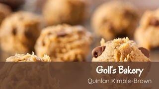
Goll’s Bakery TA.pdf
- 2. Introduction Goll’s Bakery is a bakery with a deep, rich history that is meant to be celebrated. Their history of love and hard work is currently not shown through the website. Goll’s Bakery website’s goal and reality are not aligned at all. Their website is outdated and is extremely basic. The information given is bare bones, it provides the bare minimum. Because of this, navigation, readability and style are lacking. Currently, their website looks like a document that has functional buttons. It does have the main information that’s accessible, but it can be placed randomly or difficult to distinguish. For example, the contact information is strangely placed throughout each page in a inconsistent matter. The alignment of the main information is pushed to the left because of an added “menu feature”. This is not attractive because the balance of the website is catering towards the left. The menu is short and insignificant compared to the rest. The text is also hard to process. The size of the text is all the same, and the only distinction is made by using capital letters or italics. My goal would be to make the highlighted information clearer, and the website balanced. .
- 3. SWOT Analysis In order to properly improve Goll’s website, I needed to evaluate and analyze the current website. Without the analysis, major components for improvement could be looked over or forgotten. To complete the analysis, I created a SWOT chart analysis that looked at the strengths, weaknesses, opportunities, and threats. This information is crucial to the development of the new website because I can focus more on what can be improved or grown upon in designs.
- 5. User Personas To create these user personas, I did research about their demographics through websites like Yelp and Facebook. A lot of customers seem to be adults who are working weekdays, and/or parents with young children. The great majority of customers who reviewed consider Goll’s to be their go-to bakery to settle a small craving, or for birthday cake needs. With this research I was able to create user groups based off of how customers perceived, liked, or disliked Goll’s bakery. The user personas I created are the overworked manager, a hardworking dad, and the excited new mom.
- 9. Rebranding I chose several images I felt that would describe the overall vibe of Goll’s Bakery. While reading about the history of Goll’s bakery I felt it was important to highlight their history and tradition. Multiple images I chose reflect a common theme of warmth, tradition, love, and sharing. When exploring the website, you can see they are a casual local bakery as well. To reflect that I chose an image of a food display case and typical food cooking tools that you would find in your own house. These standard items enforce the idea that Goll is your mom and pop type of shop. Being family run is also an important factor in Goll’s Bakery. Family run businesses need to show they are friendly and inviting. I chose the image of someone rolling the dough represent that they are not a high class, but a local delicacy. Another way I wanted to show the family friendly environment was by including an image of a family. The family’s togetherness is similar to the images originally on the website from their history section. The German men dancing adds the traditional aspect to the mood board. The green in the men’s outfits feel natural and fun at the same time. The color’s from these images are neutral toned, browns and greens.
- 11. Logo When creating the logo I was inspired by multiple aspects of Goll’s history and products. I wanted to incorporate their own menu items or tools to make the items. It was important to me to make Goll’s Bakery logo something personal to them. To do this I researched german traditional cookware in the 1930s, as well as looking at their items online. With my research, I found a tray that had handles on each end and a textured rim. One important aspect to keep in mind was that Goll’s Bakery is a mom and pop type of store, therefore I needed a casual vibe. With both of those Ideas I created a logo that is a baking pan, similar is style to the german tray. Reference: ApolloVintageDesign. (n.d.). Antique Carl Deffner Esslingen Art Nouveau Copper Tray [Photograph]. Etsy.Com. https://www.etsy.com/listing/1096650744/antique-carl-deffner-esslingen-art?gpla=1&gao=1&&utm_source=google&utm_medium=cpc&utm_campaign=shopping_us_a-home_and_living-home_decor-decorative_trays&utm_c ustom1=_k_Cj0KCQiA-qGNBhD3ARIsAO_o7ykQAFhTXcFsH1K6Pt12FnqGpgu3HBedG1kONzDryoql8Cp8jBkvZI8aAhSMEALw_wcB_k_&utm_content=go_12559942249_120251177460_506995100132_pla-302896275 100_c__1096650744_131180015&utm_custom2=12559942249&gclid=Cj0KCQiA-qGNBhD3ARIsAO_o7ykQAFhTXcFsH1K6Pt12FnqGpgu3HBedG1kONzDryoql8Cp8jBkvZI8aAhSMEALw_wcB
- 12. It was also important to acknowledge the size of Goll’s Bakery. Goll’s Bakery is not a large corporation, it’s a neighborhood bakery. With this in mind, it’s important that the name “Goll’s Bakery” is very visible and not complicated. The type font Oregano is perfect for a casual bakery like Goll’s. The text is as if someone wrote out the name.
- 13. Redesigning Site Architecture Despite Goll’s simple and basic navigation, the website is confusing. One of the biggest issues with Goll’s website architecture was the naming conventions they chose. Navigation links could be easily combined with each other. There are multiple links available on their homepage that lead to the same place, but have different names. Another issue is that Goll’s original website allows for users to order online, but it is unclear if it is for catering purposes or for regular orders. Users will feel frustration when trying find how to order a simple item, or for catering. To fix these issues, I combined categories and created sub-pages. The regular menu will give the user an option to order individual items, while the catering form will only be for large quantities. Because of this simplicaton, there is only three secondary pages: Menu, Catering form, and About. The secondary page, menu, includes a shopping cart that is specifically made for just the regular menu. The menu also includes popups for the item selection. The Catering form is a three step process that includes additional pages for each step. Previously, the online order form was on separate pages, which made it difficult to keep track of what a user would want to order. The about page has remained the same, with just the historical information about Goll’s Bakery.
- 16. Low Fidelity Mockups After creating the sitemap, and having the SWOT analysis in mind. I started off with sketches of how Goll’s Bakery website should look. Based off of the SWOT analysis, it was important to have plenty of imagery available, easy navigation, and improvement on readability. Once I had the general premise, I created the low-fidelity wireframes. The redesign refined how users would order and view the menu. Before the menu was simply just to look at rather than a tool preparing users to order. This was not helpful when keeping a customer’s memory in mind. The redesign creates three focal points, which are the secondary pages in the navigation bar. Users will no longer have to jump from menu to the online order form to place an order.
- 17. 2 1 1. Slideshow for displaying advertisement and promotions 2. Several images to engage users and promote memory
- 18. 1 2 1. Breadcrumb menu to help users remember their path and current location 2. Pop-ups appear to streamline checkout and the selection process
- 19. 1 2 1. The three step order form helps streamline catering process 2. “Next” buttons are disabled until information has been filled out 3. Pop-up appears when selecting a catered option 3
- 20. 1. To help customers gauge length of catering process, the circles will darken to indicate their current step 2. To assist with filling out information, Country/Region and State are already filled out 1 2
- 21. 1. Imagery of Goll’s Bakery history would be included here to help engage customers and also make them feel like a part of their history 2. Footer is included with every page to ensure customers have easy access to contact information and socials 1 2
- 22. High Fidelity Mockups These high fidelity mockups are further developed than the low fidelity mockups. These mockups include more features necessary to make Goll’s bakery website functional and appropriately themed. When I drew inspiration from my mood board, the color scheme I created gave off the warmth, traditional, and friendly environment I desired. The Home Page was dedicated to the contact information that was previously readily available. This page includes a slide show to feature any potential advertisements, promotions, and imagery that could be relevant to the season. The Menu page offered plenty of images to help the customer decide on what they may want to order. The menu page also features a third page that takes them to the shopping cart. This shopping cart provides a summary of what items were selected. The Catering Form is where customers can order items in the dozens. This menu is separated from the rest because not all regular items can be ordered through the catering selection. This three step process is made to prevent users from confusing the two menus, and to streamline the process. The About Page has been modeled similar to the original website. This is a longer history section about Goll’s that deserves its own section.
- 23. 1. The main logo is a clickable logo that leads to the home page 2. Depending on which slide is shown, the greyed out circle changes to represent which slide 3. The side arrows go through an slide show that advertise Goll's items and promote online ordering 4. Social media and alternative ordering logos are included at the bottom. The logos are a link to their respective sites.
- 24. 1. Each box is entirely clickable. 2. User location is represented by the darker brown shade in the navigation bar The main menu includes a horizontal drop down. This dropdown is shown only when the user is within the menu and it's options 3. Clicking on the shopping cart will bring users to the shopping cart page
- 25. 1. User location is also represented in bold in the horizontal drop down menu 2. Users must click the button to reveal the popup
- 26. 1. Users must select options before continuing. Selected options are darkened. 2. Quantity is updated by clicking the minus or plus 3. Users can hover over "add to cart" option before clicking. Adding to cart will close the popup and update the cart icon. 4. Each quantity chosen will add to a total in the icon
- 27. 1. Users must fill out the entire page before the "place order" button is available to be clicked on. 2. Icon is darkened to show users where they currently are: the shopping cart 3. Users can delete items they added to the cart by pressing the trash icon 4. Pop-up will appear when customer clicks on Payment selection
- 28. 1. Progress bar is updated once users move on to the next pages. The dark portion represents current location 2. Button is disabled until all information is added
- 29. 1. Each category will produce a popup once clicked on 2. Next button is disabled until there is at least 1 item added to the purchase summary 3. Users are able to add special instructions for each catered item. This is optional.
- 30. 1. Payment popup will appear once users click on the “Credit/debit Card” selection 2. Pay Now will enable once a card has been added 3. Users can delete items they do not want with the trash can icon
- 31. 1. Imagery of Goll’s Bakery history would be included here to help engage customers and also make them feel like a part of their history