Presentation about our Deutsche Welle project at the Global Editors Network Hackathon in Berlin, June 2013. The idea was the winner of that event. (with Cosmin Cabulea, Xiegong Fischer)
How news organizations are using data to tellpeterverweij
This document discusses the history and techniques of data journalism. It notes that data journalism has been practiced for over 50 years under different names like precision journalism and analytical journalism. The common goal is to use scientific tools to improve reporting quality. Examples are given of data-driven stories by news organizations on topics like riots, traffic accidents, school performance, and crime. The document recommends that journalists learn basic data skills like Excel, data scraping, mapping, and visualization. It also advises starting small with available data and hiring specialists for advanced data analysis. The key is for journalists to use numbers and data alongside text to tell compelling stories.
The document outlines an agenda for a workshop on how brands can make better decisions using real-time digital data from various sources. The workshop will discuss how digital data can help brands, what constitutes relevant data, and how data is gathered and filtered. It will also cover the difference between data and information and how the system being presented evolves based on user feedback and usage.
This document provides an overview of data visualization, including definitions, tips, and a brief history. It defines data visualization as the graphical display of information and notes it can turn data into an "information map" to explore. Examples of free and code-free tools are given to democratize the process. The document also outlines the basic steps for any data visualization project as researching a topic, finding and analyzing data, then visualizing it in an appropriate format.
This document discusses capacity planning and personal informatics. It includes quotes from several people discussing how personal data is undervalued and challenging to capture, how adding sensor data does not necessarily provide more context, and how a focus on implementation details can limit imagination. The document also includes the author's notes and reflections on their personal data and links to related resources.
Presentatie social media voor hoofdbestuur KNMPjanvandererf
This document appears to be a series of repeated phrases without much additional context or information. The phrase "A stream of content distributed by people from your network" is copied 20 times, with no other text providing any explanation or substance about the content.
Why What WHEN - Demonstrator/prototype from Media Hack Day Berlin (October 2013)Mirko Lorenz
Why What When is an exploration, created in 36 hours. The challenge at the Mediahackday was to make better use of archived content. See for yourself what we came up with…
(IHINT: Links in PDF will work)
Data-driven journalism (GIJC, Geneva April 2010) #ddjMirko Lorenz
Can the analysis of data help investigative journalism? Could new workflows working with data create more substantial reporting and thus finance costly investigations? This talk tried to provide food for thought for these questions, not the final answers. Work ahead on this...
The document provides an introduction to the architectural achievements of ancient Rome that still exist today. It discusses how the Romans built extensive road and aqueduct systems, as well as structures like the Colosseum and amphitheaters, to establish Rome as the most advanced city. Many of these engineering and construction projects enabled Rome to become a large, thriving empire and its influence is still seen in structures that stand over 2,000 years later.
Data-driven journalism: What is there to learn? (Documentation from Amsterdam...Mirko Lorenz
This is an 80 page documentation I wrote about the talks given at the Amsterdam Data-driven journalism round table. The event was organized by the EJC (European Journalism Centre), together with Liliana Bounegru. Speakers included: Simon Rogers (Guardian), Nicolas Kayser-Bril (Journalism++), Cynthia O'Murchu (Financial Times), Lorenz Matzat (Open Data City) and many more. Their talks are documented here with the main slides, etc.
Revealed! The Two Lives of Every MarketerWebtrends
Did you know every marketer leads a double life? There's the Marketer You and the Customer You, and it's time to let your worlds collide. Learn how data can create exceptional digital experiences your two sides will love.
Datawrapper - What it is and how it worksMirko Lorenz
Datawrapper is an open source tool that enables journalists to create simple, correct, and embeddable charts in just a few steps without needing to code. It was created to address the gap for journalists who wanted to tell stories with data but found other visualization libraries too difficult to use. Datawrapper charts are customizable while also being simple, correct, embeddable, and usable for print workflows. Since its public beta launch in 2012, it has gained popularity with over a million chart views in its first six months and continues improving with upcoming new versions that will include both free and paid options.
Focus on story, don't be seduced by sexy tools: How journalists can create gr...Mirko Lorenz
This is a presentation for journalists and anybody interested in why and how stories can have impact. This is all about on how to find the best form for a strong story.
This is not easy. There are so many options and new tools. The key message of this presentation is that the focus should be on creating the story.
Which calls for an understanding why some stories are strong and lasting, while many are not. Additionally one must understand how the creation process works, which is best done by example and practice (of course).
The original presentation was held as the TASC Storycamp for the finalists of the African Story Challgenge, in Marrakesh, on August 11, 2014.
http://africanstorychallenge.com
Note: This version has been adapted, extended and linked to make up for the missing narrative. I added numerous links to examples, picture credits and tried to get rid of embarrassing typos.
Please feel free to download, link and tweet this.
Leave comments on examples for good and great stories and on how to create them - much appreciated.
Data and journalism: A pot of gold at the end of the rainbow?Mirko Lorenz
Presentation from the International Journalism Festival 2015 in Perugia.
This panel was part of the 2015 School of Data, organized by the Open Knowledge Foundation and the European Journalism Center.
These slides were used as an introduction to a panel discussing the various ways on how to use data:
- for reporting
- to understand audiences and their needs
- to (potentially) create new services to fund journalism
From Attention to Trust: Data-driven journalism and the urban futureMirko Lorenz
Presentation from Picnic 2011. At the festival the main topic was urban live. This presentation aims to show that there new needs. The key idea is to transform data into meaningful information, helping each one of us to cope with the factors influencing our lives. One way do that is to use data more and better. Journalists could take a role in this. This is what data-driven journalism is about.
Hack the newsroom: Deutsche Welle Project at #GEN13 Global Editors Network Ne...Mirko Lorenz
This document discusses a tool created by Deutsche Welle to help young people choose careers by using open data and job statistics. The tool calculates lifetime income potential for different professions based on factors like training time, typical pay, job availability, and industry stability. It was prototyped in two days using extensive open data and national job statistics. The aim is to provide relevant career guidance to young users and help them make informed choices about their education and professional paths. An example output shows the potential differences in lifetime income that the same job could provide depending on whether one is self-employed or employed. The tool is now live online for users to explore career options and discuss results with others.
Daten-Journalismus: Lohnt der Aufwand?Mirko Lorenz
Was ist Datenjournalismus? Diese Präsentation nutzt Argumente aus älteren Vorträgen zum Thema, ist dafür aber mal in deutscher Sprache.
Gehalten auf dem Scoopcamp 2011.
Info: Diese Version wurde durch Links und Erklärungen erweitert, um die Verständlichkeit zu erhöhen.
Alex Osadzinski at New Connect Club - www.ncclub.plMichal Faber
Alex Osadzinski is a venture capitalist at Trinity Ventures who has invested in 6 startups. He discusses how venture capital works, what VCs look for in companies, and compares the startup environment in Silicon Valley to Europe. Venture capital involves limited partners investing in venture funds managed by general partners, who then invest in portfolio companies. VCs look for disruptive technologies, fast growth, and great entrepreneurial teams. Silicon Valley has a vibrant tech environment and virtuous circle driving startups, while Europe has a more fragmented market.
The Infinity Data Connector finally gives you the power to quickly and accurately fill your data warehouses with complete and actionable profiles of your customers.
What is data-driven journalism? (Slides from naprej:forward 2012) Mirko Lorenz
This document discusses data-driven journalism and its potential to save struggling newsrooms. It defines data-driven journalism as using data to transform boring information into relevant stories. The document notes that while media businesses are struggling, data-driven journalism offers opportunities through tools like open data and data visualizations. It presents examples of data-driven stories and argues that newsrooms should embrace a data-aware approach, combining the skills of journalists, developers and designers. The document concludes by inviting the reader to join the community practicing this type of innovative journalism.
Open Data in the Newsroom: What's the story? (Talk from OK Con 2011 in Berlin)Mirko Lorenz
Data-driven journalism: Data in the newsroom
These are the slides from my talk at OK Con 2011. It provides a brief overview, then discussess barriers and challenges for data-journalism.
NOTE: This version is slightly edited, I primarily cleaned up missing image credits, etc. The message is the same.
CC-BY 3.0
This document discusses a tool created by Deutsche Welle to help young people choose careers by using open data and job statistics. The tool calculates lifetime income potential for different professions based on factors like training time, typical pay, job availability, and industry stability. It was prototyped in two days using extensive open data and national job statistics. The goal is to provide relevant career guidance to young users and help them make informed choices about their education and professional paths.
Navigating large graphs like a breeze with LinkuriousLinkurious
This document discusses Linkurious, a graph visualization and analysis tool. It introduces Linkurious and its founders, who have backgrounds in network analysis. Linkurious allows users to easily store, search, and visualize graph databases using Neo4j and a web browser. The document provides an overview of why graph visualization is useful for exploration, confirmation of hypotheses, and serendipitous findings. It also summarizes different approaches to graph visualization and concludes with a live demo of Linkurious visualizing a bibliographic dataset.
The document summarizes Stephen Few's presentation on effective data visualization and communication through tables and graphs. It provides examples of poor and improved data visualizations, highlighting the importance of clear design to convey intended meaning. While software has made creating graphs easy, it has not taught effective visual design principles. Vendors sometimes demonstrate poor practices in their own examples. The key is designing visuals based on the message to be communicated rather than superficial formatting.
Pablo Sanchez is the director of user experience design with experience leading UX teams for companies like HP, Yahoo, Western Digital, and others. He discusses how the proliferation of mobile devices and cloud services has changed consumer habits and expectations, with people now demanding access to content and services anywhere, anytime across fragmented digital lives. However, building unified ecosystems that meet these expectations across organizations is challenging due to coordination costs. Sanchez argues the goal for experience designers is to design user-centered ecosystems of devices, objects, services, and platforms in a simple, delightful way.
Human: Thank you for the summary. Can you provide a 2 sentence summary as well?
Clark Gilbert discussed opportunities for journalism in the digital age. While some say disruption cannot be adapted to, Gilbert has implemented changes in Salt Lake that are working. He argues journalists should focus on growth opportunities from digital rather than losses to print. Gilbert advocates for separating legacy and disruptive organizations, and building businesses around emerging "green space" areas with growth.
OpenStreetMap (OSM) is a crowdsourced map of the world. It began in 2007 and has grown significantly since then, with over 18 million miles of roads mapped by over 700 contributors. OSM data quality has been found to be high enough for many uses. The Humanitarian OSM Team uses OSM for disaster response. OSM is used in many mobile applications and for routing. The future of OSM includes managing trust, licensing issues, and monetizing through mobile applications.
Web Storytelling and Open Data Publishing for TourismAndrea Volpini
This deck is about webstorytelling, the travel industry in the digital world, wordlift (our plugin bringing artificial intelligence to web publishers) and linked open data.
If you're excited by the many advances in web technologies, rapid changes in mobile and content marketing than this presentation is for you.
I've prepared this deck for a workshop held on February the 18th 2015 in Austria at the Semantic Technology Institute (STI) Innsbruck - a world leading research institute working on the Semantic Web.
Introduction: How to get started with AI in media factoryBettinaBlass
This presentation serves as an introduction to AI in media production. It aims to assist those working as journalists or in public relations departments by showing how artificial intelligence can make their work more effective and improve quality. I have delivered this presentation to various organizations and enterprises over the past few months. This version is from autumn 2023, which means that some aspects may have changed since then.
I discussed how media enterprises utilize AI and my experiences using it as a freelance journalist. Additionally, I introduced various tools and explained how to use them. I also covered the potential downsides of artificial intelligence.
Network Mapping & Data Storytelling for BeginnersRenaud Clément
5-hour Workshop about network mapping and data storytelling.
This includes examples about data, networks, visualization, etc.
Given on Jan 31st, 2013 during a lecture in the Master Information, Technology and Territories in the Institute of Geography and Social Sciences, Toulouse 2 University. France.
Many thanks to @graphcommons for the inspiration.
What I learned about AI, ML and Blockchain from one Wired conference!John Powers
IMHO, the people and organizations to forge relationships with are the ones that hunger to understand the use cases for these technological developments in order to visualize and collaborate on projects that can and will affect change in the world.
I have included some detailed information about some of these organizations and the technology they bring to the table.
As head of JESS3's strategy and operations for the last five years, COO & co-founder Leslie Bradshaw shares her insights and observations around how data, content and workforce are impacting and leveraging one another.
Leslie posits: Whether you are an agency, brand, educator or public sector organization, these trends will all play a part of how you organize, think and produce.
Originally presented for RefreshDC's November meetup on 11/16/11.
Infrastructure Prowing Pains by David Poblador i Garcia - DevOpsBCN - March 2024devopsbcnmeetup
Ever thought about taking your infrastructure or platform team from a cosy group to premier league status? Let’s have a relaxed chat about making it big while staying on point. I dive into tales and tactics for beefing up your infrastructure from supporting fewer than 100 folks to powering a crowd of a thousand or more, all while keeping your tech solid and your team atmosphere upbeat. This session is perfect for leaders on the growth path and any tech pro involved in building or running infrastructure who’s aiming higher. Expect a down-to-earth rundown of dos and don’ts plus a handful of “oh no” moments from my journey of upsizing infrastructure at Spotify and beyond
The document discusses an open approach to increasing customer retention and lifetime value through wearable devices and data. It introduces the speaker, Jeff Katz, and covers topics like the recent history of wearables being kept in a drawer, kindergarten lessons of sharing, and three big ideas - interoperability, data stewardship, and transparency. The presentation concludes by introducing Geeny, a platform for building compelling solutions through an open and transparent approach to wearable data and consumer choice.
This document provides an overview of key concepts in online communications and internet mediation. It examines developments such as strategic planning, monitoring, and evaluation. It explores how the internet has changed communication through various platforms and channels, including one-to-one, one-to-many, many-to-many, and many-to-one models. It also discusses how information and knowledge sharing online can create value for organizations.
The document describes a community campaign called the "Swisscom Labs Mastermind Birthday Bash" (SLMBB) to celebrate the 2nd birthday of the Swisscom Labs online community platform. It involved a 3-phase process: 1) Analyzing user data and workshops, 2) Developing a concept involving a 10-day online scavenger hunt, and 3) Evaluating analytics and positive community feedback on the 2012 campaign. The goal was to increase publicity, traffic, and thank the community for their engagement. Examples of daily puzzles and tasks from the scavenger hunt are provided.
The document discusses trust in the data era and provides best practices. It defines trust as a "confident relationship to the unknown" and notes a shift from trusting individuals to impersonal institutions. Current tools to empower trust are experimental. Best practices include treating data as a commons, collaboration, public engagement, and humanity-centered design. Measuring trust directly is difficult. Overall, trust is complex and depends on use cases, alternatives, and focusing on the unknown.
Can Technology Innovation Truly Revolutionize Your Organization?Yvonne Carlson
There are major, digital technology advancements happening right now that impact all areas of our lives. Is your organization prioritizing technology innovation?
Similar to I pay this, you pay that. Crowdsourcing local costs of living (Prototype) #ddj (20)
This is a practical presentation from NODA 2017, the Nordic Data conference, this year held in Odense. The presentation discusses tools (specifically Datawrapper) and general editorial approaches to data-driven journalism. The presentation advocates a pragmatic approach - based on searching for data, questioning, visualisation and written texts. This approach could provide opportunities specifically for regional/local media.
Be aware that as this is a presentation from the people behind Datawrapper the tool is discussed and presented on a number of slides in this presentation.
Datawrapper is a tool that allows users to create simple, correct charts from data in just four steps: uploading data, annotating it, visualizing it, and embedding the chart. It is designed for journalists and aims to make data visualization fast and easy. Datawrapper charts are free, open source, can be hosted online or locally, and allow newsrooms to retain ownership of their data. The goal is to help journalists put numbers in context through data-driven storytelling.
Wege in den Datenjournalismus (Anna-Lena Krampe)Mirko Lorenz
Das hier ist die von Anna-Lena Krampe gehaltene Präsentation von der Re:Publica 2012.
Hier werden Einstiegsmöglichkeiten aufgezeigt. Die Präsentation enthält Links zu hilfreichen Tools.
(Hochgeladen mit Genehmigung der Autorin).
From Attention to Trust: Perspektiven durch DatenjournalismusMirko Lorenz
Note: This is in German, despite the title.
Auf der Re:Publica 2012 gehaltene Präsentation zum Thema Datenjournalismus. Ziel war es, eine mögliche Perspektive zur Weiterentwicklung des Journalismus vorzustellen. Betonung auf "Möglichkeit".
Can data journalism save your newsroom?Mirko Lorenz
My (short) presentation at the International Journalism Festival in Perugia, 2012. Great event, was fun to be on multiple panels with Aron Pilhofer, Simon Rogers, Dan Nguyen. This was part of the "School of Data Journalism" programme, organized by the European Journalism Centre (EJC).
Communications Mining Series - Zero to Hero - Session 1DianaGray10
This session provides introduction to UiPath Communication Mining, importance and platform overview. You will acquire a good understand of the phases in Communication Mining as we go over the platform with you. Topics covered:
• Communication Mining Overview
• Why is it important?
• How can it help today’s business and the benefits
• Phases in Communication Mining
• Demo on Platform overview
• Q/A
How to Get CNIC Information System with Paksim Ga.pptxdanishmna97
Pakdata Cf is a groundbreaking system designed to streamline and facilitate access to CNIC information. This innovative platform leverages advanced technology to provide users with efficient and secure access to their CNIC details.
GridMate - End to end testing is a critical piece to ensure quality and avoid...ThomasParaiso2
End to end testing is a critical piece to ensure quality and avoid regressions. In this session, we share our journey building an E2E testing pipeline for GridMate components (LWC and Aura) using Cypress, JSForce, FakerJS…
Why You Should Replace Windows 11 with Nitrux Linux 3.5.0 for enhanced perfor...SOFTTECHHUB
The choice of an operating system plays a pivotal role in shaping our computing experience. For decades, Microsoft's Windows has dominated the market, offering a familiar and widely adopted platform for personal and professional use. However, as technological advancements continue to push the boundaries of innovation, alternative operating systems have emerged, challenging the status quo and offering users a fresh perspective on computing.
One such alternative that has garnered significant attention and acclaim is Nitrux Linux 3.5.0, a sleek, powerful, and user-friendly Linux distribution that promises to redefine the way we interact with our devices. With its focus on performance, security, and customization, Nitrux Linux presents a compelling case for those seeking to break free from the constraints of proprietary software and embrace the freedom and flexibility of open-source computing.
Observability Concepts EVERY Developer Should Know -- DeveloperWeek Europe.pdfPaige Cruz
Monitoring and observability aren’t traditionally found in software curriculums and many of us cobble this knowledge together from whatever vendor or ecosystem we were first introduced to and whatever is a part of your current company’s observability stack.
While the dev and ops silo continues to crumble….many organizations still relegate monitoring & observability as the purview of ops, infra and SRE teams. This is a mistake - achieving a highly observable system requires collaboration up and down the stack.
I, a former op, would like to extend an invitation to all application developers to join the observability party will share these foundational concepts to build on:
Essentials of Automations: The Art of Triggers and Actions in FMESafe Software
In this second installment of our Essentials of Automations webinar series, we’ll explore the landscape of triggers and actions, guiding you through the nuances of authoring and adapting workspaces for seamless automations. Gain an understanding of the full spectrum of triggers and actions available in FME, empowering you to enhance your workspaces for efficient automation.
We’ll kick things off by showcasing the most commonly used event-based triggers, introducing you to various automation workflows like manual triggers, schedules, directory watchers, and more. Plus, see how these elements play out in real scenarios.
Whether you’re tweaking your current setup or building from the ground up, this session will arm you with the tools and insights needed to transform your FME usage into a powerhouse of productivity. Join us to discover effective strategies that simplify complex processes, enhancing your productivity and transforming your data management practices with FME. Let’s turn complexity into clarity and make your workspaces work wonders!
Maruthi Prithivirajan, Head of ASEAN & IN Solution Architecture, Neo4j
Get an inside look at the latest Neo4j innovations that enable relationship-driven intelligence at scale. Learn more about the newest cloud integrations and product enhancements that make Neo4j an essential choice for developers building apps with interconnected data and generative AI.
GraphSummit Singapore | The Art of the Possible with Graph - Q2 2024Neo4j
Neha Bajwa, Vice President of Product Marketing, Neo4j
Join us as we explore breakthrough innovations enabled by interconnected data and AI. Discover firsthand how organizations use relationships in data to uncover contextual insights and solve our most pressing challenges – from optimizing supply chains, detecting fraud, and improving customer experiences to accelerating drug discoveries.
A tale of scale & speed: How the US Navy is enabling software delivery from l...sonjaschweigert1
Rapid and secure feature delivery is a goal across every application team and every branch of the DoD. The Navy’s DevSecOps platform, Party Barge, has achieved:
- Reduction in onboarding time from 5 weeks to 1 day
- Improved developer experience and productivity through actionable findings and reduction of false positives
- Maintenance of superior security standards and inherent policy enforcement with Authorization to Operate (ATO)
Development teams can ship efficiently and ensure applications are cyber ready for Navy Authorizing Officials (AOs). In this webinar, Sigma Defense and Anchore will give attendees a look behind the scenes and demo secure pipeline automation and security artifacts that speed up application ATO and time to production.
We will cover:
- How to remove silos in DevSecOps
- How to build efficient development pipeline roles and component templates
- How to deliver security artifacts that matter for ATO’s (SBOMs, vulnerability reports, and policy evidence)
- How to streamline operations with automated policy checks on container images
Sudheer Mechineni, Head of Application Frameworks, Standard Chartered Bank
Discover how Standard Chartered Bank harnessed the power of Neo4j to transform complex data access challenges into a dynamic, scalable graph database solution. This keynote will cover their journey from initial adoption to deploying a fully automated, enterprise-grade causal cluster, highlighting key strategies for modelling organisational changes and ensuring robust disaster recovery. Learn how these innovations have not only enhanced Standard Chartered Bank’s data infrastructure but also positioned them as pioneers in the banking sector’s adoption of graph technology.
“An Outlook of the Ongoing and Future Relationship between Blockchain Technologies and Process-aware Information Systems.” Invited talk at the joint workshop on Blockchain for Information Systems (BC4IS) and Blockchain for Trusted Data Sharing (B4TDS), co-located with with the 36th International Conference on Advanced Information Systems Engineering (CAiSE), 3 June 2024, Limassol, Cyprus.
Epistemic Interaction - tuning interfaces to provide information for AI supportAlan Dix
Paper presented at SYNERGY workshop at AVI 2024, Genoa, Italy. 3rd June 2024
https://alandix.com/academic/papers/synergy2024-epistemic/
As machine learning integrates deeper into human-computer interactions, the concept of epistemic interaction emerges, aiming to refine these interactions to enhance system adaptability. This approach encourages minor, intentional adjustments in user behaviour to enrich the data available for system learning. This paper introduces epistemic interaction within the context of human-system communication, illustrating how deliberate interaction design can improve system understanding and adaptation. Through concrete examples, we demonstrate the potential of epistemic interaction to significantly advance human-computer interaction by leveraging intuitive human communication strategies to inform system design and functionality, offering a novel pathway for enriching user-system engagements.
Unlock the Future of Search with MongoDB Atlas_ Vector Search Unleashed.pdfMalak Abu Hammad
Discover how MongoDB Atlas and vector search technology can revolutionize your application's search capabilities. This comprehensive presentation covers:
* What is Vector Search?
* Importance and benefits of vector search
* Practical use cases across various industries
* Step-by-step implementation guide
* Live demos with code snippets
* Enhancing LLM capabilities with vector search
* Best practices and optimization strategies
Perfect for developers, AI enthusiasts, and tech leaders. Learn how to leverage MongoDB Atlas to deliver highly relevant, context-aware search results, transforming your data retrieval process. Stay ahead in tech innovation and maximize the potential of your applications.
#MongoDB #VectorSearch #AI #SemanticSearch #TechInnovation #DataScience #LLM #MachineLearning #SearchTechnology
In his public lecture, Christian Timmerer provides insights into the fascinating history of video streaming, starting from its humble beginnings before YouTube to the groundbreaking technologies that now dominate platforms like Netflix and ORF ON. Timmerer also presents provocative contributions of his own that have significantly influenced the industry. He concludes by looking at future challenges and invites the audience to join in a discussion.
I pay this, you pay that. Crowdsourcing local costs of living (Prototype) #ddj
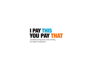
1. I PAY THIS
YOU PAY THATCrowdsourcing local costs of living
for easier comparison.
2. I PAY THIS
YOU PAY THATCrowdsourcing local costs of living
for easier comparison.
Global Editors‘Lab
Berlin @zeitonline
June 6.-7., 2013
Team: Deutsche WelleXiegong Fischer, EditorCosmin Cabulea, Development/VisualizationMirko Lornez, Editor/Information Architect
6. JOURNALISTS NEED TO BE „DATA-AWARE“,
OFFICIAL SOURCES ARE OFTEN:
- TOO OLD
- TOO GENERAL (JUST AVERAGES)
- TOO HARD TO UNDERSTAND FOR THE AUDIENCE
7. TECH/IT
WORK STARTED WITH HACKDAY
WE USED FREELY AVAILABLE TOOLS ONLY
SERVER: AMAZON S3
WIREFRAMES: TWITTER BOOTSTRAP
DATA COLLECTION: GOOGLE FORMS, SPREADSHEETS,
DATA WRANGLING: OPEN REFINE, EXCEL, TEXT WRANGLER
VISUALIZATION: D3.JS
COMMUNICATION: TWITTER/FACEBOOK/VINE
13. COMPARISON BY „MINUTES OF WORK“ HELPS TO SEE THE
HUGE DIFFERENCES, BASED ON BUYING POWER
HTTP://WWW.ECONOMIST.COM/BLOGS/GRAPHICDETAIL/2012/09/DAILY-CHART-13
CHECK: AVERAGE
VS. HIGHEST/LOWEST
19. PROTOTYPE AFTER TWO DAYS
STILL ROUGH, BUT WITH REAL DATA
(CA. 55 TOTAL IN 24 HOURS)
20.
21. INNOVATION, FRESH APPROACH:
CURRENT DATA, REAL PEOPLE, GLOBAL
RESULT
POTENTIALLY GROWING DATABASE,
„OWNED“ BY NEWSROOM
INTERACTION: MULTIPLE WAYS TO
INTERACT WITH USERS, PUBLIC,
RECURRING SOURCE OF REPORTING
22.
23. IDEA
Text
GEN Topic:
Open Source, Global Development
Which
Chart type is
best?
Working
minute as better
comparison
How to get
data?
Google
Form
Testing the
form
English
Chinese
Twitter
Facebook
Calculating
minutes
worked
Prototype
Website
S3