Gap ReBrand
•
0 likes•406 views

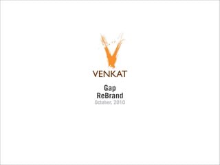
This document proposes a rebranding of the Gap logo to better reflect the brand's focus on simplicity and style. The proposed new logo keeps the design clean and simple while adding more style through an abstracted jean texture and a contemporary sans-serif typeface. The redesign aims to maintain the core aspects of the Gap's branding through consistent color schemes and structure.
Report
Share
Report
Share

Recommended
Evaluation 2
- The document discusses the effectiveness of combining a music video with ancillary tasks like a digipak and magazine advert to promote an artist's brand.
- The digipak uses images and locations from the music video to give audiences a taste and promote the brand's themes of change and adventure. Bright colors are used to catch viewers' eyes.
- The magazine advert also uses bright colors and features the main character to intrigue audiences and promote the new single. It provides information like the release date to encourage people to seek out the song.
- By linking all the tasks together through consistent branding elements like themes, fonts and colors, the overall goal of creating an influential media figure for the artist was achieved
Brunner Appliance Repair Website
The document discusses the website design and development for Brunner Appliance Repair in June 2011. A bold and brash logo was created to brand Brunner Appliance Repair in August. The website retains the same feel, showing their customer-friendly and hands-on work. A vibrant color scheme and original photography were used to give the website a unique look. Stickers were also created for appliances serviced which received positive customer feedback.
Destination Nendaz , Switzerland
Présentation complète et globale de la destination, été comme hiver, festivals, événements MICE, vacances en famille et entre amis
Vietnam market size
This document provides economic data for Vietnam from 2005 to 2010, including GDP, GDP by sector, exports, imports, labor force participation rates, employment levels by age group and sector. Some key points:
- GDP grew steadily over this period, with real GDP growth averaging around 7% annually.
- Manufacturing and agriculture were large contributors to GDP, together accounting for around 30-35% of GDP.
- Exports and imports both increased substantially, with exports growing from $32 billion to nearly $72 billion between 2005-2010.
- The labor force participation rate was stable at around 73% and total employment increased from 40 million to nearly 44 million.
- Employment in manufacturing, trade, and agriculture accounted
Portfolio Book
An organic produce vendor aims to provide fresh, affordable produce while maintaining a friendly atmosphere.
A high-end sunglasses company specializes in custom fitting each $100-200 pair of sunglasses.
A clothing line inspired by hip-hop culture markets to teenagers and their parents.
Modellazione morfodinamica della spiaggia di La Playa (Cagliari). Tesi di lau...
Il lavoro di ricerca ha riguardato l'analisi dell'evoluzione morfodinamica della spiaggia di La Playa (Cagliari) sulla scala di tempesta e lo studio dell'inondazione costiera mediante il modello numerico XBeach (Roelvink, 2009)
Driving an Accountable and Collaborative Culture
A one-hour webinar introducing 10 questions asked by Accountable Collaborators, based on the book Peer Power: Transforming Workplace Relationships by Cynthia Clay
アクション・インクワイアリー(行動探究)って何?
2016年2月23日に出版された本「アクション・インクワイアリー」の著者ビル・トルバート氏来日に伴い、3月29日にワークショップを行います。(http://soljapan-‐billtorbert-‐acKoninquiry.peaKx.com/ )
そこで、本スライドでは「アクション・インクワイアリー」や、3月29日に行うワークショップによってSOLJapanが目指していることについてまとめています。
IMSM14_report
This summarizes a document describing a workshop on mathematical and statistical modeling held in July 2014 at North Carolina State University. The workshop brought together 31 graduate students from 28 universities to work in teams on solving real-world problems presented by scientists. Students spent a week investigating their assigned problem and then presented their findings. The goal was to expose students to interdisciplinary research and real problems requiring varied expertise to solve. Past workshops have led to new research results and publications as well as future collaborations.
Days of decision – 1965 1967
This document summarizes key events in the US from 1965-1967 related to the civil rights movement, anti-war protests, and racial tensions. It discusses the Watts riots in 1965, the emergence of black power advocates like Malcolm X and Stokely Carmichael, protests against the Vietnam War including draft protests and teach-ins, and ongoing urban uprisings in response to racial inequities during the "Long, hot summer" of 1966. Lyndon Johnson attempted to address racial issues through Great Society programs but faced growing dissent over the war and a fading of liberalism.
Art of ceilings the latest
This document provides an overview of recent ceiling projects by Art of Ceilings including micro-perforated ceilings at the W Hotel in Amsterdam to enhance acoustics, stretch ceilings above the swimming pool at the W Hotel that are waterproof and can be easily removed and reinstalled, and over 2000 square meters of daylight ceilings installed in the new town hall in Deventer. It also mentions installing printed wall coverings in PVC or polyester that are quickly installed and acoustic, and notes that stretch ceilings are increasingly popular in private homes due to their quick installation, acoustic and waterproof properties, and ease of cleaning.
Art of ceilings
Art of Ceilings is a Dutch company that specializes in stretch ceiling installations. They have extensive experience installing ceilings in hotels, offices, retail stores, restaurants, and homes. Their portfolio includes projects for the W Hotel in Amsterdam, Hilton Hotel in The Hague, and buildings for Alliander, Rabobank, and various architects. Art of Ceilings uses high quality stretch ceiling membranes that provide acoustic and aesthetic benefits and can incorporate lighting effects. They complete projects around the world through their network of installation professionals.
01. cuestionario (sin respuestas) de hechos capítulo 1.1-13 restauremos a si...
Este documento contiene 27 preguntas sobre el capítulo 1:1-13 del libro de Hechos en la Biblia. Las preguntas exploran temas como los requisitos para ser considerado un apóstol, quién escribió el libro de Hechos y cuándo, el propósito del libro, los 40 días que Jesús pasó enseñando a sus discípulos después de su resurrección, el significado del bautismo, la promesa del Espíritu Santo mencionada por Jesús, y los eventos que ocurrieron después de la ascens
Pompeii
1) Pompeii was a large Roman city located near the volcano Mount Vesuvius in southern Italy.
2) On August 24th, 79 AD, Mount Vesuvius erupted for the first time in almost 2,000 years, threatening the city of Pompeii.
3) Pliny the Elder observed the eruption from his villa but went closer to investigate, and he later perished in the eruption along with many others as lava and ash buried the city.
Issues of Sustainable Built Environment: Context, Evolution and Pedagogical D...
Issues of Sustainable Built Environment: Context, Evolution and Pedagogical D...Edge Hill University
This document discusses sustainable built environments and pedagogical approaches to teaching sustainability. It provides context on the evolution of sustainability concepts and benchmarks for sustainable design and construction. It also outlines the curriculum developed at the School of Planning and Architecture to integrate sustainability issues into their Master's in Building Engineering and Management program. The curriculum embeds sustainability across core and support course areas and is being disseminated to other institutions to strengthen sustainability education.Brain-based Learning in the Virtual Classroom
60 minute webinar modelling six brain-based guidelines that lead to improved attention and learning transfer
IPM South Africa - Business Models and the Future of Work
The document discusses future business models and norms for the 21st century workplace. Key technologies discussed include robotics, AI, virtual/augmented reality, 3D printing, blockchain, and more. It suggests business models will shift from hierarchical to networked, with transformative purpose, experimentation, crowd-sourced innovation, and flexible workforces. Workers may be on-demand and lifestyle-based. Ownership will move to leveraged utilities and sharing. The future of work involves digitization, socialization, decline of jobs/managers, death of hierarchy, democratized learning, and disruption as usual. Exponential organizations will digitize, deceive, disrupt, dematerialize, demonetize, and democratize.
Creating an E-Commerce Scorecard
The document discusses creating an e-commerce scorecard. It includes presentations from three speakers: Jamie Werve from Insight, Emile Naguib from Office Depot, and Gerald Clarke from IBM. They discuss their companies' e-commerce journeys and metrics for measuring e-commerce performance. Key points include Insight's evolution in e-commerce since 1996 and their current scorecard measures. Office Depot outlines site and implementation metrics. IBM discusses their complex business model and balanced scorecard approach measuring financial, customer, operational, and people dimensions. The presentations provide lessons on developing an effective e-commerce scorecard.
利用 Amazon QuickSight 視覺化分析服務剖析資料
Amazon QuickSight is a fast, cloud-powered business analytics service that makes it easy to build visualizations, perform ad-hoc analysis, and quickly get business insights from your data. Using our cloud-based service you can easily connect to your data, perform advanced analysis, and create stunning visualizations and rich dashboards that can be accessed from any browser or mobile device.
Fiscal 2008 Annual Report and Letter to Stockholders
McKesson delivered strong financial results in fiscal year 2008, with revenues reaching over $101 billion. The company continued its track record of superior stockholder returns through strategic acquisitions that expanded its service offerings and customer base. McKesson provides a wide range of solutions to customers across the healthcare industry, including distribution services, medical supplies, clinical software, and pharmacy management tools. It aims to help all participants in healthcare succeed through innovative solutions and long-term partnerships.
NetIP Pittsburgh-Diwali Gala Poster
This document is a poster for NetIP-Pittsburgh's 2012 Diwali Gala event held on November 9th. The poster depicts a lamp made of icons representing elements of the party, such as firecrackers, drinks, a DJ, microphones, and food. Vibrant colors and deeper tones were used to create an energetic and fun vibe that would attract attention on display. The poster was commissioned by NetIP-Pittsburgh, a professional networking group for young Indian professionals that organizes cultural, social, and community events.
Yuva India Restaurant Lunch Menu
Yuva India Restaurant recently updated their lunch menu for August 2012. The menu focuses on highlighting how authentic the restaurant's Indian food is. Images of spices and handwritten text were used on the menu to convey that the food is handmade and made in an authentic style.
Betsy Lawrence Website Design
Betsy Lawrence is a musician, composer and teacher who plays in two bands, The Roman Lawrence Project and the Steel City Sound Escape. A recently completed website was designed to showcase her stage persona with a natural, bright, energetic and comforting look and feel. The website highlights her roles as a musician and teacher through different styles of music.
Brunner Appliance Repair Business Cards
Brunner Appliance Repair had their business cards redesigned for 2011. The new design kept a similar layout to the previous year but added the company logo and updated the callout and typefaces to be bolder and more noticeable. The redesign aimed to maintain continuity while improving standout aspects of the cards.
Brunner Appliance Repair-Spring Special Postcard
Brunner Appliance Repair has a yearly Spring Special promotion and designed a postcard to advertise it. The postcard features icons of an air conditioner, tools, and a medical plus sign to represent HVAC repair services. It also uses bold text to clearly showcase the services included in the special promotion.
Gilda Club of Western PA-5K T-Shirts
The document discusses redesigning the t-shirt for the Gilda Club of Western PA's 5K race in 2012. It was decided to keep the illustration that has been on their shirts while adding shoe prints to represent forward movement supported by the Gilda Club. The tagline "Race for a Reason" was used to ensure walkers in the race also felt included.
Ron Placone-Comedian & Writer: Branding, Website & Promotional Design
Ron Placone is a writer and comedian in Pittsburgh who created a one-man show called "Madness in the Message" focusing on media criticism and its impact on democracy. A branding, promotional print design, and website were created for Placone and his comedy show that showcased the message and topics he discusses such as politics, media, society and culture using illustrations and icons. The designs were carried through his branding, posters, website and other promotional materials.
Yuva India Restaurant Branding & Print Collateral
The document summarizes branding and print collateral created for Yuva India restaurant in March 2012. It describes meeting with the owner to determine the aesthetic as inviting, energetic, and youthful. Logo concepts were created to be dynamic and energetic while appealing to a wide demographic. Business cards and menus utilized illustrations of auto rickshaws and typography to convey the feeling of India and energetic youthful vibe of the restaurant.
More Related Content
Viewers also liked
アクション・インクワイアリー(行動探究)って何?
2016年2月23日に出版された本「アクション・インクワイアリー」の著者ビル・トルバート氏来日に伴い、3月29日にワークショップを行います。(http://soljapan-‐billtorbert-‐acKoninquiry.peaKx.com/ )
そこで、本スライドでは「アクション・インクワイアリー」や、3月29日に行うワークショップによってSOLJapanが目指していることについてまとめています。
IMSM14_report
This summarizes a document describing a workshop on mathematical and statistical modeling held in July 2014 at North Carolina State University. The workshop brought together 31 graduate students from 28 universities to work in teams on solving real-world problems presented by scientists. Students spent a week investigating their assigned problem and then presented their findings. The goal was to expose students to interdisciplinary research and real problems requiring varied expertise to solve. Past workshops have led to new research results and publications as well as future collaborations.
Days of decision – 1965 1967
This document summarizes key events in the US from 1965-1967 related to the civil rights movement, anti-war protests, and racial tensions. It discusses the Watts riots in 1965, the emergence of black power advocates like Malcolm X and Stokely Carmichael, protests against the Vietnam War including draft protests and teach-ins, and ongoing urban uprisings in response to racial inequities during the "Long, hot summer" of 1966. Lyndon Johnson attempted to address racial issues through Great Society programs but faced growing dissent over the war and a fading of liberalism.
Art of ceilings the latest
This document provides an overview of recent ceiling projects by Art of Ceilings including micro-perforated ceilings at the W Hotel in Amsterdam to enhance acoustics, stretch ceilings above the swimming pool at the W Hotel that are waterproof and can be easily removed and reinstalled, and over 2000 square meters of daylight ceilings installed in the new town hall in Deventer. It also mentions installing printed wall coverings in PVC or polyester that are quickly installed and acoustic, and notes that stretch ceilings are increasingly popular in private homes due to their quick installation, acoustic and waterproof properties, and ease of cleaning.
Art of ceilings
Art of Ceilings is a Dutch company that specializes in stretch ceiling installations. They have extensive experience installing ceilings in hotels, offices, retail stores, restaurants, and homes. Their portfolio includes projects for the W Hotel in Amsterdam, Hilton Hotel in The Hague, and buildings for Alliander, Rabobank, and various architects. Art of Ceilings uses high quality stretch ceiling membranes that provide acoustic and aesthetic benefits and can incorporate lighting effects. They complete projects around the world through their network of installation professionals.
01. cuestionario (sin respuestas) de hechos capítulo 1.1-13 restauremos a si...
Este documento contiene 27 preguntas sobre el capítulo 1:1-13 del libro de Hechos en la Biblia. Las preguntas exploran temas como los requisitos para ser considerado un apóstol, quién escribió el libro de Hechos y cuándo, el propósito del libro, los 40 días que Jesús pasó enseñando a sus discípulos después de su resurrección, el significado del bautismo, la promesa del Espíritu Santo mencionada por Jesús, y los eventos que ocurrieron después de la ascens
Pompeii
1) Pompeii was a large Roman city located near the volcano Mount Vesuvius in southern Italy.
2) On August 24th, 79 AD, Mount Vesuvius erupted for the first time in almost 2,000 years, threatening the city of Pompeii.
3) Pliny the Elder observed the eruption from his villa but went closer to investigate, and he later perished in the eruption along with many others as lava and ash buried the city.
Issues of Sustainable Built Environment: Context, Evolution and Pedagogical D...
Issues of Sustainable Built Environment: Context, Evolution and Pedagogical D...Edge Hill University
This document discusses sustainable built environments and pedagogical approaches to teaching sustainability. It provides context on the evolution of sustainability concepts and benchmarks for sustainable design and construction. It also outlines the curriculum developed at the School of Planning and Architecture to integrate sustainability issues into their Master's in Building Engineering and Management program. The curriculum embeds sustainability across core and support course areas and is being disseminated to other institutions to strengthen sustainability education.Brain-based Learning in the Virtual Classroom
60 minute webinar modelling six brain-based guidelines that lead to improved attention and learning transfer
IPM South Africa - Business Models and the Future of Work
The document discusses future business models and norms for the 21st century workplace. Key technologies discussed include robotics, AI, virtual/augmented reality, 3D printing, blockchain, and more. It suggests business models will shift from hierarchical to networked, with transformative purpose, experimentation, crowd-sourced innovation, and flexible workforces. Workers may be on-demand and lifestyle-based. Ownership will move to leveraged utilities and sharing. The future of work involves digitization, socialization, decline of jobs/managers, death of hierarchy, democratized learning, and disruption as usual. Exponential organizations will digitize, deceive, disrupt, dematerialize, demonetize, and democratize.
Creating an E-Commerce Scorecard
The document discusses creating an e-commerce scorecard. It includes presentations from three speakers: Jamie Werve from Insight, Emile Naguib from Office Depot, and Gerald Clarke from IBM. They discuss their companies' e-commerce journeys and metrics for measuring e-commerce performance. Key points include Insight's evolution in e-commerce since 1996 and their current scorecard measures. Office Depot outlines site and implementation metrics. IBM discusses their complex business model and balanced scorecard approach measuring financial, customer, operational, and people dimensions. The presentations provide lessons on developing an effective e-commerce scorecard.
利用 Amazon QuickSight 視覺化分析服務剖析資料
Amazon QuickSight is a fast, cloud-powered business analytics service that makes it easy to build visualizations, perform ad-hoc analysis, and quickly get business insights from your data. Using our cloud-based service you can easily connect to your data, perform advanced analysis, and create stunning visualizations and rich dashboards that can be accessed from any browser or mobile device.
Fiscal 2008 Annual Report and Letter to Stockholders
McKesson delivered strong financial results in fiscal year 2008, with revenues reaching over $101 billion. The company continued its track record of superior stockholder returns through strategic acquisitions that expanded its service offerings and customer base. McKesson provides a wide range of solutions to customers across the healthcare industry, including distribution services, medical supplies, clinical software, and pharmacy management tools. It aims to help all participants in healthcare succeed through innovative solutions and long-term partnerships.
Viewers also liked (14)
01. cuestionario (sin respuestas) de hechos capítulo 1.1-13 restauremos a si...
01. cuestionario (sin respuestas) de hechos capítulo 1.1-13 restauremos a si...
Issues of Sustainable Built Environment: Context, Evolution and Pedagogical D...
Issues of Sustainable Built Environment: Context, Evolution and Pedagogical D...
IPM South Africa - Business Models and the Future of Work
IPM South Africa - Business Models and the Future of Work
Fiscal 2008 Annual Report and Letter to Stockholders
Fiscal 2008 Annual Report and Letter to Stockholders
More from Ramakrishnan Mohan
NetIP Pittsburgh-Diwali Gala Poster
This document is a poster for NetIP-Pittsburgh's 2012 Diwali Gala event held on November 9th. The poster depicts a lamp made of icons representing elements of the party, such as firecrackers, drinks, a DJ, microphones, and food. Vibrant colors and deeper tones were used to create an energetic and fun vibe that would attract attention on display. The poster was commissioned by NetIP-Pittsburgh, a professional networking group for young Indian professionals that organizes cultural, social, and community events.
Yuva India Restaurant Lunch Menu
Yuva India Restaurant recently updated their lunch menu for August 2012. The menu focuses on highlighting how authentic the restaurant's Indian food is. Images of spices and handwritten text were used on the menu to convey that the food is handmade and made in an authentic style.
Betsy Lawrence Website Design
Betsy Lawrence is a musician, composer and teacher who plays in two bands, The Roman Lawrence Project and the Steel City Sound Escape. A recently completed website was designed to showcase her stage persona with a natural, bright, energetic and comforting look and feel. The website highlights her roles as a musician and teacher through different styles of music.
Brunner Appliance Repair Business Cards
Brunner Appliance Repair had their business cards redesigned for 2011. The new design kept a similar layout to the previous year but added the company logo and updated the callout and typefaces to be bolder and more noticeable. The redesign aimed to maintain continuity while improving standout aspects of the cards.
Brunner Appliance Repair-Spring Special Postcard
Brunner Appliance Repair has a yearly Spring Special promotion and designed a postcard to advertise it. The postcard features icons of an air conditioner, tools, and a medical plus sign to represent HVAC repair services. It also uses bold text to clearly showcase the services included in the special promotion.
Gilda Club of Western PA-5K T-Shirts
The document discusses redesigning the t-shirt for the Gilda Club of Western PA's 5K race in 2012. It was decided to keep the illustration that has been on their shirts while adding shoe prints to represent forward movement supported by the Gilda Club. The tagline "Race for a Reason" was used to ensure walkers in the race also felt included.
Ron Placone-Comedian & Writer: Branding, Website & Promotional Design
Ron Placone is a writer and comedian in Pittsburgh who created a one-man show called "Madness in the Message" focusing on media criticism and its impact on democracy. A branding, promotional print design, and website were created for Placone and his comedy show that showcased the message and topics he discusses such as politics, media, society and culture using illustrations and icons. The designs were carried through his branding, posters, website and other promotional materials.
Yuva India Restaurant Branding & Print Collateral
The document summarizes branding and print collateral created for Yuva India restaurant in March 2012. It describes meeting with the owner to determine the aesthetic as inviting, energetic, and youthful. Logo concepts were created to be dynamic and energetic while appealing to a wide demographic. Business cards and menus utilized illustrations of auto rickshaws and typography to convey the feeling of India and energetic youthful vibe of the restaurant.
Krish "Raman Noodles" Mohan Website Design & Architecture
Krish "Raman Noodles" Mohan is a young, up-and-coming comedian in Pittsburgh who runs his own comedy show. His new website was designed to showcase his upcoming shows, videos, and other projects, and to help bring comedy to the forefront of Pittsburgh's entertainment scene. The designer used a brick texture and quirky photography to give the site an authentic, personalized style matching Mohan's urban and personal comedy style.
Gilda's Great Comic Search Flyer
The Gilda Club of Western Pennsylvania provides emotional and physical support for cancer patients and their families. The document discusses a flyer design for the club's "Today's Faces Campaign - Gilda's Great Comic Search" fundraising event. The flyer highlighted celebrity judges and hosts in an old-school variety show style to promote the comedy contest finals and raise over $3,000 for the Gilda Club.
Cafe Delhi Branding & Print
Cafe Delhi is a casual Indian restaurant located within an Indian community center. The branding and a flyer for their grand opening were created, with the brand reflecting motifs from structures in Delhi through a contemporary typeface. This same motif was also carried into the pattern used for the grand opening flyer.
Sanatana-dharma, Hinduism Book Design
A book by Dr. Subba Reddy that elbaorates on the morals & ethics of Sanantana-dharma and applying then into todays life, technology, politics and more.
Noodlebowl Comedy Show Presentation
The Noodlebowl Comedy Show is a monthly comedy showcase hosted by Krish "Raman Noodles" Mohan at Senor Frogs in Pittsburgh, Pennsylvania. The show features local comedians and uses propaganda-style branding to promote the growing Pittsburgh comedy scene. The first show on March 6, 2012 will feature Elliot Burns, Zach Simons, and Ron Placone.
The Rookie-Cabernet Sauvignon
A limited run personal wine created by Jeremy Kremski & Christian Flaherty, in tribute to Joseph Tobin.
NW Clothier Branding
NW Clothier is a custom suit company that aims to make customers feel comfortable while expressing themselves. They provide fully tailored, custom suits that are powerful and elegant. To reflect these qualities, the company created a logo that is centrally anchored to look bold but also includes enclosing flourishes to resonate elegance.
CVCPA Order Form & Menu
The Chartiers Valley Chorus Parents Association is organizing a hoagie fundraiser in October 2011 to raise money for the Chorus's upcoming trip. The fundraiser menu is designed like an old-school sub shop with tonal icons representing ingredients. The accompanying order form provides information and a place to submit names, addresses, phone numbers and hoagie orders, while also tallying totals. The annual hoagie sale helps support the Chorus through fundraising targeted at parents, students and the local community.
Jeff Konkle-Website Architecture & Graphics
Jeff Konkle is a comedian from Pittsburgh who was looking for a website to display his blog and reflect his comedy style. He has opened for famous comedians and is one of the most active in the local scene. The website was created using Wordpress to provide a clean and dynamic site that shares information about Jeff and his performances.
Brand book
The document appears to be a brand book listing various clients and creative projects from August 2010 to April 2013, including appliance repair businesses, interior designers, restaurants, comedy shows, and more. Each entry includes the client or project name and date. There are over 30 clients and projects listed in the brand book over a 3 year period from 2010 to 2013.
Krish "Raman Noodles" Mohan: Flyers & Social Media
The flyer designs utilized concepts of a noodle bowl trophy and pop art style for two upcoming events to benefit Gilda's Club of Western PA. A Facebook event and flyers were created featuring a textured noodle bowl trophy for the July 21 competition. A second June 18 event flyer used a pop art style to convey an energetic, fun vibe. Both versions aimed to promote the charity events through visual concepts on social media and printed flyers.
Passion Performance
Branding and Launch for Passion Performance, a Sport Specific/Personal Training Company in Pittsburgh.
Visit: www.mypassionperformance.com
More from Ramakrishnan Mohan (20)
Ron Placone-Comedian & Writer: Branding, Website & Promotional Design
Ron Placone-Comedian & Writer: Branding, Website & Promotional Design
Krish "Raman Noodles" Mohan Website Design & Architecture
Krish "Raman Noodles" Mohan Website Design & Architecture
Krish "Raman Noodles" Mohan: Flyers & Social Media
Krish "Raman Noodles" Mohan: Flyers & Social Media
Recently uploaded
How to Style Women's Linen Wear for Every Occasion.pdf
Discover how to choose the right toddler clothing for your needs with Chi Linen. Our guide covers essential tips and factors to consider, ensuring your little one is stylish and comfortable in every outfit.
MISS TEEN HYDERABAD 2024 - WINNER RYKA TANDON
In the dynamic city of Hyderabad, a youthful and outstandingly skilled person has as of late made waves on the national stage. Ryka Tandon, a 14-year-old understudy, has been honored with the prestigious title of Miss High Schooler India 2024 Victor, Pride of India, from the Dk Show. Her travels to this regarded position are a confirmation of her unflinching devotion, ability, and tireless endeavors. Despite her youthful age, Ryka has, as of now, accomplished momentous points of reference that recognize her as a guide of motivation and pride for her city and her nation. This article digs into the uncommon life and accomplishments of Ryka Tandon, investigating her foundation, achievements, and the qualities that make her a standout individual.
Complete Guide to the 7 Chakras and their Effects.pptx
Dive into this presentation to explore the complete guide to the 7 Chakras and their effects, and discover the fascinating world of chakras. Learn how these seven energy centers influence your physical, emotional, and spiritual health, and find out how balancing them can improve your overall well-being and harmony.
Green Illustrated Sustainable World Presentation.pdf
Our project "Recycling Old Clothes" aims to enhance the public's understanding and participation in the recycling of used clothes through scientific and technological means, and promote the concept of sustainable development.
The Uttoxeter and Cheadle Voice Issue 123
Giving a voice to those in Uttoxeter and Cheadle, as well as the surrounding towns and villages.
美洲杯赔率-美洲杯赔率在哪里押注-美洲杯赔率在哪里投注|【网址🎉ac10.net🎉】
【网址🎉ac10.net🎉】美洲杯赔率 Sports 与其他博彩公司相比,其独特之处在于美洲杯赔率 Sports 基于低利润和高营业额的独一无二的体育博彩模式,该模式可以为玩家开出最高的赔率。美洲杯赔率的优势在于中文界面友好,接受人民币投注。他们的开户奖金和实时体育投注界面是大陆玩家的首选。
Stag Elevators | Leading Home Elevator Company in India
Discover Stag Elevators, India's premier home elevator company, dedicated to delivering unmatched mobility solutions nationwide. Specializing in certified home elevators, lifts, and platform lifts, Stag Elevators leads with superior safety, quality, and innovation. Partnering with renowned Italian manufacturers ensures every product meets European safety standards and is TUV certified, offering affordability and utmost safety for homes of all sizes and types, from small houses to luxury residences.
HR STRATEGIES AND EMPLOYEE OUTCOMES: A STUDY ON COMPENSATION, APPRAISAL, RECO...
This study examines the relationship between HR practices and employee outcomes in order to provide insight into the crucial role HR practices play in organisational dynamics. The results show that HR procedures significantly affect workers' engagement with their work and their ability to decide whether or not to stay with their current employer. In order to improve staff retention rates and achieve sustained organisational effectiveness, this study's findings stress the significance of well-crafted human resource policies. Purpose: The purpose of this study is to investigate the multifaceted relationship between human resource practices and employee outcomes, specifically focusing on compensation, performance appraisal, and recognition programs. By delving into these dynamics, the research aims to enhance our understanding of how these HR strategies influence job embeddedness and the intention to quit among employees, ultimately providing valuable insights for organizations to optimize their HR policies and employee retention strategies. Design/Methodology: This research adopts a quantitative approach, utilizing a structured survey instrument administered to a diverse sample of employees across various industries. Data collected will be analyzed using advanced statistical techniques, including regression analysis, to examine the associations between compensation, performance appraisal, recognition programs, job embeddedness, and intention to quit. Additionally, qualitative data such as open-ended responses will be analyzed to gain deeper insights into employee perceptions and experiences. Findings: Reveal significant correlations are identified as key determinants of job embeddedness, with higher levels of job satisfaction and commitment associated with these practices. Moreover, employees exposed to effective HR strategies exhibit a decreased intention to quit, highlighting the role of these practices in retaining talent. The study also identifies nuanced interactions between these variables, shedding light on the complexity of HR practices' impact on employee attitudes and behaviours. Practical Implications: By recognizing the importance of compensation, performance appraisal, and recognition programs in promoting job embeddedness and reducing intention to quit, organizations can design and implement more effective HR policies. This, in turn, can lead to improved employee retention rates, increased job satisfaction, and ultimately contribute to organizational success and stability. Originality/Value: The originality of this research lies in its ability to provide organizations with a comprehensive understanding of the interconnectedness of these variables, thus offering valuable insights and practical recommendations for HR practitioners and organizational leaders striving to retain talent and foster a positive workplace culture.
美洲杯投注冠军赔率揭晓!谁将问鼎南美之王?|【网址🎉ac22.net🎉】
美洲杯,作为南美洲最具影响力的足球赛事,吸引着全球球迷的目光。而对于众多球迷而言,除了观赏精彩的比赛之外,美洲杯投注也是不可或缺的一部分。如何选择合适的球队,如何解读美洲杯投注冠军赔率,成为了球迷们热议的话题。
**美洲杯投注冠军赔率**
2024年的美洲杯,各支强队蓄势待发,争夺南美之王的荣耀。而各大博彩公司也纷纷发布了最新的美洲杯投注冠军赔率,为球迷们提供了参考依据。例如,巴西队作为卫冕冠军,实力依然强劲,赔率自然也处于领先位置。而阿根廷队、乌拉圭队等传统强队,也拥有不俗的实力和深厚的底蕴。此外,近年来涌现的强劲黑马,例如哥伦比亚队、厄瓜多尔队,也值得关注。
**如何解读美洲杯投注冠军赔率**
美洲杯投注冠军赔率,反映了各支球队夺冠的概率。赔率越低,球队夺冠的可能性越高。例如,巴西队的赔率可能为1.5,而哥伦比亚队的赔率可能为8.0。这意味着,巴西队夺冠的可能性远高于哥伦比亚队。
**美洲杯投注平台推荐**
想要体验美洲杯投注的乐趣,选择一个靠谱的平台至关重要。**[入口: ac99.net]** 提供丰富的投注选项,赔率优惠,操作便捷,是您美洲杯投注的不二之选。
**如何选择合适的球队**
在选择球队进行美洲杯投注时,除了参考赔率之外,还需要综合考虑以下因素:
* 球队近期的状态
* 球队阵容的整体实力
* 球队之间的历史战绩
* 球队的战术风格
* 球队的伤病情况
只有综合考虑这些因素,才能做出更加明智的投注决策。
**总结**
美洲杯投注,不仅能够增加比赛的观赏性,还能让球迷们体验紧张刺激的博彩乐趣。选择靠谱的平台,解读美洲杯投注冠军赔率,并综合考虑各个因素,才能在美洲杯投注中取得更好的收益。祝您在美洲杯投注中好运连连!
欧洲杯买球-欧洲杯买球猜球-欧洲杯买球猜球网站|【网址🎉ac10.net🎉】
【网址🎉ac10.net🎉】欧洲杯买球 Sports 与其他博彩公司相比,其独特之处在于欧洲杯买球 Sports 基于低利润和高营业额的独一无二的体育博彩模式,该模式可以为玩家开出最高的赔率。欧洲杯买球的优势在于中文界面友好,接受人民币投注。他们的开户奖金和实时体育投注界面是大陆玩家的首选。
欧洲杯下注-欧洲杯下注买球网-欧洲杯下注买球网站|【网址🎉ac10.net🎉】
【网址🎉ac10.net🎉】欧洲杯下注是此世界知名网上博彩平台的特点是对英超、英冠以及英国的赛事准确率很高,赔率很少变动。欧洲杯下注平台的赔率一旦出现变动,其它英国和国外的赛事赔率都会因而出现变动,欧洲杯下注对业界的影响力可见一斑。
美洲杯下注-美洲杯下注最好的投注软件-美洲杯下注在哪个软件买球|【网址🎉ac22.net🎉】
【网址🎉ac22.net🎉】美洲杯下注是独立的博彩公司。该公司最初专门从事在线体育博彩,现在合并了在线娱乐场。该公司最初成立时以其前董事长Victor Chandler的名字命名,之后更名为美洲杯下注。美洲杯下注现由商人和赛马主,迈克尔·塔博尔拥有,运营总部设在直布罗陀。平台拥有体育博彩(沙巴)、真人娱乐场、电子游戏、金融投注等游戏项目,支持手机投注,优惠活动很丰富。
Navigating the World of Topsoil: A Guide to the Right Choice for Your Garden
Are you looking to improve your garden's health but unsure about which topsoil to choose? This PPT provides insights into selecting the right topsoil for your gardening needs. From understanding various types of topsoil to evaluating their benefits, this resource equips you with the essential knowledge to make an informed decision. Explore to learn more.
Click to know more - https://mulchpros.com/blog/navigating-the-world-of-topsoil-a-guide-to-the-right-choice-for-your-garden/
Press Release - Invisible Disease June 21, 2024
Invisible Disease
PRESS RELEASE: 21 June 2024 / Lenawee County
When I moved my family to Clinton Village in 2021, I had no idea how much our lives would change. I was drawn in by the cute Victorian homes, and the historical presence of the rural community. Little did I know that the reality of a family like mine moving into the community would have so many immediate negative repercussions. Despite my love of our new home and the idealism of a country lifestyle, only a few people wanted us to share in their same happiness. Life over the past couple of years has changed drastically.
We first came to Michigan to take care of my then nine-year-old son Ben. Ben was diagnosed with incurable brain cancer at the age of 2. He has had three reocurrences and one aneurysm during that time. In 2020, he had his last reocurrence which resulted in seven weeks of gamma knife radiation treatment to a little over a quarter of his brain in the front left parietal lobe. The remaining scar tissue affects various aspects of the brain. He also has 36 staples, bolts, and plates in his brain and parts that are keeping his skull together.
Ben looks like a regular boy. His disease is what we call invisible because to look at him, you would never know he has brain trauma. He is the epitome of a cancer warrior! I thought Clinton Village was perfect for us. The motto is exactly what I’ve always said about Raising Ben. “It takes a Village.”
My naivete was shattered because of the constant turmoil we’ve encountered with the Clinton school system, The Village Inc. and the local police. The problems started immediately after living in the village for only a few weeks. The police became a consistent presence at our front door, prompted by our neighbors who felt we needed formal reprimands for a variety of reasons which included having a dangerous carport, owning a loud pocket dirt bike, and complaints that our front and backyard lawns were apparently too long. These are just a few of the supposed violations that were cited by our neighbors and that compelled them to report us to The Village headquarters and/or the police department.
During this time, we as a family tried to be good neighbors, were always friendly, smiled, said hello, and continued to offer baked goods whenever possible. They weren’t having it!
The Clinton elementary school held an IEP meeting, upon my request, to help Ben in school when we arrived in 2021. Ben had a few minor needs that required attention such as additional breaks during class time to give his over-stimulated brain a rest, extra help on assignments, assistance from a paraprofessional a few hours a day for redirecting and fine motor skill attention, as well as ADHD and non grand mal seizures (Epilepsy). The control factor for the implementation of Ben’s IEP is ongoing. He needs brakes when he feels overwhelmed, and that time cannot be scheduled.
Imagine a child swimming underwater. The child needs to breathe, so he comes up f
The Power of Gratitude: How Gratitude Can Change Your Life
n our fast-paced world, it’s easy to get caught up in the hustle and bustle of daily life, often forgetting to pause and appreciate the beauty that surrounds us. Yet, there is a simple but profound practice that can significantly transform our lives: gratitude. Embracing gratitude isn’t just about saying “thank you” but about adopting an attitude of thankfulness that can shift our perspective, enhance our well-being, and lead to a more fulfilling life.
What Does Professional Yard Clean Up Include
Transform your outdoor space with professional yard clean-up services! From initial assessment to final cleanup, professional yard cleaners offer debris removal, lawn care, trimming, pruning, weed control, mulching, and meticulous disposal. Save time and enjoy a beautifully maintained yard year-round.
欧洲杯赌钱-欧洲杯赌钱比赛投注-欧洲杯赌钱比赛投注官网|【网址🎉ac22.net🎉】
【网址🎉ac22.net🎉】欧洲杯赌钱是一家极具特色的欧洲主流博彩公司,对于自己所擅长的赛事往往把赔率值压得很低,掩饰平局是他们一贯的手法。例如,当伟德旗帜鲜明地支持客胜,降低客胜值,提升主胜值,而平局赔率却与欧洲杯赌钱、欧洲杯赌钱的态度较吻合时,这场比赛往往以平局收场。
足球买球-足球买球投注平台-足球买球押注平台|【网址🎉ac10.net🎉】 .
【网址🎉ac10.net🎉】足球买球是世界上最大的网上博彩公司之一,于直布罗陀注册,在200个国家拥有超过3500万客户。在国际上都可以称得上是极其优秀的博彩公司。总部位于英国Stoke-on-Trent,足球买球在世界各地的雇员超过600名。该公司登录亚洲市场多年,近年针对亚洲的市场拓展的很快。它的特点是投注赔率富于变化,同时对于冷门赛事,赔率变化幅度会大于其它博彩公司。足球买球在终赔阶段往往向立博、韦德等靠拢,一旦差异很大,往往会出现问题。
[欧洲杯押注平台]http://www.coventrygroupllc.net
[威尼斯人博彩]http://www.toyodento-seitai.com
[威廉希尔体育]http://www.cub8o4.net
Recently uploaded (20)
How to Style Women's Linen Wear for Every Occasion.pdf
How to Style Women's Linen Wear for Every Occasion.pdf
Complete Guide to the 7 Chakras and their Effects.pptx
Complete Guide to the 7 Chakras and their Effects.pptx
Green Illustrated Sustainable World Presentation.pdf
Green Illustrated Sustainable World Presentation.pdf
Stag Elevators | Leading Home Elevator Company in India
Stag Elevators | Leading Home Elevator Company in India
HR STRATEGIES AND EMPLOYEE OUTCOMES: A STUDY ON COMPENSATION, APPRAISAL, RECO...
HR STRATEGIES AND EMPLOYEE OUTCOMES: A STUDY ON COMPENSATION, APPRAISAL, RECO...
The Traditional Weddings of the United States of America
The Traditional Weddings of the United States of America
Navigating the World of Topsoil: A Guide to the Right Choice for Your Garden
Navigating the World of Topsoil: A Guide to the Right Choice for Your Garden
The Power of Gratitude: How Gratitude Can Change Your Life
The Power of Gratitude: How Gratitude Can Change Your Life
Gap ReBrand
- 2. Brief & Concept So in recently light of the misguided rebrand of the Gap logo, we decided to take it upon ourselves to put our own spin on it. The Gap, as we see it, is a brand based on simplicity and style. Their clothes don’t come off over flashy, but they are simple and elegant. They pride themselves over their jeans. So, in our efforts to rebrand their look, we wanted to keep it simple and clean but give the mark a bit more style. The abstracted jean texture with a clean contemporary typeface relays that message while still keeping the color schemes and structure of their brand.