SURVEY | DESIGN | INSTALL | PROJECT MANAGE | WAYFINDING
B1 Southcity Business
Centre, Whitestown Way,
Tallaght, Dublin 24.
Tel: 01 452 0352
Email: info@freeneys.ie
www.freeneys.ie
N
|INSTALL
|PROJECT
M
ANAGE
|W
AY
EY
|DESIGN
|INSTALL
|PROJECT
M
OJECT
M
ANAGE
|W
AYFINDING
|DESIGN
|INSTALL
|PROJE
SURVEY
|DESIGN
|IN
LL
|PROJECT
M
ANA
NSTALL
|PROJE
DESIGN
|IN
CT
M
ANA
L
|PR
ECT
N
STAL
N
AGE
| W
A
IGN
| IN
STALL
SURVEY
| DESIGN
STALL
| PROJECT
M
AN
ESIGN
| IN
STALL
| PROJE
SURVEY
| DESIGN
| IN
STA
IN
STALL
| PROJECT
M
AN
AGE
| W
VEY
| DESIGN
| IN
STALL
| PROJECT
M
PAGE 2 www.freeneys.ie
Hotel
Hotel Lyrath Estate Hotel, Kilkenny
1 2
3
PHOTOS:
1) Monolith sign
2) Built up polished stainless steel letters and logo
stainless steel letters, backlit with red LED and dome
with steel details
4
5
PHOTOS:
4) Free standing sign with prismatic cut gold leaf
letters and logo
5) Monolith sign, double sided with prismatic cut
gold leaf letters and logo
Fitzpatrick Castle Hotel, Dublin
Set amid 170 acres of mature parkland,
just outside Kilkenny City, Lyrath Estate
Hotel fuses stunning contemporary
hotel design with the elegance of its
original 17th century house.
Over 400 signs were installed internally
with stunning feature signs designed
for the hotel bars and restaurants.
Externally the hotel and conference
centre required highly visible illumi
-
nated lettering. The overall scale of the
hotel site required two 5m high mon
-
olitic totem signs, which incorporated
digital signage capabilities.
Fitzpatricks Castle Hotel is the epitome
of elegance on the South Dublin Coast.
Located overlooking Dublin bay in the
tranquil setting for the 18th century
castle located in its own grounds.
Phase 1 of this project was to
re-design and roll out a new suite of
interior directional signs.
A mix of etched brass and gold leafed
lettering was chosen to compliment
the rich colour schemes of the hotel
interior.
The second phase was to design a
new monolithic sign and accompa-
nying feature signage at both main
entrances.
Relief cut lettering, all gilded in 23
carat gold leaf mounted to powder
coated shield shaped frames gave the
four star look.
PAGE 3
Medical Vista Primary Care, Naas
6
7
8 9
Vista Primary Care is an Irish owned company engaged in the design,
development and operation of medical and patient facilities for the primary
care sector.
Working
system and designed the graphic content to ensure clear and concise
The high level external lettering perfectly dresses the building, with low level
illuminated totems to create awareness and attract customers to the
campus pharmacy and dental practice.
PAGE 4 www.freeneys.ie
Medical
The reception area signage is
a stunning mix of back painted
glass with graphic manifestation
applied and heat sealed to the
reverse of the glass.
10
11 12
PHOTOS:
6) Built up stainless steel letters powder coated to
match logo colour, backlit with white LED
8) Internally illuminated totem sign, day time view
8) Internally illuminated totem sign, night time view
10) Back painted glass wall
11) Suspending directory sign
12) Projecting toilet sign
Vista Primary Care, Naas
PAGE 5
Commercial South Dublin County Council, Tallaght
Fortis Bank, Dublin
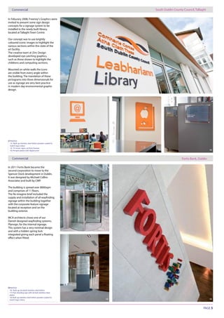
PHOTOS:
13) Built up stainless steel letters powder coated to
match logo colour
14, 15) Iconic signs cut from foamex
16) Perspex plates with digital print
13
15
14
PHOTOS:
16) Built up, brushed stainless steel letters
17) Free standing sign with etched stainless steel
plates
18) Built up stainless steel letters powder coated to
match logo colour
17
18 19
15 16
In Feburary 2008, Freeney’s Graphics were
invited to present some sign design
concepts for a signage system to be
installed in the newly built library,
located at Tallaght Town Centre.
Our concept was to use brightly
coloured iconic images to highlight the
various sections within this state of the
art facility.
The creative team at Zinc Design
developed eye catching graphics,
such as those shown to highlight the
childrens and computing sections.
Mounted on white walls the icons
are visible from every angle within
the building. The translation of these
pictograms into three dimensionals for
use as signage are very best practice
in modern day environmental graphic
design.
Commercial
In 2011 Fortis Bank became the
second corporation to move to the
Spencer Dock development in Dublin.
It was designed by Michael Collins
Associates and built by CMP.
The building is spread over 8000sqm
The Re-imagine brief included the
signage within the building together
with the corporate feature signage
located at reception and on the
building exterior.
MCA architects chose one of our
Plansign, for the internal signage.
This system has a very minimal design
and with a hidden spring lock
PAGE 6 www.freeneys.ie
Commercial
Commercial Dun Laoghaire Rathdown County Council, Dublin
Northwood Court, Dublin
PHOTOS:
20) Directory sign with vinyl graphic
21) Meeting room sign with slider
22) Braille strips applied on front of panels20
21
PHOTOS:
23, 24) Monolith sign with vinyl graphic
23 24
PHOTOS:
25) Copper folded panel with text fret cut and
backed with copper plate
25 26
22
Freeney’s were selected by Cantrell
and Crowley architects to design
by the Transportation department of
Dun Laoghaire Rathdown County
Council.
The Transportation Department covers
general public accessing on a number
The signage had to follow very
clear concise brand guidelines, with
particular reference to logo and text
colour. Readability was of paramount
importance and working closely with
directory panel.
Commercial
Northwood Court was built in
surroundings of the Northwood
Parkland.
Northwood is one of Dublin’s largest
mixed use development covering
a total of 50,000 sqm.
JNP architects chose Freeney’s to
design a series of exterior directory
signs. The signs needed to list all
companies and provide an easy to
follow overview map of the complete
complex.
steel with a black marble base.
The interchangeable directories consist
of a very simple vinyl graphic and are
system rendering the face of each
creative focused advertising agency,
came to us with a brief to help brand
we knew it was time to throw aside our
“corporate signage”hat and engage in
some creative thinking.
Internally they wanted a sign with some
“WOW”factor. This was achieved
by fabricating a 2m version of their
logo and halo illuminating it with LED
around each element of the logo.
fabricated in copper with the name
fret cut from the front panel and inset
to give a drop shadow on each letter.
The natural occurring green patina
colour of this sign over time and
create an interesting visual as natural
weathering occurs.
PAGE 7
Wall Graphics Smiles, Dublin
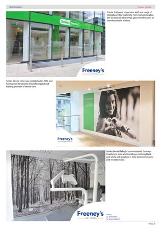
PHOTOS:
28) Vinyl wall graphics
29) Vinyl wall graphics
27
28
29
Create that great impression with our range of
digitally printed materials. From textured wallpa-
per to optically clear vinyl, glass manifestation to
seamless textile wall art.
Smiles Dental clinic was established in 2005 and
have grown to become Ireland’s biggest and
leading provider of dental care.
Smiles Dental Tallaght commissioned Freeneys
Graphics to print and install eye catching black
and white wall graphics in their treatment rooms
and reception area.
PAGE 8
Wall Graphics
Retail
Punchestown Racecourse
Emers Kitchen
www.freeneys.ie
In December 2015 - Freeney’s Graphics produced and installed
eye-catching wall Graphics at the re-developed catering facili-
ty at the Punchestown Racecourse.
Emer’s Kitchen serves great coffee & fresh food everyday in Leeson
street, Dublin. Millimetre design created a very eye-catching logo
with beautiful simplicity and from these designs we manufactured
and installed simple but effective Fascia lettering and window
manifestation.
B1 Southcity Business
Centre, Whitestown Way,
Tallaght, Dublin 24.
Tel: 01 452 0352
Email: info@freeneys.ie
www.freeneys.ie
30
31
32
33
34
Photos:
30) Wall Graphics
31) Wall Graphics
32) Fascia Lettering
33) Glass manifestation
34) Glass manifestation

freeneys graphics corporate signage

  • 1.
    SURVEY | DESIGN| INSTALL | PROJECT MANAGE | WAYFINDING B1 Southcity Business Centre, Whitestown Way, Tallaght, Dublin 24. Tel: 01 452 0352 Email: info@freeneys.ie www.freeneys.ie N |INSTALL |PROJECT M ANAGE |W AY EY |DESIGN |INSTALL |PROJECT M OJECT M ANAGE |W AYFINDING |DESIGN |INSTALL |PROJE SURVEY |DESIGN |IN LL |PROJECT M ANA NSTALL |PROJE DESIGN |IN CT M ANA L |PR ECT N STAL N AGE | W A IGN | IN STALL SURVEY | DESIGN STALL | PROJECT M AN ESIGN | IN STALL | PROJE SURVEY | DESIGN | IN STA IN STALL | PROJECT M AN AGE | W VEY | DESIGN | IN STALL | PROJECT M
  • 2.
    PAGE 2 www.freeneys.ie Hotel HotelLyrath Estate Hotel, Kilkenny 1 2 3 PHOTOS: 1) Monolith sign 2) Built up polished stainless steel letters and logo stainless steel letters, backlit with red LED and dome with steel details 4 5 PHOTOS: 4) Free standing sign with prismatic cut gold leaf letters and logo 5) Monolith sign, double sided with prismatic cut gold leaf letters and logo Fitzpatrick Castle Hotel, Dublin Set amid 170 acres of mature parkland, just outside Kilkenny City, Lyrath Estate Hotel fuses stunning contemporary hotel design with the elegance of its original 17th century house. Over 400 signs were installed internally with stunning feature signs designed for the hotel bars and restaurants. Externally the hotel and conference centre required highly visible illumi - nated lettering. The overall scale of the hotel site required two 5m high mon - olitic totem signs, which incorporated digital signage capabilities. Fitzpatricks Castle Hotel is the epitome of elegance on the South Dublin Coast. Located overlooking Dublin bay in the tranquil setting for the 18th century castle located in its own grounds. Phase 1 of this project was to re-design and roll out a new suite of interior directional signs. A mix of etched brass and gold leafed lettering was chosen to compliment the rich colour schemes of the hotel interior. The second phase was to design a new monolithic sign and accompa- nying feature signage at both main entrances. Relief cut lettering, all gilded in 23 carat gold leaf mounted to powder coated shield shaped frames gave the four star look.
  • 3.
    PAGE 3 Medical VistaPrimary Care, Naas 6 7 8 9 Vista Primary Care is an Irish owned company engaged in the design, development and operation of medical and patient facilities for the primary care sector. Working system and designed the graphic content to ensure clear and concise The high level external lettering perfectly dresses the building, with low level illuminated totems to create awareness and attract customers to the campus pharmacy and dental practice.
  • 4.
    PAGE 4 www.freeneys.ie Medical Thereception area signage is a stunning mix of back painted glass with graphic manifestation applied and heat sealed to the reverse of the glass. 10 11 12 PHOTOS: 6) Built up stainless steel letters powder coated to match logo colour, backlit with white LED 8) Internally illuminated totem sign, day time view 8) Internally illuminated totem sign, night time view 10) Back painted glass wall 11) Suspending directory sign 12) Projecting toilet sign Vista Primary Care, Naas
  • 5.
    PAGE 5 Commercial SouthDublin County Council, Tallaght Fortis Bank, Dublin PHOTOS: 13) Built up stainless steel letters powder coated to match logo colour 14, 15) Iconic signs cut from foamex 16) Perspex plates with digital print 13 15 14 PHOTOS: 16) Built up, brushed stainless steel letters 17) Free standing sign with etched stainless steel plates 18) Built up stainless steel letters powder coated to match logo colour 17 18 19 15 16 In Feburary 2008, Freeney’s Graphics were invited to present some sign design concepts for a signage system to be installed in the newly built library, located at Tallaght Town Centre. Our concept was to use brightly coloured iconic images to highlight the various sections within this state of the art facility. The creative team at Zinc Design developed eye catching graphics, such as those shown to highlight the childrens and computing sections. Mounted on white walls the icons are visible from every angle within the building. The translation of these pictograms into three dimensionals for use as signage are very best practice in modern day environmental graphic design. Commercial In 2011 Fortis Bank became the second corporation to move to the Spencer Dock development in Dublin. It was designed by Michael Collins Associates and built by CMP. The building is spread over 8000sqm The Re-imagine brief included the signage within the building together with the corporate feature signage located at reception and on the building exterior. MCA architects chose one of our Plansign, for the internal signage. This system has a very minimal design and with a hidden spring lock
  • 6.
    PAGE 6 www.freeneys.ie Commercial CommercialDun Laoghaire Rathdown County Council, Dublin Northwood Court, Dublin PHOTOS: 20) Directory sign with vinyl graphic 21) Meeting room sign with slider 22) Braille strips applied on front of panels20 21 PHOTOS: 23, 24) Monolith sign with vinyl graphic 23 24 PHOTOS: 25) Copper folded panel with text fret cut and backed with copper plate 25 26 22 Freeney’s were selected by Cantrell and Crowley architects to design by the Transportation department of Dun Laoghaire Rathdown County Council. The Transportation Department covers general public accessing on a number The signage had to follow very clear concise brand guidelines, with particular reference to logo and text colour. Readability was of paramount importance and working closely with directory panel. Commercial Northwood Court was built in surroundings of the Northwood Parkland. Northwood is one of Dublin’s largest mixed use development covering a total of 50,000 sqm. JNP architects chose Freeney’s to design a series of exterior directory signs. The signs needed to list all companies and provide an easy to follow overview map of the complete complex. steel with a black marble base. The interchangeable directories consist of a very simple vinyl graphic and are system rendering the face of each creative focused advertising agency, came to us with a brief to help brand we knew it was time to throw aside our “corporate signage”hat and engage in some creative thinking. Internally they wanted a sign with some “WOW”factor. This was achieved by fabricating a 2m version of their logo and halo illuminating it with LED around each element of the logo. fabricated in copper with the name fret cut from the front panel and inset to give a drop shadow on each letter. The natural occurring green patina colour of this sign over time and create an interesting visual as natural weathering occurs.
  • 7.
    PAGE 7 Wall GraphicsSmiles, Dublin PHOTOS: 28) Vinyl wall graphics 29) Vinyl wall graphics 27 28 29 Create that great impression with our range of digitally printed materials. From textured wallpa- per to optically clear vinyl, glass manifestation to seamless textile wall art. Smiles Dental clinic was established in 2005 and have grown to become Ireland’s biggest and leading provider of dental care. Smiles Dental Tallaght commissioned Freeneys Graphics to print and install eye catching black and white wall graphics in their treatment rooms and reception area.
  • 8.
    PAGE 8 Wall Graphics Retail PunchestownRacecourse Emers Kitchen www.freeneys.ie In December 2015 - Freeney’s Graphics produced and installed eye-catching wall Graphics at the re-developed catering facili- ty at the Punchestown Racecourse. Emer’s Kitchen serves great coffee & fresh food everyday in Leeson street, Dublin. Millimetre design created a very eye-catching logo with beautiful simplicity and from these designs we manufactured and installed simple but effective Fascia lettering and window manifestation. B1 Southcity Business Centre, Whitestown Way, Tallaght, Dublin 24. Tel: 01 452 0352 Email: info@freeneys.ie www.freeneys.ie 30 31 32 33 34 Photos: 30) Wall Graphics 31) Wall Graphics 32) Fascia Lettering 33) Glass manifestation 34) Glass manifestation