1. Explaining album cover 3
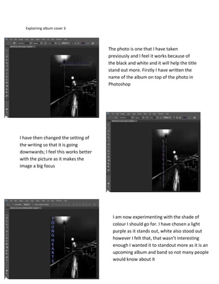
The photo is one that I have taken
previously and I feel it works because of
the black and white and it will help the title
stand out more. Firstly I have written the
name of the album on top of the photo in
Photoshop
I have then changed the setting of
the writing so that it is going
downwards; I feel this works better
with the picture as it makes the
image a big focus
I am now experimenting with the shade of
colour I should go for. I have chosen a light
purple as it stands out, white also stood out
however I felt that, that wasn’t interesting
enough I wanted it to standout more as it is an
upcoming album and band so not many people
would know about it
2. I am no writing in the band’s name and I
have chosen to use the same colour and
the album name to have consistency
thought the album and I don’t feel like it
needs to be another colour as I don’t
want it to be too over powering or too
under powering
I haven’t made the band’s name is
massive writing similar or bigger than
the album name as I feel it works well
with the picture. Also if the name was
too big I would think it would be too
cluttered. Also I think that the
audience might get confused and think
it is joined to the albums name