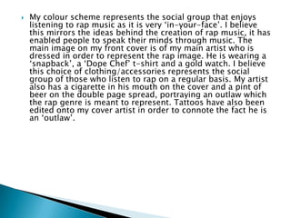
Download to read offline
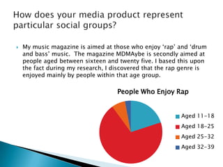

The document summarizes the key design elements and conventions used in the student's music magazine project that aim to mimic a real music magazine. Some of the main conventions included are using the largest font for the title on the cover, including a main image on the cover and contents page that relates to the double page spread feature, and blending images and text on the double page spread. The student also challenges some conventions by only including one image on the cover, adding an additional section to the contents page, and using multiple images on the double page spread. The magazine is aimed at those who enjoy rap and drum and bass music between ages 16-25.


![[Katalog] other](https://cdn.slidesharecdn.com/ss_thumbnails/katalogother-151020081848-lva1-app6891-thumbnail.jpg?width=640&height=640&fit=bounds)


