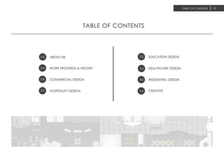
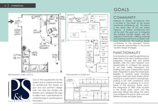
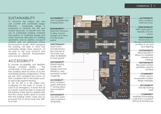
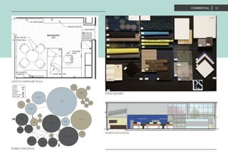
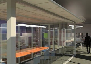
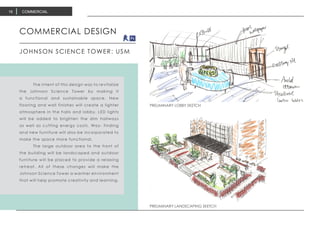
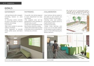
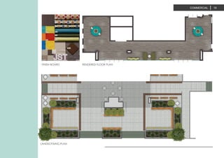
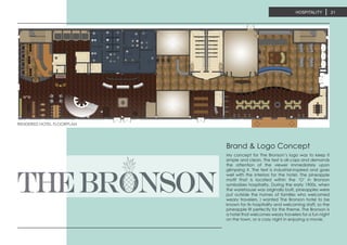
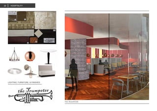
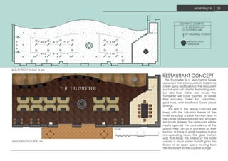
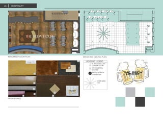
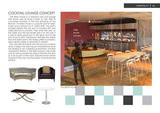
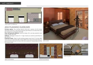
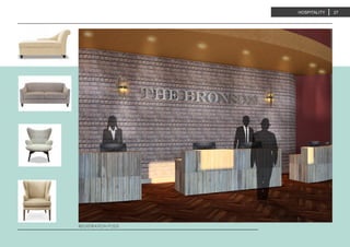
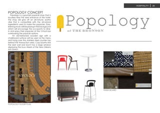
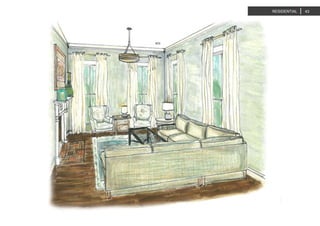
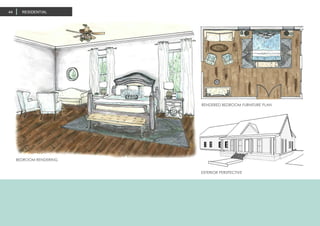
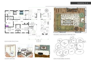
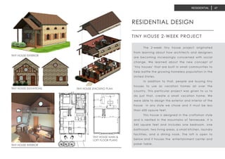
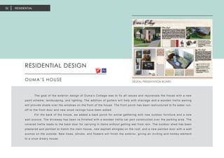
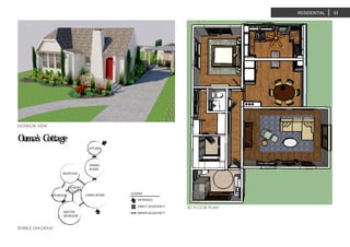
SlideShare a Scribd company logo
1 of 60
Download to read offline
EMILY STINEMETZ
INTERIOR DESIGN PORTFOLIO
2013-2015
Design is where science and art break even. -Robin Matthew
TABLE OF CONTENTS
02 ABOUT ME
04 WORK PROGRESS & HISTORY
COMMERCIAL DESIGN
HOSPITALITY DESIGN
EDUCATION DESIGN
36
RESIDENTIAL DESIGN40
CREATIVE54
TABLE OF CONTENTS 01
08
20
32
HEALTHCARE DESIGN
ABOUT ME02
THE PROFILE
EMILY STINEMETZ
INTERIOR DESIGN STUDENT
2727 Elmside Dr.
Houston, TX 77042
334.322.9034
emily.s.stinemetz@gmail.com
NAME : EMILY {STOKLEY} STINEMETZ
MAJOR: INTERIOR DESIGN
CUMULATIVE GPA: 3.95
WEBSITE: issuu.com/emilystinemetz
ABOUT ME 03
CREATIVE
DRIVEN
PEOPLE-
ORIENTED
PATIENT
KIND
HARD WORKING
ORGANIZED
INNOVATIVE
WELL-ROUNDED
WORKING PROGRESS04
LEARNING
Learning how to think and work as a
designer has been one of the most
challenging yet rewarding experiences
of my life thus far. It has taught me to be
both a better communicater and more
detail-oriented.
THINKING
Thinking as a designer means thinking
for other people. It means getting a
clear understaing of how they function
in a particular space. One of my favorite
things about design is just that; learning
how different professions use space.
DESIGNING
Designing a space, for me, means
putting all my energy into the project.
It means lots of scribbles, trash paper,
doodling, and revisions. It’s an ever-
changing process that requires practice
and diligence.
WORKING PROGRESS
WORK HISTORY 05
Designed window displays
Unpacked and distributed merchandise
OCT 2012-MAY 2013 TALBOTS>SALES ASSOCIATE/CASHIER
Assisted customers in completing outfits
Modeled window displays
Met or exceeded sales goals each week
JUNE-JULY, 2013-2014 BANANA REPUBLIC> SALES ASSOCIATE/CASHIER
Field measured and drafted floor plans in AutoCAD
Created furniture layouts and systems layouts for client meetings
Specified finishes for furniture and systems; designed finish boards
Ordered samples for the designers and maintained the resource library
Put together bid packages for contract work
MAY-JULY 2015 INNERSPAICE ARCHITECTURAL INTERIORS> DESIGN INTERN
Plan educational programs and social events for residents
Foster a positive living and learning community
Complete necessary paperwork for the front desk
Insure the safety and security of residents
AUG 2013-PRESENT SOUTHERN MISS RESIDENCE LIFE> RESIDENT ASSISTANT
WORK HISTORY
COLLECTION06
COLLECTION 07
PORTFOLIO COLLECTION
UNIVERSITY OF SOUTHERN MISSISSIPPI
2013-2015
COMMERCIAL08
COMMERCIAL DESIGN
PALACIOS/STOKLEY ARCHITECTURE FIRM
	 This project was by far my favorite.
The Palacios & Stokley architecture firm was
a collaborative project between the interior
design students and the architecture students
at Southern Miss. My partner was the talented
architect, Hans Palacios, who was also one of
the instructors for the class.
	 Our assignment was to come up with
a firm owned by the two of us, including a
full set of construction documents, a formal
presentation with boards and a slide show,
branding and logo design, furniture specs, and
finishes to correspond with our brand.
	 The firm was 11,000 sqaure feet and
inlcuded a detailed program that included a
lobby/reception space, an open studio space,
executive offices, a library, a conference
room, a break room, and many more ancillary
spaces. It was a joy to design and we were very
proud of the finished product.
OPEN OFFICE
COMMERCIAL 09
LOBBY/RECEPTION
EXTERIOR VIEW REFLECTED CEILING PLAN
COMMERCIAL10
PRELIMINARY FLOORPLAN
KITCHEN ELEVATION
PRELIMINARY LOBBY SKETCH
GOALS
Palacios & Stokley Architecture Firm
is located in the heart of the quaint
downtown Hattiesburg, MS. This photo
is the aerial view of the site where
Palacios & Stokley Architecture firm
will be built. The goal was to integrate
the building façade design with the
adjacent community. Utilizing materials
and building scale that is consistent with
local architecture, the building design
contributes to the prevalent theme,
yet explores opportunities to showcase
modern design strategies.
COMMUNITY
Functionality is to meet the performance
objectives of the client. Building systems
integration through BIM and spatial
flexibility offer the client freedom and
opportunities to configure the spaces
to suit their needs throughout the
building’s life cycle. Collaboration areas
were integrated to give the employees
flexibility in working styles including
working in their own work station alone,
working in a quiet room in small groups,
working in the staff conference room
in large groups, or relaxing on a lunch
break in the spacious break room.
The integration of DIRTT walls located
in the studio quiet rooms and the
executive offices also allows the client
to reconfigure the space later and add
different panels and glass types.
FUNCTIONALITY
One of the requirements for this
project was to create and brand
an architecture firm based on
your and your partner’s design
style. Our style was modern yet
timeless and I designed this logo
to reflect that. I used Illustrator to
create this logo to use throughout
the project.
ACCESSIBILITY
ADA compliant
stafff rest room
FUNCTIONALITY
DIRTT walls used to
flexibility of room
layout
FUNCTIONALITY
Power/data ran
through workstations
for ease of use and
reconfiguring
SUSTAINABILITY
Recycling bins in
library for outdated
samples and
catalogs
SUSTAINABILITY
Recycled-content
upholstery used for
furntiure
COMMUNITY
3-form used to
incorporate modern
design strategies
ACCESSIBILITY
Non-slip flooring
used
ACCESSIBILITY
ADA compliant sink
in Break Room
SUSTAINABILITY
Store front windows
to allow natural
daylight and views
into the Studio
space
FUNCTIONALITY
Quiet rooms
provide privacy
from the rest of
the studio and
allow for flexibility
of work spaces
SUSTAINABILITY
Raised flooring
to help with
energy costs and
efficiency- also,
recylcled-content
carpet tile
ACCESSIBILITY
ADA compliant
public restrooms-
5’ turning radius
and compliant
sink
SUSTAINABILITY
Low-VOC paint
used to prevent
off-gassing
COMMUNITY
Materials and building
scale that is consistent
with local architecture
To enhance the project site and
user comfort with sustainable design
initiatives. Sustainable design is
employed to optimize the site and
natural resources, to benefit from the
use of sustainable building materials
and systems, to moderate energy and
water resources allocated for building
operations, and to address occupant
comfort with an enhanced indoor
environmental quality. While designing
this building, we kept in mind that
sustainable design takes research, so
we plan to use local products and
materials to alleviate transportation
costs and air pollution.
SUSTAINABILITY
To provide accessibility and flexibility
through universal design. The
connectivity of the spaces in a single-
story building allow for ease of access
and flexible spatial configurations. There
are also ADA compliant rest rooms, an
ADA compliant sink in the break room,
as well as slip resistant flooring.
To the far left is a life safety plan
configured for the ease of access in
case of an emergency. It shows that all
occupants would be able to easily exit
the building. There are four exterior exits
that the correct widths apart to ensure
that the building meets code and no
occupant has to travel more than 200’
to an exit.
ACCESSIBILITY
COMMERCIAL 11
COMMERCIAL12 COMMERCIAL10
OFFICE FURNITURE PLAN
COMMERCIAL 13
FINISH BOARD
BUBBLE DIAGRAM
NORTH ELEVATION
COMMERCIAL14
RESTROOM DETAILING
PRESENTATION BOARD (1 OF 3) SITE PLAN
COMMERCIAL 11
PRELIMINARY LOBBY SKETCH
PRELIMINARY LANDSCAPING SKETCH
COMMERCIAL DESIGN
JOHNSON SCIENCE TOWER: USM
	 The intent of this design was to revitalize
the Johnson Science Tower by making it
a functional and sustainable space. New
flooring and wall finishes will create a lighter
atmosphere in the halls and lobby. LED lights
will be added to brighten the dim hallways
as well as cutting energy costs. Way- finding
and new furniture will also be incorporated to
make the space more functional.
	 The large outdoor area to the front of
the building will be landscaped and outdoor
furniture will be placed to provide a relaxing
retreat. All of these changes will make the
Johnson Science Tower a warmer environment
that will help promote creativity and learning.
COMMERCIAL16
ELEVATOR LOBBY & SIGNAGE MAIN LOBBY
GOALS
SUSTAINABILITY
+LED light fixtures with a daylight
harvesting feature to save
energy
+A recycling center centrally
located in the lobby to reduce
pollution and energy
consumption
+Bike racks outside to promote
wellness and fitness
+New vegetation to provide
shade, buffer sound, and block
wind
WAYFINDING
+A specific color will be assigned
to each department for easy
way finding
+The assigned color will be
represented on the upholstery of
the benches on each
corridor floor and painted on the
door frames along the corridor
+There will be directories located
in the lobby and on every floor to
minimize any confusion
COLLABORATION
+New furniture will be added to
the lobby to give students and
faculty a place to sit and work
+Exciting colors and patterns
will provide a creative space to
inspire students and
increase productivity
+Tables, chairs, benches, and
a bar to sit at has been added
to the exterior to give students a
place to work while enjoying the
exterior elements
PRELIMINARY OUTDOOR AREA
COMMERCIAL18
FINISH BOARD
LANDSCPAING PLAN
RENDERED FLOOR PLAN
COMMERCIAL 19
HOSIPTALITY20
HOSPITALITY DESIGN	
THE BRONSON HOTEL
For this project we were given the task of designing a hotel using a 1910 warehouse located in the Warehouse
District of New Orleans. Known as the Arts District, the building sits among fine restaurants, world class
museums and amazing art galleries. The warehouse district was originally established as an industrial area
used to store coffee, grains, and produce that was shipping out of the Port of New Orleans. This turn of the
century building is within walking distance to the convention center, Riverwalk, the National WWII Museum,
and is approximately one mile from the French Quarter.
My client wanted to attract a larger percentage of younger guests (ages 25-45) and business travelers.
The interior should be upscale, and tech driven with amenitites that appeal to this clientele. The client
indicated that the chain is open to suggestions related to the overall style of the interior. They prefer
something more contemporary that incorporates the history of the warehouse district. Electicism-- a mixture of old
and new. Each part of the hotel has its own concept that is located along with plans and renderings.
HOSPITALITY 21
RENDERED HOTEL FLOORPLAN
My concept for The Bronson’s logo was to keep it
simple and clean. The text is all-caps and demands
the attention of the viewer immediately upon
glimpsing it. The text is industrial-inspired and goes
well with the interiors for the hotel. The pineapple
motif that is located within the ‘O’ in Bronson
symbolizes hospitality. During the early 1900s, when
the warehouse was originally built, pineapples were
put outside the homes of families who welcomed
weary travelers. I wanted The Bronson hotel to be
known for its hospitality and welcoming staff, so the
pineapple fit perfectly for the theme. The Bronson is
a hotel that welcomes weary travelers for a fun night
on the town, or a cozy night in enjoying a movie.
Brand & Logo Concept
LIGHTING, FURNITURE, & FINISHES
THE TRUMPETER
HOSIPTALITY22
the trumpeter
Scale
The Trumpeter is a semi-formal Greek
restaurant that is famous for its traditional
Greek gyros and baklava. The restaurant
is a hot spot not only for the hotel guests,
but also Nola visitors and locals! The
Trumpeter will have touches of Greek
flare including Greek key upholstery,
gold hues, and traditional Greek place
settings.
The rest of the design concept will
keep with the industrial theme of the
hotel including a brick fountain wall in
the center of the restaurant and wooden
slat booth dividers. The restaurant will be
mostly open for the convenience of the
guests- they can go in and work on their
laptops or have a small meeting during
non-operating hours. The glass curtain
wall that faces the interior of the hotel
creates a visual barrier but still gives the
illusion of an open space moving from
the restaurant to the cocktail lounge.
REFLECTED CEILING PLAN
RENDERED FLOOR PLAN
HOSPITALITY 23
7' - 6 1/2" 7' - 6 1/2" 7' - 6"
7' - 6 1/2" 7' - 6 1/2" 7' - 6"
9'-31/2"
7' - 5 1/2"
7' - 5 1/2"
Project number
Date
Drawn by
Checked by
RESTAURA
Proje
Issue
Autho
Chec
No. Description Date
LIGHTIING LEGEND
8” RECESSED CAN
COPPER GLOBE
10” INDUSTRIAL SCONCE
WROUGHT IRON
CHANDELIER
RESTAURANT CONCEPT
RENDERED FLOOR PLAN REFLECTED CEILING PLAN
6' - 0"5' - 4 1/2"6' - 0"5' - 0"
4' - 6" 4' - 6"4' - 4 1/2"5' - 0"
7'-3"7'-2"
LIGHTIING LEGEND
8” RECESSED CAN
COPPER GLOBE
10” INDUSTRIAL
SCONCE
WROUGHT IRON
CHANDELIER
OVER-SIZED
FAN
FINISH BOARD
HOSPITALITY24
6' - 0"5' - 4 1/2"6' - 0"5' - 0"
4' - 6" 4' - 6"4' - 4 1/2"5' - 0"
7'-3"7'-2"
No. Descr
the brew house
THE BREW HOUSE
HOSPITALITY 25
The Brew House is a laid-back bar and lounge
that serves over 50 kinds of beer on tap. With its
convenient location at the East entrance of The
Bronson, The Brew House is a popular spot for beer-
lovers and is famous for its ‘dollar wall.’ This wall is
located behind the bar and is covered with one
dollar bills from customers. They write their wish on
the dollar and the bar tender pins it to the wall. It
is said to bring good luck to the giver and at the
end of each year, The Bronson donates the dollars
from the dollar wall to the Make-a-Wish foundation,
which grants wishes to terminally ill children.
The concrete floor flows into the bar but is broken
up by a large cow hide rug accompanied by some
soft seating to set a relaxed environment. Another
noteworthy feature in The Brew House is the water
wall. Its soft sound sets the vibe of the bar and acts
as a focal point in the room. Industrial lamps will be
hung from the wall over the tables to illuminate the
surface.
COCKTAIL LOUNGE CONCEPT
HOSPITALITY26
KING SUITE
ADA SUITE FLOORPLAN
WEST ELEVATION SOUTH ELEVATION
FINISH BOARD
Circular space: The turning space shall be a space of 60 inches
diameter minimum. The space shall be permitted to include knee and
toe clearance complying with 306.
Floor and ground surfaces. Shall be stable, firm and slip resistant and
shall comply with 302.
Vertical. Changes in level of ¼” high maximum shall be permitted to
be vertical.
Protrusion Limits. Objects with leading edges more than 27 inches (685
mm) and not more than 80 inches (2030 mm) above the finish floor or
ground shall protrude 4 inches (100 mm) maximum horizontally into the
circulation path.
ADA PLANNING GUIDELINES
HOSPITALITY 27
REGISTRATION PODS
HOSPITALITY28
POPOLOGY CONCEPT
POPOLOGY FLOOR PLAN
FINISH BOARD
HOSPITALITY 29
Popology is a gourmet popsicle shop that is
located near the west entrance of the hotel.
The shop will give off an all-natural, earthy
vibe that is compatible with the all-natural
ingredients used to make the popsicles. Easy-
listeningmusicwillbeplayinginthebackground
which will encourage the occupants to dine-
in and enjoy their popsicles at the 12-foot bar
overlooking the popsicle options.
An old-fashioned wooden sign with a
chalkboard surface will be used as the menu
and hang over the stainless steel counter top
behind the transaction area. Cozy booths line
the west wall and each has a large window
displaying the busy streets of the New Orleans
Arts District.
POPOLOGY
identification
ID-1 Hotel Lobby
ID-2 Secondary Lobby
ID-3 Concierge Desk
ID-4 Baggage Check
ID-5 Elevators
ID-6 Stairs
ID-7 ATM
ID-8 Men’s Restroom
ID-9 Women’s Restroom
ID-10 Starbucks
ID-11 Popology
ID-12 Louis’ Record Store
ID-13 The Brew House
ID-14 The Trumpeter
informational
I-1 Hotel Information
I-2 Front Desk Hours/Manager
I-3 Baggage Check Hours
I-4 Grab-n-go Hours
I-5 Starbucks Hours
I-6 Popology Hours
I-7 Louis’ Record Store Hours
I-8 The Trumpeter Hours
I-9 The Brew House
D-1 Exit Signage
D-2 Hotel Directory
D-3 Restrooms
D-4 ATM
D-5 Elevators
D-6 Stairs
R-1 Staff Only
R-2 Employee Offices
R-3 Storage
R-4 Mechanical
R-5 Staff Only Kitchen
R-6 Manager’s Office
directional restricted
HOSPITALITY30
HOSPITALITY
The Bronson Hotel is an industrial-themed boutique hotel located in the heart
of the Arts District. Popology, Louis’ Records, Starbucks, The Brew House, and
The Trumpeter are all conveniently located within the hotel for the guests as
well as other visitors in the Arts District. The renovation of the 1910 warehouse
allows for new wayfinding solutions that will benefit not only the hotel guests,
but also the staff and other contract employees. The signage is copper in
color and texture with brown text in all caps for ease of reading.
WAYFINDING FOR THE BRONSON
31
EDUCATION32
	 The School of Contruction project originated because of our
current space called the Kate Hubbard Building. It’s a small house on
the outskirts of campus and, as designers, we are always coming up
with new things to add or rennovate. Hence, this project includes the
demolition of our current building and the addition of a huge School of
Construction building that is to encompass interior design, architecture,
and construction work spaces.
	 We were given a program to guide us in designing the new two
story building but we were also given free reign to add things that
we would like in a workspace as students in the department. We also
interviewed other students, faculty, and staff to include in our research.
One big component of this project was to include ‘Global Design’ in
our building. Southern Miss has over 180 countries represented in its
student population, so designing for different cultures is an important
part of the design.
EDUCATION DESIGN
SCHOOL OF CONSTRUCTION AT USM
PRESENTATION FIRST FLOOR PLAN PRESENTATION SECOND FLOOR PLAN
EDUCATION 33
EDUCATION34
INTERACTIVE LEARNING &
GLOBAL PERSPECTIVE
In our research of schools and how students best learn, it
became clear that students learn best through interacting with
each other as well as with the professor. The newest idea for
spatial planning is to have students sit in groups and have the
professor move around the room using a cart to carry his or her
laptop, books, etc. The years of stationary teachers and rows
of desks are over. Students need to be more engaged and
they all need equal interaction with the professor– not just the
kids on the front row.
These two elevations speak to the global perspective
that I tried to keep throughout the course of the project. The
University of Southern Mississippi has enrolled students from
all fifty states and from over 70 different countries. One of my
goals was to incorporate every country represented, and what
better way to do that than an atlas mural? This map is located
in the lounge above the kitchen bar. Each student who visit
the School of Construction is encouraged to add a push pin to
their country of birth. The map will soon be filled with pins and
we will be able to visually see the impact our school is having
on the world. The second elevation I called the “Welcome
Wall” is seen upon entering the facility. It contains the word
“Welcome” in 14 different languages. We want every student
to feel welcome at our beautiful university!
WELCOME WALL
BREAK ROOM ELEVATION
EDUCATION 35
SCHOOL OF CONSTRUCTION LOBBY
TYPICAL CLASSROOM FLOORPLAN
This floorplan is my interpretation of the modern classroom floor
plan based on my research. There are tables with chairs around
them and every piece of furniture has wheels so it is able to
move around the classroom as needed. As shown on the floor
plan, there are three flat-screens mounted on the walls at each
table so that students at the table can broadcast their work on
the screen for their classmates to see. The teacher’s desk can
move as well and he/she has a cart that can roll around the
room for supplies. There is also a round table in the middle for
groups to come together for class discussions or large group
projects.
HEALTHCARE36
HEALTHCARE DESIGN	
LUMBERTON CLINIC
	 Lumberton, Mississippi
is considered 100% rural
according to City-data.com.
Its population is 2,149. In
such a rural area, healthcare
is very limited and not up
to par. While designing the
Lumberton Healthcare Clinic,
the needs of the people and
how much special technology
would be needed for the
clinic were key factors in the
design process. For example,
a visiting specialist exam
room is provided because
the majority of Lumberton
citizens cannot afford to
travel, even for health
services. The median income
for Lumberton residents is
$20,631 which is significantly
low since the Mississippi
median is $36,919. These
families are not making
enough money for traveling,
since the specialists they
need are sometimes quite a
distance away. One of the
features of a rural healthcare
clinic must be that it can
accommodate a visiting
specialist. (Citydata.com)
	 Another promising
addition to healthcare
design is telemedicine.
Telemedicine is the practice
of talking on the phone or
skyping with a doctor in
a different location from
a local doctor’s office.
Telemedicine cuts costs
completely because neither
the patient nor the specialist
have to travel. These
appointments are set up
by the doctor’s office and
help patients out a lot. It is
also helpful for homebound
adults who are unable to go
to the clinic. They can set
up appointments over the
phone and over skype that
can be done right from their
living rooms. Another plus
to telemedicine is that the
patients are able to record
the conversation on the
computer to refer back to
when needed and also have
instant access to all of their
medical records.
	 Cons of telemedicine
are also prevalent especially
for traditional southerners.
First of all, the direct physical
contact between the doctor
and patient is missing from
the exam. The doctor is able
to see the patient on the
screen, but not touch his or
her physical body which is
sometimes necessary when
dealing with certain illnesses.
Another prevalent concern
is for the age of the doctors
and patients. Many of them
may be older and not as
comfortable with technology
as the younger generation is.
More practically, things such
as power outages and loss
of internet connection can
lead to miscommunication
between the doctor and
patient.
HEALTHCARE 37
BUBBLE DIAGRAM
TRAFFIC PATTERN PLAN HAND DRAFTED FLOOR PLAN
Relatable to the Lumberton Residents
The design for Lumberton Healthcare will promote an at-home
feeling for the patients so that they feel comfortable and cared
for. In order to make them feel at home, the design will be em-
bellished with greens and browns emblematic of Lumberton’s
biggest industry, logging. There will also be touches of Lumber-
ton heritage such as old documents, local artwork, and logging
photos.
Infection control
In order to control the spread of infection, the clinic will have
Crypton and Vinyl coverings for furniture and non-porous floor-
ing in all treatment areas. The furniture in the waiting room will
be easily maintainable and have removable fabric coverings for
added cleanliness.
Easily navigable
The way-finding for Lumberton Healthcare is very important. It’s
imperative that the patients are able to find their way and that
nurses can easily explain how to get from Point A to Point B. This
will be achieved through good signage and the overall Space
Plan of the clinic. The clinic is designed to be easily navigable
because of the different pods. The five pods include Business,
Diagnostic, Staff area, Examination area, and Nursing area. This
design allows the patients to only be in certain parts of the clinic
and keeps them from walking into private rooms.
Timeless Design
A timeless design for Lumberton Healthcare is very important.
From the furniture to the fabrics, it should all stand the test of time.
In order to achieve this goal, the furniture, fabrics, and other fin-
ishes will be classic colors and a neutral pattern or texture. Time-
less design is even more important for Lumberton because of their
financial situation. It’s very important for the design to last a long
time because money for renovations in the future will be scarce.
DESIGN GOALS
LUMBERTON CLINIC FLOORPLAN
HEALTHCARE38
HEALTH, SAFETY, WELFARE PLAN
Health
H-1 Walls in ALL bathrooms MUST be impervious to moisture.
H-2 Each examination/observation room shall have a minimum clear floor area of 80 sq. feet
H-3 Room arrangement shall permit a minimum clear dimension of 2’-8” at each side and at
the foot of the examination table, recliner or chair.
H-4 A hand-washing station shall be provided in the exam room
H-5 Provisions shall be made for separate collection, storage and disposal of soiled materials
(Soiled Holding Area)
H-6 Toilet rooms with hand-washing stations shall be provided adjacent to procedure room(s)
if procedures provided require patient toilet facilities.
H-7 Public corridors shall have a minimum width of 5’.
H-8 Hand sanitation dispensers shall be provided in addition to hand –washing stations.
H-9 Selected flooring surfaces shall be easy to maintain, readily cleanable and appropriately
wear-resistant for the location.
H-10 Wall finishes shall be washable. In the vicinity of plumbing fixtures, wall finishes shall be
smooth, scrub able, and moisture-resistant.
H-11 Wall protection devices and corner guards shall be durable and scrub able.
n/a- The medical records area shall be located to maintain confidentiality of records and shall
be either restricted to staff movement or remote from treatment/public areas.
Safety
S-1 Exits MUST open in the direction of exit travel, and when open in any position, shall NOT
project more than 7” into any corridor.
S-2 Paths of travel leading to an exit MUST NOT pass through a secondary space that is
subject to closure by doors or that contains storage materials or has items that project
into the path of travel.
S-3 Flooring in ALL public bathrooms MUST be slip-resistant.
S-4 ALL grab bars at toilets MUST be 36” to 42” long, mounted at 34” AFF.
S-5 ALL exposed hot water pipes and drains MUST be insulated or otherwise protect
wheelchair users from burns on the legs.
S-6 ALL objects located on a wall between 27” and 80” AFF MUST NOT protrude more than 4”
into an egress path of travel.
S-7 Staff-only corridors shall be permitted to be 3’-8” wide unless a greater width is required
by NFPA 101.
S-8 Slip resistant flooring products shall be considered for flooring surfaces in wet areas (e.g.
Kitchens, shower, and bath areas), ramps, and entries from exterior to interior spaces,
and areas that include water for patient services.
S-9 Highly polished flooring or flooring finishes that create glare shall be avoided.
S-10 Sharp, protruding corners shall be avoided.
Welfare
W-1 ALL door openings shall be a MINIMUM of 3’-0” wide with an
18” clear space on the pull side of the door and a 12” clear
space on the push side of the door.
W-2 ALL accessible (barrier-free) counters (sinks, reception, etc.)
MUST be a maximum of 34” AFF and a minimum of 27” clear
knee space below.
W-3 Bathrooms MUST be accessible (barrier-free) with a 5’-0”
turning circle (shown as a dashed line).
W-4 Bathroom grab bars MUST be indicated in appropriate
locations on the plan. This includes two (2) grab bars for a
toilet. Refer to lecture notes and slide show for more details.
W-5 Sinks in ALL public bathrooms MUST have clear knee access
W-6 ALL accessible (barrier-free) wall mounted cabinets or shelves
located above a work surface MUST NOT exceed 46” AFF.
W-7 There MUST be a MINIMUM of 44” between parallel work
surfaces.
W-8 ALL accessible (barrier-free) counters require clear knee space
of at least 30”w x 19”D.
W-9 ALL accessible (barrier-free) base cabinets require a 3”D x 9”H
toe kick.
W-10 Provisions shall be made to preserve patient privacy from
observation from outside and examination/treatment room
through an open door
W-11 A counter or shelf space for writing or electronic
documentation shall be provided in the exam room.
W-12 A toilet for patient use shall be provided separate from the
public use toilet(s) and located to permit access from patient
care areas without passing through publicly accessible areas.
W-13 Conveniently accessible provisions for drinking water shall be
provided
W-14 Consideration should be given to special needs of specific
patient groups in a share/general waiting area, such as
separation of adolescent and geriatric patients.
W-15 Provisions shall be made for securing medical records of all
media types
W-16 Flooring surfaces shall allow for ease of ambulation and self-
propulsion.
W-17 Flooring surfaces shall provide smooth transitions between
different flooring materials.
W-18 Color contrast between walls and floors and minimized
transitions to different types of flooring may reduce falling risk.
W-19 Flush thresholds should be used to reduce tripping.
H-1
H-2
H-3
H-4
H-4
H-5
H-6
H-7
H-8
H-9
H-10
H-11
S-1
S-2
S-3
S-4
S-5
S-6
S-7
S-8S-9
S-10
W-2
W-1
W-3
W-4
W-5
W-6
W-7
W-8
W-9
W-10
W-11
W-12
W-13
W-14
W-15
W-16
W-17
W-10
W-18
W-19
Health
Safety
Welfare
HEALTHCARE 39
LOBBY RENDERED FLOOR PLAN
RENDERED LOBBY
HEALTHCARE40
CF Stinson Vinyl
Seating
Diva Limelight
DVA 49
CF Stinson
Crypton
Performance
Fabric
Aegean Jambi
Stripe 62317
Maharam
Upholstery
Chime 465350
ADA COMPLIANT PUBLIC RESTROOM
TYPICAL EXAM ROOM
RECEPTION DESK/CHECK-IN
HEALTHCARE 41
A
B
C
D
E
F
G
H
I
J
K
L
N
ADA Compliant Restroom
ADA:
A. 5’ wheelchair turning radius
B. 30”x48” wheelchair space at sink
C. 32” door clearance
D. 34” max lavatory height
E. 27” knee clearance at sink
F. 18” from wall to CL of toilet
G. 44” long, 12” from side wall grab bars
H. 48” mounting height for paper towel
dispenser
I. 48” mounting height for soap dispenser
J. 48” mounting height for mirror
K. 19” mounting height for toilet paper
dispenser
INFECTION CONTROL:
L. Nonabsorbent flooring
M. Rounded ceramic base
N. Sensor faucets
RESIDENTIAL DESIGN	
DOVE HOUSE
	 The Dove House project is based on a real house in Hattiesburg, MS that was in desparate
need of a rennovation. Our professor had us draw different scenarios out of a bowl and design
the house based on those requirements. For example, we were given a couple or single person,
age group, hobbies, disabilities, and their ethnicity.
	 I had a couple in their mid thirties, the husband was Caucasian, the wife was Asian, they
had 3 little girls, and he built model trains. So, I designed the house based on their needs which
included 4 bedrooms, a model room/offices, and a playroom across from the kitchen so the girls
could play while their mother cooked.
	 The project also included specifying fininshes and furniture, and pricing the furniture. The
four finish boards for this project are located within this segment.
RESIDENTIAL42
RESIDENTIAL 43
RENDERED BEDROOM FURNITURE PLAN
EXTERIOR PERSPECTIVE
BEDROOM RENDERING
RESIDENTIAL44
RESIDENTIAL 45
DOVE HOUSE BUBBLE DIAGRAM
RENDERED LIVING ROOM FURNITURE PLAN
DOVE HOUSE SPACE PLAN
VIGNETTE SKETCHES
WD
DN
12'-5"
FP
MASTER BATH
CLOSET
BATHROOM
BEDROOM #1
BEDROOM #2
BATHROOM
BEDROOM #3
STORAGE
CLOSET
FP
KITCHEN
PLAY ROOM
MUD/LAUNDRY RMOFFICE
LIVING RM
DINING NOOK
CORRIDORS
PANTRY HALF BATH LINEN CLOSET
PATIO
HOT TUB
DW
REF
CUBBIES
BENCH
SHELVING
2'-11/2"
23' - 10"
16'-7"
12' - 2"
FAMILY PORTRAITS
Scale 1/8" = 1'-0"
1/22/20165:44:21PM
A107
SPACE PLAN
No. Description Date
BEDROOM FINISH BOARD (1 OF 2) BEDROOM FINISH BOARD (2 OF 2)
LIVING ROOM FINISH BOARD (1 OF 2) LIVING ROOM FINISH BOARD (2 OF 2)
RESIDENTIAL46
TINY HOUSE INTERIOR
RESIDENTIAL DESIGN
TINY HOUSE 2-WEEK PROJECT
	 The 2-week tiny house project originated
from learning about how architects and designers
are becoming increasingly concerned with social
change. We learned about the new concept of
‘tiny houses’ that are built in small communities to
help battle the growing homeless population in the
United States.
	 In addition to that, people are buying tiny
houses to use as vacation homes all over the
country. This particular project was given to us to
do just that, create a small vacation home. We
were able to design the exterior and interior of the
house in any style we chose and it must be less
than 600 sqaure feet.
	 This house is designed in the craftsman style
and is nestled in the mountains of Tennessee. It is
545 square feet and includes one bedroom, one
bathroom, two living areas, a small kitchen, laundry
facilities, and a dining nook. The loft is open to
below and it houses the entertainment center and
poker table.
TINY HOUSE EXTERIOR
TINY HOUSE STACKING PLANTINY HOUSE ELEVATIONS
TINY HOUSE MAIN &
LOFT FLOOR PLANS
RESIDENTIAL 47
RESIDENTIAL DESIGN
Lawler Kitchen
RESIDENTIAL48
	 This kitchen renovation was designed in a Spanish eclectic style
to match the 1925 historic home. Materials used in this design include
all-natural honed finishes as desired. Eighteen-inch honed Travertine
tile floor makes for minimal grout lines and 2 1/2” Carrera marble for
the counter tops and backsplash complements the floor’s natural
look. New Kraftmaid cabinets will be installed with a Walnut finish to
coordinate with the color scheme of browns, soft muted yellows, and
creamy whites. Glass cabinet door fronts will be installed on the north
wall at the sink, and antique plates will be displayed on the north wall
between the two glass cabinets.
	 The breakfast nook was designed to seat 5 people and is also
custom built for storage. Two large drawers pull out of the L-shaped
bench to store large pots and pans or appliances not often used. A
pantry was also added to account for the client often buying food in
bulk. Large pillows with a brown, ‘chunky’ herringbone pattern provide
cushion for the back of the bench and add a cozy feel to the kitchen.
The ceiling was lowered to add recessed lighting and wood beams that
complement the Spanish theme.
KITCHEN FLOORPLAN
EAST ELEVATION WEST ELEVATION
SOUTH ELEVATION NORTH ELEVATION
RESIDENTIAL 49
FLOOR PLAN AND SPECIFICATIONS
RESIDENTIAL50
LIGHTING PLAN
DIGITAL FF&E BOARD RENDERED SOUTH VIEW
RESIDENTIAL 51
RESIDENTIAL DESIGN
OUMA’S HOUSE
	 The goal of the exterior design of Ouma’s Cottage was to fix all issues and rejuvenate the house with a new
paint scheme, landscaping, and lighting. The addition of gutters will help with drainage and a wooden trellis awning
will provide shade over the windows on the front of the house. The front porch has been restructured to fix water run-
off to the front door and new wood railings have been added.
	 For the back of the house, we added a back porch for social gathering with new outdoor furniture and a new
wall sconce. The driveway has been re-finished with a wooden trellis car port constructed over the parking area. The
covered trellis leads to the back door for carrying in items without getting wet from rain. The outdoor shed has been
plastered and painted to match the main house, new asphalt shingles on the roof, and a new painted door with a wall
sconce on the outside. New trees, shrubs, and flowers will finish the exterior, giving an inviting and homey element
to a once dreary house.
DIGITAL PRESENTATION BOARD
RESIDENTIAL52
EXTERIOR VIEW
3D FLOOR PLAN
LIVING ROOM
DINING
ROOM
KITCHEN
MASTER
BEDROOM
BEDROOM
BATHROOM
LAUNDRY
CLOSET
ENTRANCE
DIRECT ADJACENCY
MINOR ADJACENCY
LEGEND
Ouma’s Cottage
BUBBLE DIAGRAM
RESIDENTIAL 53
CREATIVE54
CREATIVE
ROCK ME MAMA LIKE A WAGON WHEEL
CHARCOAL ON BRISTOL
CREATIVE 55
CONEY ISLAND
CHARCOAL ON GRAY BRISTOL
TEACHER’S PET
INK ON BRISTOL
CREATIVE56
BALLIN’
CHARCOAL ON BRISTOL
DISCORD
INK ON PAPER
CREATIVE 57
2727 Elmside Dr.
Houston, TX 77042
334.322.9034
EMILY.S.STINEMETZ@GMAIL.COM
PERSONAL CONTACT
GET IN TOUCH

More Related Content

What's hot

Designer Doors 2020 interwood
Designer Doors 2020 interwoodDesigner Doors 2020 interwood
Designer Doors 2020 interwoodShahzaib Anwar
 
Chain Store Age MetroPCS
Chain Store Age MetroPCSChain Store Age MetroPCS
Chain Store Age MetroPCSRick Barrick
 
08. CATALOG BOLON-PARDOSELI PVC
08. CATALOG BOLON-PARDOSELI PVC08. CATALOG BOLON-PARDOSELI PVC
08. CATALOG BOLON-PARDOSELI PVCREDA SRL
 
Blackheath Surfaces Brochure
Blackheath Surfaces BrochureBlackheath Surfaces Brochure
Blackheath Surfaces BrochureTom Bramich
 
Ambiente Ufficio portfolio of projects and services
Ambiente Ufficio portfolio of projects and servicesAmbiente Ufficio portfolio of projects and services
Ambiente Ufficio portfolio of projects and servicesCarlo Manara
 
Jesse Hensley Industrial Design Portfolio 2016
Jesse Hensley Industrial Design Portfolio 2016Jesse Hensley Industrial Design Portfolio 2016
Jesse Hensley Industrial Design Portfolio 2016Jesse Hensley
 

What's hot (9)

Oct 2010 Portfolio
Oct 2010 PortfolioOct 2010 Portfolio
Oct 2010 Portfolio
 
Interior Portfolio
Interior PortfolioInterior Portfolio
Interior Portfolio
 
Designer Doors 2020 interwood
Designer Doors 2020 interwoodDesigner Doors 2020 interwood
Designer Doors 2020 interwood
 
Chain Store Age MetroPCS
Chain Store Age MetroPCSChain Store Age MetroPCS
Chain Store Age MetroPCS
 
08. CATALOG BOLON-PARDOSELI PVC
08. CATALOG BOLON-PARDOSELI PVC08. CATALOG BOLON-PARDOSELI PVC
08. CATALOG BOLON-PARDOSELI PVC
 
Blackheath Surfaces Brochure
Blackheath Surfaces BrochureBlackheath Surfaces Brochure
Blackheath Surfaces Brochure
 
Ambiente Ufficio portfolio of projects and services
Ambiente Ufficio portfolio of projects and servicesAmbiente Ufficio portfolio of projects and services
Ambiente Ufficio portfolio of projects and services
 
Metron CompanyPresentation
Metron CompanyPresentationMetron CompanyPresentation
Metron CompanyPresentation
 
Jesse Hensley Industrial Design Portfolio 2016
Jesse Hensley Industrial Design Portfolio 2016Jesse Hensley Industrial Design Portfolio 2016
Jesse Hensley Industrial Design Portfolio 2016
 

Similar to Emily Stinemetz_Portfolio

Porftolio 4.compressed
Porftolio 4.compressedPorftolio 4.compressed
Porftolio 4.compressednhatrang21103
 
School furniture design
School furniture designSchool furniture design
School furniture designashitaladdha
 
Sustainable Offices
Sustainable OfficesSustainable Offices
Sustainable OfficesAzra Maliha
 
Low Cost Interior Design
Low Cost Interior DesignLow Cost Interior Design
Low Cost Interior DesignIRJET Journal
 
Rockfon Inspired by you
Rockfon Inspired by youRockfon Inspired by you
Rockfon Inspired by youArchitectura
 
Ashita Laddha,B.Sc-ID+ 2 Year Residential & Commercial Design Diploma
Ashita Laddha,B.Sc-ID+ 2 Year Residential & Commercial Design DiplomaAshita Laddha,B.Sc-ID+ 2 Year Residential & Commercial Design Diploma
Ashita Laddha,B.Sc-ID+ 2 Year Residential & Commercial Design Diplomadezyneecole
 
Spacon&x talk @ Überwerke
Spacon&x talk @ ÜberwerkeSpacon&x talk @ Überwerke
Spacon&x talk @ ÜberwerkeMads Helbo
 
KRAUSE JULIE PORTFOLIO
KRAUSE JULIE PORTFOLIOKRAUSE JULIE PORTFOLIO
KRAUSE JULIE PORTFOLIOJulie Krause
 
DESIGN REPORT(ABENEZER KEBEDE AND ESKENDER TESFAYE).pdf
DESIGN REPORT(ABENEZER KEBEDE AND ESKENDER TESFAYE).pdfDESIGN REPORT(ABENEZER KEBEDE AND ESKENDER TESFAYE).pdf
DESIGN REPORT(ABENEZER KEBEDE AND ESKENDER TESFAYE).pdfnhatty966
 
Portfolio Alessandro Aceri
Portfolio Alessandro AceriPortfolio Alessandro Aceri
Portfolio Alessandro AceriAlessandro Aceri
 
Interior design portfolio rima nasr
Interior design portfolio rima nasrInterior design portfolio rima nasr
Interior design portfolio rima nasrRima Nasr
 
Product Design (School Furniture)
Product Design (School Furniture)Product Design (School Furniture)
Product Design (School Furniture)Bhagyashri Simpson
 
Mady Johnson - INTERIOR DESIGN PORTFOLIO
Mady Johnson - INTERIOR DESIGN PORTFOLIOMady Johnson - INTERIOR DESIGN PORTFOLIO
Mady Johnson - INTERIOR DESIGN PORTFOLIOMadyson Johnson
 
Mansi sharma (product design )
Mansi sharma (product design )Mansi sharma (product design )
Mansi sharma (product design )MansiSharma279
 
Alexis Murphy Digital Portfolio
Alexis Murphy Digital PortfolioAlexis Murphy Digital Portfolio
Alexis Murphy Digital PortfolioAlexis Murphy
 
Rima Nasr - Interior Design Portfolio
Rima Nasr - Interior Design Portfolio Rima Nasr - Interior Design Portfolio
Rima Nasr - Interior Design Portfolio Rima Nasr
 
Architectural and Interior Design Portolio
Architectural and Interior Design PortolioArchitectural and Interior Design Portolio
Architectural and Interior Design PortolioMark Von Der Heide
 

Similar to Emily Stinemetz_Portfolio (20)

Porftolio 4.compressed
Porftolio 4.compressedPorftolio 4.compressed
Porftolio 4.compressed
 
School furniture design
School furniture designSchool furniture design
School furniture design
 
Sustainable Offices
Sustainable OfficesSustainable Offices
Sustainable Offices
 
Low Cost Interior Design
Low Cost Interior DesignLow Cost Interior Design
Low Cost Interior Design
 
Rockfon Inspired by you
Rockfon Inspired by youRockfon Inspired by you
Rockfon Inspired by you
 
Ashita Laddha,B.Sc-ID+ 2 Year Residential & Commercial Design Diploma
Ashita Laddha,B.Sc-ID+ 2 Year Residential & Commercial Design DiplomaAshita Laddha,B.Sc-ID+ 2 Year Residential & Commercial Design Diploma
Ashita Laddha,B.Sc-ID+ 2 Year Residential & Commercial Design Diploma
 
Spacon&x talk @ Überwerke
Spacon&x talk @ ÜberwerkeSpacon&x talk @ Überwerke
Spacon&x talk @ Überwerke
 
KRAUSE JULIE PORTFOLIO
KRAUSE JULIE PORTFOLIOKRAUSE JULIE PORTFOLIO
KRAUSE JULIE PORTFOLIO
 
DESIGN REPORT(ABENEZER KEBEDE AND ESKENDER TESFAYE).pdf
DESIGN REPORT(ABENEZER KEBEDE AND ESKENDER TESFAYE).pdfDESIGN REPORT(ABENEZER KEBEDE AND ESKENDER TESFAYE).pdf
DESIGN REPORT(ABENEZER KEBEDE AND ESKENDER TESFAYE).pdf
 
AIPL PROFILE - 2023 (2).pdf
AIPL PROFILE - 2023 (2).pdfAIPL PROFILE - 2023 (2).pdf
AIPL PROFILE - 2023 (2).pdf
 
Resume
ResumeResume
Resume
 
Portfolio Alessandro Aceri
Portfolio Alessandro AceriPortfolio Alessandro Aceri
Portfolio Alessandro Aceri
 
Interior design portfolio rima nasr
Interior design portfolio rima nasrInterior design portfolio rima nasr
Interior design portfolio rima nasr
 
Product Design (School Furniture)
Product Design (School Furniture)Product Design (School Furniture)
Product Design (School Furniture)
 
Mady Johnson - INTERIOR DESIGN PORTFOLIO
Mady Johnson - INTERIOR DESIGN PORTFOLIOMady Johnson - INTERIOR DESIGN PORTFOLIO
Mady Johnson - INTERIOR DESIGN PORTFOLIO
 
Interior Design Portfolio
Interior Design PortfolioInterior Design Portfolio
Interior Design Portfolio
 
Mansi sharma (product design )
Mansi sharma (product design )Mansi sharma (product design )
Mansi sharma (product design )
 
Alexis Murphy Digital Portfolio
Alexis Murphy Digital PortfolioAlexis Murphy Digital Portfolio
Alexis Murphy Digital Portfolio
 
Rima Nasr - Interior Design Portfolio
Rima Nasr - Interior Design Portfolio Rima Nasr - Interior Design Portfolio
Rima Nasr - Interior Design Portfolio
 
Architectural and Interior Design Portolio
Architectural and Interior Design PortolioArchitectural and Interior Design Portolio
Architectural and Interior Design Portolio
 

Emily Stinemetz_Portfolio

  • 1. EMILY STINEMETZ INTERIOR DESIGN PORTFOLIO 2013-2015
  • 2. Design is where science and art break even. -Robin Matthew
  • 3. TABLE OF CONTENTS 02 ABOUT ME 04 WORK PROGRESS & HISTORY COMMERCIAL DESIGN HOSPITALITY DESIGN EDUCATION DESIGN 36 RESIDENTIAL DESIGN40 CREATIVE54 TABLE OF CONTENTS 01 08 20 32 HEALTHCARE DESIGN
  • 4. ABOUT ME02 THE PROFILE EMILY STINEMETZ INTERIOR DESIGN STUDENT 2727 Elmside Dr. Houston, TX 77042 334.322.9034 emily.s.stinemetz@gmail.com NAME : EMILY {STOKLEY} STINEMETZ MAJOR: INTERIOR DESIGN CUMULATIVE GPA: 3.95 WEBSITE: issuu.com/emilystinemetz
  • 5. ABOUT ME 03 CREATIVE DRIVEN PEOPLE- ORIENTED PATIENT KIND HARD WORKING ORGANIZED INNOVATIVE WELL-ROUNDED
  • 6. WORKING PROGRESS04 LEARNING Learning how to think and work as a designer has been one of the most challenging yet rewarding experiences of my life thus far. It has taught me to be both a better communicater and more detail-oriented. THINKING Thinking as a designer means thinking for other people. It means getting a clear understaing of how they function in a particular space. One of my favorite things about design is just that; learning how different professions use space. DESIGNING Designing a space, for me, means putting all my energy into the project. It means lots of scribbles, trash paper, doodling, and revisions. It’s an ever- changing process that requires practice and diligence. WORKING PROGRESS
  • 7. WORK HISTORY 05 Designed window displays Unpacked and distributed merchandise OCT 2012-MAY 2013 TALBOTS>SALES ASSOCIATE/CASHIER Assisted customers in completing outfits Modeled window displays Met or exceeded sales goals each week JUNE-JULY, 2013-2014 BANANA REPUBLIC> SALES ASSOCIATE/CASHIER Field measured and drafted floor plans in AutoCAD Created furniture layouts and systems layouts for client meetings Specified finishes for furniture and systems; designed finish boards Ordered samples for the designers and maintained the resource library Put together bid packages for contract work MAY-JULY 2015 INNERSPAICE ARCHITECTURAL INTERIORS> DESIGN INTERN Plan educational programs and social events for residents Foster a positive living and learning community Complete necessary paperwork for the front desk Insure the safety and security of residents AUG 2013-PRESENT SOUTHERN MISS RESIDENCE LIFE> RESIDENT ASSISTANT WORK HISTORY
  • 9. COLLECTION 07 PORTFOLIO COLLECTION UNIVERSITY OF SOUTHERN MISSISSIPPI 2013-2015
  • 10. COMMERCIAL08 COMMERCIAL DESIGN PALACIOS/STOKLEY ARCHITECTURE FIRM This project was by far my favorite. The Palacios & Stokley architecture firm was a collaborative project between the interior design students and the architecture students at Southern Miss. My partner was the talented architect, Hans Palacios, who was also one of the instructors for the class. Our assignment was to come up with a firm owned by the two of us, including a full set of construction documents, a formal presentation with boards and a slide show, branding and logo design, furniture specs, and finishes to correspond with our brand. The firm was 11,000 sqaure feet and inlcuded a detailed program that included a lobby/reception space, an open studio space, executive offices, a library, a conference room, a break room, and many more ancillary spaces. It was a joy to design and we were very proud of the finished product. OPEN OFFICE
  • 12. COMMERCIAL10 PRELIMINARY FLOORPLAN KITCHEN ELEVATION PRELIMINARY LOBBY SKETCH GOALS Palacios & Stokley Architecture Firm is located in the heart of the quaint downtown Hattiesburg, MS. This photo is the aerial view of the site where Palacios & Stokley Architecture firm will be built. The goal was to integrate the building façade design with the adjacent community. Utilizing materials and building scale that is consistent with local architecture, the building design contributes to the prevalent theme, yet explores opportunities to showcase modern design strategies. COMMUNITY Functionality is to meet the performance objectives of the client. Building systems integration through BIM and spatial flexibility offer the client freedom and opportunities to configure the spaces to suit their needs throughout the building’s life cycle. Collaboration areas were integrated to give the employees flexibility in working styles including working in their own work station alone, working in a quiet room in small groups, working in the staff conference room in large groups, or relaxing on a lunch break in the spacious break room. The integration of DIRTT walls located in the studio quiet rooms and the executive offices also allows the client to reconfigure the space later and add different panels and glass types. FUNCTIONALITY One of the requirements for this project was to create and brand an architecture firm based on your and your partner’s design style. Our style was modern yet timeless and I designed this logo to reflect that. I used Illustrator to create this logo to use throughout the project.
  • 13. ACCESSIBILITY ADA compliant stafff rest room FUNCTIONALITY DIRTT walls used to flexibility of room layout FUNCTIONALITY Power/data ran through workstations for ease of use and reconfiguring SUSTAINABILITY Recycling bins in library for outdated samples and catalogs SUSTAINABILITY Recycled-content upholstery used for furntiure COMMUNITY 3-form used to incorporate modern design strategies ACCESSIBILITY Non-slip flooring used ACCESSIBILITY ADA compliant sink in Break Room SUSTAINABILITY Store front windows to allow natural daylight and views into the Studio space FUNCTIONALITY Quiet rooms provide privacy from the rest of the studio and allow for flexibility of work spaces SUSTAINABILITY Raised flooring to help with energy costs and efficiency- also, recylcled-content carpet tile ACCESSIBILITY ADA compliant public restrooms- 5’ turning radius and compliant sink SUSTAINABILITY Low-VOC paint used to prevent off-gassing COMMUNITY Materials and building scale that is consistent with local architecture To enhance the project site and user comfort with sustainable design initiatives. Sustainable design is employed to optimize the site and natural resources, to benefit from the use of sustainable building materials and systems, to moderate energy and water resources allocated for building operations, and to address occupant comfort with an enhanced indoor environmental quality. While designing this building, we kept in mind that sustainable design takes research, so we plan to use local products and materials to alleviate transportation costs and air pollution. SUSTAINABILITY To provide accessibility and flexibility through universal design. The connectivity of the spaces in a single- story building allow for ease of access and flexible spatial configurations. There are also ADA compliant rest rooms, an ADA compliant sink in the break room, as well as slip resistant flooring. To the far left is a life safety plan configured for the ease of access in case of an emergency. It shows that all occupants would be able to easily exit the building. There are four exterior exits that the correct widths apart to ensure that the building meets code and no occupant has to travel more than 200’ to an exit. ACCESSIBILITY COMMERCIAL 11
  • 15. OFFICE FURNITURE PLAN COMMERCIAL 13 FINISH BOARD BUBBLE DIAGRAM NORTH ELEVATION
  • 18. PRELIMINARY LOBBY SKETCH PRELIMINARY LOBBY SKETCH PRELIMINARY LANDSCAPING SKETCH COMMERCIAL DESIGN JOHNSON SCIENCE TOWER: USM The intent of this design was to revitalize the Johnson Science Tower by making it a functional and sustainable space. New flooring and wall finishes will create a lighter atmosphere in the halls and lobby. LED lights will be added to brighten the dim hallways as well as cutting energy costs. Way- finding and new furniture will also be incorporated to make the space more functional. The large outdoor area to the front of the building will be landscaped and outdoor furniture will be placed to provide a relaxing retreat. All of these changes will make the Johnson Science Tower a warmer environment that will help promote creativity and learning. COMMERCIAL16
  • 19.
  • 20. ELEVATOR LOBBY & SIGNAGE MAIN LOBBY GOALS SUSTAINABILITY +LED light fixtures with a daylight harvesting feature to save energy +A recycling center centrally located in the lobby to reduce pollution and energy consumption +Bike racks outside to promote wellness and fitness +New vegetation to provide shade, buffer sound, and block wind WAYFINDING +A specific color will be assigned to each department for easy way finding +The assigned color will be represented on the upholstery of the benches on each corridor floor and painted on the door frames along the corridor +There will be directories located in the lobby and on every floor to minimize any confusion COLLABORATION +New furniture will be added to the lobby to give students and faculty a place to sit and work +Exciting colors and patterns will provide a creative space to inspire students and increase productivity +Tables, chairs, benches, and a bar to sit at has been added to the exterior to give students a place to work while enjoying the exterior elements PRELIMINARY OUTDOOR AREA COMMERCIAL18
  • 21. FINISH BOARD LANDSCPAING PLAN RENDERED FLOOR PLAN COMMERCIAL 19
  • 22. HOSIPTALITY20 HOSPITALITY DESIGN THE BRONSON HOTEL For this project we were given the task of designing a hotel using a 1910 warehouse located in the Warehouse District of New Orleans. Known as the Arts District, the building sits among fine restaurants, world class museums and amazing art galleries. The warehouse district was originally established as an industrial area used to store coffee, grains, and produce that was shipping out of the Port of New Orleans. This turn of the century building is within walking distance to the convention center, Riverwalk, the National WWII Museum, and is approximately one mile from the French Quarter. My client wanted to attract a larger percentage of younger guests (ages 25-45) and business travelers. The interior should be upscale, and tech driven with amenitites that appeal to this clientele. The client indicated that the chain is open to suggestions related to the overall style of the interior. They prefer something more contemporary that incorporates the history of the warehouse district. Electicism-- a mixture of old and new. Each part of the hotel has its own concept that is located along with plans and renderings.
  • 23. HOSPITALITY 21 RENDERED HOTEL FLOORPLAN My concept for The Bronson’s logo was to keep it simple and clean. The text is all-caps and demands the attention of the viewer immediately upon glimpsing it. The text is industrial-inspired and goes well with the interiors for the hotel. The pineapple motif that is located within the ‘O’ in Bronson symbolizes hospitality. During the early 1900s, when the warehouse was originally built, pineapples were put outside the homes of families who welcomed weary travelers. I wanted The Bronson hotel to be known for its hospitality and welcoming staff, so the pineapple fit perfectly for the theme. The Bronson is a hotel that welcomes weary travelers for a fun night on the town, or a cozy night in enjoying a movie. Brand & Logo Concept
  • 24. LIGHTING, FURNITURE, & FINISHES THE TRUMPETER HOSIPTALITY22
  • 25. the trumpeter Scale The Trumpeter is a semi-formal Greek restaurant that is famous for its traditional Greek gyros and baklava. The restaurant is a hot spot not only for the hotel guests, but also Nola visitors and locals! The Trumpeter will have touches of Greek flare including Greek key upholstery, gold hues, and traditional Greek place settings. The rest of the design concept will keep with the industrial theme of the hotel including a brick fountain wall in the center of the restaurant and wooden slat booth dividers. The restaurant will be mostly open for the convenience of the guests- they can go in and work on their laptops or have a small meeting during non-operating hours. The glass curtain wall that faces the interior of the hotel creates a visual barrier but still gives the illusion of an open space moving from the restaurant to the cocktail lounge. REFLECTED CEILING PLAN RENDERED FLOOR PLAN HOSPITALITY 23 7' - 6 1/2" 7' - 6 1/2" 7' - 6" 7' - 6 1/2" 7' - 6 1/2" 7' - 6" 9'-31/2" 7' - 5 1/2" 7' - 5 1/2" Project number Date Drawn by Checked by RESTAURA Proje Issue Autho Chec No. Description Date LIGHTIING LEGEND 8” RECESSED CAN COPPER GLOBE 10” INDUSTRIAL SCONCE WROUGHT IRON CHANDELIER RESTAURANT CONCEPT
  • 26. RENDERED FLOOR PLAN REFLECTED CEILING PLAN 6' - 0"5' - 4 1/2"6' - 0"5' - 0" 4' - 6" 4' - 6"4' - 4 1/2"5' - 0" 7'-3"7'-2" LIGHTIING LEGEND 8” RECESSED CAN COPPER GLOBE 10” INDUSTRIAL SCONCE WROUGHT IRON CHANDELIER OVER-SIZED FAN FINISH BOARD HOSPITALITY24 6' - 0"5' - 4 1/2"6' - 0"5' - 0" 4' - 6" 4' - 6"4' - 4 1/2"5' - 0" 7'-3"7'-2" No. Descr the brew house
  • 27. THE BREW HOUSE HOSPITALITY 25 The Brew House is a laid-back bar and lounge that serves over 50 kinds of beer on tap. With its convenient location at the East entrance of The Bronson, The Brew House is a popular spot for beer- lovers and is famous for its ‘dollar wall.’ This wall is located behind the bar and is covered with one dollar bills from customers. They write their wish on the dollar and the bar tender pins it to the wall. It is said to bring good luck to the giver and at the end of each year, The Bronson donates the dollars from the dollar wall to the Make-a-Wish foundation, which grants wishes to terminally ill children. The concrete floor flows into the bar but is broken up by a large cow hide rug accompanied by some soft seating to set a relaxed environment. Another noteworthy feature in The Brew House is the water wall. Its soft sound sets the vibe of the bar and acts as a focal point in the room. Industrial lamps will be hung from the wall over the tables to illuminate the surface. COCKTAIL LOUNGE CONCEPT
  • 28. HOSPITALITY26 KING SUITE ADA SUITE FLOORPLAN WEST ELEVATION SOUTH ELEVATION FINISH BOARD Circular space: The turning space shall be a space of 60 inches diameter minimum. The space shall be permitted to include knee and toe clearance complying with 306. Floor and ground surfaces. Shall be stable, firm and slip resistant and shall comply with 302. Vertical. Changes in level of ¼” high maximum shall be permitted to be vertical. Protrusion Limits. Objects with leading edges more than 27 inches (685 mm) and not more than 80 inches (2030 mm) above the finish floor or ground shall protrude 4 inches (100 mm) maximum horizontally into the circulation path. ADA PLANNING GUIDELINES
  • 31. POPOLOGY CONCEPT POPOLOGY FLOOR PLAN FINISH BOARD HOSPITALITY 29 Popology is a gourmet popsicle shop that is located near the west entrance of the hotel. The shop will give off an all-natural, earthy vibe that is compatible with the all-natural ingredients used to make the popsicles. Easy- listeningmusicwillbeplayinginthebackground which will encourage the occupants to dine- in and enjoy their popsicles at the 12-foot bar overlooking the popsicle options. An old-fashioned wooden sign with a chalkboard surface will be used as the menu and hang over the stainless steel counter top behind the transaction area. Cozy booths line the west wall and each has a large window displaying the busy streets of the New Orleans Arts District. POPOLOGY
  • 32. identification ID-1 Hotel Lobby ID-2 Secondary Lobby ID-3 Concierge Desk ID-4 Baggage Check ID-5 Elevators ID-6 Stairs ID-7 ATM ID-8 Men’s Restroom ID-9 Women’s Restroom ID-10 Starbucks ID-11 Popology ID-12 Louis’ Record Store ID-13 The Brew House ID-14 The Trumpeter informational I-1 Hotel Information I-2 Front Desk Hours/Manager I-3 Baggage Check Hours I-4 Grab-n-go Hours I-5 Starbucks Hours I-6 Popology Hours I-7 Louis’ Record Store Hours I-8 The Trumpeter Hours I-9 The Brew House D-1 Exit Signage D-2 Hotel Directory D-3 Restrooms D-4 ATM D-5 Elevators D-6 Stairs R-1 Staff Only R-2 Employee Offices R-3 Storage R-4 Mechanical R-5 Staff Only Kitchen R-6 Manager’s Office directional restricted HOSPITALITY30
  • 33. HOSPITALITY The Bronson Hotel is an industrial-themed boutique hotel located in the heart of the Arts District. Popology, Louis’ Records, Starbucks, The Brew House, and The Trumpeter are all conveniently located within the hotel for the guests as well as other visitors in the Arts District. The renovation of the 1910 warehouse allows for new wayfinding solutions that will benefit not only the hotel guests, but also the staff and other contract employees. The signage is copper in color and texture with brown text in all caps for ease of reading. WAYFINDING FOR THE BRONSON 31
  • 34. EDUCATION32 The School of Contruction project originated because of our current space called the Kate Hubbard Building. It’s a small house on the outskirts of campus and, as designers, we are always coming up with new things to add or rennovate. Hence, this project includes the demolition of our current building and the addition of a huge School of Construction building that is to encompass interior design, architecture, and construction work spaces. We were given a program to guide us in designing the new two story building but we were also given free reign to add things that we would like in a workspace as students in the department. We also interviewed other students, faculty, and staff to include in our research. One big component of this project was to include ‘Global Design’ in our building. Southern Miss has over 180 countries represented in its student population, so designing for different cultures is an important part of the design. EDUCATION DESIGN SCHOOL OF CONSTRUCTION AT USM
  • 35. PRESENTATION FIRST FLOOR PLAN PRESENTATION SECOND FLOOR PLAN EDUCATION 33
  • 36. EDUCATION34 INTERACTIVE LEARNING & GLOBAL PERSPECTIVE In our research of schools and how students best learn, it became clear that students learn best through interacting with each other as well as with the professor. The newest idea for spatial planning is to have students sit in groups and have the professor move around the room using a cart to carry his or her laptop, books, etc. The years of stationary teachers and rows of desks are over. Students need to be more engaged and they all need equal interaction with the professor– not just the kids on the front row. These two elevations speak to the global perspective that I tried to keep throughout the course of the project. The University of Southern Mississippi has enrolled students from all fifty states and from over 70 different countries. One of my goals was to incorporate every country represented, and what better way to do that than an atlas mural? This map is located in the lounge above the kitchen bar. Each student who visit the School of Construction is encouraged to add a push pin to their country of birth. The map will soon be filled with pins and we will be able to visually see the impact our school is having on the world. The second elevation I called the “Welcome Wall” is seen upon entering the facility. It contains the word “Welcome” in 14 different languages. We want every student to feel welcome at our beautiful university! WELCOME WALL BREAK ROOM ELEVATION
  • 37. EDUCATION 35 SCHOOL OF CONSTRUCTION LOBBY TYPICAL CLASSROOM FLOORPLAN This floorplan is my interpretation of the modern classroom floor plan based on my research. There are tables with chairs around them and every piece of furniture has wheels so it is able to move around the classroom as needed. As shown on the floor plan, there are three flat-screens mounted on the walls at each table so that students at the table can broadcast their work on the screen for their classmates to see. The teacher’s desk can move as well and he/she has a cart that can roll around the room for supplies. There is also a round table in the middle for groups to come together for class discussions or large group projects.
  • 38. HEALTHCARE36 HEALTHCARE DESIGN LUMBERTON CLINIC Lumberton, Mississippi is considered 100% rural according to City-data.com. Its population is 2,149. In such a rural area, healthcare is very limited and not up to par. While designing the Lumberton Healthcare Clinic, the needs of the people and how much special technology would be needed for the clinic were key factors in the design process. For example, a visiting specialist exam room is provided because the majority of Lumberton citizens cannot afford to travel, even for health services. The median income for Lumberton residents is $20,631 which is significantly low since the Mississippi median is $36,919. These families are not making enough money for traveling, since the specialists they need are sometimes quite a distance away. One of the features of a rural healthcare clinic must be that it can accommodate a visiting specialist. (Citydata.com) Another promising addition to healthcare design is telemedicine. Telemedicine is the practice of talking on the phone or skyping with a doctor in a different location from a local doctor’s office. Telemedicine cuts costs completely because neither the patient nor the specialist have to travel. These appointments are set up by the doctor’s office and help patients out a lot. It is also helpful for homebound adults who are unable to go to the clinic. They can set up appointments over the phone and over skype that can be done right from their living rooms. Another plus to telemedicine is that the patients are able to record the conversation on the computer to refer back to when needed and also have instant access to all of their medical records. Cons of telemedicine are also prevalent especially for traditional southerners. First of all, the direct physical contact between the doctor and patient is missing from the exam. The doctor is able to see the patient on the screen, but not touch his or her physical body which is sometimes necessary when dealing with certain illnesses. Another prevalent concern is for the age of the doctors and patients. Many of them may be older and not as comfortable with technology as the younger generation is. More practically, things such as power outages and loss of internet connection can lead to miscommunication between the doctor and patient.
  • 39. HEALTHCARE 37 BUBBLE DIAGRAM TRAFFIC PATTERN PLAN HAND DRAFTED FLOOR PLAN Relatable to the Lumberton Residents The design for Lumberton Healthcare will promote an at-home feeling for the patients so that they feel comfortable and cared for. In order to make them feel at home, the design will be em- bellished with greens and browns emblematic of Lumberton’s biggest industry, logging. There will also be touches of Lumber- ton heritage such as old documents, local artwork, and logging photos. Infection control In order to control the spread of infection, the clinic will have Crypton and Vinyl coverings for furniture and non-porous floor- ing in all treatment areas. The furniture in the waiting room will be easily maintainable and have removable fabric coverings for added cleanliness. Easily navigable The way-finding for Lumberton Healthcare is very important. It’s imperative that the patients are able to find their way and that nurses can easily explain how to get from Point A to Point B. This will be achieved through good signage and the overall Space Plan of the clinic. The clinic is designed to be easily navigable because of the different pods. The five pods include Business, Diagnostic, Staff area, Examination area, and Nursing area. This design allows the patients to only be in certain parts of the clinic and keeps them from walking into private rooms. Timeless Design A timeless design for Lumberton Healthcare is very important. From the furniture to the fabrics, it should all stand the test of time. In order to achieve this goal, the furniture, fabrics, and other fin- ishes will be classic colors and a neutral pattern or texture. Time- less design is even more important for Lumberton because of their financial situation. It’s very important for the design to last a long time because money for renovations in the future will be scarce. DESIGN GOALS
  • 41. HEALTH, SAFETY, WELFARE PLAN Health H-1 Walls in ALL bathrooms MUST be impervious to moisture. H-2 Each examination/observation room shall have a minimum clear floor area of 80 sq. feet H-3 Room arrangement shall permit a minimum clear dimension of 2’-8” at each side and at the foot of the examination table, recliner or chair. H-4 A hand-washing station shall be provided in the exam room H-5 Provisions shall be made for separate collection, storage and disposal of soiled materials (Soiled Holding Area) H-6 Toilet rooms with hand-washing stations shall be provided adjacent to procedure room(s) if procedures provided require patient toilet facilities. H-7 Public corridors shall have a minimum width of 5’. H-8 Hand sanitation dispensers shall be provided in addition to hand –washing stations. H-9 Selected flooring surfaces shall be easy to maintain, readily cleanable and appropriately wear-resistant for the location. H-10 Wall finishes shall be washable. In the vicinity of plumbing fixtures, wall finishes shall be smooth, scrub able, and moisture-resistant. H-11 Wall protection devices and corner guards shall be durable and scrub able. n/a- The medical records area shall be located to maintain confidentiality of records and shall be either restricted to staff movement or remote from treatment/public areas. Safety S-1 Exits MUST open in the direction of exit travel, and when open in any position, shall NOT project more than 7” into any corridor. S-2 Paths of travel leading to an exit MUST NOT pass through a secondary space that is subject to closure by doors or that contains storage materials or has items that project into the path of travel. S-3 Flooring in ALL public bathrooms MUST be slip-resistant. S-4 ALL grab bars at toilets MUST be 36” to 42” long, mounted at 34” AFF. S-5 ALL exposed hot water pipes and drains MUST be insulated or otherwise protect wheelchair users from burns on the legs. S-6 ALL objects located on a wall between 27” and 80” AFF MUST NOT protrude more than 4” into an egress path of travel. S-7 Staff-only corridors shall be permitted to be 3’-8” wide unless a greater width is required by NFPA 101. S-8 Slip resistant flooring products shall be considered for flooring surfaces in wet areas (e.g. Kitchens, shower, and bath areas), ramps, and entries from exterior to interior spaces, and areas that include water for patient services. S-9 Highly polished flooring or flooring finishes that create glare shall be avoided. S-10 Sharp, protruding corners shall be avoided. Welfare W-1 ALL door openings shall be a MINIMUM of 3’-0” wide with an 18” clear space on the pull side of the door and a 12” clear space on the push side of the door. W-2 ALL accessible (barrier-free) counters (sinks, reception, etc.) MUST be a maximum of 34” AFF and a minimum of 27” clear knee space below. W-3 Bathrooms MUST be accessible (barrier-free) with a 5’-0” turning circle (shown as a dashed line). W-4 Bathroom grab bars MUST be indicated in appropriate locations on the plan. This includes two (2) grab bars for a toilet. Refer to lecture notes and slide show for more details. W-5 Sinks in ALL public bathrooms MUST have clear knee access W-6 ALL accessible (barrier-free) wall mounted cabinets or shelves located above a work surface MUST NOT exceed 46” AFF. W-7 There MUST be a MINIMUM of 44” between parallel work surfaces. W-8 ALL accessible (barrier-free) counters require clear knee space of at least 30”w x 19”D. W-9 ALL accessible (barrier-free) base cabinets require a 3”D x 9”H toe kick. W-10 Provisions shall be made to preserve patient privacy from observation from outside and examination/treatment room through an open door W-11 A counter or shelf space for writing or electronic documentation shall be provided in the exam room. W-12 A toilet for patient use shall be provided separate from the public use toilet(s) and located to permit access from patient care areas without passing through publicly accessible areas. W-13 Conveniently accessible provisions for drinking water shall be provided W-14 Consideration should be given to special needs of specific patient groups in a share/general waiting area, such as separation of adolescent and geriatric patients. W-15 Provisions shall be made for securing medical records of all media types W-16 Flooring surfaces shall allow for ease of ambulation and self- propulsion. W-17 Flooring surfaces shall provide smooth transitions between different flooring materials. W-18 Color contrast between walls and floors and minimized transitions to different types of flooring may reduce falling risk. W-19 Flush thresholds should be used to reduce tripping. H-1 H-2 H-3 H-4 H-4 H-5 H-6 H-7 H-8 H-9 H-10 H-11 S-1 S-2 S-3 S-4 S-5 S-6 S-7 S-8S-9 S-10 W-2 W-1 W-3 W-4 W-5 W-6 W-7 W-8 W-9 W-10 W-11 W-12 W-13 W-14 W-15 W-16 W-17 W-10 W-18 W-19 Health Safety Welfare HEALTHCARE 39
  • 42. LOBBY RENDERED FLOOR PLAN RENDERED LOBBY HEALTHCARE40 CF Stinson Vinyl Seating Diva Limelight DVA 49 CF Stinson Crypton Performance Fabric Aegean Jambi Stripe 62317 Maharam Upholstery Chime 465350
  • 43. ADA COMPLIANT PUBLIC RESTROOM TYPICAL EXAM ROOM RECEPTION DESK/CHECK-IN HEALTHCARE 41 A B C D E F G H I J K L N ADA Compliant Restroom ADA: A. 5’ wheelchair turning radius B. 30”x48” wheelchair space at sink C. 32” door clearance D. 34” max lavatory height E. 27” knee clearance at sink F. 18” from wall to CL of toilet G. 44” long, 12” from side wall grab bars H. 48” mounting height for paper towel dispenser I. 48” mounting height for soap dispenser J. 48” mounting height for mirror K. 19” mounting height for toilet paper dispenser INFECTION CONTROL: L. Nonabsorbent flooring M. Rounded ceramic base N. Sensor faucets
  • 44. RESIDENTIAL DESIGN DOVE HOUSE The Dove House project is based on a real house in Hattiesburg, MS that was in desparate need of a rennovation. Our professor had us draw different scenarios out of a bowl and design the house based on those requirements. For example, we were given a couple or single person, age group, hobbies, disabilities, and their ethnicity. I had a couple in their mid thirties, the husband was Caucasian, the wife was Asian, they had 3 little girls, and he built model trains. So, I designed the house based on their needs which included 4 bedrooms, a model room/offices, and a playroom across from the kitchen so the girls could play while their mother cooked. The project also included specifying fininshes and furniture, and pricing the furniture. The four finish boards for this project are located within this segment. RESIDENTIAL42
  • 46. RENDERED BEDROOM FURNITURE PLAN EXTERIOR PERSPECTIVE BEDROOM RENDERING RESIDENTIAL44
  • 47. RESIDENTIAL 45 DOVE HOUSE BUBBLE DIAGRAM RENDERED LIVING ROOM FURNITURE PLAN DOVE HOUSE SPACE PLAN VIGNETTE SKETCHES WD DN 12'-5" FP MASTER BATH CLOSET BATHROOM BEDROOM #1 BEDROOM #2 BATHROOM BEDROOM #3 STORAGE CLOSET FP KITCHEN PLAY ROOM MUD/LAUNDRY RMOFFICE LIVING RM DINING NOOK CORRIDORS PANTRY HALF BATH LINEN CLOSET PATIO HOT TUB DW REF CUBBIES BENCH SHELVING 2'-11/2" 23' - 10" 16'-7" 12' - 2" FAMILY PORTRAITS Scale 1/8" = 1'-0" 1/22/20165:44:21PM A107 SPACE PLAN No. Description Date
  • 48. BEDROOM FINISH BOARD (1 OF 2) BEDROOM FINISH BOARD (2 OF 2) LIVING ROOM FINISH BOARD (1 OF 2) LIVING ROOM FINISH BOARD (2 OF 2) RESIDENTIAL46
  • 49. TINY HOUSE INTERIOR RESIDENTIAL DESIGN TINY HOUSE 2-WEEK PROJECT The 2-week tiny house project originated from learning about how architects and designers are becoming increasingly concerned with social change. We learned about the new concept of ‘tiny houses’ that are built in small communities to help battle the growing homeless population in the United States. In addition to that, people are buying tiny houses to use as vacation homes all over the country. This particular project was given to us to do just that, create a small vacation home. We were able to design the exterior and interior of the house in any style we chose and it must be less than 600 sqaure feet. This house is designed in the craftsman style and is nestled in the mountains of Tennessee. It is 545 square feet and includes one bedroom, one bathroom, two living areas, a small kitchen, laundry facilities, and a dining nook. The loft is open to below and it houses the entertainment center and poker table. TINY HOUSE EXTERIOR TINY HOUSE STACKING PLANTINY HOUSE ELEVATIONS TINY HOUSE MAIN & LOFT FLOOR PLANS RESIDENTIAL 47
  • 50. RESIDENTIAL DESIGN Lawler Kitchen RESIDENTIAL48 This kitchen renovation was designed in a Spanish eclectic style to match the 1925 historic home. Materials used in this design include all-natural honed finishes as desired. Eighteen-inch honed Travertine tile floor makes for minimal grout lines and 2 1/2” Carrera marble for the counter tops and backsplash complements the floor’s natural look. New Kraftmaid cabinets will be installed with a Walnut finish to coordinate with the color scheme of browns, soft muted yellows, and creamy whites. Glass cabinet door fronts will be installed on the north wall at the sink, and antique plates will be displayed on the north wall between the two glass cabinets. The breakfast nook was designed to seat 5 people and is also custom built for storage. Two large drawers pull out of the L-shaped bench to store large pots and pans or appliances not often used. A pantry was also added to account for the client often buying food in bulk. Large pillows with a brown, ‘chunky’ herringbone pattern provide cushion for the back of the bench and add a cozy feel to the kitchen. The ceiling was lowered to add recessed lighting and wood beams that complement the Spanish theme.
  • 51. KITCHEN FLOORPLAN EAST ELEVATION WEST ELEVATION SOUTH ELEVATION NORTH ELEVATION RESIDENTIAL 49
  • 52. FLOOR PLAN AND SPECIFICATIONS RESIDENTIAL50
  • 53. LIGHTING PLAN DIGITAL FF&E BOARD RENDERED SOUTH VIEW RESIDENTIAL 51
  • 54. RESIDENTIAL DESIGN OUMA’S HOUSE The goal of the exterior design of Ouma’s Cottage was to fix all issues and rejuvenate the house with a new paint scheme, landscaping, and lighting. The addition of gutters will help with drainage and a wooden trellis awning will provide shade over the windows on the front of the house. The front porch has been restructured to fix water run- off to the front door and new wood railings have been added. For the back of the house, we added a back porch for social gathering with new outdoor furniture and a new wall sconce. The driveway has been re-finished with a wooden trellis car port constructed over the parking area. The covered trellis leads to the back door for carrying in items without getting wet from rain. The outdoor shed has been plastered and painted to match the main house, new asphalt shingles on the roof, and a new painted door with a wall sconce on the outside. New trees, shrubs, and flowers will finish the exterior, giving an inviting and homey element to a once dreary house. DIGITAL PRESENTATION BOARD RESIDENTIAL52
  • 55. EXTERIOR VIEW 3D FLOOR PLAN LIVING ROOM DINING ROOM KITCHEN MASTER BEDROOM BEDROOM BATHROOM LAUNDRY CLOSET ENTRANCE DIRECT ADJACENCY MINOR ADJACENCY LEGEND Ouma’s Cottage BUBBLE DIAGRAM RESIDENTIAL 53
  • 57. CREATIVE ROCK ME MAMA LIKE A WAGON WHEEL CHARCOAL ON BRISTOL CREATIVE 55
  • 58. CONEY ISLAND CHARCOAL ON GRAY BRISTOL TEACHER’S PET INK ON BRISTOL CREATIVE56
  • 60. 2727 Elmside Dr. Houston, TX 77042 334.322.9034 EMILY.S.STINEMETZ@GMAIL.COM PERSONAL CONTACT GET IN TOUCH