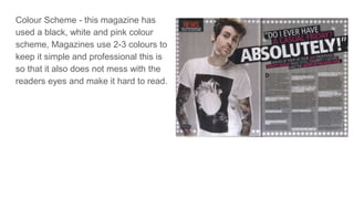
The document analyzes the layout and design elements of a typical double page spread (DPS) in a magazine. It notes that the main image usually bleeds across both pages to create a larger portrait of the subject. Color schemes are typically limited to 2-3 colors for simplicity and readability. Drop caps and line breaks are used to guide the reader through paragraphs. The body text is divided into columns for readability and to allow space for the main image. Headlines stand out in a different font and largest size to clearly indicate the topic of the article.