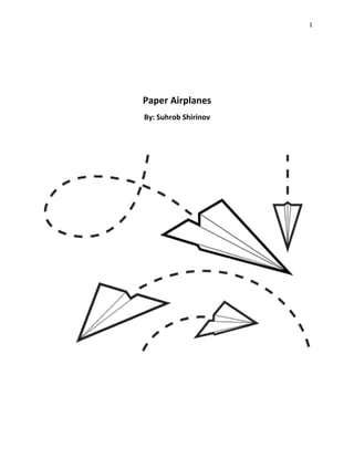
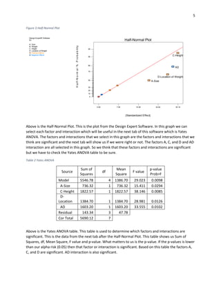
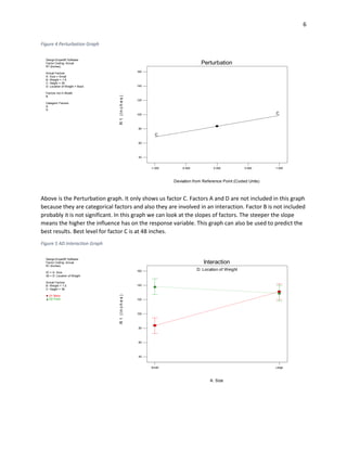
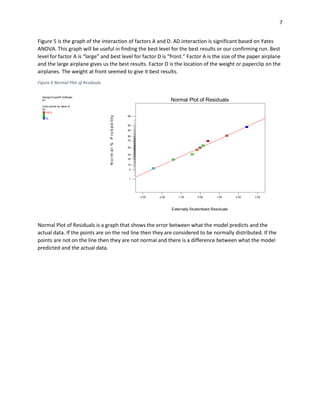
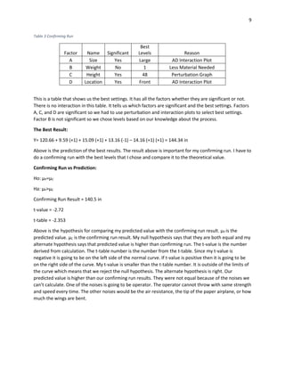
1
Paper Airplanes
By: Suhrob Shirinov
2
Project Description
This project is very simple. It is a project on paper airplanes. I used to make two types of paper
airplanes as a kid and I always wondered which one was better. After going through this class, and
learning how to build arrays and interpreting the data, I decided to test and see which one was better.
This was a perfect opportunity for me to answer one of the questions I had as a small child. Part of the
reason I chose to do paper airplanes was that the child in me took over and decided to have some fun.
The process includes two different sizes of paper airplanes (large and small), and some paperclips (1 and
3 paperclips) to add weight. The size and weight are two factors and the other two factors were the
location of the weight, and the height at which the paper airplanes were thrown at.
I had 4 factors and that meant I needed an eight run array for fractional factorial. I chose to do
four trials for each run and calculate the average of those four runs for my response variable. The
process of this project was very simple. I just had to throw the paper airplanes and record how far they
traveled. My main objective was to see which paper airplane would go the farthest, and see if the added
weight and the location of weight would make any difference. My side goal was to have fun doing this
project because I have not played with paper airplanes in a long time.
Determining the size of the array:
Y-intercept = 1
Number of Factors: 4
Expected Interactions: 1
Above are the numbers required to find the size of the
fractional array. The sum of all those numbers equals to
six and by rules we have to round it up to eight. So our
fractional array is going to have eight runs in it.
Materials Required:
 2 sheets of paper (for paper airplanes)
 3 paper clips
 Tape measure
Figure 1 Factor A: Small and Large Airplane
3
Factors and Levels:
The 4 factors and levels that I had for this experiment:
1. Paper airplane size (small and large)
2. Weight (1 and 3 paperclips)
3. Height at which the planes were thrown (30 and 48 inches)
4. Location of weight on planes (back and front)
The size of the paper airplanes was my first factor since that was the only reason I did this experiment. I
wanted to find out if the size made any difference. The weight was added because heavier objects fall
faster. I wanted to see how much of a difference a weight could make. The height at which the planes
are thrown makes a difference in response variable. When it is thrown from higher height it will travel
farther. The levels I chose were 30 inches and 48 inches. 30 inches was when I was sitting and 48 inches
was when I was on my knees. The location of the weight was important because if the plane is heavy in
front it will plunge to the ground immediately.
Response Variable:
The response variable for this project is distance in
inches. I throw the airplane and see how far it travels from
my initial position. My measuring tool was tape measure. It
is not the most accurate thing in the world but for this
project it will do the job. The way I measured the distance
was where the tip of the airplane landed.
Affinity Diagram
A. Size
B. Weight
C. Height
D. Location
Above is the affinity diagram for the project. The expected
interaction is BD. I chose this interactions because I think
that weight, and location of weight are the ones that will
make a difference in my response variable. Weight will
make it heavier which causes the airplane to go down
faster and location of weight might make it unstable.
Figure 2 Measuring Tape or Landing Strip
4
Complete Confounding Pattern:
A≈BCD AB≈CD
B≈ACD AC≈BD
C≈ABD AD≈BC
Based on my affinity diagram my expected interaction is BD. BD interaction confounds with AC
interaction according to the chart above. My expected interaction should not confound with a single
factor, it should be confounded with another interaction that is not significant or applicable.
Table 1 Fractional Array
Standard Random A: Size
B: Weight
(paperclips)
C: Height
(in)
D:
Location
Distance
(in)
1 3 Small 1 30 Front 75
2 1 Large 1 30 Back 109
3 5 Small 3 30 Back 121.25
4 7 Large 3 30 Back 117
5 8 Small 1 48 Front 155.5
6 2 Large 1 48 Front 145.5
7 4 Small 3 48 Back 92.5
8 6 Large 3 48 Front 149.5
Above is the Fractional Array. It is in standard order. It has all 4 factors with their levels. It also shows us
the response variable for each run. The response variable is an average of 4 trials. Not much
interpretation can be done from this table.
5
Figure 3 Half-Normal Plot
Above is the Half-Normal Plot. This is the plot from the Design Expert Software. In this graph we can
select each factor and interaction which will be useful in the next tab of this software which is Yates
ANOVA. The factors and interactions that we select in this graph are the factors and interactions that we
think are significant and the next tab will show us if we were right or not. The factors A, C, and D and AD
interaction are all selected in this graph. So we think that these factors and interactions are significant
but we have to check the Yates ANOVA table to be sure.
Table 2 Yates ANOVA
Source
Sum of
Squares
df
Mean
Square
F value
p-value
Prob>F
Model 5546.78 4 1386.70 29.023 0.0098
A-Size 736.32 1 736.32 15.411 0.0294
C-Height 1822.57 1 1822.57 38.146 0.0085
D-
Location 1384.70 1 1384.70 28.981 0.0126
AD 1603.20 1 1603.20 33.555 0.0102
Residual 143.34 3 47.78
Cor Total 5690.12 7
Above is the Yates ANOVA table. This table is used to determine which factors and interactions are
significant. This is the data from the next tab after the Half-Normal Plot. This table shows us Sum of
Squares, df, Mean Square, F value and p-value. What matters to us is the p-value. If the p-values is lower
than our alpha risk (0.05) then that factor or interaction is significant. Based on this table the factors A,
C, and D are significant. AD interaction is also significant.
Design-Expert® Software
R1
A: Size
B: Weight
C: Height
D: Location of Weight
Positive Effects
Negative Effects
0.00 7.55 15.09 22.64 30.19
0
10
20
30
50
70
80
90
95
Half-Normal Plot
|Standardized Effect|
Half-Normal%Probability
A-Size
C-Height
D-Location of Weight
AD
6
Figure 4 Perturbation Graph
Above is the Perturbation graph. It only shows us factor C. Factors A and D are not included in this graph
because they are categorical factors and also they are involved in an interaction. Factor B is not included
probably it is not significant. In this graph we can look at the slopes of factors. The steeper the slope
means the higher the influence has on the response variable. This graph can also be used to predict the
best results. Best level for factor C is at 48 inches.
Figure 5 AD Interaction Graph
Design-Expert® Software
Factor Coding: Actual
R1 (Inches)
Actual Factors
A: Size = Small
B: Weight = 1.5
C: Height = 39
D: Location of Weight = Back
Factors not in Model
B
Categoric Factors
A
D
-1.000 -0.500 0.000 0.500 1.000
40
60
80
100
120
140
160
C
C
Perturbation
Deviation from Reference Point (Coded Units)
R1(Inches)
Design-Expert® Software
Factor Coding: Actual
R1 (Inches)
X1 = A: Size
X2 = D: Location of Weight
Actual Factors
B: Weight = 1.5
C: Height = 39
D1 Back
D2 Front
A: Size
D: Location of Weight
Small Large
R1(Inches)
40
60
80
100
120
140
160
Interaction
7
Figure 5 is the graph of the interaction of factors A and D. AD interaction is significant based on Yates
ANOVA. This graph will be useful in finding the best level for the best results or our confirming run. Best
level for factor A is “large” and best level for factor D is “front.” Factor A is the size of the paper airplane
and the large airplane gives us the best results. Factor D is the location of the weight or paperclip on the
airplanes. The weight at front seemed to give it best results.
Figure 6 Normal Plot of Residuals
Normal Plot of Residuals is a graph that shows the error between what the model predicts and the
actual data. If the points are on the red line then they are considered to be normally distributed. If the
points are not on the line then they are not normal and there is a difference between what the model
predicted and the actual data.
Design-Expert® Software
R1
Color points by value of
R1:
155.5
75
Externally Studentized Residuals
Normal%Probability
Normal Plot of Residuals
-3.00 -2.00 -1.00 0.00 1.00 2.00 3.00
1
5
10
20
30
50
70
80
90
95
99
8
Figure 7 Box-Cox Plot
The Box-Cox transformation graph provides information on the data collected. The main purpose of this
graph is to determine whether the data collected should be transformed by calculation to have the data
appear more like a normal distribution. The assumption of all this statistical data is that the data is
normally distributed. In this scenario, the Box-Cox graph recommends inverse square change to the data
linearl model and response variable. However, since the data can still be reasonably interpreted, no
transformation will be completed since the response would need to be inverse squared as well. Ideally,
there would be no transformation recommendation which would indicate the data closely resembles
the normal distribution.
Linear Model:
Y= 120.66 + 9.59 A + 15.09 C + 13.16 D – 14.16 AD
Above is the linear model for our experiment. The coefficients of the factors are the slopes of the lines
and the number with no factor behind it is the y-intercept. This is a linear model in terms of coded units.
This can be used to predict the best results for our experiment.
Design-Expert® Software
R1
Lambda
Current = 1
Best = -0.47
Low C.I. = -1.51
High C.I. = 0.87
Recommend transform:
Inverse Sqrt
(Lambda = -0.5)
Lambda
Ln(ResidualSS)
Box-Cox Plot for Power Transforms
3
4
5
6
7
-3 -2 -1 0 1 2 3
9
Table 3 Confirming Run
Factor Name Significant
Best
Levels Reason
A Size Yes Large AD Interaction Plot
B Weight No 1 Less Material Needed
C Height Yes 48 Perturbation Graph
D Location Yes Front AD Interaction Plot
This is a table that shows us the best settings. It has all the factors whether they are significant or not.
There is no interaction in this table. It tells us which factors are significant and the best settings. Factors
A, C, and D are significant so we had to use perturbation and interaction plots to select best settings.
Factor B is not significant so we chose levels based on our knowledge about the process.
The Best Result:
Y= 120.66 + 9.59 (+1) + 15.09 (+1) + 13.16 (-1) – 14.16 (+1) (+1) = 144.34 in
Above is the prediction of the best results. The result above is important for my confirming run. I have to
do a confirming run with the best levels that I chose and compare it to the theoretical value.
Confirming Run vs Prediction:
Ho: µP=µC
Ha: µP>µC
Confirming Run Result = 140.5 in
t-value = -2.72
t-table = -2.353
Above is the hypothesis for comparing my predicted value with the confirming run result. µP is the
predicted value. µC is the confirming run result. My null hypothesis says that they are both equal and my
alternate hypothesis says that predicted value is higher than confirming run. The t-value is the number
derived from calculation. The t-table number is the number from the t-table. Since my t-value is
negative it is going to be on the left side of the normal curve. If t-value is positive then it is going to be
on the right side of the curve. My t-value is smaller than the t-table number. It is outside of the limits of
the curve which means that we reject the null hypothesis. The alternate hypothesis is right. Our
predicted value is higher than our confirming run results. They were not equal because of the noises we
can’t calculate. One of the noises is going to be operator. The operator cannot throw with same strength
and speed every time. The other noises would be the air resistance, the tip of the paper airplane, or how
much the wings are bent.
10
Summary and Conclusion:
This experiment answered the question I had as a small child in a more scientific way. It made it clear
that the larger paper airplane flies farther and it is more stable. The added weight did not make much of
a difference but the location of weight did significant difference. When the weight was in the back the
airplane became really unstable. When it was thrown the back of the airplane dropped thus reducing
the distance. The weight on front made it fly farther and better. It became more balanced. Through this
experiment I accomplished my main goal but I did not accomplish my side goal. Gathering the data was
not as fun as I expected it to be and making the paper airplane fly in a straight line was not easy. I did
not have any fun while throwing and gathering the data but now I know which paper airplane is better
and how to make it more stable.

DOE Project

  • 1.
  • 2.
    2 Project Description This projectis very simple. It is a project on paper airplanes. I used to make two types of paper airplanes as a kid and I always wondered which one was better. After going through this class, and learning how to build arrays and interpreting the data, I decided to test and see which one was better. This was a perfect opportunity for me to answer one of the questions I had as a small child. Part of the reason I chose to do paper airplanes was that the child in me took over and decided to have some fun. The process includes two different sizes of paper airplanes (large and small), and some paperclips (1 and 3 paperclips) to add weight. The size and weight are two factors and the other two factors were the location of the weight, and the height at which the paper airplanes were thrown at. I had 4 factors and that meant I needed an eight run array for fractional factorial. I chose to do four trials for each run and calculate the average of those four runs for my response variable. The process of this project was very simple. I just had to throw the paper airplanes and record how far they traveled. My main objective was to see which paper airplane would go the farthest, and see if the added weight and the location of weight would make any difference. My side goal was to have fun doing this project because I have not played with paper airplanes in a long time. Determining the size of the array: Y-intercept = 1 Number of Factors: 4 Expected Interactions: 1 Above are the numbers required to find the size of the fractional array. The sum of all those numbers equals to six and by rules we have to round it up to eight. So our fractional array is going to have eight runs in it. Materials Required:  2 sheets of paper (for paper airplanes)  3 paper clips  Tape measure Figure 1 Factor A: Small and Large Airplane
  • 3.
    3 Factors and Levels: The4 factors and levels that I had for this experiment: 1. Paper airplane size (small and large) 2. Weight (1 and 3 paperclips) 3. Height at which the planes were thrown (30 and 48 inches) 4. Location of weight on planes (back and front) The size of the paper airplanes was my first factor since that was the only reason I did this experiment. I wanted to find out if the size made any difference. The weight was added because heavier objects fall faster. I wanted to see how much of a difference a weight could make. The height at which the planes are thrown makes a difference in response variable. When it is thrown from higher height it will travel farther. The levels I chose were 30 inches and 48 inches. 30 inches was when I was sitting and 48 inches was when I was on my knees. The location of the weight was important because if the plane is heavy in front it will plunge to the ground immediately. Response Variable: The response variable for this project is distance in inches. I throw the airplane and see how far it travels from my initial position. My measuring tool was tape measure. It is not the most accurate thing in the world but for this project it will do the job. The way I measured the distance was where the tip of the airplane landed. Affinity Diagram A. Size B. Weight C. Height D. Location Above is the affinity diagram for the project. The expected interaction is BD. I chose this interactions because I think that weight, and location of weight are the ones that will make a difference in my response variable. Weight will make it heavier which causes the airplane to go down faster and location of weight might make it unstable. Figure 2 Measuring Tape or Landing Strip
  • 4.
    4 Complete Confounding Pattern: A≈BCDAB≈CD B≈ACD AC≈BD C≈ABD AD≈BC Based on my affinity diagram my expected interaction is BD. BD interaction confounds with AC interaction according to the chart above. My expected interaction should not confound with a single factor, it should be confounded with another interaction that is not significant or applicable. Table 1 Fractional Array Standard Random A: Size B: Weight (paperclips) C: Height (in) D: Location Distance (in) 1 3 Small 1 30 Front 75 2 1 Large 1 30 Back 109 3 5 Small 3 30 Back 121.25 4 7 Large 3 30 Back 117 5 8 Small 1 48 Front 155.5 6 2 Large 1 48 Front 145.5 7 4 Small 3 48 Back 92.5 8 6 Large 3 48 Front 149.5 Above is the Fractional Array. It is in standard order. It has all 4 factors with their levels. It also shows us the response variable for each run. The response variable is an average of 4 trials. Not much interpretation can be done from this table.
  • 5.
    5 Figure 3 Half-NormalPlot Above is the Half-Normal Plot. This is the plot from the Design Expert Software. In this graph we can select each factor and interaction which will be useful in the next tab of this software which is Yates ANOVA. The factors and interactions that we select in this graph are the factors and interactions that we think are significant and the next tab will show us if we were right or not. The factors A, C, and D and AD interaction are all selected in this graph. So we think that these factors and interactions are significant but we have to check the Yates ANOVA table to be sure. Table 2 Yates ANOVA Source Sum of Squares df Mean Square F value p-value Prob>F Model 5546.78 4 1386.70 29.023 0.0098 A-Size 736.32 1 736.32 15.411 0.0294 C-Height 1822.57 1 1822.57 38.146 0.0085 D- Location 1384.70 1 1384.70 28.981 0.0126 AD 1603.20 1 1603.20 33.555 0.0102 Residual 143.34 3 47.78 Cor Total 5690.12 7 Above is the Yates ANOVA table. This table is used to determine which factors and interactions are significant. This is the data from the next tab after the Half-Normal Plot. This table shows us Sum of Squares, df, Mean Square, F value and p-value. What matters to us is the p-value. If the p-values is lower than our alpha risk (0.05) then that factor or interaction is significant. Based on this table the factors A, C, and D are significant. AD interaction is also significant. Design-Expert® Software R1 A: Size B: Weight C: Height D: Location of Weight Positive Effects Negative Effects 0.00 7.55 15.09 22.64 30.19 0 10 20 30 50 70 80 90 95 Half-Normal Plot |Standardized Effect| Half-Normal%Probability A-Size C-Height D-Location of Weight AD
  • 6.
    6 Figure 4 PerturbationGraph Above is the Perturbation graph. It only shows us factor C. Factors A and D are not included in this graph because they are categorical factors and also they are involved in an interaction. Factor B is not included probably it is not significant. In this graph we can look at the slopes of factors. The steeper the slope means the higher the influence has on the response variable. This graph can also be used to predict the best results. Best level for factor C is at 48 inches. Figure 5 AD Interaction Graph Design-Expert® Software Factor Coding: Actual R1 (Inches) Actual Factors A: Size = Small B: Weight = 1.5 C: Height = 39 D: Location of Weight = Back Factors not in Model B Categoric Factors A D -1.000 -0.500 0.000 0.500 1.000 40 60 80 100 120 140 160 C C Perturbation Deviation from Reference Point (Coded Units) R1(Inches) Design-Expert® Software Factor Coding: Actual R1 (Inches) X1 = A: Size X2 = D: Location of Weight Actual Factors B: Weight = 1.5 C: Height = 39 D1 Back D2 Front A: Size D: Location of Weight Small Large R1(Inches) 40 60 80 100 120 140 160 Interaction
  • 7.
    7 Figure 5 isthe graph of the interaction of factors A and D. AD interaction is significant based on Yates ANOVA. This graph will be useful in finding the best level for the best results or our confirming run. Best level for factor A is “large” and best level for factor D is “front.” Factor A is the size of the paper airplane and the large airplane gives us the best results. Factor D is the location of the weight or paperclip on the airplanes. The weight at front seemed to give it best results. Figure 6 Normal Plot of Residuals Normal Plot of Residuals is a graph that shows the error between what the model predicts and the actual data. If the points are on the red line then they are considered to be normally distributed. If the points are not on the line then they are not normal and there is a difference between what the model predicted and the actual data. Design-Expert® Software R1 Color points by value of R1: 155.5 75 Externally Studentized Residuals Normal%Probability Normal Plot of Residuals -3.00 -2.00 -1.00 0.00 1.00 2.00 3.00 1 5 10 20 30 50 70 80 90 95 99
  • 8.
    8 Figure 7 Box-CoxPlot The Box-Cox transformation graph provides information on the data collected. The main purpose of this graph is to determine whether the data collected should be transformed by calculation to have the data appear more like a normal distribution. The assumption of all this statistical data is that the data is normally distributed. In this scenario, the Box-Cox graph recommends inverse square change to the data linearl model and response variable. However, since the data can still be reasonably interpreted, no transformation will be completed since the response would need to be inverse squared as well. Ideally, there would be no transformation recommendation which would indicate the data closely resembles the normal distribution. Linear Model: Y= 120.66 + 9.59 A + 15.09 C + 13.16 D – 14.16 AD Above is the linear model for our experiment. The coefficients of the factors are the slopes of the lines and the number with no factor behind it is the y-intercept. This is a linear model in terms of coded units. This can be used to predict the best results for our experiment. Design-Expert® Software R1 Lambda Current = 1 Best = -0.47 Low C.I. = -1.51 High C.I. = 0.87 Recommend transform: Inverse Sqrt (Lambda = -0.5) Lambda Ln(ResidualSS) Box-Cox Plot for Power Transforms 3 4 5 6 7 -3 -2 -1 0 1 2 3
  • 9.
    9 Table 3 ConfirmingRun Factor Name Significant Best Levels Reason A Size Yes Large AD Interaction Plot B Weight No 1 Less Material Needed C Height Yes 48 Perturbation Graph D Location Yes Front AD Interaction Plot This is a table that shows us the best settings. It has all the factors whether they are significant or not. There is no interaction in this table. It tells us which factors are significant and the best settings. Factors A, C, and D are significant so we had to use perturbation and interaction plots to select best settings. Factor B is not significant so we chose levels based on our knowledge about the process. The Best Result: Y= 120.66 + 9.59 (+1) + 15.09 (+1) + 13.16 (-1) – 14.16 (+1) (+1) = 144.34 in Above is the prediction of the best results. The result above is important for my confirming run. I have to do a confirming run with the best levels that I chose and compare it to the theoretical value. Confirming Run vs Prediction: Ho: µP=µC Ha: µP>µC Confirming Run Result = 140.5 in t-value = -2.72 t-table = -2.353 Above is the hypothesis for comparing my predicted value with the confirming run result. µP is the predicted value. µC is the confirming run result. My null hypothesis says that they are both equal and my alternate hypothesis says that predicted value is higher than confirming run. The t-value is the number derived from calculation. The t-table number is the number from the t-table. Since my t-value is negative it is going to be on the left side of the normal curve. If t-value is positive then it is going to be on the right side of the curve. My t-value is smaller than the t-table number. It is outside of the limits of the curve which means that we reject the null hypothesis. The alternate hypothesis is right. Our predicted value is higher than our confirming run results. They were not equal because of the noises we can’t calculate. One of the noises is going to be operator. The operator cannot throw with same strength and speed every time. The other noises would be the air resistance, the tip of the paper airplane, or how much the wings are bent.
  • 10.
    10 Summary and Conclusion: Thisexperiment answered the question I had as a small child in a more scientific way. It made it clear that the larger paper airplane flies farther and it is more stable. The added weight did not make much of a difference but the location of weight did significant difference. When the weight was in the back the airplane became really unstable. When it was thrown the back of the airplane dropped thus reducing the distance. The weight on front made it fly farther and better. It became more balanced. Through this experiment I accomplished my main goal but I did not accomplish my side goal. Gathering the data was not as fun as I expected it to be and making the paper airplane fly in a straight line was not easy. I did not have any fun while throwing and gathering the data but now I know which paper airplane is better and how to make it more stable.