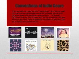
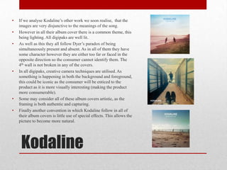
Conventions of Indie Genre
“The term indie rock, derived from "independent," describes the small
and relatively low-budget labels on which it is released and the do-it-
yourself attitude of the bands and artists involved.” – Wikipedia.
Within the indie genre lots of bands have links between their work, this
is because they share several identifiable conventions of the genre. This
can be clearly seen in album covers.
The Conventions…
• The majority of album covers in the indie music industry have follow
dyer’s paradox of the star being both simultaneously present as well
as simultaneously absent. This is the case as there are few stars on the
front of the album cover, however often the band name is shown in a
large font. Therefore the typography is creating a link from consumer
to artist.
• As well as this all album covers are visually expressive, and they
amplify a possible view of the band. Or they are visually interesting
and try to explain the back ground of the artist (meta-narrative).#
• Also as this genre is fairly new compared to American Rock, or Jazz,
it aims to attract positive technological determinists (such as youths)
as they are more likely to acknowledge the recent buzz around a new
artist.
• Finally unlike other genres, all of bands within the indie genre aim to
authentic, and therefore all album covers look different. This creates
pluralistic landscape of ideas in the genre.
The Concept
• Our main concept revolves around domestic violence, the song
we have chosen is No Angels by Bastille. We feel this song creates
enigmatic codes, as it uses percussion and slow emotional vocals.
• We would hope our digipak could create this atmosphere. A method
we may use to create this would be unfocused characters, dark colour
grading, or contrasting lighting.
• Within this genre however we may not need to directly link the
album cover to music video or song. As there is often a sense of
disjunctive within the genre.
• An example of the emotion we hope to create is in Rudimental’s ‘Not
Giving In’ 0:00-1:00 minutes. I think that emotion is also expressed
in the album cover. As it shows a town in complete poverty.
Connotations: this particular
could be symbolic, having a
hidden meaning.
Distance: this image is an
extreme long shot. Both
the background and
foreground are in focus.
Rule of Thirds: this
technique is used, as the
centre has the main purpose
of the shot.
The use of lighting
could act as an amplifier
to the background of the
shot, giving it a purpose.
Typography: the font used is
simple, is used in other
prints.
Present/Absent: The
star is clearly
present, however the
use of long shot
makes it hard for the
consumer to entirely
see them.
Background: often
the use of the ocean
in a picture illustrates
freedom, the
landscape in the
background could be
the idea of ‘A perfect
world’in the eyes of
the artist.
Kodaline
• If we analyse Kodaline’s other work we soon realise, that the
images are very disjunctive to the meanings of the song.
• However in all their album cover there is a common theme, this
being lighting. All digipaks are well lit.
• As well as this they all follow Dyer’s paradox of being
simultaneously present and absent. As in all of them they have
some character however they are either too far or faced in the
opposite direction so the consumer cannot identify them. The
4th wall is not broken in any of the covers.
• In all digipaks, creative camera techniques are utilised. As
something is happening in both the background and foreground,
this could be iconic as the consumer will be enticed to the
product as it is more visually interesting (making the product
more consumerable).
• Some may consider all of these album covers artistic, as the
framing is both authentic and capturing.
• Finally another convention in which Kodaline follow in all of
their album covers is little use of special effects. This allows the
picture to become more natural.

Digipak analysis

  • 1.
    Conventions of IndieGenre “The term indie rock, derived from "independent," describes the small and relatively low-budget labels on which it is released and the do-it- yourself attitude of the bands and artists involved.” – Wikipedia. Within the indie genre lots of bands have links between their work, this is because they share several identifiable conventions of the genre. This can be clearly seen in album covers.
  • 2.
    The Conventions… • Themajority of album covers in the indie music industry have follow dyer’s paradox of the star being both simultaneously present as well as simultaneously absent. This is the case as there are few stars on the front of the album cover, however often the band name is shown in a large font. Therefore the typography is creating a link from consumer to artist. • As well as this all album covers are visually expressive, and they amplify a possible view of the band. Or they are visually interesting and try to explain the back ground of the artist (meta-narrative).# • Also as this genre is fairly new compared to American Rock, or Jazz, it aims to attract positive technological determinists (such as youths) as they are more likely to acknowledge the recent buzz around a new artist. • Finally unlike other genres, all of bands within the indie genre aim to authentic, and therefore all album covers look different. This creates pluralistic landscape of ideas in the genre.
  • 3.
    The Concept • Ourmain concept revolves around domestic violence, the song we have chosen is No Angels by Bastille. We feel this song creates enigmatic codes, as it uses percussion and slow emotional vocals. • We would hope our digipak could create this atmosphere. A method we may use to create this would be unfocused characters, dark colour grading, or contrasting lighting. • Within this genre however we may not need to directly link the album cover to music video or song. As there is often a sense of disjunctive within the genre. • An example of the emotion we hope to create is in Rudimental’s ‘Not Giving In’ 0:00-1:00 minutes. I think that emotion is also expressed in the album cover. As it shows a town in complete poverty.
  • 4.
    Connotations: this particular couldbe symbolic, having a hidden meaning. Distance: this image is an extreme long shot. Both the background and foreground are in focus. Rule of Thirds: this technique is used, as the centre has the main purpose of the shot. The use of lighting could act as an amplifier to the background of the shot, giving it a purpose. Typography: the font used is simple, is used in other prints. Present/Absent: The star is clearly present, however the use of long shot makes it hard for the consumer to entirely see them. Background: often the use of the ocean in a picture illustrates freedom, the landscape in the background could be the idea of ‘A perfect world’in the eyes of the artist.
  • 5.
    Kodaline • If weanalyse Kodaline’s other work we soon realise, that the images are very disjunctive to the meanings of the song. • However in all their album cover there is a common theme, this being lighting. All digipaks are well lit. • As well as this they all follow Dyer’s paradox of being simultaneously present and absent. As in all of them they have some character however they are either too far or faced in the opposite direction so the consumer cannot identify them. The 4th wall is not broken in any of the covers. • In all digipaks, creative camera techniques are utilised. As something is happening in both the background and foreground, this could be iconic as the consumer will be enticed to the product as it is more visually interesting (making the product more consumerable). • Some may consider all of these album covers artistic, as the framing is both authentic and capturing. • Finally another convention in which Kodaline follow in all of their album covers is little use of special effects. This allows the picture to become more natural.