Design of Everday Things - Final Project
•
0 likes•879 views

This is my final project for the Udacity online course: The Design of Everyday Things taught by Don Norman.

Recommended
More Related Content
Similar to Design of Everday Things - Final Project
Similar to Design of Everday Things - Final Project (20)
More from Mark Congiusta
More from Mark Congiusta (20)
Recently uploaded
Recently uploaded (20)
Design of Everday Things - Final Project
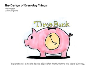
- 1. The Design of Everyday Things Final Project Mark Congiusta Exploration of a mobile device application that turns time into social currency.
- 6. Wireframes: Post Feedback Iteration
- 7. User Feedback: What I Learned Initial Design Iteration There were several point of consistent feedback on my original design: 1. No need for 2 time gauges Users found this confusing and pointed out that there should only be a single time balance, not one for deficit and surplus. 2. Plus/minus signs not clear. More explicit call to action required. 3. Don’t bury key functionality. Finding people to transact time with is a primary function. 4. Need multiple ways to find people. Proximity is an important method for finding transactors but should not be the only one. 5. Social cues not clear. Benefits for linking to social accounts needs to be more obvious. 6/7. Transaction flow is missing step. Who am I transacting with? Need indication of where the time currency is coming/going. I addressed the user feedback in the following ways: 1. A single time balance display. Added a positive/negative indicator in front of the balance to indicate a deficit or surplus. 2. Used text strings to denote action. Removed ambiguous iconography on controls. Text strings also align to mobile design UI trends. 3. Made finding people a top level UI control. 4. Added conventional contact search functionality. In addition to map based geolocation, also included the ability to search for individuals by name. 5. Contextualized social benefit. Enhanced the benefit of a wider social circle using the app to increase its benefit to the user. 6/7. Added transactor to exchange UI. Also included more obvious hooks for moving from finding a transactor and moving to the transaction workflow.