Dec cal
•Download as PPTX, PDF•
0 likes•32 views
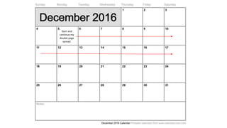
This very short document consists of a single sentence instructing the reader to start and continue a double page spread. It provides direction to create a two-page layout but gives no other context or details.
Report
Share
Report
Share
Recommended
Jan cal
This document outlines steps for a project including finishing research and planning, getting feedback on a double page spread, and starting an evaluation to complete it.
Photoshoot Preparation
The document provides guidance for a model preparing for an upcoming photoshoot, including facial expressions, poses, and hair and makeup styles to practice. It notes that a variety of photos from different angles and expressions will be taken over the one hour session. Direct eye contact will be important. Props and clothing will be provided. Examples are given of practical, sexual, and carefree facial expressions as well as standing and sitting poses reflecting an alternative style. The goal is to achieve a punk/alternative look through the hair and makeup.
Model organisation
Becky Lindsay, a 17-year-old performing arts student, was chosen as the model for a photoshoot portraying an alternative music artist. She was selected due to her music tastes in indie, alternative genres and experience from acting roles, which would help her look the part. Her age also fits the target demographic of 15-21 year olds for alternative music magazines. Extensive text conversations were had to coordinate schedules and availability between the model, photographer, and studio during the upcoming October half term break.
Question5
The document discusses how the magazine targeted its audience of 13-23 year olds interested in alternative music. It aimed to attract this audience through using genre conventions like dark colors, emotive language, and images of alternative musicians in the magazine's layout and design. The magazine also included common features like competitions, subscriber perks, and a free song download to engage readers. The price of £2 was chosen to be affordable for students while still undercutting competitors. Overall, the document explains how the magazine was tailored to attract its intended target audience through visuals, content, and pricing.
Nov
This short document provides basic instructions on creating a contents page for a book or document. It instructs the reader to start the contents page after the front cover and continue listing contents until all sections are included.
Calendar
During the month, I set up a blog on Blogger.com and added initial items including a mood board on music genres and a proposal table. I analyzed examples of language and register and began drafting an article. I also looked at other magazines to gather ideas and information on techniques and target audiences before developing magazine pages. Further work included deconstructing magazine covers, contents pages and spreads then creating mood boards on topics like costume, makeup and fonts to upload to my blog along with competition research.
October
The document is an October 2016 calendar listing tasks related to creating a college magazine, including finishing facial expression research, creating a reader profile and mood boards, organizing a photoshoot, making a first draft of the front cover and sourcing examples, and catching up on planning and research for the magazine.
Flat plan for contents page
This document discusses various features and subheads without providing details on the actual content. It includes a heading, features and subheads sections, an editor's note, images, and mentions of social media. However, the summary cannot determine the key topics or essential information from the document as no substance is included beyond section titles and images.
January
The document outlines tasks for a design project including redrafting a magazine spread, peer assessing work, working on evaluations, and finishing rationales and any outstanding work by the coursework deadline.
Flat plan dps
This document appears to be a template for laying out the various elements of a news article, including the title, images, credits, quotes, bylines and other typical sections. It lists placeholders for common elements like the headline, author, photographs and captions, pull quotes, and additional content. The template provides a structure to organize the key components of a written news story.
Flat plan contents page
This document appears to be a template for laying out content on a page, with designated sections for things like a heading, dominant image, essential information, sub images, top and bottom banners, charts, and a review or editor's note. The template provides a structure for presenting different types of media and content in distinct labeled sections.
Deconstruction of magazines
The document summarizes and analyzes various aspects of magazine covers and articles, including their layouts, designs, images, and how different elements are used to target audiences and convey information. Key points discussed include how logos and fonts establish brands, cover images and headlines attract attention while revealing just enough to intrigue readers without giving everything away, and article styles and visual presentations aim to engage specific demographics. Color schemes, imagery, and other stylistic choices are examined for their symbolic meanings and how they position the magazines.
Compare and contrast of a double page spread
The document compares the author's double page magazine spread to one from Top of the Pops magazine. Both have similar layout elements like the title placement and images, but differ in aspects such as the author's spread only having two columns while Top of the Pops has four, and the author's images being together while Top of the Pops' are separated. The author notes their spread needs a clearer dominant image but is overall pleased with the layout.
December
The document outlines the process of creating a double page spread, including sourcing inspiration, planning the layout, beginning the creation process by drafting the first half, continuing work on the second half, and finishing the first draft of the double page spread.
Target audience moodboard
Children ages 11-13 are beginning to develop independence and identity separate from parents and family. They are increasingly influenced by peers and desire more freedom and responsibility. This stage requires understanding, trust and open communication between children and parents to help them transition into young teenagers.
Deconstruction of magazines 2
1) The masthead of "Q" magazine and the dominant image of Ed Sheeran implies that the artist is the most important part of the magazine. The casual image of Ed with his guitar suggests his relaxed musical style.
2) Details like font, placement, and color are used purposefully throughout the magazine to draw attention to important information and create a clean layout that would appeal to their target audience of 16-24 year olds.
3) The well-organized front cover uses techniques like bold text, separation of articles with lines, and framing of the dominant image to clearly present content to readers.
Flat plan for double page spread
This document appears to be a template for a newspaper or magazine article layout, showing common elements like the title, byline, images, introductory text, and page numbers but without any actual content. It provides an outline of the standard sections but does not have a story to summarize.
Flat plan front cover
This magazine cover contains various elements including a top banner, mast head, dominant image, multiple cover lines, main sell line, sub heading, puff/plug, essential information, bottom banner, and barcode to advertise and provide key details about the publication in a concise visual format.
Compare and contrast contents page
The document compares the contents page created by the author to that of Shout magazine. Both have the masthead in the top left and feature listings under "What's Inside" sorted into categories. However, the author's page includes an editor's note and social media links not found in Shout's. The author concludes they will take more design cues from Shout's "more professional" layout for their next draft, aiming to reduce white space and fonts while organizing image subsections.
Flat plan for my cover
This magazine cover features a celebrity as the dominant image with essential information including their name and a subhead. Below are additional images and quotes from the celebrity alongside short descriptions of the issue's content and a competitive offer. The issue number, price and website are listed at the bottom.
Target audience profiles
The document profiles 3 individuals between ages 16-17, describing their favorite colors, hobbies, and music interests in pop, alternative, pop punk, and punk rock genres. It concludes that a music magazine appealing to this target audience should feature alternative artists that also incorporate some pop or punk elements to attract the maximum number of readers and differentiate itself from competitors.
Source exisiting magazines
These links are to popular magazines and music brands. Seventeen and Cosmopolitan are magazines focused on fashion, beauty, and relationships. Top of the Pops was a television show and brand in the UK focused on pop music charts and performances.
Community pharmacy- Social and preventive pharmacy UNIT 5
Covered community pharmacy topic of the subject Social and preventive pharmacy for Diploma and Bachelor of pharmacy
South African Journal of Science: Writing with integrity workshop (2024)
South African Journal of Science: Writing with integrity workshop (2024)Academy of Science of South Africa
A workshop hosted by the South African Journal of Science aimed at postgraduate students and early career researchers with little or no experience in writing and publishing journal articles.More Related Content
Viewers also liked
January
The document outlines tasks for a design project including redrafting a magazine spread, peer assessing work, working on evaluations, and finishing rationales and any outstanding work by the coursework deadline.
Flat plan dps
This document appears to be a template for laying out the various elements of a news article, including the title, images, credits, quotes, bylines and other typical sections. It lists placeholders for common elements like the headline, author, photographs and captions, pull quotes, and additional content. The template provides a structure to organize the key components of a written news story.
Flat plan contents page
This document appears to be a template for laying out content on a page, with designated sections for things like a heading, dominant image, essential information, sub images, top and bottom banners, charts, and a review or editor's note. The template provides a structure for presenting different types of media and content in distinct labeled sections.
Deconstruction of magazines
The document summarizes and analyzes various aspects of magazine covers and articles, including their layouts, designs, images, and how different elements are used to target audiences and convey information. Key points discussed include how logos and fonts establish brands, cover images and headlines attract attention while revealing just enough to intrigue readers without giving everything away, and article styles and visual presentations aim to engage specific demographics. Color schemes, imagery, and other stylistic choices are examined for their symbolic meanings and how they position the magazines.
Compare and contrast of a double page spread
The document compares the author's double page magazine spread to one from Top of the Pops magazine. Both have similar layout elements like the title placement and images, but differ in aspects such as the author's spread only having two columns while Top of the Pops has four, and the author's images being together while Top of the Pops' are separated. The author notes their spread needs a clearer dominant image but is overall pleased with the layout.
December
The document outlines the process of creating a double page spread, including sourcing inspiration, planning the layout, beginning the creation process by drafting the first half, continuing work on the second half, and finishing the first draft of the double page spread.
Target audience moodboard
Children ages 11-13 are beginning to develop independence and identity separate from parents and family. They are increasingly influenced by peers and desire more freedom and responsibility. This stage requires understanding, trust and open communication between children and parents to help them transition into young teenagers.
Deconstruction of magazines 2
1) The masthead of "Q" magazine and the dominant image of Ed Sheeran implies that the artist is the most important part of the magazine. The casual image of Ed with his guitar suggests his relaxed musical style.
2) Details like font, placement, and color are used purposefully throughout the magazine to draw attention to important information and create a clean layout that would appeal to their target audience of 16-24 year olds.
3) The well-organized front cover uses techniques like bold text, separation of articles with lines, and framing of the dominant image to clearly present content to readers.
Flat plan for double page spread
This document appears to be a template for a newspaper or magazine article layout, showing common elements like the title, byline, images, introductory text, and page numbers but without any actual content. It provides an outline of the standard sections but does not have a story to summarize.
Flat plan front cover
This magazine cover contains various elements including a top banner, mast head, dominant image, multiple cover lines, main sell line, sub heading, puff/plug, essential information, bottom banner, and barcode to advertise and provide key details about the publication in a concise visual format.
Compare and contrast contents page
The document compares the contents page created by the author to that of Shout magazine. Both have the masthead in the top left and feature listings under "What's Inside" sorted into categories. However, the author's page includes an editor's note and social media links not found in Shout's. The author concludes they will take more design cues from Shout's "more professional" layout for their next draft, aiming to reduce white space and fonts while organizing image subsections.
Flat plan for my cover
This magazine cover features a celebrity as the dominant image with essential information including their name and a subhead. Below are additional images and quotes from the celebrity alongside short descriptions of the issue's content and a competitive offer. The issue number, price and website are listed at the bottom.
Target audience profiles
The document profiles 3 individuals between ages 16-17, describing their favorite colors, hobbies, and music interests in pop, alternative, pop punk, and punk rock genres. It concludes that a music magazine appealing to this target audience should feature alternative artists that also incorporate some pop or punk elements to attract the maximum number of readers and differentiate itself from competitors.
Source exisiting magazines
These links are to popular magazines and music brands. Seventeen and Cosmopolitan are magazines focused on fashion, beauty, and relationships. Top of the Pops was a television show and brand in the UK focused on pop music charts and performances.
Viewers also liked (20)
Recently uploaded
Community pharmacy- Social and preventive pharmacy UNIT 5
Covered community pharmacy topic of the subject Social and preventive pharmacy for Diploma and Bachelor of pharmacy
South African Journal of Science: Writing with integrity workshop (2024)
South African Journal of Science: Writing with integrity workshop (2024)Academy of Science of South Africa
A workshop hosted by the South African Journal of Science aimed at postgraduate students and early career researchers with little or no experience in writing and publishing journal articles.Digital Artifact 1 - 10VCD Environments Unit
Digital Artifact 1 - 10VCD Environments Unit - NGV Pavilion Concept Design
The History of Stoke Newington Street Names
Presented at the Stoke Newington Literary Festival on 9th June 2024
www.StokeNewingtonHistory.com
Pollock and Snow "DEIA in the Scholarly Landscape, Session One: Setting Expec...
Pollock and Snow "DEIA in the Scholarly Landscape, Session One: Setting Expec...National Information Standards Organization (NISO)
This presentation was provided by Steph Pollock of The American Psychological Association’s Journals Program, and Damita Snow, of The American Society of Civil Engineers (ASCE), for the initial session of NISO's 2024 Training Series "DEIA in the Scholarly Landscape." Session One: 'Setting Expectations: a DEIA Primer,' was held June 6, 2024.ISO/IEC 27001, ISO/IEC 42001, and GDPR: Best Practices for Implementation and...
Denis is a dynamic and results-driven Chief Information Officer (CIO) with a distinguished career spanning information systems analysis and technical project management. With a proven track record of spearheading the design and delivery of cutting-edge Information Management solutions, he has consistently elevated business operations, streamlined reporting functions, and maximized process efficiency.
Certified as an ISO/IEC 27001: Information Security Management Systems (ISMS) Lead Implementer, Data Protection Officer, and Cyber Risks Analyst, Denis brings a heightened focus on data security, privacy, and cyber resilience to every endeavor.
His expertise extends across a diverse spectrum of reporting, database, and web development applications, underpinned by an exceptional grasp of data storage and virtualization technologies. His proficiency in application testing, database administration, and data cleansing ensures seamless execution of complex projects.
What sets Denis apart is his comprehensive understanding of Business and Systems Analysis technologies, honed through involvement in all phases of the Software Development Lifecycle (SDLC). From meticulous requirements gathering to precise analysis, innovative design, rigorous development, thorough testing, and successful implementation, he has consistently delivered exceptional results.
Throughout his career, he has taken on multifaceted roles, from leading technical project management teams to owning solutions that drive operational excellence. His conscientious and proactive approach is unwavering, whether he is working independently or collaboratively within a team. His ability to connect with colleagues on a personal level underscores his commitment to fostering a harmonious and productive workplace environment.
Date: May 29, 2024
Tags: Information Security, ISO/IEC 27001, ISO/IEC 42001, Artificial Intelligence, GDPR
-------------------------------------------------------------------------------
Find out more about ISO training and certification services
Training: ISO/IEC 27001 Information Security Management System - EN | PECB
ISO/IEC 42001 Artificial Intelligence Management System - EN | PECB
General Data Protection Regulation (GDPR) - Training Courses - EN | PECB
Webinars: https://pecb.com/webinars
Article: https://pecb.com/article
-------------------------------------------------------------------------------
For more information about PECB:
Website: https://pecb.com/
LinkedIn: https://www.linkedin.com/company/pecb/
Facebook: https://www.facebook.com/PECBInternational/
Slideshare: http://www.slideshare.net/PECBCERTIFICATION
RPMS TEMPLATE FOR SCHOOL YEAR 2023-2024 FOR TEACHER 1 TO TEACHER 3
RPMS Template 2023-2024 by: Irene S. Rueco
DRUGS AND ITS classification slide share
Any substance (other than food) that is used to prevent, diagnose, treat, or relieve symptoms of a
disease or abnormal condition
How to Build a Module in Odoo 17 Using the Scaffold Method
Odoo provides an option for creating a module by using a single line command. By using this command the user can make a whole structure of a module. It is very easy for a beginner to make a module. There is no need to make each file manually. This slide will show how to create a module using the scaffold method.
ANATOMY AND BIOMECHANICS OF HIP JOINT.pdf
it describes the bony anatomy including the femoral head , acetabulum, labrum . also discusses the capsule , ligaments . muscle that act on the hip joint and the range of motion are outlined. factors affecting hip joint stability and weight transmission through the joint are summarized.
Advanced Java[Extra Concepts, Not Difficult].docx
This is part 2 of my Java Learning Journey. This contains Hashing, ArrayList, LinkedList, Date and Time Classes, Calendar Class and more.
Hindi varnamala | hindi alphabet PPT.pdf
हिंदी वर्णमाला पीपीटी, hindi alphabet PPT presentation, hindi varnamala PPT, Hindi Varnamala pdf, हिंदी स्वर, हिंदी व्यंजन, sikhiye hindi varnmala, dr. mulla adam ali, hindi language and literature, hindi alphabet with drawing, hindi alphabet pdf, hindi varnamala for childrens, hindi language, hindi varnamala practice for kids, https://www.drmullaadamali.com
What is Digital Literacy? A guest blog from Andy McLaughlin, University of Ab...
What is Digital Literacy? A guest blog from Andy McLaughlin, University of Aberdeen
Recently uploaded (20)
Community pharmacy- Social and preventive pharmacy UNIT 5
Community pharmacy- Social and preventive pharmacy UNIT 5
South African Journal of Science: Writing with integrity workshop (2024)
South African Journal of Science: Writing with integrity workshop (2024)
Film vocab for eal 3 students: Australia the movie
Film vocab for eal 3 students: Australia the movie
Pollock and Snow "DEIA in the Scholarly Landscape, Session One: Setting Expec...
Pollock and Snow "DEIA in the Scholarly Landscape, Session One: Setting Expec...
ISO/IEC 27001, ISO/IEC 42001, and GDPR: Best Practices for Implementation and...
ISO/IEC 27001, ISO/IEC 42001, and GDPR: Best Practices for Implementation and...
Digital Artefact 1 - Tiny Home Environmental Design
Digital Artefact 1 - Tiny Home Environmental Design
RPMS TEMPLATE FOR SCHOOL YEAR 2023-2024 FOR TEACHER 1 TO TEACHER 3
RPMS TEMPLATE FOR SCHOOL YEAR 2023-2024 FOR TEACHER 1 TO TEACHER 3
How to Build a Module in Odoo 17 Using the Scaffold Method
How to Build a Module in Odoo 17 Using the Scaffold Method
Pride Month Slides 2024 David Douglas School District
Pride Month Slides 2024 David Douglas School District
Liberal Approach to the Study of Indian Politics.pdf
Liberal Approach to the Study of Indian Politics.pdf
What is Digital Literacy? A guest blog from Andy McLaughlin, University of Ab...
What is Digital Literacy? A guest blog from Andy McLaughlin, University of Ab...
Dec cal
- 1. Start and continue my double page spread.