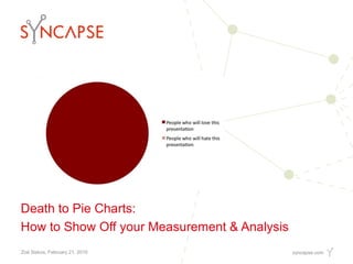
Death to Pie Charts: How to Show Off Your Measurement & Analysis
•
4 likes•1,889 views

Zoe Siskos, Manager, Measurement Science and her presentation at PodCamp Toronto 2010 - Death to Pie Charts

Recommended
Recommended
More Related Content
More from Syncapse
More from Syncapse (7)
Recently uploaded
Recently uploaded (20)
Death to Pie Charts: How to Show Off Your Measurement & Analysis
- 1. Death to Pie Charts: How to Show Off your Measurement & Analysis Zoë Siskos, February 21, 2010
- 2. Agenda 2
- 3. About me
- 4. So what’s your problem with pie charts?
- 5. So what? image byOlly Moss 5
- 7. So what? image by Laszlo Thoth 7
- 8. Pie charts (et al.) are not sophisticated enough for the depth of information we measure. 8
- 9. Your brain likes to categorize things. 9
- 10. Engage your clients the way you would engage their customers. 10
- 11. Info-what?
- 12. Info-what? Infographics: The visual representation of data, information or knowledge. 12
- 13. Info-what? A picture is worth a thousand words. 13
- 14. Info-what? 14
- 15. Info-what? 15
- 16. Info-what? 16
- 17. Don’t Cry for Me Argentina (Evita) 17
- 18. Girl & Boys (Blur) 18
- 19. Should I Stay or Should I Go? (The Clash) 19
- 20. 20
- 21. And how do I do that?
- 22. Know your objective. 22
- 23. Know your information. 23
- 24. Know your audience. 24
- 25. Know what other people are doing. 25
- 26. Know your friends. 26
- 27. What have you done for me lately?
- 28. 28
- 29. Sum it up
- 30. Chose the graphic best suited for your information. Stay inspired. Create. Eat a lot of pie. 30
- 31. Quiz time!
- 32. Quiz Time What did I say that pie charts make me think of? 32
- 33. Thank You Zoë Siskos Manager, Measurement Science Syncapse z.siskos@syncapse.com @zoeDisco
Editor's Notes
- WelcomeHere to show you different ways of communication that brilliant analysis that you come up with
- In case you didn’t catch it my name is Zoe and a Manager of Measurement Science at Syncapse – a technology agency in Toronto My educational background is in health Sciences and Public relations, but it wasn’t until I discovered the wonderful world of blogging that I was introduced to social media as a profession rather than just a hobby. I started doing influencer outreach with brands like Ford, Canadian Tire and SAPI then joined Syncapse June of last year and recently made the move to the Measurement Science dept, where I still spend a lot of my time identifying those influencers but my focus now is on analyzing their behaviours and conversations to provide the best insight to our clients. thank you for joining me
- I don’t have a problem with pie charts. I have a problem with people abusing pie charts.it’s hard to take pie charts seriously now days, they usually make me think of pie. the problem is that most people don’t understand the data they are presenting and therefore don’t understand the best way to represent it which is a shame, bc we spend so much time and effort gathering information and figuring out these brilliant insights, that get lost in translation we need to make sure that our visuals are true representation of the things we are measuring- Like this first example, which does that perfectly…(next slide)
- See? It visualizes what it represents. But what kind of business would you have to be in where this is an adequate chart?Do you see what I mean, when people come up with stuff like this it’s hard to take pie charts seriously.Esp. when things like this happen.
- Shocker – this happened on Fox newsPerfect example of the problem – most people aren’t thinking of the BEST way to display the data they have gatheredThey just get information and put it into a graph without thinking about how they want to communicate to their audienceNow – I am going to show you the most accurate pie chart in the universe
- Ok – this is it, the best, this the jimmihendrix of the pie chart – how can we even try to top this?So, where do we go from here?Let’s try and understand exactly what the problem with pie charts is.
- Simple charts and graphs are for simple pieces of information – page views, visits, membership numbers, moneyBut we are waaay past that when considering web analytics, or at least aiming to be past thatThose types of numbers do not show us the value of our social media programs – they just don’t cut it.We are coming up with way more complex, more rich, much more diverse ways of showing success – so why shouldn’t our charts and graphs follow that same line of thinking?
- We see a Rottweiler, a bulldog, a scottie….we think dogs.It’s how our brains work. Typically, we take in information and sort it away based on pictures and categories – it’s not just one static piece of information. We associate a ton of variables to that piece of informationInforgraphics do that too – bc they use a combo of images, words, and numbers They stimulate both the verbal and the visual.This is why they are so effective in communicating a lot of information at once. Inforgraphics are also very memorable – why?
- Social Media is all about engagement. At least that’s what we sell to our clients.So we have these fancy ways of sharing information (marketing) to customers, and even fancier ways of measuring the success of those campaigns and projects…but when we bring it full circle to our clients we stop short.The right infometric can help us get past that
- I keep saying this word infographics, or infometric…but what is that exactly?
- Familiar with this saying?When done correctly, you can communicate more information in less space and time. And, as I said, it’s more memorable.I am sure that this concept is not new to anyone here. Let’s look at the history of infographics.
- Hieroglyphics are probably some of the first recorded infographics ever. This is not new, actually, you are probably more familiar with infographics than you realize
- http://zebu.uoregon.edu/~imamura/122/images/periodic_table.gifLook familiar? Using symbols, colours, height, and placement – the periodic table tells us a lot about each element.How many words do you think it would take to describe what’s going on here?
- http://techupcoming.com/periodic-table-of-the-internet/Periodic table is such a successful infograph that there is a ton of replicationMemeProbably have seen this before, and it’s not the only parody on the periodic table – there are tons.Another meme, using infographics, was about a year and a half ago.It was mostly on flickr and it encouraged people to submit Song Charts – or charts that described lyrics or titles of popular songs.
- Pic: boyshapedbox [Flickr]Any guesses?
- Pic: boyshapedbox [Flickr]Any guesses?
- Pic: slowburn [Flickr]Any guesses?Even more recently is the meme of social responsibility.
- http://www.good.is/post/design-an-infographic-for-haiti-submissions/ There have been a bunch of infographs about the effects of hati – mostly from a financial perspective.These are also commonly used for public service announcementsOn the train I see the one about the H1N1 flu shot – you call the shot, using a hypodermic needle.Much more effective than just saying “Go get your shot!” and a bunch of facts underneath it.So, what does it take to make a good infograph?
- Creating inforgraphics is not just about science, but obviously art as well. But it’s not impossible and you don’t even have to be an artist to do it.However, as it is with any graph, it’s important to follow a few guidelines to increase your chances of success.
- What is it that you are trying to say?Like I said before, this is forgotten even with simple graphs – add more dimensions and you are liable to have a very confusing diagram that doesn’t say what you want it to say.While you can include a multiple of variables, try to focus on one point – the main thing that you want to get across, and start from there
- Data is king.Is it geographical? Spatial? Chronological? Emotional?These are perfect starting points to help you decide what kind of visuals you need.You want to make sure that it’s relevant so that you don’t confuse your audience.
- Truthfully,infographics aren’t for everyone. They do require a bit more involvement to understand what they are saying, at first. Be considerate of time.
- I’m not saying to rip off ideas but stay current, be inspired, do research.There are a few really great blogs on the subject, some fabulous books as well. This is where those ideas will stem from.
- Don’t just ask the guy you work with who understands the data, and information and your objective. Run you ideas by people who have no idea what you are doing.It will help you keep it simple.What is obvious to you is not obvious to everyone else.
- I wanted to take you thru an example of how we embrace the concept of infographics at syncapse, especially in the Measurement Science dept.I am very fortunate to work with a team of talented and innovative individualsThis type of thinking is very encouraged and really is a part of our culture.
- One of our qualitative measurement tools, that I’ve adapted for podcampThat’s just a screenshot of a portion of it, bc it’s really not meant for the screen.It’s meant to be tangible so I’ve got a few examples going around the room – please share – I didn’t want to print too many, trying to be eco conscious(Handout papers)
- Okay, I know this was not on my stellar agenda but I wanted to surprise you.I have a prize for the person who can correctly answer the question on the next slide.
- Thank youI’ll be here to answer any questions you have but also feel free to contact me thru email or twitterAnd I hope to see some of you at SXSW in a couple of weeks, a few of us from Syncpase are going to be there, so I hope to see you out.