Data visualization using r pt 20140316
•
3 likes•1,188 views

This document discusses data visualization techniques using R and provides 24 examples of different types of plots and graphs that can be created, including calendar heatmaps, bivariate density plots, hexagonal binning, regression plots, jittering, square tiles, table plots, mosaic plots, tree maps, bar plots, pie charts, dashboards, images of matrices, Monte Carlo simulations, parametric curves, area charts, bubble charts, box plots, word clouds, R color palettes, time plots, path plots, conditioning plots, and moving scatterplots. The examples demonstrate how to create informative yet easy to understand graphs using R for data analysis and visualization.

Recommended
Recommended
More Related Content
What's hot
What's hot (20)
More from Myung-Hoe Huh
Data visualization using r pt 20140316
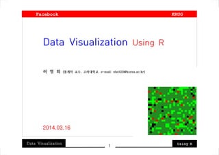
- 1. Data Visualization Using R 1 Data Visualization Using R 허 명 회 (통계학 교수, 고려대학교. e-mail: stat420@korea.ac.kr) 2014.03.16 Facebook KRUG
- 2. Data Visualization Using R 2 : Background and Aim Data Visualization Smart Graphs, Beautiful Pictures 1. Informative, but Easy to Understand 2. Familiar, but Creative 3. Beautiful or “Artistic” Show examples of R pictures : Open source language and software for data analysis
- 3. Data Visualization Using R 3 01. Calendar Heatmap * Data. KOSPI from 2011 to 2013 by days
- 4. Data Visualization Using R 4 02. Bivariate Density * Data. geyser {MASS}
- 5. Data Visualization Using R 5 03. Bivariate Histogram * Data. geyser {MASS}
- 6. Data Visualization Using R 6 04. Hexagonal Binning * Data. NHANES {hexbin},
- 7. Data Visualization Using R 7 05. Regression with Two Predictors * Data. cars {datasets}
- 8. Data Visualization Using R 8 06. Jittering * Data. OrchardSprays {datasets}
- 9. Data Visualization Using R 9 07. Square Tiles * Data. Religion of Korea None 47%, Buddhism 23%, Christian 18%, Catholic 11%, Others 1%
- 10. Data Visualization Using R 10 08. Table Plot * Data. diamonds {ggplot2},
- 11. Data Visualization Using R 11 09. Mosaic Plot * Data. UCBAdmissions {datasets}
- 12. Data Visualization Using R 12 10. Tree Map * Data. GNI2010 {treemap}
- 13. Data Visualization Using R 13 11. Bar Plot * Data. VADeaths {datasets}
- 14. Data Visualization Using R 14 12. Pie Chart * Data. Budget 2012, Korea
- 15. Data Visualization Using R 15 13. Dash Board * Data. c(0.57, 0.79, 0.12, 0.92)
- 16. Data Visualization Using R 16 14. Image of Matrices * Mathematical patterns
- 17. Data Visualization Using R 17 15. Monte Carlo * Simulated from algorithm
- 18. Data Visualization Using R 18 16. Parametric Curves * Simulated from algorithm
- 19. Data Visualization Using R 19 17. Area Chart * Data. "conn.txt"
- 20. Data Visualization Using R 20 18. Bubble Chart * Data. UScrime {MASS}
- 21. Data Visualization Using R 21 19. Box Plot * Data. Korean House of Representatives Electorates
- 22. Data Visualization Using R 22 20. Word Cloud * Data. Korean essay on e-mails
- 23. Data Visualization Using R 23 21. R Colors * Data. Monte Carlo Simulation
- 24. Data Visualization Using R 24 22. Time Plot * Data. Monte Carlo Simulation
- 25. Data Visualization Using R 25 23. Path Plot * economics {ggplot2}
- 26. Data Visualization Using R 26 24. Conditioning Plot * quakes {datasets}
- 27. Data Visualization Using R 27 25. Moving Scatterplot
- 28. Data Visualization Using R 28 : Finale Two Levels of Data Visualization - Analytic Visualization (using advanced mathematics) - Descriptive Visualization
- 29. Data Visualization Using R 29 허 명 회 블 로 그 - http://blog.daum.net/huh420/18 - http://blog.naver.com/huh4200