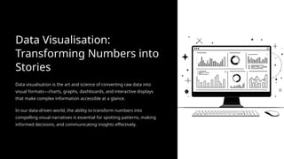
Data Visualisation:
Transforming Numbersinto
Stories
Data visualisation is the art and science of converting raw data into
visual formats—charts, graphs, dashboards, and interactive displays
that make complex information accessible at a glance.
In our data-driven world, the ability to transform numbers into
compelling visual narratives is essential for spotting patterns, making
informed decisions, and communicating insights effectively.
2.
Essential Types ofData Visualisation
Different data sets require different visual approaches. Understanding which visualisation type to use is fundamental to effective
data interpretation and/or communication.
Bar Charts
Perfect for comparing categories and quantities. Ideal when you need to show differences between distinct groups or items.
Line Graphs
Excellent for displaying trends and changes over time. Show how values progress, decline, or fluctuate across periods.
Pie Charts
Best for showing proportions and parts of a whole. Use when demonstrating how components contribute to the total.
Scatter Plots
Reveal relationships between two variables. Perfect for identifying correlations, clusters, and outliers in your data.
3.
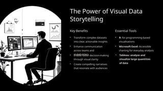
The Power ofVisual Data
Storytelling
Key Benefits
• Transform complex datasets
into clear, actionable insights
• Enhance communication
across teams and
stakeholders
• Enable faster decision-making
through visual clarity
• Create compelling narratives
that resonate with audiences
Essential Tools
• R: for programming-based
visualisations
• Microsoft Excel: Accessible
charting for everyday analysis
• Tableau: analyze and
visualize large quantities
of data
4.
Getting Started withData
Visualization
Embarking on your data visualization journey is simpler than you think. Follow
these fundamental steps to create impactful visuals from your data.
01
Know Your Data
02
Define Your Message
03
Select the Right Chart
04
Keep it Clean
05
Provide Context


![[DSC Europe 25] Ivan Lukovic & Marija Djukic - From Data to Value: Why Maturi...](https://cdn.slidesharecdn.com/ss_thumbnails/ahrfps8xr6knowwhacxh-1-ivan-marija-dsc-2025-ld-v1-presentation-260115093812-be21adfc-thumbnail.jpg?width=640&height=640&fit=bounds)


![[DSC Europe 25] Mijat Kustudic - Building Financial Intelligence with AI Agen...](https://cdn.slidesharecdn.com/ss_thumbnails/38y2lb5lse6wstegtvas-3-mijat-kustudic-building-financial-intelligence-with-ai-agents-260114111931-1a4783ce-thumbnail.jpg?width=640&height=640&fit=bounds)

![[DSC Europe 25] Srba Markovic - From Pilot to Production: Overcoming AI Deplo...](https://cdn.slidesharecdn.com/ss_thumbnails/yjjmrtytmwbalxlba7px-4-srba-markovic-from-pilot-to-production-overcoming-ai-deployment-blockers-with-260114111931-4a892d44-thumbnail.jpg?width=640&height=640&fit=bounds)


![[DSC Europe 25] Stefan Brankovic - #ResumeIsDead. AI-Powered Interviews and C...](https://cdn.slidesharecdn.com/ss_thumbnails/qnmbsv0xq3uysdrq3sev-2-stefan-brankovic-job-bolt-260114111931-a065aa3d-thumbnail.jpg?width=640&height=640&fit=bounds)


![[DSC Europe 25] Slobodan Dolinic - Smart and Intelligent Green Region.pptx](https://cdn.slidesharecdn.com/ss_thumbnails/0bribinjsp6ghwtvsvor-2-sigre-slobodan-dolinic-260115093812-c9c10e90-thumbnail.jpg?width=640&height=640&fit=bounds)


![[DSC Europe 25] Nikola Vasiljevic - Player segmentation by combat playstyles ...](https://cdn.slidesharecdn.com/ss_thumbnails/mnvbf0yvrwaqsipzrrv3-2-nikola-vasiljevic-player-segmentation-by-playstyles-in-action-shooter-games-260114111931-b4d766cd-thumbnail.jpg?width=640&height=640&fit=bounds)