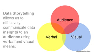
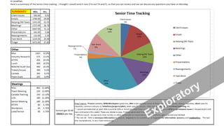
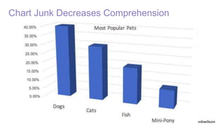
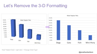
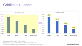
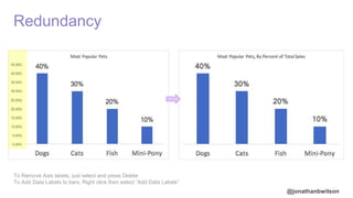
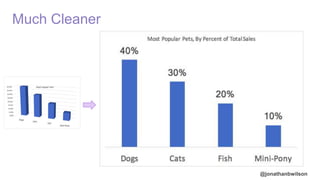
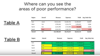
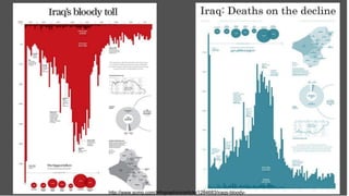
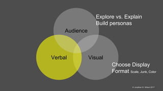
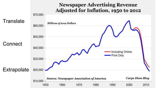
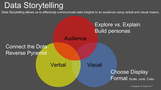
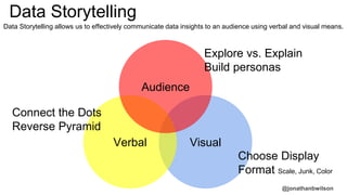
@jonathanbwilson
Data Storytelling for
Digital Marketers
Jonathan B. Wilson
DS-Chicago
10/24/2017
@jonathanbwilson
Reference
Berinato, Scott. Good Charts: The HBR Guide to Making Smarter, More Persuasive Data Visualizations
Yau, Nathan. Data Points: Visualization That Means Something
Provost, Foster; Fawcett, Tom. Data Science for Business: What you need to know about data mining and data-
analytic thinking
Tufte, Edward R., Envisioning Information
Knaflic, Cole Nussbaumer. Storytelling with Data
Kaushik, Avinash. Web Analytics 2.0: The Art of Online Accountability and Science of Customer Centricity 2009
Kaushik, Avinash. Web Analytics 2007
Susan N. Friel, Frances R. Curcio and George W. Bright. Making Sense of Graphis: Critical Factors Influencing
Comprehension and Instructional Implications, Journal for Research in Mathematics Education, Vol. 32, No. 2 (Mar., 2001),
pp. 124-158
@jonathanbwilson
@jonathanbwilson
@jonathanbwilson
“Visual
communication is
a must-have skill
for all managers...”
Harvard Business Review, June 2016; Visualizations that Really Work, Scott Barinato; https://hbr.org/2016/06/visualizations-that-really-work
@jonathanbwilson
Data Storytelling
allows us to
effectively
communicate data
insights to an
audience using
verbal and visual
means.
VisualVerbal
Audience
@jonathanbwilson© Jonathan B. Wilson 2017
VisualVerbal
Audience
@jonathanbwilson
Pilot vs. Mobile App
Exploratory vs. Explanatory
@jonathanbwilson
@jonathanbwilson
Senior Time Tracking, As a Percentage of Total Hours Worked (10/2 - 10/13)
I recommend we further investigate opportunities to reduce meetings and increase evaluations.
@jonathanbwilson
Explanatory
Exploratory
Simple: Segment Data Audience by Job Title
Refined
Insights
Strategic
Articulated Causality
Recommendations
Colloquial
Shoutout to Avinash Kaushik
@jonathanbwilson
@jonathanbwilson
@jonathanbwilson
Result: Data Personas
Competency Definition In-House Marketing
Manager
Business Owner
Verbal Jargon, terminology, definitions Explore Explain
Visual Understand complex visualizations Explain/Explore Explain
Subject Expertise KPIs, priority, causality Explain Explain
Accessibility Where are reviewing reporting? Desktop, at Office Mobile, In-Field
Goal Why are they reading report? Performance, Boss Value, $
Dramatization
@jonathanbwilson© Jonathan B. Wilson 2017
VisualVerbal
Audience
Explore vs. Explain
Build personas
@jonathanbwilson
Break Rules, but You Must Know The Rules First!
Man in a Beret by Picasso, aged
@jonathanbwilson
Data Visualization Tools: It’s the “Think” not the Ink.
$$$ $$$
Simple
Complex
@jonathanbwilson© Jonathan B. Wilson 2017
Choose
Appropriate
Display
@jonathanbwilson
Andrew Abela
@jonathanbwilson
Which Chart is More Efficient?
A B
@jonathanbwilson
Which Visual is More Efficient?
A B
40%
Voted for Dogs.
@jonathanbwilson© Jonathan B. Wilson 2017
Format
○Scale
○Chart Junk
○Color
@jonathanbwilson
Any
News
Corp
@jonathanbwilson
Which Chart is More Accurate?
A B
@jonathanbwilson© Jonathan B. Wilson 2017
Format
○Scale
○Chart Junk
○Color
@jonathanbwilson
Which Chart is Easier to Read?
BA
@jonathanbwilson
Chart Junk Decreases Comprehension
@jonathanbwilson
Let’s Remove the 3-D Formatting
How? Select Chart > right click > “Change Chart Type”
@jonathanbwilson
Gridlines + Labels
To Remove Grids, Select, Press “Delete”
To Add Data Labels, right click bars, click “Add Data Labels”
To enlarge data labels, select, then adjust Font Size under Home Menu
@jonathanbwilson
Redundancy
To Remove Axis labels, just select and press Delete
To Add Data Labels to bars, Right click then select “Add Data Labels”
@jonathanbwilson
Much Cleaner
@jonathanbwilson© Jonathan B. Wilson 2017
Format
○Scale
○Chart Junk
○Color
@jonathanbwilson
@jonathanbwilson
@jonathanbwilson
@jonathanbwilsonhttp://www.scmp.com/infographics/article/1284683/iraqs-bloody-
@jonathanbwilson© Jonathan B. Wilson 2017
VisualVerbal
Audience
Choose Display
Format Scale, Junk, Color
Explore vs. Explain
Build personas
@jonathanbwilson
Narratives Are Sticky
@jonathanbwilson© Jonathan B. Wilson 2017
Connect the Dots
@jonathanbwilson
ExtrapolateTranslate Connect
@jonathanbwilson
Extrapolate
Translate
Connect
@jonathanbwilson© Jonathan B. Wilson 2017
Reverse Pyramid
@jonathanbwilson
Assume Audience Will Only Read Headline
@jonathanbwilson
Test Reverse Pyramid Headline: CTR, Full Scroll, Open Attachment
@jonathanbwilson© Jonathan B. Wilson 2017
Data Storytelling allows us to effectively communicate data insights to an audience using verbal and visual means.
Data Storytelling
VisualVerbal
Audience
Connect the Dots
Reverse Pyramid
Choose Display
Format Scale, Junk, Color
Explore vs. Explain
Build personas
@jonathanbwilson
Use These Powers For Good!
@jonathanbwilson© Jonathan B. Wilson 2017
Thank You
Jonathan B. Wilson
Twitter: @jonathanbwilson
Email: me@iamjonathanwilson
Linkedin.com/digitaldominator
@jonathanbwilson
VisualVerbal
Audience
Data Storytelling allows us to effectively communicate data insights to an audience using verbal and visual means.
Data Storytelling
Connect the Dots
Reverse Pyramid
Choose Display
Format Scale, Junk, Color
Explore vs. Explain
Build personas

Data Storytelling for Digital Marketers