COURSE OBJECTIVES:
• Tounderstand techniques and processes of data science.
• Learn and describe the relationship between data.
• Outline an overview of exploratory data analysis.
• Utilize the Python libraries for Data Wrangling.
• Interpret data using visualization techniques in Python.
3.
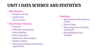
UNIT I DATASCIENCE AND STATISTICS
• Data Science:
• Benefits and uses.
• Applications
• Facets of data.
• Data Science Process:
• Overview.
• Defining research goals.
• Retrieving Data.
• Data Preparation.
• Exploratory Data Analysis
• Build the Model.
• Presenting Findings and Building
Applications.
• Statistics
• Basic Statistical Descriptions
of Data
• Types of Data
• Describing Data with Tables
and Graphs
• Describing Data with
Averages.
4.
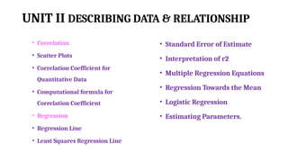
UNIT II DESCRIBINGDATA & RELATIONSHIP
• Correlation
• Scatter Plots
• Correlation Coefficient for
Quantitative Data
• Computational formula for
Correlation Coefficient
• Regression
• Regression Line
• Least Squares Regression Line
• Standard Error of Estimate
• Interpretation of r2
• Multiple Regression Equations
• Regression Towards the Mean
• Logistic Regression
• Estimating Parameters.
5.
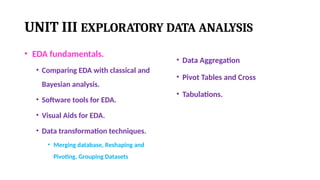
UNIT III EXPLORATORYDATA ANALYSIS
• EDA fundamentals.
• Comparing EDA with classical and
Bayesian analysis.
• Software tools for EDA.
• Visual Aids for EDA.
• Data transformation techniques.
• Merging database, Reshaping and
Pivoting, Grouping Datasets
• Data Aggregation
• Pivot Tables and Cross
• Tabulations.
6.
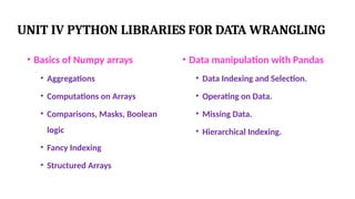
UNIT IV PYTHONLIBRARIES FOR DATA WRANGLING
• Basics of Numpy arrays
• Aggregations
• Computations on Arrays
• Comparisons, Masks, Boolean
logic
• Fancy Indexing
• Structured Arrays
• Data manipulation with Pandas
• Data Indexing and Selection.
• Operating on Data.
• Missing Data.
• Hierarchical Indexing.
7.
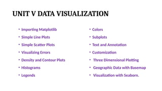
UNIT V DATAVISUALIZATION
• Importing Matplotlib
• Simple Line Plots
• Simple Scatter Plots
• Visualizing Errors
• Density and Contour Plots
• Histograms
• Legends
• Colors
• Subplots
• Text and Annotation
• Customization
• Three Dimensional Plotting
• Geographic Data with Basemap
• Visualization with Seaborn.
8.
COURSE OUTCOMES:
CO1:Understand thedata science process and different types of data
description.
CO2: Analyze the relationship between data using statistics.
CO3: Perform fundamental exploratory data analysis on dataset.
CO4:Handle data using primary tools used for data science in Python.
CO5: Apply visualization Libraries in Python to interpret and explore
data.
9.
Books
TEXTBOOKS:
1. Davy Cielen,Arno D. B. Meysman, and Mohamed Ali, “Introducing Data Science”, Manning
Publications, 2016.
2. Robert S. Witte and John S. Witte, “Statistics”, Eleventh Edition, Wiley Publications, 2017.
REFERENCE:
3. Sanjeev J. Wagh, Manisha S. Bhende, Anuradha D. Thakare, “Fundamentals of Data Science”,
CRC Press, 2022.
4. Jake VanderPlas, “Python Data Science Handbook”, O’Reilly, 2016.
5. Allen B. Downey, “Think Stats: Exploratory Data Analysis in Python”, Green Tea Press,2014.
6. Matthew O. Ward, Georges Grinstein, Daniel Keim, “Interactive Data Visualization:
Foundations, Techniques, and Applications”, 2nd Edition, CRC press, 2015.
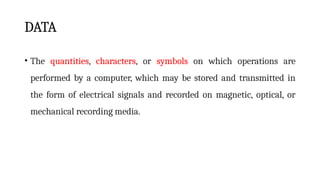
DATA
• The quantities,characters, or symbols on which operations are
performed by a computer, which may be stored and transmitted in
the form of electrical signals and recorded on magnetic, optical, or
mechanical recording media.
12.
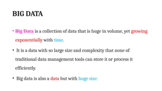
BIG DATA
• BigData is a collection of data that is huge in volume, yet growing
exponentially with time.
• It is a data with so large size and complexity that none of
traditional data management tools can store it or process it
efficiently.
• Big data is also a data but with huge size.
14.
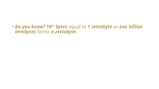
• Do youknow? 1021
bytes equal to 1 zettabyte or one billion
terabytes forms a zettabyte.
15.
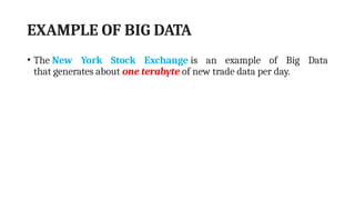
EXAMPLE OF BIGDATA
• The New York Stock Exchange is an example of Big Data
that generates about one terabyte of new trade data per day.
16.
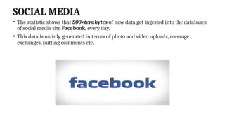
SOCIAL MEDIA
• Thestatistic shows that 500+terabytes of new data get ingested into the databases
of social media site Facebook, every day.
• This data is mainly generated in terms of photo and video uploads, message
exchanges, putting comments etc.
17.
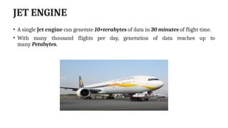
JET ENGINE
• Asingle Jet engine can generate 10+terabytes of data in 30 minutes of flight time.
• With many thousand flights per day, generation of data reaches up to
many Petabytes.
18.
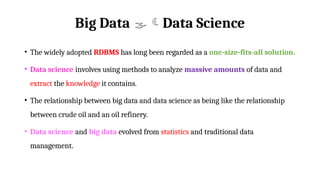
Big Data DataScience
• The widely adopted RDBMS has long been regarded as a one-size-fits-all solution.
• Data science involves using methods to analyze massive amounts of data and
extract the knowledge it contains.
• The relationship between big data and data science as being like the relationship
between crude oil and an oil refinery.
• Data science and big data evolved from statistics and traditional data
management.
19.
• The characteristicsof big data are often referred to as the three Vs:
• Volume—How much data is there?
• Variety—How diverse are different types of data?
• Velocity—At what speed is new data generated?
These characteristics are complemented with a fourth V,
• Veracity: How accurate is the data?
• These four properties make big data different from the data found in traditional
data management tools.
20.
• Consequently, thechallenges are almost in every aspect:
• Data capture,
• Curation,
• Storage,
• Search,
• Sharing,
• Transfer,
• Visualization.
• In addition, big data calls for specialized techniques to extract the insights.
21.
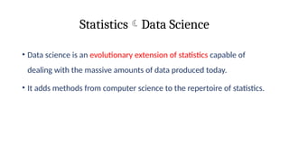
StatisticsData Science
• Datascience is an evolutionary extension of statistics capable of
dealing with the massive amounts of data produced today.
• It adds methods from computer science to the repertoire of statistics.
22.
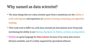
Why named asdata scientist?
• The main things that set a data scientist apart from a statistician are the ability to
work with big data and experience in machine learning, computing, and algorithm
building.
• Their tools tend to differ too, with data scientist job descriptions more frequently
mentioning the ability to use Hadoop, Pig, Spark, R, Python, and Java, among others.
• Python is a great language for data science because it has many data science
libraries available, and it’s widely supported by specialized software.
23.
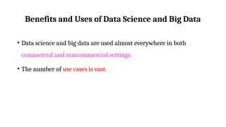
Benefits and Usesof Data Science and Big Data
• Data science and big data are used almost everywhere in both
commercial and noncommercial settings.
• The number of use cases is vast.
24.
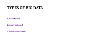
TYPES OF BIGDATA
1.Structured
2.Unstructured
3.Semi-structured
25.
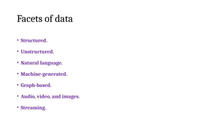
Facets of data
•Structured.
• Unstructured.
• Natural language.
• Machine-generated.
• Graph-based.
• Audio, video, and images.
• Streaming.
26.
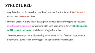
STRUCTURED
• Any datathat can be stored, accessed and processed in the form of fixed format is
termed as a ‘structured’ data.
• Over the period of time, talent in computer science has achieved greater success in
developing techniques for working with such kind of data (where the format is
well known in advance) and also deriving value out of it.
• However, nowadays, we are foreseeing issues when a size of such data grows to a
huge extent, typical sizes are being in the rage of multiple zettabytes.
27.
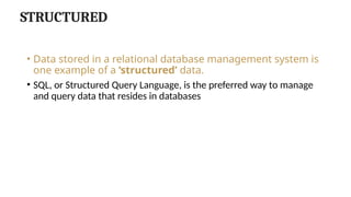
STRUCTURED
• Data storedin a relational database management system is
one example of a ‘structured’ data.
• SQL, or Structured Query Language, is the preferred way to manage
and query data that resides in databases
28.
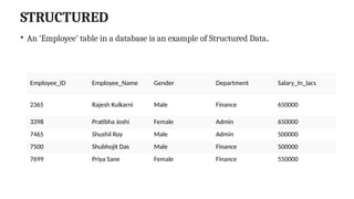
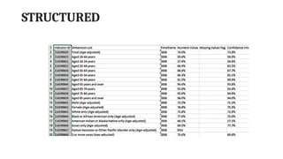
STRUCTURED
• An ‘Employee’table in a database is an example of Structured Data.
Employee_ID Employee_Name Gender Department Salary_In_lacs
2365 Rajesh Kulkarni Male Finance 650000
3398 Pratibha Joshi Female Admin 650000
7465 Shushil Roy Male Admin 500000
7500 Shubhojit Das Male Finance 500000
7699 Priya Sane Female Finance 550000
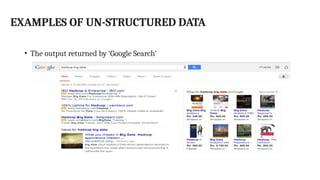
UNSTRUCTURED
• Any datawith unknown form or the structure is classified as unstructured data.
• In addition to the size being huge, un-structured data poses multiple challenges in terms of
its processing for deriving value out of it.
• A typical example of unstructured data is a
• Heterogeneous data source containing a combination of simple text files, images, videos etc.
• Now day organizations have wealth of data available with them but unfortunately, they don’t
know how to derive value out of it since this data is in its raw form or unstructured format.
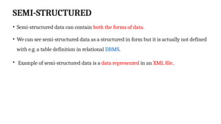
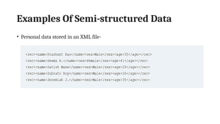
SEMI-STRUCTURED
• Semi-structured datacan contain both the forms of data.
• We can see semi-structured data as a structured in form but it is actually not defined
with e.g. a table definition in relational DBMS.
• Example of semi-structured data is a data represented in an XML file.
Natural language
• Naturallanguage is a special type of unstructured data; it’s challenging to
process because it requires knowledge of specific data science techniques
and linguistics.
• The natural language processing community has had success in entity
recognition, topic recognition, summarization, text completion, and sentiment
analysis, but models trained in one domain don’t generalize well to other
domains.
35.
Natural language
• Thisshouldn’t be a surprise though: Humans struggle with natural language
as well.
• It’s ambiguous by nature.
• The concept of meaning itself is questionable here.
• Have two people listen to the same conversation.
• Will they get the same meaning? The meaning of the same words can vary
when coming from someone upset or joyous.
36.
Machine-Generated Data
• Machine-generateddata is information that’s automatically created by a
computer, process, application, or other machine without human
intervention.
• Machine-generated data is becoming a major data resource and will
continue to do so.
• Wikibon has forecast that the market value of the industrial Internet will
be approximately $540 billion in 2020.
37.
Machine-Generated Data
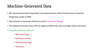
• IDC(International Data Corporation) has estimated there will be 26 times more connected
things than people in 2020.
• This network is commonly referred to as the Internet of Things.
• The analysis of machine data relies on highly scalable tools, due to its high volume and speed.
• Examples of machine data are
• Web server logs,
• Call detail records,
• Network event logs,
• Telemetry
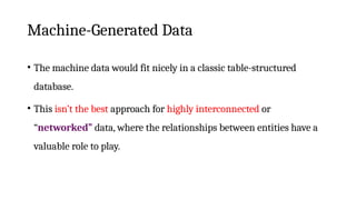
Machine-Generated Data
• Themachine data would fit nicely in a classic table-structured
database.
• This isn’t the best approach for highly interconnected or
“networked” data, where the relationships between entities have a
valuable role to play.
40.
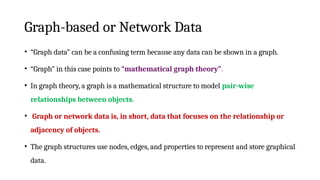
Graph-based or NetworkData
• “Graph data” can be a confusing term because any data can be shown in a graph.
• “Graph” in this case points to “mathematical graph theory”.
• In graph theory, a graph is a mathematical structure to model pair-wise
relationships between objects.
• Graph or network data is, in short, data that focuses on the relationship or
adjacency of objects.
• The graph structures use nodes, edges, and properties to represent and store graphical
data.
41.
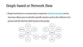
Graph-based or NetworkData
• Graph-based data is a natural way to represent social networks, and its
structure allows you to calculate specific metrics such as the influence of a
person and the shortest path between two people.
42.
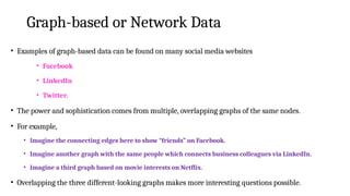
Graph-based or NetworkData
• Examples of graph-based data can be found on many social media websites
• Facebook
• LinkedIn
• Twitter.
• The power and sophistication comes from multiple, overlapping graphs of the same nodes.
• For example,
• Imagine the connecting edges here to show “friends” on Facebook.
• Imagine another graph with the same people which connects business colleagues via LinkedIn.
• Imagine a third graph based on movie interests on Netflix.
• Overlapping the three different-looking graphs makes more interesting questions possible.
43.
Graph-based or NetworkData
• Graph databases are used to store graph-based data and are queried with
specialized query languages such as SPARQL.
• Graph data poses its challenges, but for a computer interpreting additive and
image data, it can be even more difficult.
44.
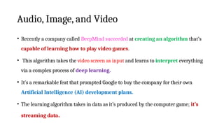
Audio, Image, andVideo
• Audio, image, and video are data types that pose specific challenges to a data scientist.
• Tasks that are trivial for humans, such as recognizing objects in pictures, turn out to
be challenging for computers.
• MLBAM (Major League Baseball Advanced Media) announced in 2014 that
they’ll increase video capture to approximately 7 TB per game for the purpose
of live, in-game analytics.
• High-speed cameras at stadiums will capture ball and athlete movements to calculate
in real time, for example, the path taken by a defender relative to two baselines.
45.
Audio, Image, andVideo
• Recently a company called DeepMind succeeded at creating an algorithm that’s
capable of learning how to play video games.
• This algorithm takes the video screen as input and learns to interpret everything
via a complex process of deep learning.
• It’s a remarkable feat that prompted Google to buy the company for their own
Artificial Intelligence (AI) development plans.
• The learning algorithm takes in data as it’s produced by the computer game; it’s
streaming data.
46.
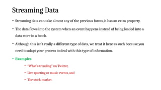
Streaming Data
• Streamingdata can take almost any of the previous forms, it has an extra property.
• The data flows into the system when an event happens instead of being loaded into a
data store in a batch.
• Although this isn’t really a different type of data, we treat it here as such because you
need to adapt your process to deal with this type of information.
• Examples
• “What’s trending” on Twitter,
• Live sporting or music events, and
• The stock market.
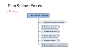
Data Science Process
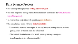
•The first step of this process is setting a research goal.
• The main purpose is making sure all the stakeholders understand the what, how, and
why of the project.
• In every serious project this will result in a project charter.
• The second phase is data retrieval- Data Availability
• To have data available for analysis, so this step includes finding suitable data and
getting access to the data from the data owner.
• The result is data in its raw form, which probably needs polishing and
transformation before it becomes usable.
50.
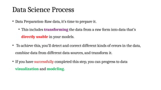
Data Science Process
•Data Preparation-Raw data, it’s time to prepare it.
• This includes transforming the data from a raw form into data that’s
directly usable in your models.
• To achieve this, you’ll detect and correct different kinds of errors in the data,
combine data from different data sources, and transform it.
• If you have successfully completed this step, you can progress to data
visualization and modeling.
51.
Data Science Process
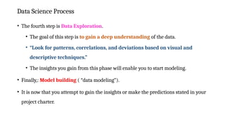
•The fourth step is Data Exploration.
• The goal of this step is to gain a deep understanding of the data.
• “Look for patterns, correlations, and deviations based on visual and
descriptive techniques.”
• The insights you gain from this phase will enable you to start modeling.
• Finally,: Model building ( “data modeling”).
• It is now that you attempt to gain the insights or make the predictions stated in your
project charter.
52.
Data Science Process
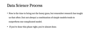
•Now is the time to bring out the heavy guns, but remember research has taught
us that often (but not always) a combination of simple models tends to
outperform one complicated model.
• If you’ve done this phase right, you’re almost done.
53.
Data Science Process
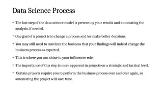
•The last step of the data science model is presenting your results and automating the
analysis, if needed.
• One goal of a project is to change a process and/or make better decisions.
• You may still need to convince the business that your findings will indeed change the
business process as expected.
• This is where you can shine in your influencer role.
• The importance of this step is more apparent in projects on a strategic and tactical level.
• Certain projects require you to perform the business process over and over again, so
automating the project will save time.
54.
Setting the ResearchGoal
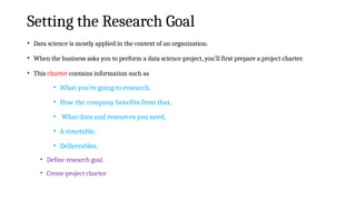
• Data science is mostly applied in the context of an organization.
• When the business asks you to perform a data science project, you’ll first prepare a project charter.
• This charter contains information such as
• What you’re going to research,
• How the company benefits from that,
• What data and resources you need,
• A timetable,
• Deliverables.
• Define research goal.
• Create project charter.
55.
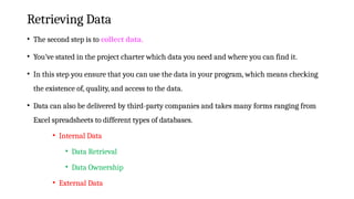
Retrieving Data
• Thesecond step is to collect data.
• You’ve stated in the project charter which data you need and where you can find it.
• In this step you ensure that you can use the data in your program, which means checking
the existence of, quality, and access to the data.
• Data can also be delivered by third-party companies and takes many forms ranging from
Excel spreadsheets to different types of databases.
• Internal Data
• Data Retrieval
• Data Ownership
• External Data
56.
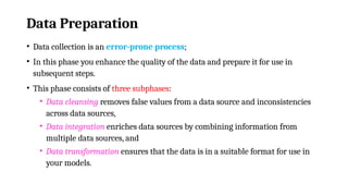
Data Preparation
• Datacollection is an error-prone process;
• In this phase you enhance the quality of the data and prepare it for use in
subsequent steps.
• This phase consists of three subphases:
• Data cleansing removes false values from a data source and inconsistencies
across data sources,
• Data integration enriches data sources by combining information from
multiple data sources, and
• Data transformation ensures that the data is in a suitable format for use in
your models.
57.
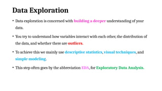
Data Exploration
• Dataexploration is concerned with building a deeper understanding of your
data.
• You try to understand how variables interact with each other, the distribution of
the data, and whether there are outliers.
• To achieve this we mainly use descriptive statistics, visual techniques, and
simple modeling.
• This step often goes by the abbreviation EDA, for Exploratory Data Analysis.
58.
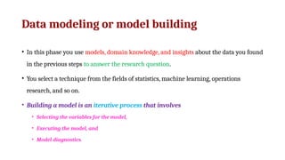
Data modeling ormodel building
• In this phase you use models, domain knowledge, and insights about the data you found
in the previous steps to answer the research question.
• You select a technique from the fields of statistics, machine learning, operations
research, and so on.
• Building a model is an iterative process that involves
• Selecting the variables for the model,
• Executing the model, and
• Model diagnostics.
59.
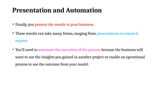
Presentation and Automation
•Finally, you present the results to your business.
• These results can take many forms, ranging from presentations to research
reports.
• You’ll need to automate the execution of the process because the business will
want to use the insights you gained in another project or enable an operational
process to use the outcome from your model.
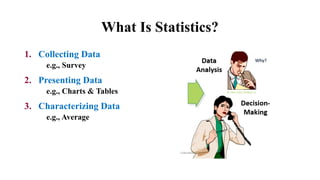
What Is Statistics?
1.Collecting Data
e.g., Survey
2. Presenting Data
e.g., Charts & Tables
3. Characterizing Data
e.g., Average
62.
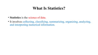
What Is Statistics?
•Statistics is the science of data.
• It involves collecting, classifying, summarizing, organizing, analyzing,
and interpreting numerical information.
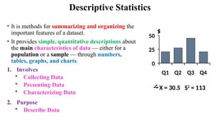
Descriptive Statistics
• Itis methods for summarizing and organizing the
important features of a dataset.
• It provides simple, quantitative descriptions about
the main characteristics of data — either for a
population or a sample — through numbers,
tables, graphs, and charts.
1. Involves
• Collecting Data
• Presenting Data
• Characterizing Data
2. Purpose
• Describe Data
X = 30.5 S2
= 113
0
25
50
Q1 Q2 Q3 Q4
$
67.
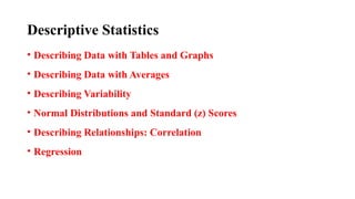
Descriptive Statistics
• DescribingData with Tables and Graphs
• Describing Data with Averages
• Describing Variability
• Normal Distributions and Standard (z) Scores
• Describing Relationships: Correlation
• Regression
68.
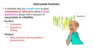
• A methodsthat use sample data to draw
conclusions or inferences about a larger
population, along with a measure of
uncertainty or reliability.
• Involves
• Estimation
• Hypothesis
Testing
• Purpose
• Make decisions about population
characteristics
Inferential Statistics
Population?
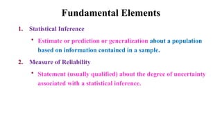
Fundamental Elements
1. StatisticalInference
• Estimate or prediction or generalization about a population
based on information contained in a sample.
2. Measure of Reliability
• Statement (usually qualified) about the degree of uncertainty
associated with a statistical inference.
72.
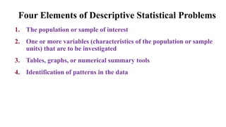
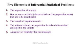
Four Elements ofDescriptive Statistical Problems
1. The population or sample of interest
2. One or more variables (characteristics of the population or sample
units) that are to be investigated
3. Tables, graphs, or numerical summary tools
4. Identification of patterns in the data
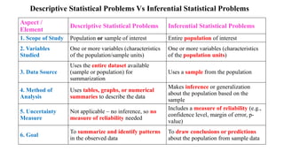
Descriptive Statistical ProblemsVs Inferential Statistical Problems
Aspect /
Element
Descriptive Statistical Problems Inferential Statistical Problems
1. Scope of Study Population or sample of interest Entire population of interest
2. Variables
Studied
One or more variables (characteristics
of the population/sample units)
One or more variables (characteristics
of the population units)
3. Data Source
Uses the entire dataset available
(sample or population) for
summarization
Uses a sample from the population
4. Method of
Analysis
Uses tables, graphs, or numerical
summaries to describe the data
Makes inference or generalization
about the population based on the
sample
5. Uncertainty
Measure
Not applicable – no inference, so no
measure of reliability needed
Includes a measure of reliability (e.g.,
confidence level, margin of error, p-
value)
6. Goal
To summarize and identify patterns
in the observed data
To draw conclusions or predictions
about the population from sample data
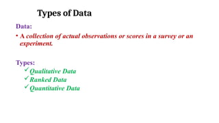
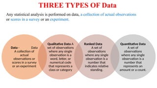
Types of Data
Data:
•A collection of actual observations or scores in a survey or an
experiment.
Types:
Qualitative Data
Ranked Data
Quantitative Data
77.
THREE TYPES OFData
Data - Data
A collection of
actual
observations or
scores in a survey
or an experiment
Qualitative Data A
set of observations
where any single
observation is a
word, letter, or
numerical code
that represents a
class or category
Ranked Data
A set of
observations
where any single
observation is a
number that
indicates relative
standing.
Quantitative Data
A set of
observations
where any single
observation is a
number that
represents an
amount or a count.
Any statistical analysis is performed on data, a collection of actual observations
or scores in a survey or an experiment.
78.
Types of Data
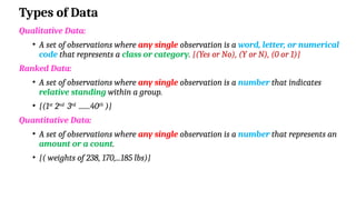
QualitativeData:
• A set of observations where any single observation is a word, letter, or numerical
code that represents a class or category. {(Yes or No), (Y or N), (0 or 1)}
Ranked Data:
• A set of observations where any single observation is a number that indicates
relative standing within a group.
• {(1st
2nd
3rd
.......40th
)}
Quantitative Data:
• A set of observations where any single observation is a number that represents an
amount or a count.
• {( weights of 238, 170,...185 lbs)}
79.
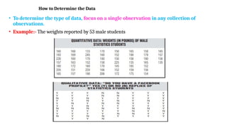
How to Determinethe Data
• To determine the type of data, focus on a single observation in any collection of
observations.
• Example:- The weights reported by 53 male students
80.
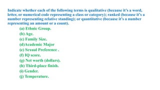
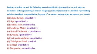
Indicate whether eachof the following terms is qualitative (because it’s a word,
letter, or numerical code representing a class or category); ranked (because it’s a
number representing relative standing); or quantitative (because it’s a number
representing an amount or a count).
(a) Ethnic Group.
(b) Age.
(c) Family Size.
(d)Academic Major
(e) Sexual Preference .
(f) IQ score.
(g) Net worth (dollars).
(h) Third-place finish.
(i) Gender.
(j) Temperature.
81.
Indicate whether eachof the following terms is qualitative (because it’s a word, letter, or
numerical code representing a class or category); ranked (because it’s a number representing
relative standing); or quantitative (because it’s a number representing an amount or a count).
(a) Ethnic Group.- qualitative
(b) Age.-quantitative
(c) Family Size.-quantitative
(d)Academic Major- qualitative
(e) Sexual Preference .- qualitative
(f) IQ score.-quantitative
(g) Net worth (dollars).-quantitative
(h) Third-place finish.-ranked
(i) Gender.-qualitative
(j) Temperature.-quantitative
82.
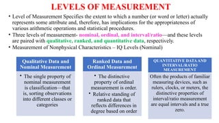
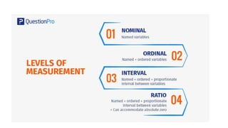
LEVELS OF MEASUREMENT
•Level of Measurement Specifies the extent to which a number (or word or letter) actually
represents some attribute and, therefore, has implications for the appropriateness of
various arithmetic operations and statistical procedures.
• Three levels of measurement- nominal, ordinal, and interval/ratio—and these levels
are paired with qualitative, ranked, and quantitative data, respectively.
• Measurement of Nonphysical Characteristics – IQ Levels (Nominal)
Qualitative Data and
Nominal Measurement
• The single property of
nominal measurement
is classification—that
is, sorting observations
into different classes or
categories
Ranked Data and
Ordinal Measurement
• The distinctive
property of ordinal
measurement is order.
• Relative standing of
ranked data that
reflects differences in
degree based on order
QUANTITATIVE DATAAND
INTERVAL/RATIO
MEASUREMENT
Often the products of familiar
measuring devices, such as
rulers, clocks, or meters, the
distinctive properties of
interval/ratio measurement
are equal intervals and a true
zero.
85.
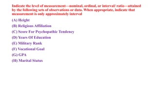
Indicate the levelof measurement—nominal, ordinal, or interval/ ratio—attained
by the following sets of observations or data. When appropriate, indicate that
measurement is only approximately interval
(A) Height
(B) Religious Affiliation
(C) Score For Psychopathic Tendency
(D) Years Of Education
(E) Military Rank
(F) Vocational Goal
(G) GPA
(H) Marital Status
86.
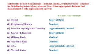
Indicate the levelof measurement—nominal, ordinal, or interval/ ratio—attained
by the following sets of observations or data. When appropriate, indicate that
measurement is only approximately interval
Variable Level of Measurement
(a) Height Interval/Ratio
(b) Religious Affiliation Nominal
(c) Score for Psychopathic Tendency Approximately Interval
(d) Years of Education Interval/Ratio
(e) Military Rank Ordinal
(f) Vocational Goal Nominal
(g) GPA Approximately Interval
(h) Marital Status Nominal
87.
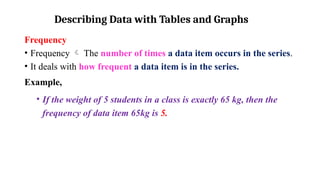
Describing Data withTables and Graphs
Frequency
• Frequency The number of times a data item occurs in the series.
• It deals with how frequent a data item is in the series.
Example,
• If the weight of 5 students in a class is exactly 65 kg, then the
frequency of data item 65kg is 5.
88.
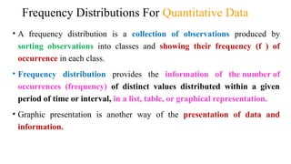
Frequency Distributions ForQuantitative Data
• A frequency distribution is a collection of observations produced by
sorting observations into classes and showing their frequency (f ) of
occurrence in each class.
• Frequency distribution provides the information of the number of
occurrences (frequency) of distinct values distributed within a given
period of time or interval, in a list, table, or graphical representation.
• Graphic presentation is another way of the presentation of data and
information.
89.
Frequency Distributions
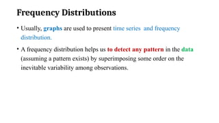
• Usually,graphs are used to present time series and frequency
distribution.
• A frequency distribution helps us to detect any pattern in the data
(assuming a pattern exists) by superimposing some order on the
inevitable variability among observations.
90.
Frequency Distribution
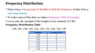
• Manytimes, it is not easy or feasible to find the frequency of data from a
very large dataset.
• To make sense of the data we make a frequency table and graphs.
• Let us take the example of the heights of ten students in CMs.
Frequency Distribution Table
139, 145, 150, 145, 136, 150, 152, 144, 138, 138
91.
Guidelines For FrequencyDistributions
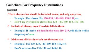
Essential
Each observation should be included in one, and only one, class.
• Example: Use classes like 130–139, 140–149, 150–159, etc.
• Don’t use overlapping classes like 130–140, 140–150, 150–160.
Include all classes, even if no data falls in them.
• Example: If there’s no data in the class 210–219, still list it with a
frequency of zero.
Make sure all class intervals are the same size.
• Example: Use 130–139, 140–149, 150–159, etc.
• Don’t mix sizes like 130–139 and 140–159.
92.
Optional
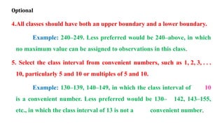
4.All classes shouldhave both an upper boundary and a lower boundary.
Example: 240–249. Less preferred would be 240–above, in which
no maximum value can be assigned to observations in this class.
5. Select the class interval from convenient numbers, such as 1, 2, 3, . . .
10, particularly 5 and 10 or multiples of 5 and 10.
Example: 130–139, 140–149, in which the class interval of 10
is a convenient number. Less preferred would be 130– 142, 143–155,
etc., in which the class interval of 13 is not a convenient number.
93.
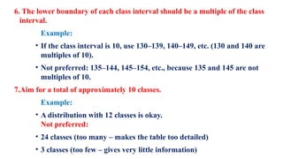
6. The lowerboundary of each class interval should be a multiple of the class
interval.
Example:
• If the class interval is 10, use 130–139, 140–149, etc. (130 and 140 are
multiples of 10).
• Not preferred: 135–144, 145–154, etc., because 135 and 145 are not
multiples of 10.
7.Aim for a total of approximately 10 classes.
Example:
• A distribution with 12 classes is okay.
Not preferred:
• 24 classes (too many – makes the table too detailed)
• 3 classes (too few – gives very little information)
94.
How many Classes?
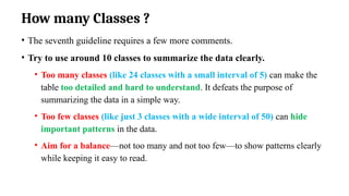
• The seventh guideline requires a few more comments.
• Try to use around 10 classes to summarize the data clearly.
• Too many classes (like 24 classes with a small interval of 5) can make the
table too detailed and hard to understand. It defeats the purpose of
summarizing the data in a simple way.
• Too few classes (like just 3 classes with a wide interval of 50) can hide
important patterns in the data.
• Aim for a balance—not too many and not too few—to show patterns clearly
while keeping it easy to read.
95.
Gaps between Classes
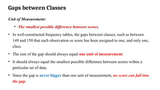
Unitof Measurement:
• The smallest possible difference between scores.
• In well-constructed frequency tables, the gaps between classes, such as between
149 and 150 that each observation or score has been assigned to one, and only one,
class.
• The size of the gap should always equal one unit of measurement.
• It should always equal the smallest possible difference between scores within a
particular set of data.
• Since the gap is never bigger than one unit of measurement, no score can fall into
the gap.
96.
Examples
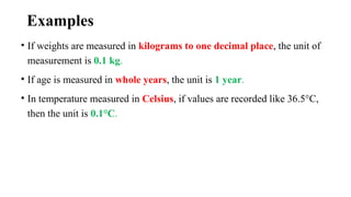
• If weightsare measured in kilograms to one decimal place, the unit of
measurement is 0.1 kg.
• If age is measured in whole years, the unit is 1 year.
• In temperature measured in Celsius, if values are recorded like 36.5°C,
then the unit is 0.1°C.
97.
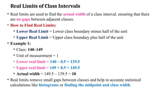
Real Limits ofClass Intervals
• Real limits are used to find the actual width of a class interval. ensuring that there
are no gaps between adjacent classes.
• How to Find Real Limits:
• Lower Real Limit = Lower class boundary minus half of the unit
• Upper Real Limit = Upper class boundary plus half of the unit
• Example 1:
• Class: 140–149
• Unit of measurement = 1
• Lower real limit = 140 – 0.5 = 139.5
• Upper real limit = 149 + 0.5 = 149.5
• Actual width = 149.5 – 139.5 = 10
• Real limits remove small gaps between classes and help in accurate statistical
calculations like histograms or finding the midpoint and class width.
98.
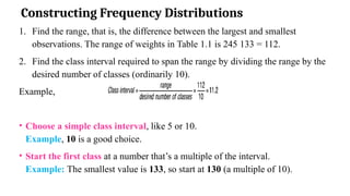
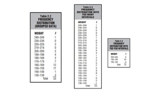
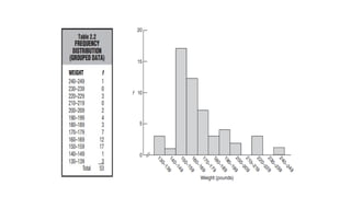
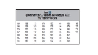
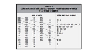
Constructing Frequency Distributions
1.Find the range, that is, the difference between the largest and smallest
observations. The range of weights in Table 1.1 is 245 133 = 112.
2. Find the class interval required to span the range by dividing the range by the
desired number of classes (ordinarily 10).
Example,
• Choose a simple class interval, like 5 or 10.
Example, 10 is a good choice.
• Start the first class at a number that’s a multiple of the interval.
Example: The smallest value is 133, so start at 130 (a multiple of 10).
99.
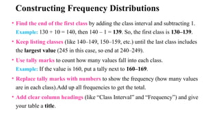
Constructing Frequency Distributions
•Find the end of the first class by adding the class interval and subtracting 1.
Example: 130 + 10 = 140, then 140 – 1 = 139. So, the first class is 130–139.
• Keep listing classes (like 140–149, 150–159, etc.) until the last class includes
the largest value (245 in this case, so end at 240–249).
• Use tally marks to count how many values fall into each class.
Example: If the value is 160, put a tally next to 160–169.
• Replace tally marks with numbers to show the frequency (how many values
are in each class).Add up all frequencies to get the total.
• Add clear column headings (like “Class Interval” and “Frequency”) and give
your table a title.
100.
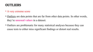
OUTLIERS
• A veryextreme score
• Outliers are data points that are far from other data points. In other words,
they’re unusual values in a dataset.
• Outliers are problematic for many statistical analyses because they can
cause tests to either miss significant findings or distort real results.
101.
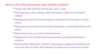
Here are someof the more common causes of outliers in datasets:
Human error while manually entering data, such as a typo.
Intentional errors, such as dummy outliers included in a dataset to test detection
methods.
Sampling errors that arise from extracting or mixing data from inaccurate or various
sources.
Data processing errors that arise from data manipulation, or unintended mutations of a
dataset.
Measurement errors as a result of instrumental error.
Experimental errors, from the data extraction process or experiment planning or
execution.
Natural outliers which occur “naturally” in the dataset, as opposed to being the result
of an error otherwise listed. These naturally-occurring errors are known as novelties.
102.
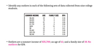
• Identify anyoutliers in each of the following sets of data collected from nine college
students.
• Outliers are a summer income of $25,700; an age of 61; and a family size of 18. No
outliers for GPA
103.
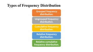
Types of FrequencyDistribution
Grouped frequency
distribution.
Ungrouped frequency
distribution.
Cumulative frequency
distribution.
Relative frequency
distribution.
Relative cumulative
frequency distribution.
104.
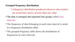
Grouped frequency distribution:
•A frequency distribution produced whenever observations
are sorted into classes of more than one value.
• The data is arranged and separated into groups called class
intervals.
• The frequency of data belonging to each class interval is noted
in a frequency distribution table.
• The grouped frequency table shows the distribution of
frequencies in class intervals.
105.
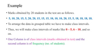
Example
• Marks obtainedby 20 students in the test are as follows.
• 5, 10, 20, 15, 5, 20, 20, 15, 15, 15, 10, 10, 10, 20, 15, 5, 18, 18, 18, 18.
• To arrange the data in grouped table we have to make class intervals.
• Thus, we will make class intervals of marks like 0 – 5, 6 – 10, and so
on.
• One Column is of class intervals (marks obtained in test) and the
second column is of frequency (no. of students).
106.
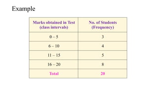
Example
Marks obtained inTest
(class intervals)
No. of Students
(Frequency)
0 – 5 3
6 – 10 4
11 – 15 5
16 – 20 8
Total 20
107.
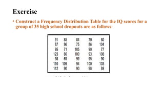
Exercise
• Construct aFrequency Distribution Table for the IQ scores for a
group of 35 high school dropouts are as follows:
Ungrouped Frequency Distribution
•It shows the frequency of an item in each separate data value rather than
groups of data values.
• A frequency distribution produced whenever observations are sorted into
classes of single values.
• In an ungrouped frequency distribution table, data are not organized into class
intervals instead, the exact frequency of each individual data value is recorded
• The table shows two columns:
• One is of marks obtained in the test and the second is of frequency
(no. of students).
110.
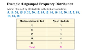
Example :Ungrouped FrequencyDistribution
Marks obtained in Test No. of Students
5 3
10 4
15 5
18 4
20 4
Total 20
Marks obtained by 20 students in the test are as follows.
5, 10, 20, 15, 5, 20, 20, 15, 15, 15, 10, 10, 10, 20, 15, 5, 18,
18, 18, 18.
111.
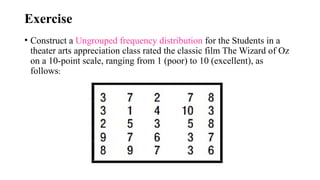
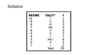
Exercise
• Construct aUngrouped frequency distribution for the Students in a
theater arts appreciation class rated the classic film The Wizard of Oz
on a 10-point scale, ranging from 1 (poor) to 10 (excellent), as
follows:
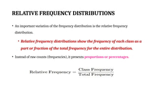
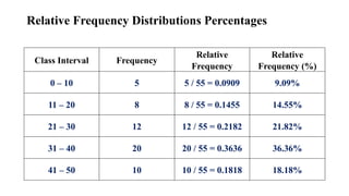
RELATIVE FREQUENCY DISTRIBUTIONS
•An important variation of the frequency distribution is the relative frequency
distribution.
• Relative frequency distributions show the frequency of each class as a
part or fraction of the total frequency for the entire distribution.
• Instead of raw counts (frequencies), it presents proportions or percentages.
115.
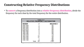
Constructing Relative FrequencyDistributions
• To convert a frequency distribution into a relative frequency distribution, divide the
frequency for each class by the total frequency for the entire distribution.
116.
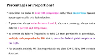
Percentages or Proportions?
•Sometimes we prefer to deal with percentages rather than proportions because
percentages usually lack decimal points.
• A proportion always varies between 0 and 1, whereas a percentage always varies
between 0 percent and 100 percent.
• To convert the relative frequencies in Table 2.5 from proportions to percentages,
multiply each proportion by 100; that is, move the decimal point two places to
the right.
• For example, multiply .06 (the proportion for the class 130–139) by 100 to obtain
6 percent.
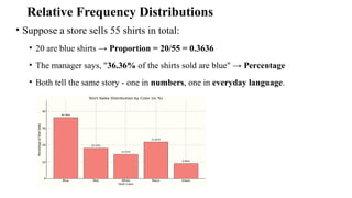
Relative Frequency Distributions
•Suppose a store sells 55 shirts in total:
• 20 are blue shirts → Proportion = 20/55 = 0.3636
• The manager says, "36.36% of the shirts sold are blue" → Percentage
• Both tell the same story - one in numbers, one in everyday language.
119.
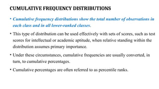
CUMULATIVE FREQUENCY DISTRIBUTIONS
•Cumulative frequency distributions show the total number of observations in
each class and in all lower-ranked classes.
• This type of distribution can be used effectively with sets of scores, such as test
scores for intellectual or academic aptitude, when relative standing within the
distribution assumes primary importance.
• Under these circumstances, cumulative frequencies are usually converted, in
turn, to cumulative percentages.
• Cumulative percentages are often referred to as percentile ranks.
120.
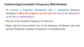
Constructing Cumulative FrequencyDistributions
• To convert a frequency distribution into a cumulative frequency
distribution, add to the frequency of each class the sum of the frequencies
of all classes ranked below it.
• This gives the cumulative frequency for that class.
• Begin with the lowest-ranked class in the frequency distribution and work
upward, finding the cumulative frequencies in ascending order.
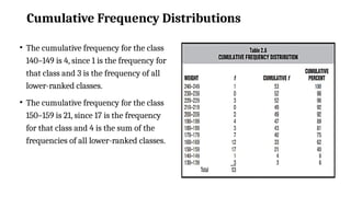
Cumulative Frequency Distributions
•The cumulative frequency for the class
140–149 is 4, since 1 is the frequency for
that class and 3 is the frequency of all
lower-ranked classes.
• The cumulative frequency for the class
150–159 is 21, since 17 is the frequency
for that class and 4 is the sum of the
frequencies of all lower-ranked classes.
123.
Cumulative Percentages
• Ifrelative standing within a distribution is particularly important, then
cumulative frequencies are converted to cumulative percentages.
• A glance at Table 2.6 reveals that 75 percent of all weights are the same as or
lighter than the weights between 170 and 179 lbs.
• To obtain this cumulative percentage (75%), the cumulative frequency of 40
for the class 170–179 should be divided by the total frequency of 53 for the
entire distribution.
124.
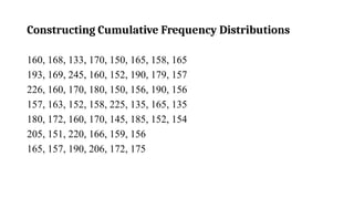
Exercise: Cumulative FrequencyDistribution
Construct a Cumulative Frequency Distribution for the given score:
55, 62, 47, 88, 90, 78, 84, 67, 74, 92,58, 80, 63, 70, 49, 86, 73, 91, 75,
61,60, 85, 77, 69, 64, 53, 71, 83, 79, 66,68, 76, 82, 87, 59, 52, 65, 81,
50, 46,45, 89, 48, 72, 54, 56, 62, 57, 93, 95
125.
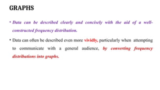
GRAPHS
• Data canbe described clearly and concisely with the aid of a well-
constructed frequency distribution.
• Data can often be described even more vividly, particularly when attempting
to communicate with a general audience, by converting frequency
distributions into graphs.
126.
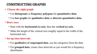
CONSTRUCTING GRAPHS
• Choosethe right graph:
• Use histograms or frequency polygons for quantitative data.
• Use bar graphs for qualitative data or discrete quantitative data.
• Draw axes:
• Start with the horizontal (x) axis, then the vertical (y) axis.
• Make the height of the vertical axis roughly equal to the width of the
horizontal axis.
• Set up class intervals:
• For qualitative or ungrouped data, use the categories from the data.
• For grouped data, create class intervals as you would for a frequency
distribution
127.
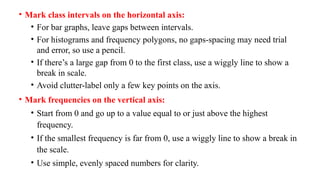
• Mark classintervals on the horizontal axis:
• For bar graphs, leave gaps between intervals.
• For histograms and frequency polygons, no gaps-spacing may need trial
and error, so use a pencil.
• If there’s a large gap from 0 to the first class, use a wiggly line to show a
break in scale.
• Avoid clutter-label only a few key points on the axis.
• Mark frequencies on the vertical axis:
• Start from 0 and go up to a value equal to or just above the highest
frequency.
• If the smallest frequency is far from 0, use a wiggly line to show a break in
the scale.
• Use simple, evenly spaced numbers for clarity.
128.
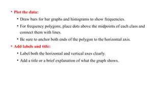
• Plot thedata:
• Draw bars for bar graphs and histograms to show frequencies.
• For frequency polygons, place dots above the midpoints of each class and
connect them with lines.
• Be sure to anchor both ends of the polygon to the horizontal axis.
• Add labels and title:
• Label both the horizontal and vertical axes clearly.
• Add a title or a brief explanation of what the graph shows.
129.
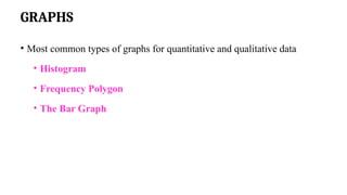
GRAPHS
• Most commontypes of graphs for quantitative and qualitative data
• Histogram
• Frequency Polygon
• The Bar Graph
130.
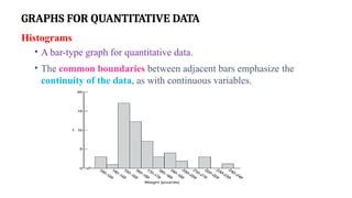
GRAPHS FOR QUANTITATIVEDATA
Histograms
• A bar-type graph for quantitative data.
• The common boundaries between adjacent bars emphasize the
continuity of the data, as with continuous variables.
131.
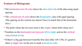
Features of Histograms
•The horizontal axis (X-axis) shows the class intervals of the data using equal
spacing.
• The vertical axis (Y-axis) shows the frequencies, also with equal spacing.
(The spacing on the vertical axis doesn’t have to match that of the horizontal
axis.)
• The point where the two axes meet is the origin, where both values are 0.
• Numbers on the horizontal axis increase left to right, and on the vertical
axis, bottom to top.
• If there’s a big gap between 0 and the first class (like 130–139), it’s good to
show a wiggly line on the axis to mark a break in scale.
132.
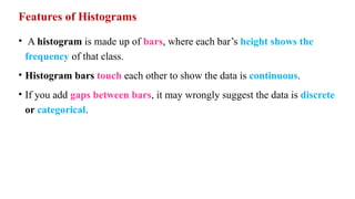
Features of Histograms
•A histogram is made up of bars, where each bar’s height shows the
frequency of that class.
• Histogram bars touch each other to show the data is continuous.
• If you add gaps between bars, it may wrongly suggest the data is discrete
or categorical.
134.
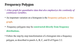
Frequency Polygon
• Aline graph for quantitative data that also emphasizes the continuity of
continuous variables.
• An important variation on a histogram is the frequency polygon, or line
graph.
• Frequency polygons may be constructed directly from frequency
distributions.
• Follow the step-by-step transformation of a histogram into a frequency
polygon, as described in panels A, B, C, and D of Figure 2.2.
135.
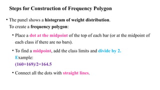
Steps for Constructionof Frequency Polygon
• The panel shows a histogram of weight distribution.
To create a frequency polygon:
• Place a dot at the midpoint of the top of each bar (or at the midpoint of
each class if there are no bars).
• To find a midpoint, add the class limits and divide by 2.
Example:
(160+169)/2=164.5
• Connect all the dots with straight lines.
136.
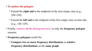
• To anchorthe polygon:
• Extend the right end to the midpoint of the next empty class (e.g.,
250–259).
• Extend the left end to the midpoint of the first empty class on that side
(e.g., 120–129).
• Finally, remove all the histogram bars, so only the frequency polygon
remains.
• Frequency polygons useful for
• Compare two or more frequency distributions or relative
frequency distributions on the same graph.
138.
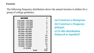
Exercise
The following frequencydistribution shows the annual incomes in dollars for a
group of college graduates.
(a) Construct a histogram.
(b) Construct a frequency
polygon.
(c) Is this distribution
balanced or lopsided?
Stem and LeafDisplays
• Another technique for summarizing quantitative data is a stem and leaf
display.
• A stem-and-leaf display is a simple way to organize and visualize
quantitative data to see its distribution.
• It helps in identifying the shape of the data, such as whether it's
symmetric, skewed, or has clusters.
141.
Constructing a StemLeaf Display
• Each number is split into two parts:
• Stem – the leading digit(s)
• Leaf – the last digit
• For example, for the number 47:
Stem = 4
Leaf = 7
• The stems are listed in a vertical column, and the leaves (remaining
digits) are listed to the right of each stem.
142.
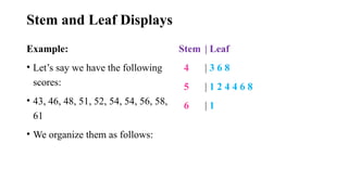
Stem and LeafDisplays
Example:
• Let’s say we have the following
scores:
• 43, 46, 48, 51, 52, 54, 54, 56, 58,
61
• We organize them as follows:
Stem | Leaf
4 | 3 6 8
5 | 1 2 4 4 6 8
6 | 1
145.
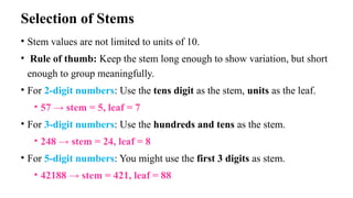
Selection of Stems
•Stem values are not limited to units of 10.
• Rule of thumb: Keep the stem long enough to show variation, but short
enough to group meaningfully.
• For 2-digit numbers: Use the tens digit as the stem, units as the leaf.
• 57 → stem = 5, leaf = 7
• For 3-digit numbers: Use the hundreds and tens as the stem.
• 248 → stem = 24, leaf = 8
• For 5-digit numbers: You might use the first 3 digits as stem.
• 42188 → stem = 421, leaf = 88
146.
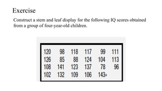
Exercise
Construct a stemand leaf display for the following IQ scores obtained
from a group of four-year-old children.
147.
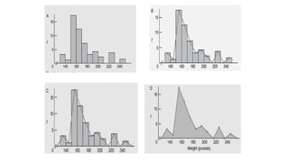
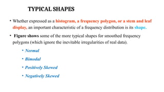
TYPICAL SHAPES
• Whetherexpressed as a histogram, a frequency polygon, or a stem and leaf
display, an important characteristic of a frequency distribution is its shape.
• Figure shows some of the more typical shapes for smoothed frequency
polygons (which ignore the inevitable irregularities of real data).
• Normal
• Bimodal
• Positively Skewed
• Negatively Skewed
148.
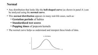
Normal
• Any distributionthat looks like the bell-shaped curve (as shown in panel A ) can
be analyzed using the normal curve.
• This normal distribution appears in many real-life cases, such as:
• Gestation periods of babies
• Standardized test scores
• Popping times of popcorn kernels
• The normal curve helps us understand and interpret these kinds of data.
149.
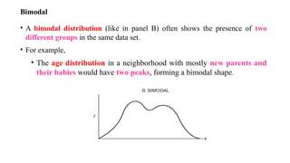
Bimodal
• A bimodaldistribution (like in panel B) often shows the presence of two
different groups in the same data set.
• For example,
• The age distribution in a neighborhood with mostly new parents and
their babies would have two peaks, forming a bimodal shape.
150.
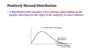
Positively Skewed Distribution
•A distribution that includes a few extreme observations in the
positive direction (to the right of the majority of observations).
151.
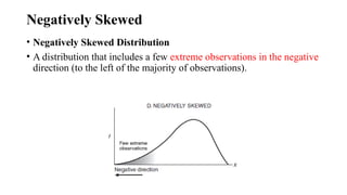
Negatively Skewed
• NegativelySkewed Distribution
• A distribution that includes a few extreme observations in the negative
direction (to the left of the majority of observations).
152.
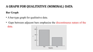
A GRAPH FORQUALITATIVE (NOMINAL) DATA
Bar Graph
• A bar-type graph for qualitative data.
• Gaps between adjacent bars emphasize the discontinuous nature of the
data.
153.
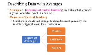
Describing Data withAverages
• Averages (measures of central tendency) are values that represent
a typical or central point in a data set.
• Measures of Central Tendency
• Numbers or words that attempt to describe, most generally, the
middle or typical value for a distribution.
154.
Mode
• The valueof the most frequent
score or the value that appears most
frequently in a dataset.
Key Properties:
• Can be used for qualitative and
quantitative data.
• A dataset can have no mode, one
mode (unimodal), two modes
(bimodal), or more
(multimodal).
Example:
Data:
[60, 63, 45, 63, 65, 70, 55, 63, 60,
65, 63]
Step 1: Count each value’s frequency
63 appears 4 times
Others less than that
Mode = 63
155.
Median
• The medianis the middle value
when all observations are sorted
from smallest to largest.
Data: [60, 63, 45, 63, 65, 70, 55,
63, 60, 65, 63]
Step 1: Sort the data
45, 55, 60, 60, 63, 63, 63, 63, 65,
65, 70
Step 2: Count number of items =
11 (odd number)
Median = 63 (6th value)
• Data: [26.3, 28.7, 27.4, 26.6,
27.4, 26.9]
• Sorted: [26.3, 26.6, 26.9, 27.4,
27.4, 28.7]
• Middle two: 26.9, 27.4
• Median = (26.9 + 27.4) / 2 =
27.15
156.
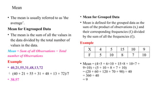
Mean
• The meanis usually referred to as 'the
average’.
Mean for Ungrouped Data
• The mean is the sum of all the values in
the data divided by the total number of
values in the data.
Mean = Sum of all Observations ÷ Total
number of Observations
Example
• 40,21,55,31,48,13,72
(40 + 21 + 55 + 31 + 48 + 13 + 72)/7
• 38.57
• Mean for Grouped Data
• Mean is defined for the grouped data as the
sum of the product of observations (xi) and
their corresponding frequencies (fi) divided
by the sum of all the frequencies (fi).
Example
• Mean = (4×5 + 6×10 + 15×8 + 10×7 +
9×10) ÷ (5 + 10 + 8 + 7 + 10)
= (20 + 60 + 120 + 70 + 90) ÷ 40
= 360 ÷ 40
= 9
X 4 5 15 10 9
F 5 10 8 7 10
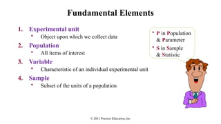
#70 Data
facts or information that is relevant or appropriate to a decision maker
Population
the totality of objects under consideration
Sample
a portion of the population that is selected for analysis
Parameter
a summary measure (e.g., mean) that is computed to describe a characteristic of the population
Statistic
a summary measure (e.g., mean) that is computed to describe a characteristic of the sample
#71 Data
facts or information that is relevant or appropriate to a decision maker
Population
the totality of objects under consideration
Sample
a portion of the population that is selected for analysis
Parameter
a summary measure (e.g., mean) that is computed to describe a characteristic of the population
Statistic
a summary measure (e.g., mean) that is computed to describe a characteristic of the sample
#72 Data
facts or information that is relevant or appropriate to a decision maker
Population
the totality of objects under consideration
Sample
a portion of the population that is selected for analysis
Parameter
a summary measure (e.g., mean) that is computed to describe a characteristic of the population
Statistic
a summary measure (e.g., mean) that is computed to describe a characteristic of the sample
#73 Data
facts or information that is relevant or appropriate to a decision maker
Population
the totality of objects under consideration
Sample
a portion of the population that is selected for analysis
Parameter
a summary measure (e.g., mean) that is computed to describe a characteristic of the population
Statistic
a summary measure (e.g., mean) that is computed to describe a characteristic of the sample

![Mode
• The value of the most frequent
score or the value that appears most
frequently in a dataset.
Key Properties:
• Can be used for qualitative and
quantitative data.
• A dataset can have no mode, one
mode (unimodal), two modes
(bimodal), or more
(multimodal).
Example:
Data:
[60, 63, 45, 63, 65, 70, 55, 63, 60,
65, 63]
Step 1: Count each value’s frequency
63 appears 4 times
Others less than that
Mode = 63](https://image.slidesharecdn.com/ds-u-1-250822043423-ee9c8e44/85/Data-science-notes-for-reference-engineering-154-320.jpg)
![Median
• The median is the middle value
when all observations are sorted
from smallest to largest.
Data: [60, 63, 45, 63, 65, 70, 55,
63, 60, 65, 63]
Step 1: Sort the data
45, 55, 60, 60, 63, 63, 63, 63, 65,
65, 70
Step 2: Count number of items =
11 (odd number)
Median = 63 (6th value)
• Data: [26.3, 28.7, 27.4, 26.6,
27.4, 26.9]
• Sorted: [26.3, 26.6, 26.9, 27.4,
27.4, 28.7]
• Middle two: 26.9, 27.4
• Median = (26.9 + 27.4) / 2 =
27.15](https://image.slidesharecdn.com/ds-u-1-250822043423-ee9c8e44/85/Data-science-notes-for-reference-engineering-155-320.jpg)


![[DSC Europe 25] Egor Krasheninnikov - The Control Stack: Building Guardrails ...](https://cdn.slidesharecdn.com/ss_thumbnails/3lzcz7hxqmo51mtalv4u-the-control-stack-260119101520-ea90841a-thumbnail.jpg?width=640&height=640&fit=bounds)
![[DSC Europe 25] Mikhail Rozhkov - AI Product Canvas: From Business Goals to T...](https://cdn.slidesharecdn.com/ss_thumbnails/d53doddtpgfqivmzqel6-mikhail-rozhkov-ai-product-canvas-v1-260121115910-9dd517a7-thumbnail.jpg?width=640&height=640&fit=bounds)


![[DSC Europe 25] Laila Kakar - Leveraging AI for Strategic Excellence: Enhanci...](https://cdn.slidesharecdn.com/ss_thumbnails/eykmhrtsqmaaftwkexh7-dsc-lailakakar-1-260119101520-5f3b5616-thumbnail.jpg?width=640&height=640&fit=bounds)


![[DSC Europe 25] Paula Garcia Esteban -Building the Future: The Role of Data S...](https://cdn.slidesharecdn.com/ss_thumbnails/9ld1r1bsqpwve8qfvphy-paula-garcia-esteban-building-the-future-260122103838-4171f5cb-thumbnail.jpg?width=640&height=640&fit=bounds)


![[DSC Europe 25] Marcos Heidemann - Beyond the Hype: Making AI Coding Assistan...](https://cdn.slidesharecdn.com/ss_thumbnails/eexkhvldrjsopspdjbur-marcos-heidemann-beyond-the-hype-getting-real-value-out-of-ai-assisted-coding-260121115910-7e9d41ec-thumbnail.jpg?width=640&height=640&fit=bounds)
![[DSC Europe 25] Srdj Stanisic - Local and Private AI in UX.pdf](https://cdn.slidesharecdn.com/ss_thumbnails/vwmetykqmztgmokmmkfa-3-srdjan-stanisic-local-and-small-ai-in-ux-260120105855-55a31869-thumbnail.jpg?width=640&height=640&fit=bounds)
![[DSC Europe 25] Andrzej Kowalczyk - AI - how to start small and grow in the f...](https://cdn.slidesharecdn.com/ss_thumbnails/oy1zmo94qv6vpcqjvno2-andrzej-kowalczyk-ai-how-to-start-small-and-grow-in-the-future-1-260119121559-cf093b23-thumbnail.jpg?width=640&height=640&fit=bounds)

![[DSC Europe 25] Milos Belcevic - Product Professional's Journey to Full-Stack...](https://cdn.slidesharecdn.com/ss_thumbnails/1zovd6fgsycdg4wvgvls-milos-belcevic-product-professionals-journey-to-full-stack-product-developer-260123083019-d993120d-thumbnail.jpg?width=640&height=640&fit=bounds)
![[DSC Europe 25] Jovan Sumarac - Real-World Applications of Computer Vision in...](https://cdn.slidesharecdn.com/ss_thumbnails/fiksms22smcpopvvld03-jovan-sumarac-real-life-applications-of-computer-vision-in-automotive-systems-260120105855-de622abb-thumbnail.jpg?width=640&height=640&fit=bounds)