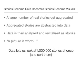
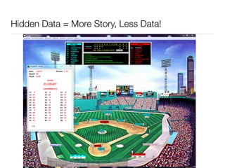
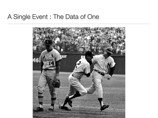
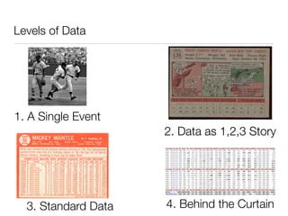
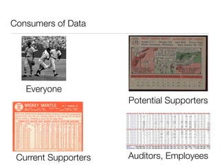
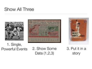
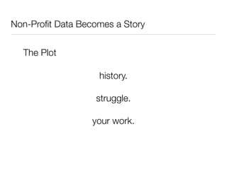
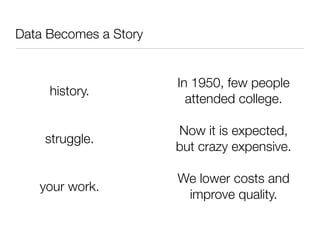
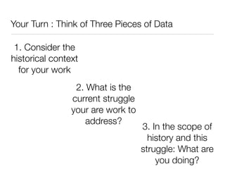
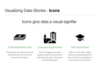
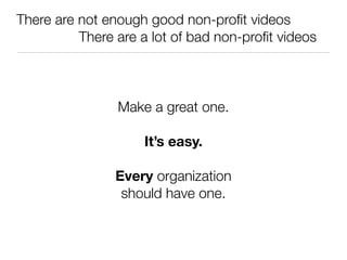
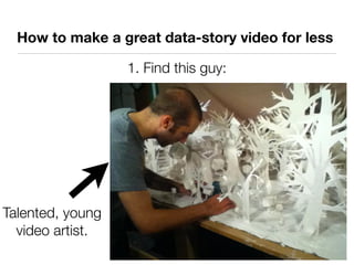
The document discusses the process of transforming real stories into data, and then how that data can be revitalized back into compelling narratives and visualizations. It argues that effective storytelling in non-profits relies on understanding the historical context, current struggles, and impactful events, as well as advocating for the use of visual mediums like infographics and videos to engage audiences. It emphasizes the importance of maintaining a connection to the 'why' behind the data while navigating through its abstraction levels.


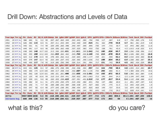
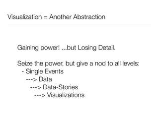
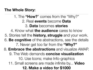
![“Abstraction”
• Each level assumes the previous so we can have
greater capacity: Gain Power, Lose The Details
{endorphins + fresh air + (“Can I grow this at home? = “True”) = “motivation”;
vitamins+(pancreas - sugar)+(“Are Doritos a vegetable?” = False) = “nutrition”;
chard + turnips + ladybugs + dirt = “gardens”;
(sasha + tobias + samwell + charleston) = “youth”;
[(youth + gardens) = (nutrition + motivation)]}
=
“grant pitch”](https://image.slidesharecdn.com/technow-121025145536-phpapp02/85/Data-is-boring-Stories-are-not-8-320.jpg)


![74676371-Coagulation-and-Flocculation[1].ppt](https://cdn.slidesharecdn.com/ss_thumbnails/74676371-coagulation-and-flocculation1-260116154109-a3cbf55e-thumbnail.jpg?width=640&height=640&fit=bounds)


