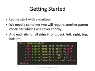
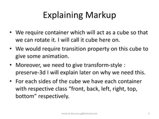

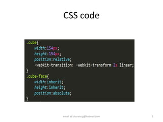


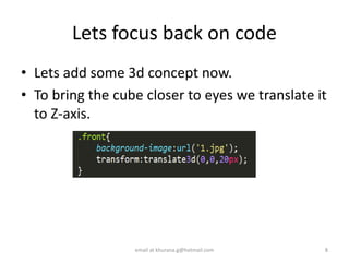

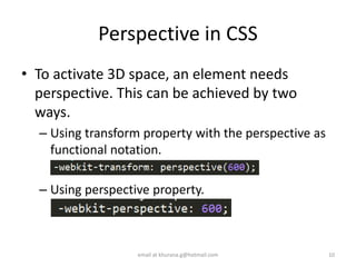


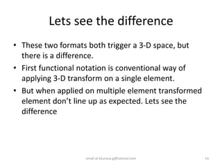

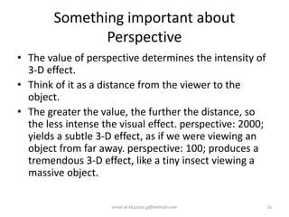
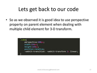


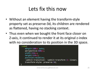


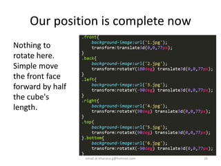

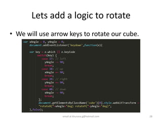


This document provides instructions for creating a 3D cube with pure CSS3. It begins by explaining the required HTML markup of a container div and divs for each cube side. It then covers the CSS code, including positioning each side, adding perspective for the 3D effect, and fixing issues with perspective that arose when rotating elements. Key steps include adding 'transform-style: preserve-3d' to maintain the stacking context, using the 'perspective' property on a parent container rather than individual elements, and wrapping all elements in another div to prevent the perspective from changing with rotations. In the end, arrow keys can be used to rotate the cube as desired while maintaining the 3D perspective.