Download as PDF, PPTX


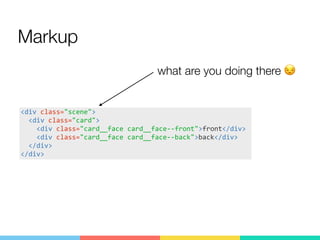
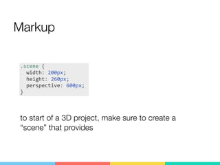
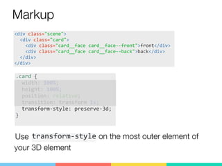
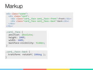
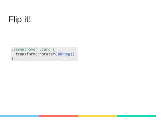

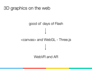
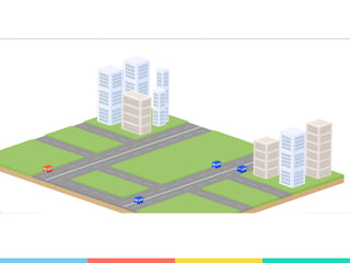
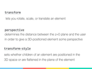
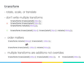
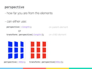
This document introduces CSS 3D transforms for beginners. It discusses how 3D graphics were previously done with Flash, canvas, and WebGL, but can now also be done with CSS 3D transforms using only three properties: transform, perspective, and transform-style. The document provides examples of how to use these properties to create a card flip animation, explaining how to structure the HTML and apply the appropriate CSS rules.


