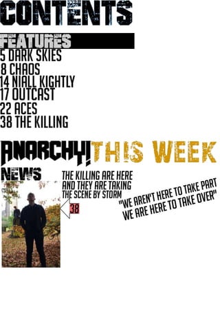
Contents page
•Download as PPTX, PDF•
0 likes•17 views
contents page
Report
Share
Report
Share
Recommended
Photo planning
The document provides guidance on composing shots for a book cover and pages. It recommends using techniques like rule of thirds, mid shots, close ups, and interesting backgrounds. Shots for the front cover should include 2-3 people using triangles, while inside pages should use single subjects turned away or looking at the camera against plain backgrounds. Composition is also discussed, such as taking wide shots from above or below for contents pages to draw attention.
Survey summarise
This document summarizes the results of a survey about music magazine preferences. Key findings include that the survey respondents were mostly older males who preferred rock music from the 1960s. Most respondents did not want to spend a lot of money on a magazine and liked the inclusion of free items. The majority's favorite band was AC/DC and they wanted to see performance photos of artists in the magazine. Over half preferred a bright color scheme for the magazine.
Double page spreads
This document discusses an image and story but provides little detail. It has a title but no body text or paragraphs to summarize. The document only lists "Title", "Image", and "Story" with no other information given.
Focus group answer 5
A male focus group participant aged 21 was asked questions about his magazine buying habits. He has previously purchased the Classic Rock magazine and looks for information about charting bands when choosing a magazine. He prefers magazine covers that attract attention and look interesting. He is willing to spend up to £4 on a magazine as he doesn't expect high quality magazines to be cheap.
Homework 2
DJ Mag is published by Thrust Publishing, a London-based company formed in 2009 that has been operating for 7 years in the UK. Thrust Publishing only publishes one magazine, DJ Mag, which focuses on electronic dance music and targets younger audiences between approximately ages 15 to 25.
Detailed analysis
This document analyzes and summarizes different elements of magazine layouts from an older Rolling Stones magazine. It discusses the sans serif font used on the front cover that reflects the era when the magazine was published. It also describes the masthead using a larger font to stand out and the cover stories providing insights into the magazine's contents. The contents page is analyzed for its clear layout making it easy to read, inclusion of pictures for context, and use of serif font suggesting an older target audience. Finally, the double page spread is discussed for using a large picture and article to grab attention, a drop cap to intrigue readers, and formatting of headlines to stand out from the text.
Front cover
This document is advertising an exclusive Green Day poster from November 2016 for £3.99. It includes details about the poster such as the price, band name, month and year of issue, and that it is from issue number 1. In 3 sentences or less, it summarizes that this is an advertisement for a limited edition Green Day band poster from November 2016 issue 1 for £3.99.
Questions
This document summarizes responses from two people to questions about their interests in rock and roll magazines. Person 1 and Person 2 both express interest in rock and roll. Person 1 is interested in detailed articles about bands or singers, while Person 2 likes magazines that include freebies. Person 1 prefers sans serif fonts throughout magazines, while Person 2 prefers serif fonts. Person 1 is willing to spend £2.99 on a magazine, while Person 2's maximum is £1.99. Both people's favorite rock artist is The Rolling Stones.
Music magazines
The document discusses the design elements of magazine covers for different genres of music. It describes the color schemes, layouts, main images, publishers, targeted audiences, and typical content for magazines focused on hip-hop, rock and roll, and pop music. The covers are designed to appeal to fans of particular artists or genres by prominently featuring well-known musicians to draw readers in with topics they will find interesting.
Focus group answer 1
A focus group participant was asked questions about magazine purchasing habits. The 18-year-old male has previously purchased the Classic Rock magazine and looks for artists he enjoys when choosing a magazine. He prefers a colorful magazine cover because it looks interesting and would spend up to £3.50 on a magazine depending on its quality.
Homework 2
Bauer Media Group owns many magazines, radio stations, and TV channels across different countries, including brands like Kerrang!, Empire, Mojo, Q, and Kiss. While they appeal to a wide range of ages and genders overall, each individual brand targets specific demographics - for example, Kerrang! aims at a different audience than Q. Bauer Media Group is an example of media cross-ownership, as they own multiple media businesses across 15 countries, with over 300 magazine titles. The privately-held company is currently 85% owned by Yvonne Bauer and has been managed by five generations of the Bauer family.
Music magazines analysis
This document discusses three music magazines. The first magazine focuses on DJ/EDM music with colorful graphics and targets young adults and teenagers. It contains information on new tracks and DJ equipment and is published by Thrust Publishing. The second magazine focuses on house music with a clean, professional style and varying color schemes. It contains charts and articles on the music business and is published by Lynne Segall. The third magazine focuses on pop music but provides no details on its content, style, audience or publisher.
genre analysis
The magazine targets an older, mature audience who lived through or appreciate the rock music of the 1950s and 1960s. Various design elements aim to appeal to this demographic. The content, font styles, black and white photographs, and vintage aesthetic create a formal, retro feel that evokes the era of rock n roll the magazine focuses on. This style aims to engage readers from the older generation it seeks to reach.
Media front cover
This document provides an exclusive interview with Harry Underwood and lists the top 10 free iTunes codes available this week. It focuses on both an in-depth celebrity interview and promotion of free digital media codes for downloading music, movies, apps or other content from the iTunes store.
Task 12 pitch
This magazine will focus on interviews and images about current electronic music artists, tours, and technology, featuring a different artist on the cover of each issue and including an in-depth article about that artist. It will target teenagers, young adults who enjoy electronic music, as well as music industry professionals. The magazine's style will have a modern layout with bright contrasting colors and sans serif fonts to appeal to its target audience.
Task 10 drafts
This magazine issue features a cover story on a tour poster image. The table of contents lists multiple featured articles with accompanying images throughout the issue. Additional articles and images are presented toward the back of the magazine.
Focus group answer 3
A focus group was conducted with a 17-year-old female participant. She has previously purchased the music magazine Kerrang and looks for the artist on the front cover when buying magazines. Her preferred magazine cover is one featuring Green Day as she is a fan of that band. The most she would spend on a magazine is £4 depending on its perceived quality.
Focus group answer 2
A focus group participant was asked questions about magazine purchasing habits. The male participant, age 21, had previously purchased Rolling Stone magazine because it contained interesting articles on bands he liked. When asked about magazine covers, he preferred ones that stood out, such as one featuring Pink Floyd, and said he would spend up to £4 on a magazine.
Front cover layout
This document appears to be from a magazine or newspaper and contains several short news stories and articles, as well as images and identifying information like a masthead and barcode. A longer cover story is the primary focus, with supplementary smaller stories and visuals to round out the publication's content.
Task 5 research summary
The magazine follows several conventions in its layout. It places the logo and name in the top right corner on all covers. The covers feature a large central image of an artist to draw readers' attention. Additional text is placed around the image in a proportional way. The contents page has a structured layout with columns of text and images to help readers find articles. Double page spreads place a large image on one page and the accompanying article on the facing page.
The artists in the magazine generally dress casually in t-shirts and jeans, though some take a more unconventional approach wearing masks or helmets. This reflects the genre's emphasis on individual styles while maintaining bright, energetic aesthetics.
Representation of the artists is also
Task 6 focus group planning
This document contains a list of 9 questions for a focus group to discuss their preferences regarding DJ music, DJ magazines, and specific aspects of magazine covers, contents pages, and spreads. The questions seek to understand what draws readers to DJ magazines, what content they expect and want to see, and what would persuade them to purchase a DJ magazine.
Focus group answer 4
A focus group participant was asked questions about magazine purchasing habits. The 20-year-old male has previously purchased the music magazine Kerrang and bases his magazine buying decisions primarily on the appearance of the front cover. He prefers covers that use bright colors that catch his eye and look interesting. The most he is willing to spend on a single magazine is £3 since he has a limited budget for magazines.
Task 11 photography plan
This photography plan outlines the dates, locations, props, costumes, personnel, and equipment needed for shooting images for a music production book. It includes taking photos of the subject in front of green screens with various music production software and equipment, as well as on location near a table. The photographer will be shooting solo with one model to create cover images, contents pages, and double page spreads to showcase music production tools.
Audience feedback
Three people provided feedback on different elements of a book. For the front cover, the first two people liked aspects of the image and color scheme but suggested improvements to the cover lines. The third person thought the picture was blurry. For the contents page, the first two people liked parts of the layout and design while the third suggested reducing the size of the editor's photo. Regarding a double page spread, the first and third people felt the photo fit the genre but the layout was boring, while the second liked the simple layout and conventional font.
Are you interested in pop music
The document contains questions and responses from two individuals regarding their interests in pop music and preferences for a pop magazine. Person 1 and Person 2, both teenagers, discuss their favorite female artists (Taylor Swift and Ariana Grande), male artists (Ed Sheeran and Shawn Mendes), bands (One Direction and Fifth Harmony), songs, and color schemes for a pop magazine cover. They also provide opinions on reasonable magazine prices and the types of stories and covers they find most appealing.
Fonts
This document discusses font research conducted by Gemma Barrett. It provides a link to the dafont website where a specific font called "101star-studded" can be viewed and downloaded. The preview text for the font on the website is "Non-stop Pop".
audience feedback
Person 1 liked the consistent colors used throughout the magazine and was drawn to the magazine's name on the front cover. Person 2 thought the magazine looked like Top of the Pops and liked that there was a lot to look at on the front cover, especially the celebrity snaps story. Person 3 appreciated the simplicity and easy readability of the contents page, and how the larger numbers stood out from the text. Person 4 thought using different fonts on the front cover helped distinguish the stories and liked the inclusion of emojis.
Task 13 production schedule
This production schedule outlines the photo shoots planned for October 25th, 2016. Photos for the front cover will be taken at 12pm in an abandoned area next to the park with a cameraman and one model. At 1pm, photos for the contents page will be shot in the same location with a cameraman and a few models. Finally, a double page spread will be photographed at 2pm in the abandoned area with a cameraman and one model.
BÀI TẬP BỔ TRỢ TIẾNG ANH 8 CẢ NĂM - GLOBAL SUCCESS - NĂM HỌC 2023-2024 (CÓ FI...
BÀI TẬP BỔ TRỢ TIẾNG ANH 8 CẢ NĂM - GLOBAL SUCCESS - NĂM HỌC 2023-2024 (CÓ FI...Nguyen Thanh Tu Collection
https://app.box.com/s/y977uz6bpd3af4qsebv7r9b7s21935vdMore Related Content
Viewers also liked
Music magazines
The document discusses the design elements of magazine covers for different genres of music. It describes the color schemes, layouts, main images, publishers, targeted audiences, and typical content for magazines focused on hip-hop, rock and roll, and pop music. The covers are designed to appeal to fans of particular artists or genres by prominently featuring well-known musicians to draw readers in with topics they will find interesting.
Focus group answer 1
A focus group participant was asked questions about magazine purchasing habits. The 18-year-old male has previously purchased the Classic Rock magazine and looks for artists he enjoys when choosing a magazine. He prefers a colorful magazine cover because it looks interesting and would spend up to £3.50 on a magazine depending on its quality.
Homework 2
Bauer Media Group owns many magazines, radio stations, and TV channels across different countries, including brands like Kerrang!, Empire, Mojo, Q, and Kiss. While they appeal to a wide range of ages and genders overall, each individual brand targets specific demographics - for example, Kerrang! aims at a different audience than Q. Bauer Media Group is an example of media cross-ownership, as they own multiple media businesses across 15 countries, with over 300 magazine titles. The privately-held company is currently 85% owned by Yvonne Bauer and has been managed by five generations of the Bauer family.
Music magazines analysis
This document discusses three music magazines. The first magazine focuses on DJ/EDM music with colorful graphics and targets young adults and teenagers. It contains information on new tracks and DJ equipment and is published by Thrust Publishing. The second magazine focuses on house music with a clean, professional style and varying color schemes. It contains charts and articles on the music business and is published by Lynne Segall. The third magazine focuses on pop music but provides no details on its content, style, audience or publisher.
genre analysis
The magazine targets an older, mature audience who lived through or appreciate the rock music of the 1950s and 1960s. Various design elements aim to appeal to this demographic. The content, font styles, black and white photographs, and vintage aesthetic create a formal, retro feel that evokes the era of rock n roll the magazine focuses on. This style aims to engage readers from the older generation it seeks to reach.
Media front cover
This document provides an exclusive interview with Harry Underwood and lists the top 10 free iTunes codes available this week. It focuses on both an in-depth celebrity interview and promotion of free digital media codes for downloading music, movies, apps or other content from the iTunes store.
Task 12 pitch
This magazine will focus on interviews and images about current electronic music artists, tours, and technology, featuring a different artist on the cover of each issue and including an in-depth article about that artist. It will target teenagers, young adults who enjoy electronic music, as well as music industry professionals. The magazine's style will have a modern layout with bright contrasting colors and sans serif fonts to appeal to its target audience.
Task 10 drafts
This magazine issue features a cover story on a tour poster image. The table of contents lists multiple featured articles with accompanying images throughout the issue. Additional articles and images are presented toward the back of the magazine.
Focus group answer 3
A focus group was conducted with a 17-year-old female participant. She has previously purchased the music magazine Kerrang and looks for the artist on the front cover when buying magazines. Her preferred magazine cover is one featuring Green Day as she is a fan of that band. The most she would spend on a magazine is £4 depending on its perceived quality.
Focus group answer 2
A focus group participant was asked questions about magazine purchasing habits. The male participant, age 21, had previously purchased Rolling Stone magazine because it contained interesting articles on bands he liked. When asked about magazine covers, he preferred ones that stood out, such as one featuring Pink Floyd, and said he would spend up to £4 on a magazine.
Front cover layout
This document appears to be from a magazine or newspaper and contains several short news stories and articles, as well as images and identifying information like a masthead and barcode. A longer cover story is the primary focus, with supplementary smaller stories and visuals to round out the publication's content.
Task 5 research summary
The magazine follows several conventions in its layout. It places the logo and name in the top right corner on all covers. The covers feature a large central image of an artist to draw readers' attention. Additional text is placed around the image in a proportional way. The contents page has a structured layout with columns of text and images to help readers find articles. Double page spreads place a large image on one page and the accompanying article on the facing page.
The artists in the magazine generally dress casually in t-shirts and jeans, though some take a more unconventional approach wearing masks or helmets. This reflects the genre's emphasis on individual styles while maintaining bright, energetic aesthetics.
Representation of the artists is also
Task 6 focus group planning
This document contains a list of 9 questions for a focus group to discuss their preferences regarding DJ music, DJ magazines, and specific aspects of magazine covers, contents pages, and spreads. The questions seek to understand what draws readers to DJ magazines, what content they expect and want to see, and what would persuade them to purchase a DJ magazine.
Focus group answer 4
A focus group participant was asked questions about magazine purchasing habits. The 20-year-old male has previously purchased the music magazine Kerrang and bases his magazine buying decisions primarily on the appearance of the front cover. He prefers covers that use bright colors that catch his eye and look interesting. The most he is willing to spend on a single magazine is £3 since he has a limited budget for magazines.
Task 11 photography plan
This photography plan outlines the dates, locations, props, costumes, personnel, and equipment needed for shooting images for a music production book. It includes taking photos of the subject in front of green screens with various music production software and equipment, as well as on location near a table. The photographer will be shooting solo with one model to create cover images, contents pages, and double page spreads to showcase music production tools.
Audience feedback
Three people provided feedback on different elements of a book. For the front cover, the first two people liked aspects of the image and color scheme but suggested improvements to the cover lines. The third person thought the picture was blurry. For the contents page, the first two people liked parts of the layout and design while the third suggested reducing the size of the editor's photo. Regarding a double page spread, the first and third people felt the photo fit the genre but the layout was boring, while the second liked the simple layout and conventional font.
Are you interested in pop music
The document contains questions and responses from two individuals regarding their interests in pop music and preferences for a pop magazine. Person 1 and Person 2, both teenagers, discuss their favorite female artists (Taylor Swift and Ariana Grande), male artists (Ed Sheeran and Shawn Mendes), bands (One Direction and Fifth Harmony), songs, and color schemes for a pop magazine cover. They also provide opinions on reasonable magazine prices and the types of stories and covers they find most appealing.
Fonts
This document discusses font research conducted by Gemma Barrett. It provides a link to the dafont website where a specific font called "101star-studded" can be viewed and downloaded. The preview text for the font on the website is "Non-stop Pop".
audience feedback
Person 1 liked the consistent colors used throughout the magazine and was drawn to the magazine's name on the front cover. Person 2 thought the magazine looked like Top of the Pops and liked that there was a lot to look at on the front cover, especially the celebrity snaps story. Person 3 appreciated the simplicity and easy readability of the contents page, and how the larger numbers stood out from the text. Person 4 thought using different fonts on the front cover helped distinguish the stories and liked the inclusion of emojis.
Task 13 production schedule
This production schedule outlines the photo shoots planned for October 25th, 2016. Photos for the front cover will be taken at 12pm in an abandoned area next to the park with a cameraman and one model. At 1pm, photos for the contents page will be shot in the same location with a cameraman and a few models. Finally, a double page spread will be photographed at 2pm in the abandoned area with a cameraman and one model.
Viewers also liked (20)
Recently uploaded
BÀI TẬP BỔ TRỢ TIẾNG ANH 8 CẢ NĂM - GLOBAL SUCCESS - NĂM HỌC 2023-2024 (CÓ FI...
BÀI TẬP BỔ TRỢ TIẾNG ANH 8 CẢ NĂM - GLOBAL SUCCESS - NĂM HỌC 2023-2024 (CÓ FI...Nguyen Thanh Tu Collection
https://app.box.com/s/y977uz6bpd3af4qsebv7r9b7s21935vdDigital Artifact 1 - 10VCD Environments Unit
Digital Artifact 1 - 10VCD Environments Unit - NGV Pavilion Concept Design
The Diamonds of 2023-2024 in the IGRA collection
A review of the growth of the Israel Genealogy Research Association Database Collection for the last 12 months. Our collection is now passed the 3 million mark and still growing. See which archives have contributed the most. See the different types of records we have, and which years have had records added. You can also see what we have for the future.
Chapter 4 - Islamic Financial Institutions in Malaysia.pptx
Chapter 4 - Islamic Financial Institutions in Malaysia.pptxMohd Adib Abd Muin, Senior Lecturer at Universiti Utara Malaysia
This slide is special for master students (MIBS & MIFB) in UUM. Also useful for readers who are interested in the topic of contemporary Islamic banking.
Azure Interview Questions and Answers PDF By ScholarHat
Azure Interview Questions and Answers PDF By ScholarHat
The History of Stoke Newington Street Names
Presented at the Stoke Newington Literary Festival on 9th June 2024
www.StokeNewingtonHistory.com
How to Manage Your Lost Opportunities in Odoo 17 CRM
Odoo 17 CRM allows us to track why we lose sales opportunities with "Lost Reasons." This helps analyze our sales process and identify areas for improvement. Here's how to configure lost reasons in Odoo 17 CRM
clinical examination of hip joint (1).pdf
described clinical examination all orthopeadic conditions .
Pengantar Penggunaan Flutter - Dart programming language1.pptx
Pengantar Penggunaan Flutter - Dart programming language1.pptx
South African Journal of Science: Writing with integrity workshop (2024)
South African Journal of Science: Writing with integrity workshop (2024)Academy of Science of South Africa
A workshop hosted by the South African Journal of Science aimed at postgraduate students and early career researchers with little or no experience in writing and publishing journal articles.Pollock and Snow "DEIA in the Scholarly Landscape, Session One: Setting Expec...
Pollock and Snow "DEIA in the Scholarly Landscape, Session One: Setting Expec...National Information Standards Organization (NISO)
This presentation was provided by Steph Pollock of The American Psychological Association’s Journals Program, and Damita Snow, of The American Society of Civil Engineers (ASCE), for the initial session of NISO's 2024 Training Series "DEIA in the Scholarly Landscape." Session One: 'Setting Expectations: a DEIA Primer,' was held June 6, 2024.What is Digital Literacy? A guest blog from Andy McLaughlin, University of Ab...
What is Digital Literacy? A guest blog from Andy McLaughlin, University of Aberdeen
Recently uploaded (20)
BÀI TẬP BỔ TRỢ TIẾNG ANH 8 CẢ NĂM - GLOBAL SUCCESS - NĂM HỌC 2023-2024 (CÓ FI...
BÀI TẬP BỔ TRỢ TIẾNG ANH 8 CẢ NĂM - GLOBAL SUCCESS - NĂM HỌC 2023-2024 (CÓ FI...
Chapter 4 - Islamic Financial Institutions in Malaysia.pptx
Chapter 4 - Islamic Financial Institutions in Malaysia.pptx
Azure Interview Questions and Answers PDF By ScholarHat
Azure Interview Questions and Answers PDF By ScholarHat
How to Manage Your Lost Opportunities in Odoo 17 CRM
How to Manage Your Lost Opportunities in Odoo 17 CRM
Pengantar Penggunaan Flutter - Dart programming language1.pptx
Pengantar Penggunaan Flutter - Dart programming language1.pptx
South African Journal of Science: Writing with integrity workshop (2024)
South African Journal of Science: Writing with integrity workshop (2024)
Pollock and Snow "DEIA in the Scholarly Landscape, Session One: Setting Expec...
Pollock and Snow "DEIA in the Scholarly Landscape, Session One: Setting Expec...
What is Digital Literacy? A guest blog from Andy McLaughlin, University of Ab...
What is Digital Literacy? A guest blog from Andy McLaughlin, University of Ab...